The plugin includes the shortcode [yith_wapo_show_options] that can be used to print the options block on product pages created with a page builder.
Premium version settings
Options blocks
In the first tab of the plugin panel, you will be able to create and configure your blocks of options.
Every block can group unlimited options sets of different types, and each set of options can have unlimited options in it.
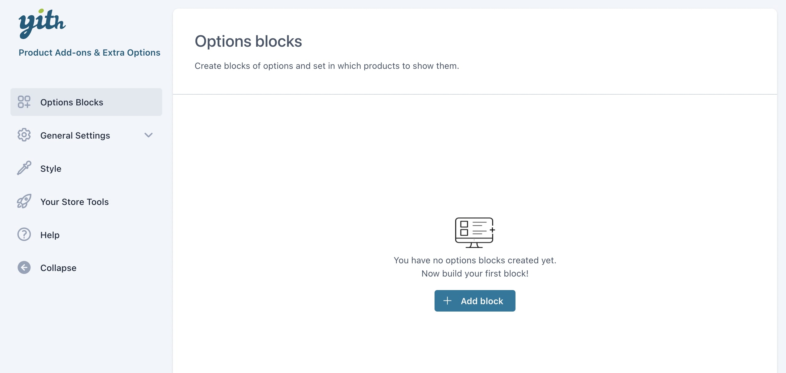
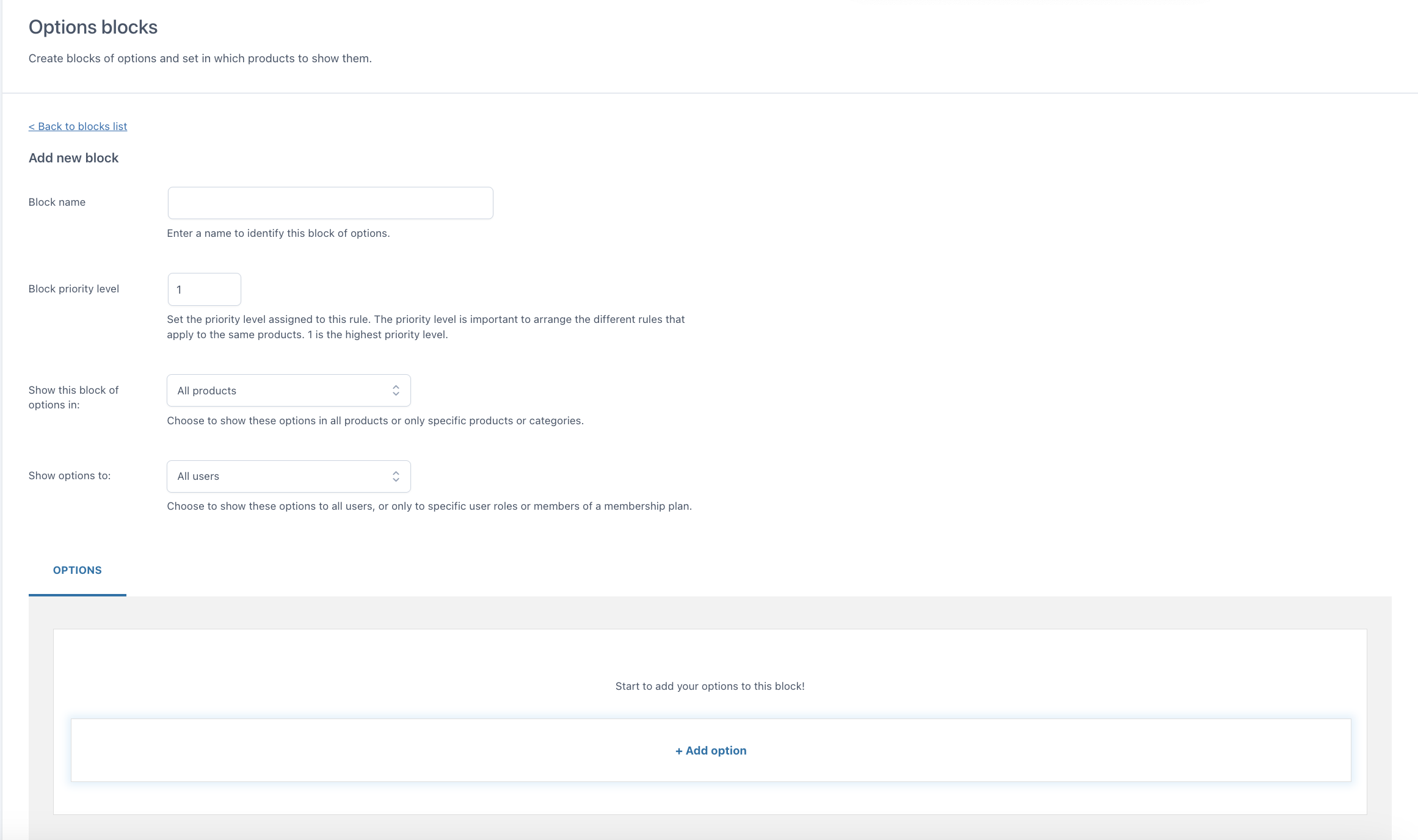
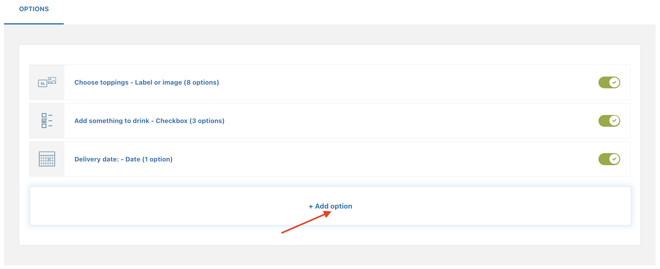
To create your first block, go to YITH > Product Add-ons > Options blocks.
This is what it looks like:
Click on + Add block to add your first block.
Here you will be able to set:
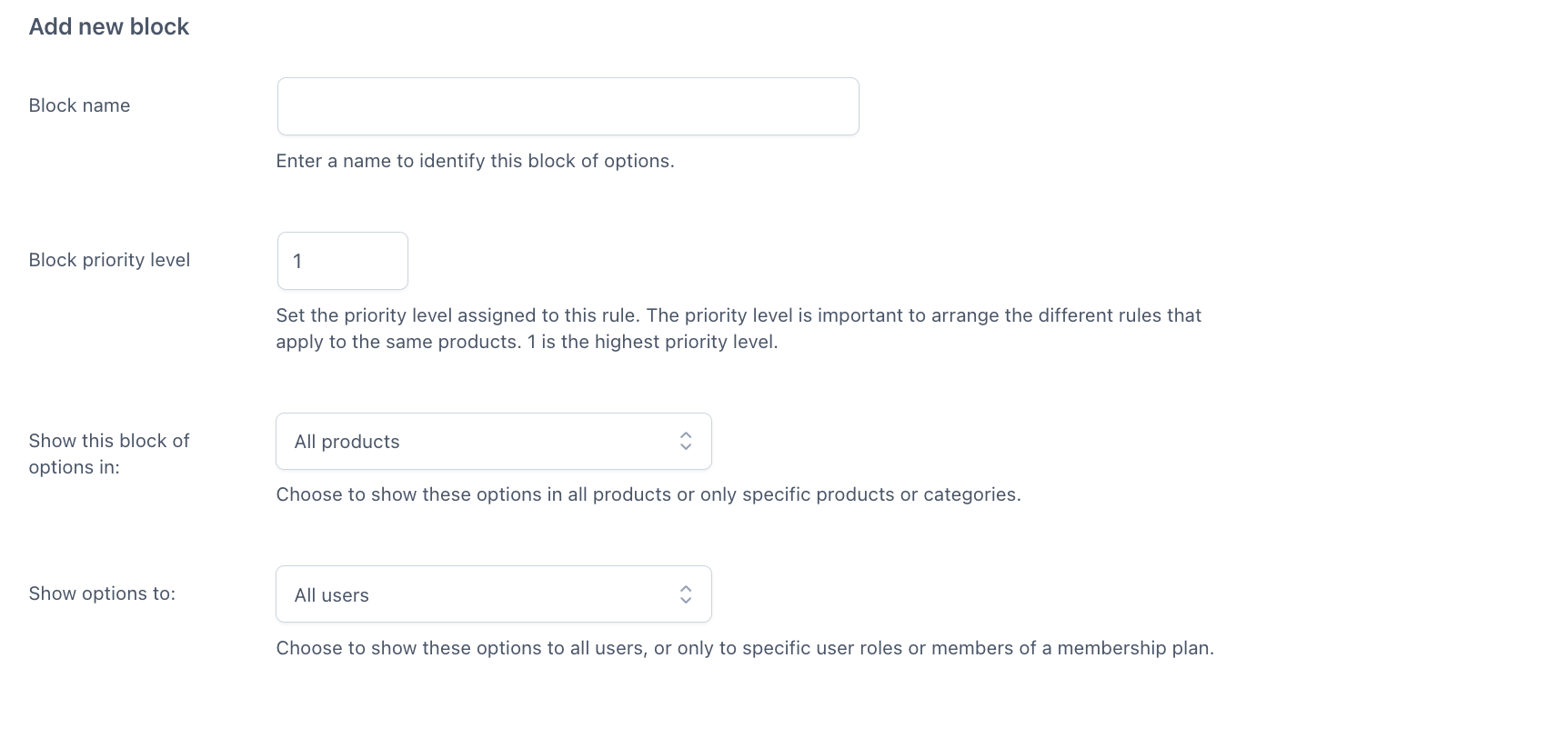
- the name of the options block
- a priority that will help you sort the blocks in case more than one block applies to the same product
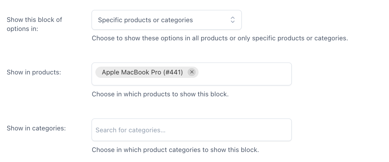
- the possibility to show the block of options in all products or specific products and categories
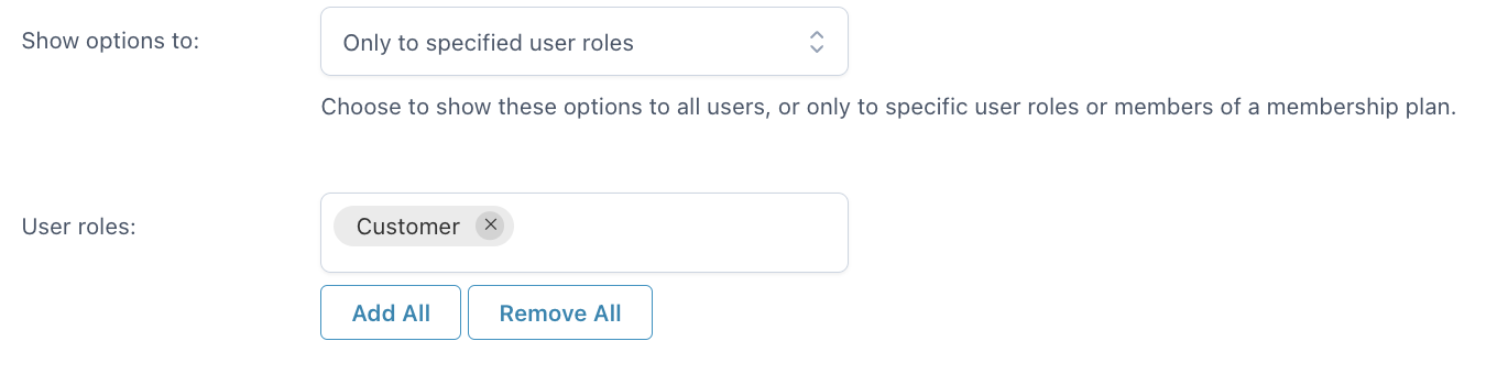
- the possibility to show options to all users, only guest users, only logged-in users or only specific user roles
Then, you will be able to configure the options and the rules. We’ll check all the available settings in detail on the following pages.
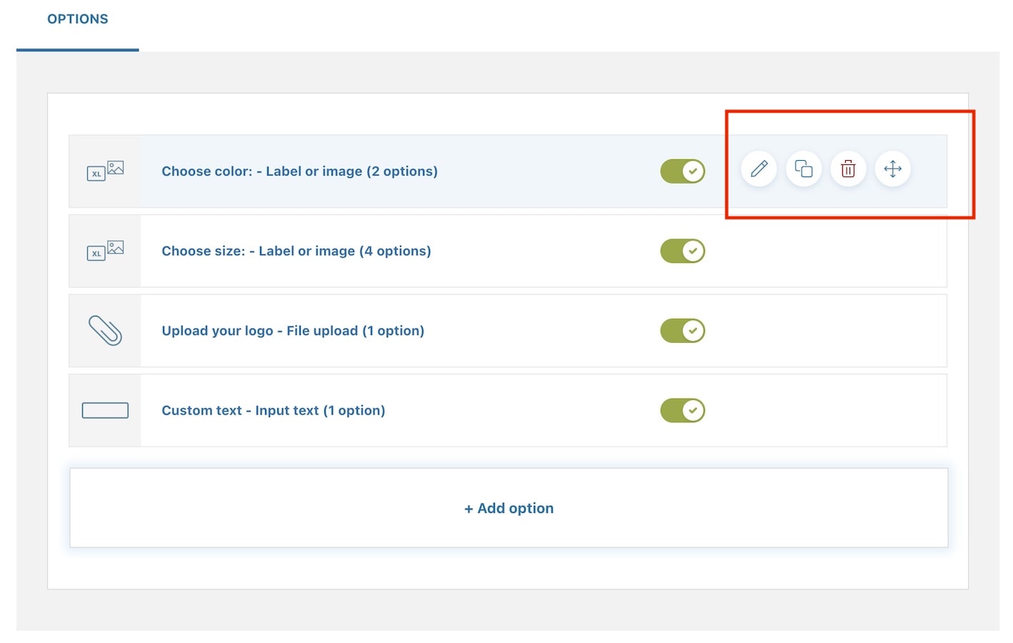
Also, after closing the options block, you will see them all in a list and, by using the buttons on the right, for each block you can:
- edit
- duplicate
- delete
- move with drag&drop
- enable/disable the block in one click.
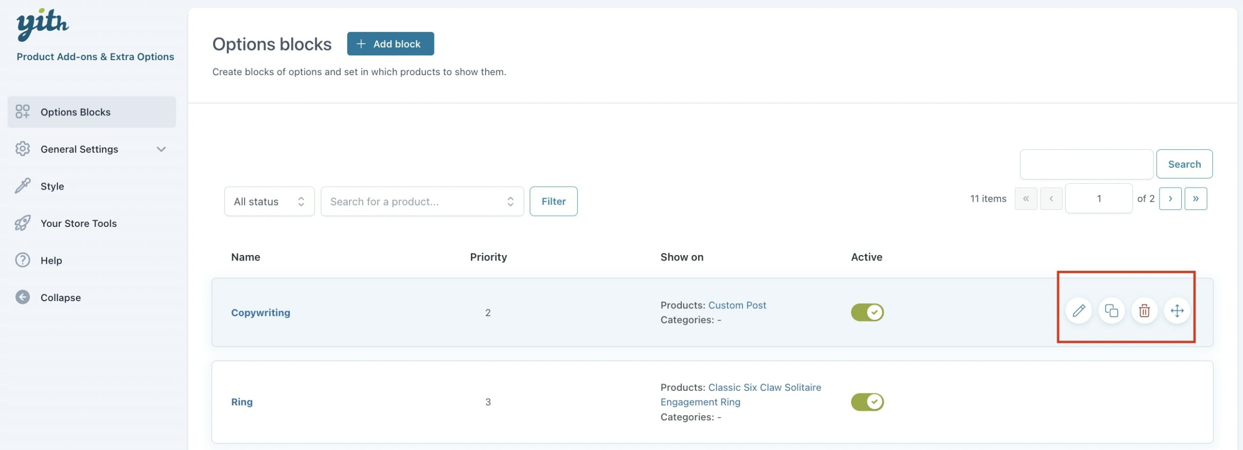
For each option block, you will see the name, the priority assigned to it and the products and categories where it shows on.
Moreover, you will be able to filter and search within the block list through the following options:

(1) Filter block by status: decide to filter options blocks based on whether their status is enabled or disabled.
(2) Filter the blocks by single product: type in the name of a product and you will be able to filter the options blocks available in that product.
(3) Search by block title: you can search options blocks based on a title.
Options sets
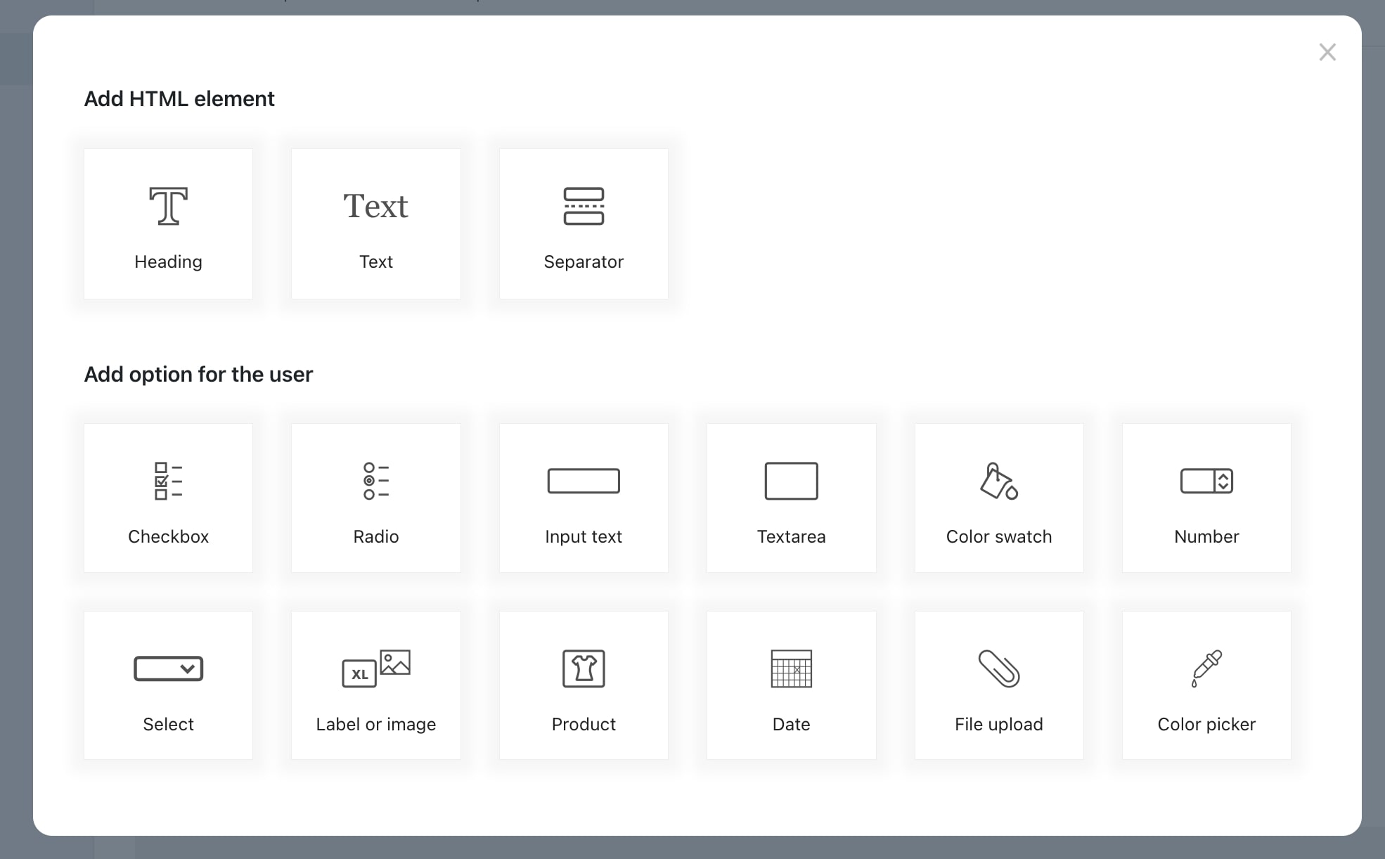
From the Options block, click on + Add options and you will be able to choose between one of the following types of options sets:
- Checkbox
- Radio
- Input text
- Textarea
- Color swatch
- Number
- Select
- Label or image
- Product
- Date
- File Upload
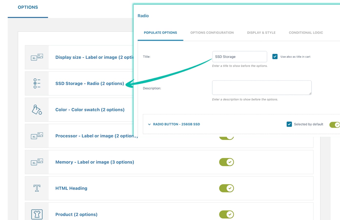
For every option set, you can enter a title that will help you identify it in the options list of the block:
Also, after closing the options set, you will see them all in a list and using the buttons on the right, for each set you can:
- edit
- duplicate
- delete
- move with drag&drop
- enable/disable the block in one click.
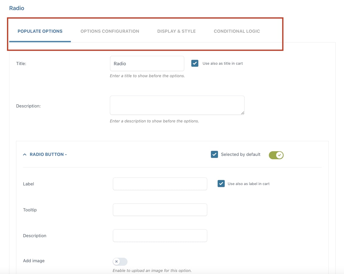
For every options set, you will see different settings tabs:
- Populate options
- Display settings
- Style (only available for “Label and image” type)
- Conditional logic
- Advanced settings
HTML elements
Let’s start from the Options tab. Here is where you can add either an HTML element or an options set. Just click on Add option.
Let’s focus on available HTML elements first:
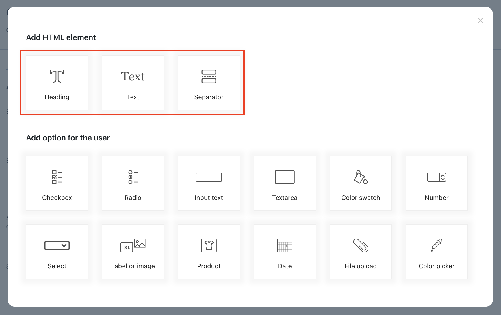
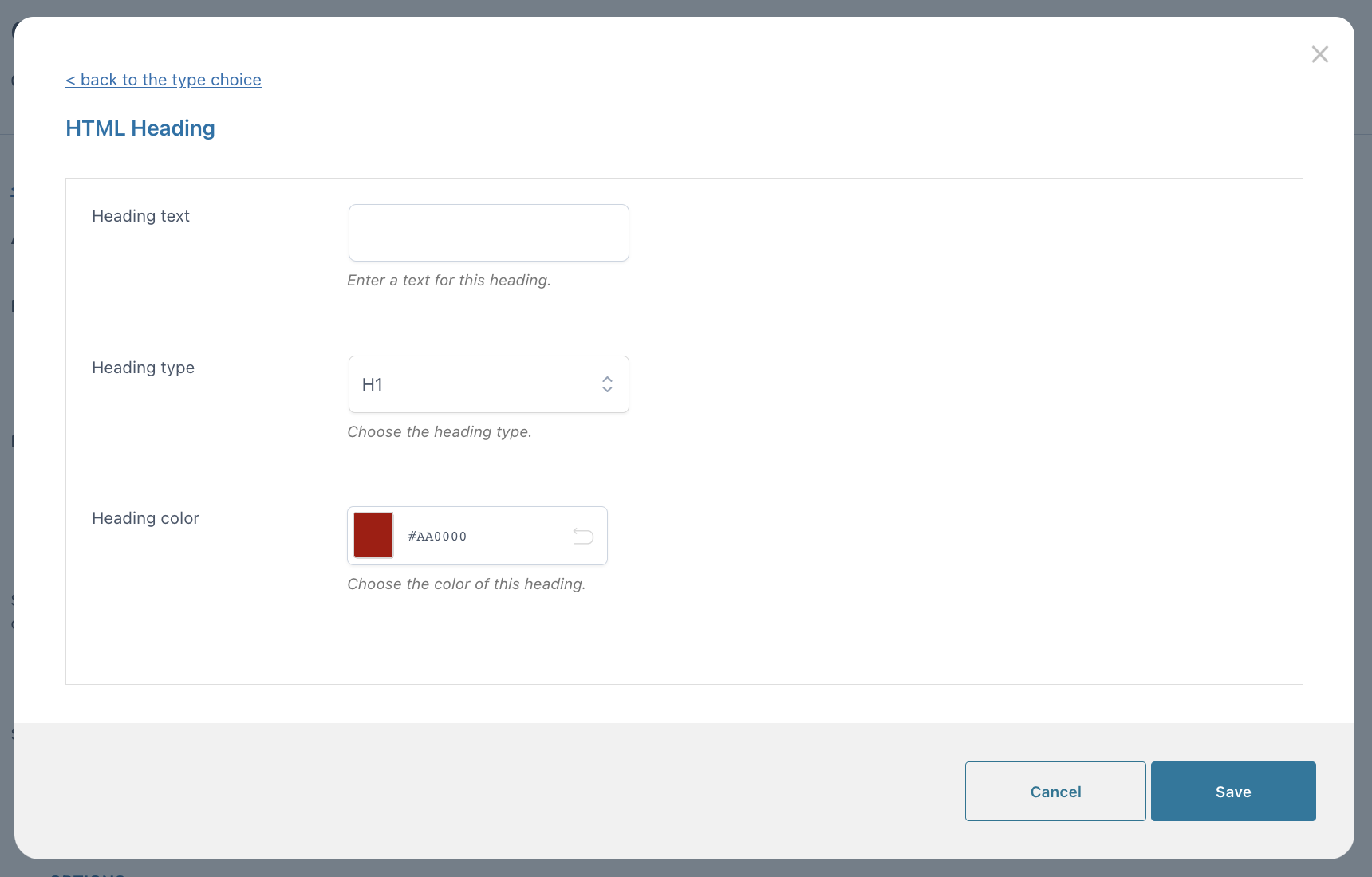
Heading
You can set the text, the type of heading (H1 to H6), and the color.
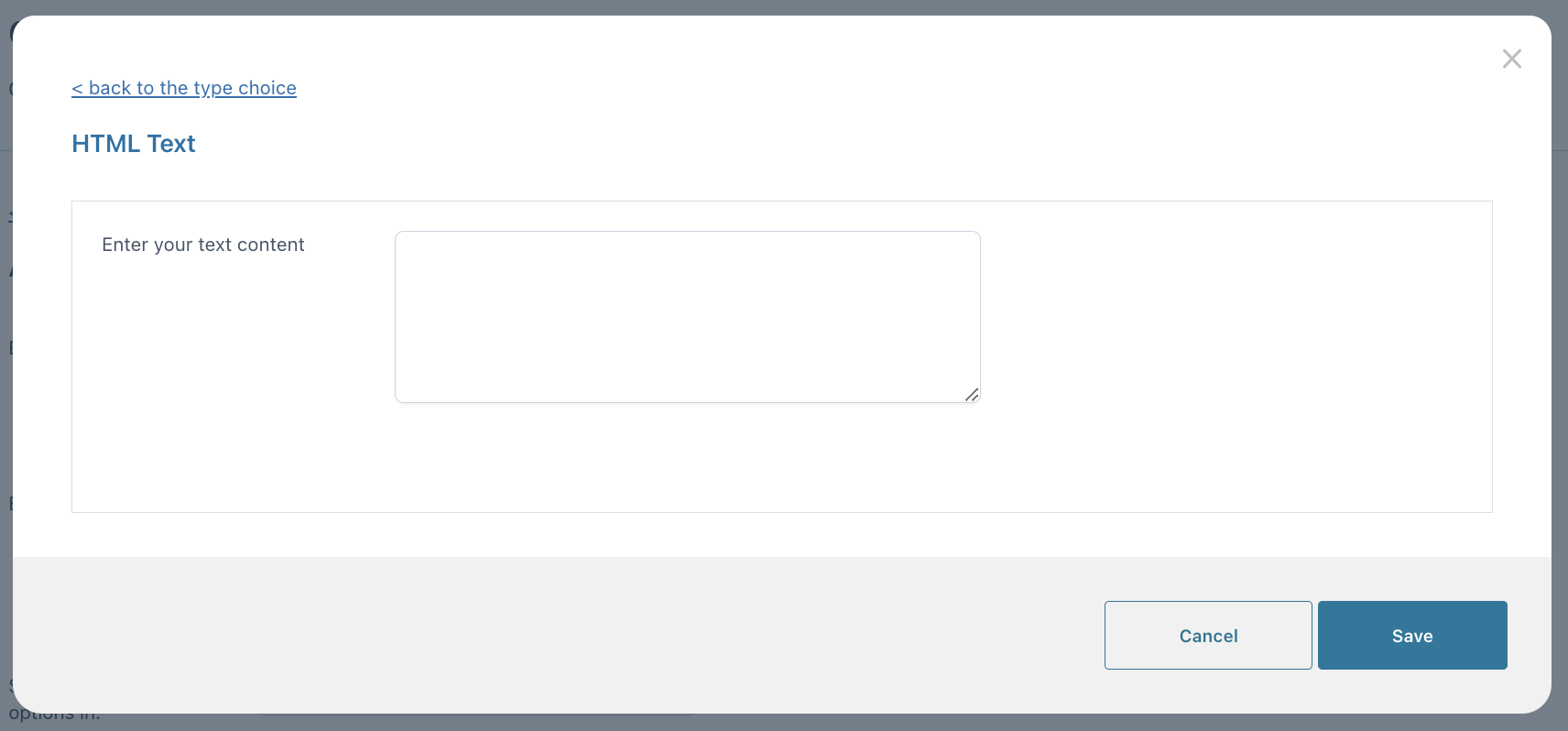
Text
Enter a custom static text here.
Separator
Configure a graphic separator that you can use between your options sets.
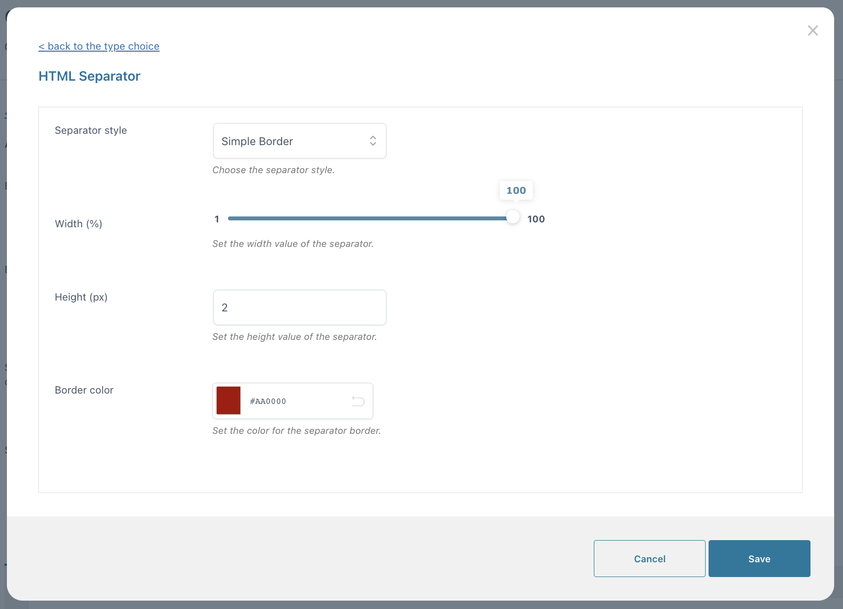
- Separator style: simple border, double border, dotted border, dashed border, empty space.
- Width (px)
- Height (px)
- Color
Populate options
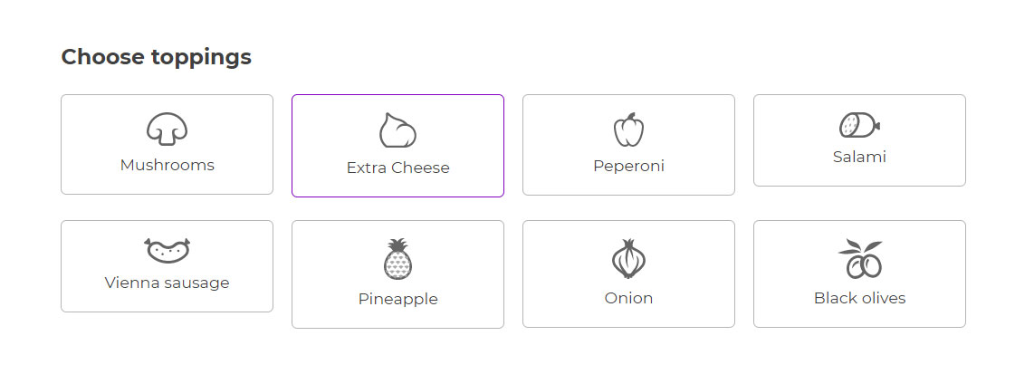
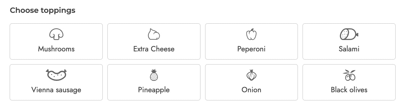
In the Populate options, you will be able to add as many options as you wish. For example, if you choose a Label/image options set to display the available pizza toppings, every option will be one topping.
To add more options to this set, just click on + Add option:
The Populate settings allow enabling or disabling every option and vary based on the type selected. Let’s go through all of them one by one below.
- Checkbox
- Radio
- Input text
- Textarea
- Color swatch
- Number
- Select
- Label or image
- Product
- Date
- File Upload
- Color picker
Checkbox
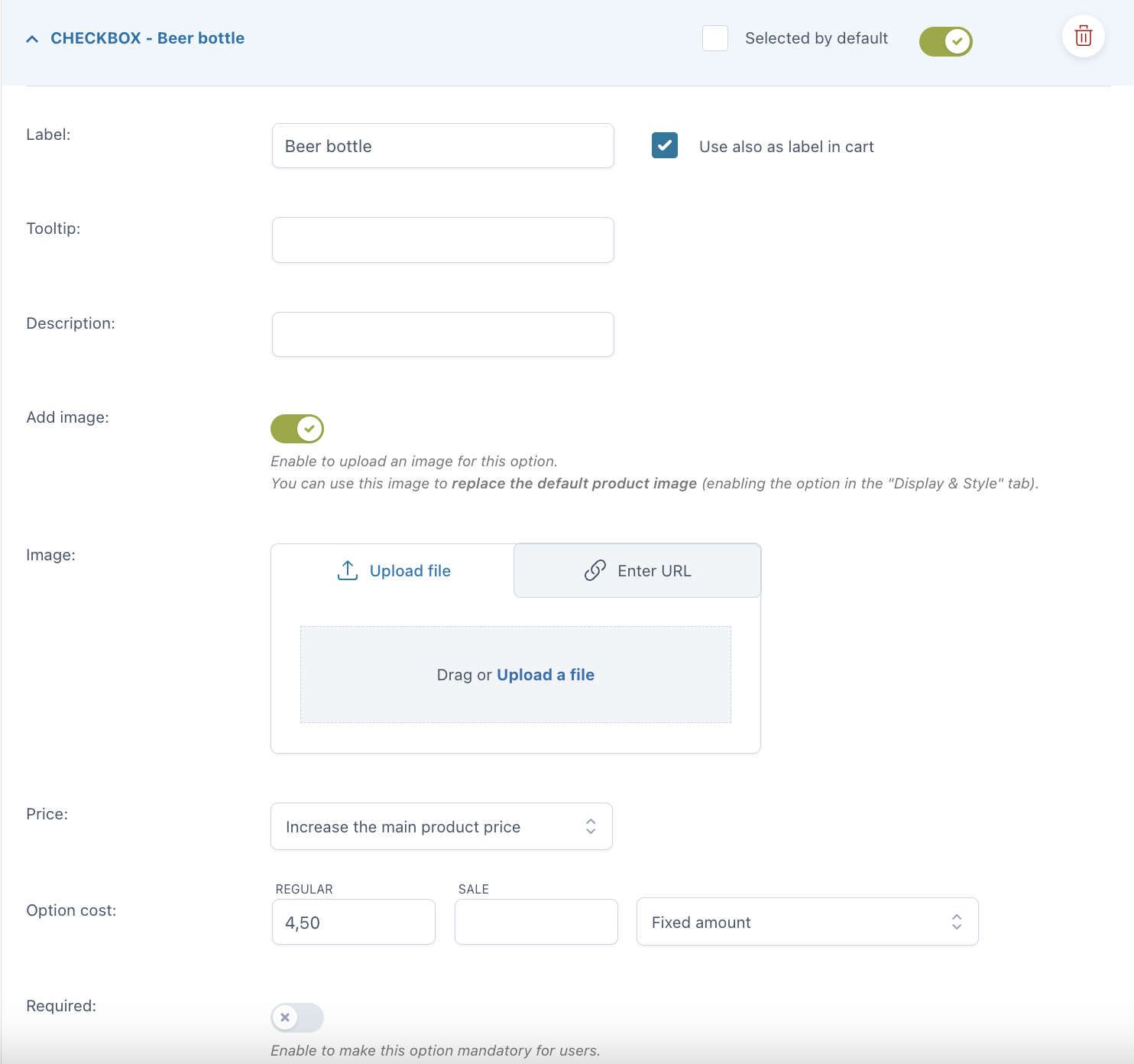
As opposed to radio buttons, checkboxes let your users select more than one option for the same set. For every option you can set:
- Selected by default
- Label
- use also as label in cart
- label in cart: enter a text to show as a label in cart (available only if the option “Use also as label in cart” is not enabled)
- Tooltip
- Description
- Image: you can either upload a file or enter the URL
- Price: the option price can be calculated as a fixed or percentage amount from the product price:
- product price doesn’t change – set option as free
- increase the product price (on-sale available as well)
- discount the product price
- Required: if enabled, the customer cannot add the product to the cart without entering a text in this option.
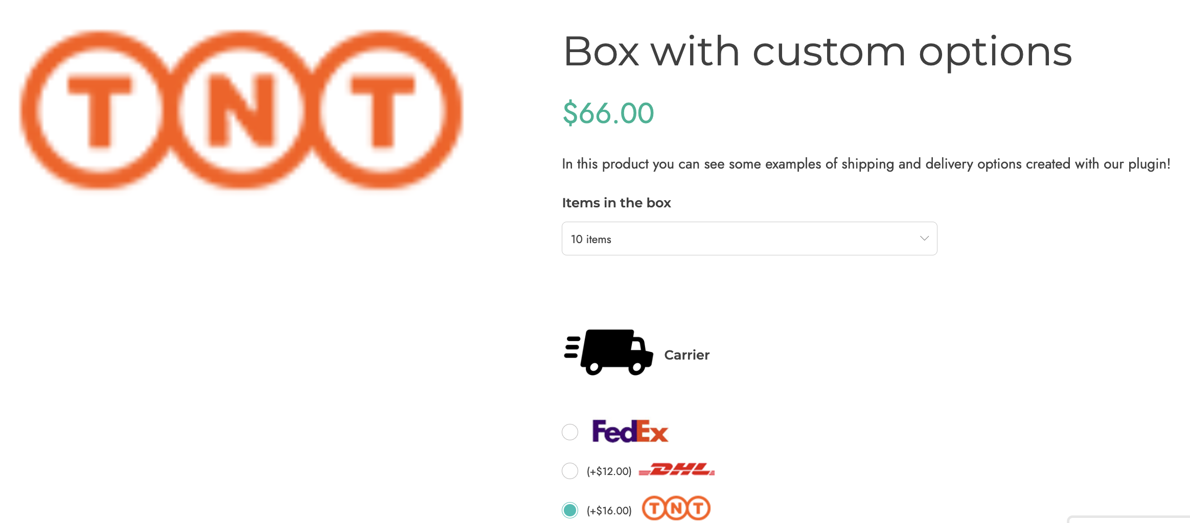
Example: add extra paid options to your custom box delivered at home like order tracking and insurance.

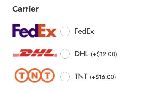
Radio
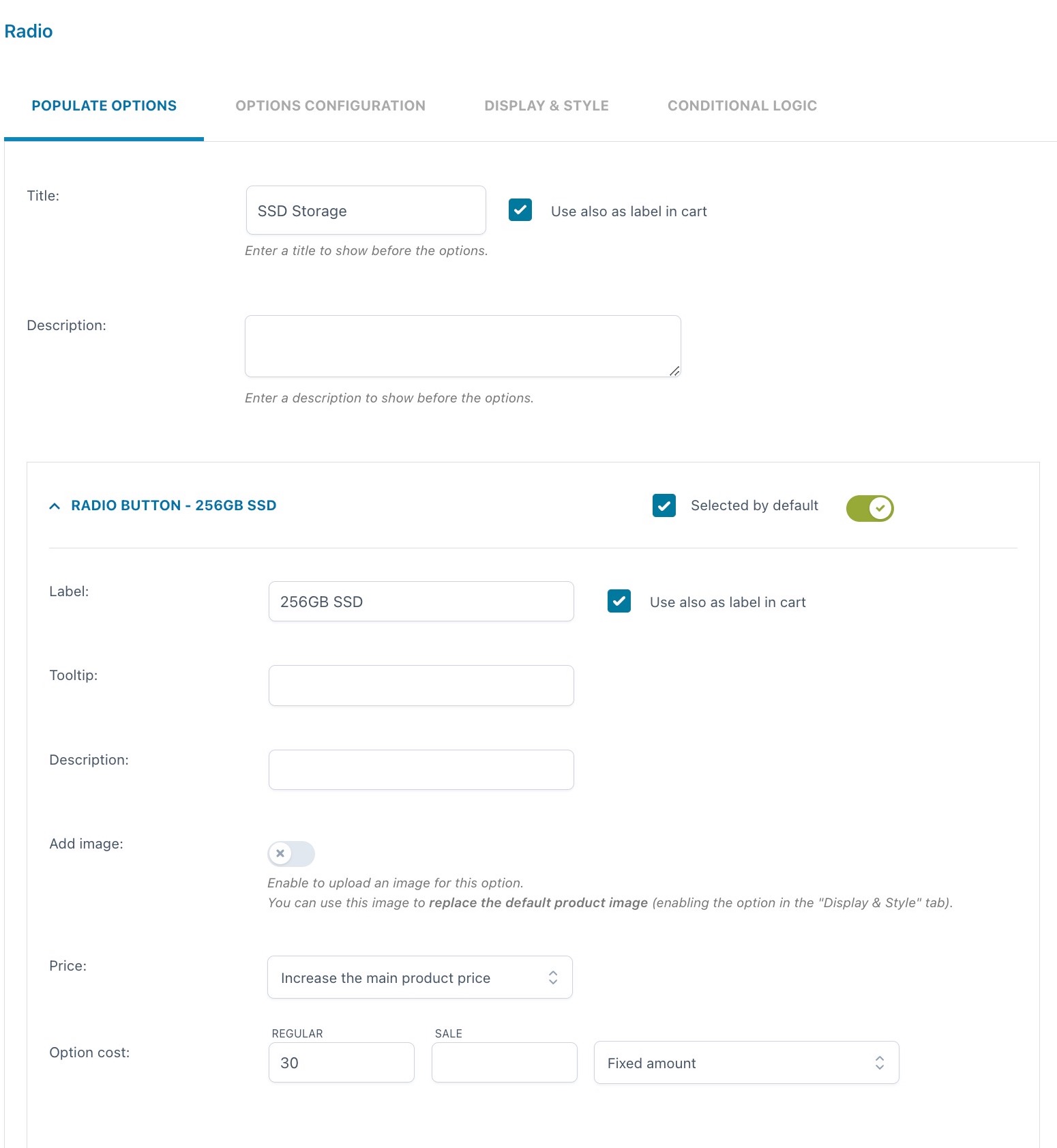
For every option you can set:
- Selected by default: one of the created options will be always selected by default
- Label
- use also as label in cart
- label in cart: enter a text to show as a label in cart (available only if the option “Use also as label in cart” is not enabled)
- Tooltip
- Description
- Image: you can either upload a file or enter the URL
- Price: the option price can be calculated as a fixed or percentage amount from the product price:
- product price doesn’t change – set option as free
- increase the product price (on-sale available as well)
- discount the product price
By its very nature, users can only select one option in a radio input. Use checkboxes if you want to let users select multiple options instead.
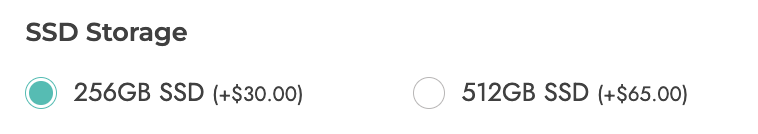
Example: I can create a radio add-on for the SSD Storage with two options:
1. 256GB SSD with an additional cost of $30 and selected by default
2. 512GB SSD with an additional cost of $65
Input text
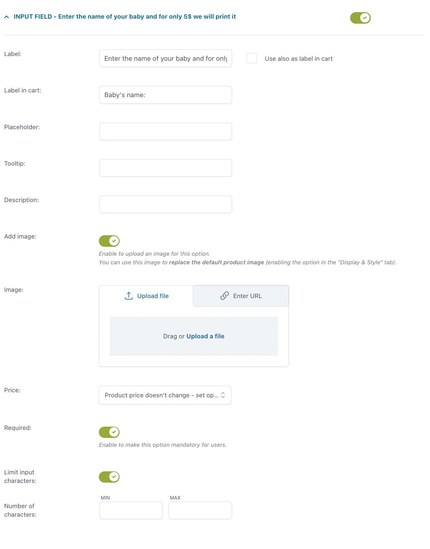
For every option you can set:
- Label
- use also as label in cart
- label in cart: enter a text to show as a label in cart (available only if the option “Use also as label in cart” is not enabled)
- Tooltip
- Description
- Image: you can either upload a file or enter the URL
- Price: the option price can be calculated as a fixed or percentage amount from the product price:
- product price doesn’t change – set option as free
- increase the product price (on-sale available as well)
- discount the product price
- Required: if enabled, the customer cannot add the product to the cart without entering a text in this option
- Limit input characters: here, you can set a minimum and maximum value.
Example: let your customer have a custom text printed on a T-shirt for an extra $5. The text can be no more than 20 characters. Explain what this is for in the option description. The screenshot above shows these specific settings and below is how it appears on the frontend.

Textarea
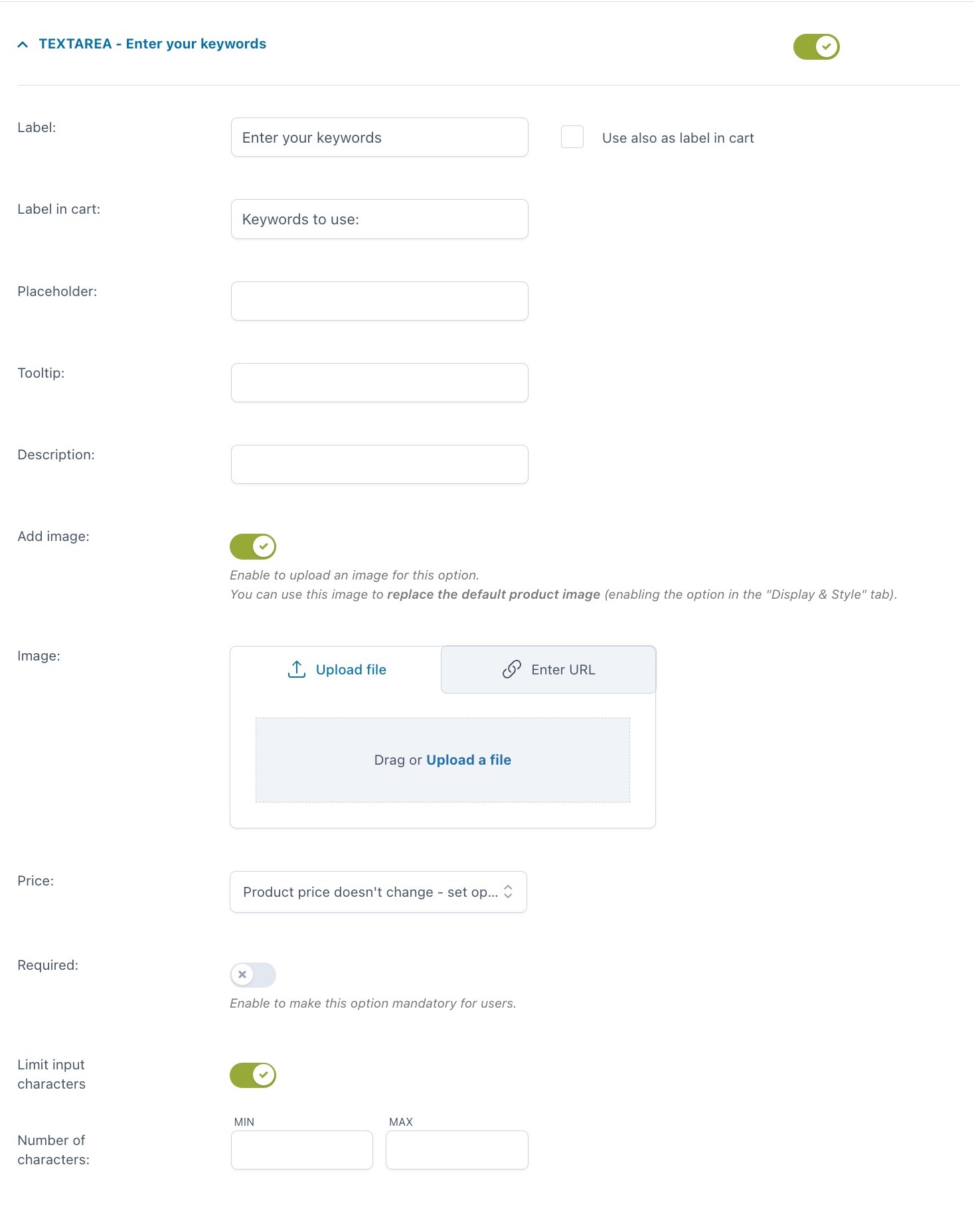
For every option you can set:
- Label
- use also as label in cart
- label in cart: enter a text to show as a label in cart (available only if the option “Use also as label in cart” is not enabled)
- Tooltip
- Description
- Image: you can either upload a file or enter the URL
- Price: the option price can be calculated as a fixed or percentage amount from the product price:
- product price doesn’t change – set option as free
- increase the product price (on-sale available as well)
- discount the product price
- Required: if enabled, the customer cannot add the product to the cart without entering a text in this option
- Limit input characters: here, you can set a minimum and maximum value.
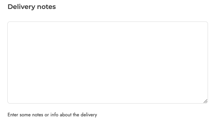
Example: show a textarea for delivery notes.
Color swatch
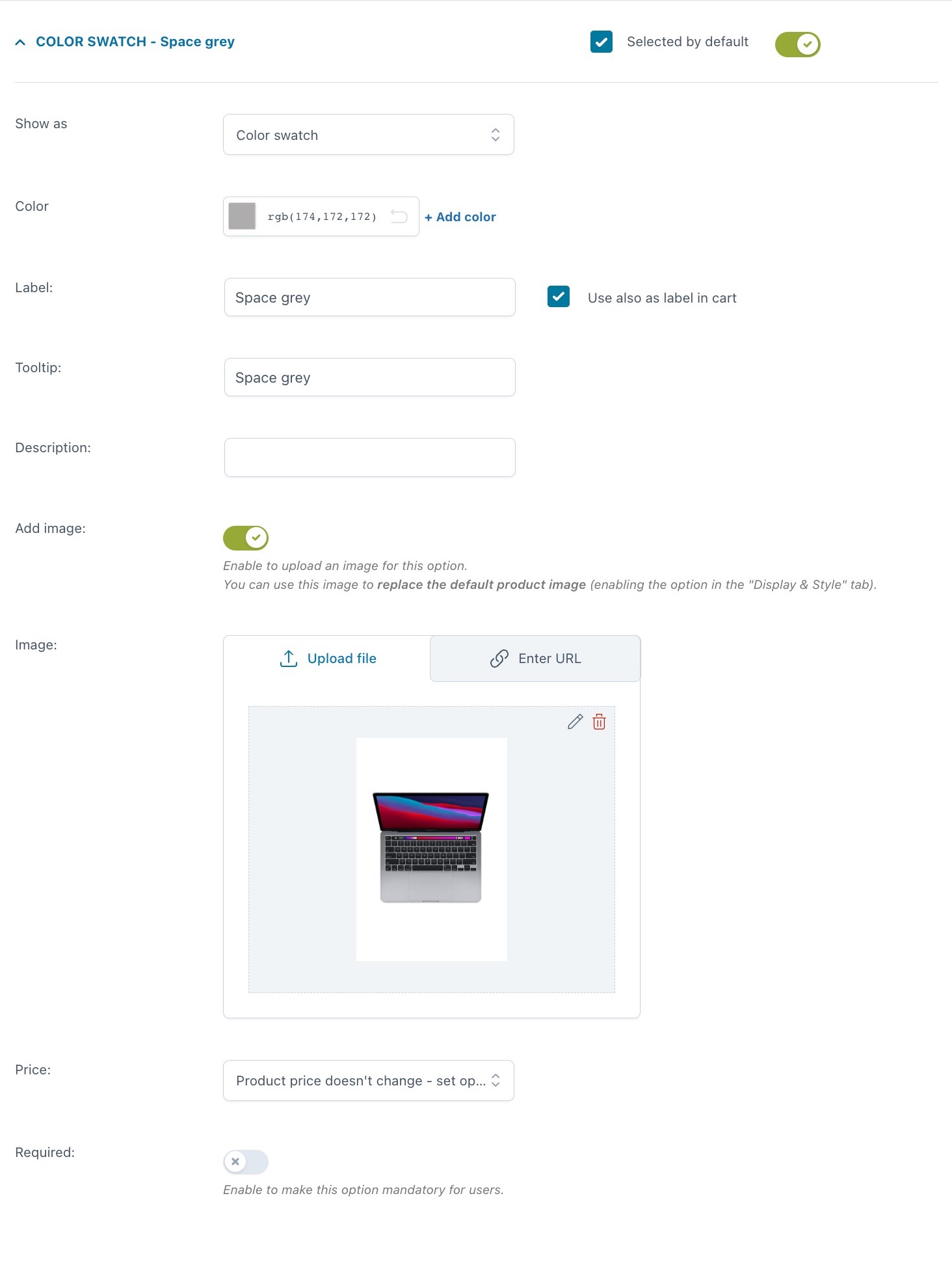
For every option you can set:
- Selected by default
- Show as:
- color swatch
- image swatch
- Color: pick the color from the spectrum or enter the hexadecimal code. You can also add an additional color by clicking on + Add color to create a bicolor option
- Label
- use also as label in cart
- label in cart: enter a text to show as a label in cart (available only if the option “Use also as label in cart” is not enabled)
- Tooltip
- Description
- Image: you can either upload a file or enter the URL
- Price: the option price can be calculated as a fixed or percentage amount from the product price:
- product price doesn’t change – set option as free
- increase the product price (on-sale available as well)
- discount the product price
- Required: if enabled, the customer cannot add the product to the cart without entering a text in this option.
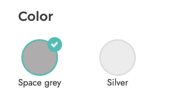
Example: you sell the Macbook Pro in two colors, space gray and silver gray. For each of them, you have not only selected a color using single color swatches but also uploaded an image of the MacBook in that color.
The settings are shown in the screenshot above, whereas below you can see how it looks on the frontend.

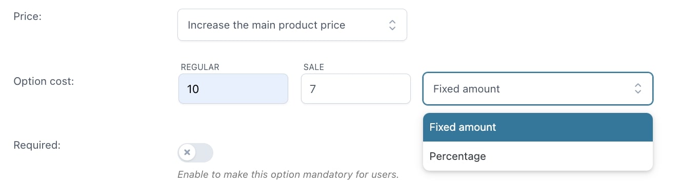
Number
For every option you can set:
- Label
- use also as label in cart
- label in cart: enter a text to show as a label in cart (available only if the option “Use also as label in cart” is not enabled)
- Tooltip
- Description
- Show field: you can show the field empty by default or with a default number
- Set min/max number: here, you can set a minimum and maximum value
- Image: you can either upload a file or enter the URL
- Price: the option price can be calculated as a fixed or percentage amount from the product price:
- product price doesn’t change – set option as free
- increase the product price (on-sale available as well)
- price multiplied by value (this option will be available if you select Increase by product price): this allows you to multiply the option price by the number you enter
- discount the product price
- value multiplied by product price: this will multiply the product price by the number that you enter in the option.
- Required: if enabled, the customer cannot add the product to the cart without entering a text in this option.
Example: you can add a number add-on to collect the age of users for statistic purposes.

Select
For every option you can set:
- Selected by default
- Label
- use also as label in cart
- label in cart: enter a text to show as a label in cart (available only if the option “Use also as label in cart” is not enabled)
- Description
- Image: you can either upload a file or enter the URL
- Price: the option price can be calculated as a fixed or percentage amount from the product price:
- product price doesn’t change – set option as free
- increase the product price (on-sale available as well)
- discount the product price
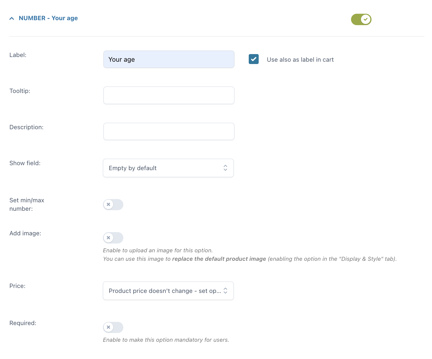
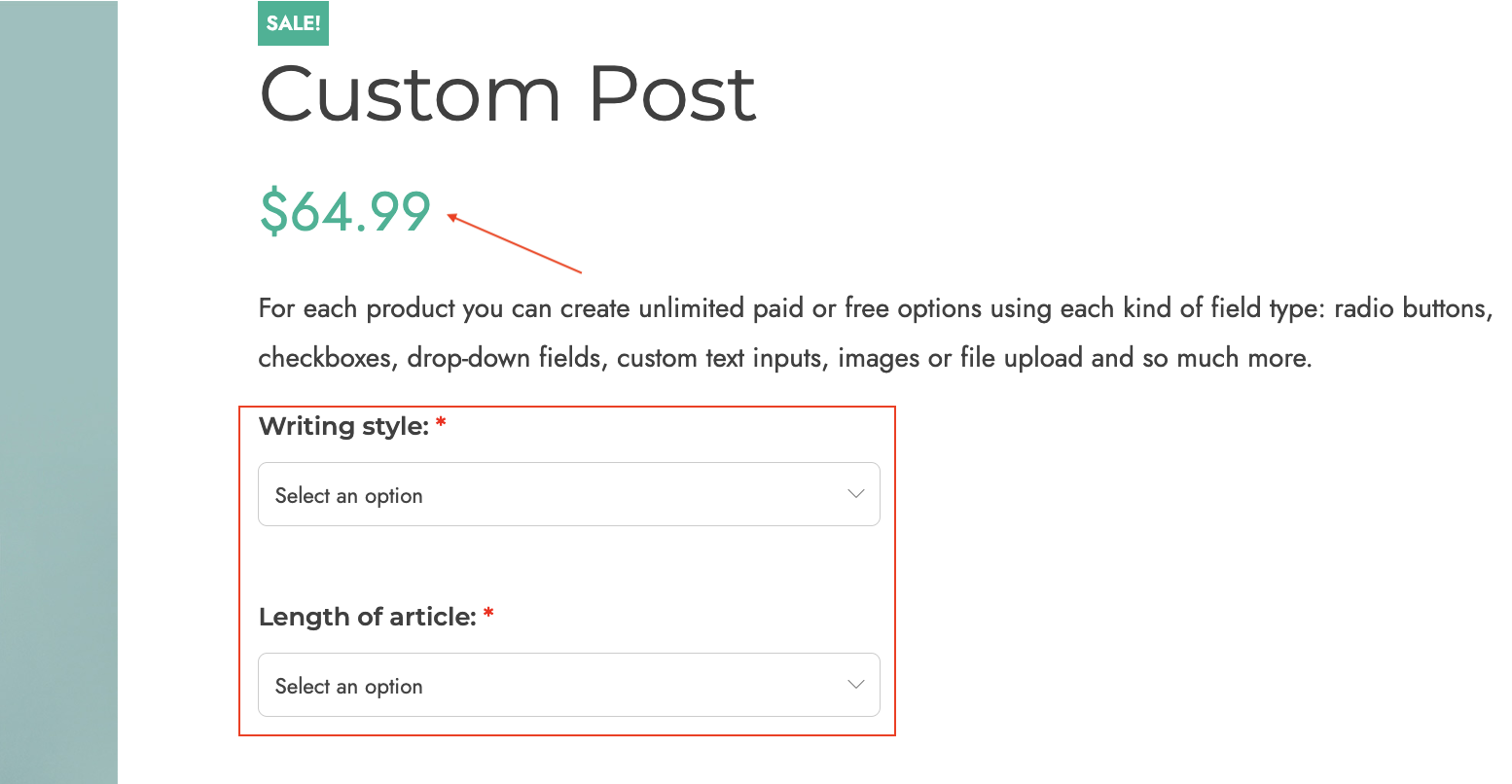
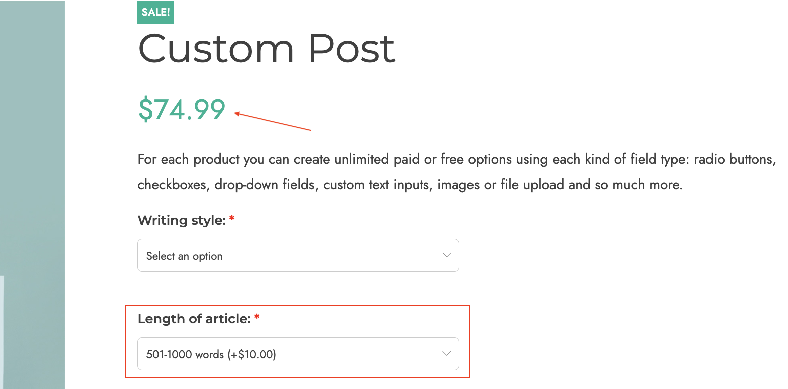
Example: you write copy and you offer two standard length for a blog post:
1. up to 500 words is the basic product price
2. 501 to 1000 words has an additional cost of $10.
Settings are in the screenshot above, frontend is below.

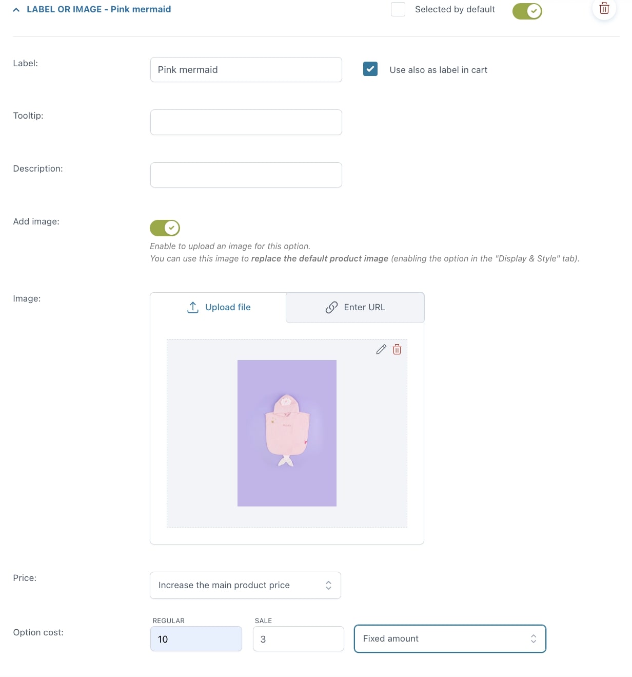
Label or image
For every option you can set:
- Selected by default
- Label
- use also as label in cart
- label in cart: enter a text to show as a label in cart (available only if the option “Use also as label in cart” is not enabled)
- Tooltip
- Description
- Image: you can either upload a file or enter the URL
- Price: the option price can be calculated as a fixed or percentage amount from the product price:
- product price doesn’t change – set option as free
- increase the product price (on-sale available as well)
- discount the product price
- Required: if enabled, the customer cannot add the product to the cart without entering a text in this option.
Example: you sell customizable baby towels, with 4 different options.
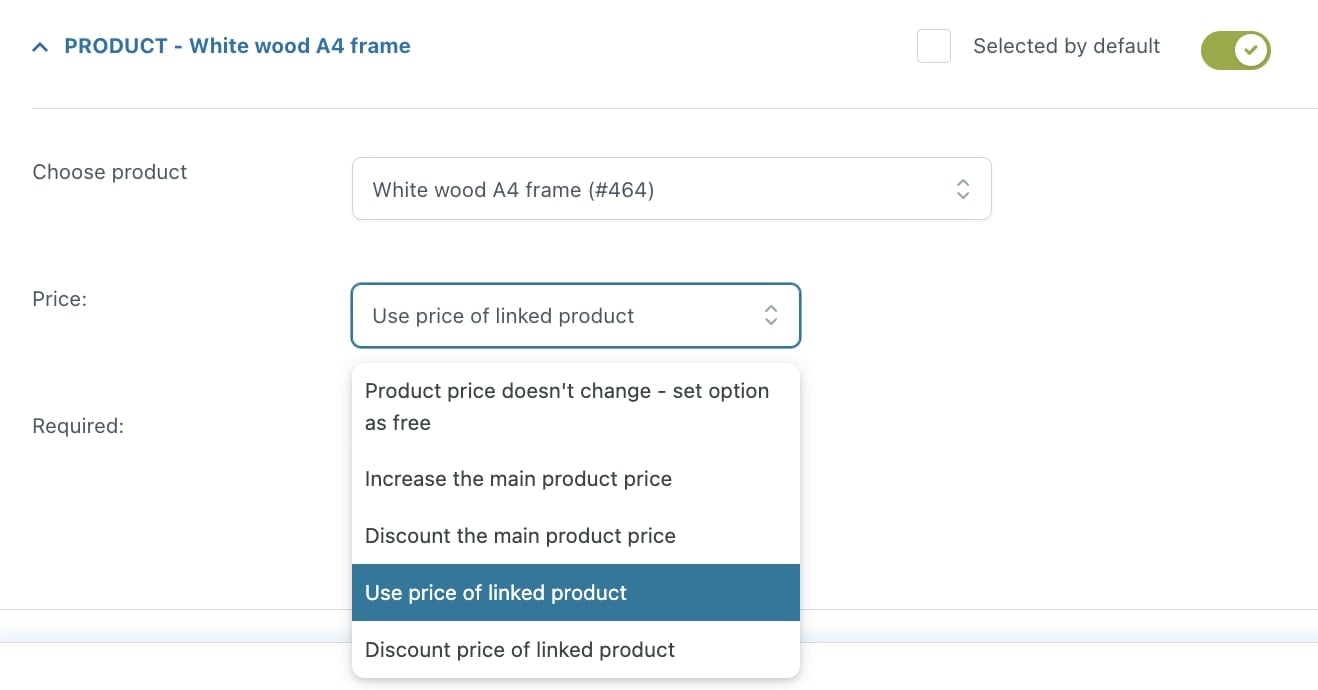
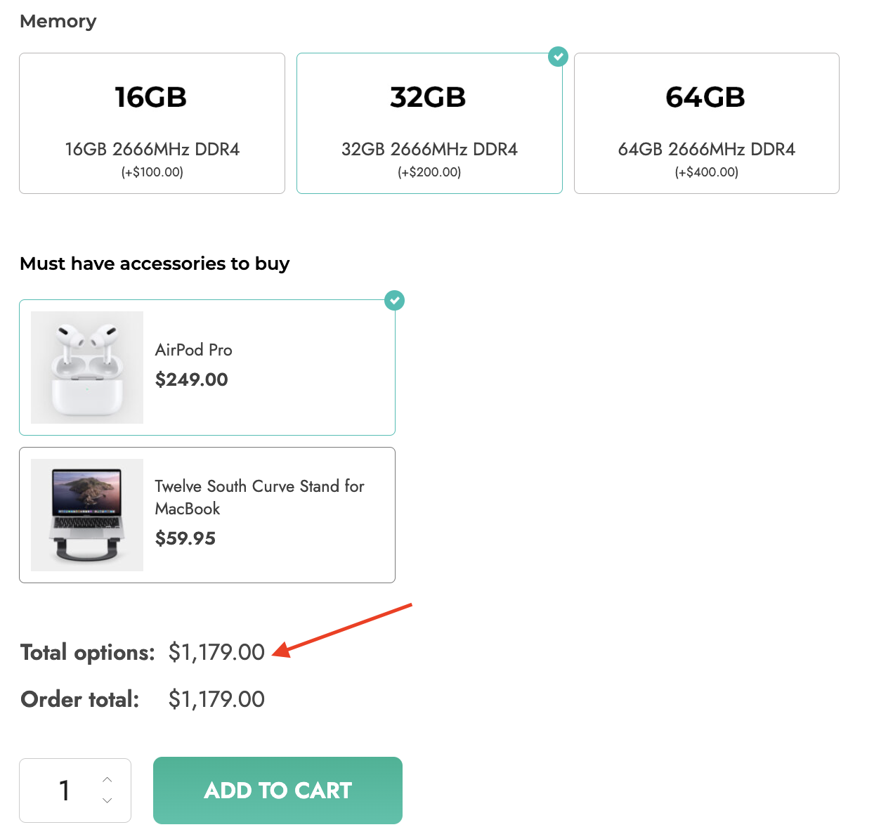
Product
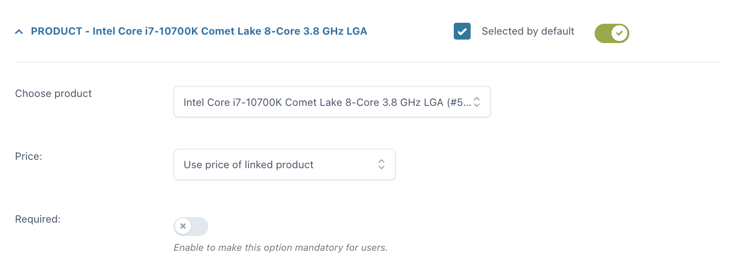
With the Product add-on, you can include one or more products (or product variations) as options for another product. This will automatically update the stock of the selected products.
For every option you can set:
- Selected by default
- Choose product: pick a product from your WooCommerce products
- Price: the option price can be calculated as a fixed or percentage amount from the product price:
- product price doesn’t change – set option as free
- increase the product price (on-sale available as well)
- discount the product price
- use price of linked product
- discount price of linked product: this discount will be available on the product only if the user buys it as an add-on.
Example: you sell a customizable computer and you can let your user choose every part of it by selecting a processor, motherboard, case, etc. Each of these parts will be an add-on with products/options the user can choose from.

Date
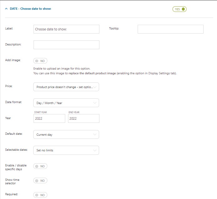
- Label
- Tooltip
- Description
- Image: you can either upload a file or enter the URL
- Price: the option price can be calculated as a fixed or percentage amount from the product price:
- product price doesn’t change – set option as free
- increase the product price (on-sale available as well)
- discount the product price
- Date format: choose between
- Day / Month / Year
- Month / Day / Year
- Day . Month . Year
- Year: select the start and end year you want to display in the calendar picker. You can refine these ranges with the options below.
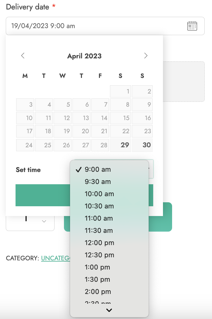
For example, if you want to let your users select a delivery date only within the year 2023, select 2023 both in the start and end year, but if you want to let your users select their date of birth, make sure the start year goes back enough to cover your users’ actual age.

- Default date: this is the date that will be selected by default on the frontend:
- None
- Current day
- Current day + 1
- Set a specific day
- Set a time interval from current day: for example, 7 days from today
- First available date

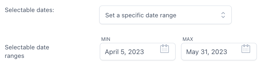
- Selectable dates:
- Set no limits
- Set a range of dates – this allows you to select a date range from the current date. For example, the user will be able to select any date between 1 and 10 days from today.
- Set a specific date range – this allows you to select a specific start date and end date (for example 20th – 30th May), static dates basically
- Disable dates previous to current day: all dates prior to the current day won’t be available for the selection.
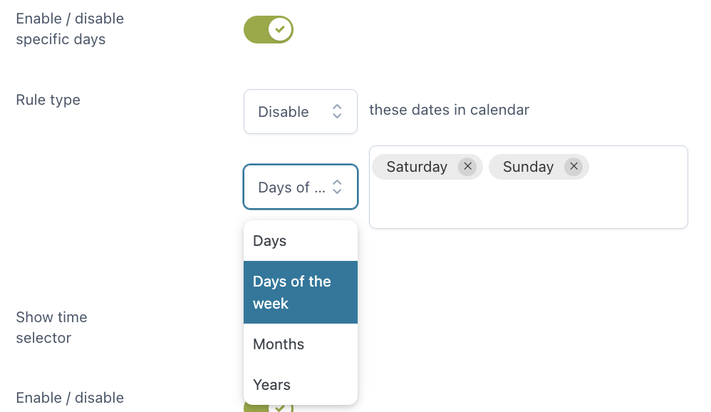
- Enable/Disable specific days: you can enable or disable specific days, days of the week, months or years in the calendar
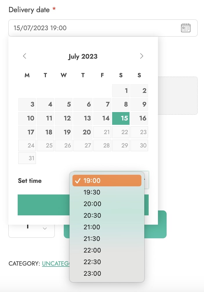
- Show time selector: let your customers select also the time. You can either show every time slot available or enable/disable specific time slots. Choose also the time interval that will be used to automatically generate the time slots.
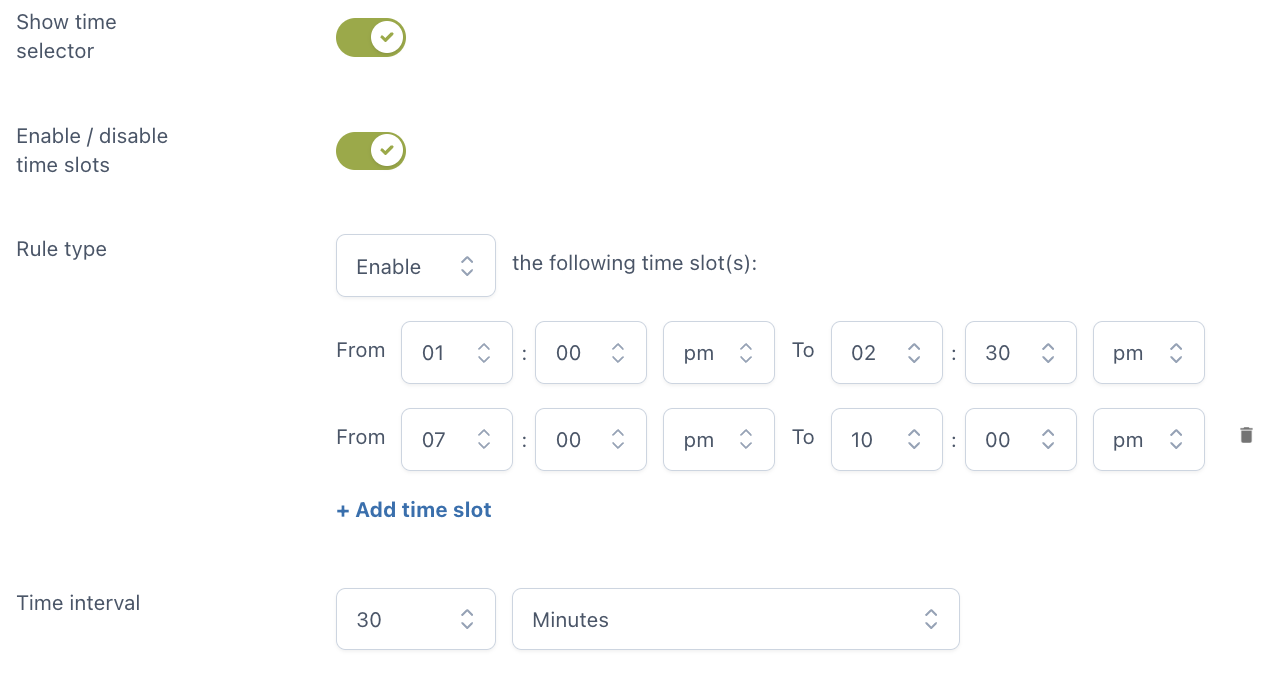
Example – in the following screenshot, you see time slots of 30 minutes between 9 am and 6 pm.
- Required: if enabled, the customer cannot add the product to the cart without entering a text in this option.
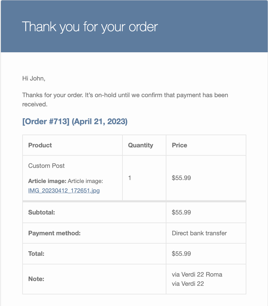
File upload
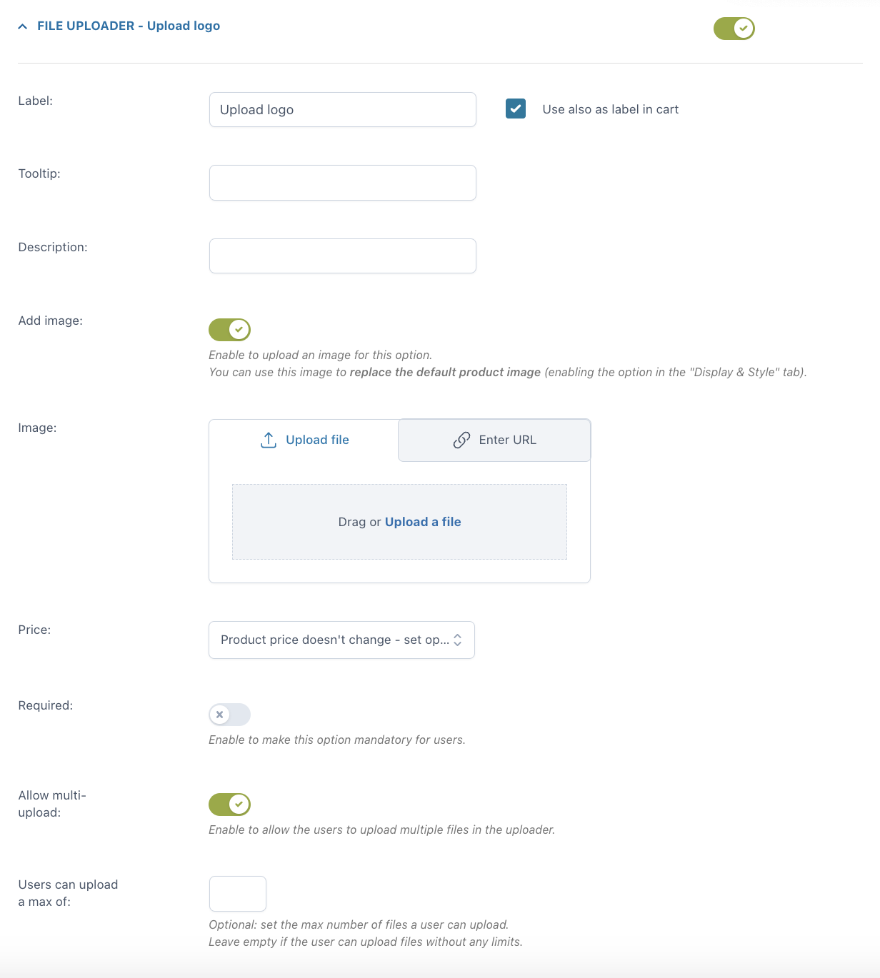
For every option you can set:
- Label
- use also as label in cart
- label in cart: enter a text to show as a label in cart (available only if the option “Use also as label in cart” is not enabled)
- Tooltip
- Description
- Image: you can either upload a file or enter the URL
- Price: the option price can be calculated as a fixed or percentage amount from the product price:
- product price doesn’t change – set option as free
- increase the product price (on-sale available as well)
- discount the product price
- Required: if enabled, the customer cannot add the product to the cart without entering a text in this option.
- Allow multi-upload: let your users upload more than one file in the uploader. Optionally, you can set the maximum number of files allowed.
Example: you sell a customizable T-shirt and let your customers upload their own image(s) to be printed on it.

For more global settings of your upload options, please, refer to this page.
Color picker
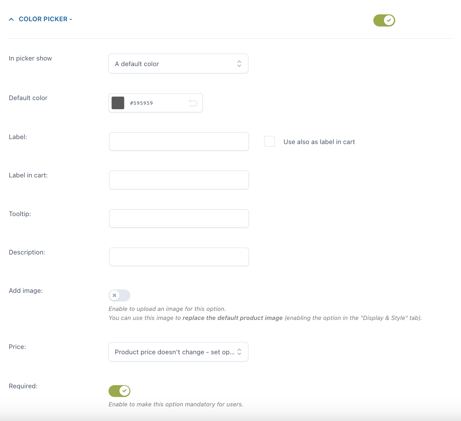
For every option you can set:
- the picker to show: you can choose from a default color and a placeholder text
- default color or placeholder according to the previous selection
- label
- use also as label in cart
- label in cart: enter a text to show as a label in cart (available only if the option “Use also as label in cart” is not enabled)
- tooltip
- description
- image: you can either upload a file or enter the URL
- Price: the option price can be calculated as a fixed or percentage amount from the product price:
- product price doesn’t change – set option as free
- increase the product price (on-sale available as well)
- discount the main product price
- Price: the option price can be calculated as a fixed or percentage amount from the product price:
- Required: if enabled, the customer cannot add the product to the cart without choosing a color in this option.

Options configuration
For every option set, you can configure different settings. Let’s analyze them together.
- Checkbox
- Radio
- Input text
- Textarea
- Color swatch
- Number
- Select
- Label or image
- Product
- Date
- File upload
- Color picker
Checkbox
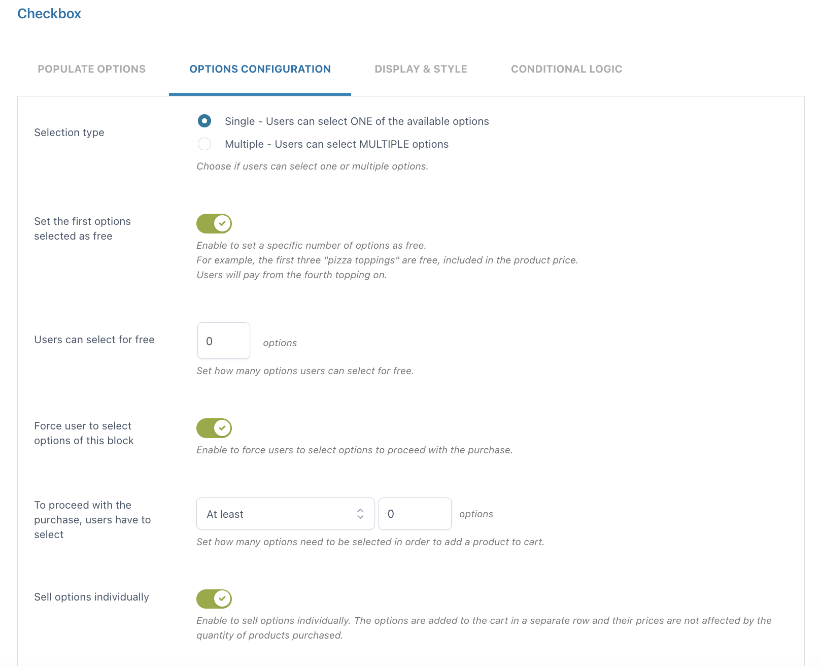
- Selection type: choose Single if you want your users to select only ONE of the available options or Multiple if you want them to select MULTIPLE options
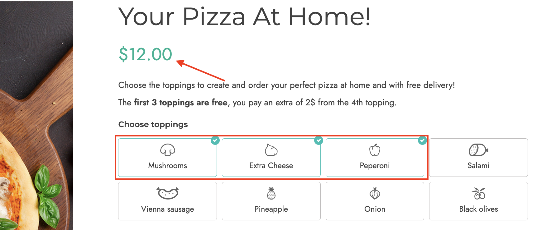
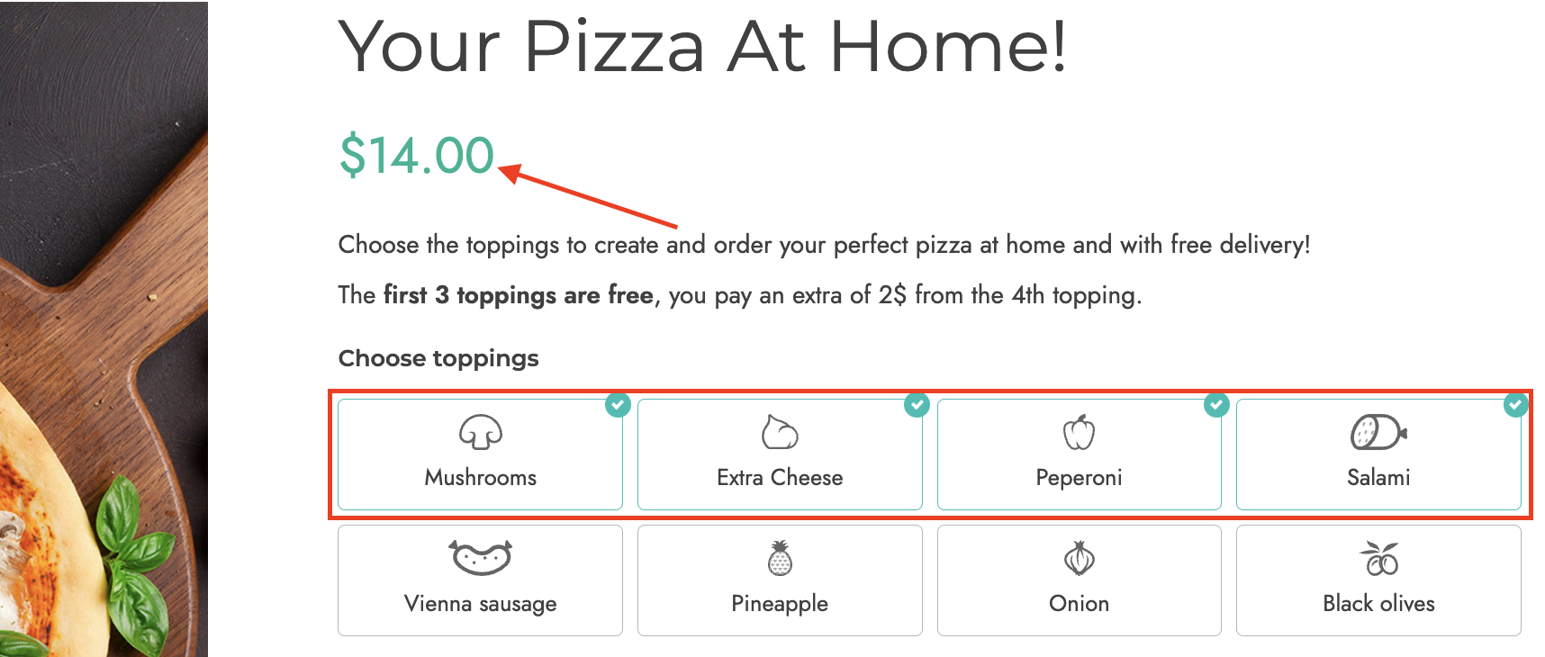
- Set the first options selected as free: enable to set a specific number of options as free. For example, the first three pizza ingredients are free and included in the product price. The user will pay for the fourth ingredient. In the example below, you can see that the product price does not change for the first 3 ingredients, but it adds $2 per any additional ingredient selected after the fourth
- Force user to select options of this block: enable to force users to select an option before proceeding with the purchase
- To proceed with the purchase, users have to select: here, you can define the number of options that must be selected after choosing from At least or Exactly
- Users can select a max of: (only if the Multiple selection type has been enabled): define the maximum number of options that users can select

- Sell options individually: if enabled, the options selected by the user will be added to the cart in a separate row. In this case, option prices won’t change based on the purchased product quantity.
Radio
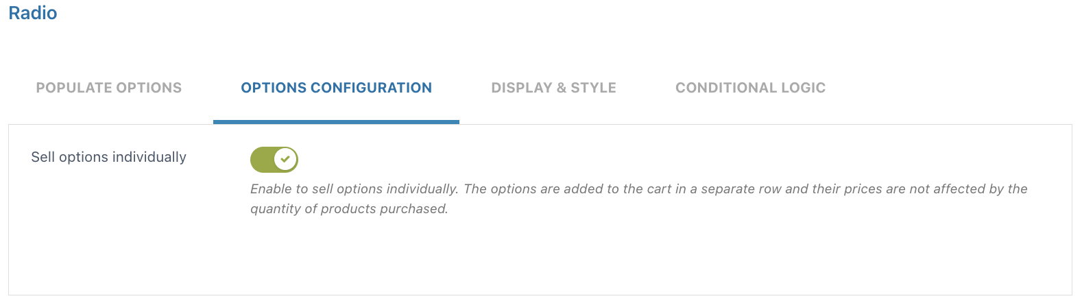
- Sell options individually: if enabled, the options selected by the user will be added to the cart in a separate row. In this case, option prices won’t change based on the purchased product quantity.
Input text
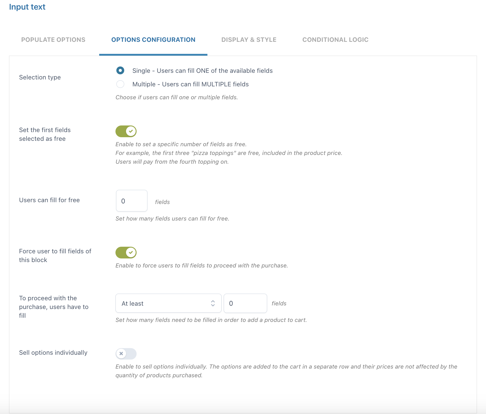
- Selection type: choose Single if you want your users to fill only ONE of the available fields or Multiple if you want them to fill MULTIPLE fields
- Set the first fields selected as free: enable to set a specific number of fields that can be filled for free
- Users can fill for free: define the number of fields that users can fill for free
- Force user to select fields of this block: enable to force users to select fields before proceeding with the purchase
- To proceed with the purchase, users have to fill: here, you can define the number of fields that must be filled after choosing from At least or Exactly
- Sell options individually: if enabled, the options selected by the user will be added to the cart in a separate row. In this case, option prices won’t change based on the purchased product quantity.
Textarea
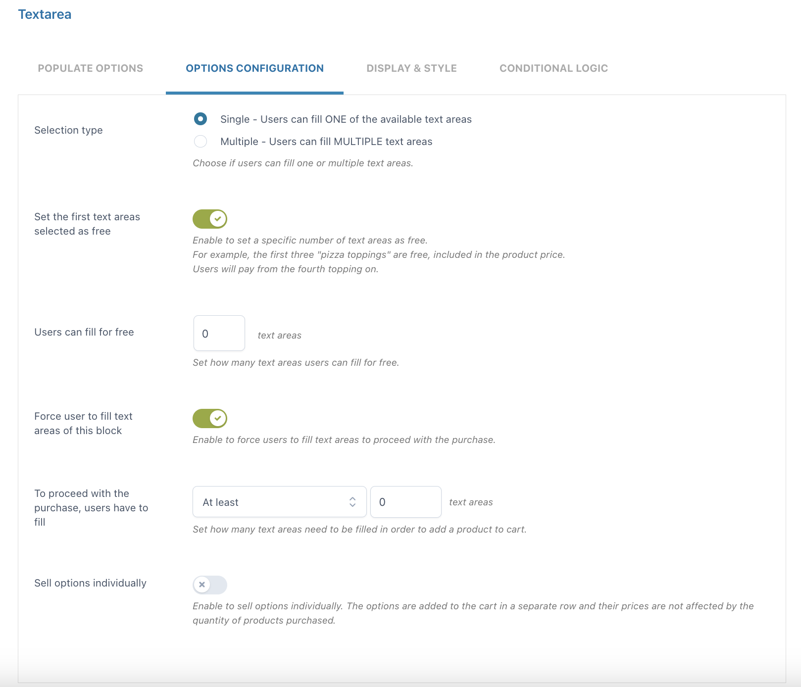
- Selection type: choose Single if you want your users to fill only ONE of the available text areas or Multiple if you want them to fill MULTIPLE text areas
- Set the first text areas selected as free: enable to set a specific number of text areas that can be filled for free
- Users can fill for free: define the number of text areas that users can fill for free
- Force user to fill text areas of this block: enable to force users to fill text areas before proceeding with the purchase
- To proceed with the purchase, users have to fill: here, you can define the number of text areas that must be filled after choosing from At least or Exactly
- Sell options individually: if enabled, the options selected by the user will be added to the cart in a separate row. In this case, option prices won’t change based on the purchased product quantity.
Color swatch
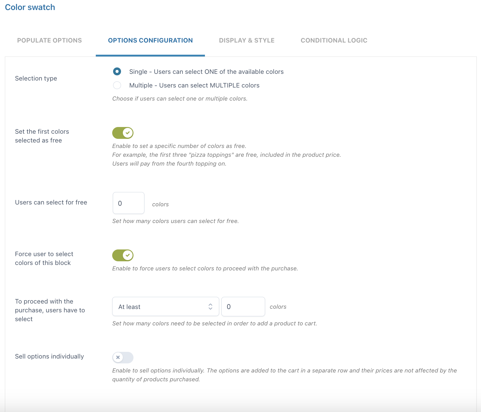
- Selection type: choose Single if you want your users to select only ONE of the available colors or Multiple if you want them to select MULTIPLE colors
- Set the first colors selected as free: enable to set a specific number of colors that can be selected for free
- Users can select for free: define the number of colors that users can select for free
- Force user to select colors of this block: enable to force users to select colors before proceeding with the purchase
- To proceed with the purchase, users have to select: here, you can define the number of colors that must be selected after choosing from At least or Exactly
- Sell options individually: if enabled, the options selected by the user will be added to the cart in a separate row. In this case, option prices won’t change based on the purchased product quantity.
Number
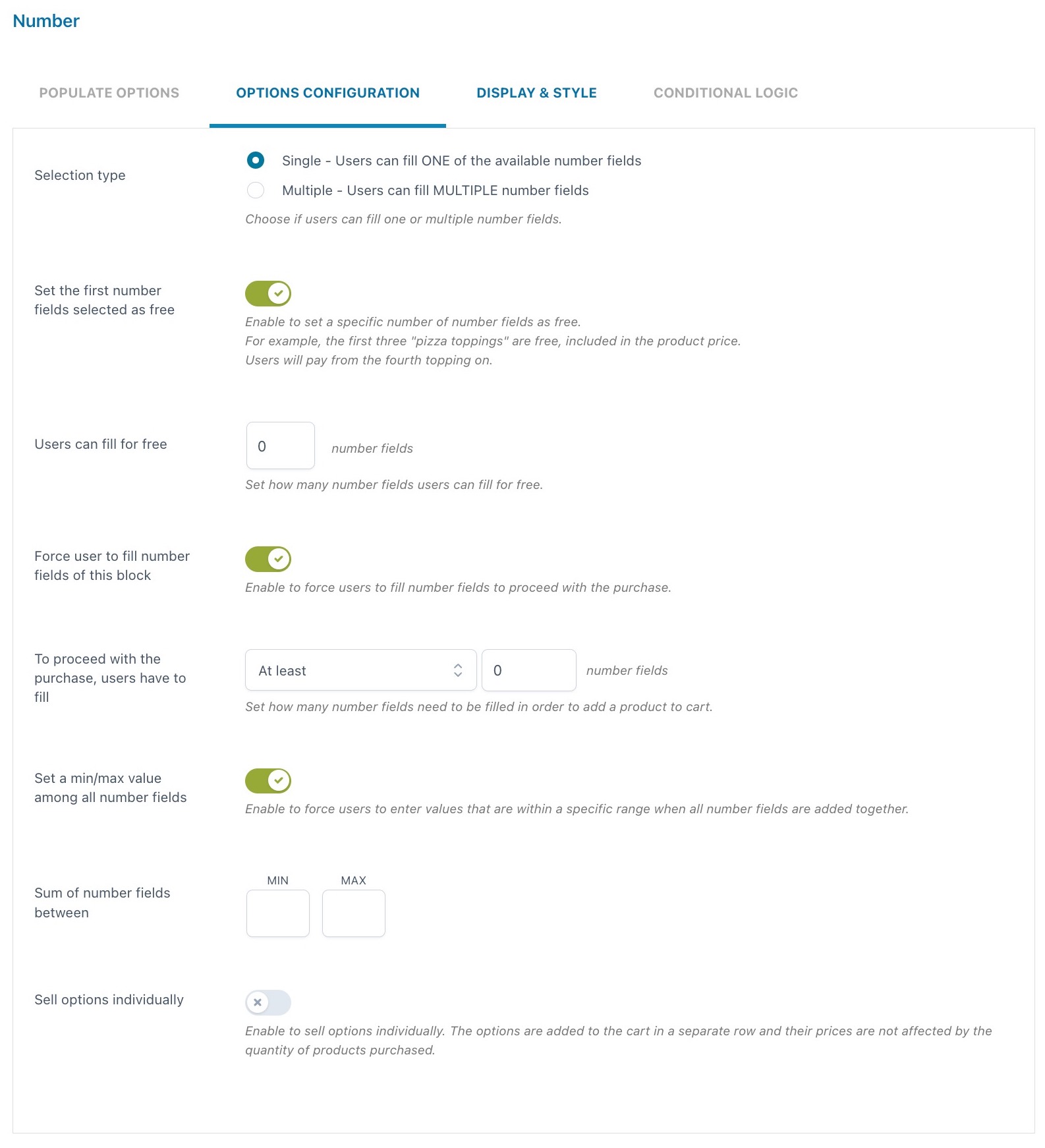
- Selection type: choose Single if you want your users to fill only ONE of the available number fields or Multiple if you want them to fill MULTIPLE number fields
- Set the first number fields selected as free: enable to set a specific number of number fields that can be filled for free
- Users can fill for free: define the number of number fields that users can fill for free
- Force user to fill number fields of this block: enable to force users to fill number fields before proceeding with the purchase
- To proceed with the purchase, users have to fill: here, you can define the number of number fields that must be filled after choosing from At least or Exactly
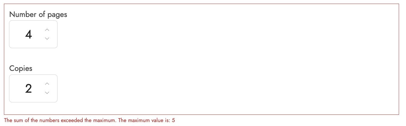
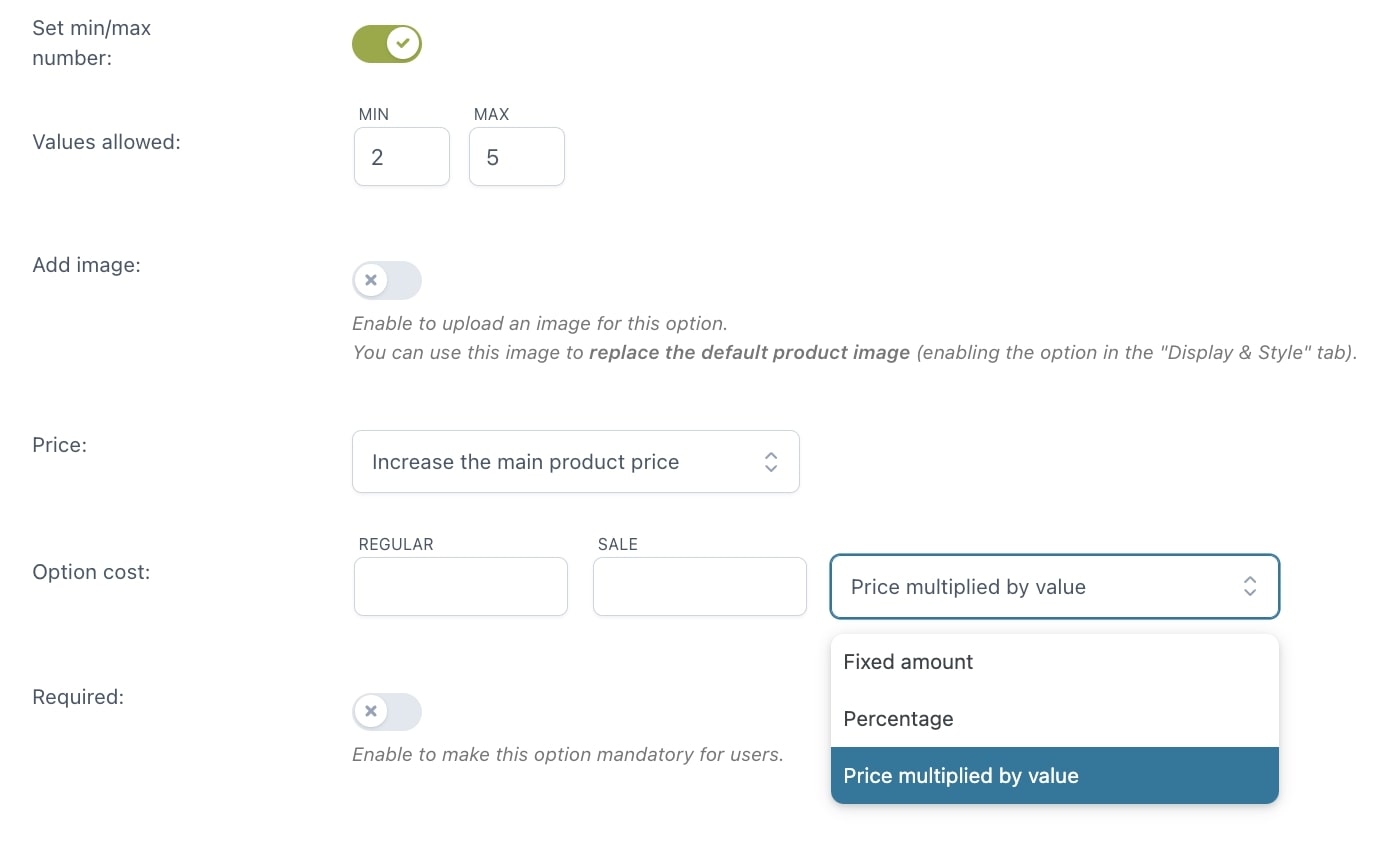
- Set a min/max value among all number fields: enable to define a minimum and/or maximum value for the sum of number fields that users can enter. If the values entered exceed the limit configured, an error message will show when adding the product to the cart. For example, if we set the minimum value to 2 and the maximum value to 5, this is what users will see if the sum of the entered values is higher.
- Sell options individually: if enabled, the options selected by the user will be added to the cart in a separate row. In this case, option prices won’t change based on the purchased product quantity.
Select
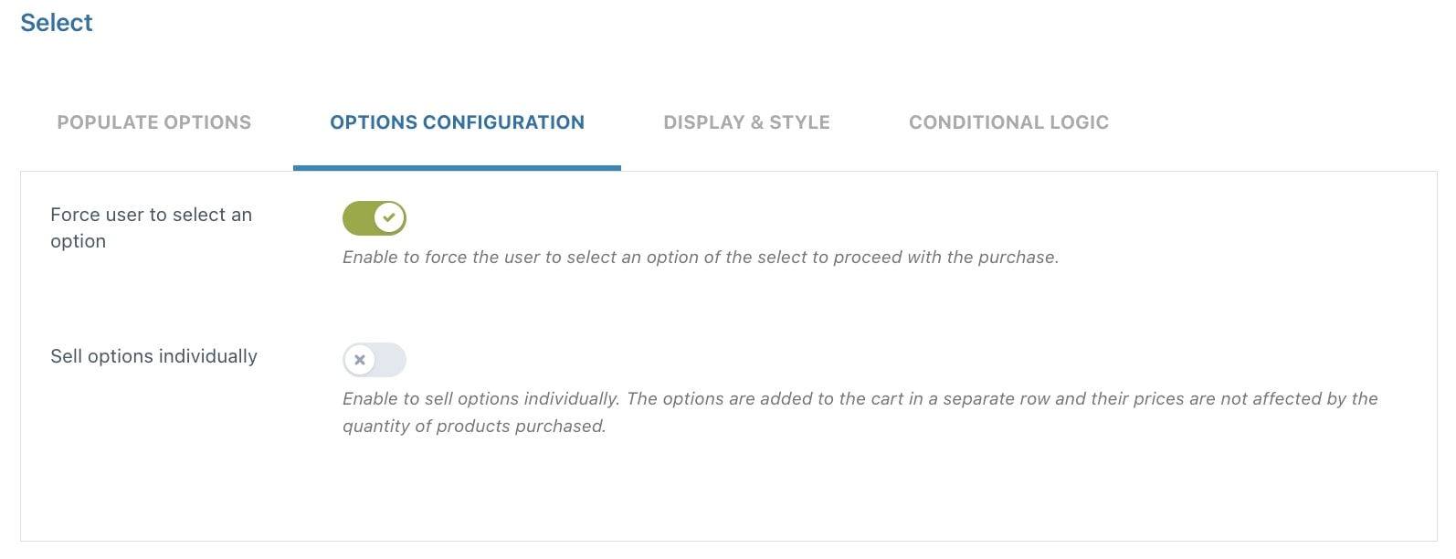
- Force user to select an option: enable to force users to select an option before proceeding with the purchase
- Sell options individually: if enabled, the options selected by the user will be added to the cart in a separate row. In this case, option prices won’t change based on the purchased product quantity.
Label or image
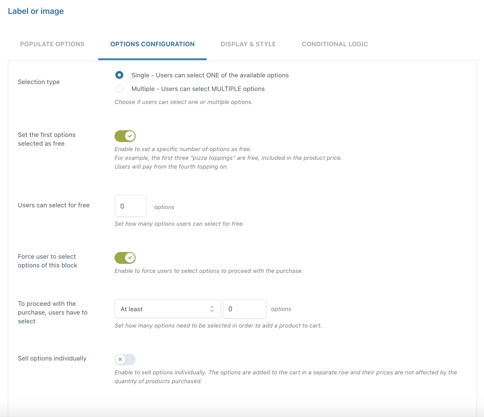
- Selection type: choose Single if you want your users to select only ONE of the available options or Multiple if you want them to select MULTIPLE options
- Set the first options selected as free: enable to set a specific number of options as free. For example, the first three pizza ingredients are free and included in the product price
- Force user to select options of this block: enable to force users to select an option before proceeding with the purchase
- To proceed with the purchase, users have to select: here, you can define the number of options that must be selected after choosing from At least or Exactly
- Sell options individually: if enabled, the options selected by the user will be added to the cart in a separate row. In this case, option prices won’t change based on the purchased product quantity.
Product
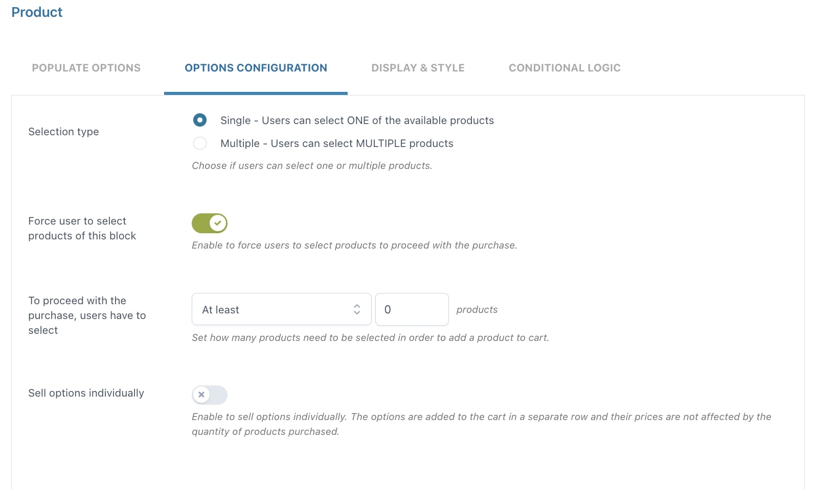
- Selection type: choose Single if you want your users to select only ONE of the available products or Multiple if you want them to select MULTIPLE products
- Force user to select products of this block: enable to force users to select products before proceeding with the purchase
- To proceed with the purchase, users have to select: here, you can define the number of products that must be selected after choosing from At least or Exactly
- Sell options individually: if enabled, the options selected by the user will be added to the cart in a separate row. In this case, option prices won’t change based on the purchased product quantity.
Date
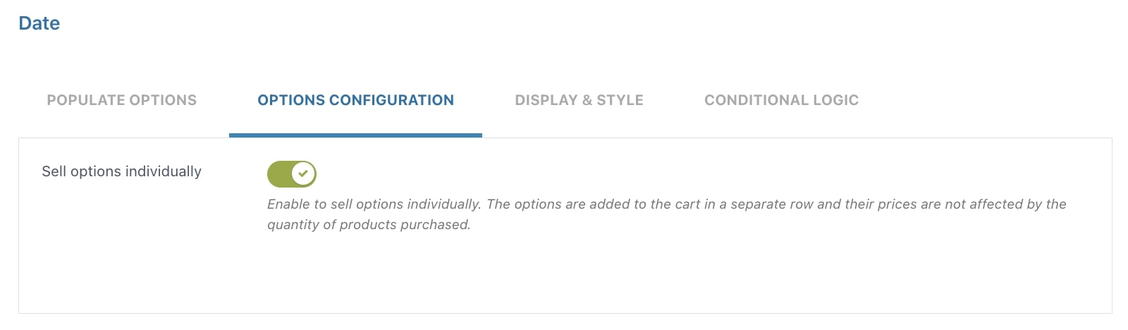
- Sell options individually: if enabled, the options selected by the user will be added to the cart in a separate row. In this case, option prices won’t change based on the purchased product quantity.
File upload
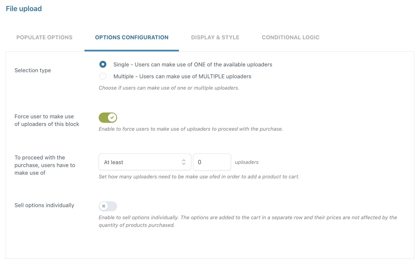
- Selection type: choose Single if you want your users to use only ONE of the available uploaders or Multiple if you want them to use MULTIPLE uploaders
- Force user to make use of uploaders of this block: enable to force users to use file uploaders before proceeding with the purchase
- To proceed with the purchase, users have to make use of: here, you can define the number of file uploaders that must be used, after choosing from At least or Exactly
- Sell options individually: if enabled, the options selected by the user will be added to the cart in a separate row. In this case, option prices won’t change based on the purchased product quantity.
Color picker
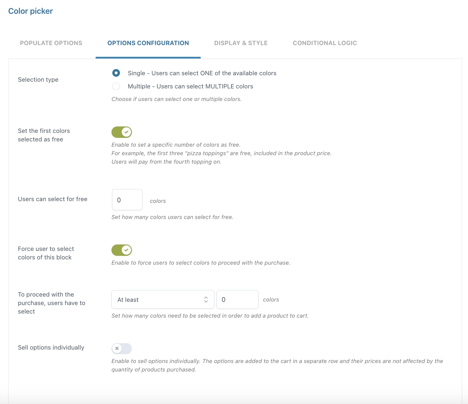
- Selection type: choose Single if you want your users to select only ONE of the available colors or Multiple if you want them to select MULTIPLE colors
- Set the first colors selected as free: enable to set a specific number of colors that can be selected for free
- Users can select for free: define the number of colors that users can select for free
- Force user to select colors of this block: enable to force users to select colors before proceeding with the purchase
- To proceed with the purchase, users have to select: here, you can define the number of colors that must be selected after choosing from At least or Exactly
- Sell options individually: if enabled, the options selected by the user will be added to the cart in a separate row. In this case, option prices won’t change based on the purchased product quantity.
Display & Style
From this tab, you can configure a set of display and style options. The options are the same for all types of options sets, except for the Select and Product sets which will be explained below on this page. Let’s analyze them together.
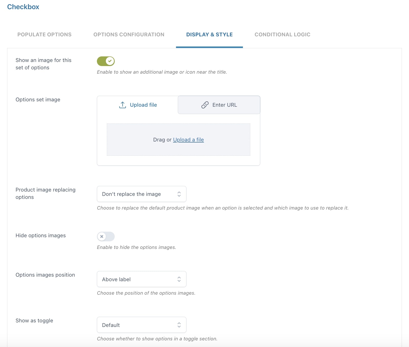
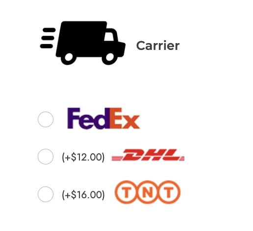
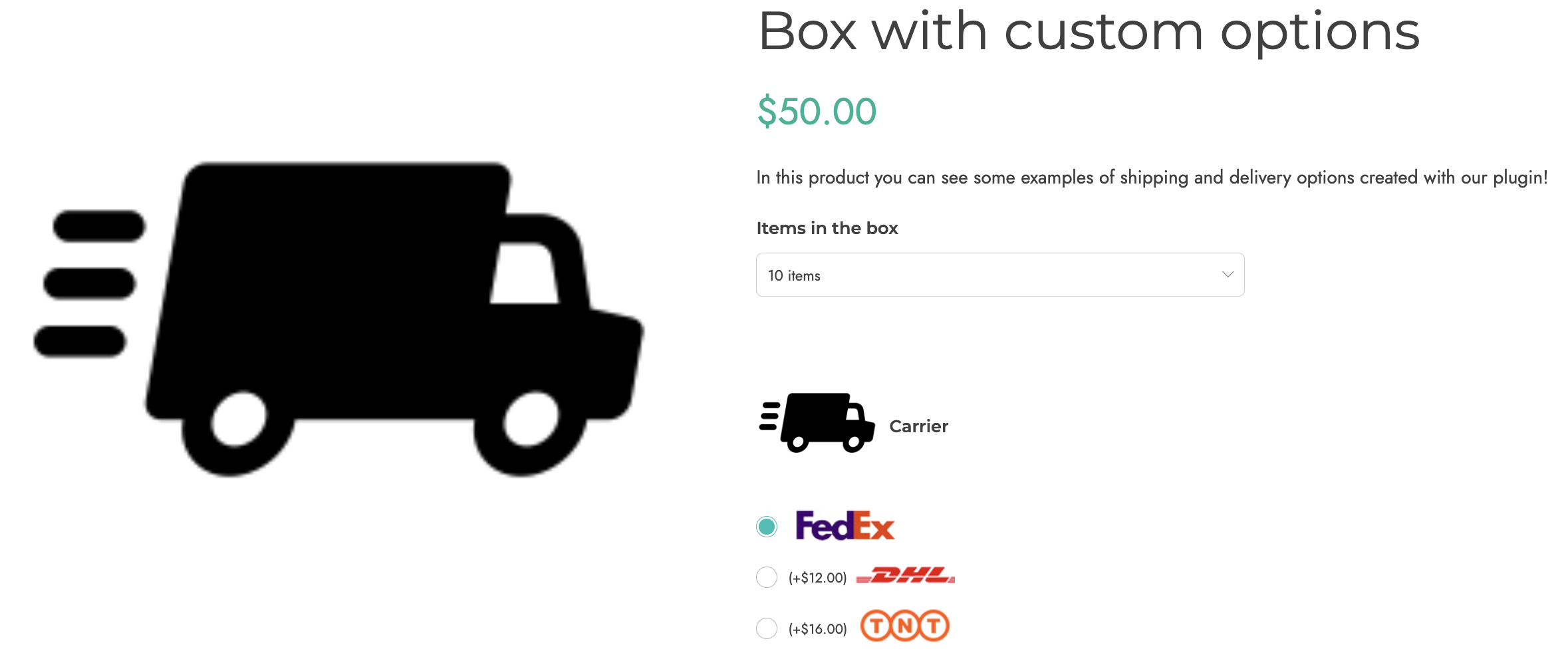
Show an image for this set of options
By enabling this option, you can show an additional image or icon near the title. You can have both an image for each option and an image for the set.
Example: in the screenshot below, we set a custom image for each option plus the additional add-on image (the “truck” icon), and set the images position to the right.
Product image replacing options
Choose to replace the default product image when an option is selected and which image to use to replace it.
- Don’t replace the image
- Replace with block image
- Replace with options image
Note: make sure that if you replace the product image either with the block image or the options image, you don’t have more than one add-on with these settings in the same product. If you have more, the replacement image will be the one of the last selected option.
Hide options images
Hide the images of all the options of this block in one click. Please note, that if you’re using an image color swatch, also this image will be hidden.
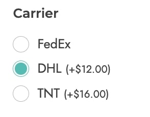
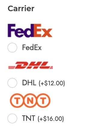
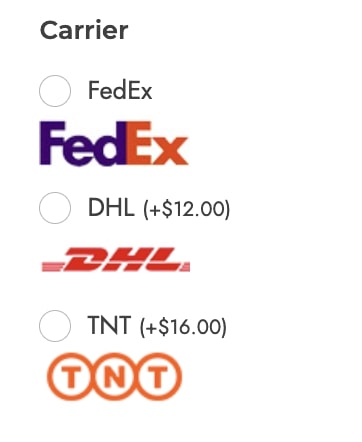
Options images position
Choose the position to show the options images from:
- above label
- under label
- left side
- right side
Show as toggle
- no
- yes, with toggle opened by default
- yes, with toggle closed by default

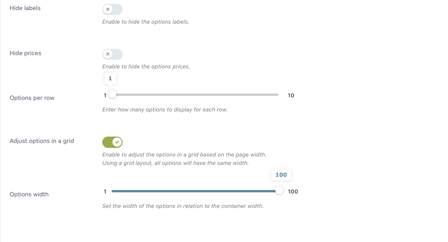
Hide options labels
Hide the labels of all the options of this block in one click.
Hide options prices
Hide the prices of all options in this add-on in one click.
Options per row
Use the slider to choose the number of options (from 1 to 10) to show in each row.
Use a grid layout
Enable to adjust the options in a grid based on the page width. This is particularly useful when you have many options with texts of different lengths: forcing them into a grid will make them cover the same space.
Select
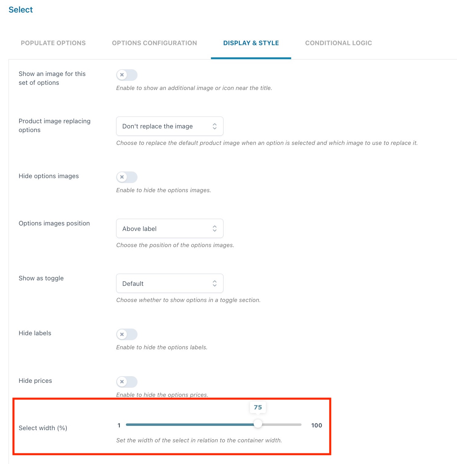
For the Select type, in addition to the other display and style options, you will also be able to define the width (in %) of the select in relation to the container. The value can be configured from 1 to 100.
Product
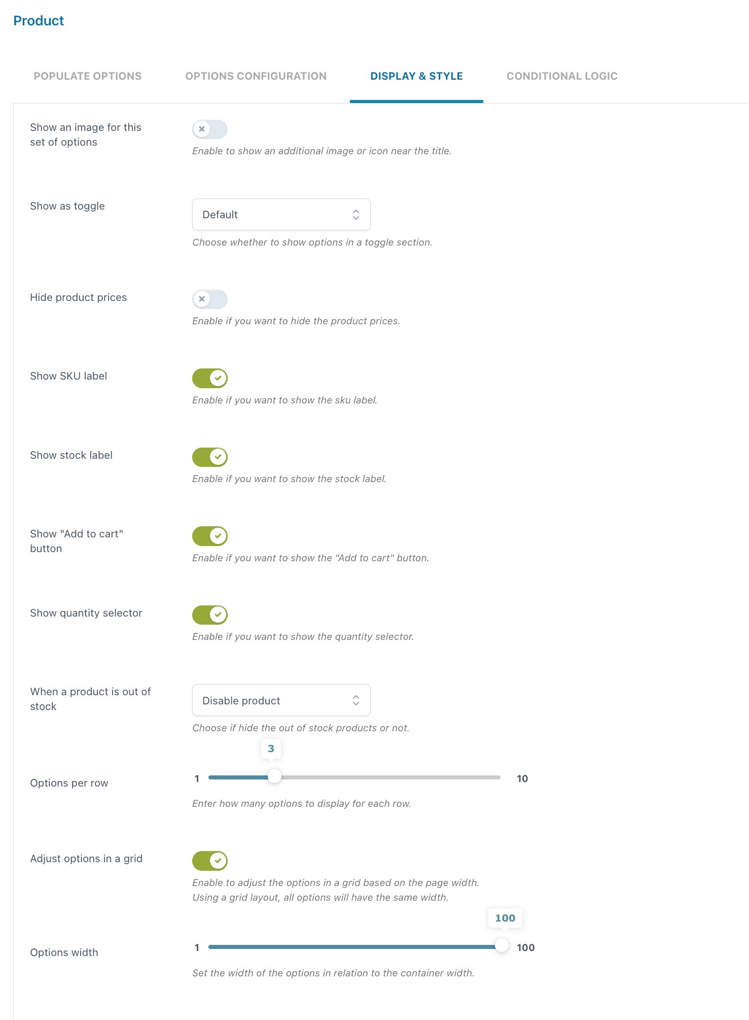
The Display & Style options of the “Product” type differ from the general ones.
Show an image for this add-on: enable to show an additional image or icon near the title.
Show as toggle:
- no
- yes, with toggle opened by default
- yes, with toggle closed by default
Hide options prices: hide the prices of all options of this block in one click.
Show SKU label: enable to show the related product SKU.
Show stock label: enable to show the stock info and quantity (if set).
Show add to cart button: enable if you want that customers can not only select these products as options of the main product but also add them to the cart as individual products.
Show quantity selector: enable to let your customers select the quantity of the product.
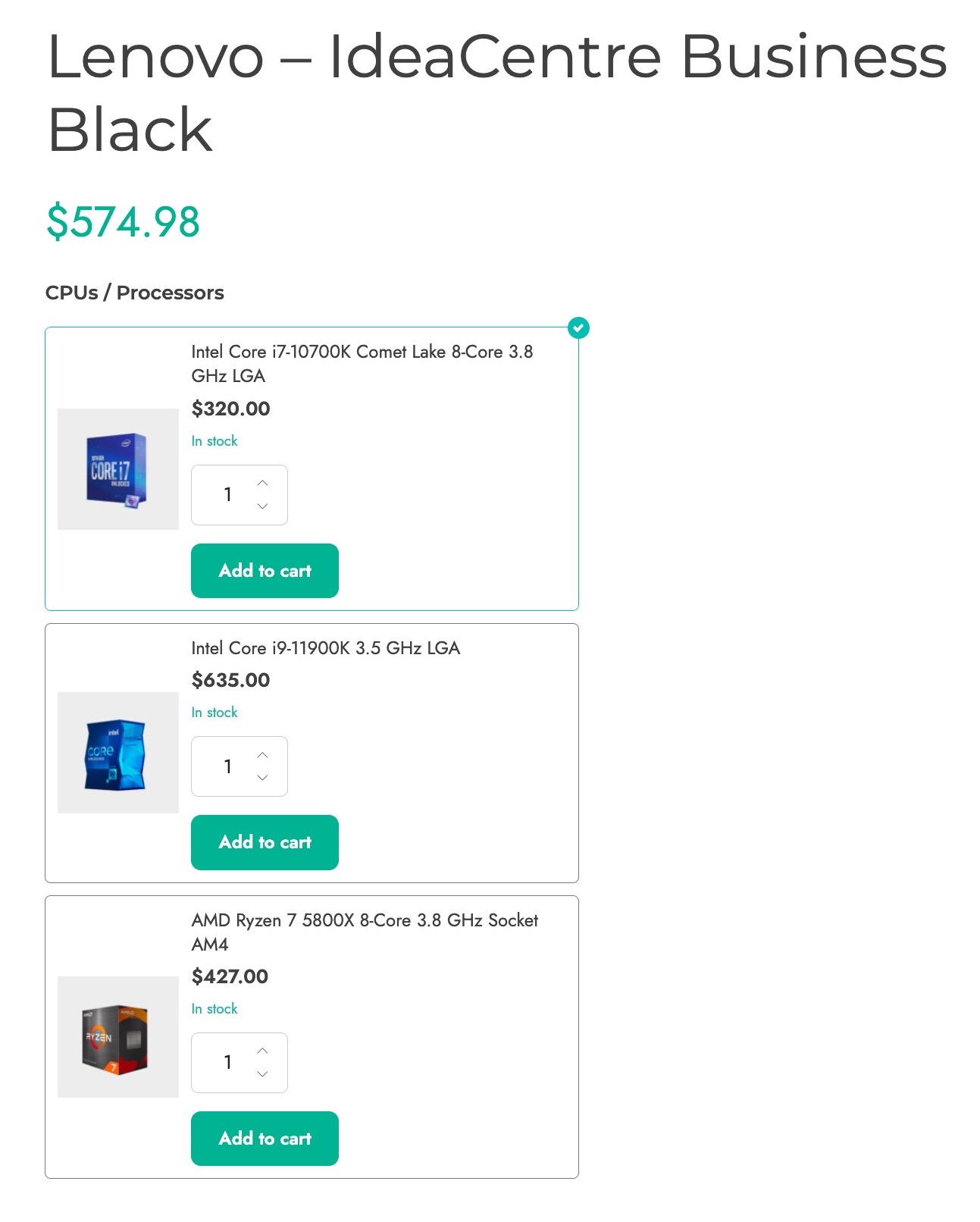
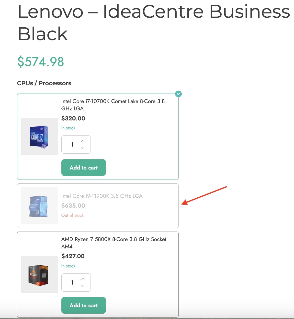
When a product is out of stock: you can either hide the product or disable it so that users can’t select it. Below is an example of an out-of-stock product disabled.
Options per row: use the slider to choose the number of options (from 1 to 10) to show in each row.
Adjust options in a grid: enable to adjust the options in a grid based on the page width.
Conditional logic
The conditional logic is extremely useful if you want to hide or show some options based on what the customer selects in other options sets.
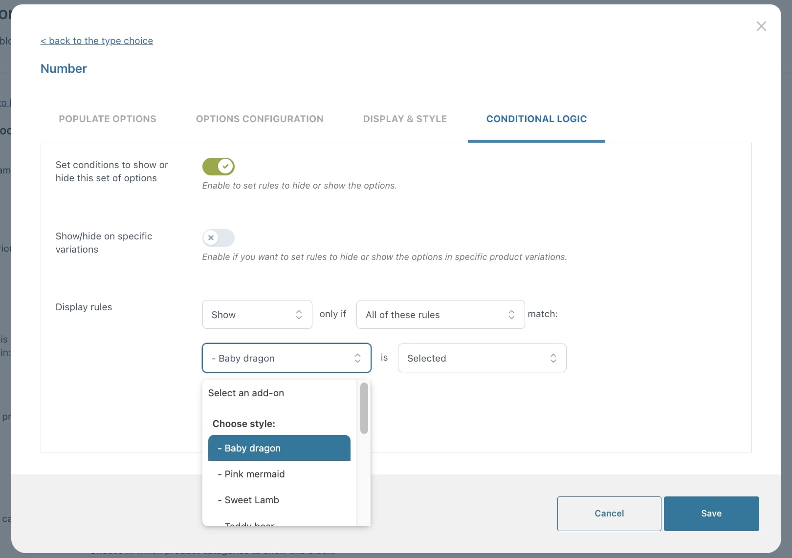
After enabling the creation of display conditions, you will be able to set up the display rules.
You can choose whether to show or hide the current options set (add-on) if either All of the following rules or any of them match.
You can create unlimited rules and for each of them, you can pick as a condition:
- either the entire set of options
- or one specific option selection
- or a specific product variation.
Then set if it has to be:
- Selected
- Not selected
- Empty
- Not empty
Let’s give an example to clarify how these rules work.
Example — show X if Y is selected (YES/NO choice)
You want your customers to choose whether to add topping to their ice-cream or not.
If they choose YES, they should be able to choose the flavor;
if they choose NO, nothing appears.
- First of all, create the YES/NO block, name it “Optional topping“.
- Now add a Radio options set in it and add “YES” and “NO” as options.

- Create another options set, this time choose a Checkbox field, name it “Choose your flavor” and add all the topping flavors as options.

4. Now you can configure the conditional logic options from within the Checkbox options.
IMPORTANT: keep in mind that the conditional logic options have to be configured inside the the options that will be hidden or shown based on the customer’s selection. So, in this case, you have to edit the conditional logic of the Checkbox options “Choose your flavor”.

Below an example of how it appears when YES or NO are selected.


Pricing
In this post we will cover all price options, the general ones available in all types of options and the extra ones available for specific options sets:
- General price options
- Custom price options for Product type
- Extra price options for Text inputs and Textareas
General price options
For every option, you can choose one of the following:
- product price doesn’t change – set option as free
- increase the product price (on-sale available as well)
- discount the product price
When you select either increase or decrease, you can choose the price as:
- fixed
- percentage
Also, you can set not only the regular price for the option but also a sale price.
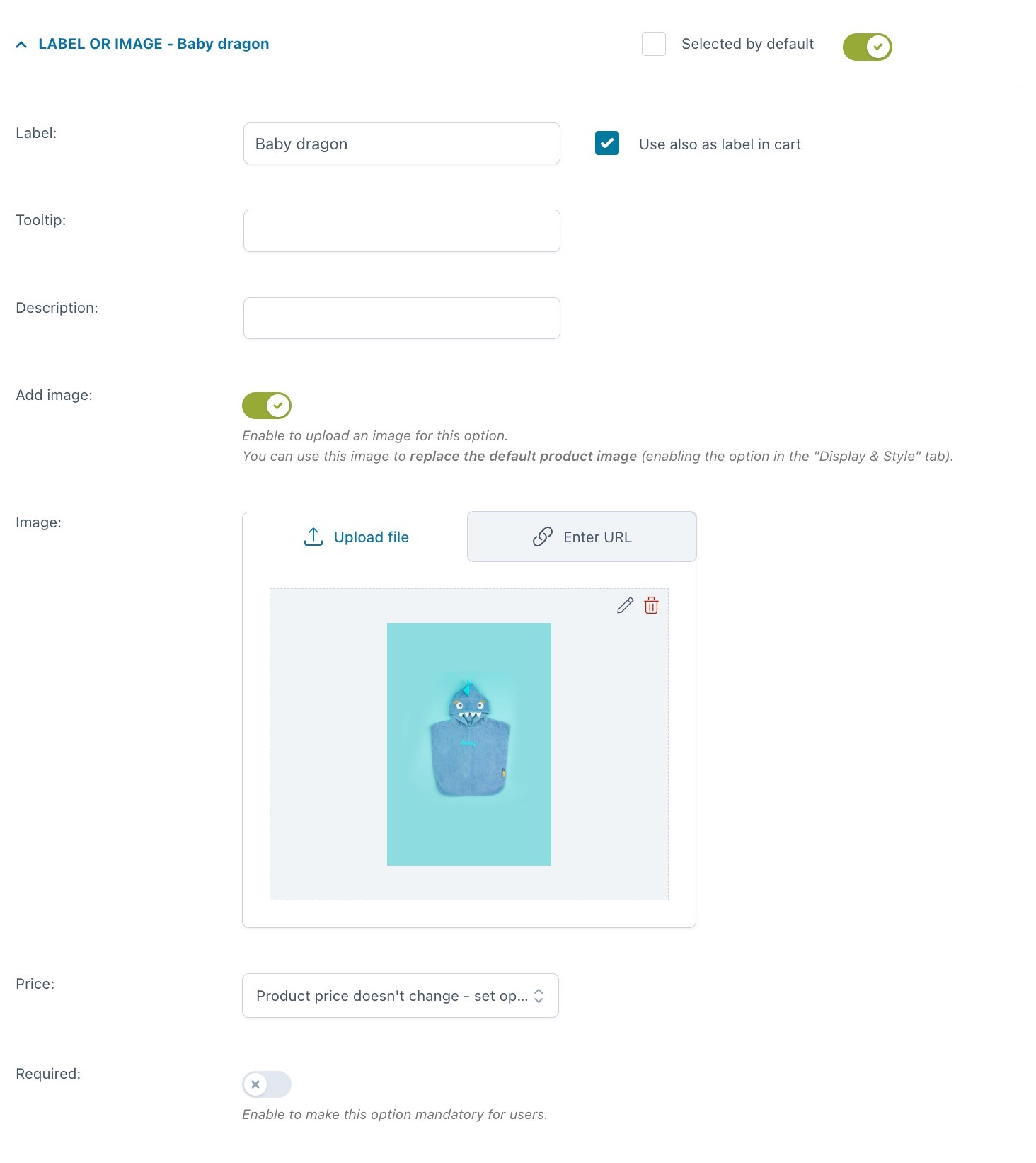
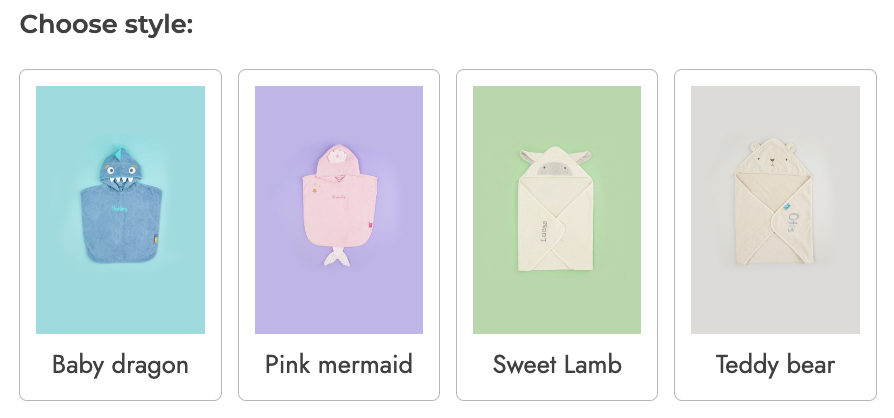
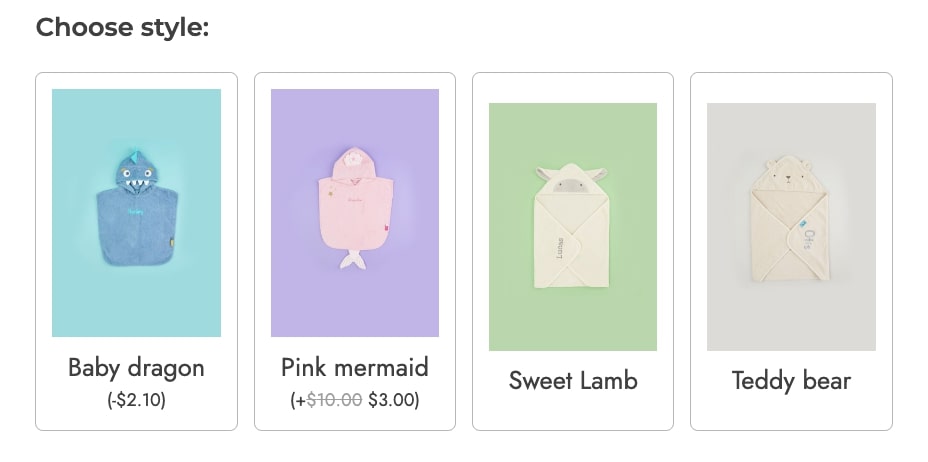
Example: you sell customizable baby towels, with 4 different options.
1. The baby dragon discounts the base product price by 10%
2. The pink mermaid would generally cost $10.00 more, but it is on sale for +$3.00
3. Sweet lamb and 4. Teddy bear will not change the base product price.
Below you find the settings of the Pink mermaid option and the frontend of all 4 options.
Pro tip: if you want to offer a certain number of options as free, but charge the users if they select more, you can do that from the Options configuration tab.
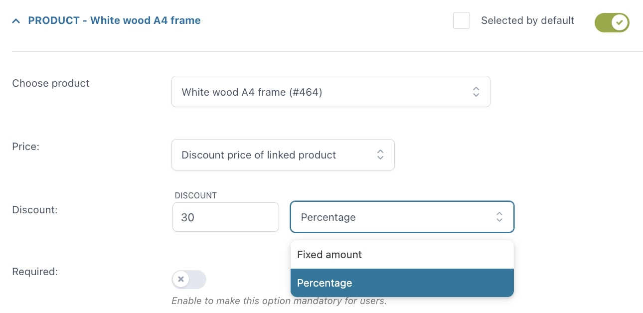
Custom price options for Product type
Whenever you create a Product type option (so, include an existing product as an add-on of another product), you have some extra options concerning the price.
- use the price of the linked products
- discount price of linked product: this discount will be available on the product only if the user buys it as an add-on.
Example: you sell a customized print and want to offer a frame as an add-on with a special 30% discount.

Extra price options for Text inputs and Textareas
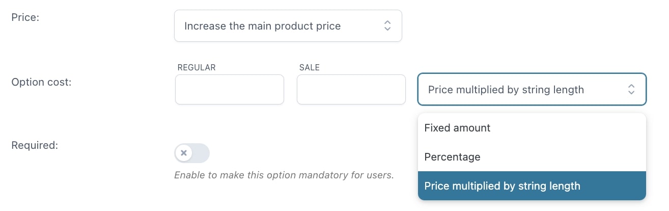
Do you offer a custom ring with engraving options and want to charge the user $1 for every letter?
Text input and Textarea options include this extra feature and allow you to multiply the cost of the option by the number of characters typed in by the user.
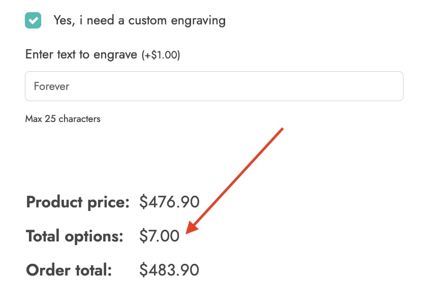
When you choose to Increase the product price, besides fixed or percentage, you will be able to choose also Price multiplied by string length:
Example: in the screenshot below you can see that the cost of the engraving is €1 per character, so a total of €7 as the word forever is made of 7 letters.
Extra price options for Number
If you create a Number option type, you will have a couple of more options at your disposal to control the price.
Multiply by product price
In the Price dropdown, besides the standard options, you will be able to select also the Value multiplied by product price option.
This allows you to multiply the price of the product by the number entered by the user.
Example: if you sell fabric by the meter, you may want to let the customer use this option, enter the number of meters needed and get the product price updated based on that value (decimal values are supported).
If the fabric is €15/meter and the user selects 4,5 m, it will cost €67.50.
Multiply by option price
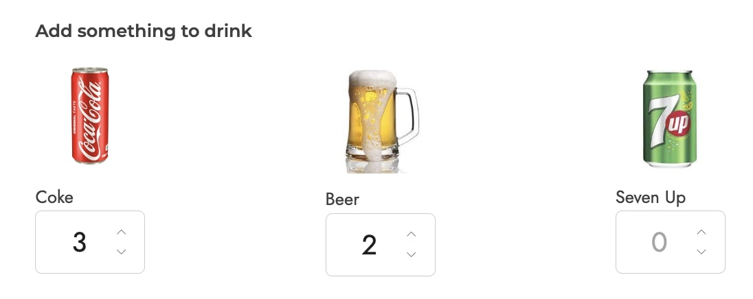
The Number options set includes this extra feature and allows you to multiply the cost of the selected option by the value entered by the user. So, for example, 2 cokes at €2 each will add €4 to the total.
When you choose to Increase the product price, besides fixed or percentage, you will be able to choose also: Price multiplied by value. Additionally, you can also limit the input number and set a minimum and maximum value for every option:
Example: you offer drinks as extras on a pizza and want the user to enter a quantity for each drink: 2 cokes for €2.00 each and 1 beer for €4.00 each will add €8.00 to the total.
General options
In the General settings tab, you will find two sections, the first of which is about General options, let’s check them one by one.
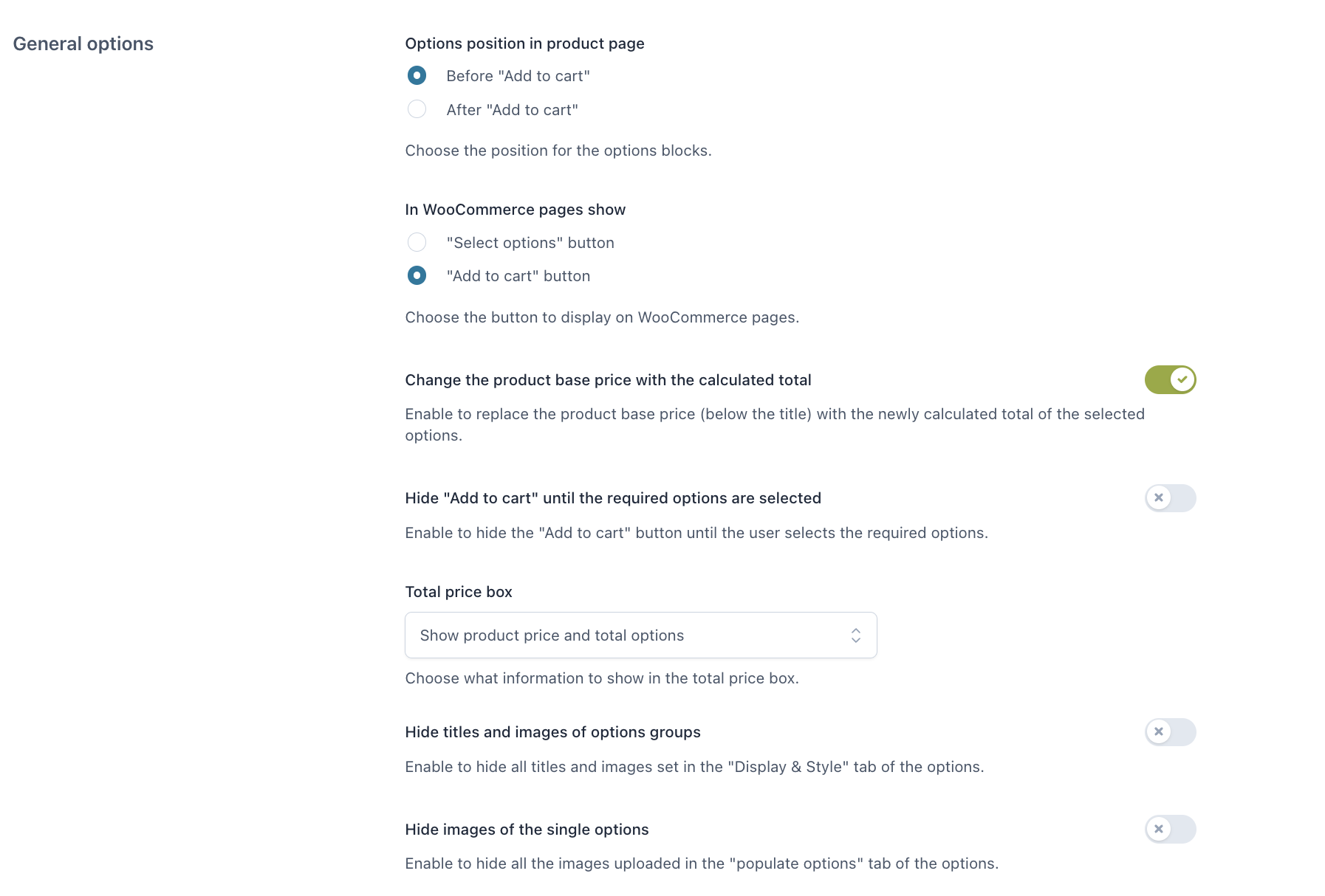
Options position in product page:
- Before “Add to cart”
- After “Add to cart”
In WooCommerce pages show:
- “Select options” button
- “Add to cart” button
Both of them will take the user to the product page, where the user can configure the add-ons.
Label for “Select options” button: customize here the text of the “Select options” button that shows on archive pages when a product has options to be selected.
Change the product base price with the calculated total: enable to replace the product base price (below the title) with the newly calculated total of the selected options.
Hide “Add to cart” until the required options are selected: if your product includes required options to be selected, enable this to make sure the “Add to cart” button is hidden until they are selected. Leave it disabled, if you want to show the “Add to cart” button but keep it disabled until the required options are selected.
Total price box:

- Show product price and total options
- Show the final total but hide options total only if the value is 0
- Show only the final total
- Hide price box on the product page
Hide titles and images of options groups: enable to hide all titles and images set in the “display” tab of the options.
Hide images of all singular options: enable to hide all the images uploaded in the “populate options” tab of the options.
Upload options
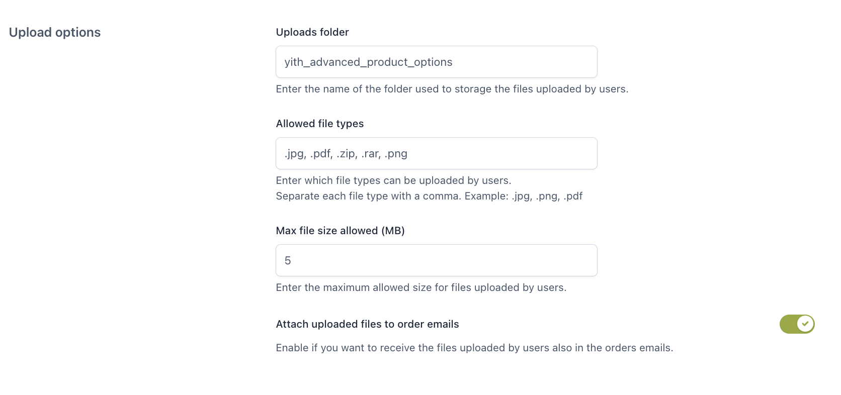
Uploads folder: enter the folder name where the files uploaded by the user will be stored.
Allowed file types: enter the file types (comma separated) that can be uploaded.
Max file size allowed: enter the maximum allowed size for files uploaded by the user.
Attach uploaded files to order emails: enable to attach the files uploaded by users to the order emails.
Date options

- 24-hour time format: enable this option if you want to show the time picker in the Date add-on type with a 24-hour format.