In the Style tab, you will be able to configure all the style related options that apply to all add-ons globally.
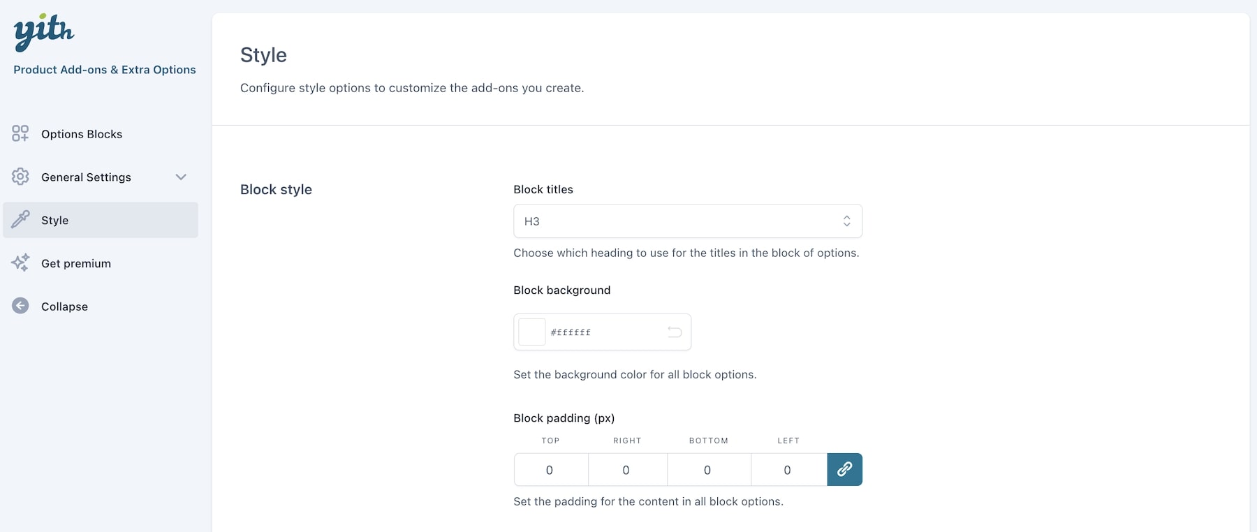
Block titles: choose here the default heading for the title in the block of options. You can select any tag between H1 and H6, and it will apply to all your add-ons titles.
Block background: set the background color for all block options.
Block padding: set the padding for the content in all block options.
Form style: choose the general style for the form elements: (checkbox, radio, select, input, textarea, etc.):
- theme style: select this if you want that all style elements are inherited from the theme style, or
- custom style: set your custom style using the options that will appear below

Checkbox style: choose between rounded or square.
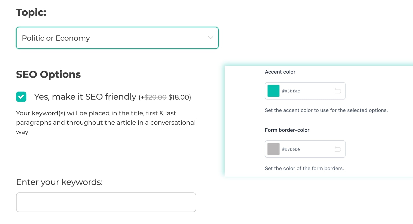
Accent color: set the accent color (e.g. green in the screenshot below).
Form border color: set the color of the borders in the form (e.g. all other borders of non-selected options – grey in the screenshot below).
Label font size (px): set the font size of all options labels in pixels.
Description font size (px): set the font size of all options labels in pixels.