For every option set, you can configure different settings. Let’s analyze them together.
- Checkbox
- Radio
- Input text
- Textarea
- Color swatch
- Number
- Select
- Label or image
- Product
- Date
- File upload
- Color picker
Checkbox
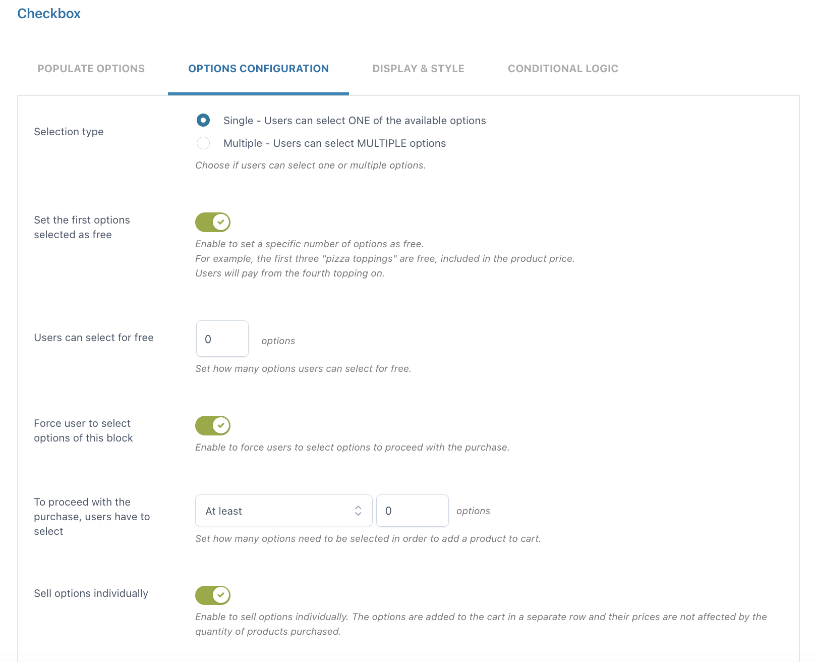
- Selection type: choose Single if you want your users to select only ONE of the available options or Multiple if you want them to select MULTIPLE options
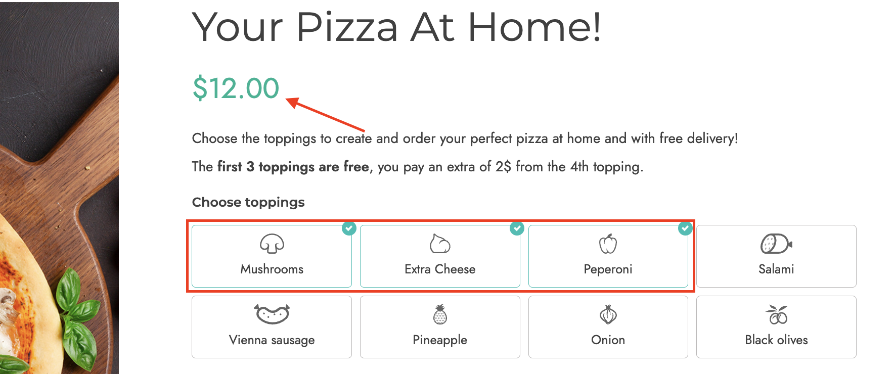
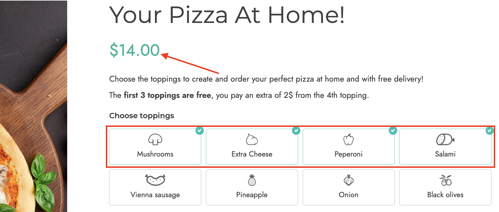
- Set the first options selected as free: enable to set a specific number of options as free. For example, the first three pizza ingredients are free and included in the product price. The user will pay for the fourth ingredient. In the example below, you can see that the product price does not change for the first 3 ingredients, but it adds $2 per any additional ingredient selected after the fourth
- Force user to select options of this block: enable to force users to select an option before proceeding with the purchase
- To proceed with the purchase, users have to select: here, you can define the number of options that must be selected after choosing from At least or Exactly
- Users can select a max of: (only if the Multiple selection type has been enabled): define the maximum number of options that users can select

- Sell options individually: if enabled, the options selected by the user will be added to the cart in a separate row. In this case, option prices won’t change based on the purchased product quantity.
Radio
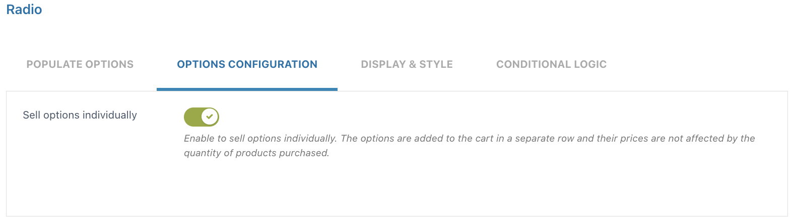
- Sell options individually: if enabled, the options selected by the user will be added to the cart in a separate row. In this case, option prices won’t change based on the purchased product quantity.
Input text
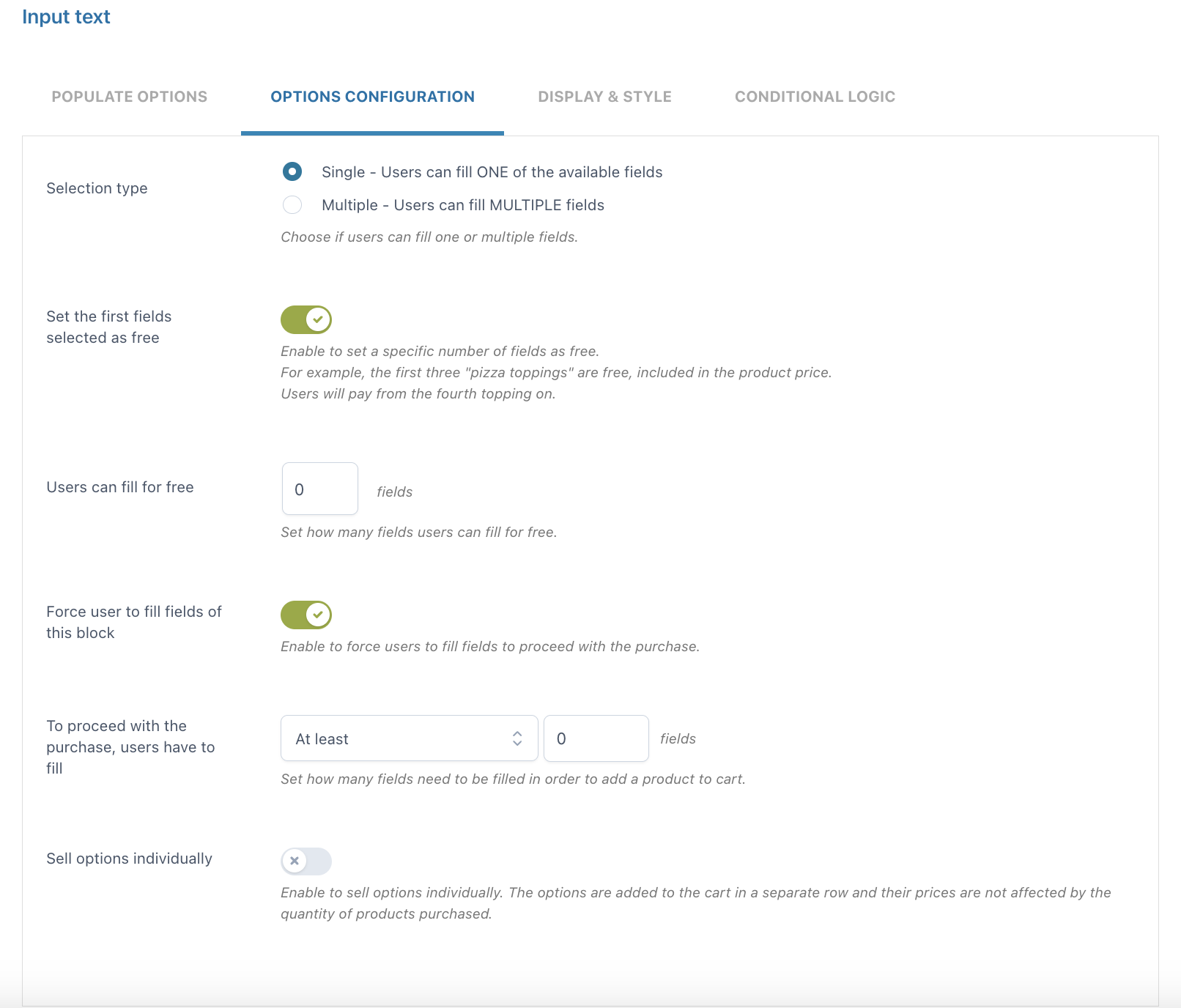
- Selection type: choose Single if you want your users to fill only ONE of the available fields or Multiple if you want them to fill MULTIPLE fields
- Set the first fields selected as free: enable to set a specific number of fields that can be filled for free
- Users can fill for free: define the number of fields that users can fill for free
- Force user to select fields of this block: enable to force users to select fields before proceeding with the purchase
- To proceed with the purchase, users have to fill: here, you can define the number of fields that must be filled after choosing from At least or Exactly
- Sell options individually: if enabled, the options selected by the user will be added to the cart in a separate row. In this case, option prices won’t change based on the purchased product quantity.
Textarea
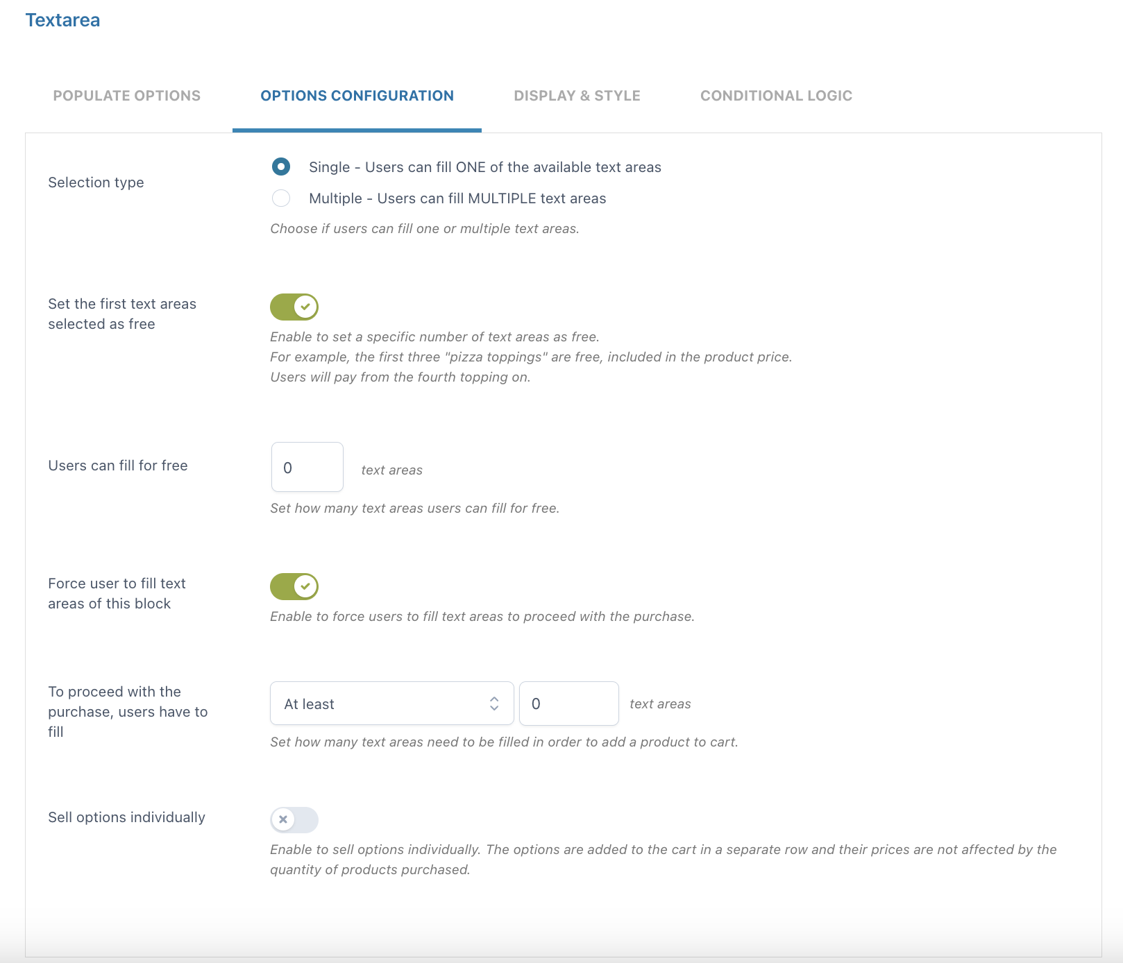
- Selection type: choose Single if you want your users to fill only ONE of the available text areas or Multiple if you want them to fill MULTIPLE text areas
- Set the first text areas selected as free: enable to set a specific number of text areas that can be filled for free
- Users can fill for free: define the number of text areas that users can fill for free
- Force user to fill text areas of this block: enable to force users to fill text areas before proceeding with the purchase
- To proceed with the purchase, users have to fill: here, you can define the number of text areas that must be filled after choosing from At least or Exactly
- Sell options individually: if enabled, the options selected by the user will be added to the cart in a separate row. In this case, option prices won’t change based on the purchased product quantity.
Color swatch
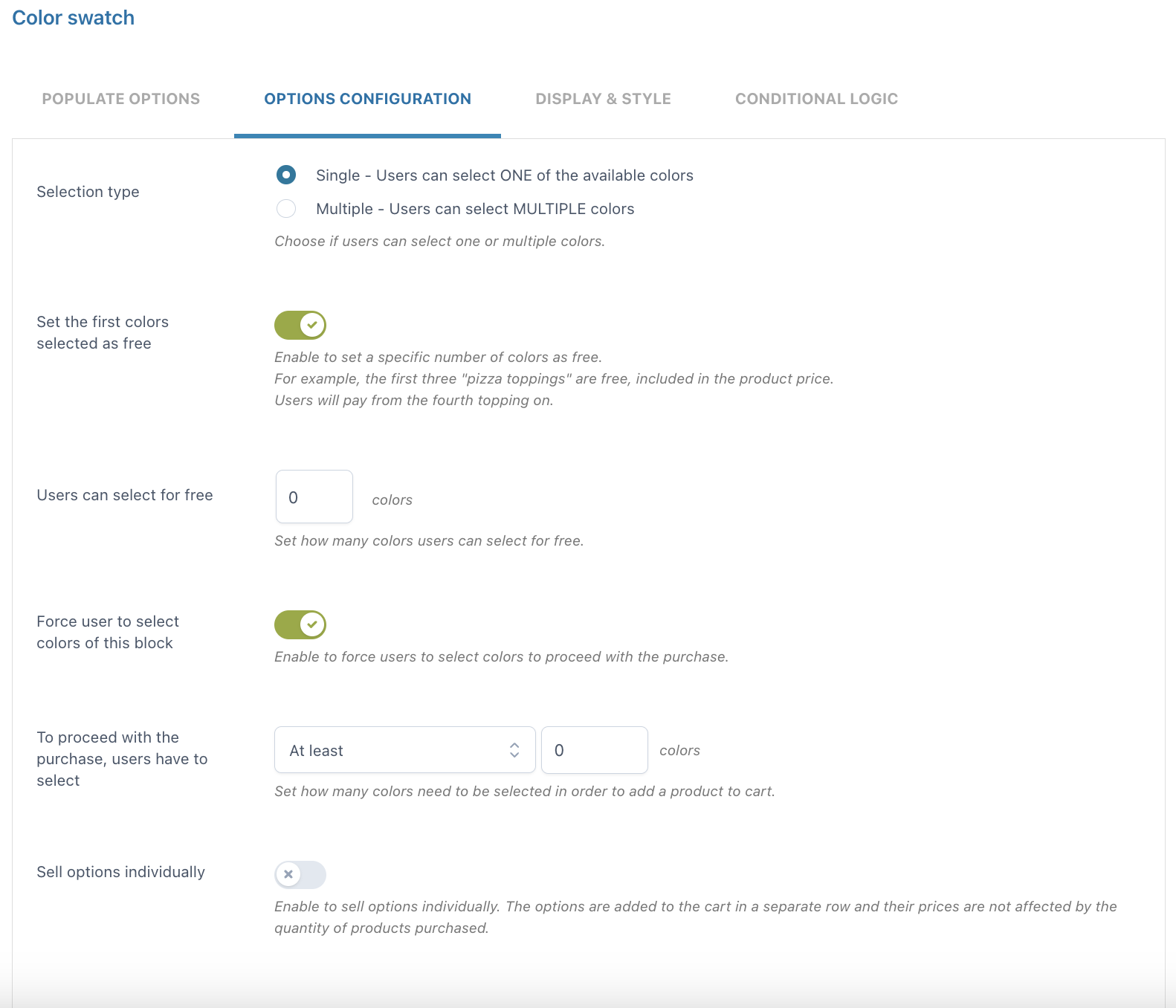
- Selection type: choose Single if you want your users to select only ONE of the available colors or Multiple if you want them to select MULTIPLE colors
- Set the first colors selected as free: enable to set a specific number of colors that can be selected for free
- Users can select for free: define the number of colors that users can select for free
- Force user to select colors of this block: enable to force users to select colors before proceeding with the purchase
- To proceed with the purchase, users have to select: here, you can define the number of colors that must be selected after choosing from At least or Exactly
- Sell options individually: if enabled, the options selected by the user will be added to the cart in a separate row. In this case, option prices won’t change based on the purchased product quantity.
Number
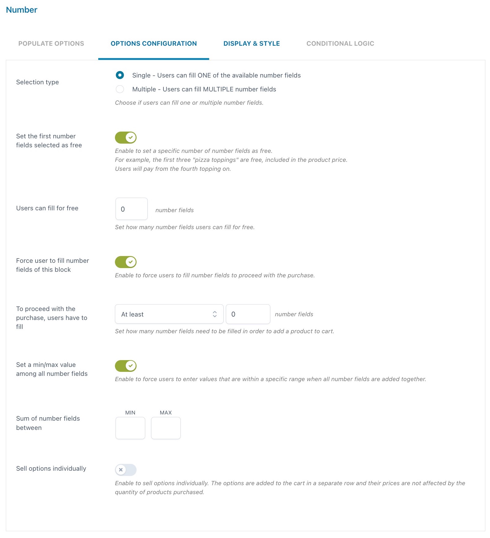
- Selection type: choose Single if you want your users to fill only ONE of the available number fields or Multiple if you want them to fill MULTIPLE number fields
- Set the first number fields selected as free: enable to set a specific number of number fields that can be filled for free
- Users can fill for free: define the number of number fields that users can fill for free
- Force user to fill number fields of this block: enable to force users to fill number fields before proceeding with the purchase
- To proceed with the purchase, users have to fill: here, you can define the number of number fields that must be filled after choosing from At least or Exactly
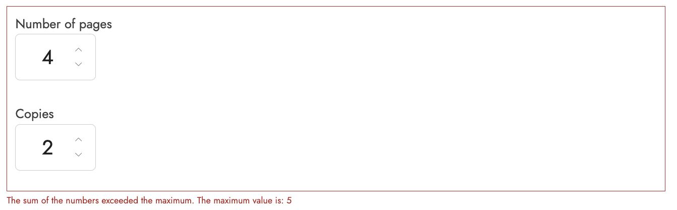
- Set a min/max value among all number fields: enable to define a minimum and/or maximum value for the sum of number fields that users can enter. If the values entered exceed the limit configured, an error message will show when adding the product to the cart. For example, if we set the minimum value to 2 and the maximum value to 5, this is what users will see if the sum of the entered values is higher.
- Sell options individually: if enabled, the options selected by the user will be added to the cart in a separate row. In this case, option prices won’t change based on the purchased product quantity.
Select
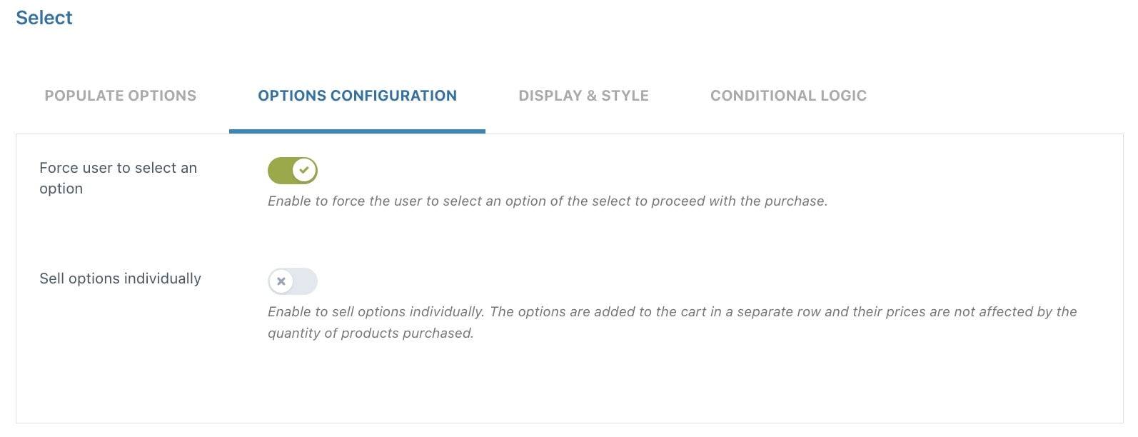
- Force user to select an option: enable to force users to select an option before proceeding with the purchase
- Sell options individually: if enabled, the options selected by the user will be added to the cart in a separate row. In this case, option prices won’t change based on the purchased product quantity.
Label or image
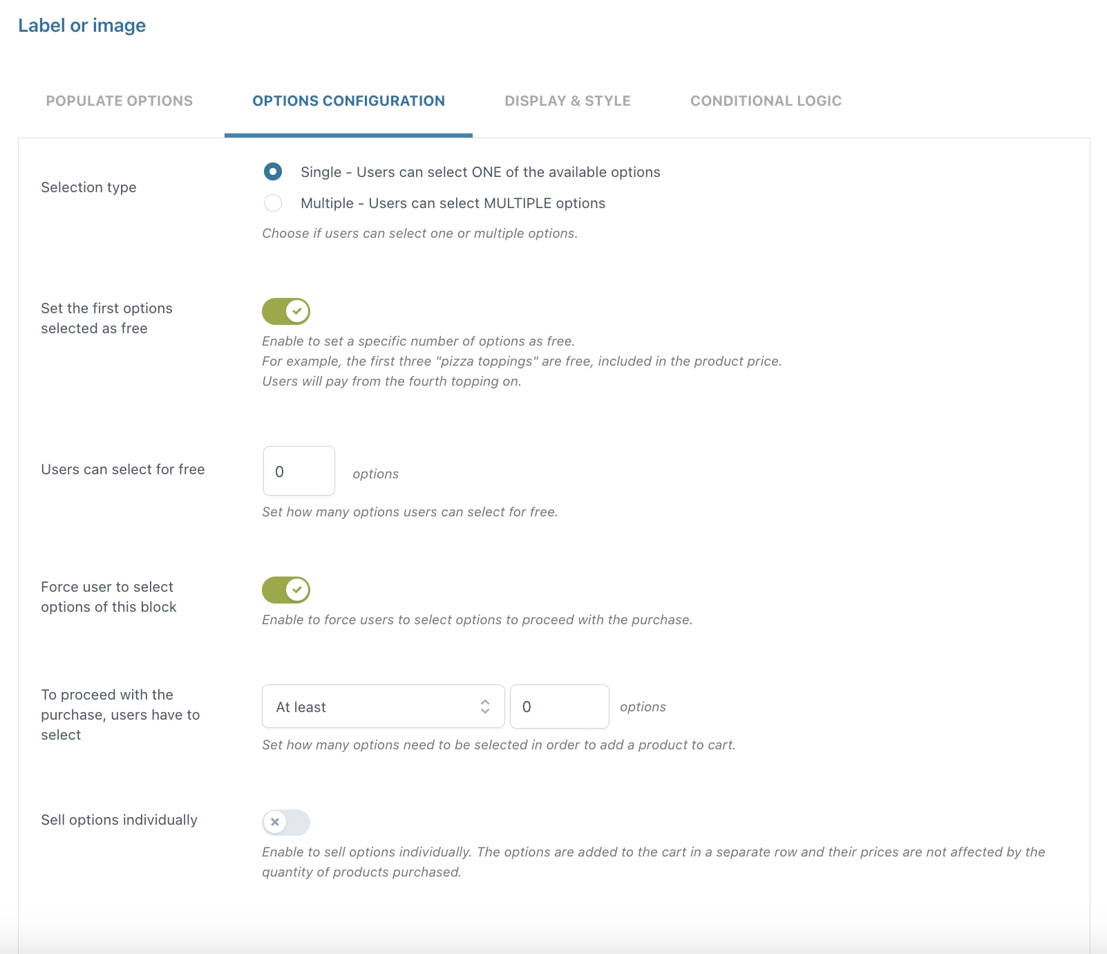
- Selection type: choose Single if you want your users to select only ONE of the available options or Multiple if you want them to select MULTIPLE options
- Set the first options selected as free: enable to set a specific number of options as free. For example, the first three pizza ingredients are free and included in the product price
- Force user to select options of this block: enable to force users to select an option before proceeding with the purchase
- To proceed with the purchase, users have to select: here, you can define the number of options that must be selected after choosing from At least or Exactly
- Sell options individually: if enabled, the options selected by the user will be added to the cart in a separate row. In this case, option prices won’t change based on the purchased product quantity.
Product
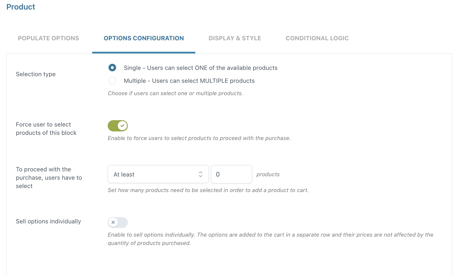
- Selection type: choose Single if you want your users to select only ONE of the available products or Multiple if you want them to select MULTIPLE products
- Force user to select products of this block: enable to force users to select products before proceeding with the purchase
- To proceed with the purchase, users have to select: here, you can define the number of products that must be selected after choosing from At least or Exactly
- Sell options individually: if enabled, the options selected by the user will be added to the cart in a separate row. In this case, option prices won’t change based on the purchased product quantity.
Date
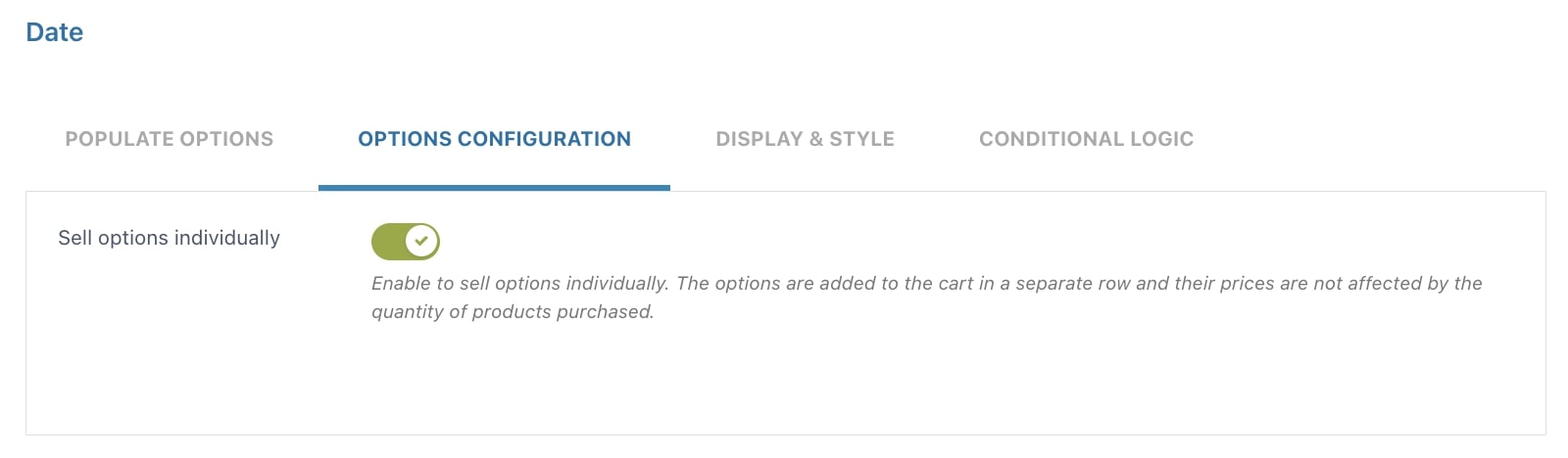
- Sell options individually: if enabled, the options selected by the user will be added to the cart in a separate row. In this case, option prices won’t change based on the purchased product quantity.
File upload
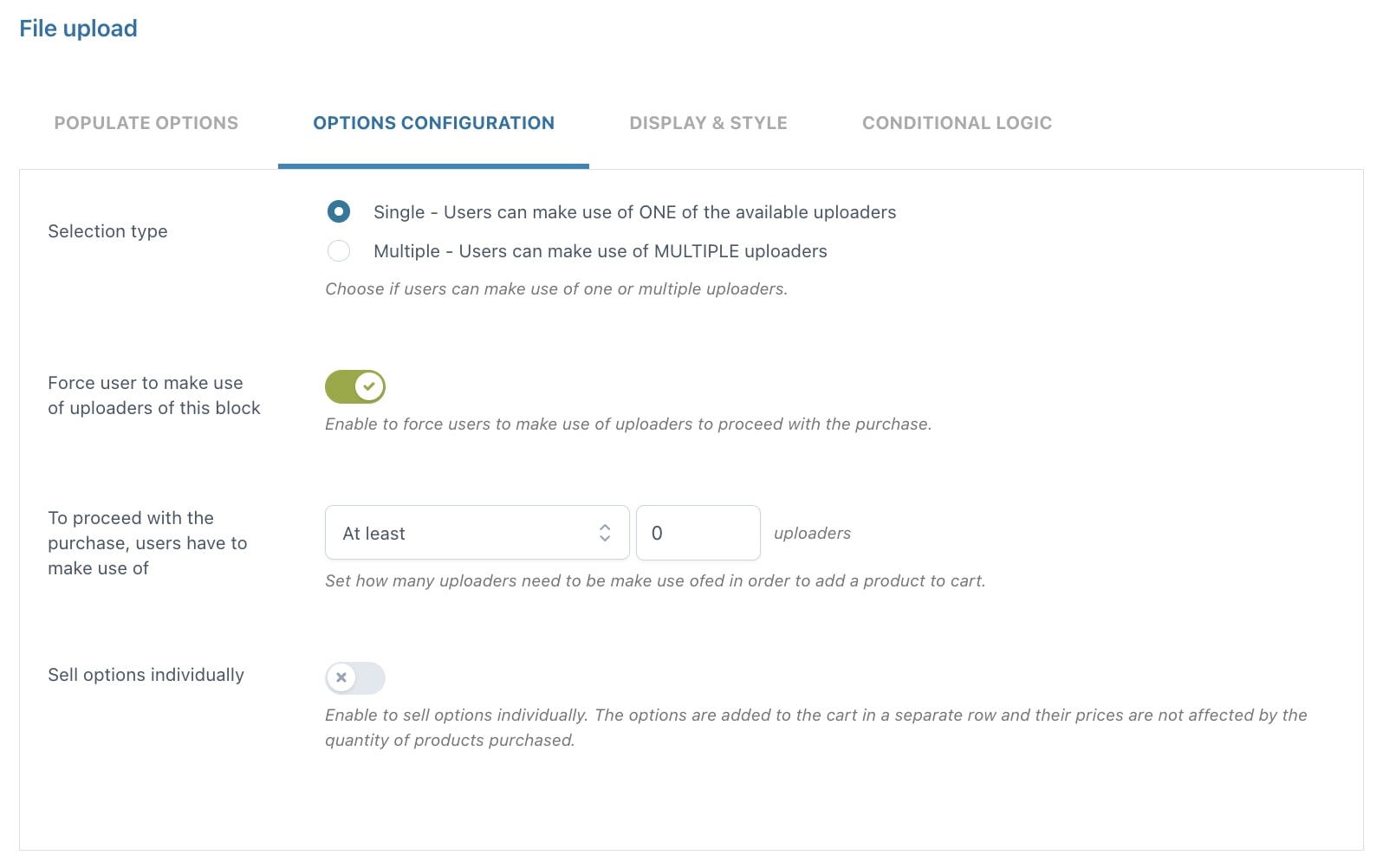
- Selection type: choose Single if you want your users to use only ONE of the available uploaders or Multiple if you want them to use MULTIPLE uploaders
- Force user to make use of uploaders of this block: enable to force users to use file uploaders before proceeding with the purchase
- To proceed with the purchase, users have to make use of: here, you can define the number of file uploaders that must be used, after choosing from At least or Exactly
- Sell options individually: if enabled, the options selected by the user will be added to the cart in a separate row. In this case, option prices won’t change based on the purchased product quantity.
Color picker
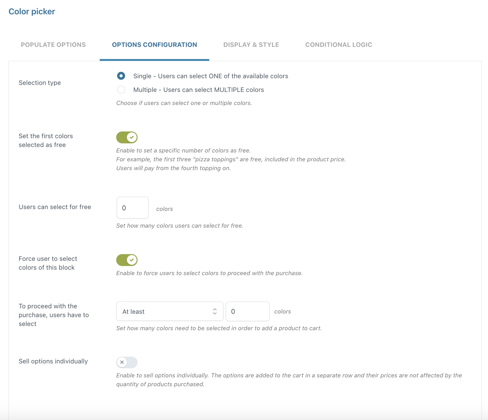
- Selection type: choose Single if you want your users to select only ONE of the available colors or Multiple if you want them to select MULTIPLE colors
- Set the first colors selected as free: enable to set a specific number of colors that can be selected for free
- Users can select for free: define the number of colors that users can select for free
- Force user to select colors of this block: enable to force users to select colors before proceeding with the purchase
- To proceed with the purchase, users have to select: here, you can define the number of colors that must be selected after choosing from At least or Exactly
- Sell options individually: if enabled, the options selected by the user will be added to the cart in a separate row. In this case, option prices won’t change based on the purchased product quantity.