The plugin includes the shortcode [yith_wapo_show_options] that can be used to print the options block on product pages created with a page builder.
Free version settings
Options blocks – free version
In the first tab of the plugin settings, you will be able to configure your blocks of options.
Every block can group unlimited options sets of different types, and each options set can have unlimited options in it.
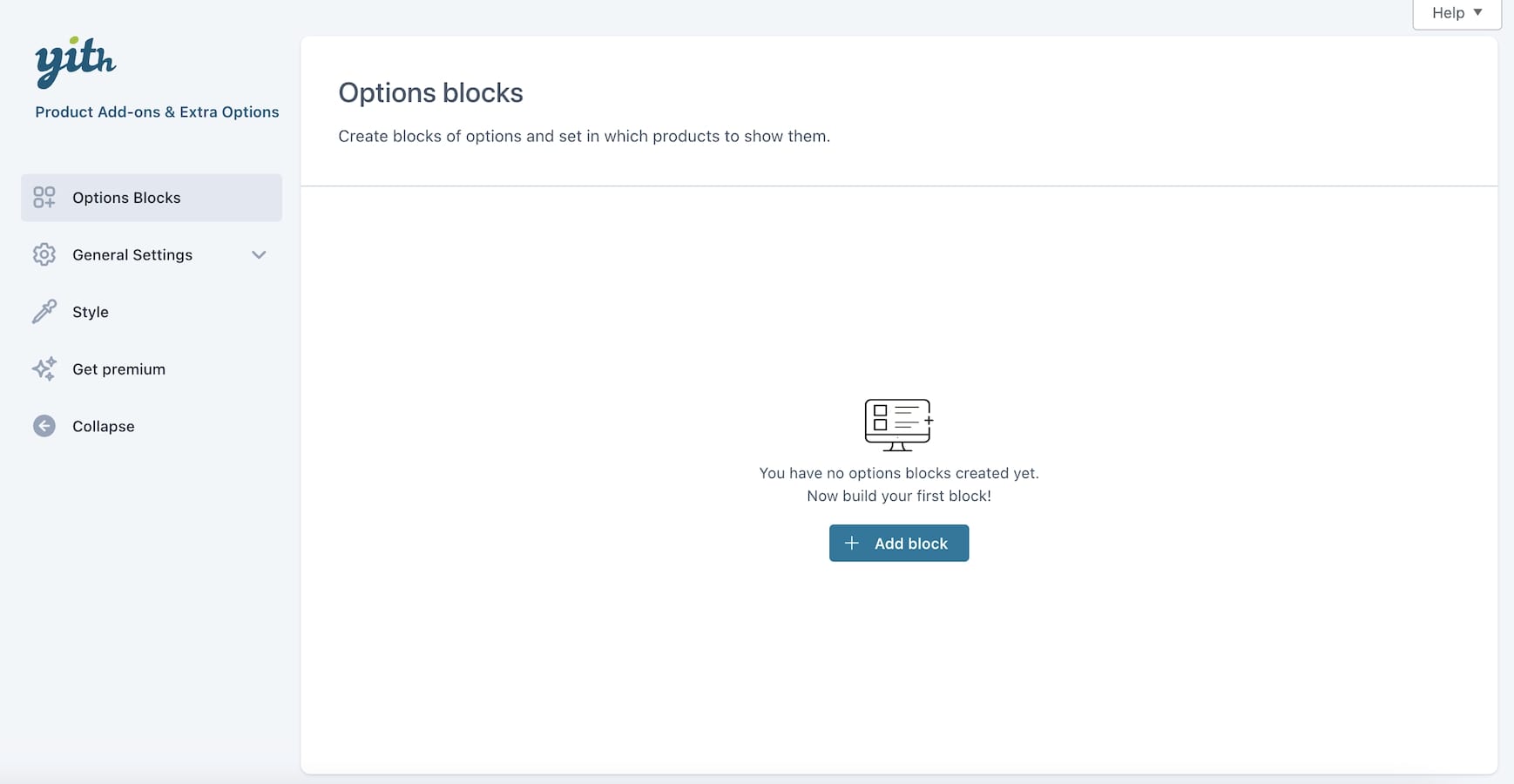
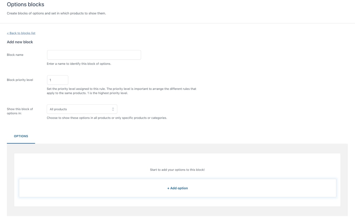
To create your first block, go to YITH > Product Add-ons > Options blocks.
This is how it looks like:
Click on + Add block to add your first block.
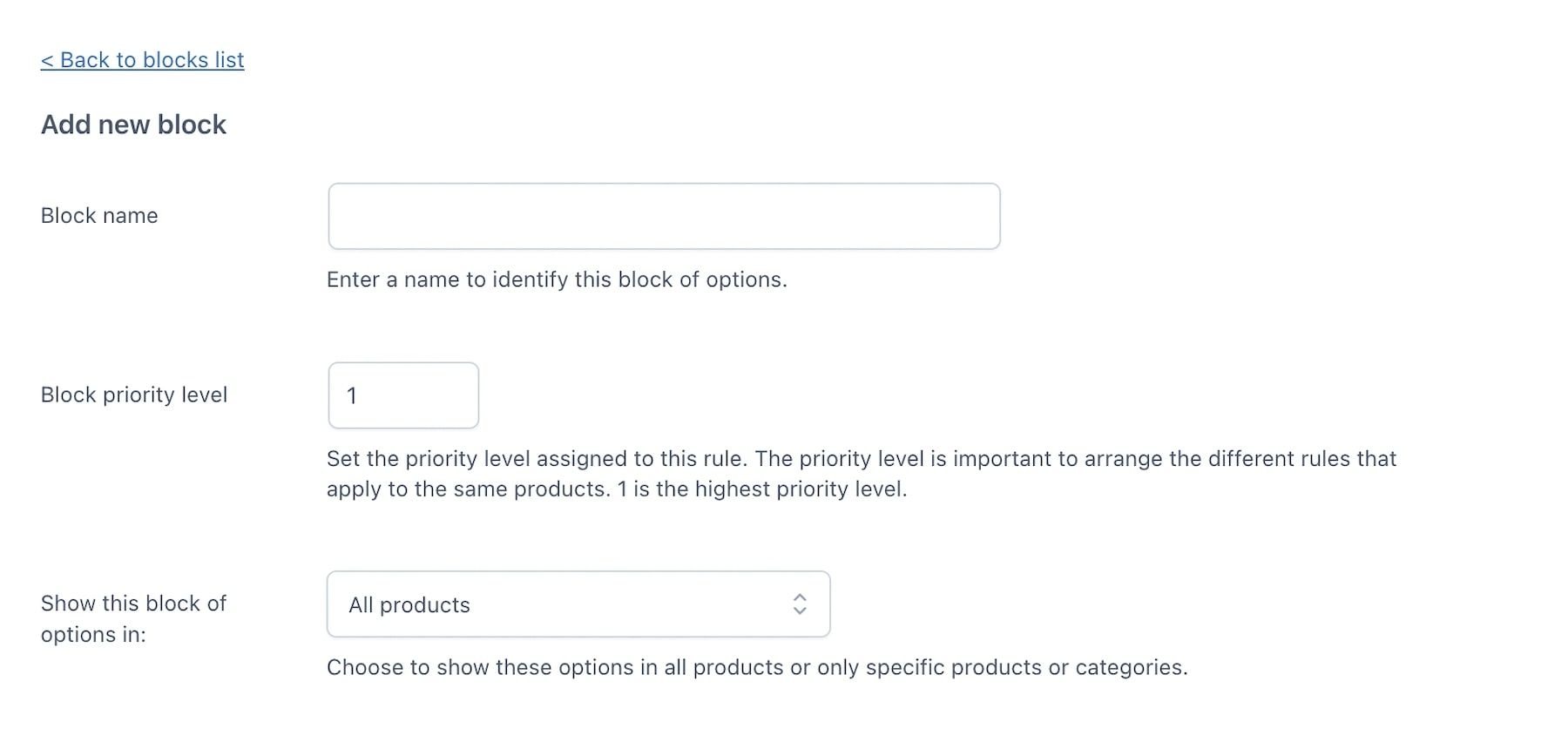
Here you will be able to set:
- The name of the options block
- A priority that will help you sort the blocks in case more than one block apply to the same product.
- The possibility to show the block of options in all products or specific products and categories

Then, you will be able to configure the options and the rules. We’ll check all the available settings in detail in the following pages.
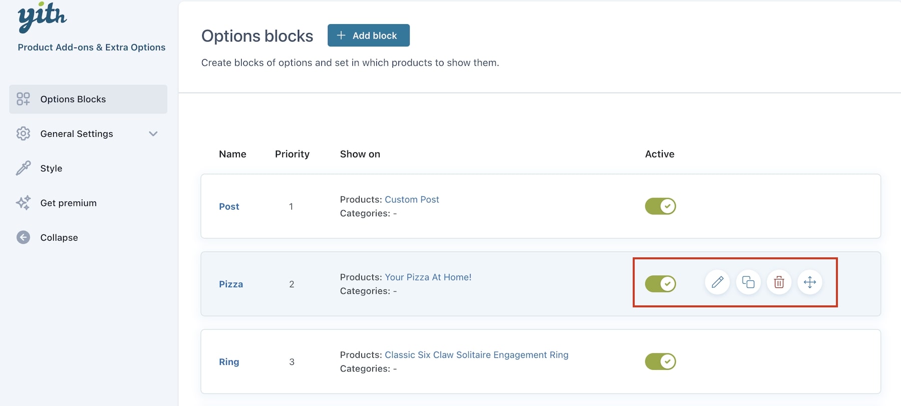
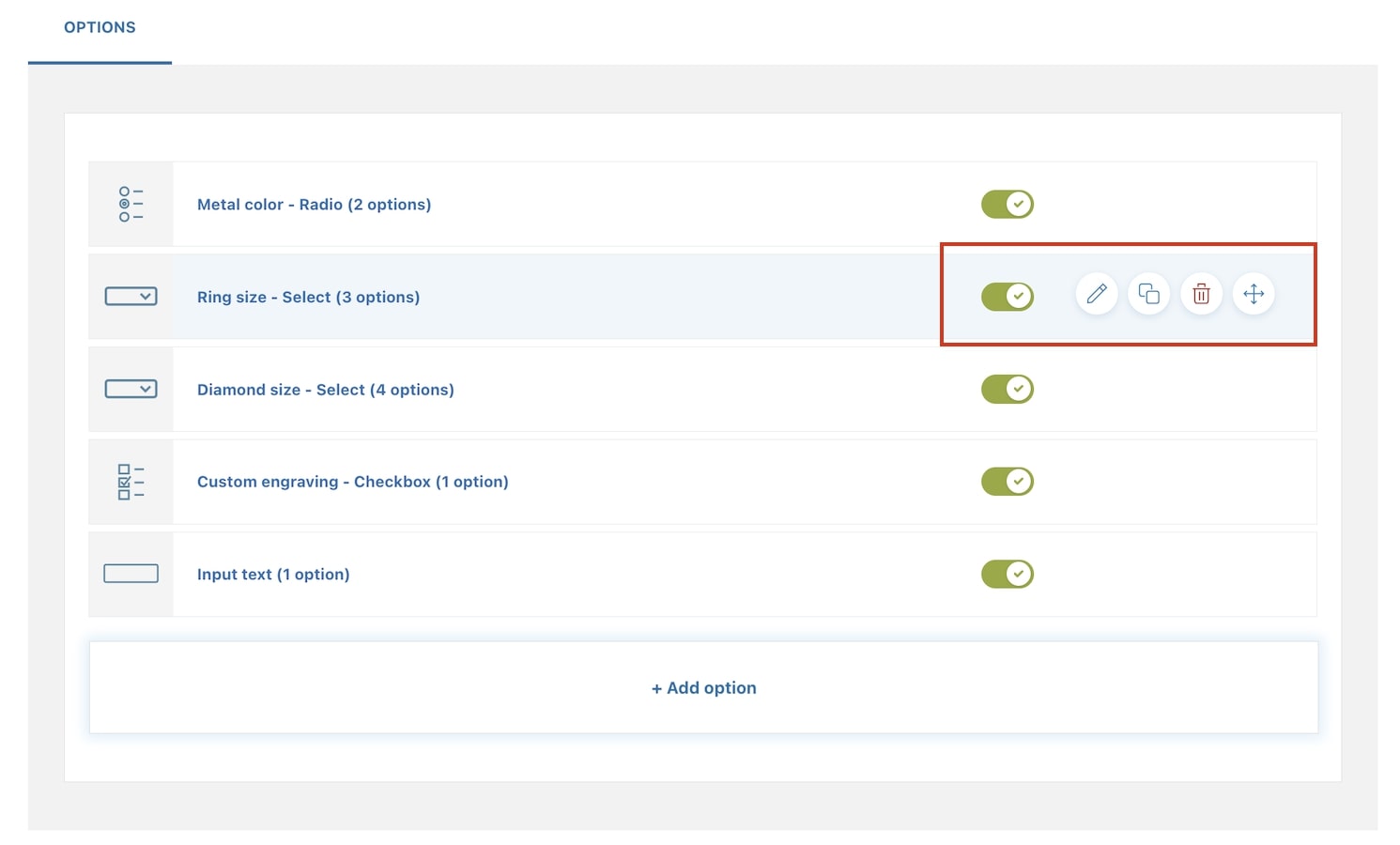
Also, after closing the options block, you will see them all in a list and using the buttons on the right, for each block you can:
- edit
- duplicate
- delete
- move with drag&drop
- enable/disable the block in one click.
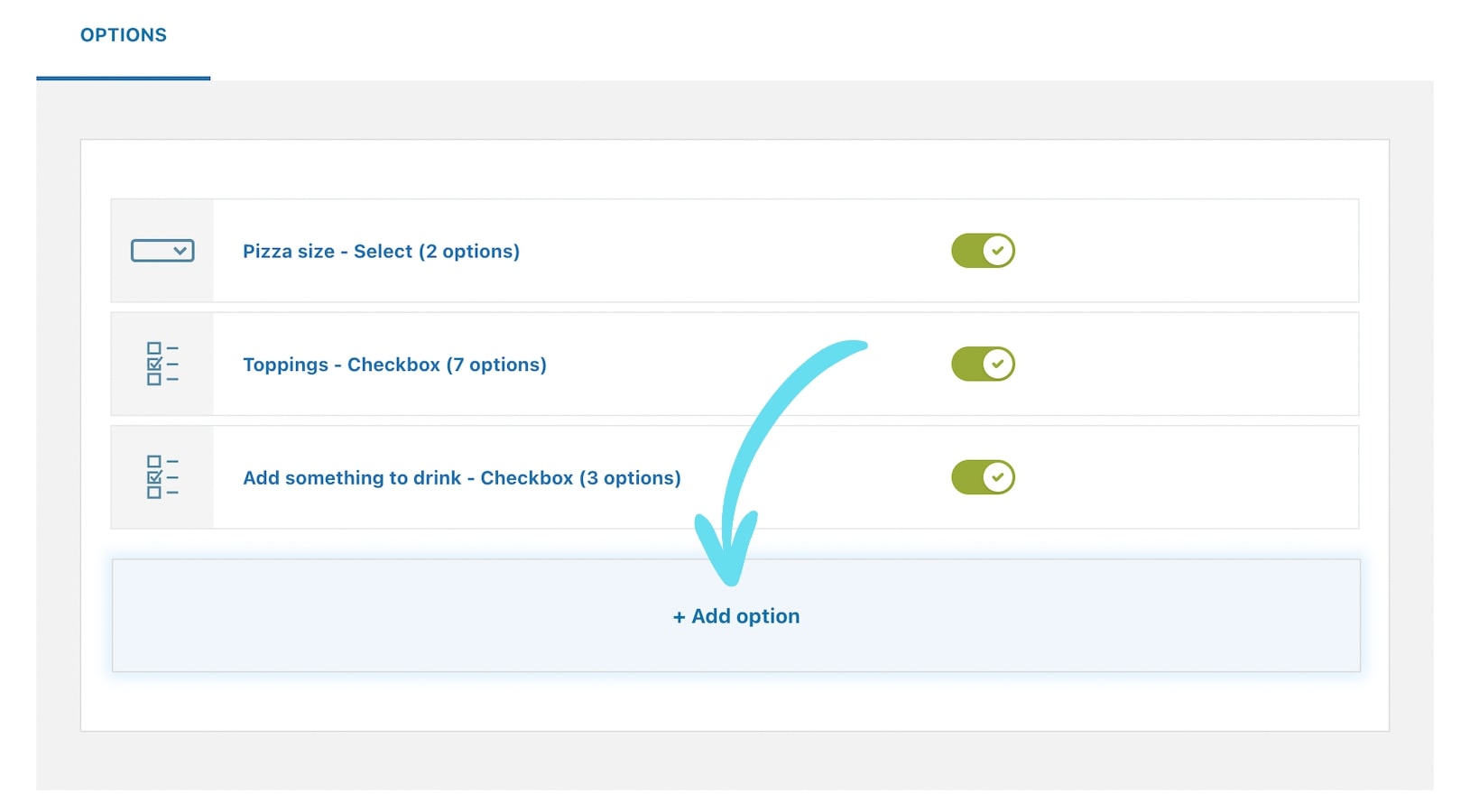
Options sets – free version
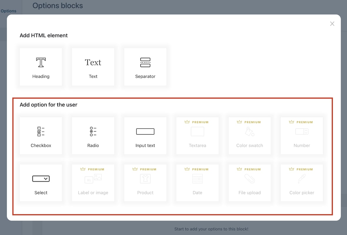
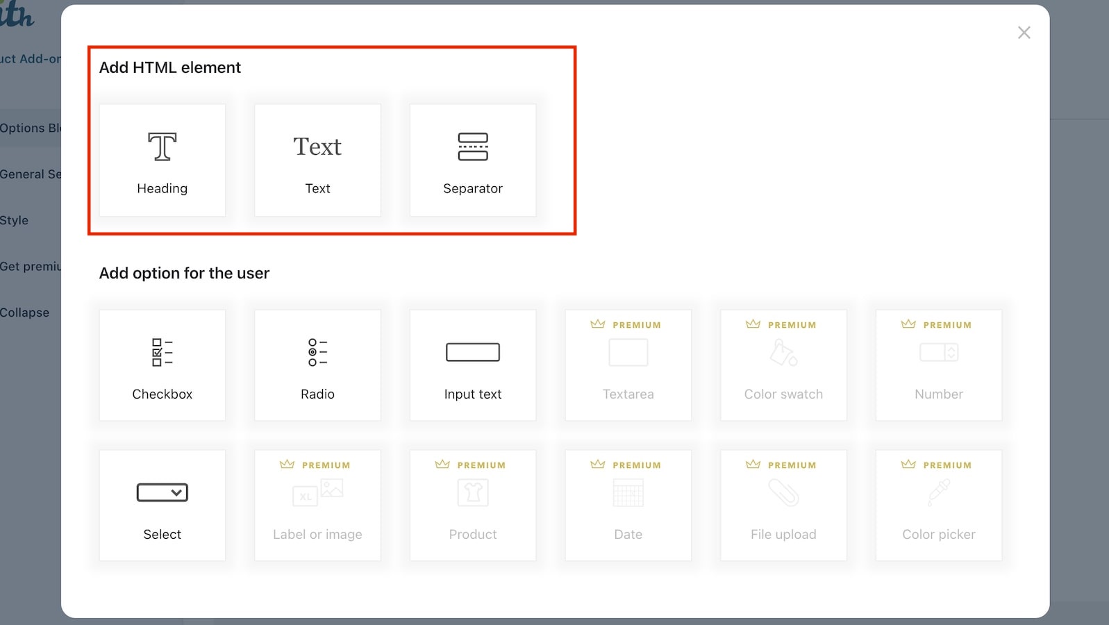
From the Block settings > Options tab, click on + Add options and you will be able to choose between one of the following types of options sets:
- Checkbox
- Radio
- Input text
- Select
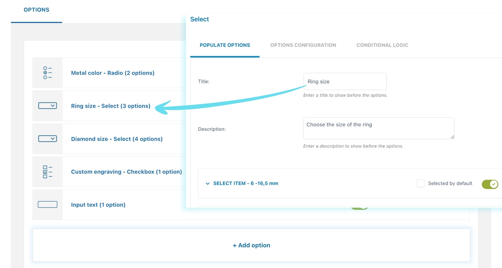
For every option set, you can enter a title that will help you identify it in the options list of the block and a description to show before the options:
Also, after closing the options set, you will see them all in a list and using the buttons on the right, for each set you can:
- edit
- duplicate
- delete
- move with drag&drop
- enable/disable the block in one click.
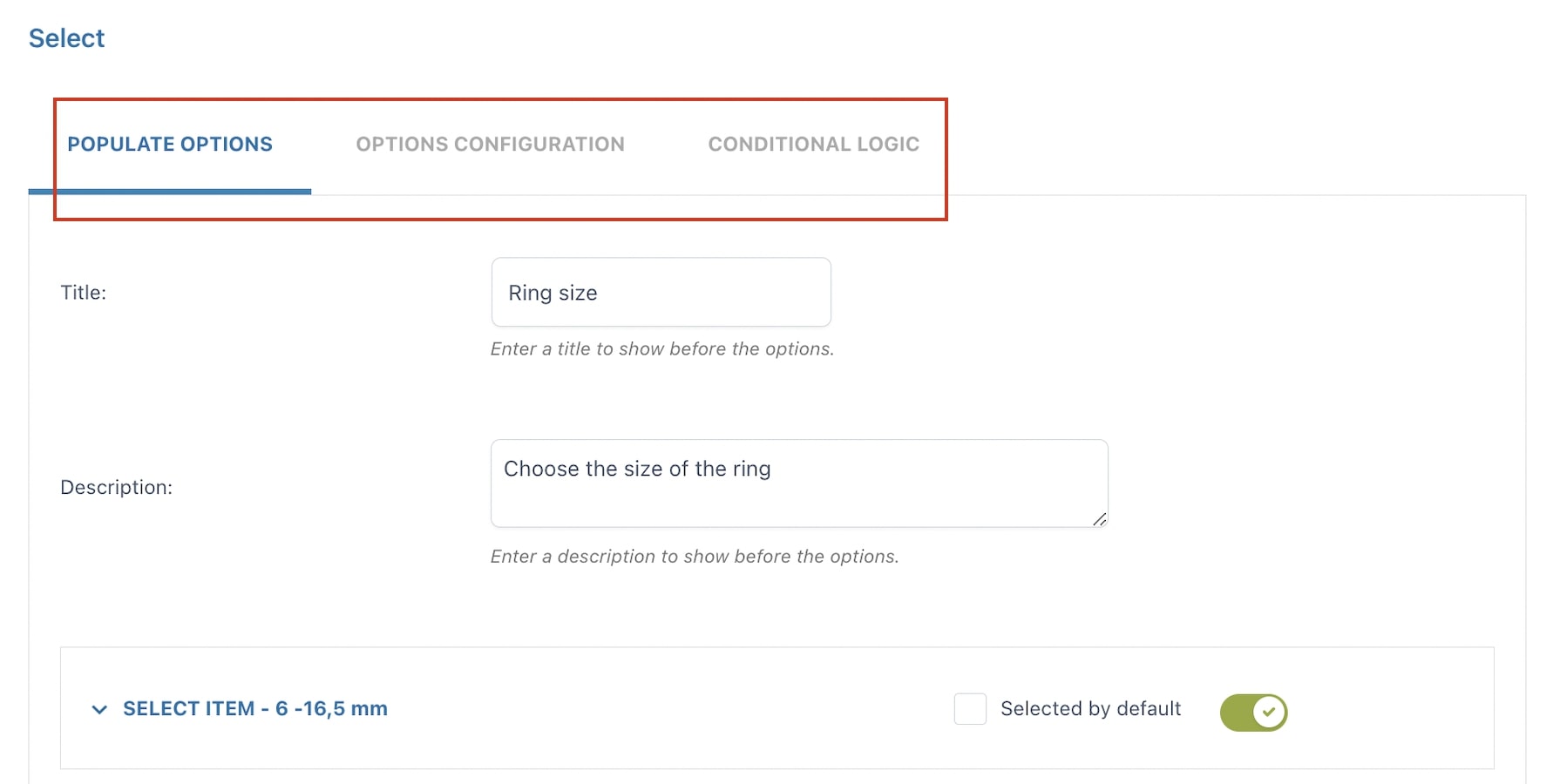
For every options set, you will see different settings tabs:
HTML elements
Let’s start from the Options tab. Here is where you can add either an HTML element or an options set. Just click on Add options.
Let’s focus available HTML elements first:
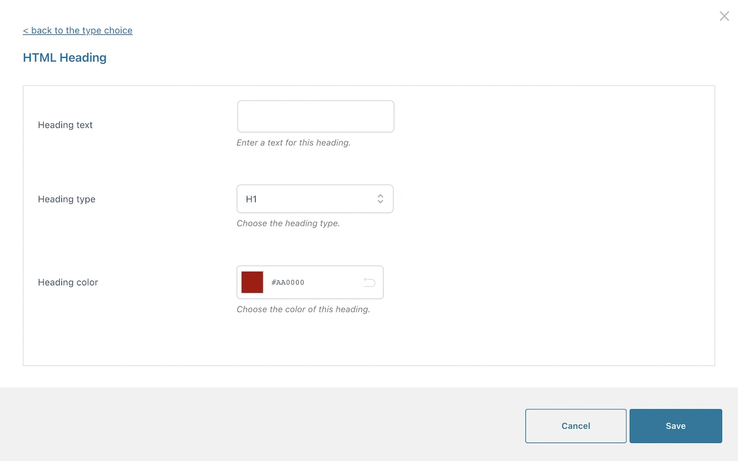
Heading
You can set the text, the type of heading (H1 to H6) and the color.
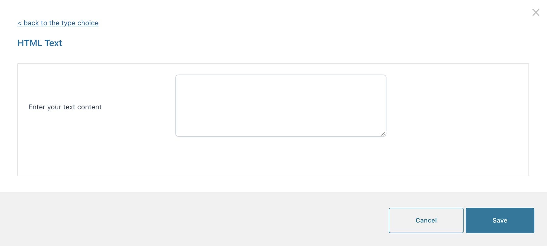
Text
Enter a custom static text here.
Separator
Configure a graphic separator that you can use between your options sets.
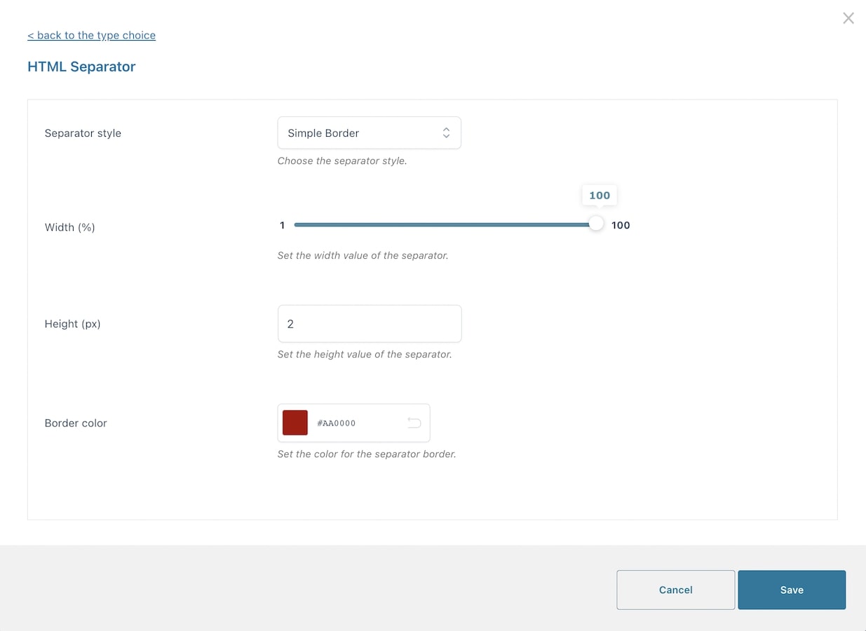
- Separator style: simple border, double border, dotted border, dashed border, empty space.
- Width (px)
- Hight (px)
- Border color
Populate options – free version
In the Populate options, you will be able to add as many options as you wish. For example, if you choose a Checkbox options set to display the available pizza toppings, every option will be one topping.
To add more options in this set, just click on + Add a new option:
The Populate settings of every option vary based on the type selected. Let go through all of them one by one below.
Checkbox
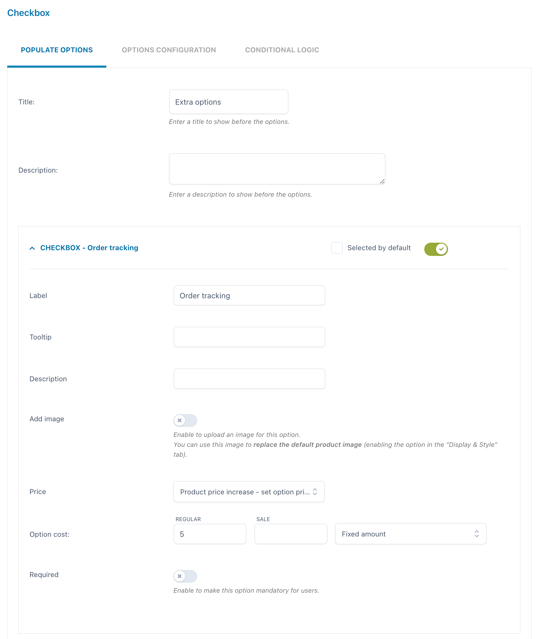
As opposed to radio buttons, checkboxes let your users select more than one option for the same set. For every option you can set:
- Label
- Tooltip
- Description
- Image
- Price: the option price can be calculated as a fixed or percentage amount from the product price:
- product price doesn’t change – set option as free
- increase the product price (on-sale available as well)
- discount the product price
- Selected by default
- Required: if enabled, the customer cannot add the product to the cart without entering a text in this option.
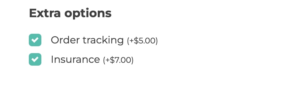
Example: add extra paid options to your custom box delivered at home like order tracking and insurance.
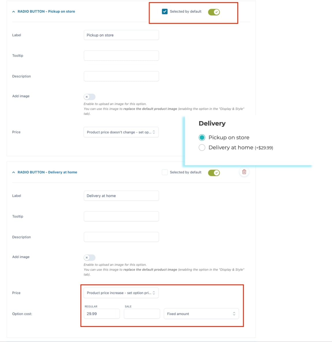
Radio
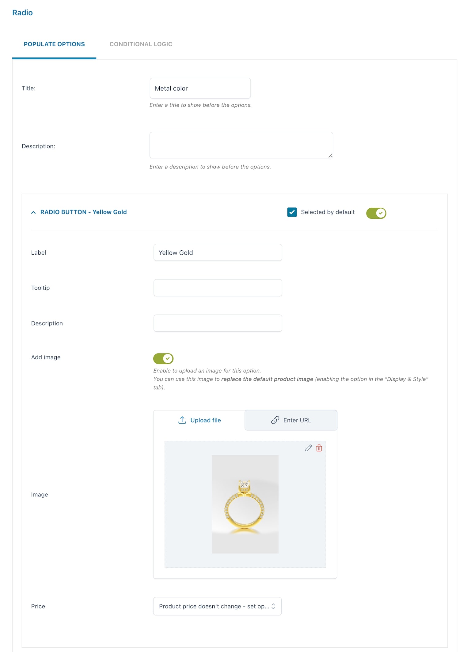
For every option you can set:
- Label
- Tooltip
- Description
- Image
- Price: the option price can be calculated as a fixed or percentage amount from the product price:
- product price doesn’t change – set option as free
- increase the product price (on-sale available as well)
- discount the product price
- Selected by default
- Required: if enabled, the customer cannot add the product to the cart without entering a text in this option.
By its very nature, users can only select one option in a radio input. Use checkboxes if you want to let users select multiple options instead.
Example: I can create a radio add-on for the Delivery with two options:
1. pick up in store is free of charge and is the default selection
2. delivery at home has an additional cost of $29.99
Input text
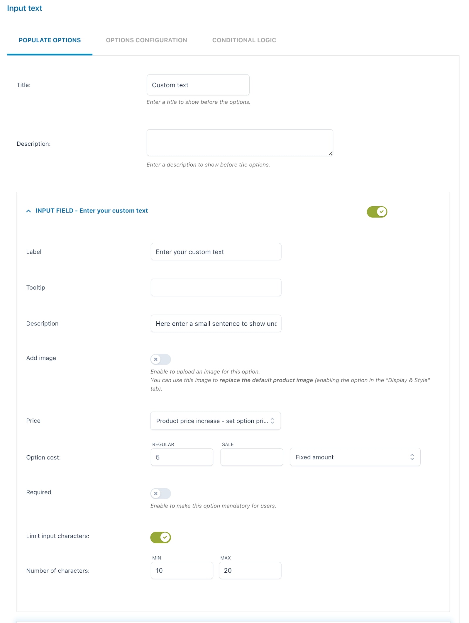
For every option you can set:
- Label
- Tooltip
- Description
- Image
- Price: the option price can be calculated as a fixed or percentage amount from the product price:
- product price doesn’t change – set option as free
- increase the product price (on-sale available as well)
- discount the product price
- Required: if enabled, the customer cannot add the product to the cart without entering a text in this option.
- Limit input characters: if enabled, you can set a minimum and maximum number of characters allowed.
Example: let your customer have a custom text printed on a T-shirt for extra $5. The text can be no more than 20 characters. Explain what this is for in the option description. The screenshot above shows these specific settings and below is how it appears on the frontend.

Select
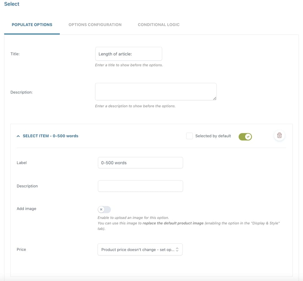
For every option you can set:
- Required: if enabled, the customer cannot add the product to the cart without entering a text in this option.
- Label
- Description
- Image: if enabled, you can upload an image for the add-on.
- Price: the option price can be calculated as a fixed or percentage amount from the product price:
- product price doesn’t change – set option as free
- increase the product price (on-sale available as well)
- discount the product price
- Selected by default
Example: you write copy and you offer two standard lengths for a blog post:
1. up to 500 words is the basic product price
2. 501 to 1000 words has an additional cost of $10.
Settings are in the screenshot above, frontend is below.

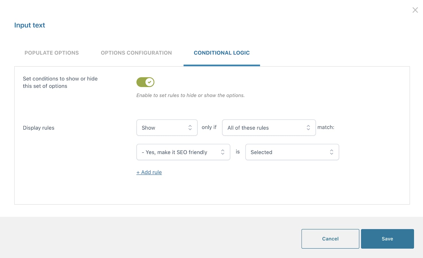
Move on to the Conditional logic >
Conditional logic
The conditional logic is extremely useful if you want to hide or show some options based on what the customer selects in another options set.
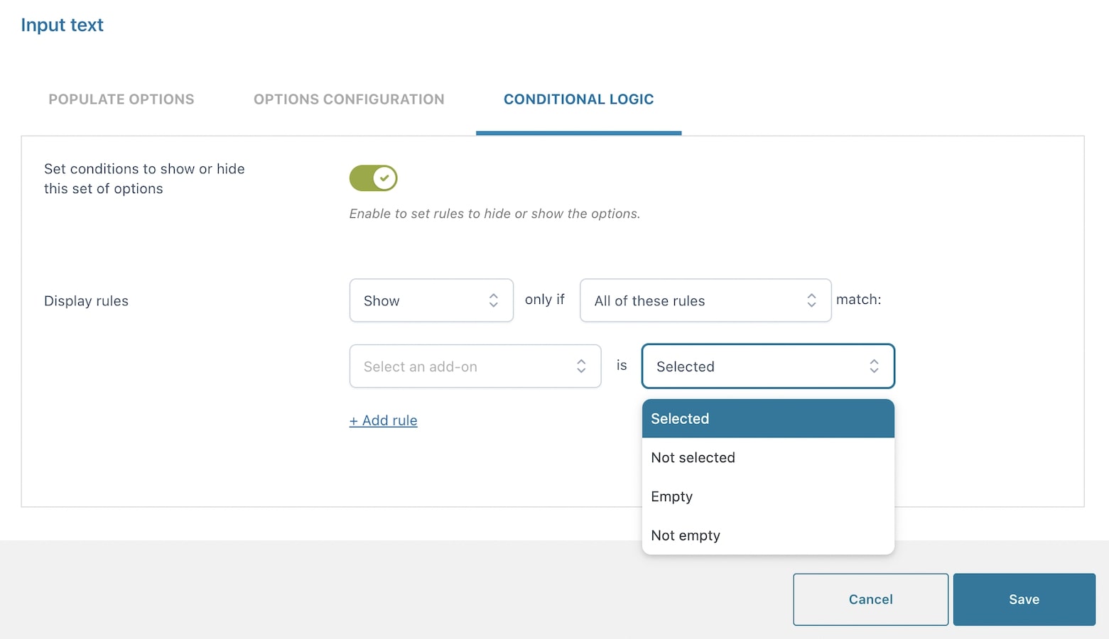
After enabling the creation of display conditions, you will be able to set up the display rules.
You can choose whether to show or hide the current options set (add-on) if either All of the following rules or any of them match.
Then set if it has to be:
- Selected
- Not selected
- Empty
- Not empty
Let’s give an example to clarify how these rules work.
Example — show X if set of options Y is selected
You offer copywriting as a paid service, but SEO keywords can be added optionally and at an extra cost.
So, use a checkbox to let the user add the extra paid service for SEO keywords, and only if it is flagged, show a textbox where the user can type them in.
Create both options and then, from the Input text conditional logic, set the display rule like in the following screenshot:
Options configuration – free version
For every option set, you can configure different settings. Let’s analyze them together.
Checkbox
Using the Selection type option, you can choose Single if you want your users to select only ONE of the available options or Multiple if you want them to select MULTIPLE options
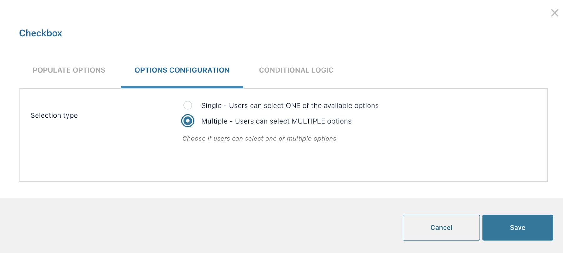
Example: you let your users select multiple pizza toppings from a list of checkboxes.

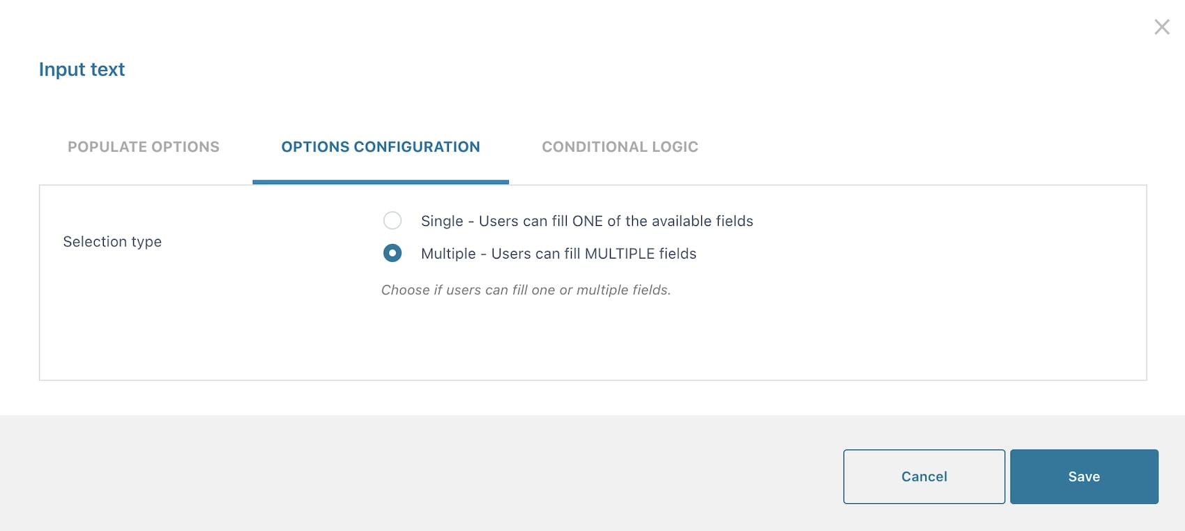
Input text
Using the Selection type for this add-on, you can choose Single if you want your users to fill only ONE of the available fields or Multiple if you want them to fill MULTIPLE fields
Select
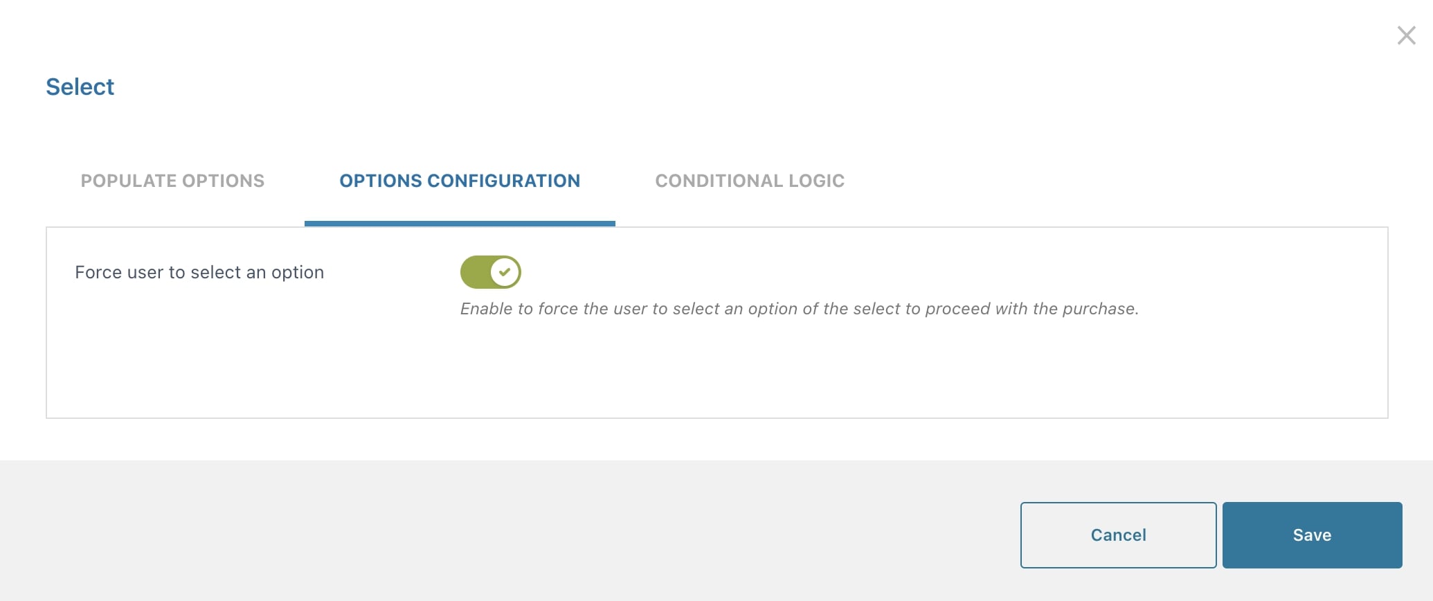
In the Options configuration tab of this add-on, you can enable Force user to select an option to force users to select an option before proceeding with the purchase.
Options pricing
In this post we will cover all price options, the general ones available in all types of options and the extra one available for text inputs:
General price options
For every option, you can choose one of the following:
- product price doesn’t change – set option as free
- increase the product price (on-sale available as well)
- discount the product price
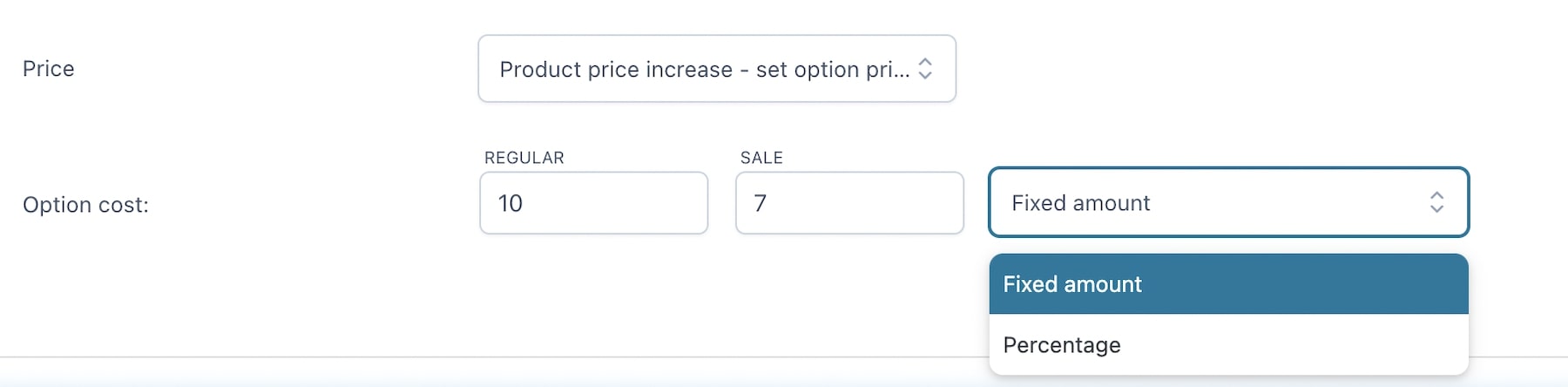
When you select either increase or decrease, you can choose the price as:
- fixed or
- percentage
Also, you can set not only the regular price for the option but also a sale price.
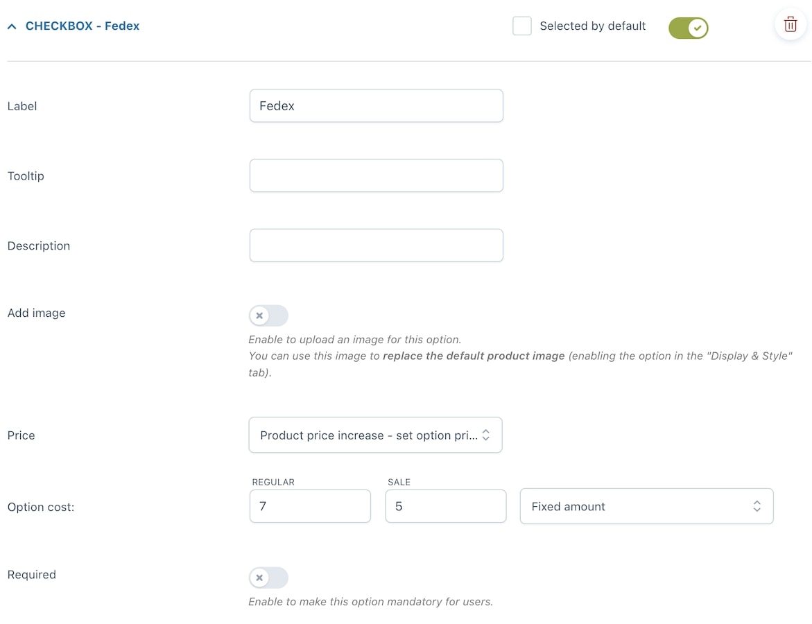
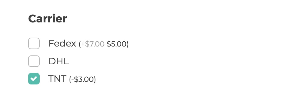
Example: Your product has three carrier options:
1. Fedex would generally cost $7, but this option is on sale for $5
2. DHL will not change the base product price
3. TNT discounts the base price by $3
Below you find the settings of the Fedex option and the frontend of all 4 options.
Pro tip: if you want to offer a certain number of options as free, but charge the users if they select more, you can do that from the Option configuration tab (option available only with the premium version).
Extra price options for Text inputs
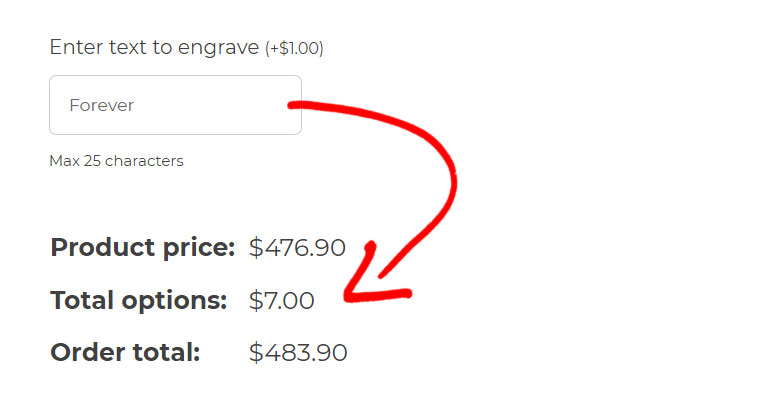
Do you offer a custom ring with engraving options and want to charge the user $1 for every letter?
Text input and Textarea options include this extra feature and allow you to multiply the cost of the option by the number of characters typed in by the user.
When you choose to Increase the product price, besides fixed or percentage, you will be able to choose also Price multiplied by string length:
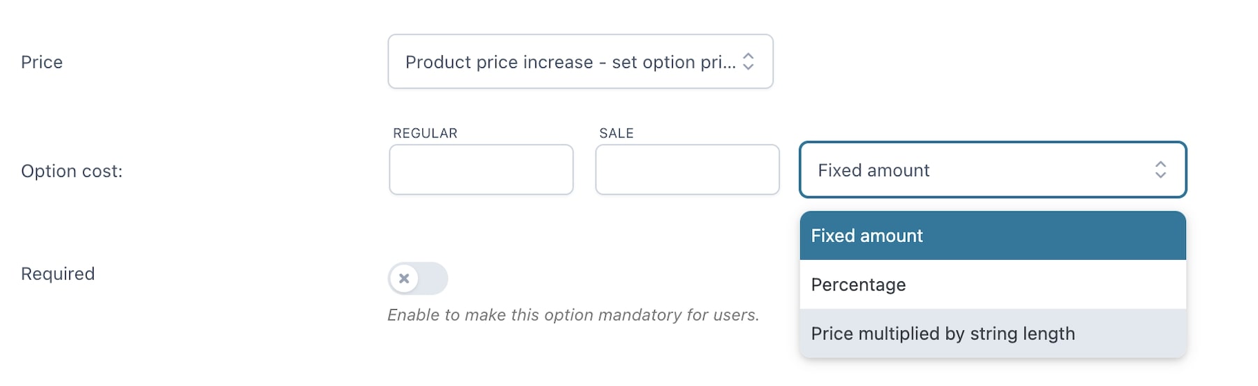
Example: in the screenshot below you can see that the cost of the engraving is €1 per character, so a total of €7 as the word forever is made of 7 letters.
General options – free version
In the General settings tab, you will find two sections, the first of which is about General options, let’s check them one by one.
Options position in product page:
- Before “Add to cart”
- After “Add to cart”
In WooCommerce pages show:
- “Select options” button
- “Add to cart” button
Both of them will take the user to the product page, where the user can configure the add-ons.
Label for “Select options” button: customize here the text of the “Select options” button that shows on archive pages when a product has add-ons to be selected.
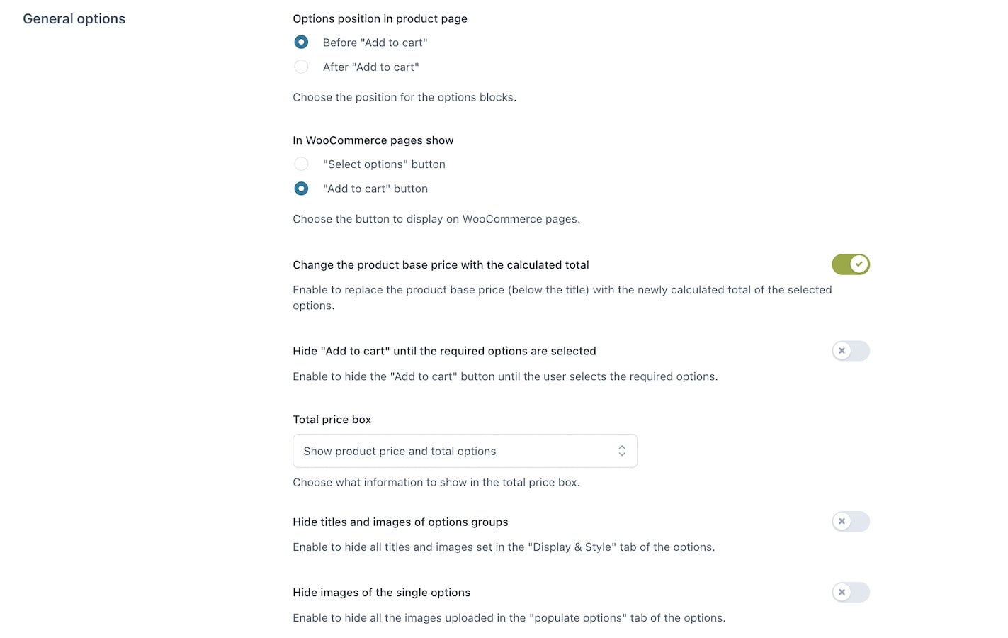
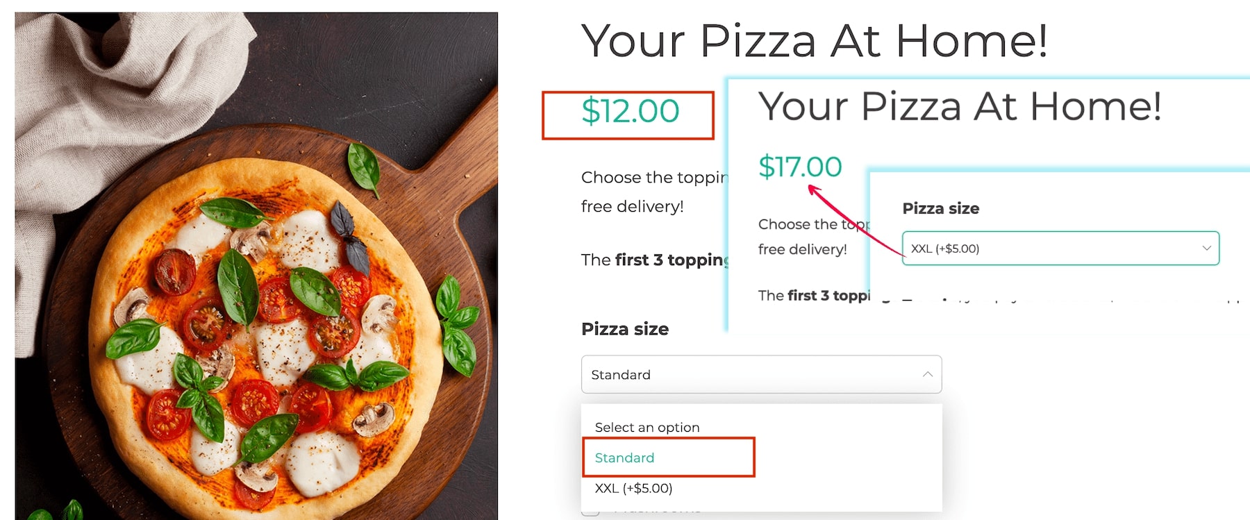
Change the product base price with the calculated total: enable to replace the product base price (below the title) the the newly calculated total of the selected options.
Hide “Add to cart” until the required options are selected: if your product includes required options to be selected, enable this to make sure the “Add to cart” button is hidden until they are selected. Leave it to OFF, if you want to show the “Add to cart” button but keep it disabled until the required options are selected.
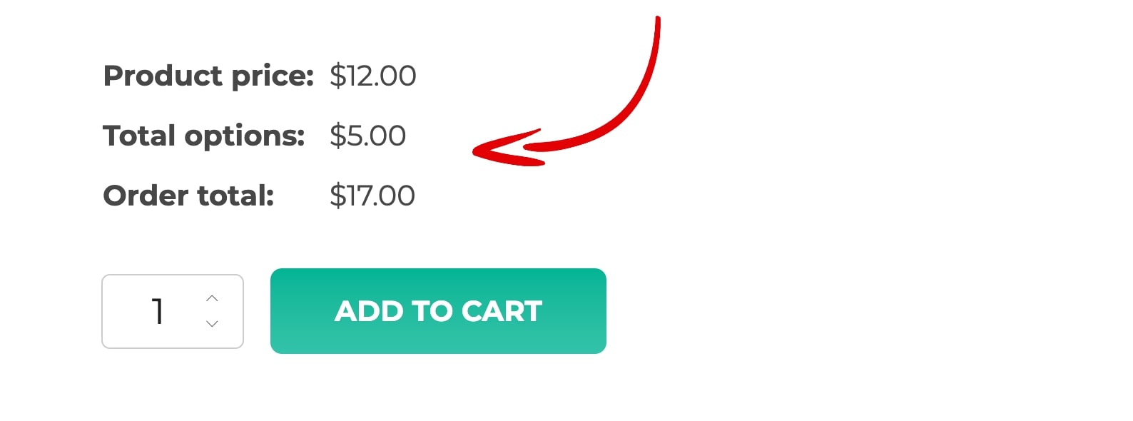
Total price box:
- Show product price and total options
- Show the final total but hide options total if the value is 0
- Show only the final total
- Hide price box on the product page
Hide titles and images of options groups: enable to hide all titles and images set in the “display” tab of the options.
Hide images of all singular options: enable to hide all the images uploaded in the “populate options” tab of the options.
Cart & Order
Still from the General settings tab, go to Cart & Order options to configure the following settings:
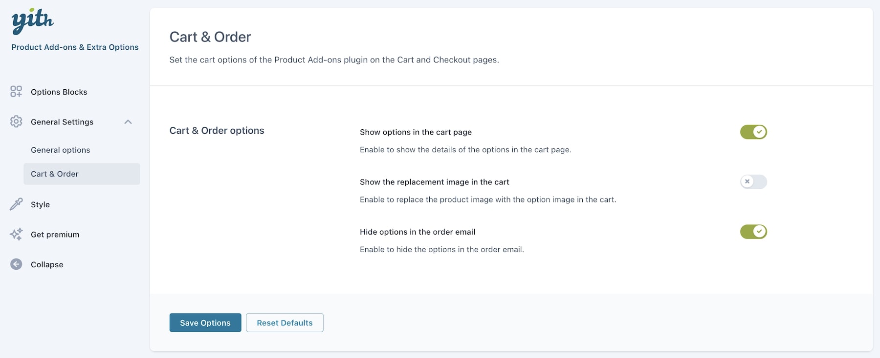
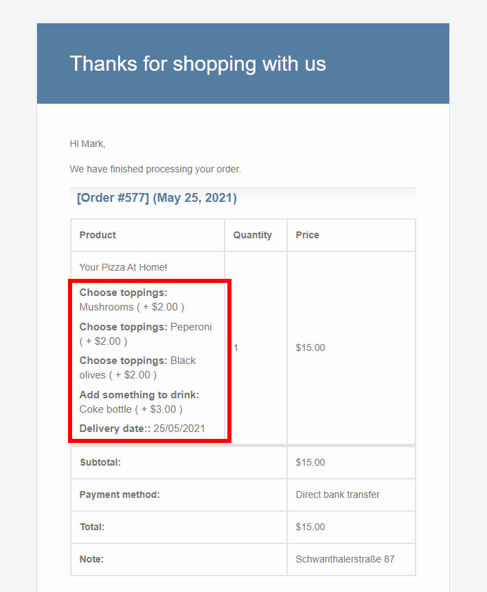
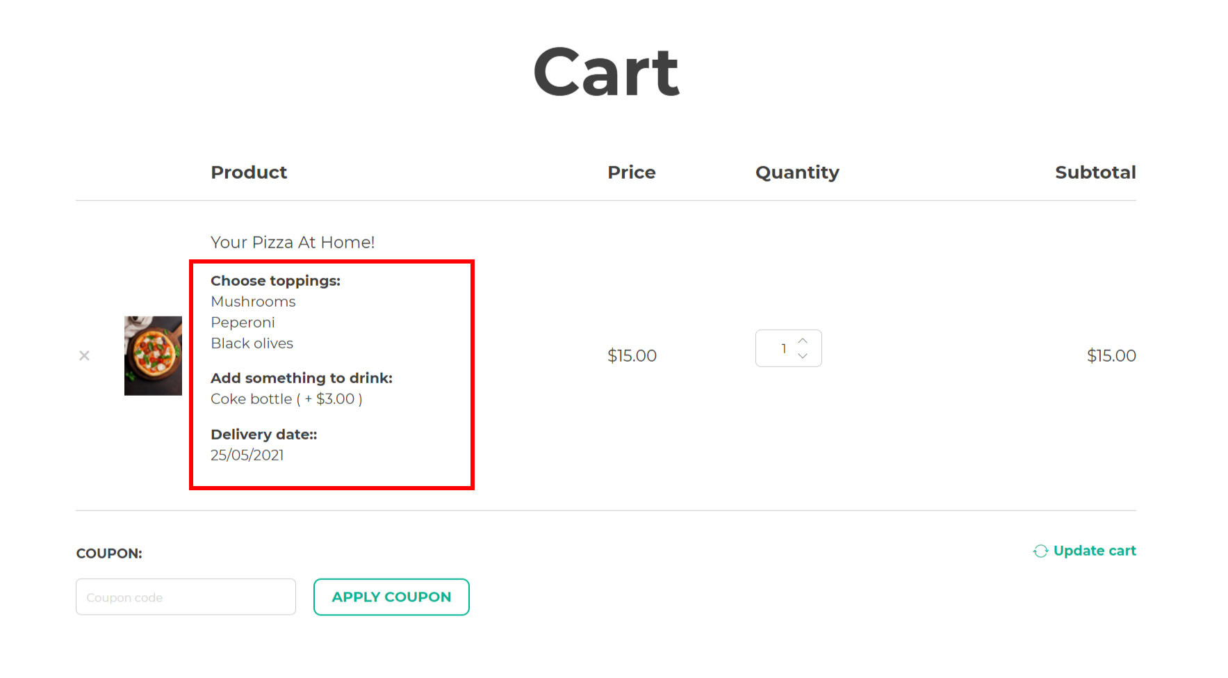
Show options in the cart page: enable to show the details of the selected options in the Cart page.
Show the replacement image in the cart: enable to replace the product image with the option image in the cart.
Hide options in the order email: enable to hide the selected options in the order email.