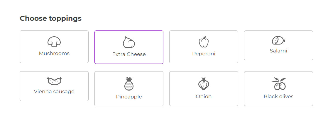
In the Populate options, you will be able to add as many options as you wish. For example, if you choose a Label/image options set to display the available pizza toppings, every option will be one topping.
To add more options to this set, just click on + Add option:
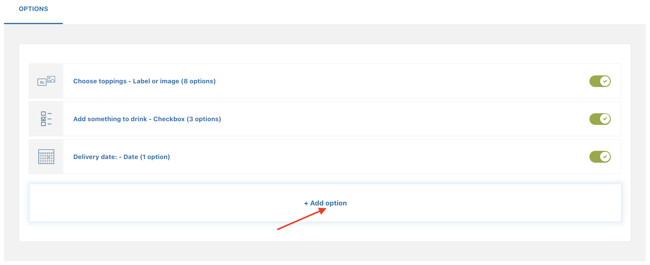
The Populate settings allow enabling or disabling every option and vary based on the type selected. Let’s go through all of them one by one below.
- Checkbox
- Radio
- Input text
- Textarea
- Color swatch
- Number
- Select
- Label or image
- Product
- Date
- File Upload
- Color picker
Checkbox
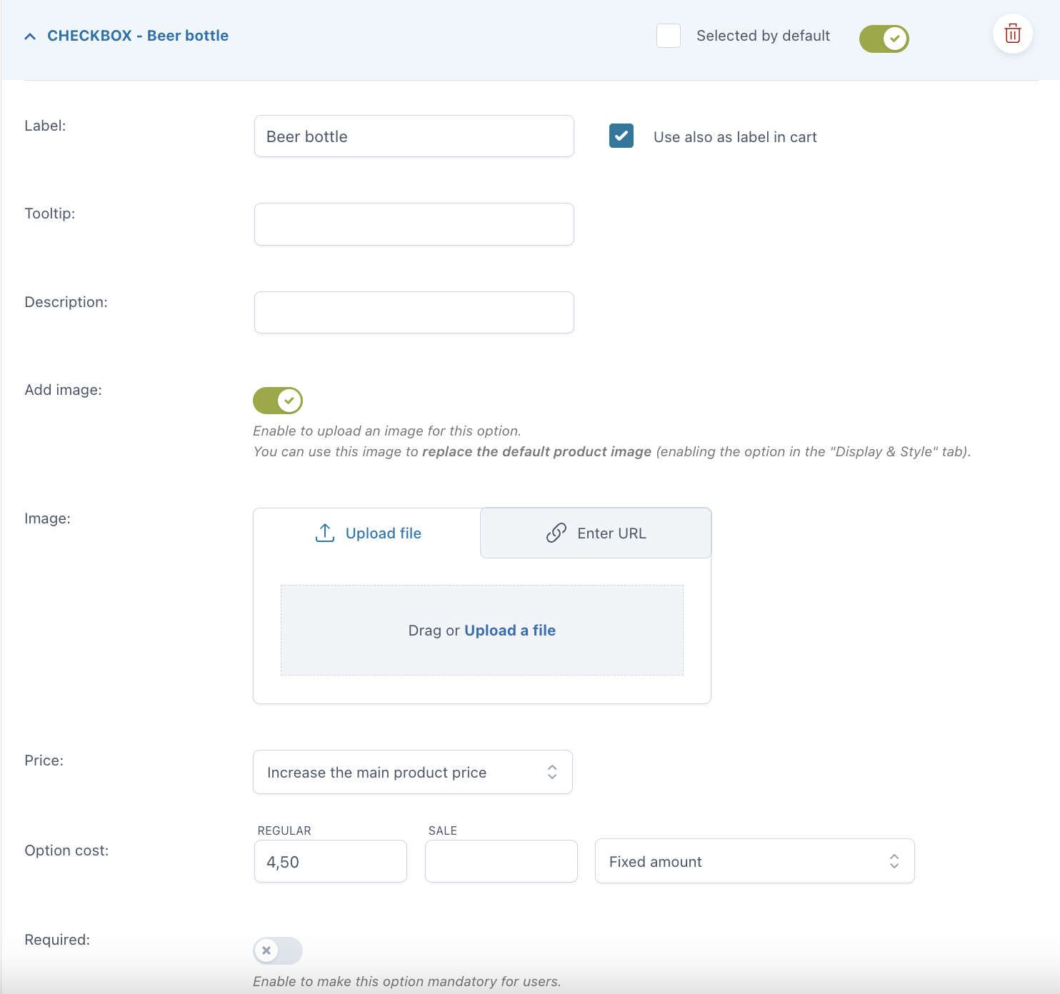
As opposed to radio buttons, checkboxes let your users select more than one option for the same set. For every option you can set:
- Selected by default
- Label
- use also as label in cart
- label in cart: enter a text to show as a label in cart (available only if the option “Use also as label in cart” is not enabled)
- Tooltip
- Description
- Image: you can either upload a file or enter the URL
- Price: the option price can be calculated as a fixed or percentage amount from the product price:
- product price doesn’t change – set option as free
- increase the product price (on-sale available as well)
- discount the product price
- Required: if enabled, the customer cannot add the product to the cart without entering a text in this option.
Example: add extra paid options to your custom box delivered at home like order tracking and insurance.

Radio
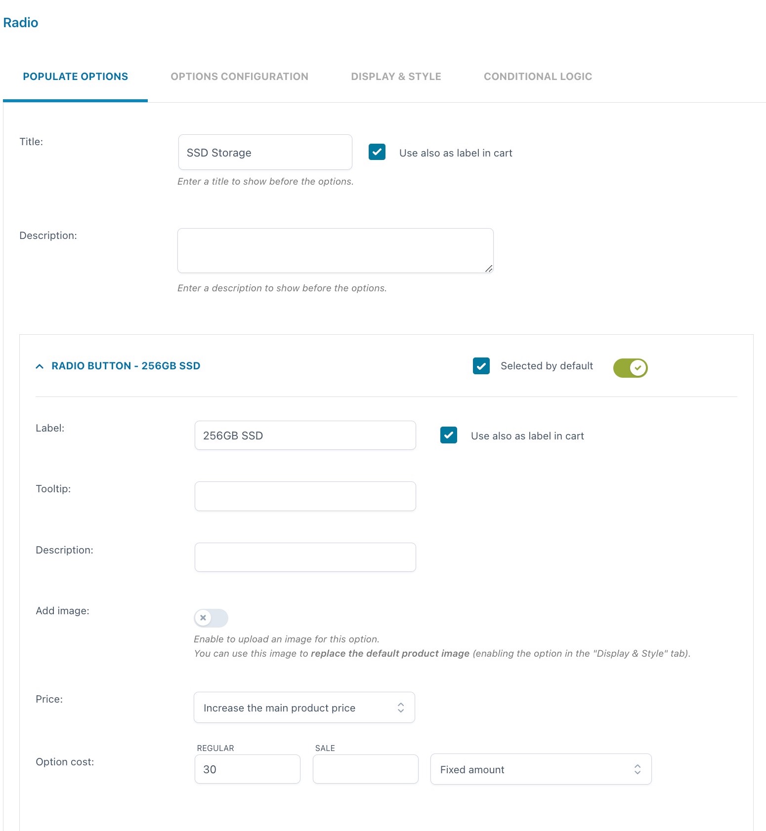
For every option you can set:
- Selected by default: one of the created options will be always selected by default
- Label
- use also as label in cart
- label in cart: enter a text to show as a label in cart (available only if the option “Use also as label in cart” is not enabled)
- Tooltip
- Description
- Image: you can either upload a file or enter the URL
- Price: the option price can be calculated as a fixed or percentage amount from the product price:
- product price doesn’t change – set option as free
- increase the product price (on-sale available as well)
- discount the product price
By its very nature, users can only select one option in a radio input. Use checkboxes if you want to let users select multiple options instead.
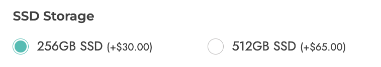
Example: I can create a radio add-on for the SSD Storage with two options:
1. 256GB SSD with an additional cost of $30 and selected by default
2. 512GB SSD with an additional cost of $65
Input text
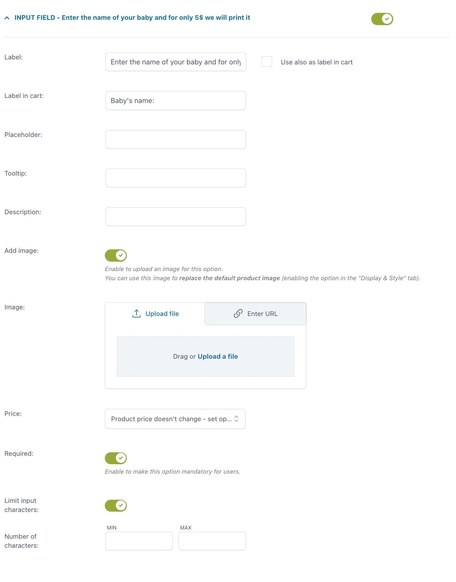
For every option you can set:
- Label
- use also as label in cart
- label in cart: enter a text to show as a label in cart (available only if the option “Use also as label in cart” is not enabled)
- Tooltip
- Description
- Image: you can either upload a file or enter the URL
- Price: the option price can be calculated as a fixed or percentage amount from the product price:
- product price doesn’t change – set option as free
- increase the product price (on-sale available as well)
- discount the product price
- Required: if enabled, the customer cannot add the product to the cart without entering a text in this option
- Limit input characters: here, you can set a minimum and maximum value.
Example: let your customer have a custom text printed on a T-shirt for an extra $5. The text can be no more than 20 characters. Explain what this is for in the option description. The screenshot above shows these specific settings and below is how it appears on the frontend.

Textarea
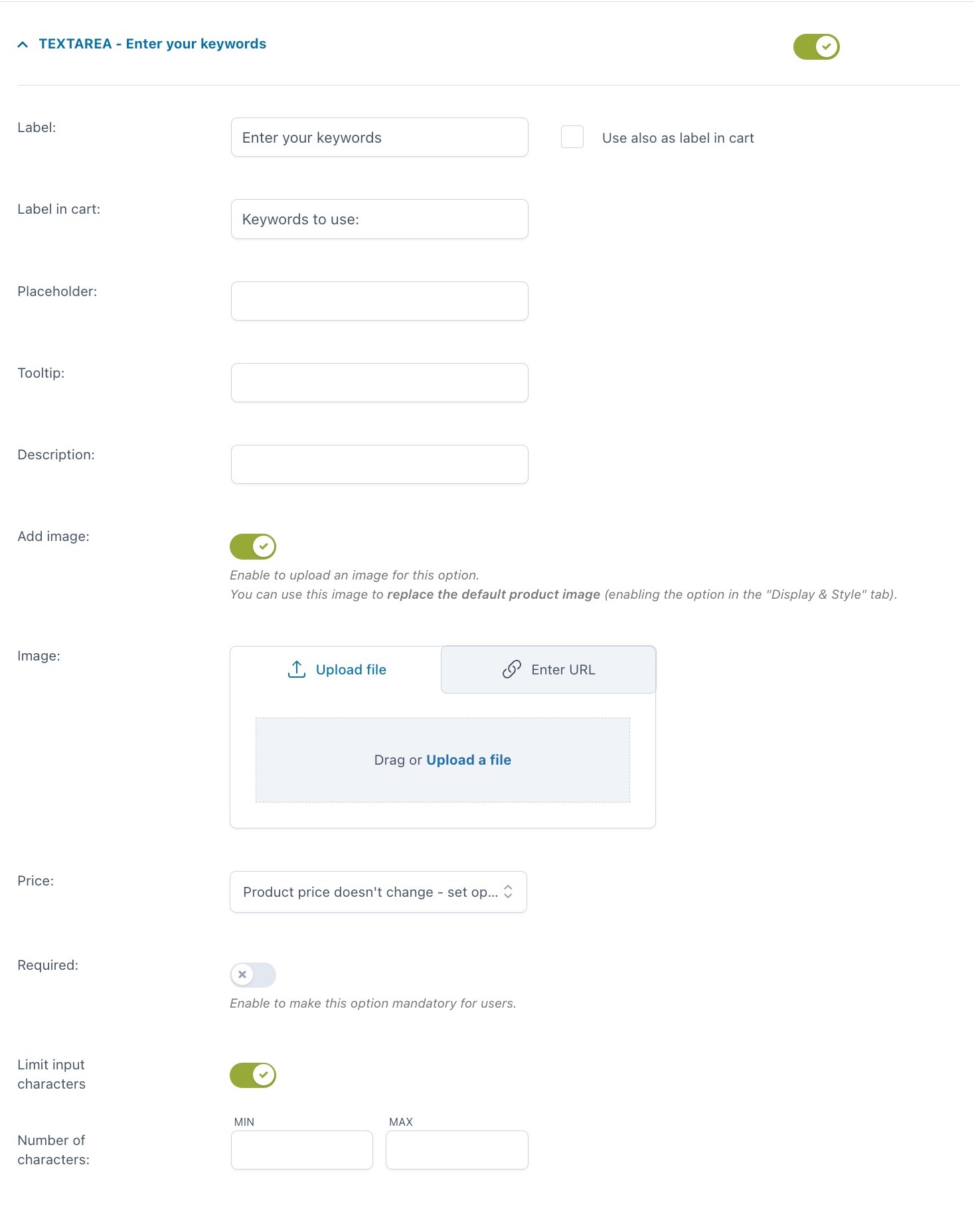
For every option you can set:
- Label
- use also as label in cart
- label in cart: enter a text to show as a label in cart (available only if the option “Use also as label in cart” is not enabled)
- Tooltip
- Description
- Image: you can either upload a file or enter the URL
- Price: the option price can be calculated as a fixed or percentage amount from the product price:
- product price doesn’t change – set option as free
- increase the product price (on-sale available as well)
- discount the product price
- Required: if enabled, the customer cannot add the product to the cart without entering a text in this option
- Limit input characters: here, you can set a minimum and maximum value.
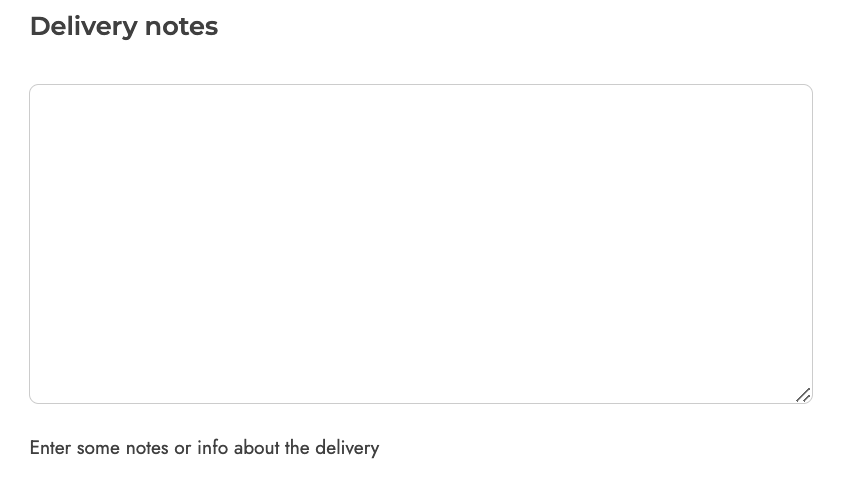
Example: show a textarea for delivery notes.
Color swatch
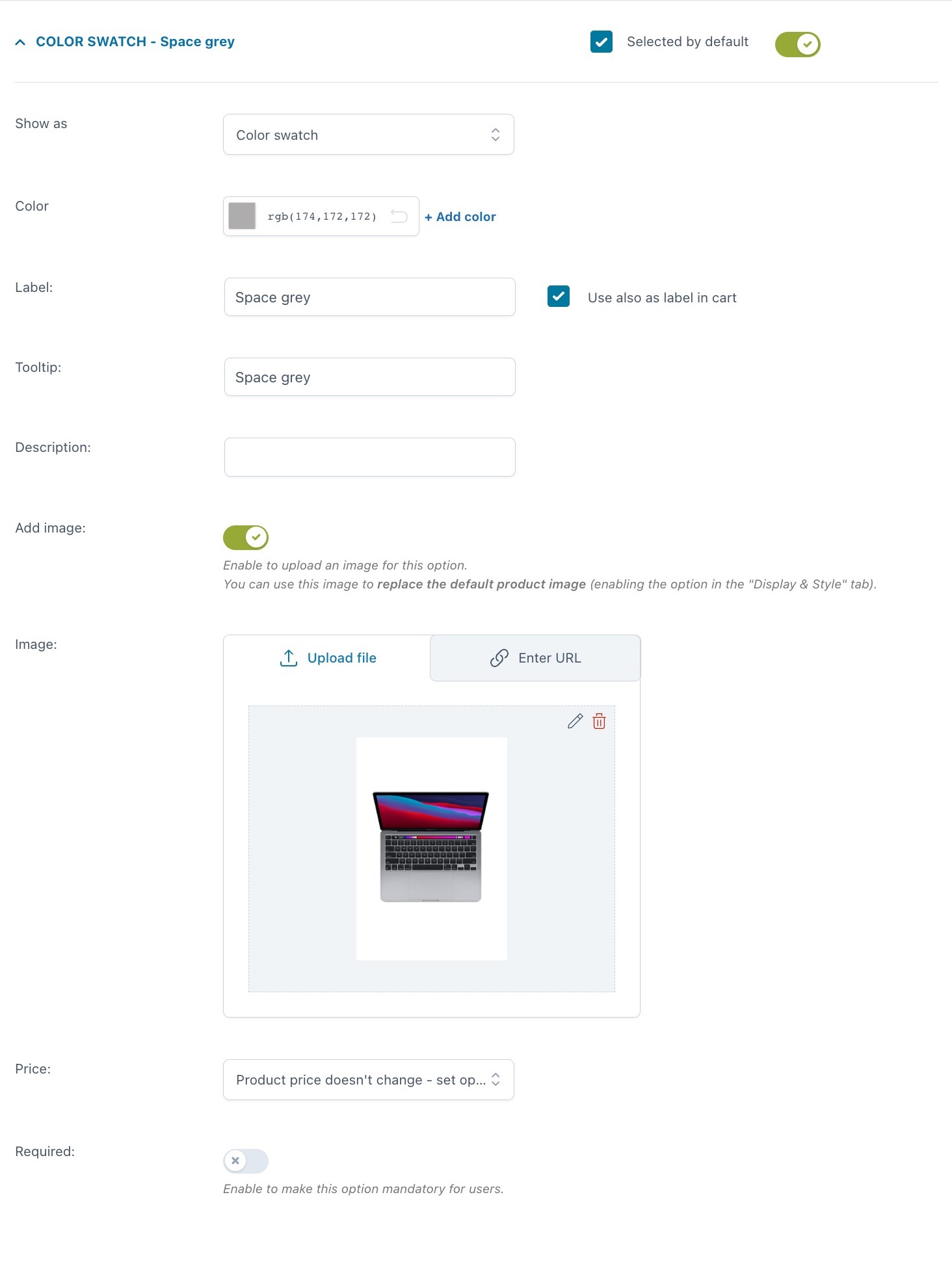
For every option you can set:
- Selected by default
- Show as:
- color swatch
- image swatch
- Color: pick the color from the spectrum or enter the hexadecimal code. You can also add an additional color by clicking on + Add color to create a bicolor option
- Label
- use also as label in cart
- label in cart: enter a text to show as a label in cart (available only if the option “Use also as label in cart” is not enabled)
- Tooltip
- Description
- Image: you can either upload a file or enter the URL
- Price: the option price can be calculated as a fixed or percentage amount from the product price:
- product price doesn’t change – set option as free
- increase the product price (on-sale available as well)
- discount the product price
- Required: if enabled, the customer cannot add the product to the cart without entering a text in this option.
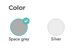
Example: you sell the Macbook Pro in two colors, space gray and silver gray. For each of them, you have not only selected a color using single color swatches but also uploaded an image of the MacBook in that color.
The settings are shown in the screenshot above, whereas below you can see how it looks on the frontend.

Number
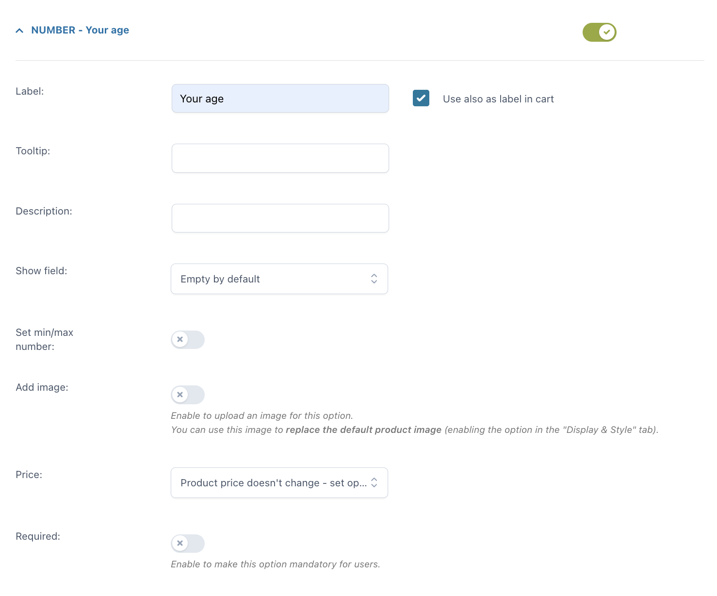
For every option you can set:
- Label
- use also as label in cart
- label in cart: enter a text to show as a label in cart (available only if the option “Use also as label in cart” is not enabled)
- Tooltip
- Description
- Show field: you can show the field empty by default or with a default number
- Set min/max number: here, you can set a minimum and maximum value
- Image: you can either upload a file or enter the URL
- Price: the option price can be calculated as a fixed or percentage amount from the product price:
- product price doesn’t change – set option as free
- increase the product price (on-sale available as well)
- price multiplied by value (this option will be available if you select Increase by product price): this allows you to multiply the option price by the number you enter
- discount the product price
- value multiplied by product price: this will multiply the product price by the number that you enter in the option.
- Required: if enabled, the customer cannot add the product to the cart without entering a text in this option.
Example: you can add a number add-on to collect the age of users for statistic purposes.

Select
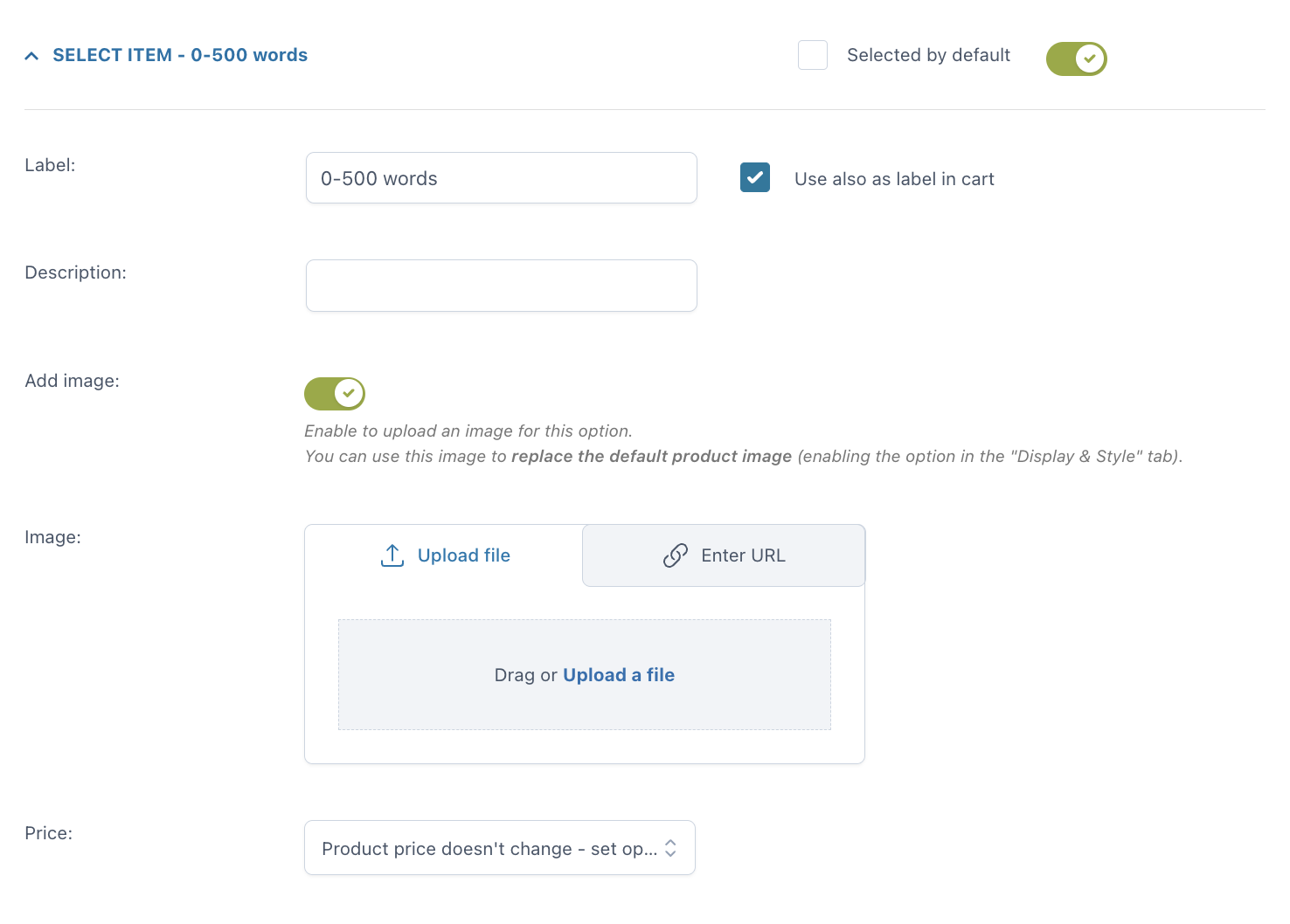
For every option you can set:
- Selected by default
- Label
- use also as label in cart
- label in cart: enter a text to show as a label in cart (available only if the option “Use also as label in cart” is not enabled)
- Description
- Image: you can either upload a file or enter the URL
- Price: the option price can be calculated as a fixed or percentage amount from the product price:
- product price doesn’t change – set option as free
- increase the product price (on-sale available as well)
- discount the product price
Example: you write copy and you offer two standard length for a blog post:
1. up to 500 words is the basic product price
2. 501 to 1000 words has an additional cost of $10.
Settings are in the screenshot above, frontend is below.

Label or image
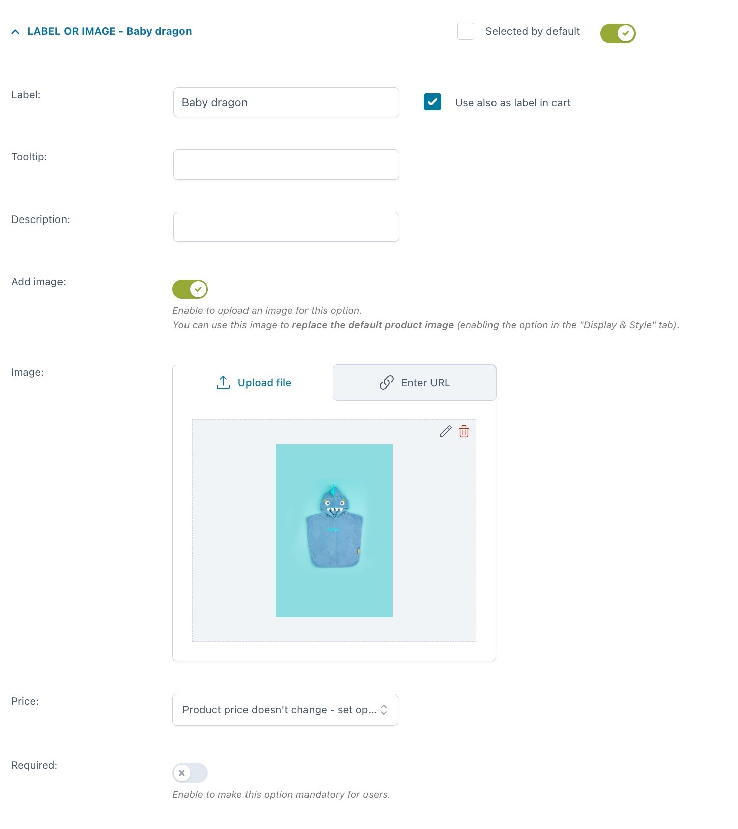
For every option you can set:
- Selected by default
- Label
- use also as label in cart
- label in cart: enter a text to show as a label in cart (available only if the option “Use also as label in cart” is not enabled)
- Tooltip
- Description
- Image: you can either upload a file or enter the URL
- Price: the option price can be calculated as a fixed or percentage amount from the product price:
- product price doesn’t change – set option as free
- increase the product price (on-sale available as well)
- discount the product price
- Required: if enabled, the customer cannot add the product to the cart without entering a text in this option.
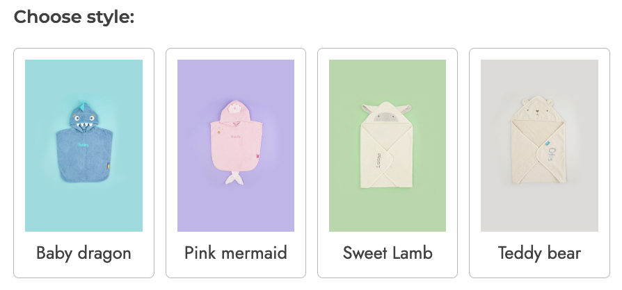
Example: you sell customizable baby towels, with 4 different options.
Product
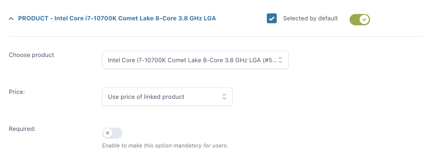
With the Product add-on, you can include one or more products (or product variations) as options for another product. This will automatically update the stock of the selected products.
For every option you can set:
- Selected by default
- Choose product: pick a product from your WooCommerce products
- Price: the option price can be calculated as a fixed or percentage amount from the product price:
- product price doesn’t change – set option as free
- increase the product price (on-sale available as well)
- discount the product price
- use price of linked product
- discount price of linked product: this discount will be available on the product only if the user buys it as an add-on.
Example: you sell a customizable computer and you can let your user choose every part of it by selecting a processor, motherboard, case, etc. Each of these parts will be an add-on with products/options the user can choose from.

Date
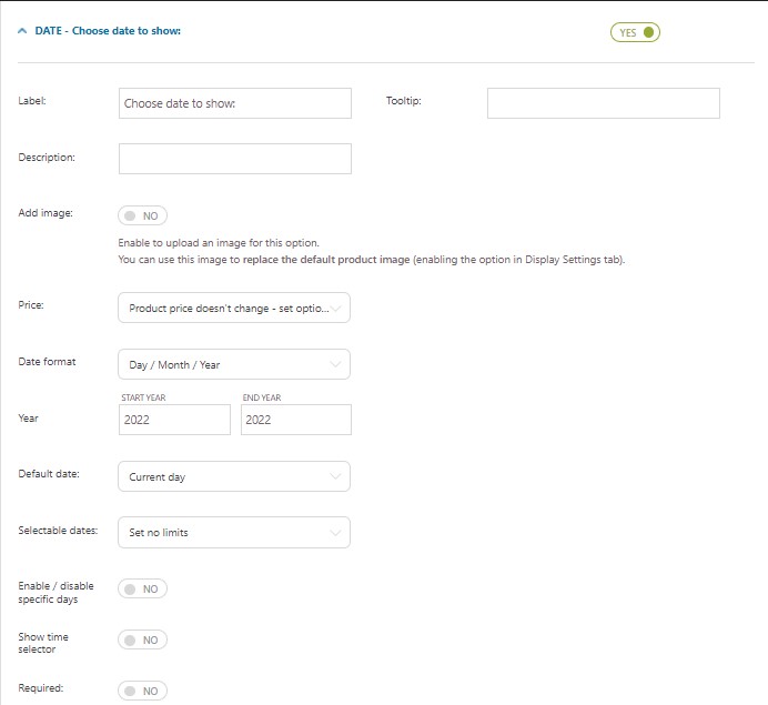
- Label
- Tooltip
- Description
- Image: you can either upload a file or enter the URL
- Price: the option price can be calculated as a fixed or percentage amount from the product price:
- product price doesn’t change – set option as free
- increase the product price (on-sale available as well)
- discount the product price
- Date format: choose between
- Day / Month / Year
- Month / Day / Year
- Day . Month . Year
- Year: select the start and end year you want to display in the calendar picker. You can refine these ranges with the options below.
For example, if you want to let your users select a delivery date only within the year 2023, select 2023 both in the start and end year, but if you want to let your users select their date of birth, make sure the start year goes back enough to cover your users’ actual age.

- Default date: this is the date that will be selected by default on the frontend:
- None
- Current day
- Current day + 1
- Set a specific day
- Set a time interval from current day: for example, 7 days from today
- First available date

- Selectable dates:
- Set no limits
- Set a range of dates – this allows you to select a date range from the current date. For example, the user will be able to select any date between 1 and 10 days from today.
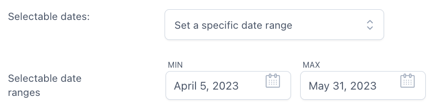
- Set a specific date range – this allows you to select a specific start date and end date (for example 20th – 30th May), static dates basically
- Disable dates previous to current day: all dates prior to the current day won’t be available for the selection.
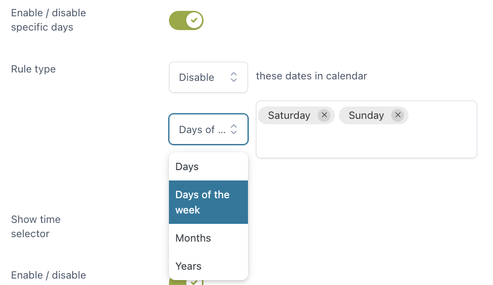
- Enable/Disable specific days: you can enable or disable specific days, days of the week, months or years in the calendar
- Show time selector: let your customers select also the time. You can either show every time slot available or enable/disable specific time slots. Choose also the time interval that will be used to automatically generate the time slots.
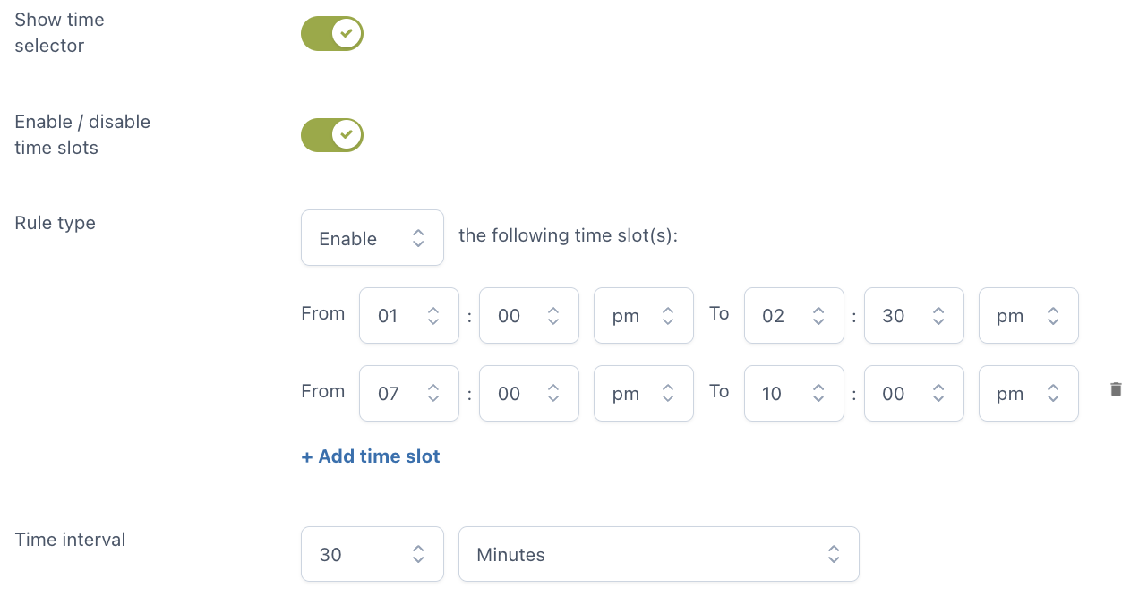
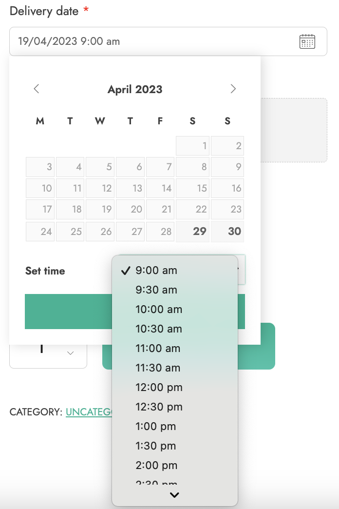
Example – in the following screenshot, you see time slots of 30 minutes between 9 am and 6 pm.
- Required: if enabled, the customer cannot add the product to the cart without entering a text in this option.
File upload
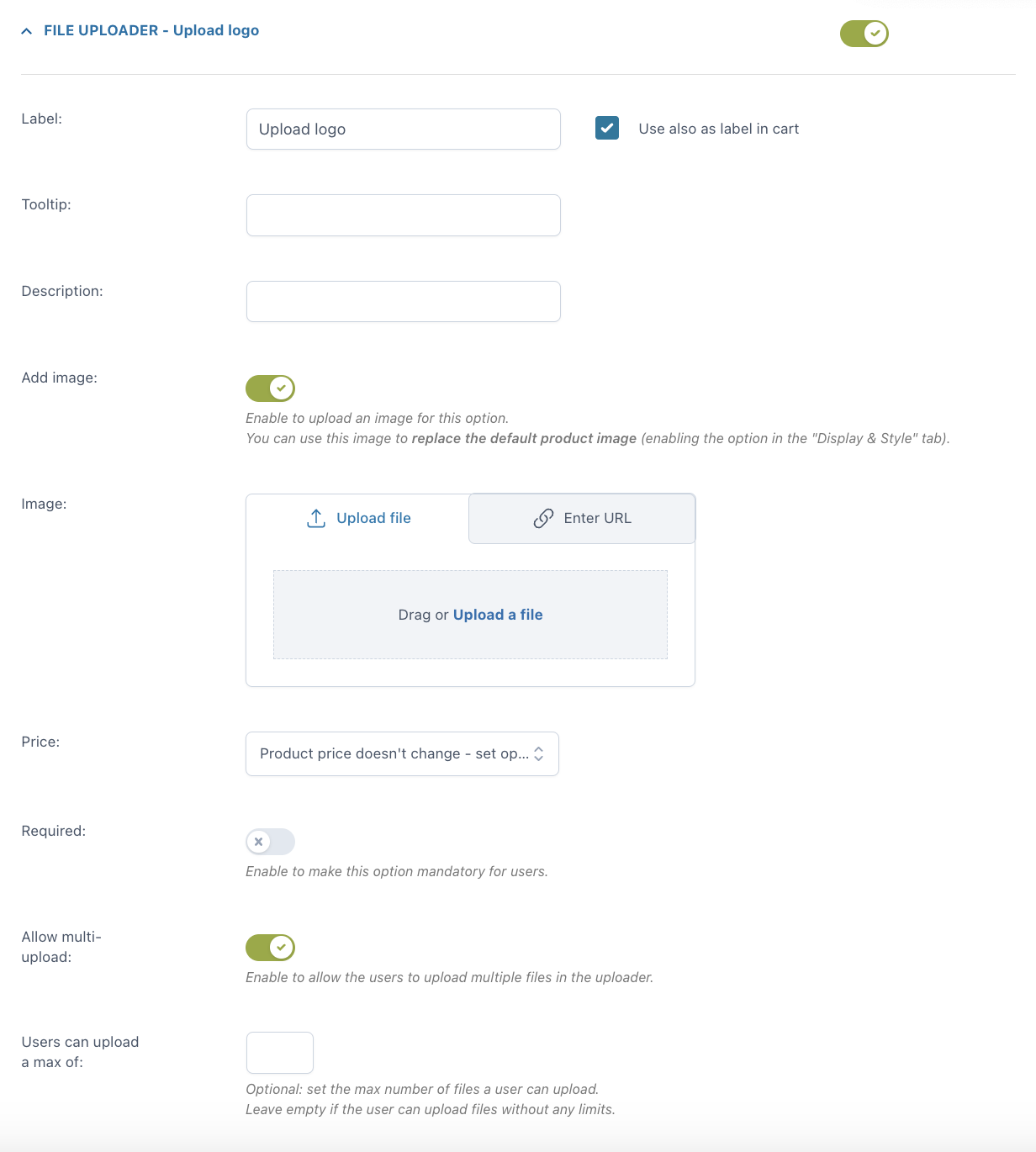
For every option you can set:
- Label
- use also as label in cart
- label in cart: enter a text to show as a label in cart (available only if the option “Use also as label in cart” is not enabled)
- Tooltip
- Description
- Image: you can either upload a file or enter the URL
- Price: the option price can be calculated as a fixed or percentage amount from the product price:
- product price doesn’t change – set option as free
- increase the product price (on-sale available as well)
- discount the product price
- Required: if enabled, the customer cannot add the product to the cart without entering a text in this option.
- Allow multi-upload: let your users upload more than one file in the uploader. Optionally, you can set the maximum number of files allowed.
Example: you sell a customizable T-shirt and let your customers upload their own image(s) to be printed on it.

For more global settings of your upload options, please, refer to this page.
Color picker
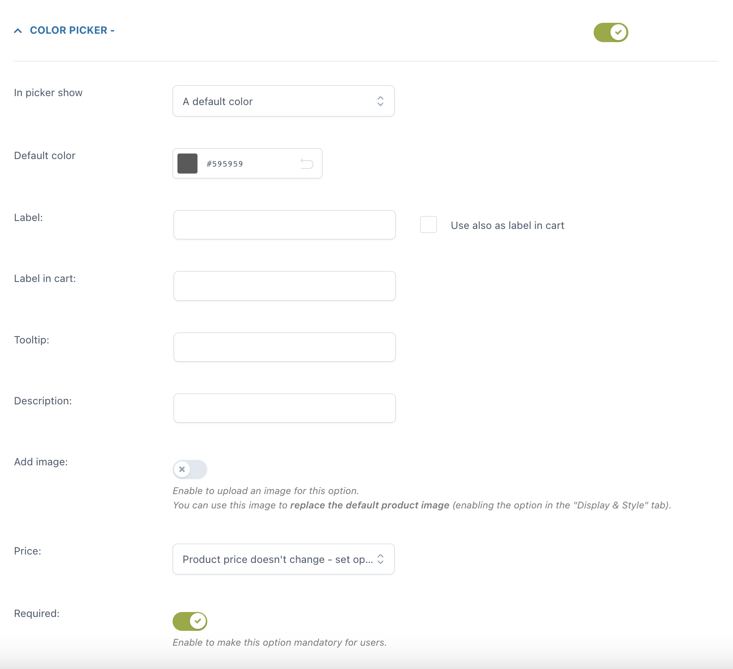
For every option you can set:
- the picker to show: you can choose from a default color and a placeholder text
- default color or placeholder according to the previous selection
- label
- use also as label in cart
- label in cart: enter a text to show as a label in cart (available only if the option “Use also as label in cart” is not enabled)
- tooltip
- description
- image: you can either upload a file or enter the URL
- Price: the option price can be calculated as a fixed or percentage amount from the product price:
- product price doesn’t change – set option as free
- increase the product price (on-sale available as well)
- discount the main product price
- Price: the option price can be calculated as a fixed or percentage amount from the product price:
- Required: if enabled, the customer cannot add the product to the cart without choosing a color in this option.
