From this tab, you can configure a set of display and style options. The options are the same for all types of options sets, except for the Select and Product sets which will be explained below on this page. Let’s analyze them together.
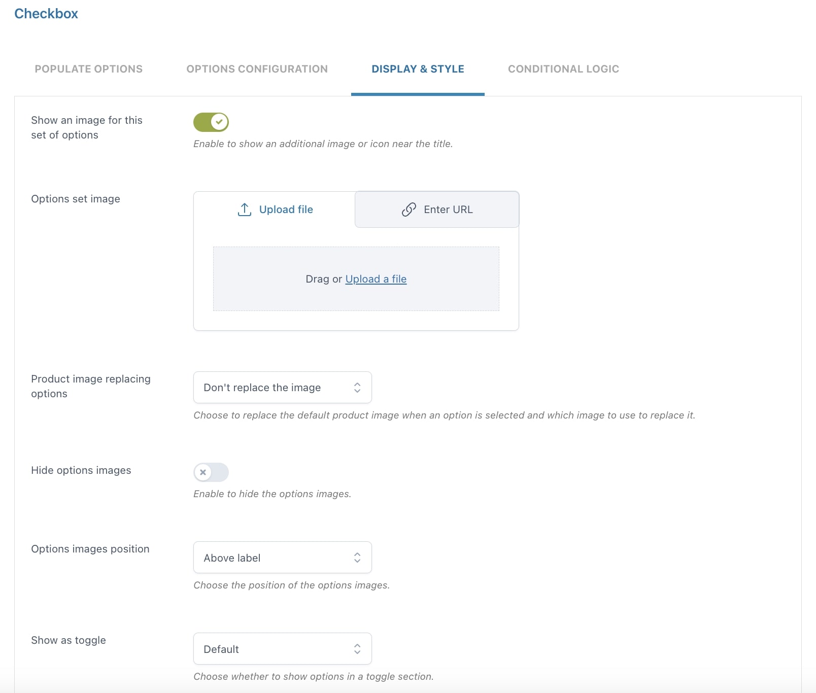
Show an image for this set of options
By enabling this option, you can show an additional image or icon near the title. You can have both an image for each option and an image for the set.
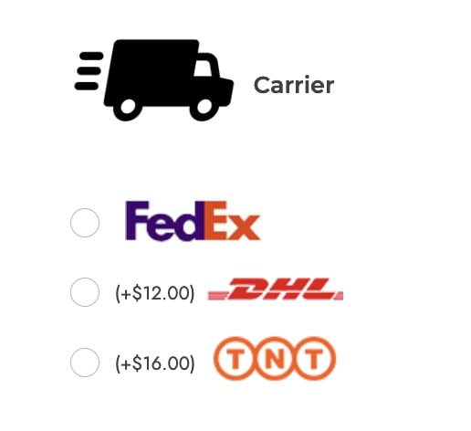
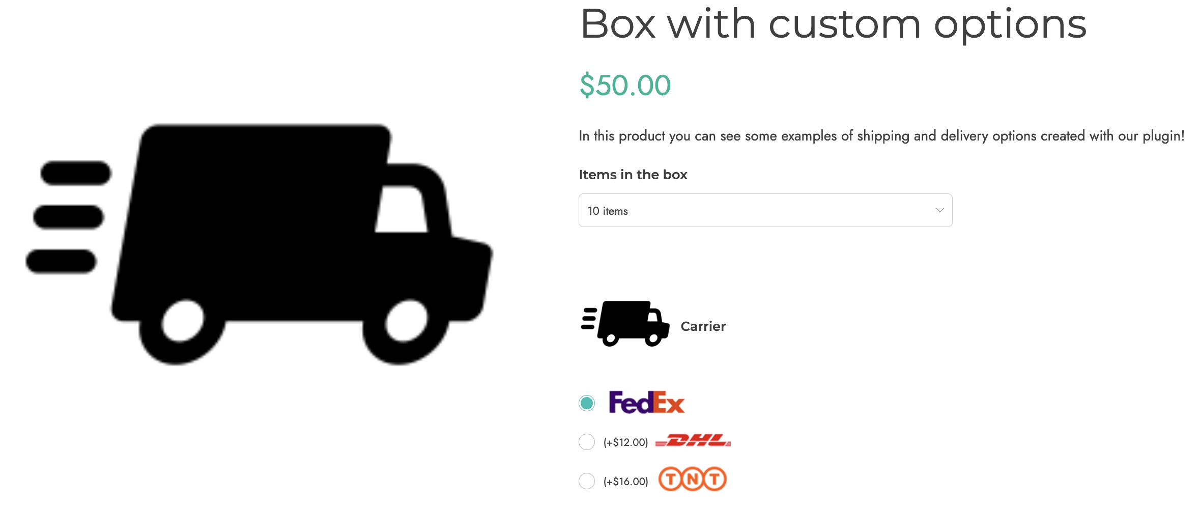
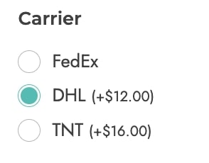
Example: in the screenshot below, we set a custom image for each option plus the additional add-on image (the “truck” icon), and set the images position to the right.
Product image replacing options
Choose to replace the default product image when an option is selected and which image to use to replace it.
- Don’t replace the image
- Replace with block image
- Replace with options image
Note: make sure that if you replace the product image either with the block image or the options image, you don’t have more than one add-on with these settings in the same product. If you have more, the replacement image will be the one of the last selected option.
Hide options images
Hide the images of all the options of this block in one click. Please note, that if you’re using an image color swatch, also this image will be hidden.
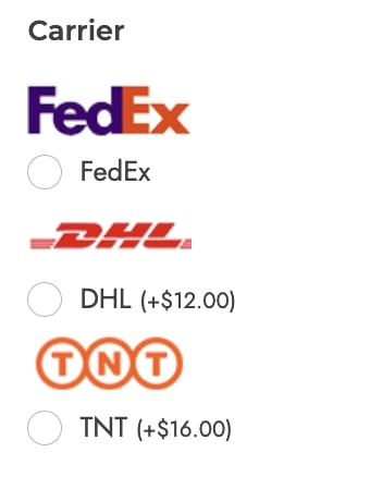
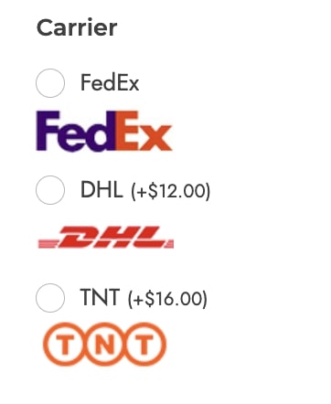
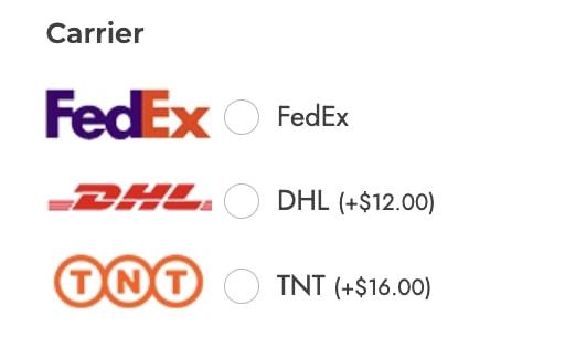
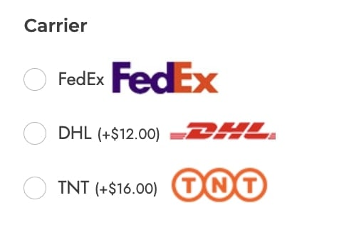
Options images position
Choose the position to show the options images from:
- above label
- under label
- left side
- right side
Show as toggle
- no
- yes, with toggle opened by default
- yes, with toggle closed by default

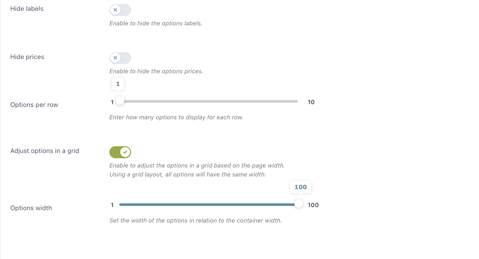
Hide options labels
Hide the labels of all the options of this block in one click.
Hide options prices
Hide the prices of all options in this add-on in one click.
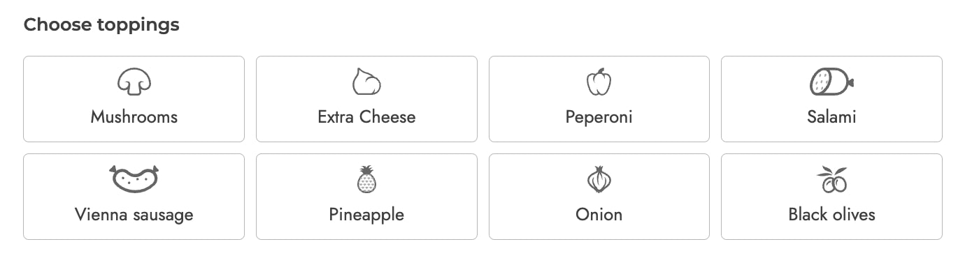
Options per row
Use the slider to choose the number of options (from 1 to 10) to show in each row.
Use a grid layout
Enable to adjust the options in a grid based on the page width. This is particularly useful when you have many options with texts of different lengths: forcing them into a grid will make them cover the same space.
Select
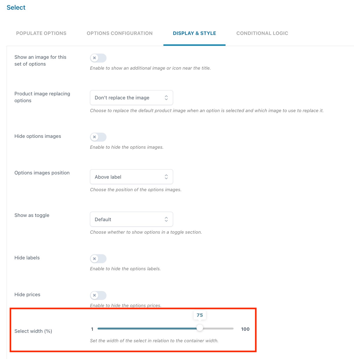
For the Select type, in addition to the other display and style options, you will also be able to define the width (in %) of the select in relation to the container. The value can be configured from 1 to 100.
Product
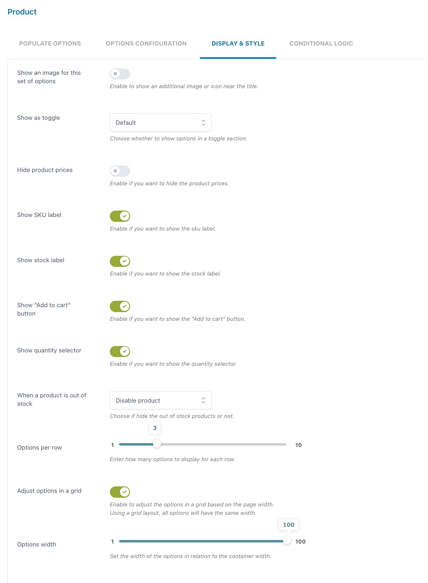
The Display & Style options of the “Product” type differ from the general ones.
Show an image for this add-on: enable to show an additional image or icon near the title.
Show as toggle:
- no
- yes, with toggle opened by default
- yes, with toggle closed by default
Hide options prices: hide the prices of all options of this block in one click.
Show SKU label: enable to show the related product SKU.
Show stock label: enable to show the stock info and quantity (if set).
Show add to cart button: enable if you want that customers can not only select these products as options of the main product but also add them to the cart as individual products.
Show quantity selector: enable to let your customers select the quantity of the product.
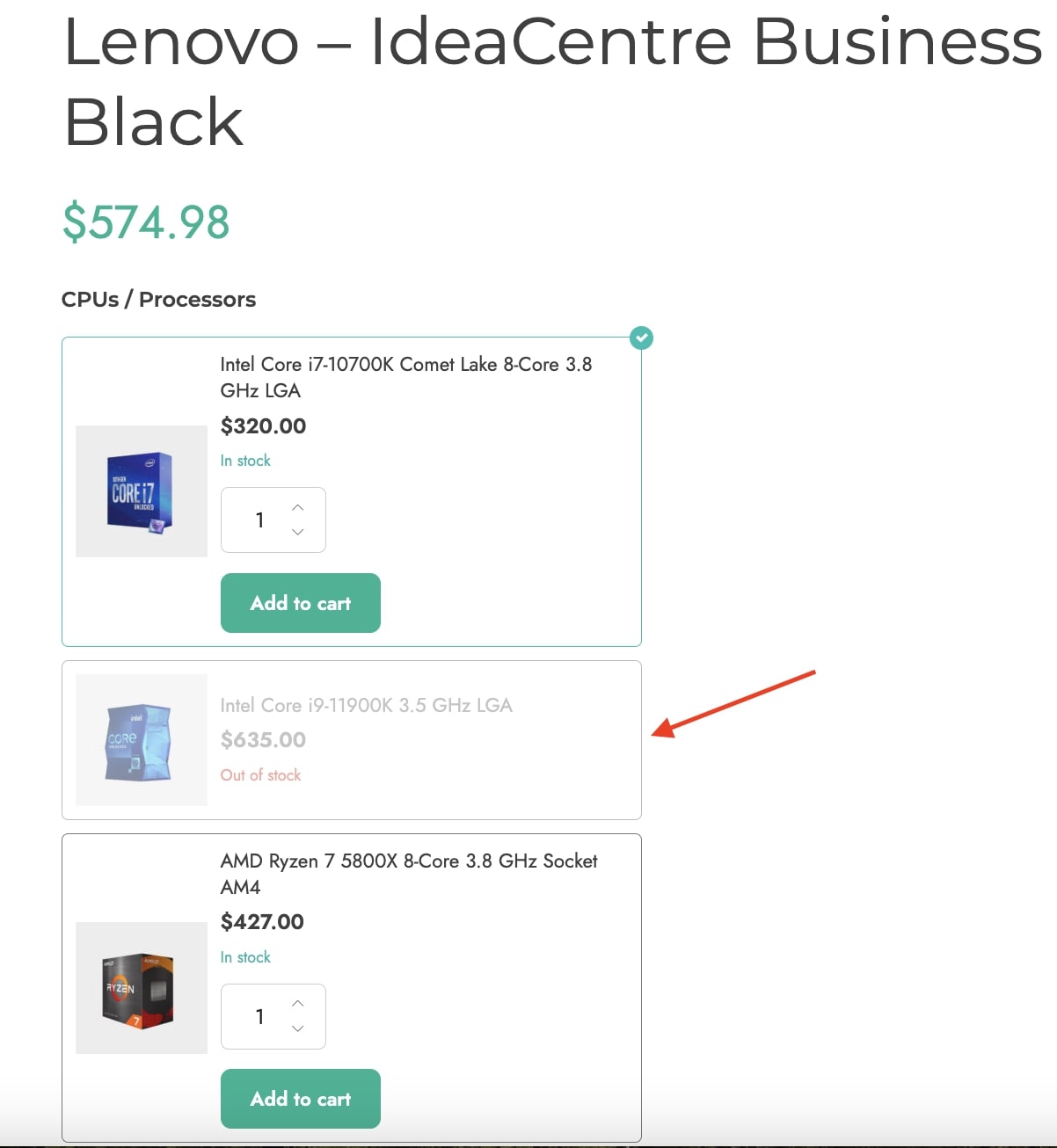
When a product is out of stock: you can either hide the product or disable it so that users can’t select it. Below is an example of an out-of-stock product disabled.
Options per row: use the slider to choose the number of options (from 1 to 10) to show in each row.
Adjust options in a grid: enable to adjust the options in a grid based on the page width.