In the Style tab, you will be able to configure all the style-related options that apply to all add-ons globally.
Block style
Let’s start with the options of the first section: Block style.
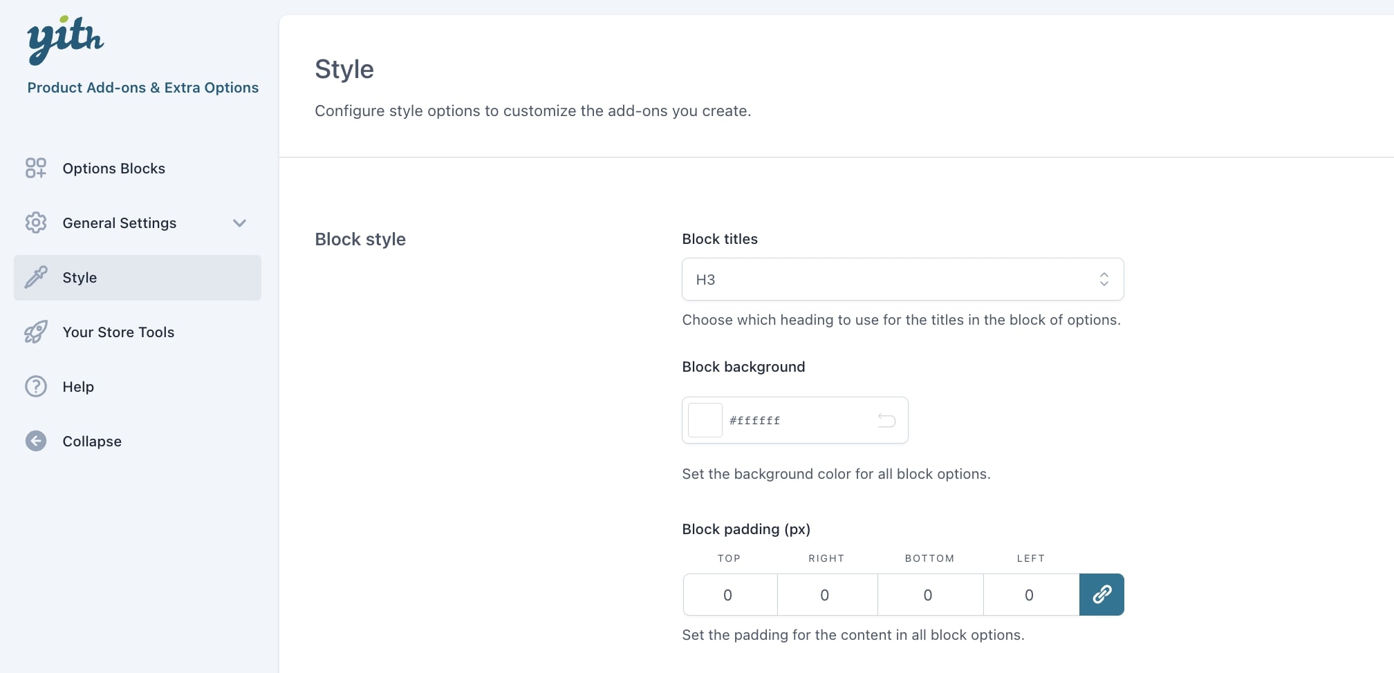
Block titles: choose here the default heading for the title in the block of options. You can select any tag between H1 and H6, and it will apply to all your add-ons titles.
Block background: set the background color for all block options.
Block padding: set the padding for the content in all block options.
Toggle
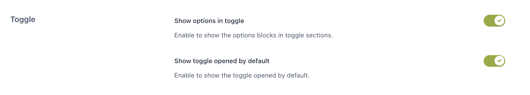
Show options in toggle: enable to show the options blocks in toggle sections.
Show toggle opened by default: enable to show the toggle opened by default.
If you want to override these settings for one or more add-ons, you can do that from the “Display & Style” tab available for all add-ons types.
Form style
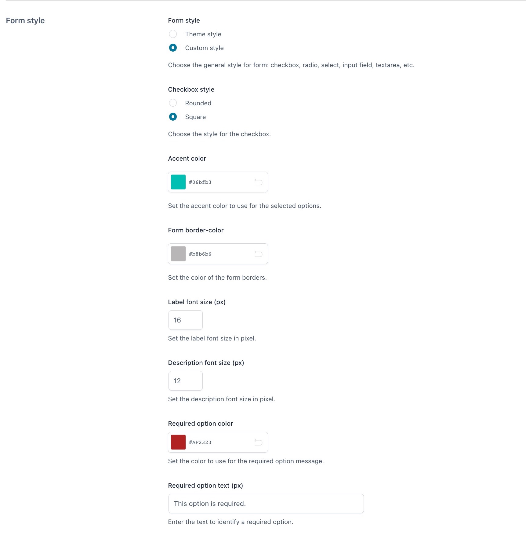
Form style: choose the general style for the form elements: (checkbox, radio, select, input, textarea, etc.):
- theme style: select this if you want that all style elements are inherited from the theme style, or
- custom style: set your custom style using the options that will appear below
Checkbox style: choose between rounded or square.
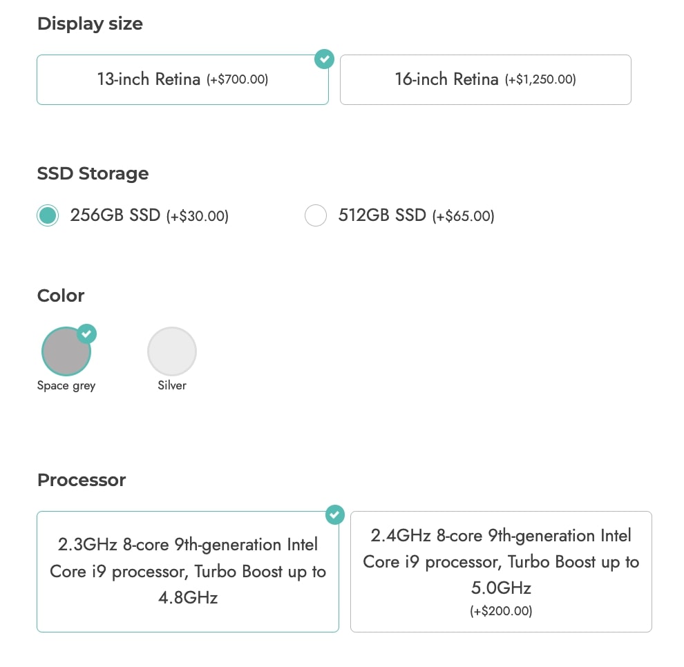
Accent color: set the accent color (e.g. green in the screenshot below).
Form border color: set the color of the borders in the form.
Label font size (px): set the font size of all options labels in pixels.
Description font size (px): set the font size of all options labels in pixels.
Required option color: set the color of the options set as required
Required option text (px): enter a custom text that identifies the required options
Price box style
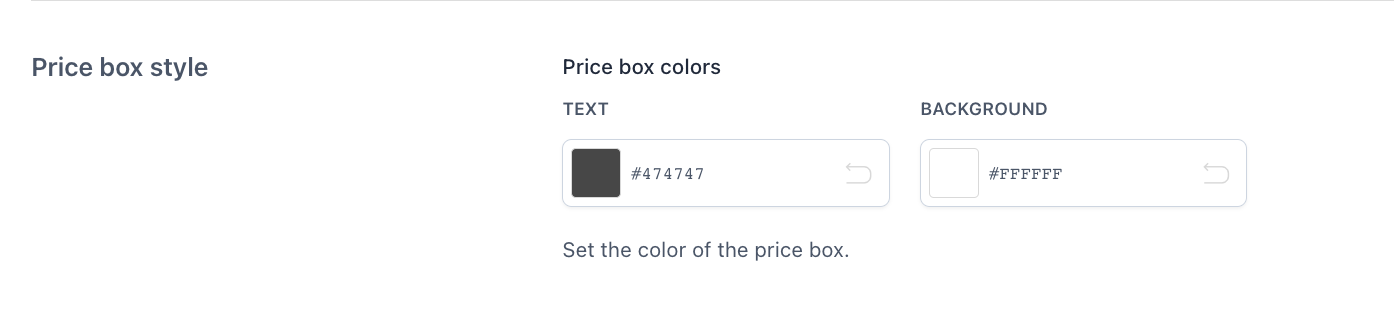
Price box style: set the text and background colors for the price box.
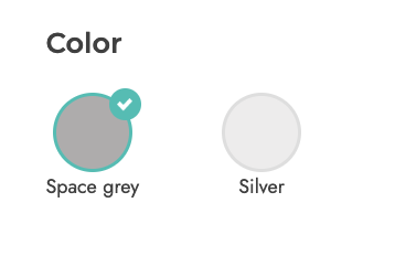
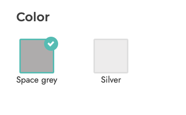
Color swatches
These settings apply to all color swatches across your site:

Color swatch style: choose between
- rounded
- square
Color swatch size (px): set the size of the color thumbnails.
Labels/images
In the next section, you will be able to set up the options of all labels and images type of options globally. Yet, these settings can be overridden from every single label/image add-on.
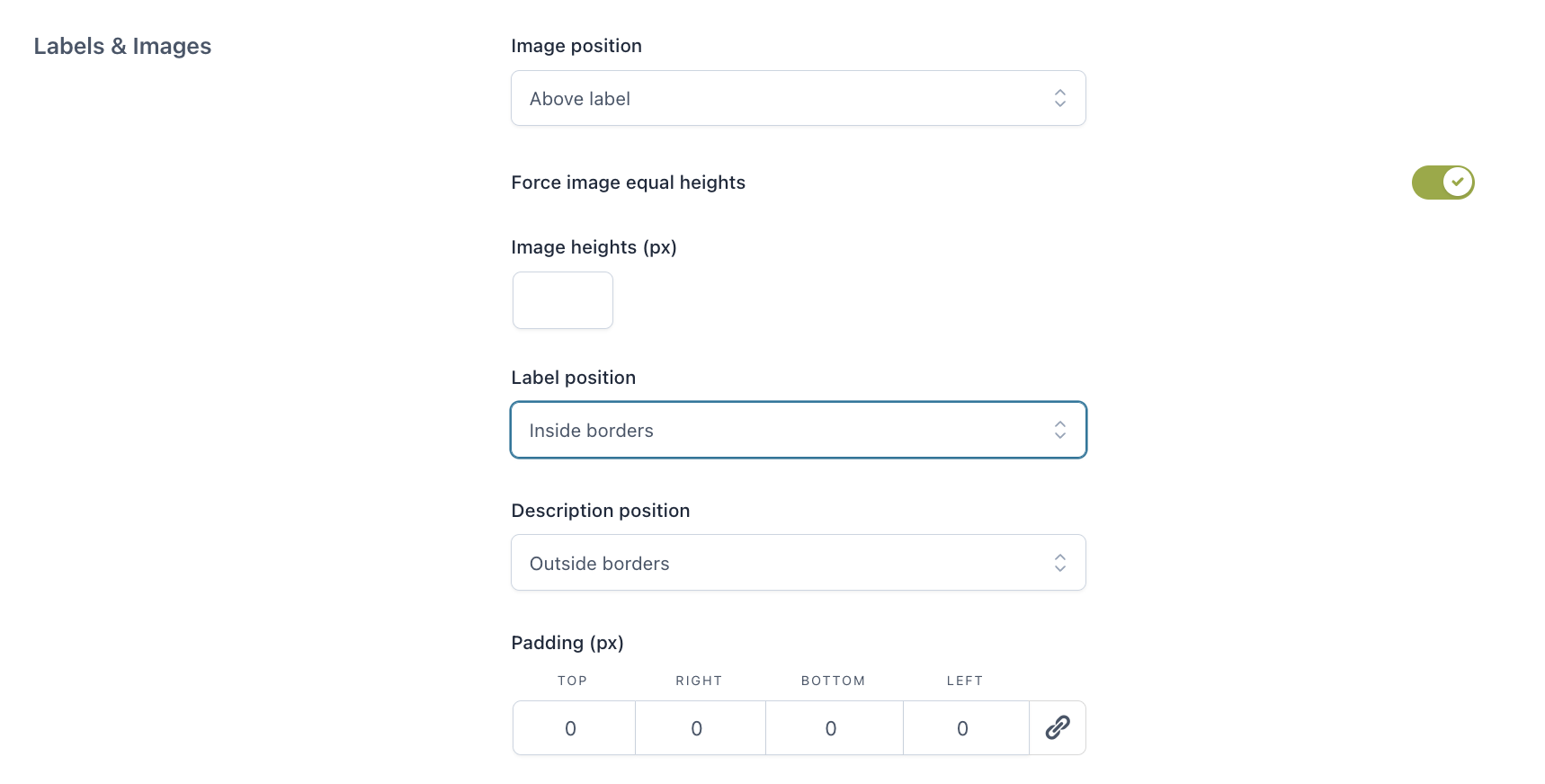
Image position:
- above label
- below label
- left side
- right side
Force image equal heights: enable this to force the height of all options images to the same size. This is particularly useful if you use different sizes and ratios for your options images. If enabled, you will be able to set the exact size in pixels in the option Image heights (px).
Label position: choose here whether to show the label text inside or outside the borders.
Description position: choose here whether to show the description of a label/image option inside or outside the borders.
Padding (px): set the padding of all label options in pixels.
If you want to override these settings for one or more add-ons, you can do that from the “Display & Style” tab of label/image options.
Tooltip
Here you can set the tooltip options for all the add-ons across your website.
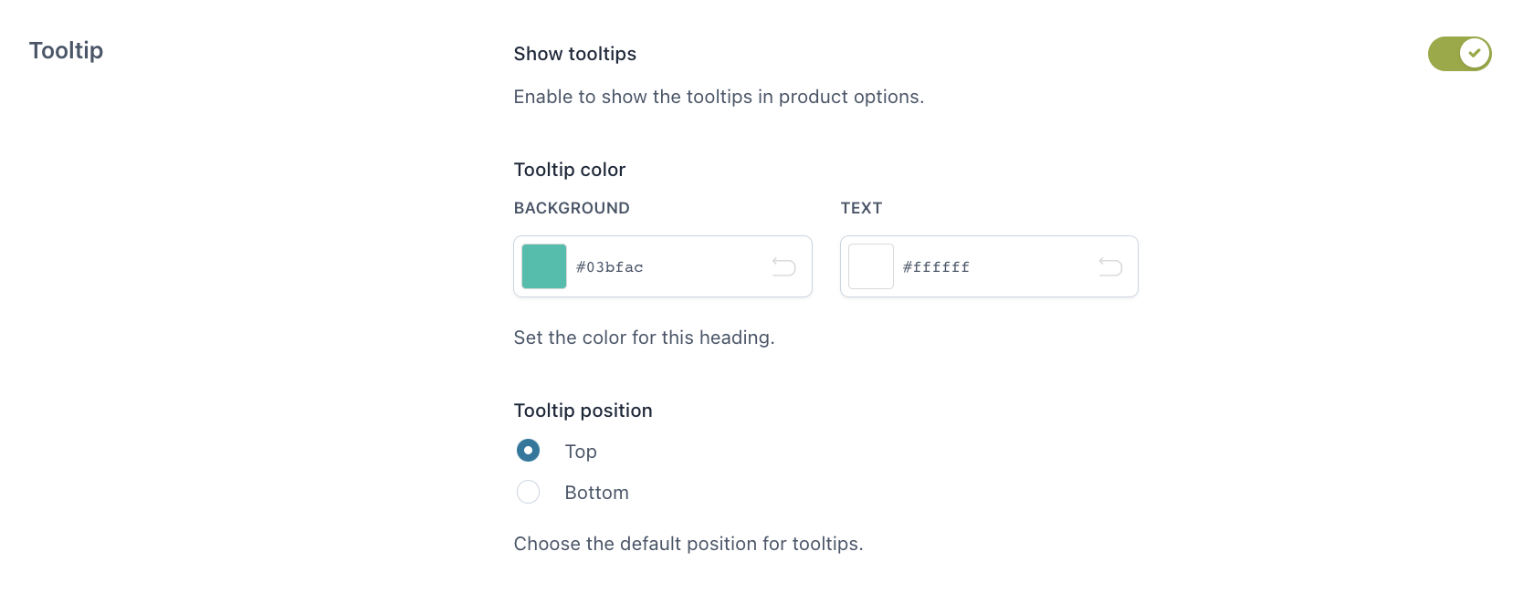
Show tooltips: enable to show the tooltips of your product options. You will be able to set up a custom text from the options settings.
Tooltip color: choose here both the background and the text colors.
Tooltip position: choose the default position between top and bottom.
Upload file
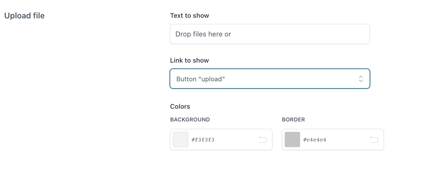
Text to show: enter the text to show in the file uploader.
Link to show: show the upload option as an “upload” button or a textual “browse”.
Colors: set the background and border colors of the upload box.