View Product Page

General options

In the General settings tab, you will find two sections, the first of which is about General options, let’s check them one by one.

General options

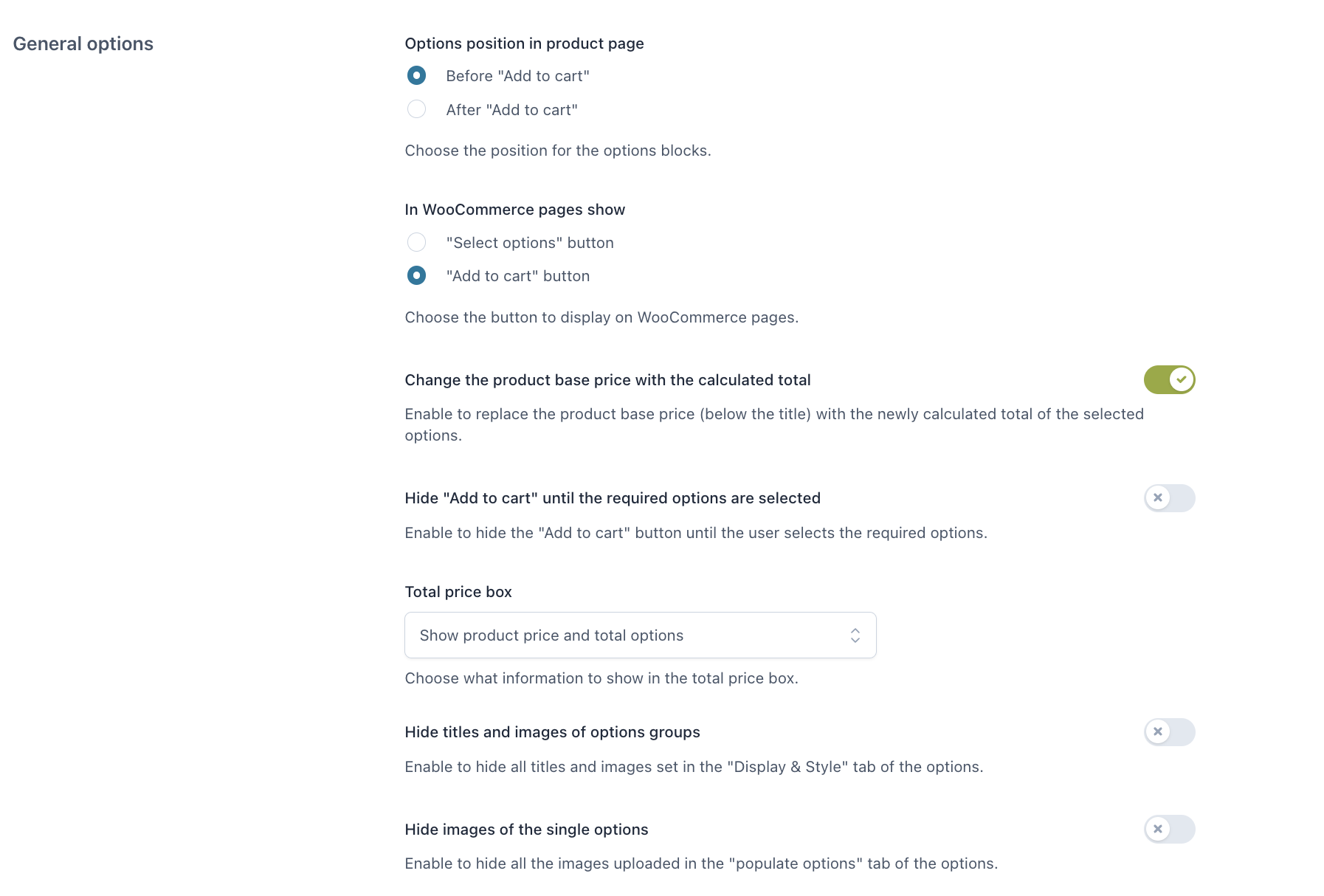
Options position in product page:

  • Before “Add to cart”
  • After “Add to cart”

In WooCommerce pages show:

  • “Select options” button
  • “Add to cart” button

Both of them will take the user to the product page, where the user can configure the add-ons.

Label for “Select options” button: customize here the text of the “Select options” button that shows on archive pages when a product has options to be selected.

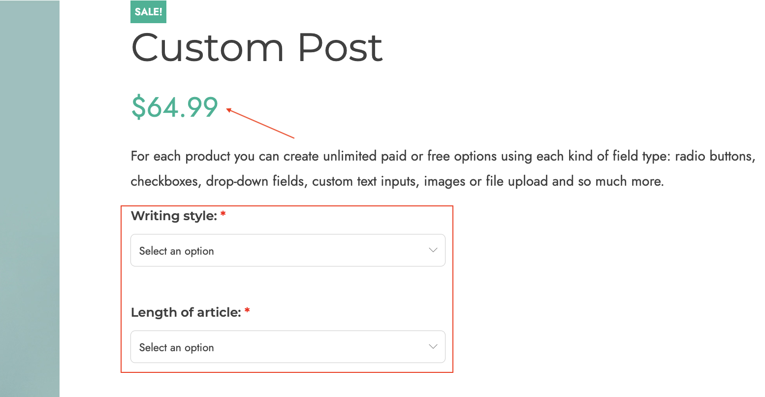
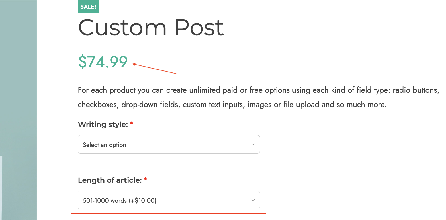
Change the product base price with the calculated total: enable to replace the product base price (below the title) with the newly calculated total of the selected options.

No paid option selected
Paid option selected

Hide “Add to cart” until the required options are selected: if your product includes required options to be selected, enable this to make sure the “Add to cart” button is hidden until they are selected. Leave it disabled, if you want to show the “Add to cart” button but keep it disabled until the required options are selected.
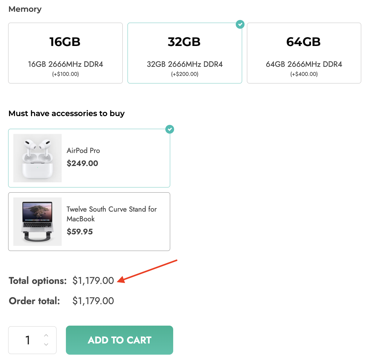
Total price box:

Total price box
  • Show product price and total options
  • Show the final total but hide options total only if the value is 0
  • Show only the final total
  • Hide price box on the product page
Total options

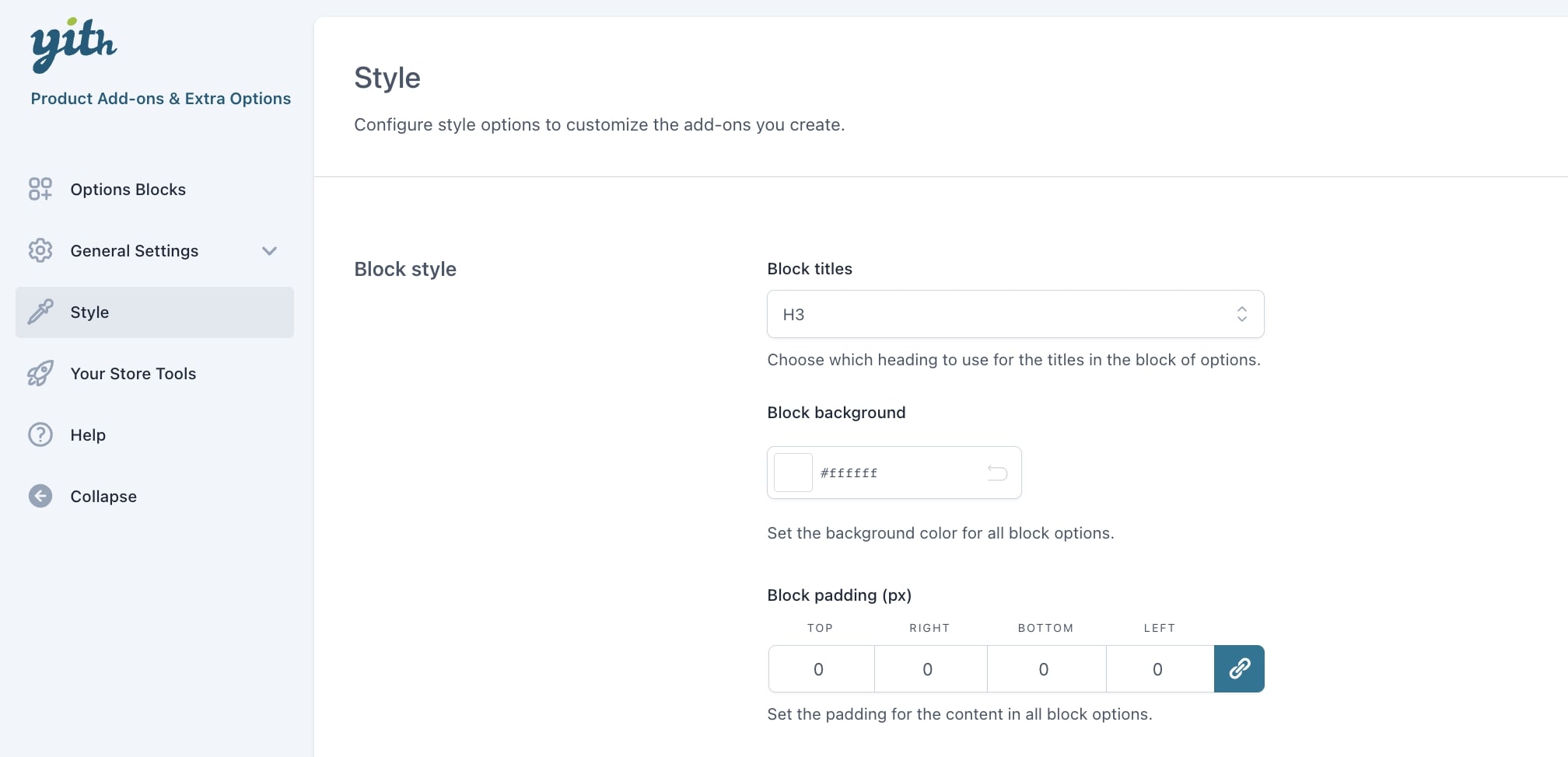
Hide titles and images of options groups: enable to hide all titles and images set in the “display” tab of the options.

Hide images of all singular options: enable to hide all the images uploaded in the “populate options” tab of the options.
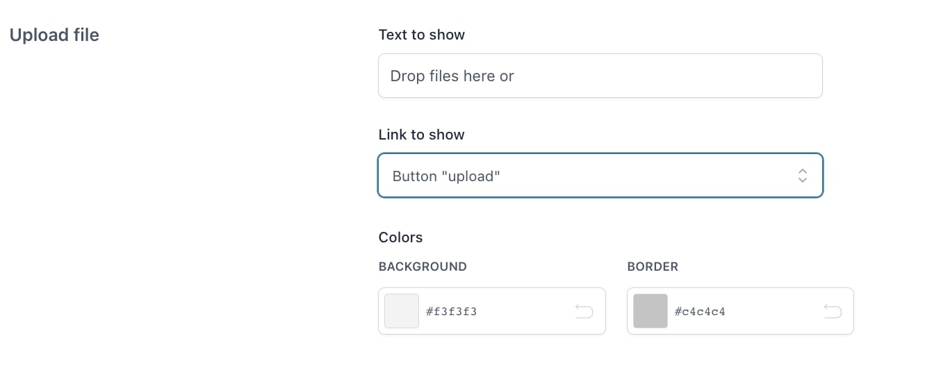
Upload options

Upload options

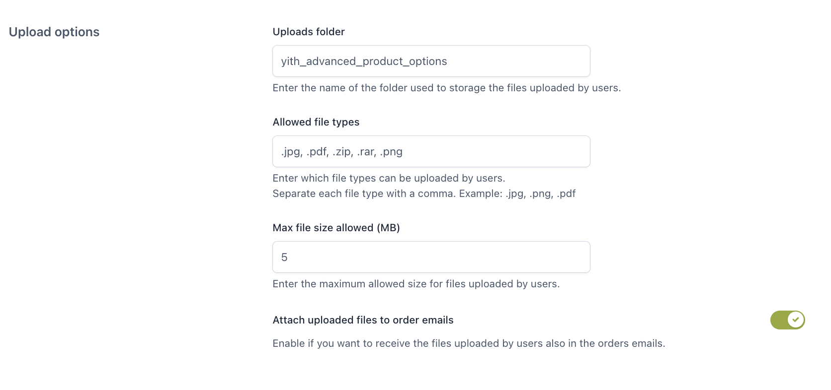
Uploads folder: enter the folder name where the files uploaded by the user will be stored.

Allowed file types: enter the file types (comma separated) that can be uploaded.

Max file size allowed: enter the maximum allowed size for files uploaded by the user.

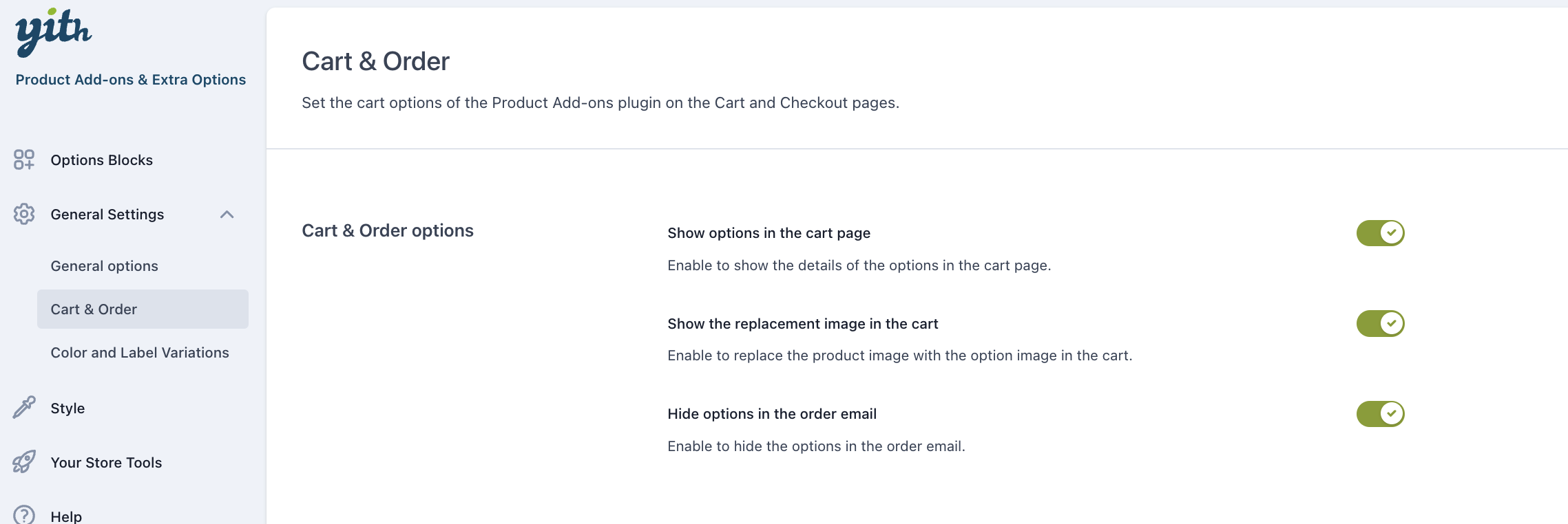
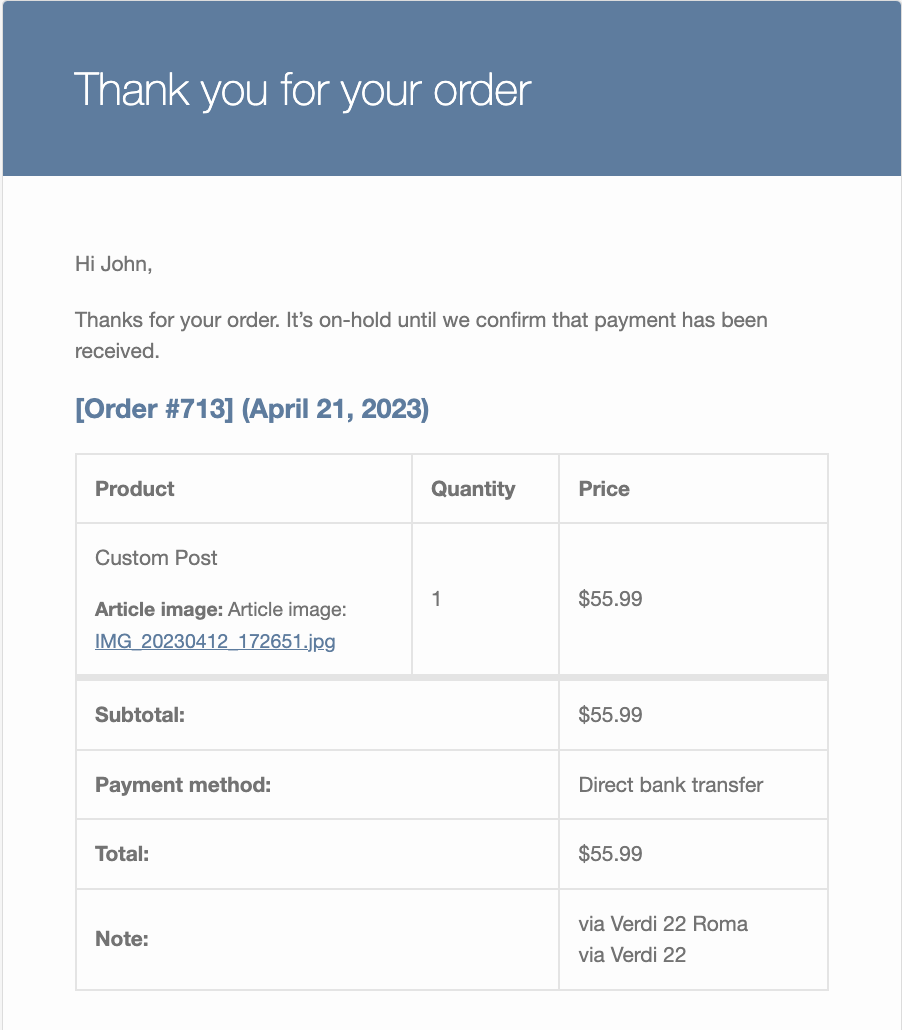
Attach uploaded files to order emails: enable to attach the files uploaded by users to the order emails.
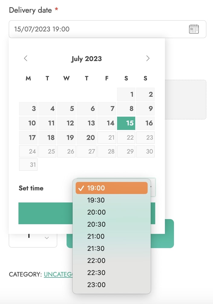
Order email

Date options

Date options
  • 24-hour time format: enable this option if you want to show the time picker in the Date add-on type with a 24-hour format.
Time format

Cart & Order

Still from the General settings tab, go to Cart & Order options to configure the following settings:

Show options in cart page: enable to show the details of the selected options in the Cart page.

Options in Cart page

Allow options editing in the cart: Enable this option to allow users to edit options directly in the cart, a new button ”Edit options” will be available in the cart.

By clicking it a modal window will be available to let you edit and update the add-ons previously selected (product variations included).

Show the replacement image in the cart: enable to replace the product image with the option image in the cart.

Hide options in the order email: enable to hide the selected options in the order email.

Style

In the Style tab, you will be able to configure all the style-related options that apply to all add-ons globally.

Block style

Let’s start with the options of the first section: Block style.

Block style

Block titles: choose here the default heading for the title in the block of options. You can select any tag between H1 and H6, and it will apply to all your add-ons titles.

Block background: set the background color for all block options.

Block padding: set the padding for the content in all block options.

Toggle

Toggle

Show options in toggle: enable to show the options blocks in toggle sections.

Show toggle opened by default: enable to show the toggle opened by default.

If you want to override these settings for one or more add-ons, you can do that from the “Display & Style” tab available for all add-ons types.

Form style

Form style

Form style: choose the general style for the form elements: (checkbox, radio, select, input, textarea, etc.):

  • theme style: select this if you want that all style elements are inherited from the theme style, or
  • custom style: set your custom style using the options that will appear below

Checkbox style: choose between rounded or square.

Accent color: set the accent color (e.g. green in the screenshot below).

Form border color: set the color of the borders in the form.

Form border colors

Label font size (px): set the font size of all options labels in pixels.

Description font size (px): set the font size of all options labels in pixels.

Required option color: set the color of the options set as required

Required option text (px): enter a custom text that identifies the required options

Price box style

Price box style

Price box style: set the text and background colors for the price box.

Color swatches

These settings apply to all color swatches across your site:

Color swatches

Color swatch style: choose between

  • rounded
  • square
Rounded
Square

Color swatch size (px): set the size of the color thumbnails.

Labels/images

In the next section, you will be able to set up the options of all labels and images type of options globally. Yet, these settings can be overridden from every single label/image add-on.

Lbel & Images

Image position:

  • above label
  • below label
  • left side
  • right side

Force image equal heights: enable this to force the height of all options images to the same size. This is particularly useful if you use different sizes and ratios for your options images. If enabled, you will be able to set the exact size in pixels in the option Image heights (px).

Label position: choose here whether to show the label text inside or outside the borders.

Description position: choose here whether to show the description of a label/image option inside or outside the borders.

Padding (px): set the padding of all label options in pixels.

If you want to override these settings for one or more add-ons, you can do that from the “Display & Style” tab of label/image options.

Tooltip

Here you can set the tooltip options for all the add-ons across your website.

Tooltip

Show tooltips: enable to show the tooltips of your product options. You will be able to set up a custom text from the options settings.

Tooltip color: choose here both the background and the text colors.

Tooltip position: choose the default position between top and bottom.

Upload file

Upload file

Text to show: enter the text to show in the file uploader.

Link to show: show the upload option as an “upload” button or a textual “browse”.

Colors: set the background and border colors of the upload box.