Site Identity

In the Site Identity menu, you will be able to customize the following options that appear as separate sections:

  1. Site logo
  2. Site title
  3. Tagline
  4. Favicon

Site identity

1. Site logo

Enable the logo option to upload your own logo image. You will be able to also set its maximum width in pixels.

2. Site title

Enable the site title option to show a custom title for your site. You can also customize:

  • font
  • font weight & style
  • font size in pixels
  • color
  • spacing

3. Tagline

Enable the tagline (the text just below the site title) and customize:

  • font
  • font weight & style
  • font size in pixels
  • color
  • spacing
  • position: it can either be below or in line with the title

4. Site Icon

You can upload here your custom site icon, which has to be square and at least 512 × 512 pixels. Site Icons are what you see in browser tabs, bookmark bars, and within the WordPress mobile apps.

Topbar

Topbar

The Topbar can be enabled or disabled to achieve your design goal. Once enabled you will be able to edit the settings and customize the background color, spacing, typography, elements alignment and add a border as well.

When enabled, the topbar becomes a widget area where you can add custom widgets.

topbar with widgets

You can configure widgets from Appearance > Widgets.

Header layout and style

The menu Header layout and style includes four submenus, where you can configure every part of the header.

1. Header layout

Header layout


Choose the layout of the header and the position of the site logo and navigation in it.

Available options:

  • Logo on the left and navigation below
  • Logo on the left and navigation inline
  • Centered logo and navigation below

Spacing: here you can set up a custom spacing value (in pixels) for every side of the header

Enable full width header: this option is very useful if you want to achieve a particular wide layout for your website (for example when using full width editor blocks to display page contents).

2. Header elements

Header elements

Here you can enable the icons that quickly link to:

  • Search bar
  • Cart (either use the default one or upload a custom icon from your library)
  • User account

They will show up on the right side of the header as quick links for your users.

Header elements - icons

Show header widget area

Enable this option to show the Header widget area on the top right corner, next to the active icons if enabled. You can configure widgets from Appearance > Widgetsor from the Customizer > Widgets.

3. Header menu options

Header menu options

Here you can customize the style of the header menu:

  • font
  • weight & style
  • font size
  • text transform (uppercase, lowercase, capitalize)
  • letter spacing
  • text color
  • text color on hover
  • spacing (pixels): this is the spacing of the all the text in the header left aside the widget areas

4. Sticky header

Sticky header

Enable this option to add a fancy modern look to your website and let the header stick to the page even when the user scrolls down. You can give it a different look when you scroll down the page.

You can change:

  • background color
  • text color
  • text color on hover
  • spacing (pixels)

For example you can change the background color opacity, so the user can see through it when scrolling down the page.

Header opacity

Header background image

You can also customize the header background with your own image.

Recommended size: 1920 × 250 pixels — for a perfect fit, you’ll be able to crop your image once uploaded.

If you add more than one image and enable the Randomize option, the images will be randomly loaded every time that the page is refreshed.

Header background

Sidebars

YITH Proteo theme supports a total of 13 sidebars that you can customize by adding widgets from Appearance > Widgets.

Proteo widgets

Additionally, the theme allows you to pick one of those sidebars and set the position for the following pages:

  • All posts and pages
  • Main blog page (the blog page is where all your posts are listed)
  • All blog categories pages
  • All blog tags pages

To set this up, you can go to YITH Theme Options > Sidebars and choose a custom layout for them.

Proteo sidebars

If you want to override these settings for specific posts or pages, you can do that from the post or page details. Please, read more about this in Page/Post options menu of this documentation.

Sticky sidebar

Sticky sidebar

In Layout options, you can also choose whether to enable the sticky sidebar or not.

Do you have an e-commerce website? Check the WooCommerce menu in this documentation to find out more about sidebars on shop and product pages.

Footer Options

This section contains submenus for:

1. Footer background

2. Footer typography

3. Footer widgets

Background

Available options:

  • Background color
  • Background image: the image will override the background color, so for example, you can also use a .png image over the background color
  • 100% background image: this option will make sure the image covers the full area of the footer.
  • Background repeat: this option only appears if the “100% background image” option is set to NO. You will also be able to set the “repeat” option and choose among:
    • Do not repeat
    • Repeat horizontally
    • Repeat vertically
    • Repeat vertically and horizontally
  • Background position:
    • left top
    • left center
    • left bottom
    • right top
    • right center
    • right bottom
    • center top
    • center
    • center bottom

Footer typography

You can customize here the typography options for the texts in the widgets:

  • Font size: default to 16px
  • Font color
  • Hyperlink color
  • Hyperlink color on hover
  • Widgets title font size
  • Widgets title color
  • Elements alignment:
    • Left
    • Center
    • Right

Widget areas

In this section you can enable up to two widget areas in the footer and for each of them configure the following options:

  • width (%): it stands for the percentage value that it takes related to the total footer area (starting from the left). For example, if it’s set to 50% it will only cover half the size of the footer.
    Widget examples
  • columns: you can choose up to 6 columns (and so slots for widgets) for every widget area. Please, note that if you choose 4 as a value for this option and you add 5 widgets in this widget area, the fifth widget will go into a new line.

Additionally, you can choose also whether to put the two widget areas side by side, instead of showing them one below the other as it is by default.

Please, note, if you set this option, you will have to make sure that the percentage width of both widget areas is no more than 100%, otherwise the second widget area will be however shown below and not aside. For example, 50% + 50% or 30% + 70% and so on.

Footer Credits

Footer credits are is generally used to display textual information about site copyright, but you can add also shortcodes in this panel.

Background color, typography and alignment options are available too.

Credits

Typography

In the Typography menu you will be able to customize every option related to text, with custom settings for every kind of heading.
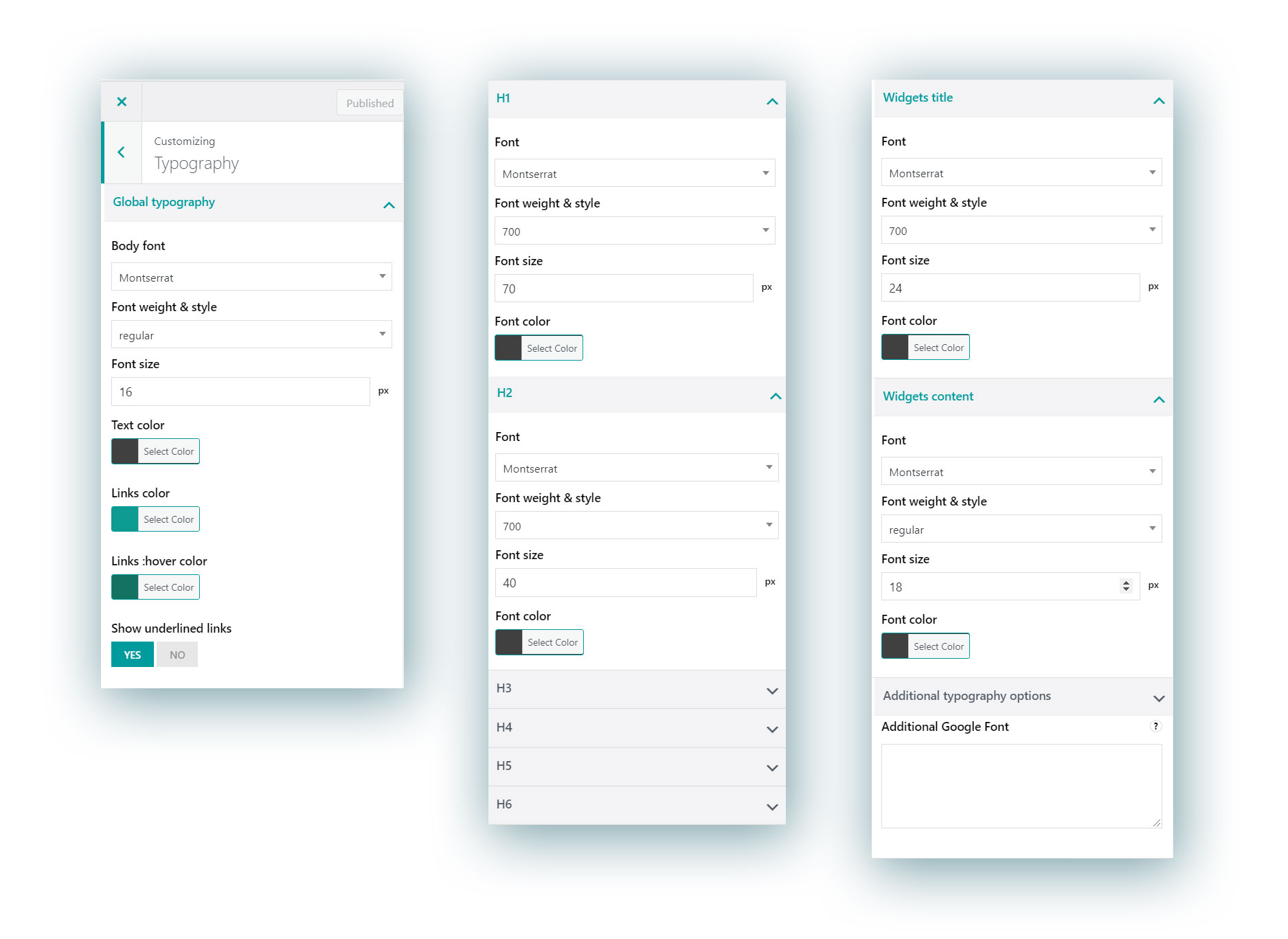
Typography

Global Typography

Here you can configure text options for the body text across your website. It is used for <p> tags and similar. Google fonts are supported. The available options are:

  • Font
  • Font weight & style (regular, bold, italics etc.)
  • Font size
  • Text color
  • Links color
  • Links color on hover
  • Underlined links: enable this to show links with the traditional underlined style

Heading typography options

For every heading from H1 to H6, you can separately configure the following options:

  • Font
  • Font weight & style (regular, bold, italics etc.)
  • Font size
  • Font color

Widget titles

Here you can configure the style of the titles of all widgets. Google fonts are supported. The available options are:

  • Font
  • Font weight & style (regular, bold, italics etc.)
  • Font size
  • Font color

Widget content

Here you can configure the style of the text showing in all the widgets. Google fonts are supported. The available options are:

  • Font
  • Font weight & style (regular, bold, italics etc.)
  • Font size
  • Font color

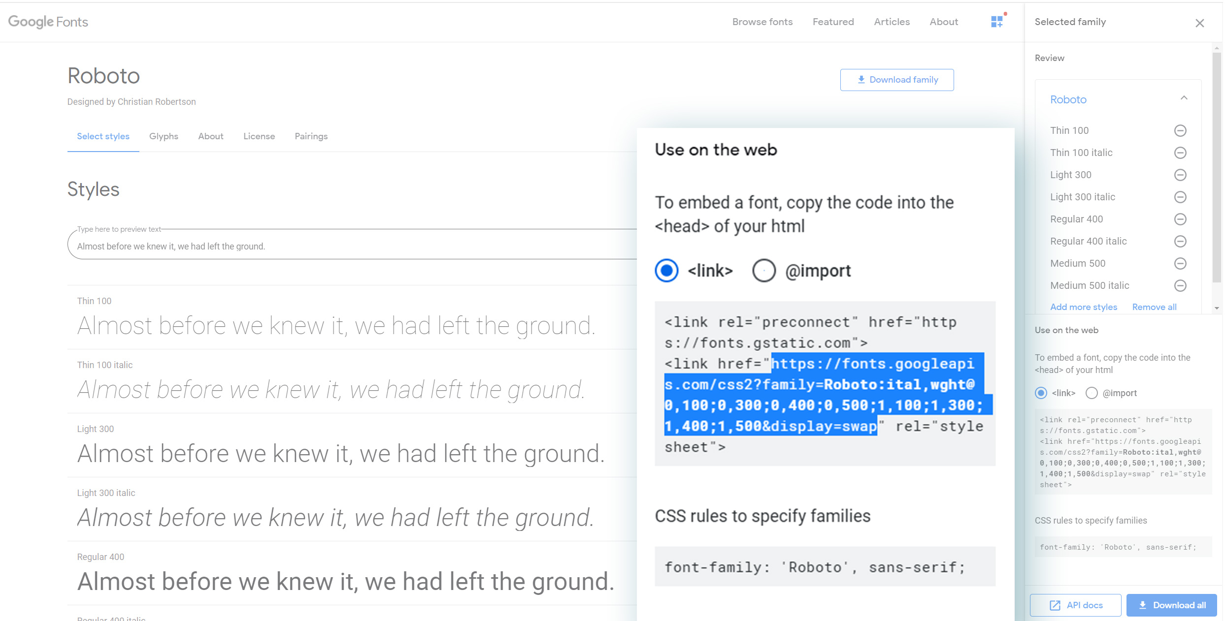
Additional Google fonts

If you can’t find your favourite Google font in the list, no worries, you can add it as well.

Please follow these steps:

a) Go to https://fonts.google.com/

b) Select the font you want to use (i.e. Roboto)

c) Customize the font as you wish by choosing the font weight and style you want to use.

d) Copy the href link from Google Font. It should be something like

https://fonts.googleapis.com/css?family=Roboto:300,400,500,600,700&display=swap

Additional Google font

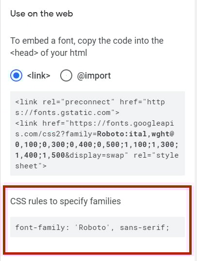
e) Visit your site and navigate to Appearance > Customize > YITH Theme Options > Typography > Additional Google Font

e) Paste the link into the text area.

f) Now navigate to Appearance > Customize > Additional CSS and add the following rule:

body {
font-family: 'Roboto', sans-serif;
}

Here is another rule example based on the Montserrat font (the Proteo default font)

body {
font-family: 'Montserrat', sans-serif;
}

Please note that this rule depends on the font you choose. Google Font helps you identify the right rule to use inside the “CSS rules to specify families”:

Site colors

The first menu you can access to in the  Miscellaneous menu is the the one where you can change the main colors of your sites:

  • Site background
  • Main color shade: this color is used as primary color for many elements of the Proteo theme to keep your site style always consistent, hassle-free.

Site colors

Site background image

In the Miscellaneous menu you will be able to choose the Site background image.

Site background image

Here you can add an image that will be displayed as background for your entire site.

In the Preset, you can choose how to display it:

  • Default
  • Fill screen
  • Fit to screen
  • Repeat
  • Custom

Based on the preset chosen, you will also be able to choose:

  • Image position
  • Image size:
    • Original
    • Fill screen
    • Fit to screen
  • Repeat background image
  • Scroll with page