This section contains submenus for:
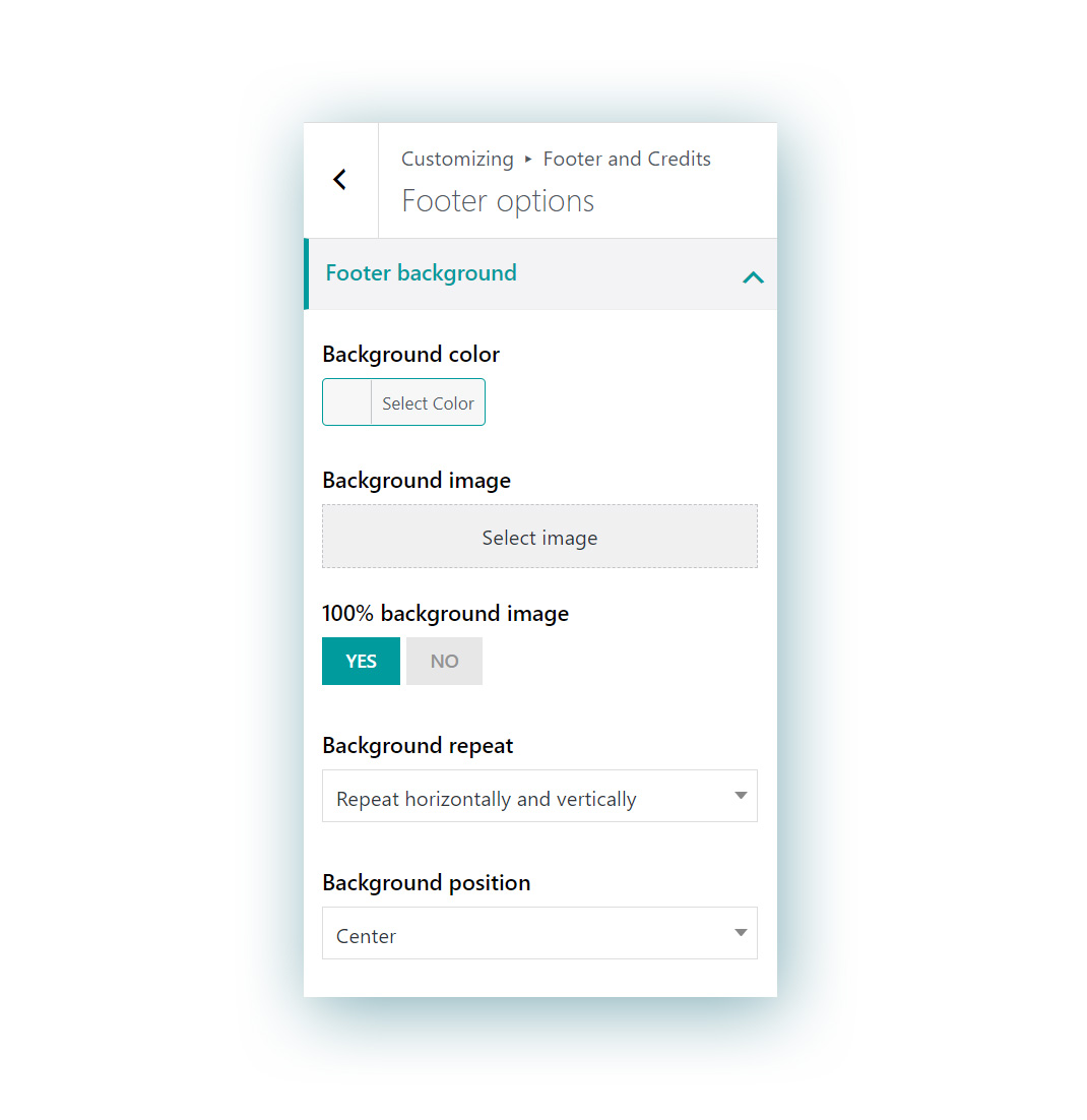
1. Footer background
Available options:
- Background color
- Background image: the image will override the background color, so for example, you can also use a .png image over the background color
- 100% background image: this option will make sure the image covers the full area of the footer.
- Background repeat: this option only appears if the “100% background image” option is set to NO. You will also be able to set the “repeat” option and choose among:
- Do not repeat
- Repeat horizontally
- Repeat vertically
- Repeat vertically and horizontally
- Background position:
- left top
- left center
- left bottom
- right top
- right center
- right bottom
- center top
- center
- center bottom
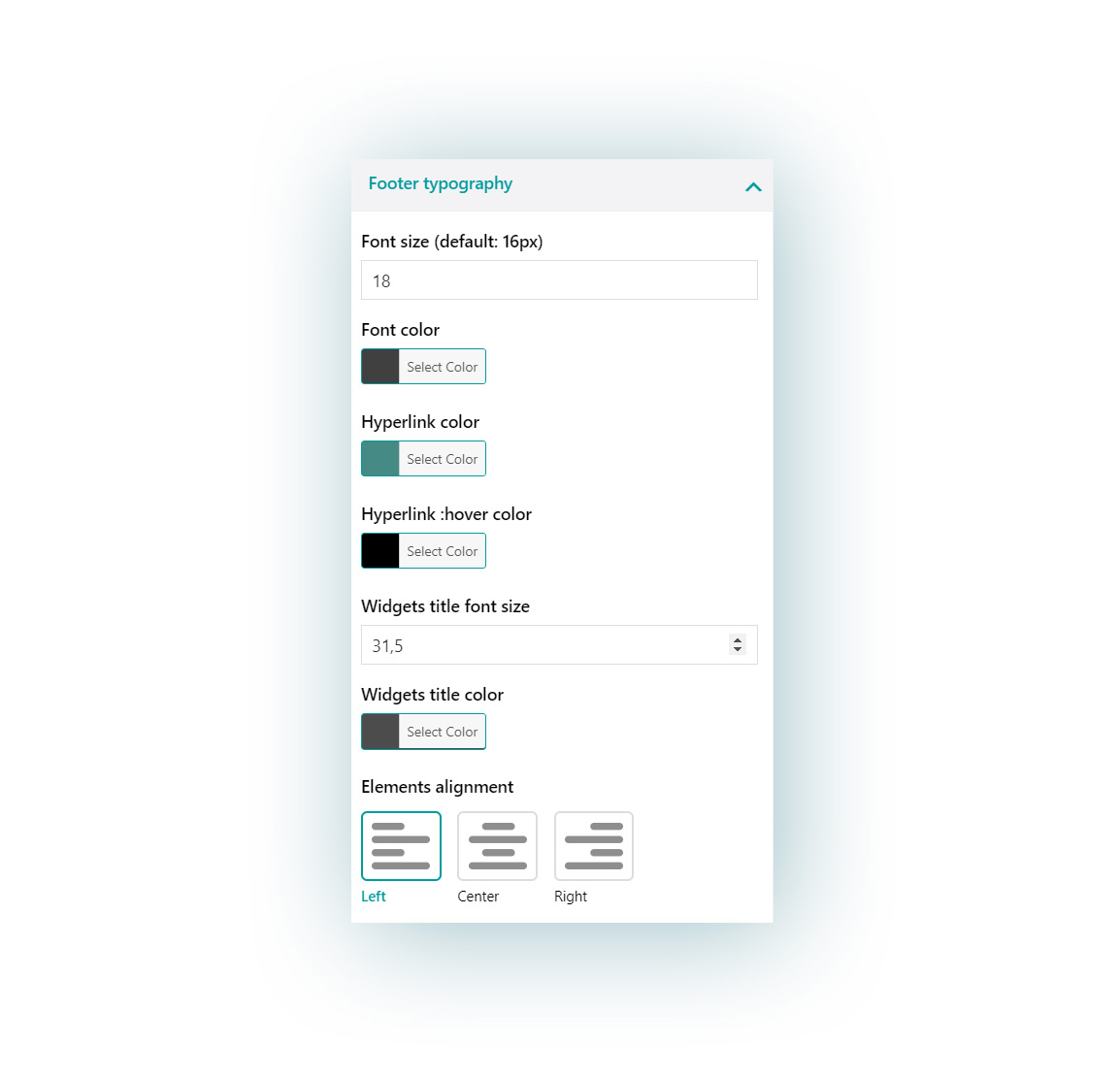
2. Footer typography
You can customize here the typography options for the texts in the widgets:
- Font size: default to 16px
- Font color
- Hyperlink color
- Hyperlink color on hover
- Widgets title font size
- Widgets title color
- Elements alignment:
- Left
- Center
- Right
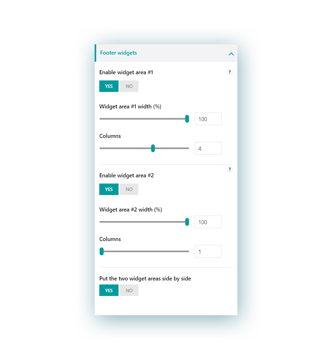
3. Footer widgets
In this section you can enable up to two widget areas in the footer and for each of them configure the following options:
- width (%): it stands for the percentage value that it takes related to the total footer area (starting from the left). For example, if it’s set to 50% it will only cover half the size of the footer.

- columns: you can choose up to 6 columns (and so slots for widgets) for every widget area. Please, note that if you choose 4 as a value for this option and you add 5 widgets in this widget area, the fifth widget will go into a new line.

Additionally, you can choose also whether to put the two widget areas side by side, instead of showing them one below the other as it is by default.
Please, note, if you set this option, you will have to make sure that the percentage width of both widget areas is no more than 100%, otherwise the second widget area will be however shown below and not aside. For example, 50% + 50% or 30% + 70% and so on.


