Block editor colors

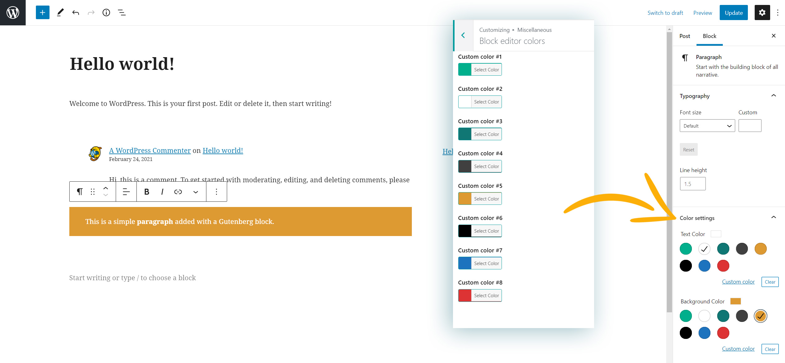
Replace the default color swatches of the Gutenberg block editor with your custom colors. In this way when you create a new page using Gutenberg you will find these colors and you can easily apply them to the page elements.

Block editor colors

Buttons

Buttons

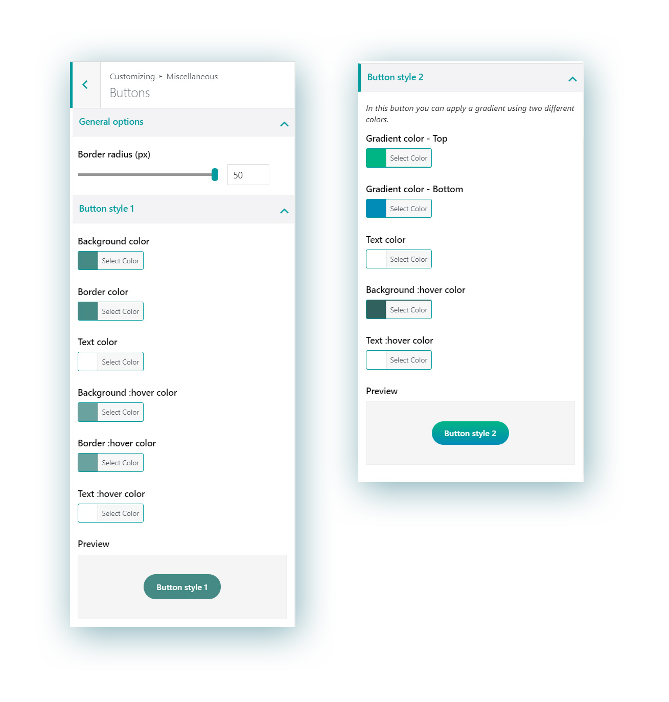
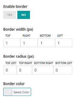
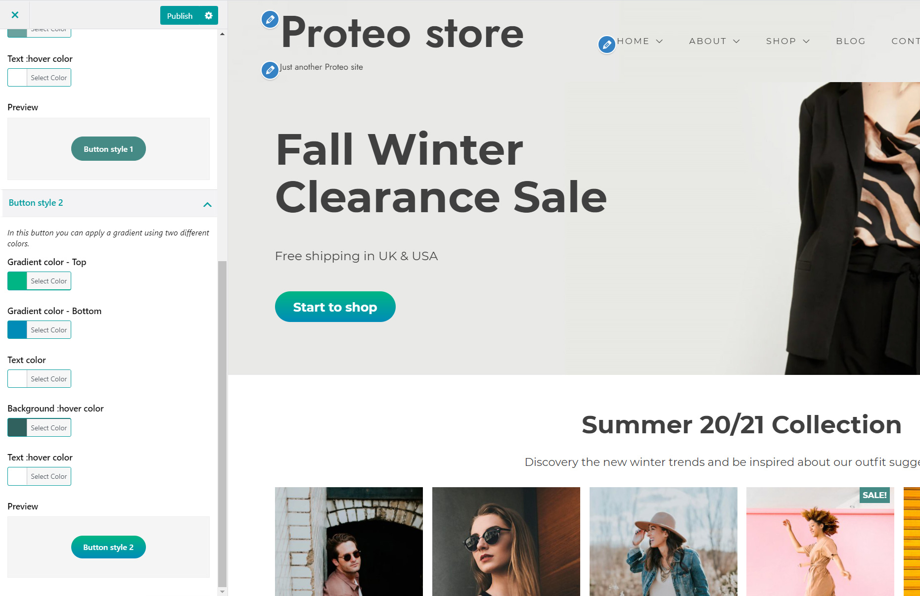
In this menu you will be able to configure the Button radius as a general settings for all your theme buttons, and after that you can customize two different styles for the buttons available in Proteo theme. You will also see a preview of how the button will look like.

Button Style 1 – available options

  • Background color
  • Border color
  • Text color
  • Background :hover color
  • Border :hover color
  • Text :hover color

Button Style 2 – available options

  • Background color shade 1
  • Background color shade 2
  • Text color
  • Background :hover color
  • Text :hover color

All style-2 buttons have a gradient background color, that’s why you have to set two background color shades.

Proteo buttons

Forms

Form options


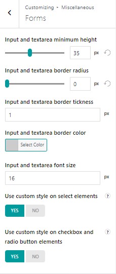
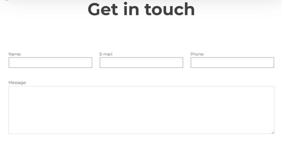
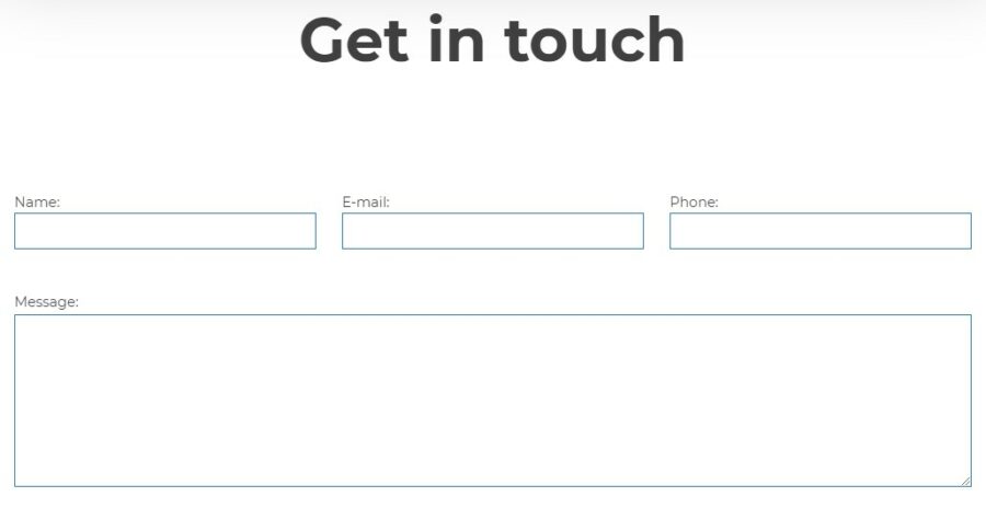
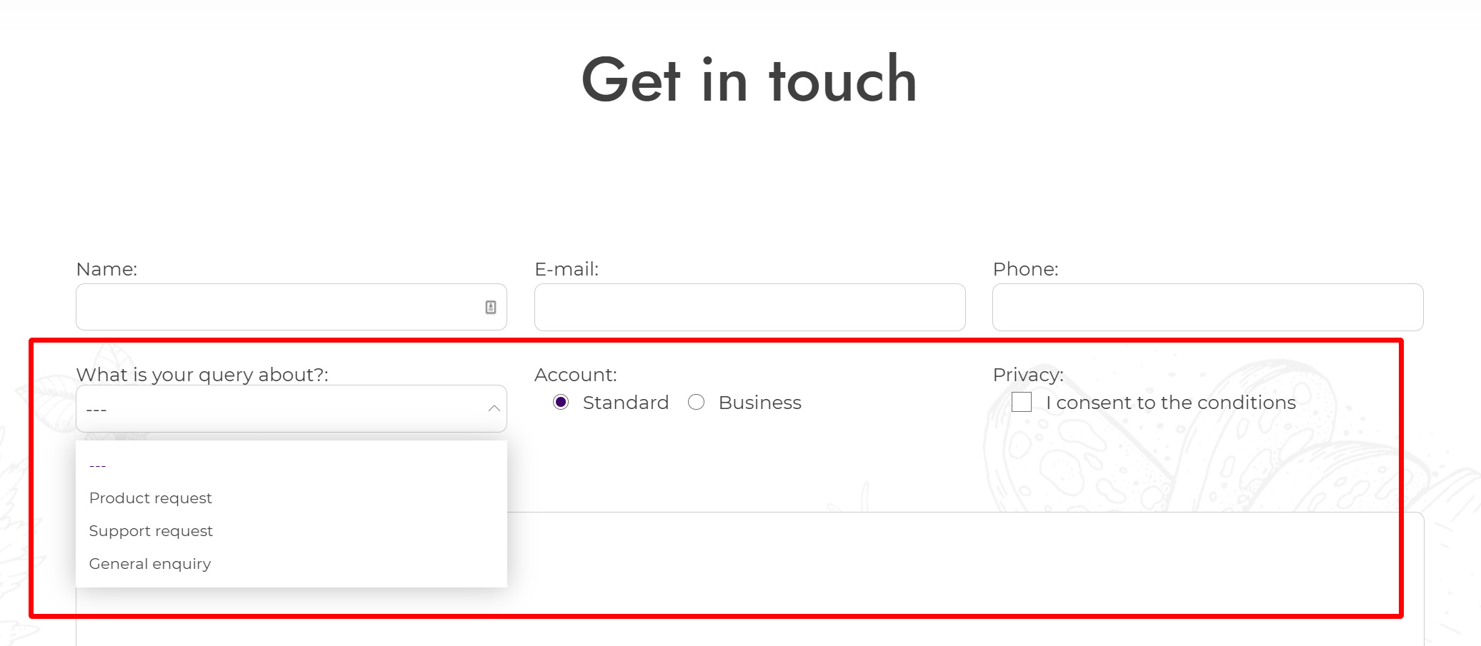
In this menu, you can find specific settings for your forms that are managed through the theme style.

  • Input and textarea minimum height (pixels): use this option to define your input and textarea minimum height.
  • Input and textarea border radius (pixels): use this option to make your text input and text area borders rounded.
  • Input and textarea border thickness (pixels): use this option to choose the border thickness of your text input and text areas.

Form border thickness

  • Input and textarea border color: use this option to choose the border color of your text input and text areas.

Input and textarea border color

  • Input and textarea font size (px): choose the font size for your input and text area;
  • Use custom style on select elements (for dropdown menus) instead of standard ones;
  • Use custom style on checkbox and radio button elements instead of standard ones.
Enhanced form elements
Enhanced style for dropdowns, radio buttons and checkboxes

Breadcrumbs

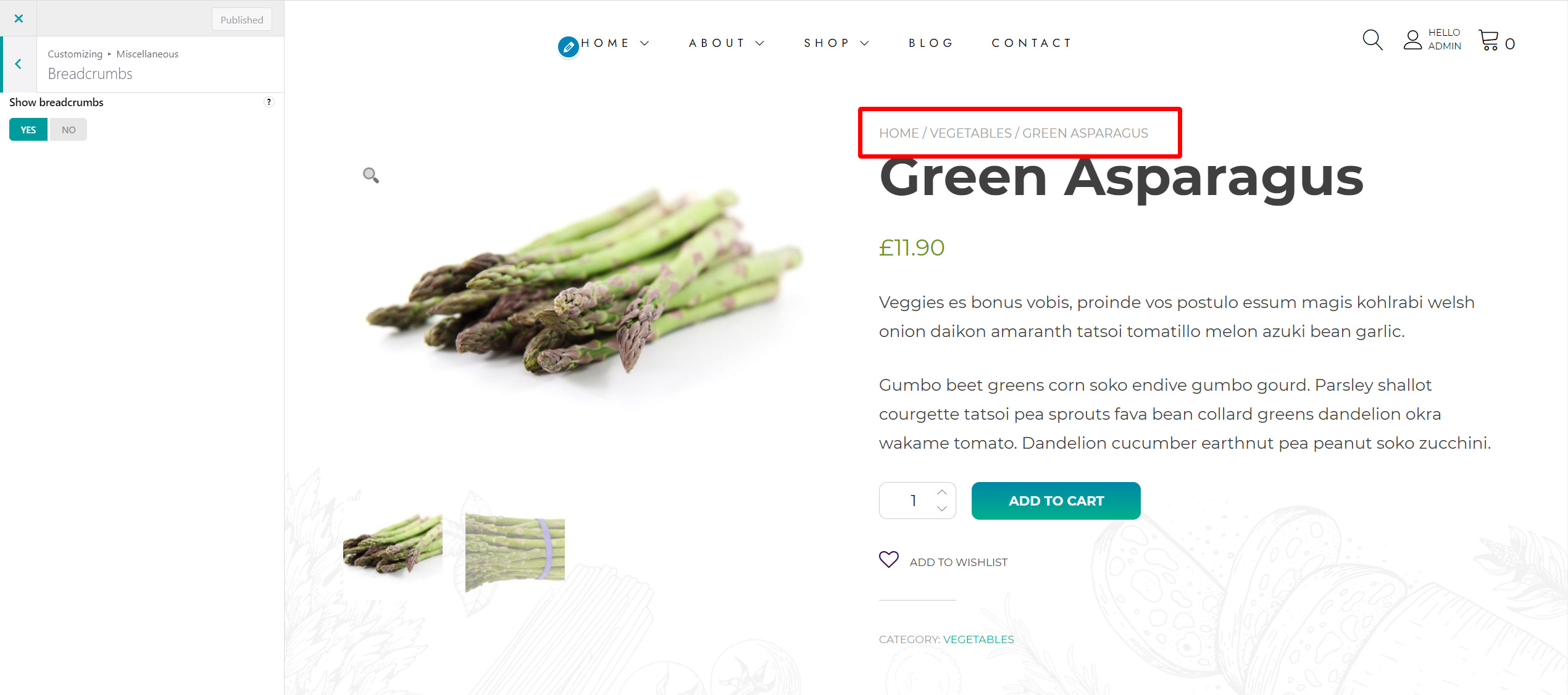
Here you can enable the breadcrumbs, i.e. the navigational links that will show on products, posts and pages.

Breadcrumbs

Layout

Layout

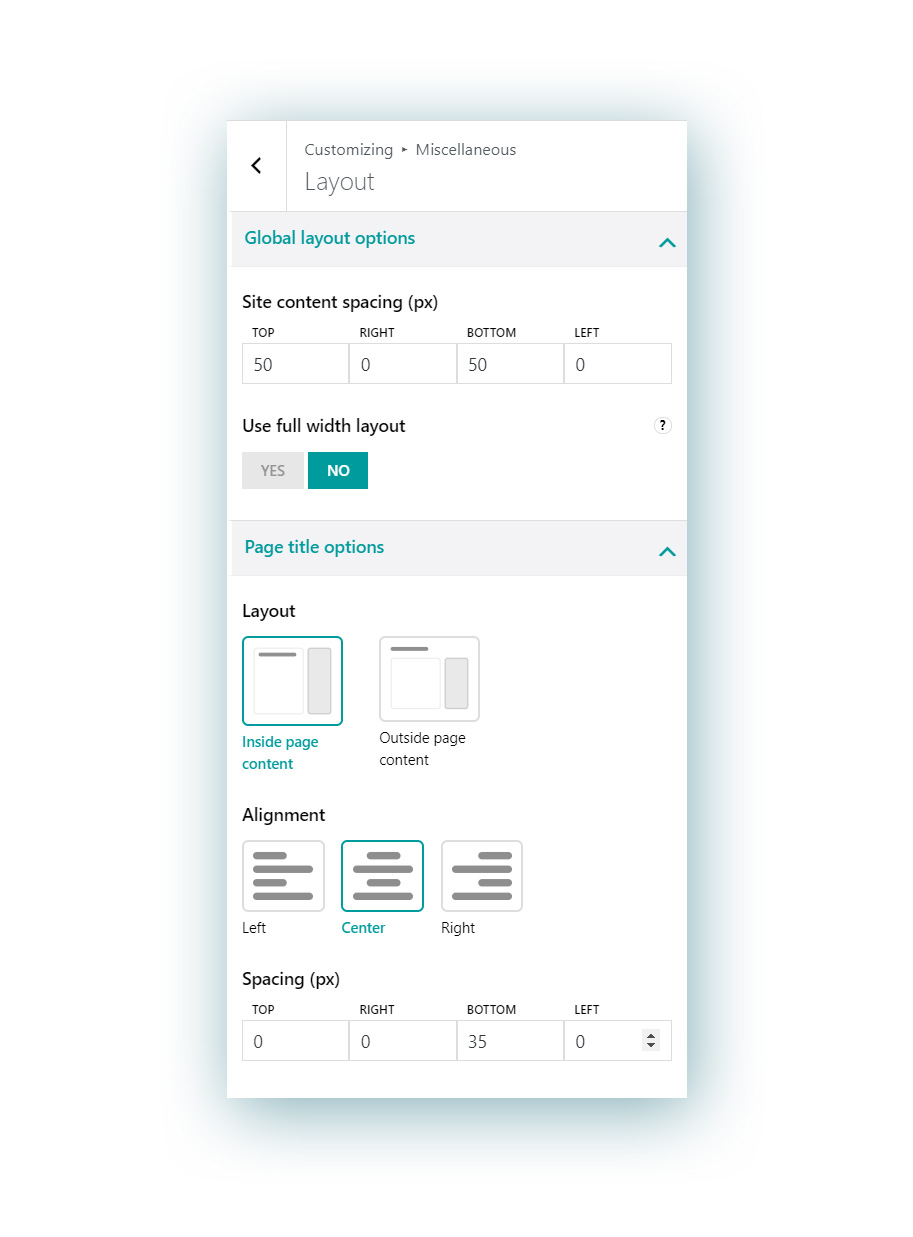
In this menu you will find two sections.

1. Global layout options

Configure here:

  • site content spacing in pixels and
  • choose whether to use a full width layout, no matter which resolution your screen has.

2. Page title options

  • Layout:
    • Inside page content
    • Outside page content
  • Alignment:
    • Left
    • Center
    • Right
  • Spacing (px)

Mobile & responsive

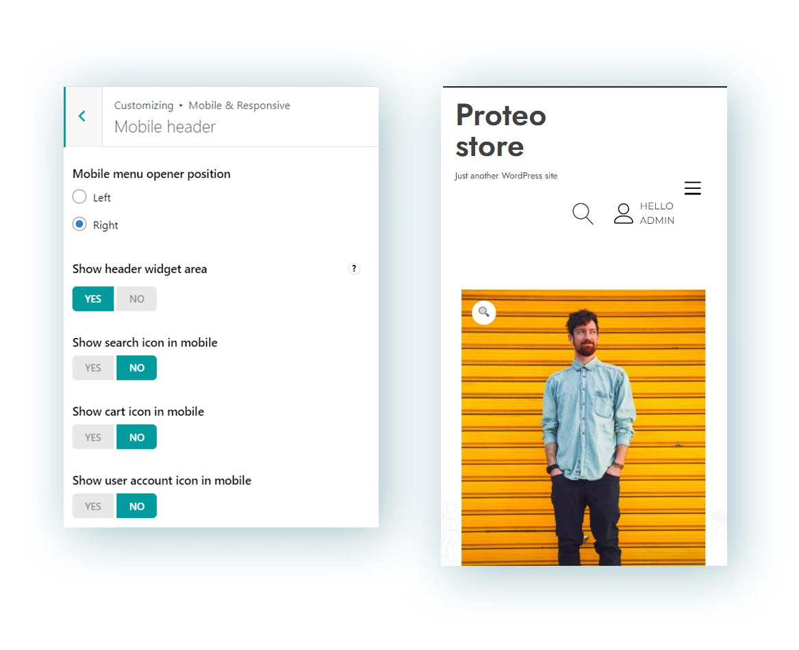
This menu of the theme options is entirely dedicated to the mobile version of your theme, so you can customize how it looks like also on mobile devices (smartphones and tablets).

1. Mobile topbar

Topbar on mobile

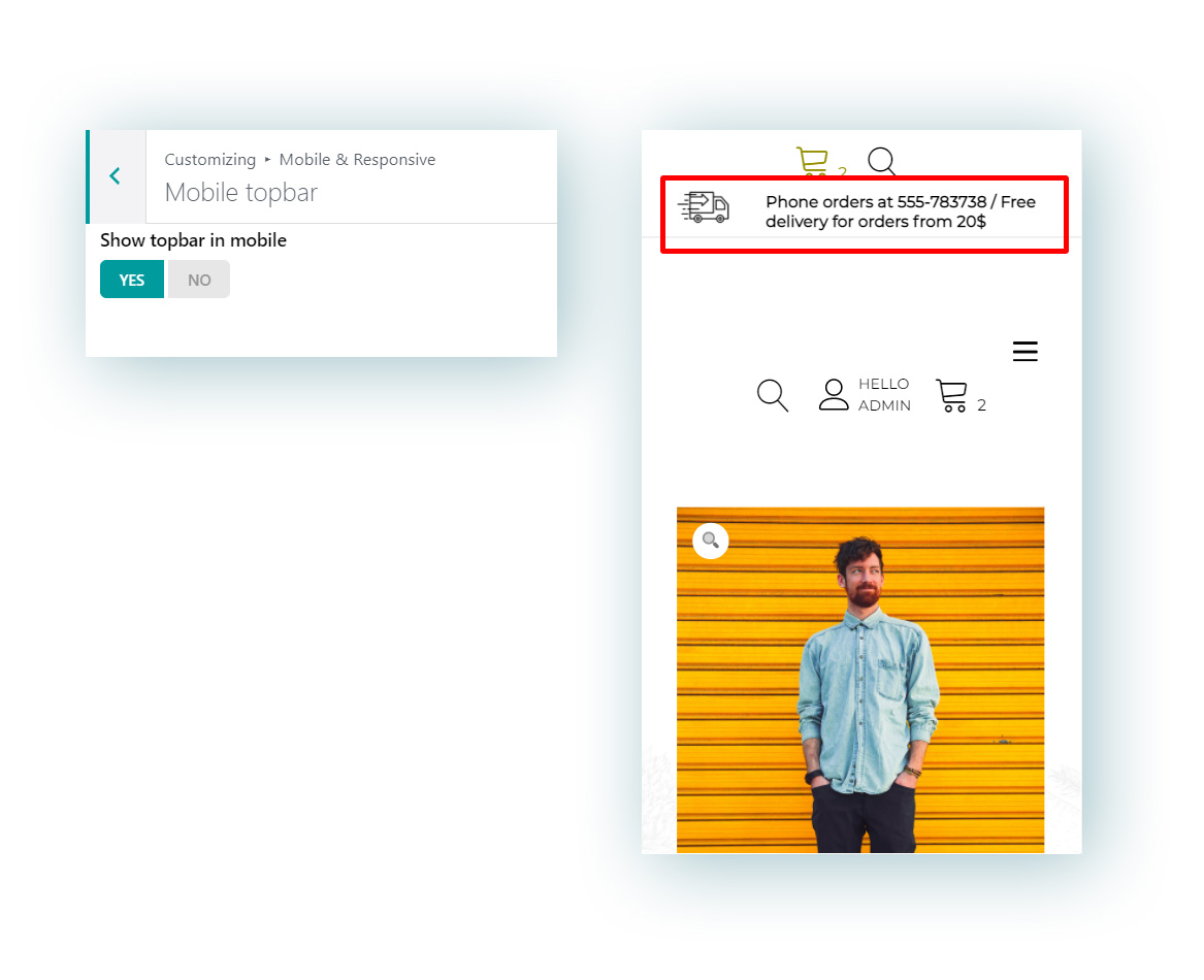
If the topbar has been enabled, you can however choose whether to keep showing it or hide it only on mobile devices.

2. Mobile header

Mobile header

  • Mobile menu opener position:
    • Left
    • Right
  • Show header widget area: this will show the widget area in the header.
  • Show Search icon on mobile
  • Show Cart icon on mobile
  • Show User account icon on mobile

3. Mobile menu

Mobile menu

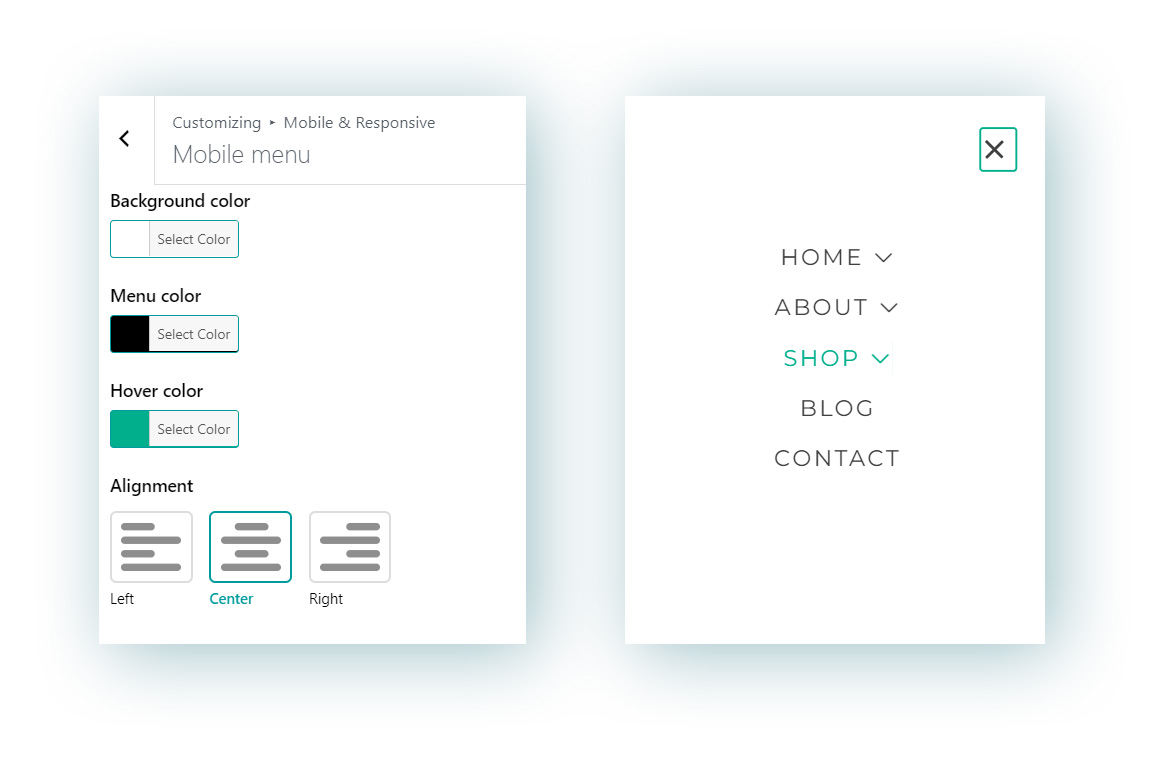
Here you can customize the look and feel of the menu when it is displayed on mobile devices and set:

  • Background color
  • Menu text color
  • Hover text color
  • Alignment: left, center or right

4. Mobile typography

Mobile typography

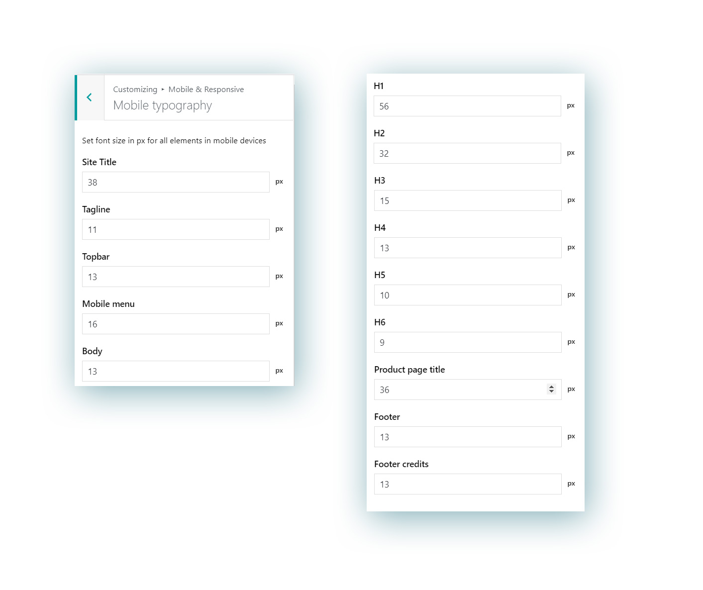
Here you can set up a custom font size in pixels for each of the following text elements when displayed on mobile devices:

  • Site title
  • Tagline
  • Body text
  • Topbar text
  • Mobile menu text
  • H1
  • H2
  • H3
  • H4
  • H5
  • H6
  • Product page title
  • Footer
  • Footer credits

5. Responsive breakpoints

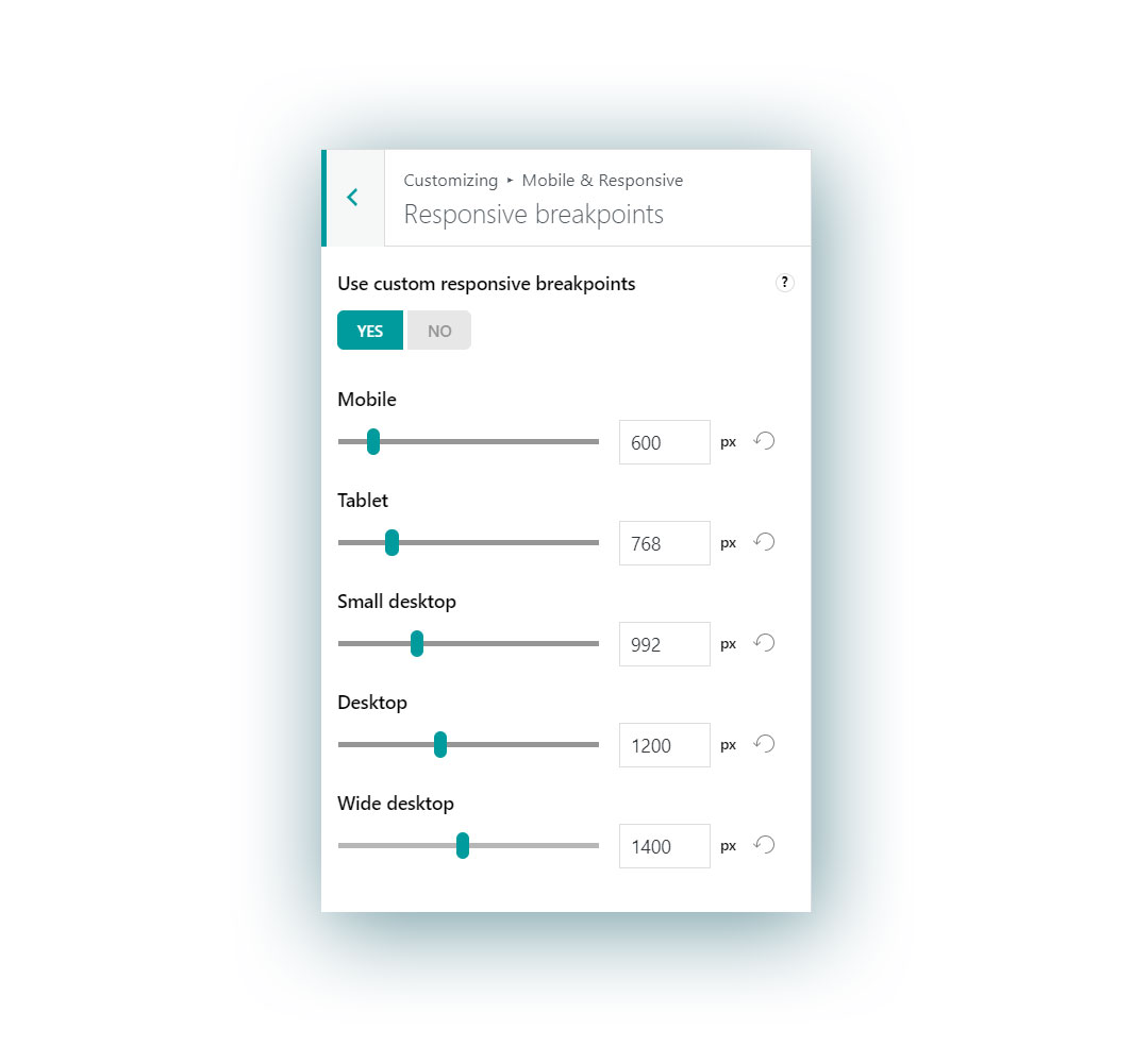
In responsive design, a breakpoint is the “point” at which a website’s content and design will adapt in a certain way in order to provide the best possible user experience. For advanced customization options, we’ve added a dedicated section to customize your theme’s breakpoints.

  • Mobile
  • Tablet
  • Small desktop
  • Desktop
  • Wide desktop

Editing them will automatically generate a custom responsive.css file in your theme folder.

Blog

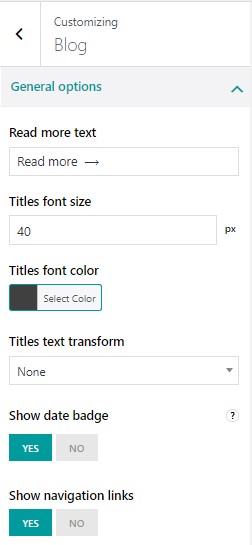
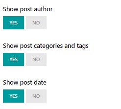
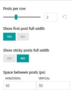
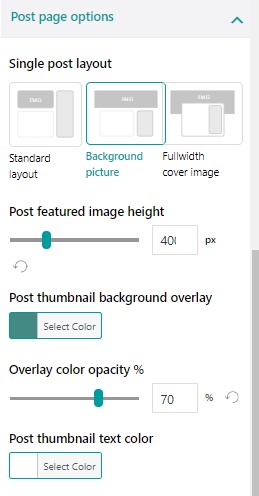
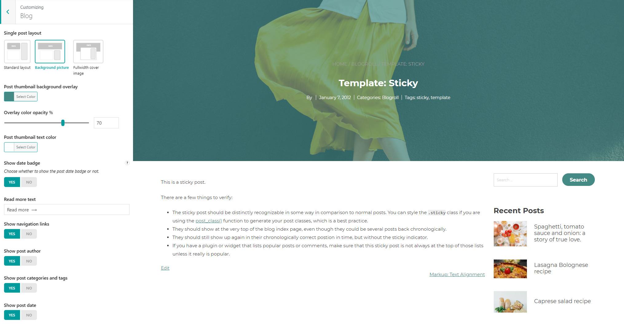
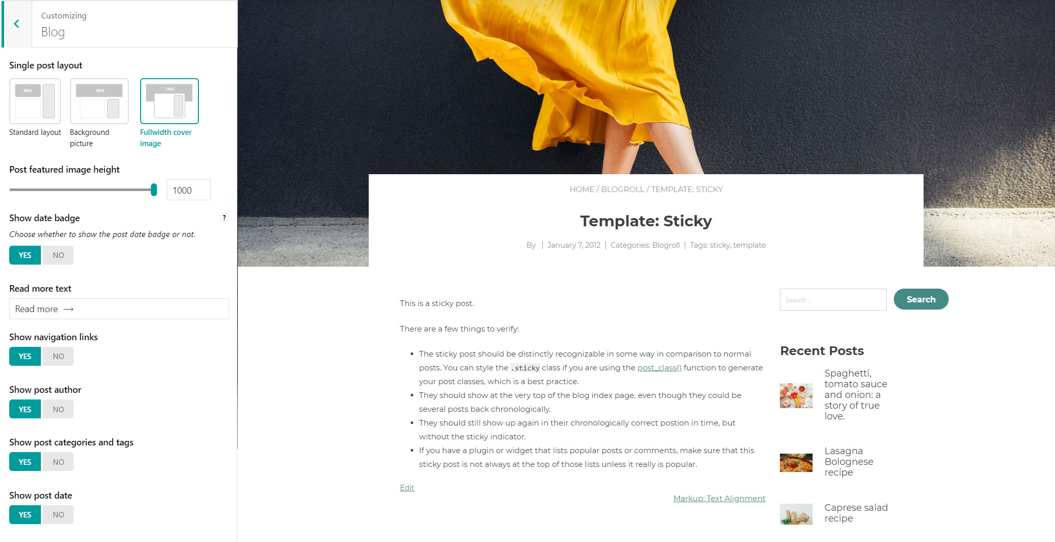
In this section, you can customize the settings for your blog posts.

Blog settings

General options

Blog general options

Blog general options

General options - Blog

General options - Blog

  • Read more text: add here a custom text to show for the link that will open the full post
  • Titles font size (px)
  • Titles font color
  • Titles text transform: choose from None, Uppercase, Lowercase, or Capitalize
  • Show date badge
  • Show navigation links
  • Show post author
  • Show post categories and tags
  • Show post date
  • Posts per row
  • Show first post full width
  • Show sticky posts full width
  • Space between posts (px)
  • Enable border
  • Border width (px)
  • Border radius (px)
  • Border color

Blog - general options

Post page options

Post page options

    • Standard layout. If you select this, the post image will be displayed with its current size.
      Standard layout
    • Background picture. If you select this, the image will be used to fill the full width of the screen, and its height will be consequently adjusted and cropped if necessary to fit the background proportions.
      You can additionally set the overlay color, its opacity, and the color of the text that appears over the image.
      Recommended image size for this layout: 1920x560px.
      Background picture

    • Fullwidth cover image. If you select this, the image will be fully displayed and you will be able to resize it by adjusting the image height.
      Fullwidth cover image
  • Post featured image height
  • Post thumbnail background overlay
  • Overlay color opacity (%)
  • Post thumbnail text color