General options
Choose how to display categories, subcategories, products, and how to sort them.
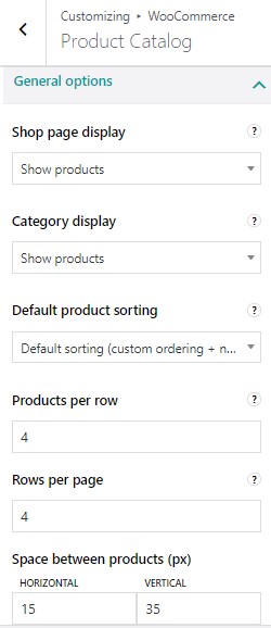
Shop page display:
-
-
- Show products
- Show categories
- Show categories and products
-
Category display:
-
-
- Show products
- Show subcategories
- Show subcategories and products
-
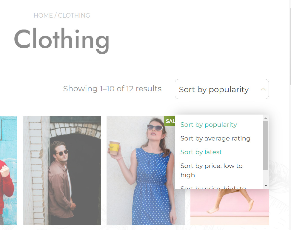
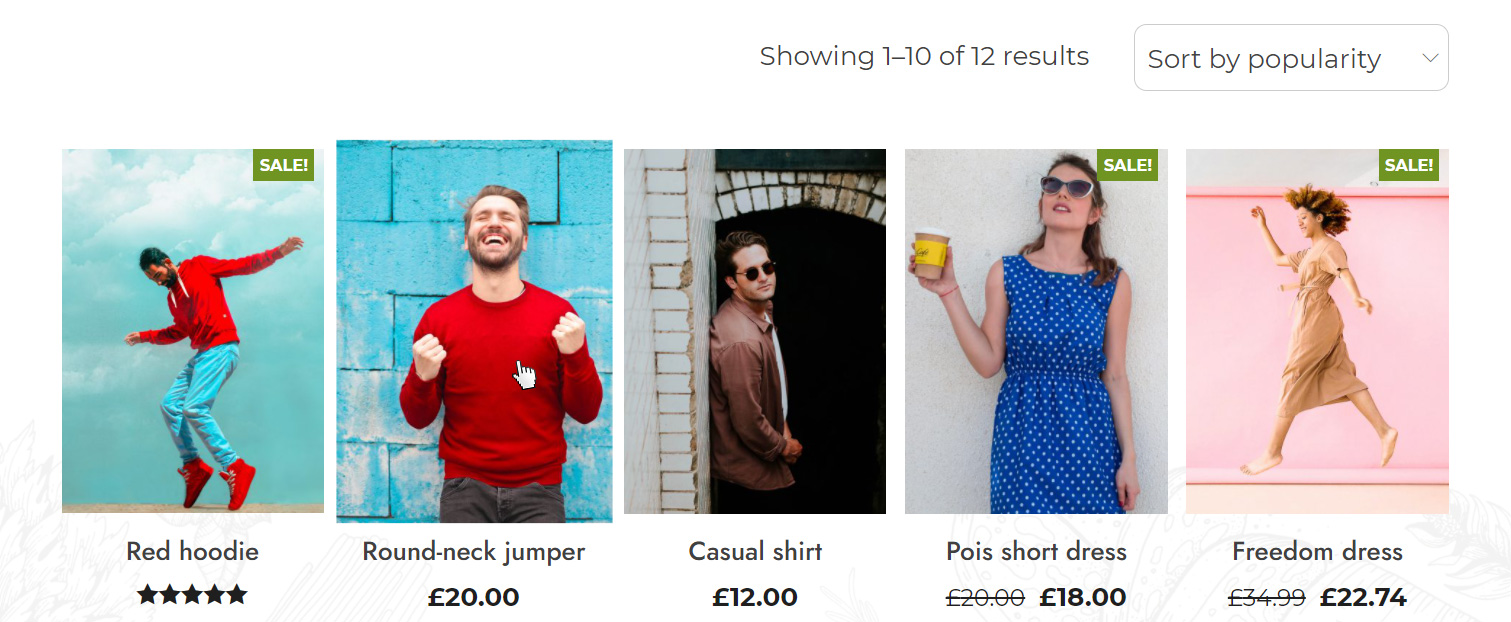
Default product sorting:
Select here the default sorting for products displayed on your archive pages. Users will however be able to select a different sorting manually from the dropdown menu in the top right corner.
-
- Default (custom ordering + name)
- Popularity (sales)
- Average rating
- Sort by most recent
- Sort by price (asc)
- Sort by price (desc)
Products per row: you can select from 2 to 6 products per row.
Rows per page: you can select from 2 up to 8 rows per page.
In the following screenshot, for example, there are 5 products per row and a maximum of 2 rows per page.
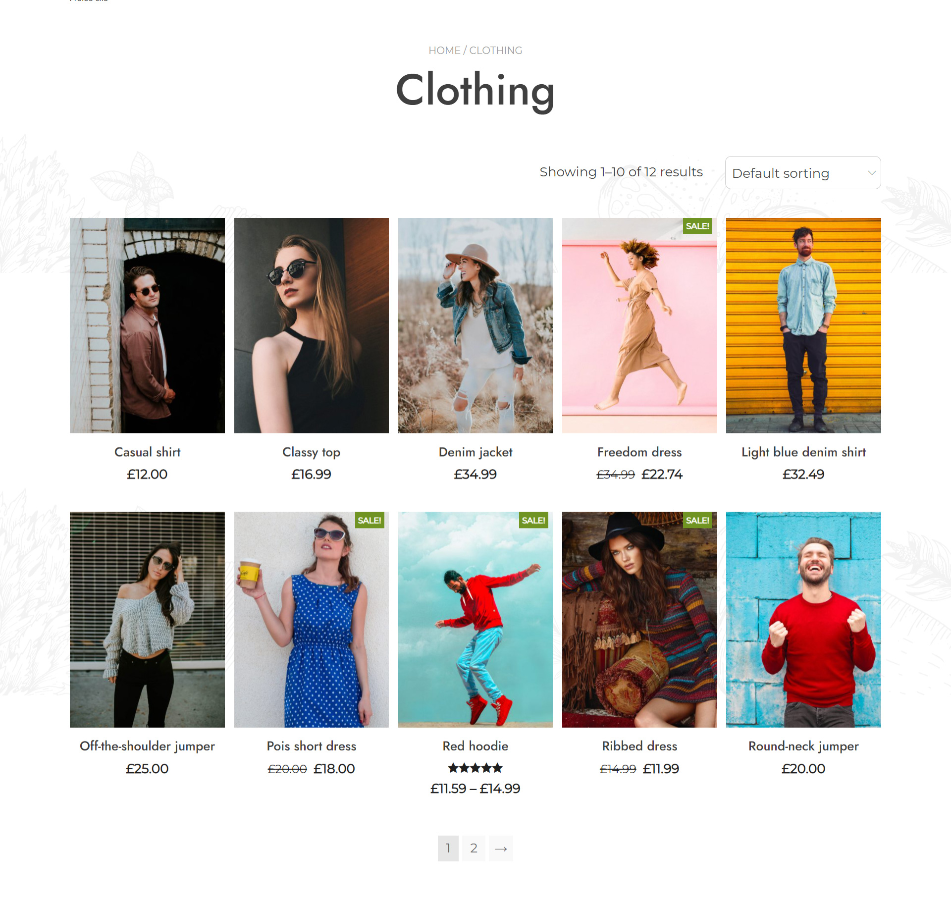
Space between products (px): you can select the space (in px) between products horizontally and vertically.
Display options
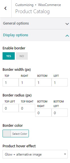
Enable border: yes/no
Border width (px): select borders width (top, bottom, left, right) in px
Border radius (px): select border radius in px
Border color: choose the color of the border
Product hover effect:
-
-
- None
- Glow: contrast is enhanced to make the image look brighter
- Zoom: the image will be slightly enlarged on mouse-hover
- Alternative image: it will automatically pick the first image in the product gallery
- Glow + alternative image: it will load the alternative image and apply the glow effect on it.
-
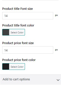
Product TITLE font size: default value set to 14px
Product TITLE font color
Product PRICE font size: default 14px
Product PRICE font color
Add to Cart options
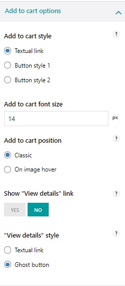
Add to cart style:
-
-
- Textual link
- Button style 1
- Button style 2
-
To customize the two available button styles of the theme, please, refer to Theme options > Miscellaneous > Buttons. You can find out more on this page.
Add to cart font size: default 14px
Add to cart position on archive pages (Shop, category, and tag pages)
-
-
- Classic: it will be displayed below the product image
- On image hover: it will be displayed above the product image on mouseover
-
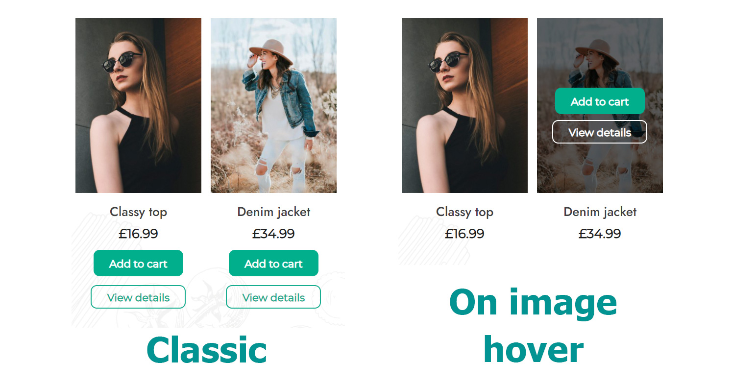
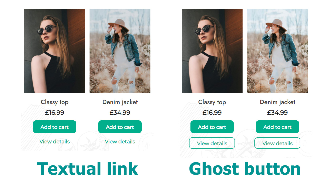
Show “View details” link: this is the button that opens the product detail page. If set to NO, the full image will be clickable, if set to YES, you will be able to choose the style of this link.
“View details” style:
-
-
- Textual link
- Ghost button
-