Site colors

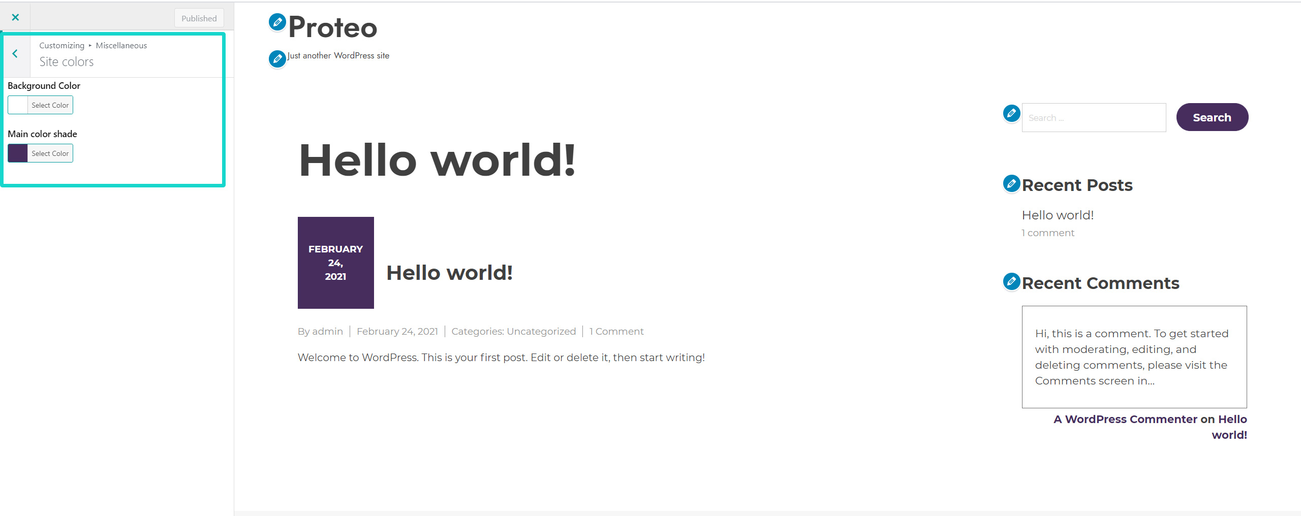
The first menu you can access to in the  Miscellaneous menu is the the one where you can change the main colors of your sites:

  • Site background
  • Main color shade: this color is used as primary color for many elements of the Proteo theme to keep your site style always consistent, hassle-free.

Site colors

Site background image

In the Miscellaneous menu you will be able to choose the Site background image.

Site background image

Here you can add an image that will be displayed as background for your entire site.

In the Preset, you can choose how to display it:

  • Default
  • Fill screen
  • Fit to screen
  • Repeat
  • Custom

Based on the preset chosen, you will also be able to choose:

  • Image position
  • Image size:
    • Original
    • Fill screen
    • Fit to screen
  • Repeat background image
  • Scroll with page

Block editor colors

Replace the default color swatches of the Gutenberg block editor with your custom colors. In this way when you create a new page using Gutenberg you will find these colors and you can easily apply them to the page elements.

Block editor colors

Buttons

Buttons

In this menu you will be able to configure the Button radius as a general settings for all your theme buttons, and after that you can customize two different styles for the buttons available in Proteo theme. You will also see a preview of how the button will look like.

Button Style 1 – available options

  • Background color
  • Border color
  • Text color
  • Background :hover color
  • Border :hover color
  • Text :hover color

Button Style 2 – available options

  • Background color shade 1
  • Background color shade 2
  • Text color
  • Background :hover color
  • Text :hover color

All style-2 buttons have a gradient background color, that’s why you have to set two background color shades.

Proteo buttons

Forms

Form options


In this menu, you can find specific settings for your forms that are managed through the theme style.

  • Input and textarea minimum height (pixels): use this option to define your input and textarea minimum height.
  • Input and textarea border radius (pixels): use this option to make your text input and text area borders rounded.
  • Input and textarea border thickness (pixels): use this option to choose the border thickness of your text input and text areas.

Form border thickness

  • Input and textarea border color: use this option to choose the border color of your text input and text areas.

Input and textarea border color

  • Input and textarea font size (px): choose the font size for your input and text area;
  • Use custom style on select elements (for dropdown menus) instead of standard ones;
  • Use custom style on checkbox and radio button elements instead of standard ones.
Enhanced form elements
Enhanced style for dropdowns, radio buttons and checkboxes

Breadcrumbs

Here you can enable the breadcrumbs, i.e. the navigational links that will show on products, posts and pages.

Breadcrumbs

Layout

Layout

In this menu you will find two sections.

1. Global layout options

Configure here:

  • site content spacing in pixels and
  • choose whether to use a full width layout, no matter which resolution your screen has.

2. Page title options

  • Layout:
    • Inside page content
    • Outside page content
  • Alignment:
    • Left
    • Center
    • Right
  • Spacing (px)