The menu Header layout and style includes four submenus, where you can configure every part of the header.
1. Header layout
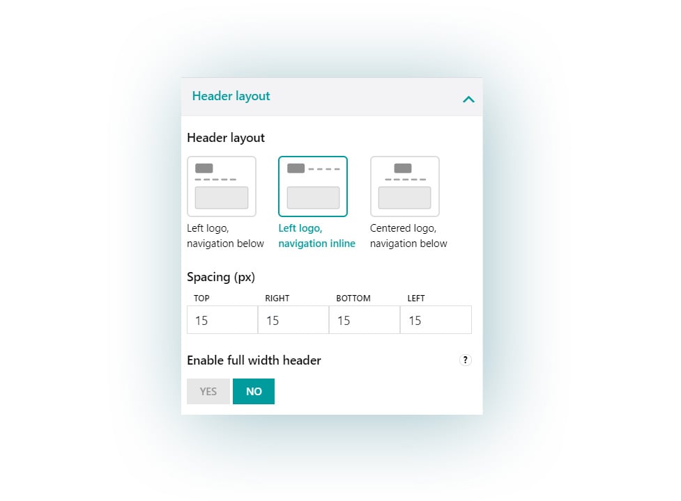
Choose the layout of the header and the position of the site logo and navigation in it.
Available options:
- Logo on the left and navigation below
- Logo on the left and navigation inline
- Centered logo and navigation below
Spacing: here you can set up a custom spacing value (in pixels) for every side of the header
Enable full width header: this option is very useful if you want to achieve a particular wide layout for your website (for example when using full width editor blocks to display page contents).
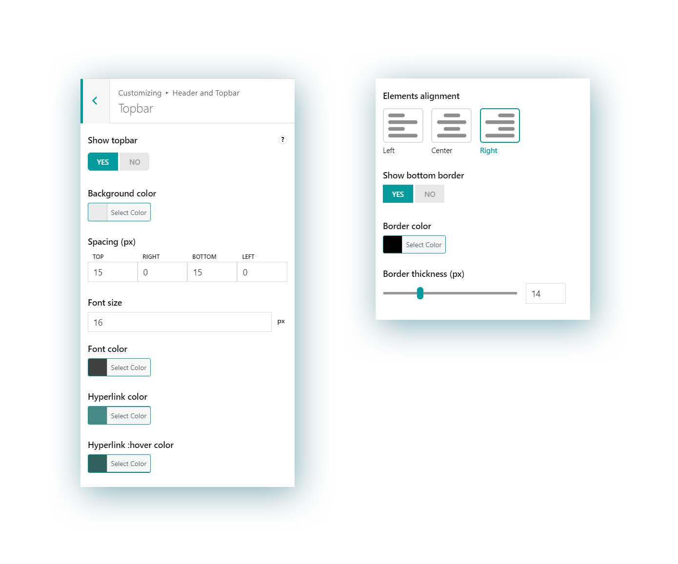
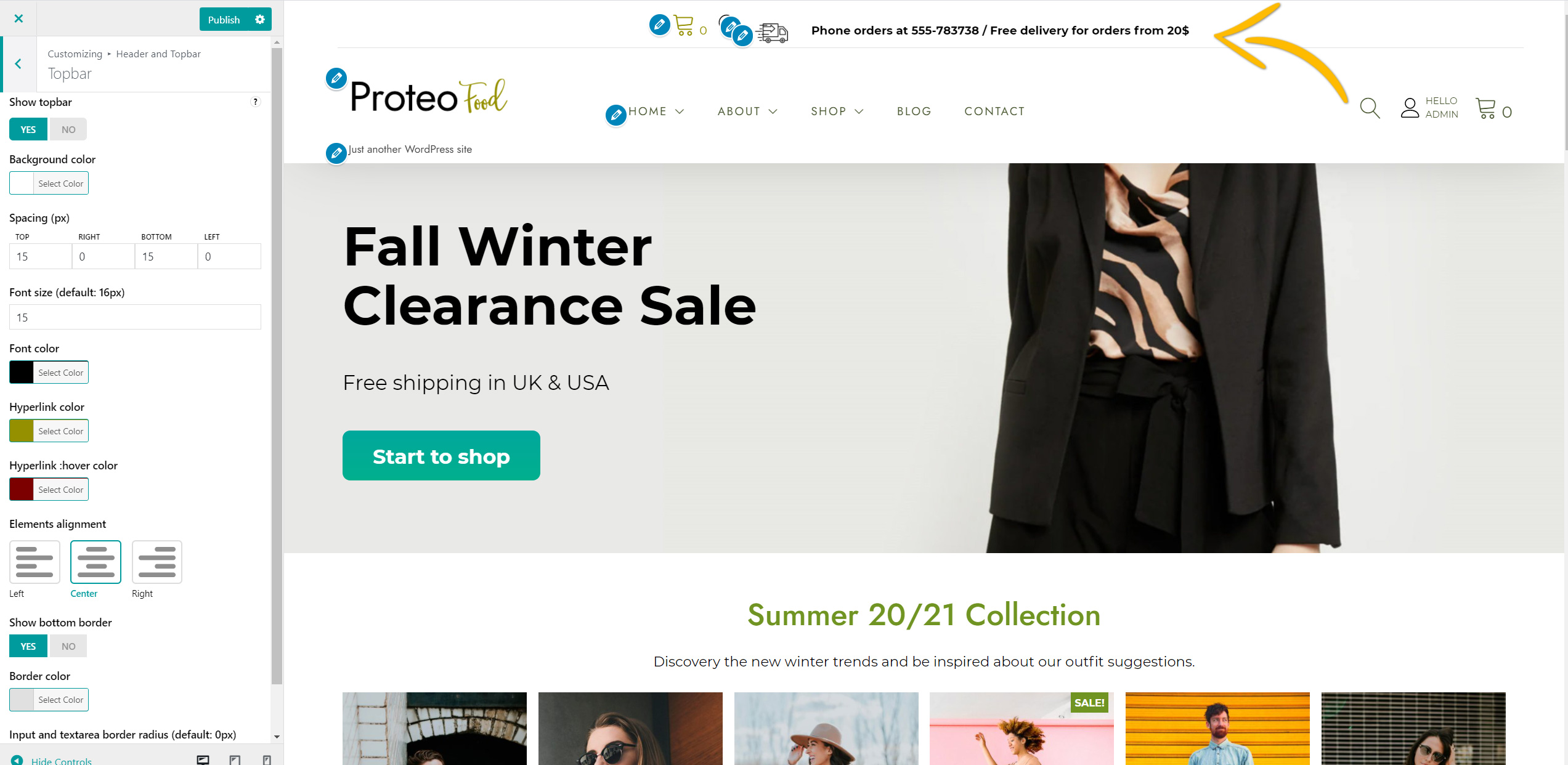
2. Header elements
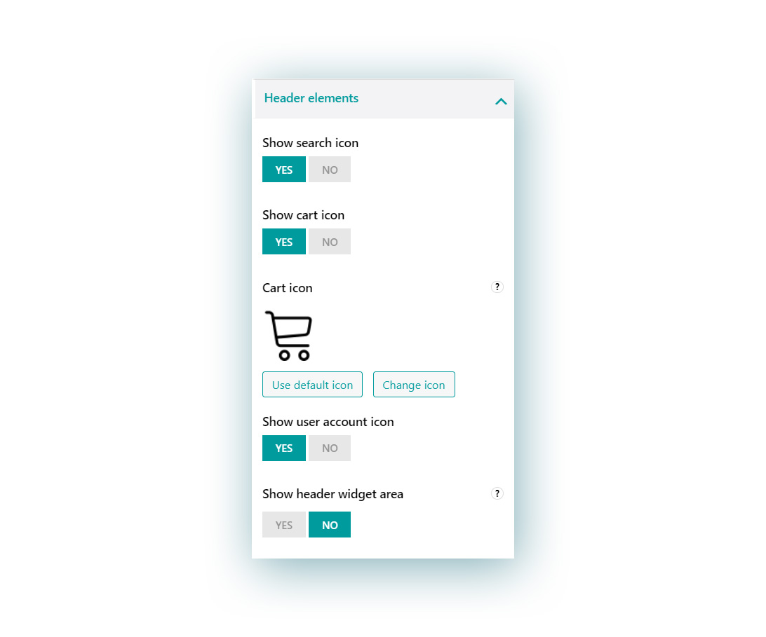
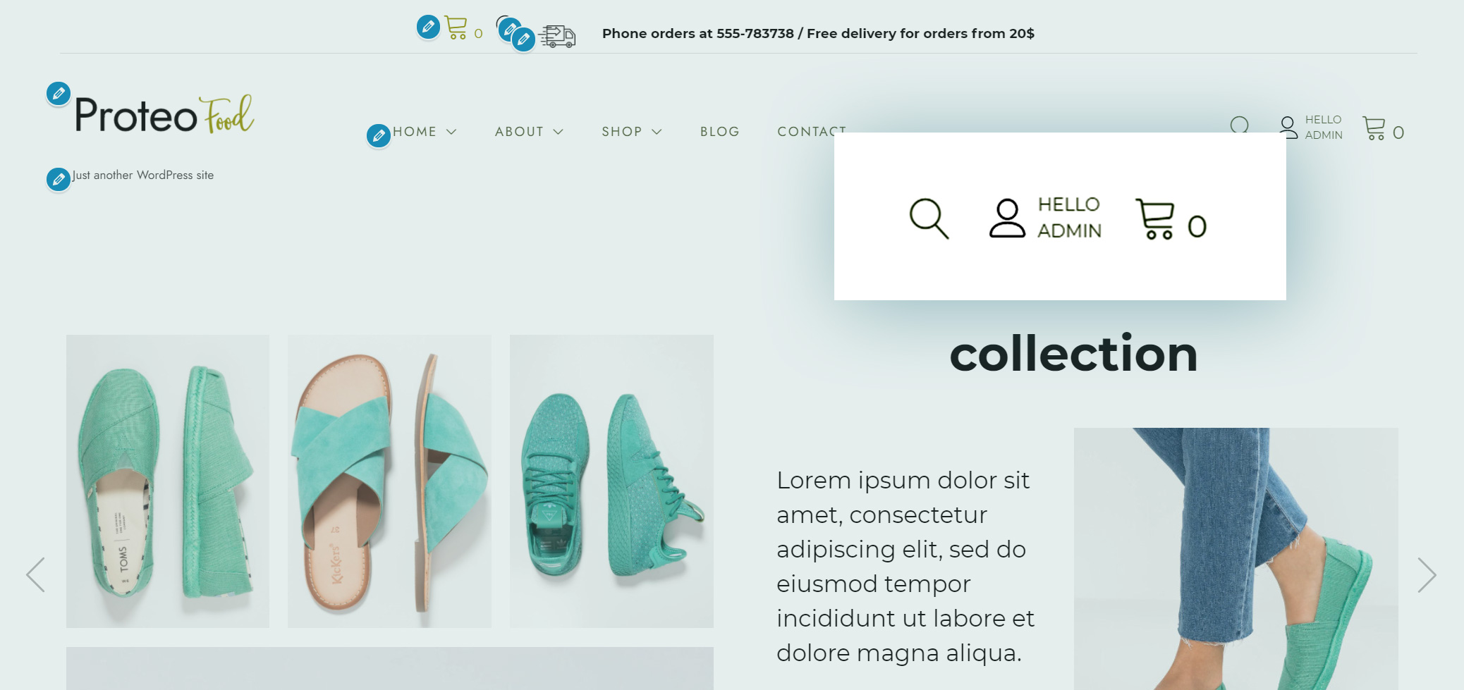
Here you can enable the icons that quickly link to:
- Search bar
- Cart (either use the default one or upload a custom icon from your library)
- User account
They will show up on the right side of the header as quick links for your users.
Show header widget area
Enable this option to show the Header widget area on the top right corner, next to the active icons if enabled. You can configure widgets from Appearance > Widgetsor from the Customizer > Widgets.
3. Header menu options
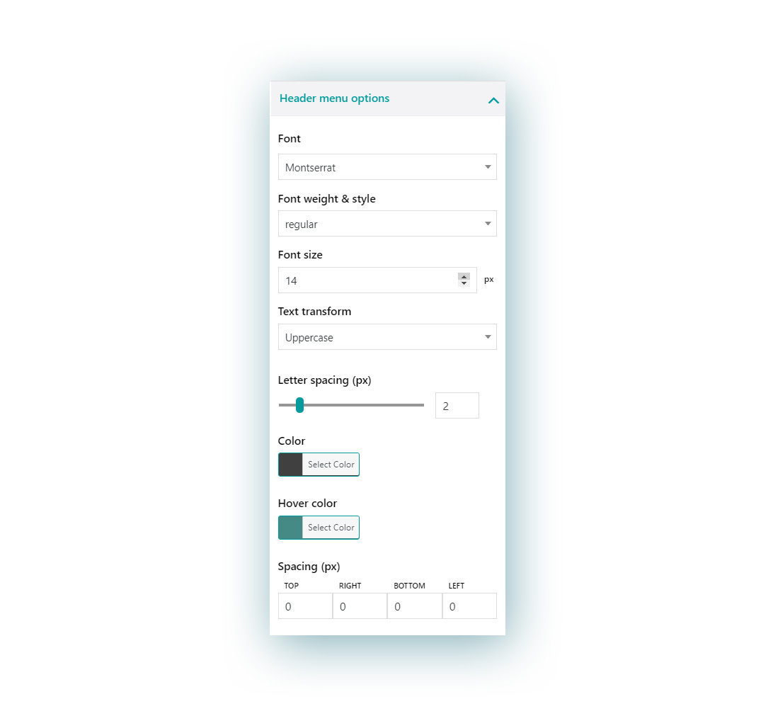
Here you can customize the style of the header menu:
- font
- weight & style
- font size
- text transform (uppercase, lowercase, capitalize)
- letter spacing
- text color
- text color on hover
- spacing (pixels): this is the spacing of the all the text in the header left aside the widget areas
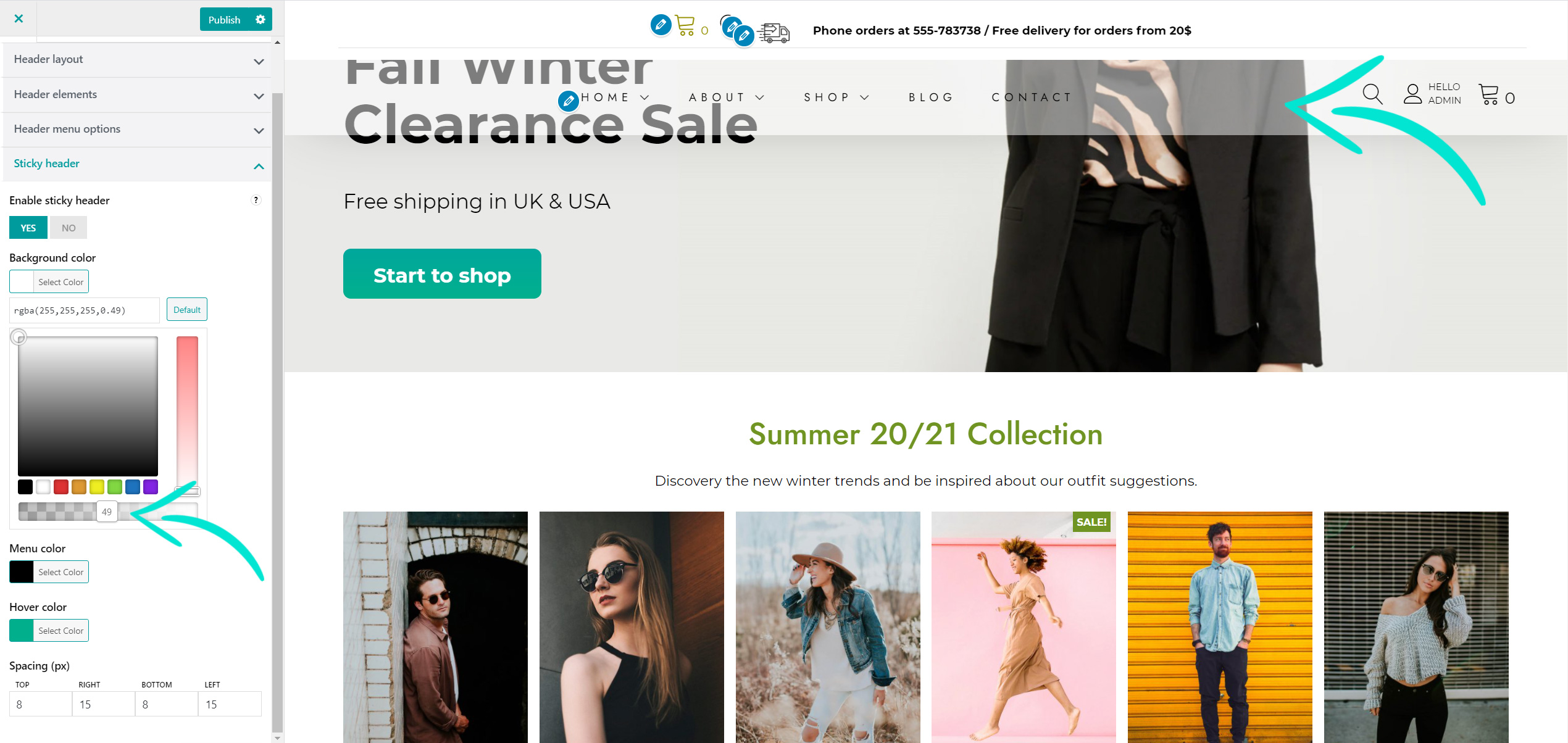
4. Sticky header
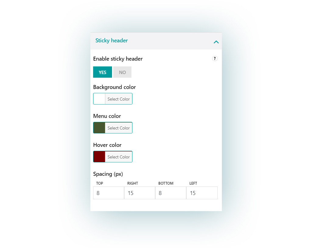
Enable this option to add a fancy modern look to your website and let the header stick to the page even when the user scrolls down. You can give it a different look when you scroll down the page.
You can change:
- background color
- text color
- text color on hover
- spacing (pixels)
For example you can change the background color opacity, so the user can see through it when scrolling down the page.