View Product Page

How to update YITH WooCommerce Ajax Product Filter to version 4.0

When updating YITH WooCommerce Ajax Product Filter to version 4.0, the button Convert widgets in a preset will show.

How to convert widgets into preset

By clicking on it, a modal window will open and you can decide to start the wizard or close the modal.

Start the wizard to convert widgets into preset

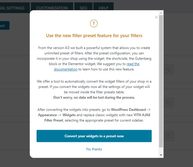
By closing it, you will be able to convert your widgets into a preset from WooCommerce > Status > Tools at any time.

Run filter widgets upgrade

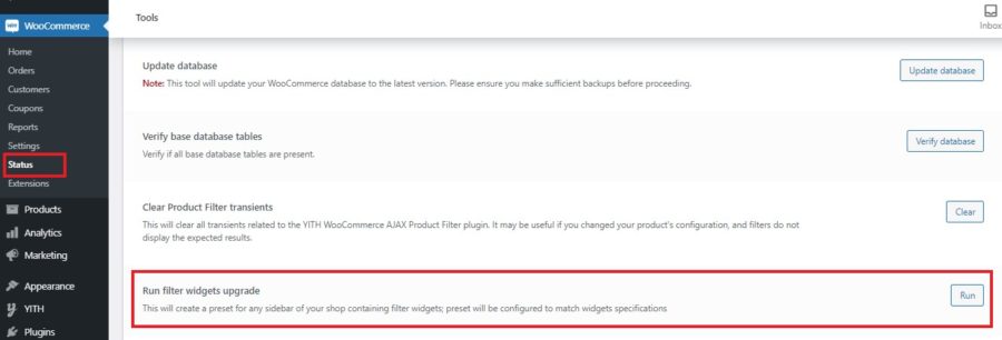
By clicking on the Run button, your sidebar widgets will be converted into presets automatically. Sidebars won’t be changed, so, you will need to place the created preset on the page you prefer.

Next steps

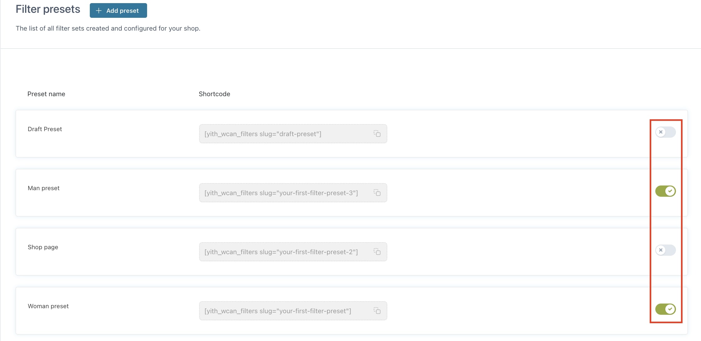
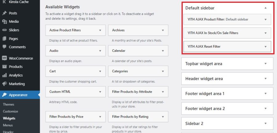
After converting the widgets into presets, they will be created with the sidebar names like in the example below. These presets will be filled based on the previous configuration of filters for that specific sidebar.

Widgets converted into presets

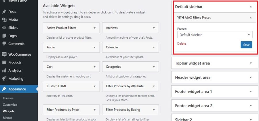
Now, if you go to WordPress Dashboard -> Appearance -> Widgets you will find the sidebars still including the classic widgets.

How to manage classic widgets after conversion

So, if you want to move from the old widgets to the new presets, you must remove all the existing widgets from the sidebar first…

Remove classic widgets from sidebars

…then you can add the preset to the same sidebar.

Add preset to your sidebar


Filter presets

The plugin allows the creation of unlimited groups of filters (presets) that you can show on different product and category pages or custom pages.

It already includes a default preset, the Draft preset, that you will find after installing and activating the plugin in the Filter presets section.

Draft preset

This preset includes filters whose settings can be changed according to your needs.

To start creating new presets, click on Add preset.

Add preset

For each preset created, you can enter a title to easily identify it when checking the list.

Each preset of filters created can be enabled or disabled through the related button.

Enable/disable presets

Vertical or horizontal style

The option Preset layout allows you to choose the style to be used to show your filter presets.

Preset layout

The default layout shows the filters vertically and can be used in sidebars like in the image below. You can use the filter presets in your sidebars through the widget, Gutenberg blocks, and Elementor.

Default layout

Otherwise, if you want to show your filters horizontally, just select the horizontal layout and the result will be as shown below. For further details about the horizontal style, please refer to this page.

Horizontal layout

Preset filters

You can then start choosing the filters to include by clicking on the button Add new filters in the section Filters of this preset.
This allows the creation of different filters based on the page on which you want to show them and configure the available options we will analyze below:

Add new filter

Each filter can be shown as a toggle, closed or opened, by activating the option Toggle style.

How to show filter as a toggle
Opened
Closed

Please note – By adding more presets on the same page, the filters won’t be combined because they will apply to the same products, that is the use of a preset will override the filters of the other one. The only way to use two presets on the same page is to make them work on different products through the selector attribute of the “preset” shortcode or if they share all the filters, so there is no way for one to override the other.

Taxonomy filter

The taxonomy filter allows configuring filters for categories, tags, attributes, and custom taxonomies. Let’s analyze all the available options.

How to configure taxonomy filters
  • Filter name: type the name that will define the filter;
  • Filter for: select Taxonomy;
  • Choose taxonomy: select the taxonomy that will be applied to this filter;
  • Auto-populate with all terms: by enabling this option, the filter will acquire all the terms already available for the taxonomy you have selected and also the ones you will create in the future.
  • Choose terms: (available if the option Auto-populate with all terms is disabled) based on the taxonomy selected, you will be able to add the terms to be used for filtering. In the image above, we have used product categories.
Filter type
  • Filter type: types available are: checkbox, radio, select, text, color swatches, and label/image.
Customize terms options
  • Customize terms: by enabling this option, you will have the possibility to customize each term label and tooltip. If you don’t want to customize the label and tooltip for each selected term, you can disable the option, and just use the term name; this will also improve the performance of the filter editing screen, in case you have many terms selected.

CHECKBOX & TEXT

Checkbox filter terms

These are the available options:

Checkbox options
  • Show as toggle: enable if you want to show the filter as a toggle;
  • Order by: you can choose how to sort terms shown in the filter by name, slug, term count, term order and drag & drop. When selecting Drag & drop, you will also be able to change the position of the terms in Terms options by drag and drop;
  • Order type: choose the default order for terms from ASC (ascending) and DESC (descending);
  • Show count of items: enable if you want to show the number of items available for each term;
  • Show hierarchy: this ordering applies to hierarchical taxonomy levels.
    • By selecting No, show all terms in same level, the hierarchy won’t show and only the terms in the same level will;
    • by selecting No, show only parent terms, the hierarchy won’t show and only the terms in the same level will;
    • by selecting Yes, with terms collapsed, the hierarchy will show and terms will be collapsed;
    • by selecting Yes, with terms expanded, the hierarchy will show and terms will be opened;
    • by selecting Yes, without toggles, the hierarchy will show but without toggles.

Based on the selection made in the Order by option, the ordering of the terms will apply level by level starting from parent terms.

Multiple selection
  • Allow multiple selection: by enabling this option, users will be able to select multiple terms when filtering products;
  • Multiselect relation: by selecting AND, filter results will show only if all selected terms match at the same time; by selecting OR, filter results will show only if at least one of the selected terms matches.
Adoptive filtering
  • Adoptive filtering: this option allows you to choose to hide terms with no results or show them without being clickable (see image below), based on the number of products and categories selected.
Adoptive filtering example

RADIO

Same options as for Checkbox except for Allow multiple selection and Multiselect relation since radio allows selecting only one option at a time.

Radio

SELECT

Same options as for Checkbox except for Show hierarchy since it is not possible to show hierarchy structure inside the select body.

Moreover, it adds the option Show search field which, if enabled, shows a search field that allows users to filter product terms directly from the dropdown.

Show Search field
Search field example

COLOR SWATCHES

By selecting Color swatches, you will need to select if and where labels will show, enter the number of items per row that you want to show in the option Columns number, then in Terms options you can add color or image to each term.

Color swatches term options
Color swatch filter example

LABEL/IMAGE

Label/Image

By selecting Label/Image, you will need to select if and where labels will show, and enter the number of items per row that you want to show in the option Columns number.

Label/Image example

Order by

Order by

By selecting Order by, you can decide the sorting options to show such as default, popularity, price, rating, latest, etc. by adding them to the option Order options.

Order by example

Price range

Price range

By selecting Price range, you will be able to choose the filter type to use from Checkbox, Radio, Select, and Text.

Configure price ranges

Price ranges example

You can add all the price ranges you want by adding them through the option Customize price ranges. Here, you can specify the minimum and maximum amount or the minimum only and enable the option Show “& above” in last range which allows users to filter prices from the minimum value you have specified to the highest price available.

The other options available are:

  • Show count of items: enable if you want to show the number of items available for each term;
  • Allow multiple selection: by enabling this option, users will be able to select multiple terms when filtering products;
  • Adoptive filtering: this option allows you to choose to hide terms or show them but without being clickable, based on the number of products and categories selected.
& above option

Price slider

Price slider

By selecting Price slider, you will be able to show a slider with a minimum and maximum price value. Through the option Price slider style, you can decide to show a slider, the fields “From” and “To” or both.

Price slider example

The plugin allows calculating the minimum and maximum value automatically by enabling the option Adaptive limits. In this way, the values will adjust to the current selection without the need to specify them. Yet, if you prefer to configure these values, you can disable Adaptive limits and the min/max fields will show like in the image below. Here, you will need to insert the minimum and maximum values for the slider to start and end.

Adaptive limits

Finally, you can insert the value for each increment of the slider through the Slider step option.

Slider step

Review filter

Filter by review

By selecting Review, your users will be able to filter products by customers’ review ratings as shown in the image below.

Filter by review example

In stock/On sale filter

By selecting In stock/On sale, you will give your users the possibility to filter only by discounted and/or available products, therefore excluding those currently out-of-stock.

In stock/On sale filter

To filter and show only available products, you must enable the option Show stock filter.
To filter and show only discounted products, you must enable the option Show sale filter.
To filter and show only featured products, you must enable the option Show featured filter.

If you want to show also the number of items available for each term (like in the image below), activate the option Show count of items.

In stock/On sale filter example


Horizontal layout

If you prefer to show your filters horizontally on the top of your pages, select Horizontal in the option Preset layout when creating your filter preset.

Horizontal layout

This type of layout requires setting a title for the filters created. By leaving the field empty, the system will show a notice when saving the filter.

Filter name error message

All filters configured will show as toggles.

Horizontal layout example

After a selection has been made within the filter, the button Clear will show to let users reset their choice (only if the related option is enabled). By clicking on Save, the selection will be saved and registered for that filter.

Clear and Save buttons

Based on your configurations in the General settings tab, you will be able to show the Reset filters button (and choose where to show it), the count of items, the active filters (and the possibility to remove them), the Apply filters button, etc.

Active filters and Reset button

General options

In the tab General options, you will find all the global options available for your filters. Let’s check them below.

General options

Filter mode options
  • Filter mode: decide to apply filters in Ajax or show the Apply filters button to get results;
Apply filters button
  • Filter mode (horizontal): choose whether to show the “save” button or immediately filter results for the horizontal layout;
Save button (horizontal layout)
Save button
General options
  • Show results: select if you want to load the results on the same page by using AJAX or load them on a new page;
  • Variations filtering: enable it to make sure that only variable products with variations matching all the selected terms are shown in the set of results; if disabled, the variable product will appear in the results if the selected attribute is available in the product and regardless whether it matches an existing or in-stock variation.

Enabling this option automatically activates the option in WooCommerce > Settings > Products > Advanced > “Enable table usage”. If you disable this option, the Variations filtering will be disabled too;

Enable table usage in woocommerce

If you want to learn more about how this option works with an example, please, refer to this page.

General options
  • Lazy filter loading: enabling this option allows the filters in the preset to load asynchronously using AJAX to speed up the initial page loading;
  • Paginate terms: when enabled, the taxonomy filters won’t show more than 10 terms. If there are more terms available, users will see a “Show more” link to display the remaining terms (1). Also, the selected term will show always at the top (2) to make sure they are always visible;
Paginate terms option example
General options
  • Hide empty terms: enable if you want to hide empty terms from the filters section;
  • Hide out of stock products: enable if you want to exclude out-of-stock products from results;
  • Show “Clear” above each filter: enable if you want to show a button to reset the filters to let users quickly start a new selection;
Show Clear link
  • Show as modal on mobile: enable if you want to show the filter section as a modal on mobile devices to make the filtering easier;
Filter section modal on mobile 1
Filter section modal on mobile 2
  • Scroll top after filtering: enable if you want the page to automatically scroll up whenever a filter is selected. In this way, your users will always be able to see the list of filtered items starting from the top without missing any product.

Active filters options

In this section, you can configure the global options for the active filters.

Active filters options
  • Show active filters as labels: enable if you want to show the currently selected filters as labels; it is also possible to remove any active filter;
Active filters example
  • Active filters labels position: choose the position where to show the filter labels;
Active filters position
  • Show titles for active filter labels: enable if you want to show a label for each group of active filters;
Active filters titles

Reset button

In this section, you can configure the global options for the reset button.

Reset button options
  • Show reset button: enable to show the rest button through which users can easily reset the selected filters;
Reset button
  • Reset button position: choose whether to show the reset button
    • Before filters
    • After filters
    • Above products list
    • Inline with active filters