In this post, we will go over the Badges tab, where you can manage the created badges from the Badges list. We will also see how to create a new badge:
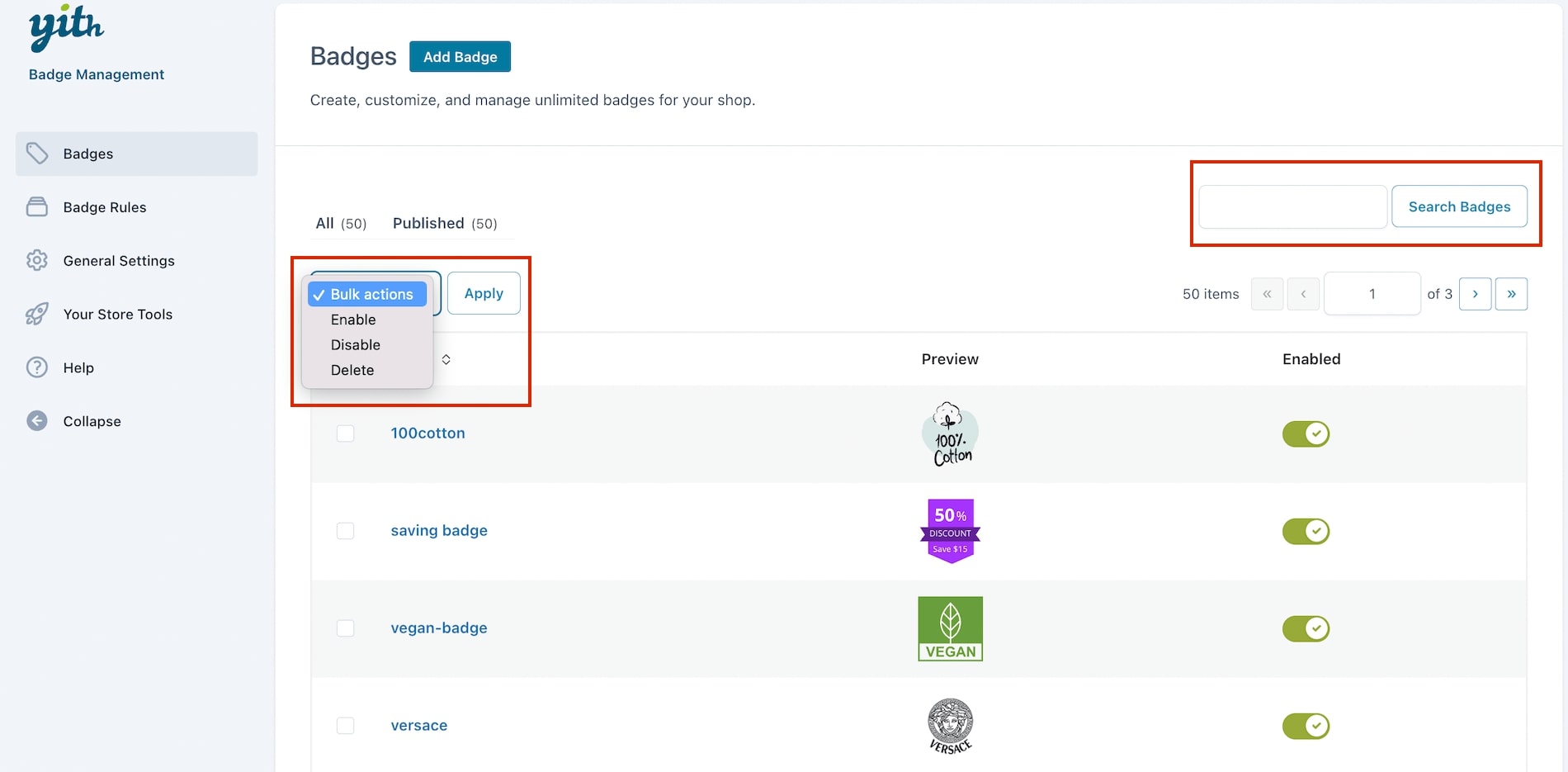
Badge list
All the badges created will show in the tab Badges of the plugin panel.
For each badge, you can decide to enable/disable it, edit it, clone it or delete it.
From the same section, you can also search badges through the related field and apply bulk actions to enable, disable, and delete your badges.
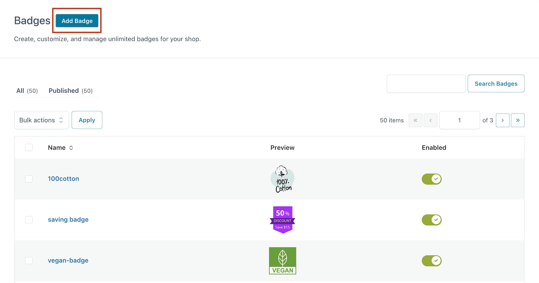
How to create a new badge
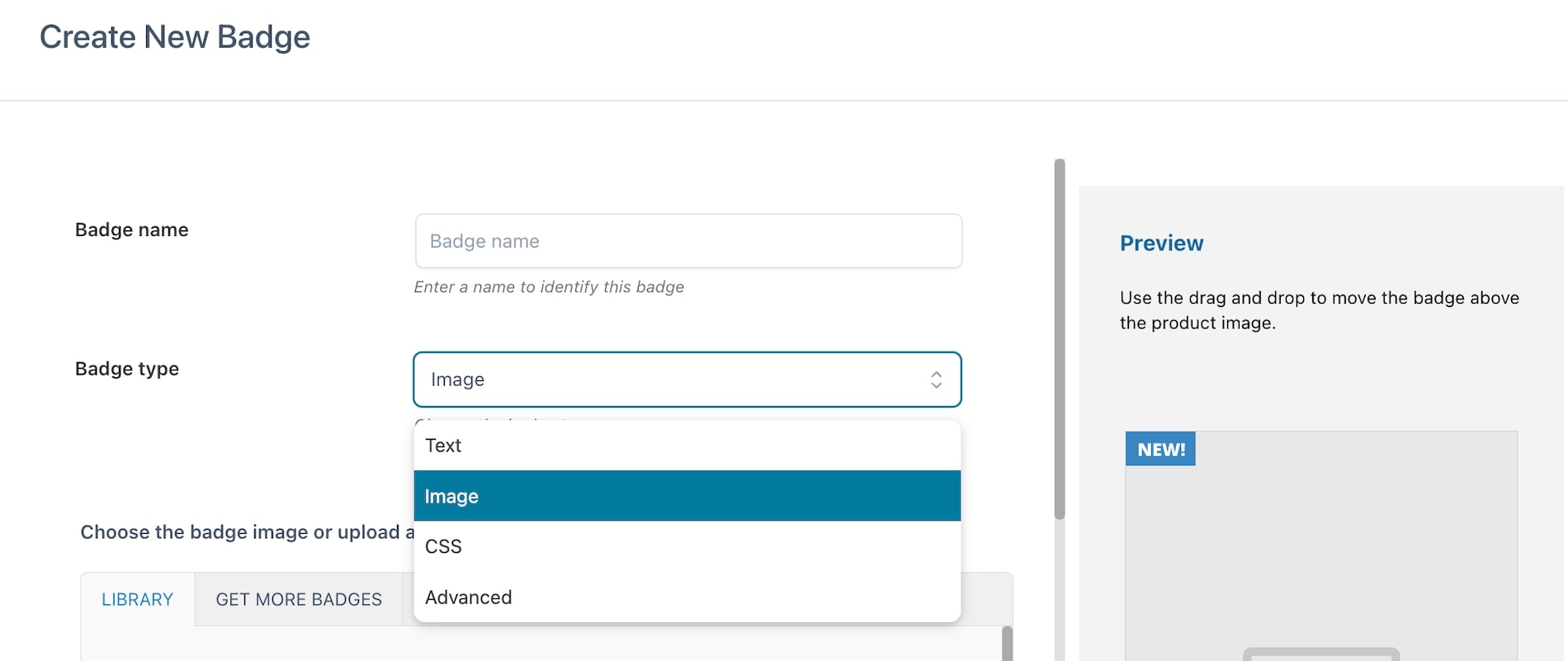
To create a new badge to apply to the products of your shop, click on the button “Add badge” that you find in the “Badges” tab of the plugin panel.
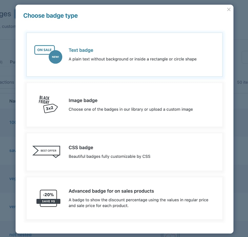
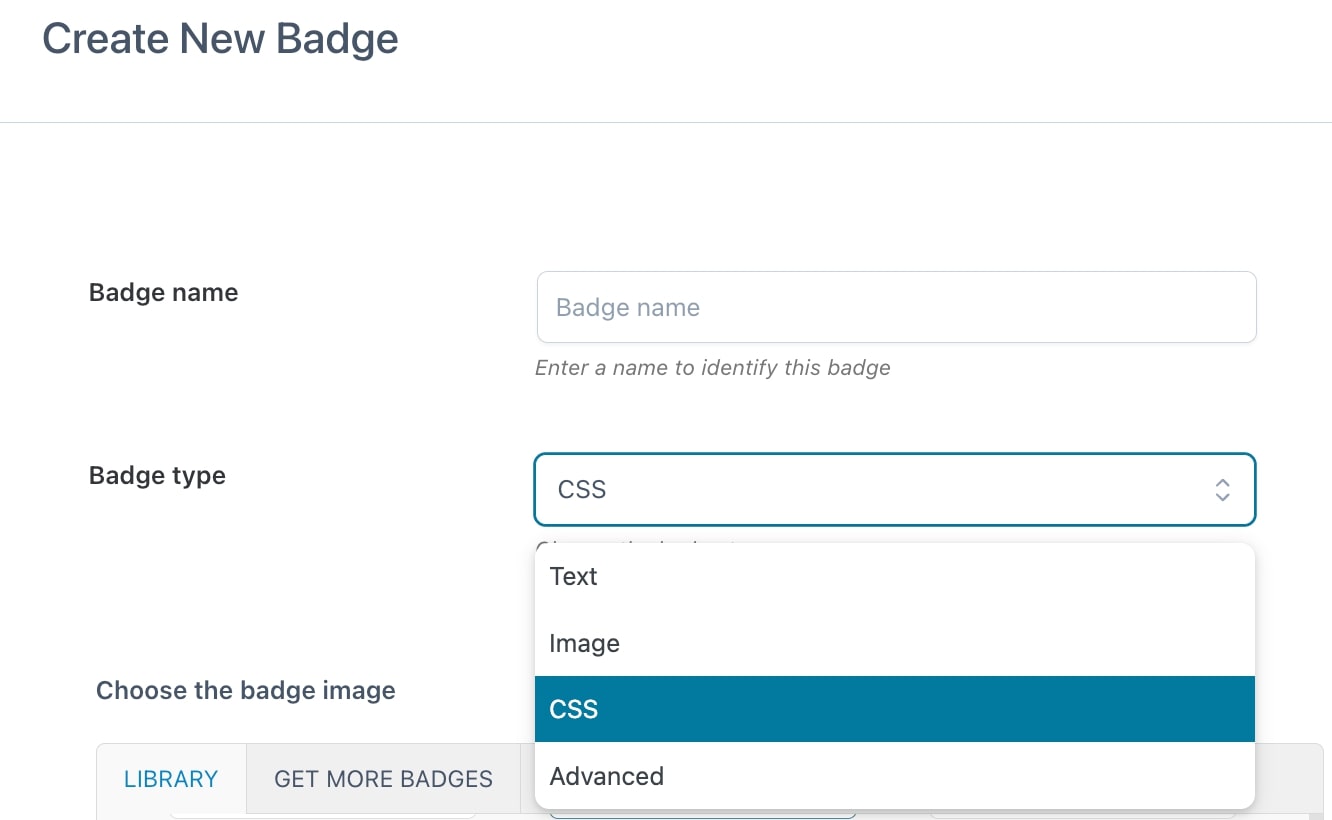
Now choose the badge type from text, image, CSS, and advanced.
We’ll analyze the different badge types in the following sections:
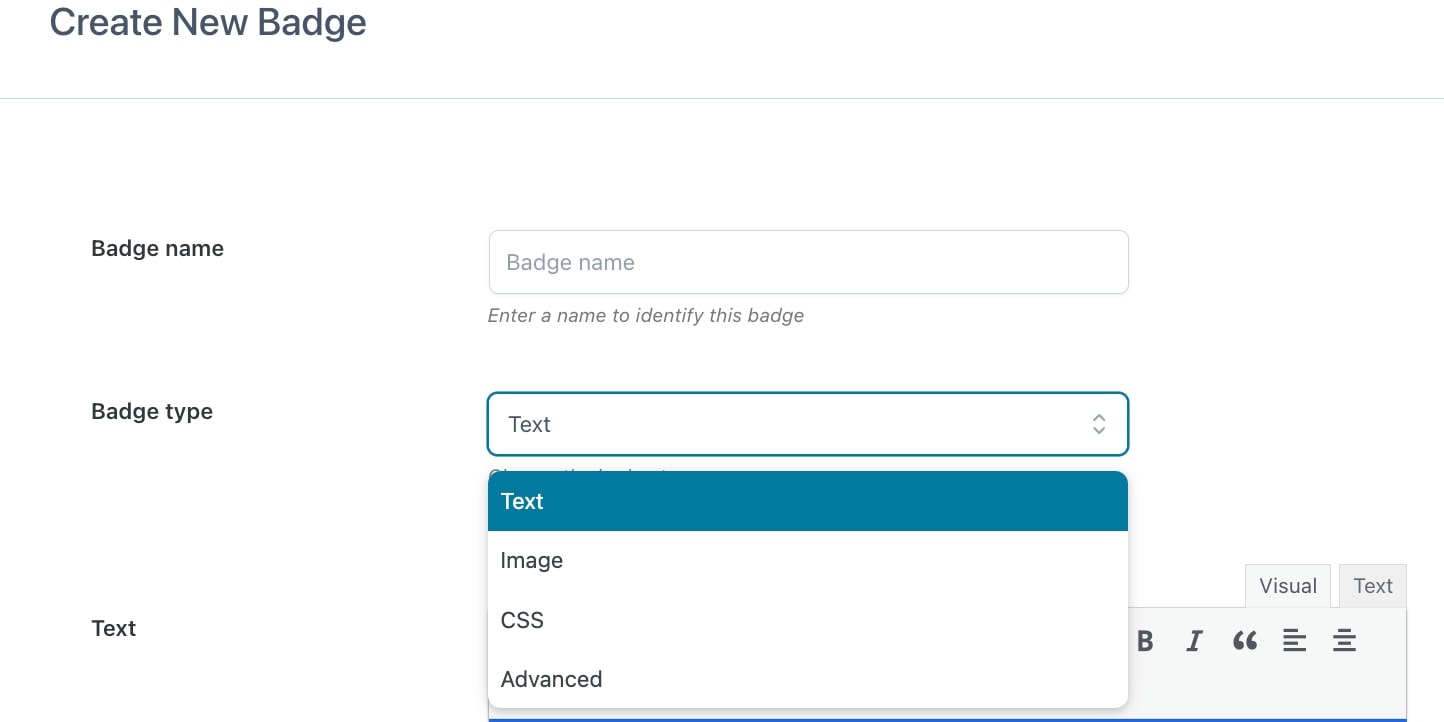
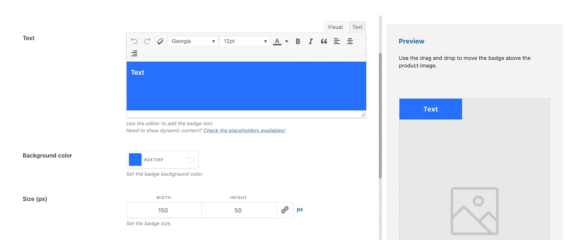
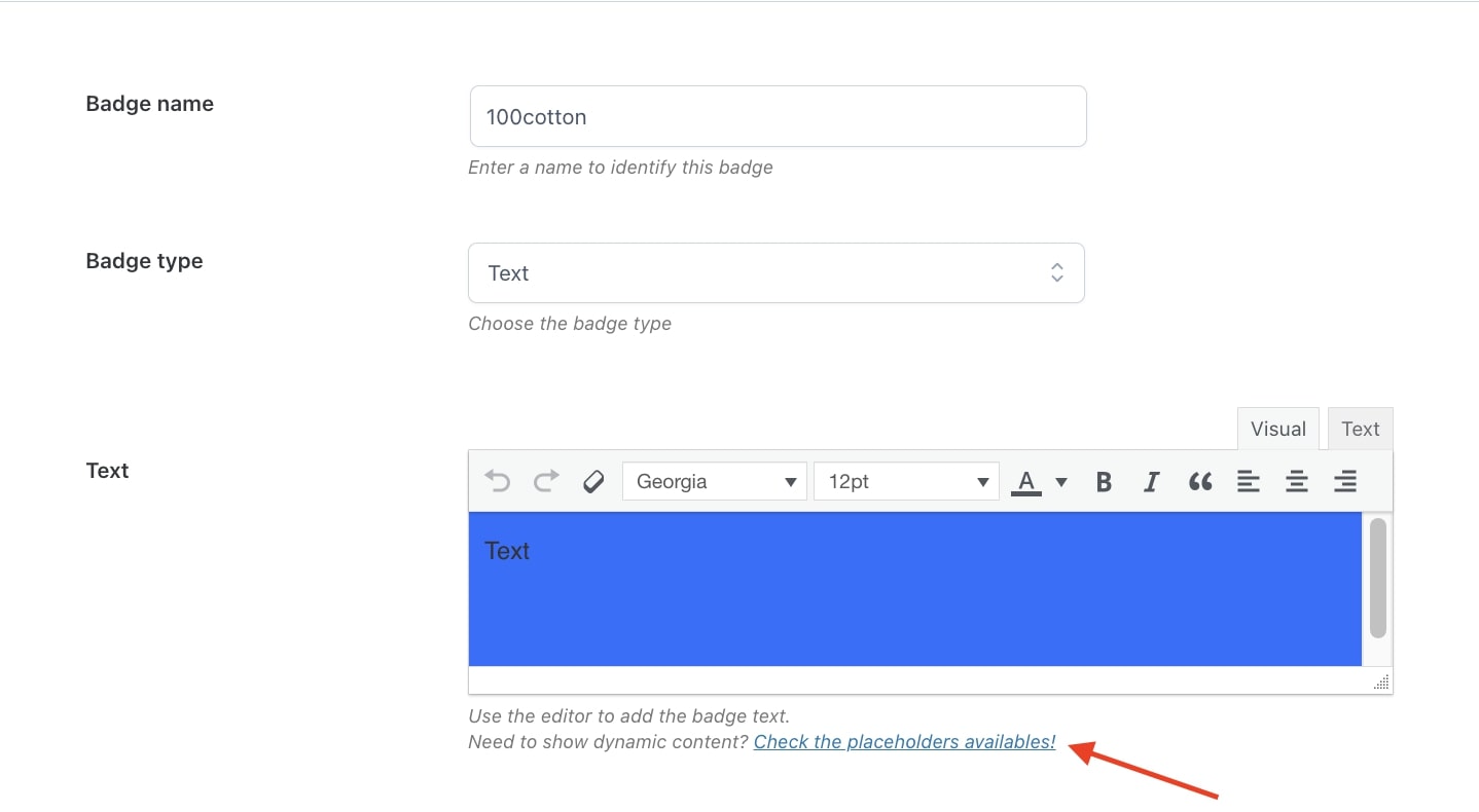
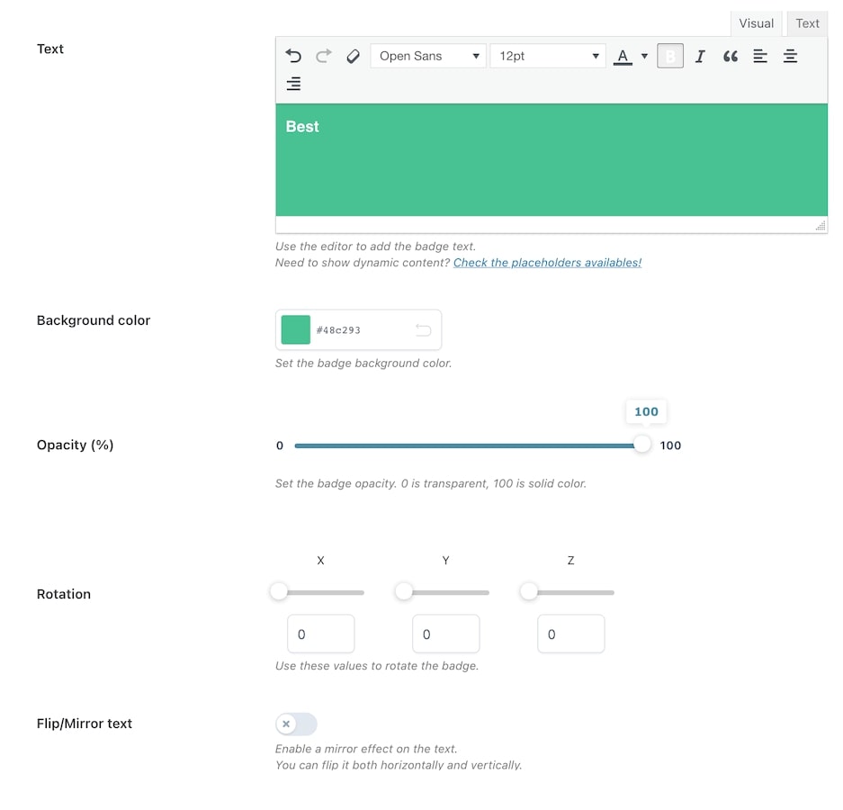
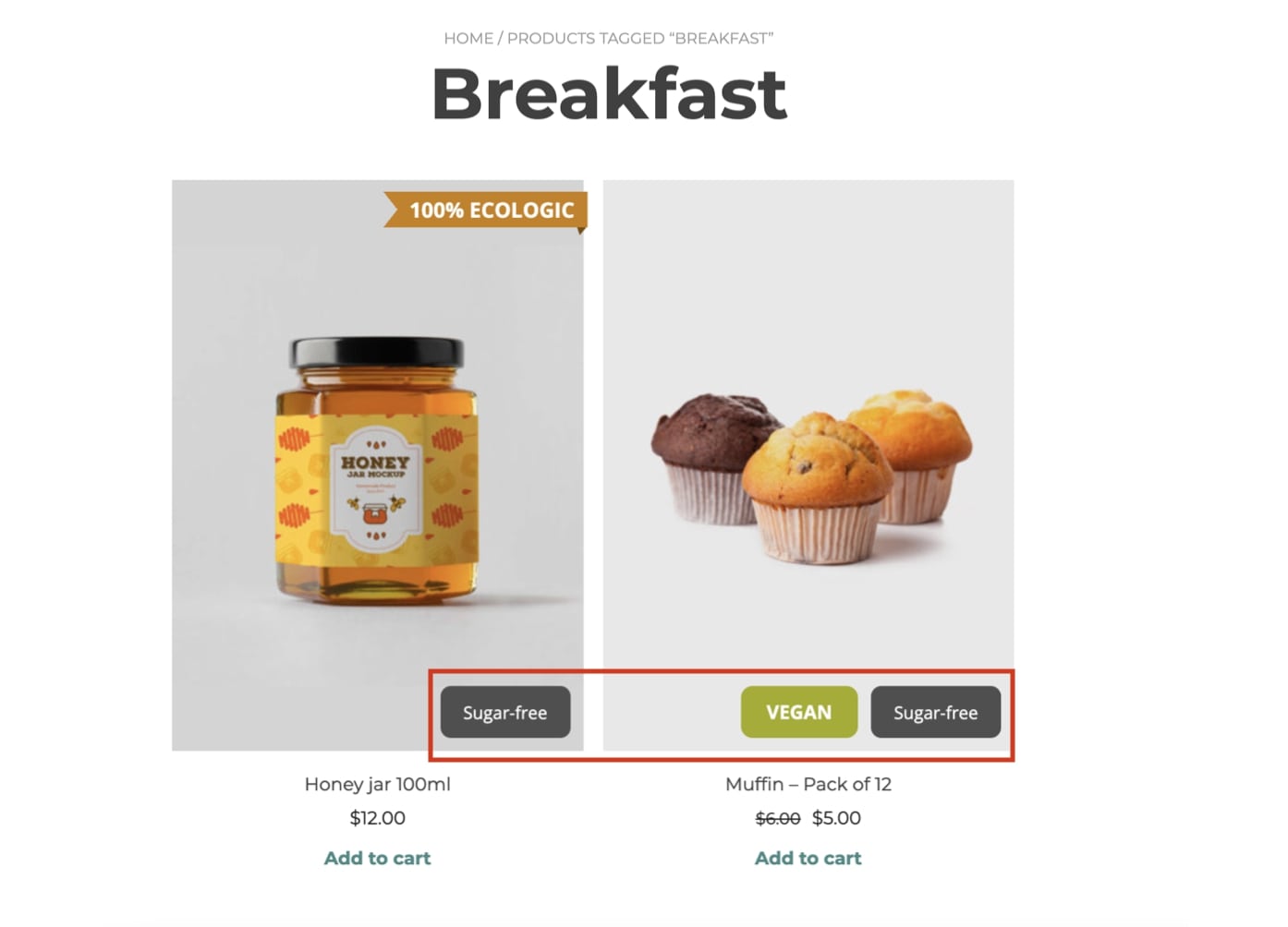
This type of badge is entirely formed of a text label, for which you can customize colors, size, width, height, position, and more.
To create your text badge, start by entering a name to identify it (N.B.this is a required field) then select Text from the dropdown in Badge type.
Now you can start setting all the available options through the built-in editor:
Text: here, you can customize the text style (font, size, color, alignment, etc.);
Background color: choose the color of the text background;
Size (px): select height and width of the badge;
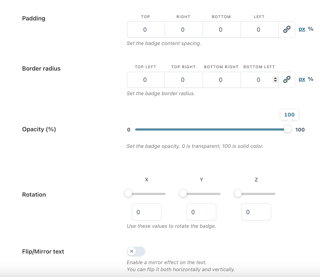
Padding: set the badge content padding (top, right, bottom, left) in px or %;
Border radius: set the badge border radius (top-left, top-right, bottom-right, bottom-left) in px or %;
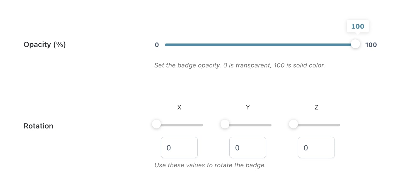
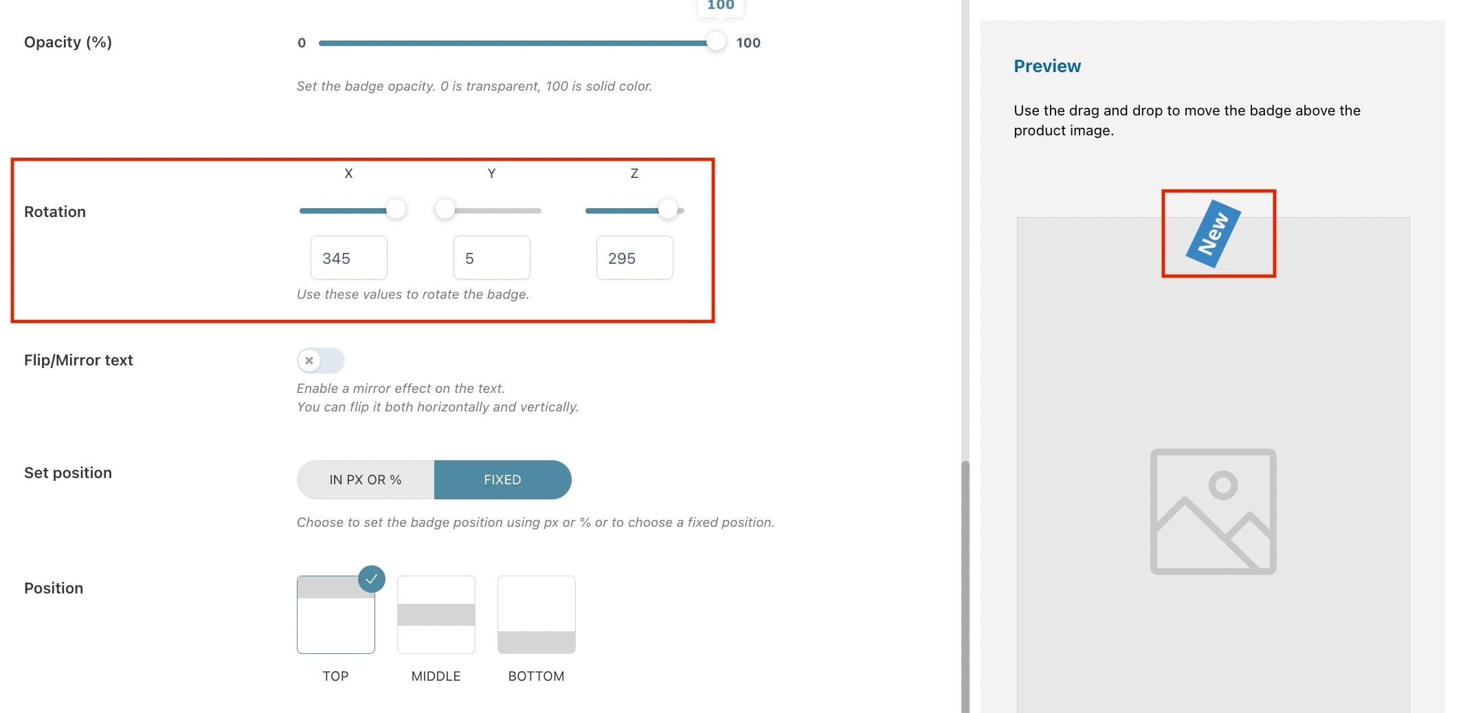
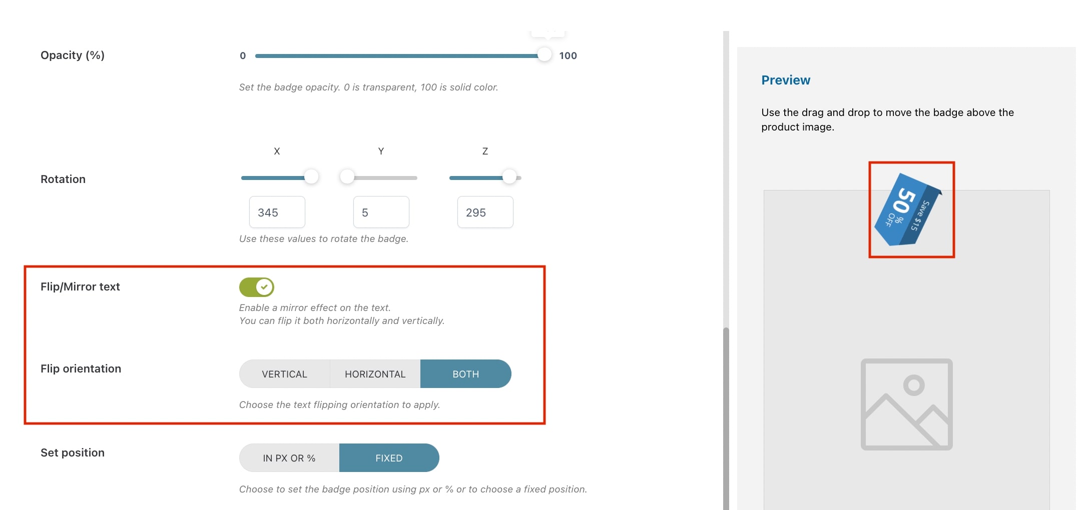
Opacity (%): set the percentage of opacity for the badge. Min. 0 = transparent; max 100 = solid color;
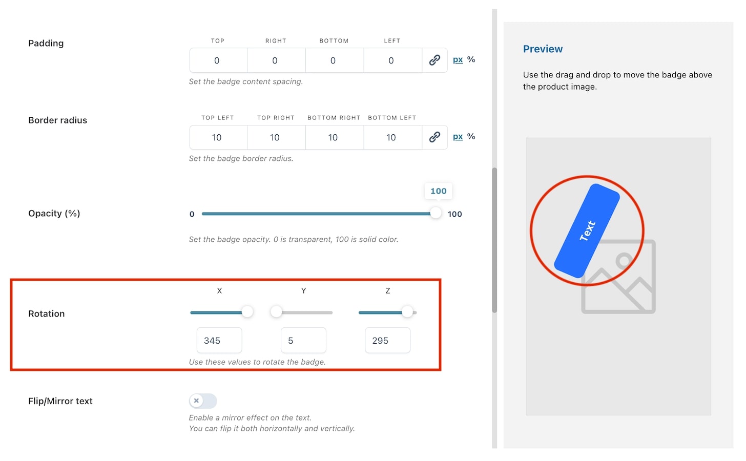
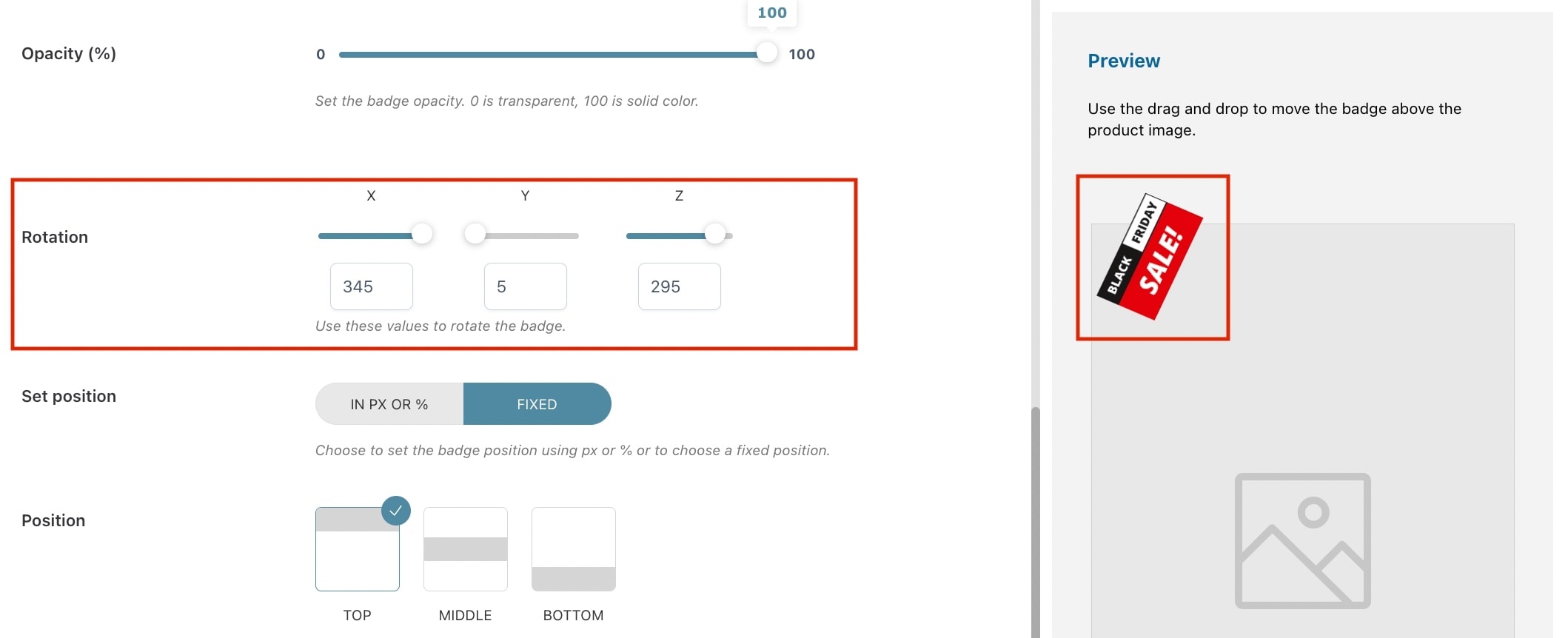
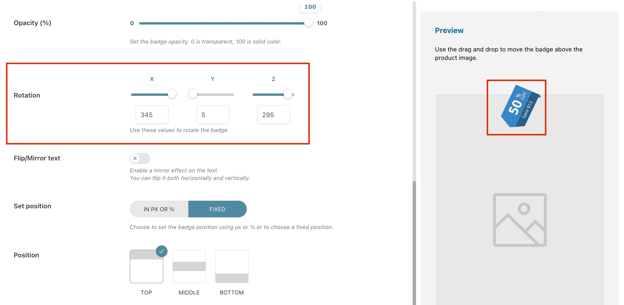
Rotation: With the rotation option, you can rotate the image like a 3D object. You can rotate it using the three main axes X, Y, and Z. You can either choose to use numbers or the slider as shown in the image below.
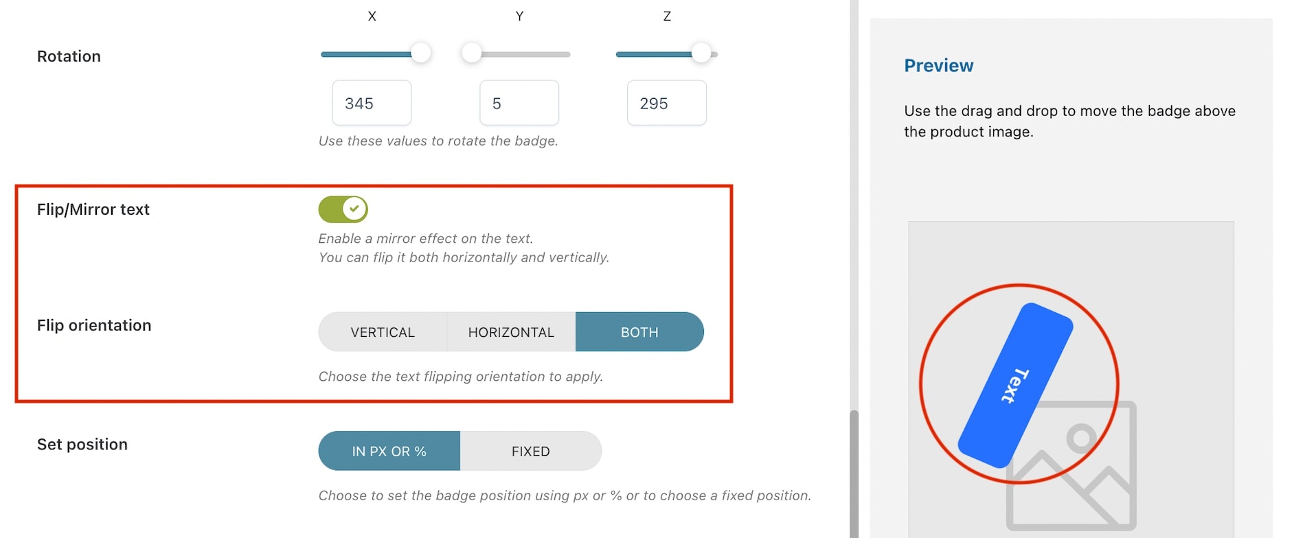
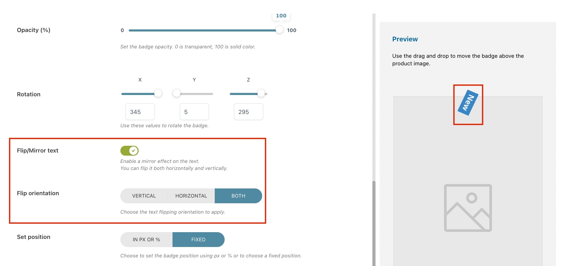
Flip/Mirror text: enable if you want to apply a mirror effect on the text. If enabled, you can choose how to flip it through the option Flip orientation;
Badge position
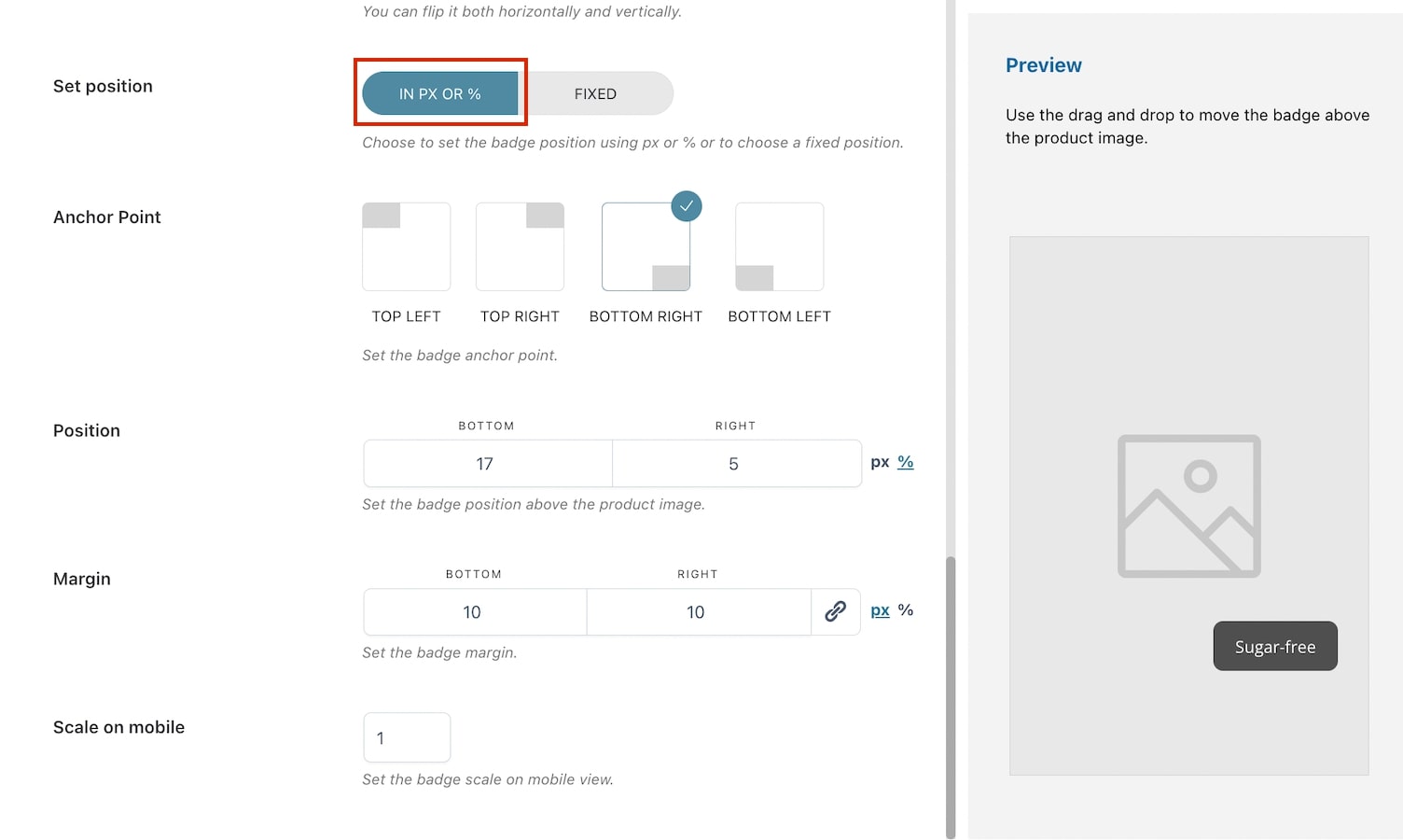
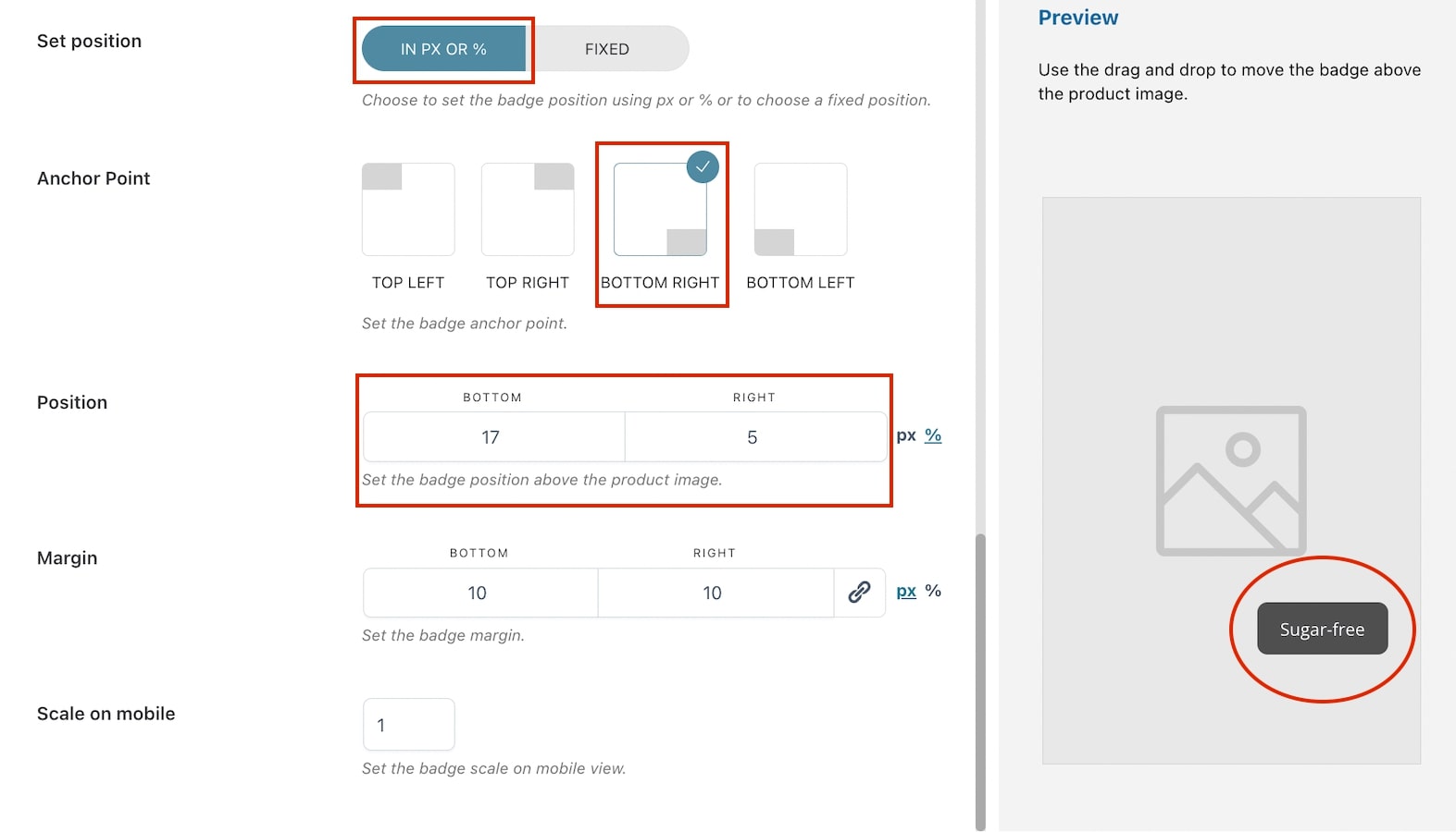
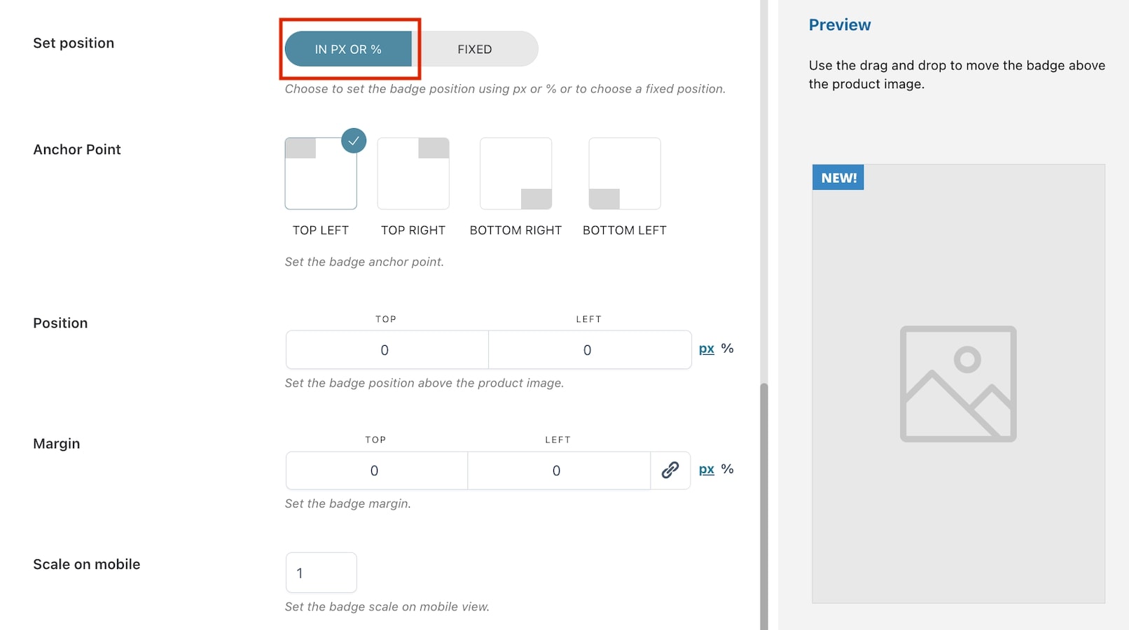
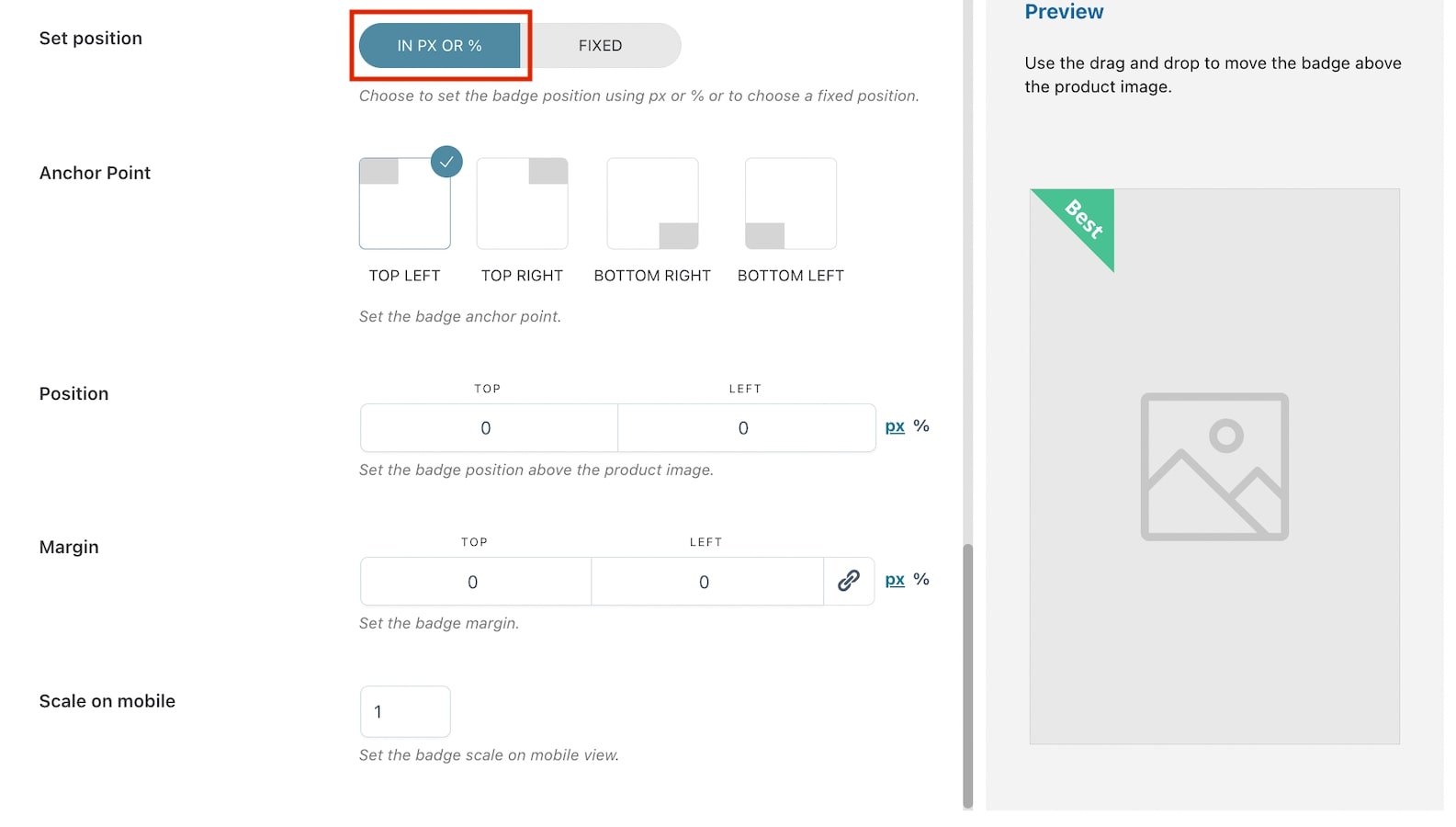
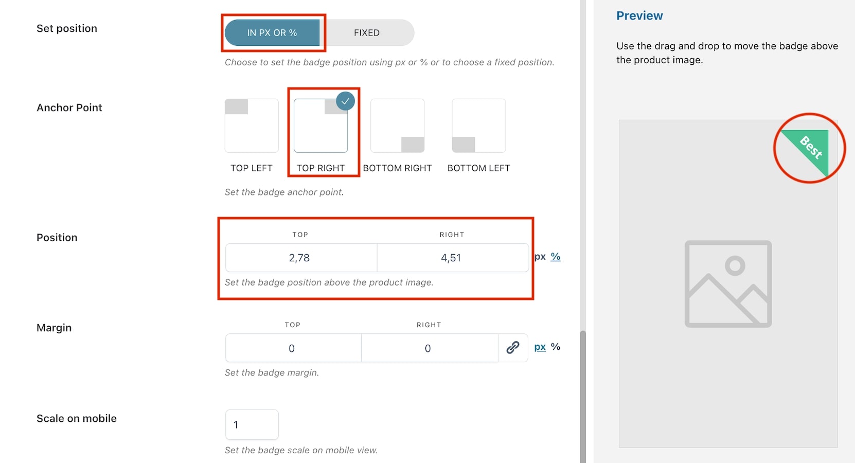
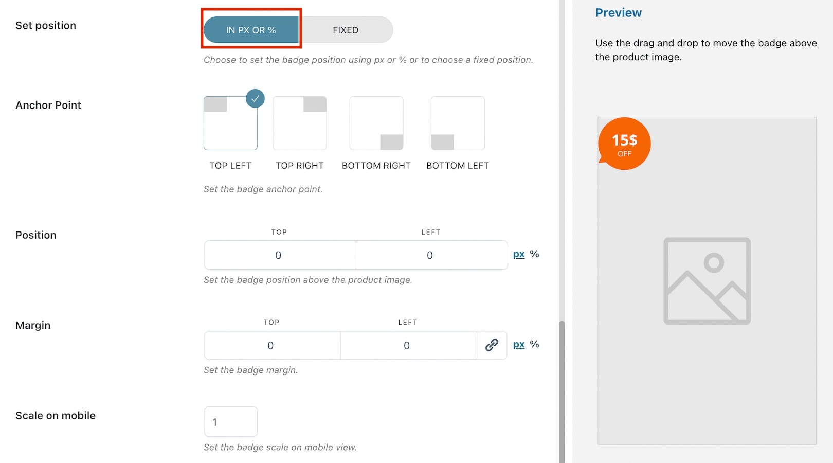
Set position: choose how to set the badge position in the product image from in px or % and fixed. By selecting in px or %, you will have the following options:
Anchor Point: select the anchor point for the badge (top left, top right, bottom, left, bottom right). E.g. in the image above, we have selected bottom right;
Position: based on the selected anchor point, the position will automatically show two options (in this case bottom and right) and their values. Adjust them according to your needs in px or %;
Margin: based on the selected anchor point, the margin will automatically show two options (in this case bottom and right) and their values. Adjust them according to your needs in px or %.
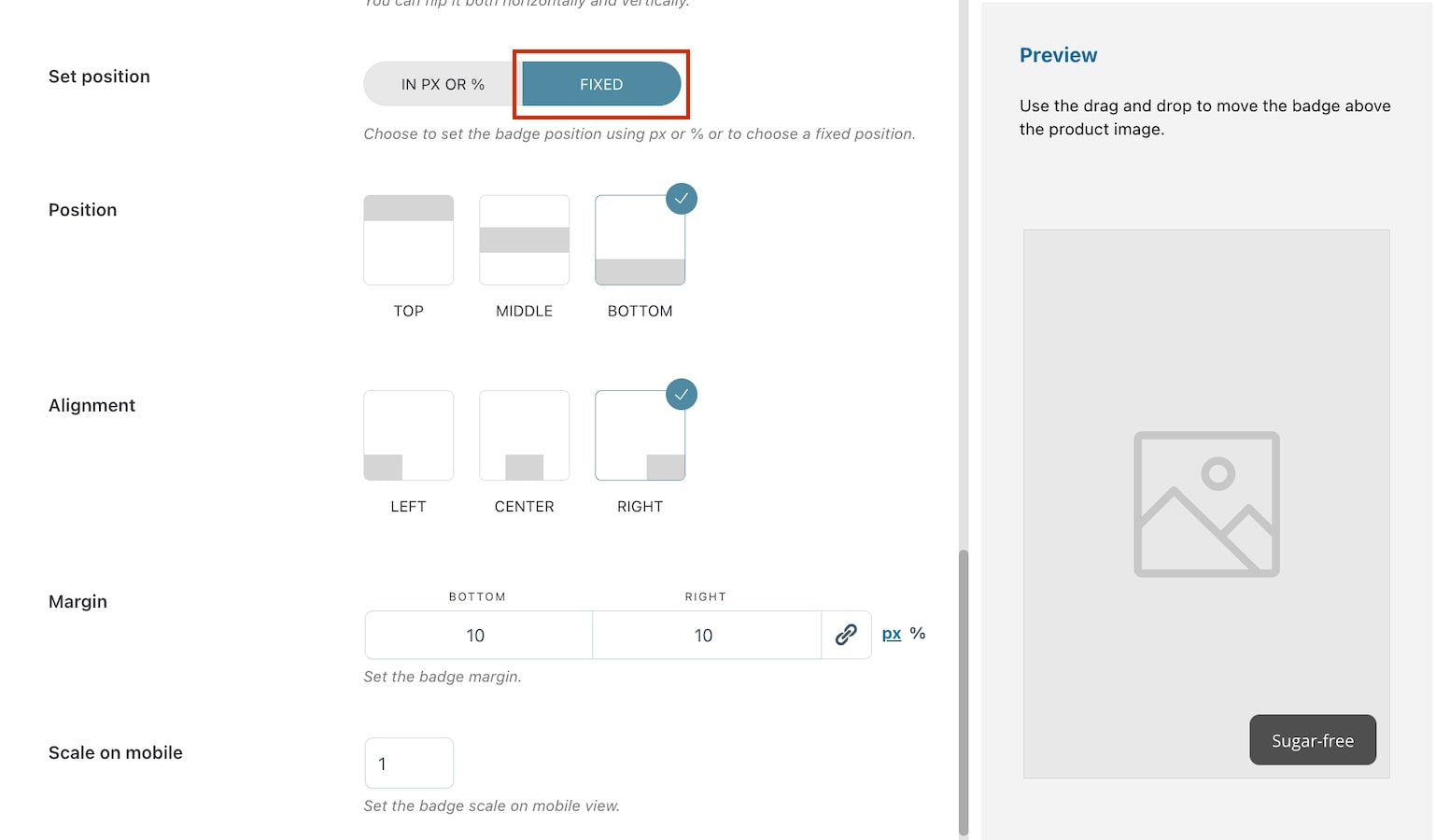
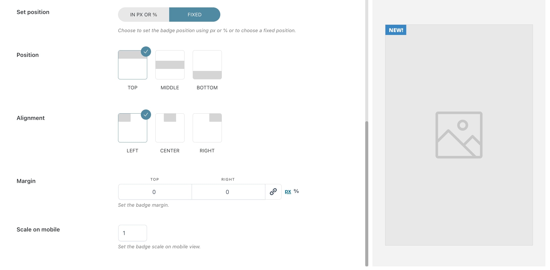
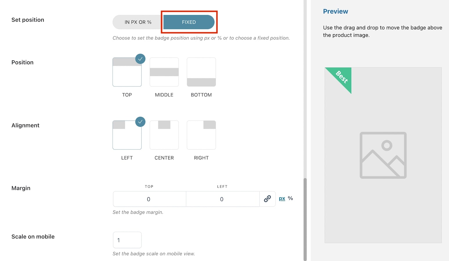
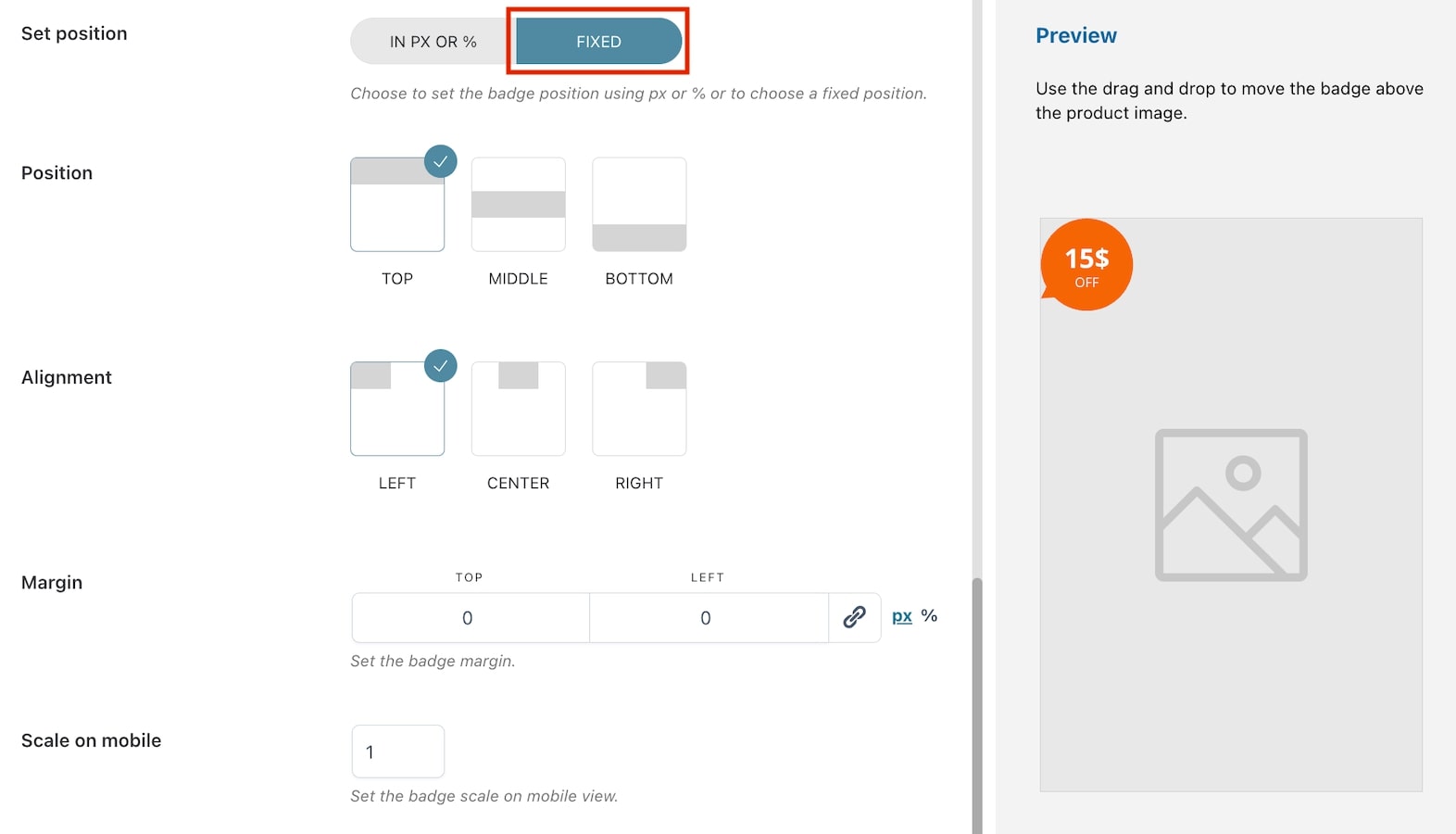
Set position: choose how to set the badge position in the product image from in px or % and fixed. By selecting fixed, you will have the following options:
Position: choose the badge position from top, middle or bottom. E.g. in the image above, we have selected bottom;
Alignment: choose the badge alignment from left, center or right. E.g. in the image above, we have selected right;
Margin: based on the previous selections, the margin will automatically show two options (in this case bottom and right) and their values. Adjust them according to your needs in px or %.
Scale on mobile: insert the value to scale the badge on mobile devices. Default value: 1.
Preview
Any of the above option settings will reflect in the preview box on the right so you will be able to see in real-time the badge you are creating and apply any necessary adjustments.
To move the badge above the product image, you can use drag and drop. When applying this action, the position will be automatically set to in px or % and the values will update based on where you’re moving the badge.
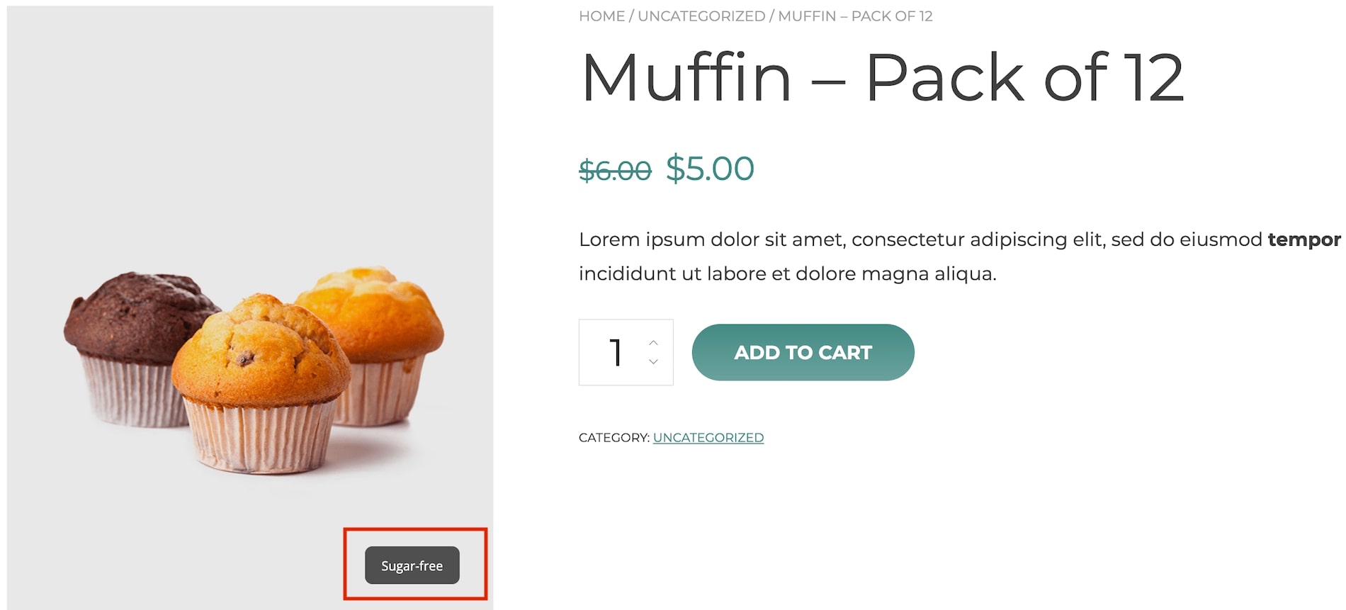
Text badge on frontend
Placeholders
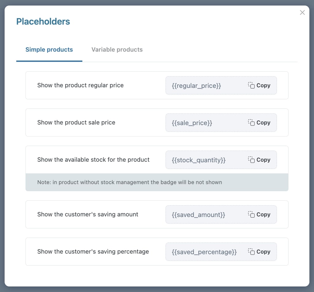
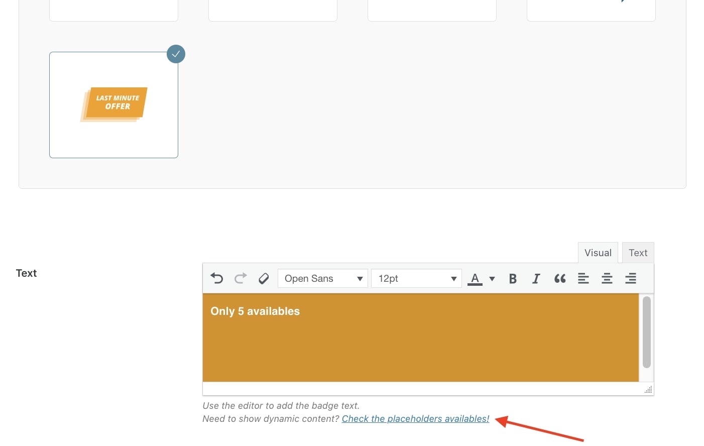
When using the built-in editor, you can add dynamic content to show on the badge through the available placeholders that you can find by clicking on the link under the editor.
In the modal, you will be able to copy placeholders for simple and variable products.
Simple products
The available placeholders are:
{{regular_price}} – this shows the product regular price;
{{sale_price}} – this shows the product on-sale price;
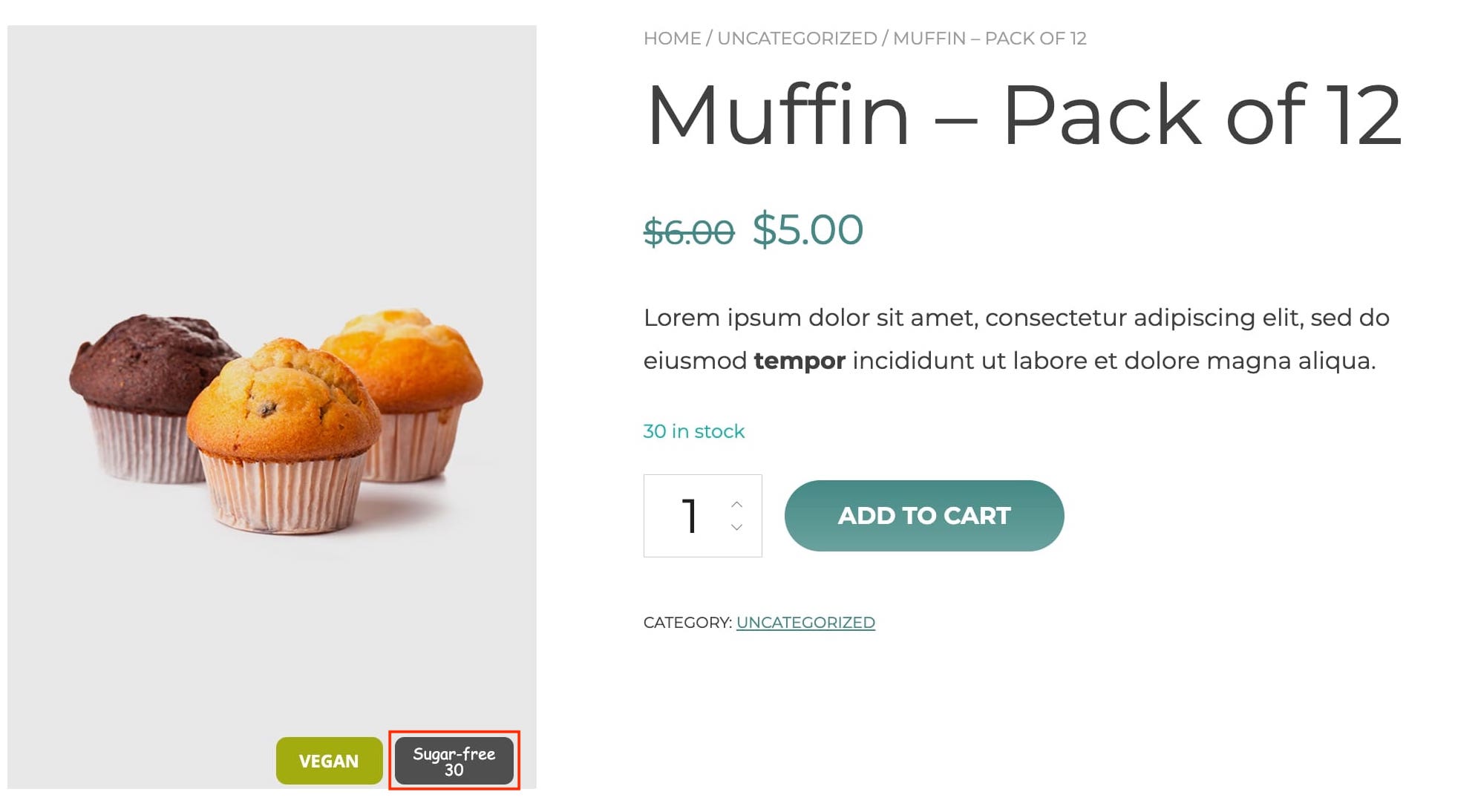
{{stock_quantity}} – this shows the product stock. For products with stock management disabled, the badge won’t show;
{{saved_amount}} – this shows the amount saved by customers;
{{saved_percentage}} – this shows the percentage saved by customers.
Stock quantity placeholder
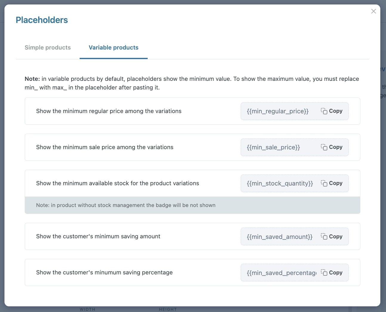
Variable products
The available placeholders are:
{{min_regular_price}} – this shows the minimum regular price of product variations;
{{min_sale_price}} – this shows the minimum on-sale price of product variations;
{{min_stock_quantity}} – this shows the minimum stock quantity of product variations. For products with stock management disabled, the badge won’t show;
{{min_saved_amount}} – this shows the minimum amount saved by customers;
{{min_saved_percentage}} – this shows the minimum percentage saved by customers.
Please note: by default, the placeholders show the minimum value. If you want to show the maximum value, just replace min with max. For example, {{max_sale_price}}.
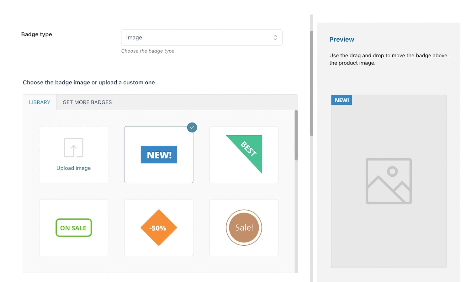
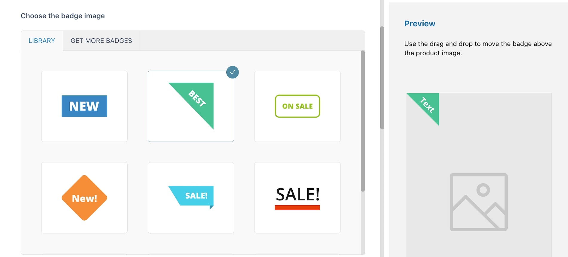
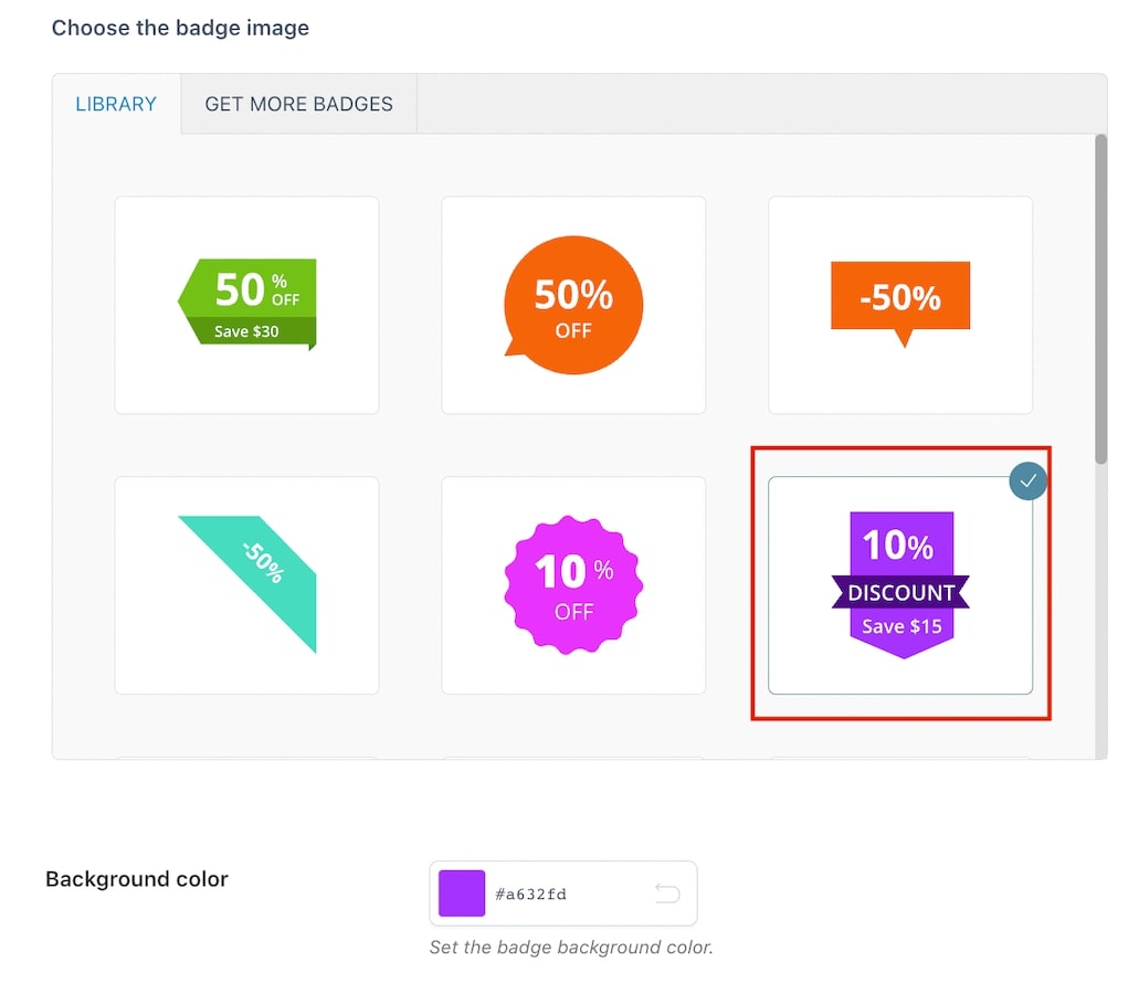
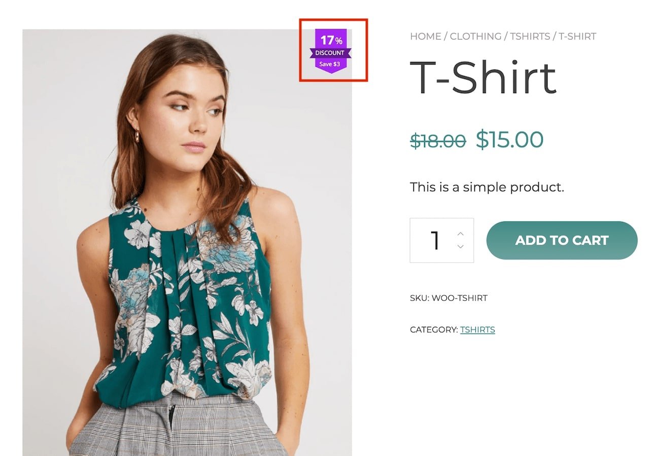
Image badges give you the opportunity to choose among a series of ready badges or to upload a customized one.
To create your image badge, start by entering a name to identify it (N.B.this is a required field) then select Image from the dropdown in Badge type.
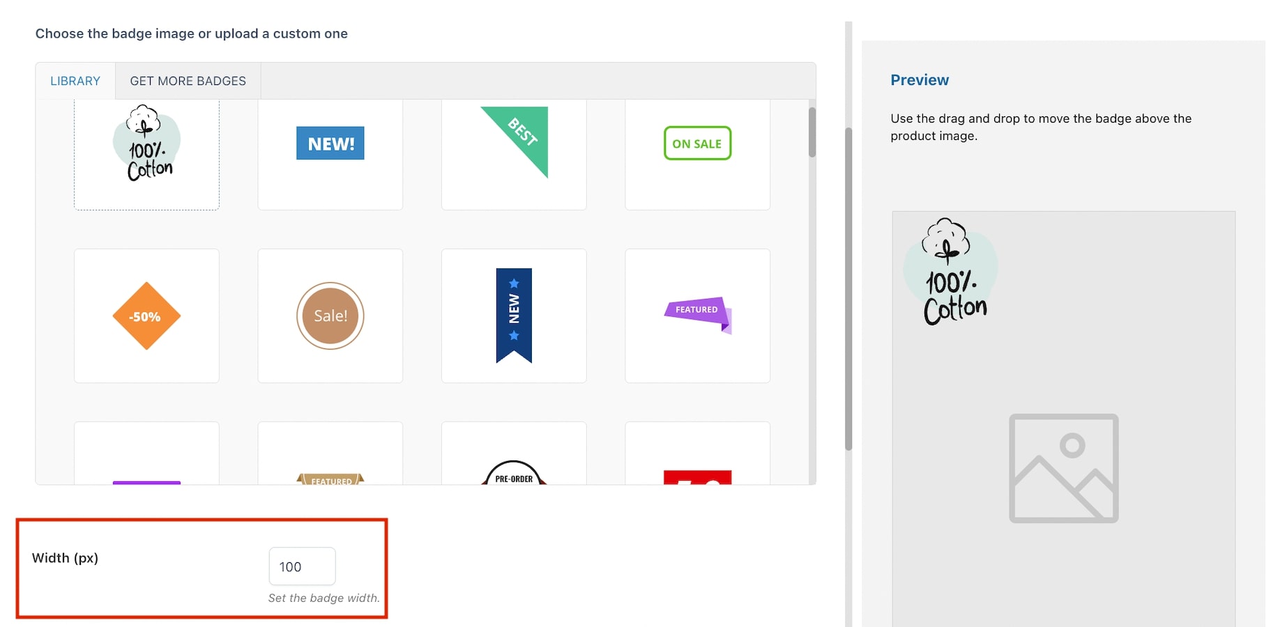
The plugin includes a library with ready-to-use badges as well as the possibility to upload custom images.
When using a custom image, you can set the badge width through the related option Width (px). For custom images, we recommend using vector graphics format.
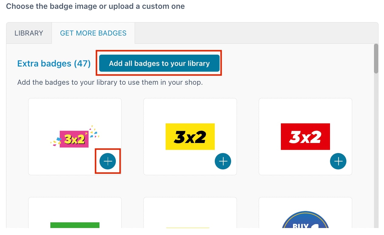
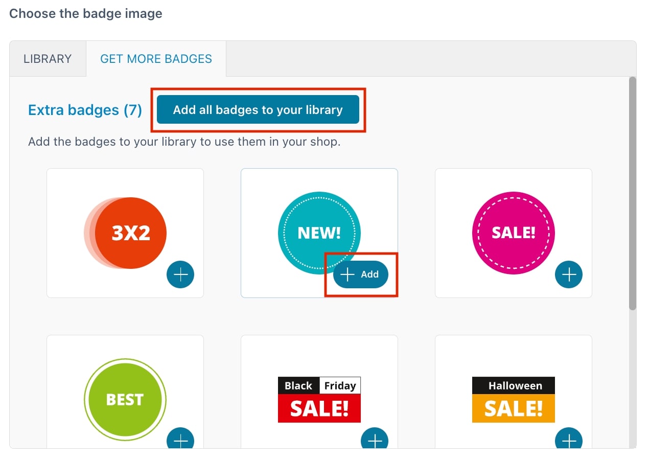
In addition to the images available in the Library tab, you can also download extra badges from Get more badges.
Here, you can either download them all or only those you want to use through the related buttons that will add the badges to your library.
NOTE: You can download and use extra badges only if you have activated a valid license key. You can enter the key in YITH License activation.
Other options are:
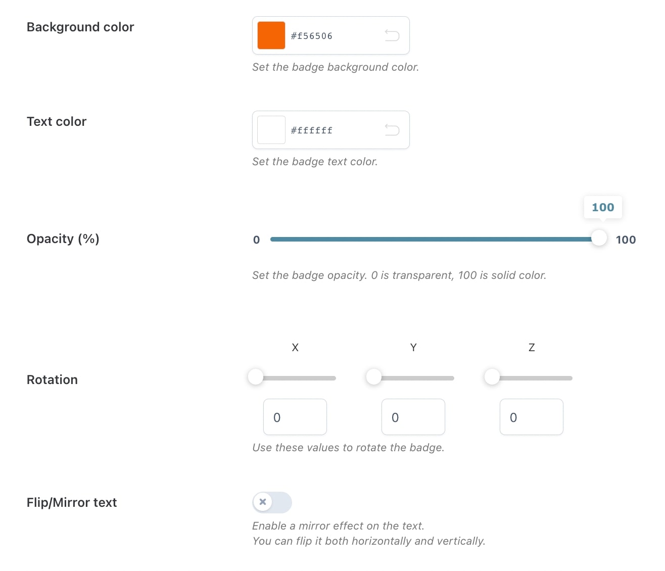
Opacity (%): set the percentage of opacity for the badge. Min. 0 = transparent; max 100 = solid color;
Rotation: With the rotation option, you can rotate the image like a 3D object. You can rotate it using the three main axes X, Y, and Z. You can either choose to use numbers or the slider as shown in the image below.
Please, note that there is no flip/mirrortext option for the image badges. The option to flip the text is only available for the text, css, and advanced badges.
Badge position
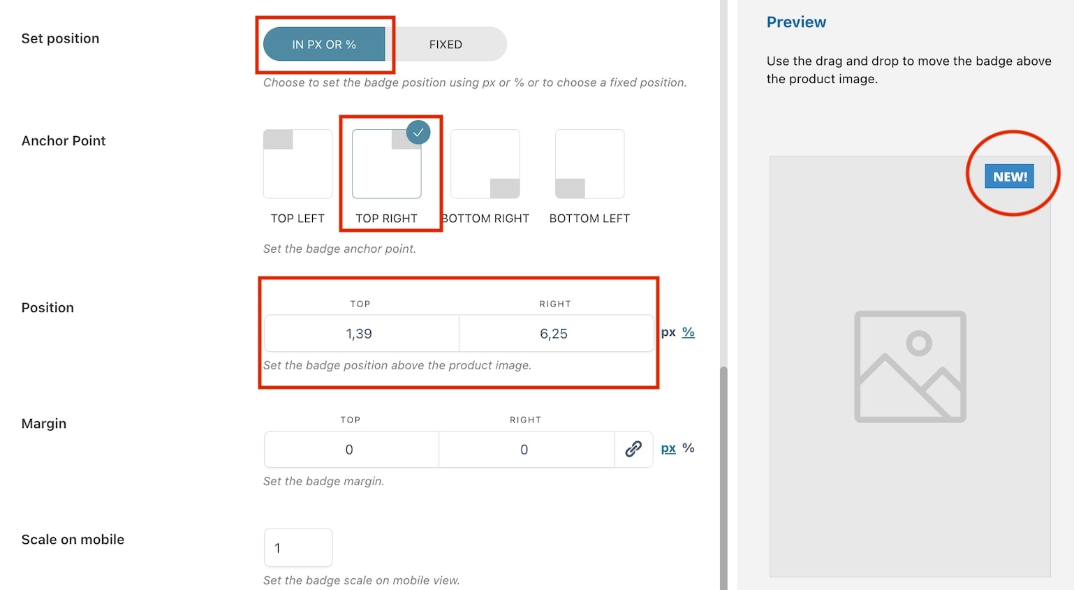
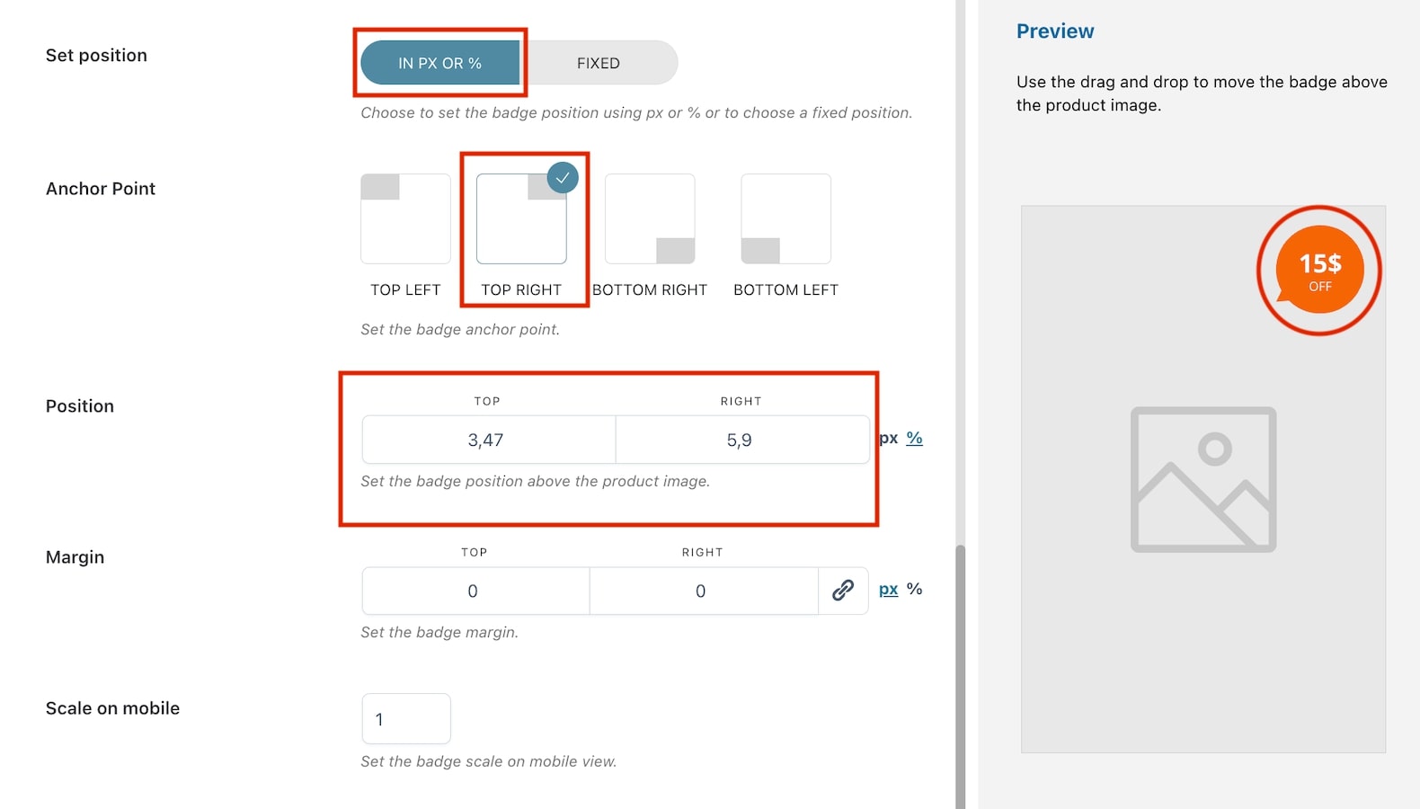
Set Position: choose how to set the badge position in the product image from in px or % and fixed. By selecting in px or %, you will have the following options:
Anchor Point: select the anchor point for the badge (top left, top right, bottom, left, bottom right). E.g. in the image above, we have selected top right;
Position: based on the selected anchor point, the position will automatically show two options (in this case top and right) and their values. Adjust them according to your needs in px or %;
Margin: based on the selected anchor point, the margin will automatically show two options (in this case top and right) and their values. Adjust them according to your needs in px or %.
Set position: choose how to set the badge position in the product image from in px or % and fixed. By selecting fixed, you will have the following options:
Position: choose the badge position from top, middle or bottom. E.g. in the image above, we have selected top;
Alignment: choose the badge alignment from left, center or right. E.g. in the image above, we have selected right;
Margin: based on the previous selections, the margin will automatically show two options (in this case top and right) and their values. Adjust them according to your needs in px or %.
Scale on mobile: insert the value to scale the badge on mobile devices. Default value: 1.
Preview
Any of the above option settings will reflect in the preview box on the right so you will be able to see in real-time the badge you are creating and apply any necessary adjustments.
To move the badge above the product image, you can use drag and drop. When applying this action, the position will be automatically set to in px or % and the values will update based on where you’re moving the badge.
To create your CSS badge, start by entering a name to identify it (N.B.this is a required field) then select CSS from the dropdown in Badge type.
Choose the image for your badge from those available in the library or extra badges.
You can download extra badges from Get more badges.
Here, you can either download them all or only those you want to use through the related buttons that will add the badges to your library.
NOTE: You can download and use extra badges only if you have activated a valid license key. You can enter the key in YITH License activation.
Now you can start setting all the available options through the built-in editor:
Text: here, you can customize the text style (font, size, color, alignment, etc.) as you like;
Background color: choose the color of the badge background;
Opacity (%): set the percentage of opacity for the badge. Min. 0 = transparent; max 100 = solid color;
Rotation: With the rotation option, you can rotate the image like a 3D object. You can rotate it using the three main axes X, Y, and Z. You can either choose to use numbers or the slider as shown in the image below.
Flip/Mirror text: enable if you want to apply a mirror effect on the text. If enabled, you can choose how to flip it through the option Flip orientation;
Badge position
Set position: choose how to set the badge position in the product image from in px or % and fixed. By selecting in px or %, you will have the following options:
Anchor Point: select the anchor point for the badge (top left, top right, bottom, left, bottom right). E.g. in the image above, we have selected top right;
Position: based on the selected anchor point, the position will automatically show two options (in this case top and right) and their values. Adjust them according to your needs in px or %;
Margin: based on the selected anchor point, the margin will automatically show two options (in this case top and right) and their values. Adjust them according to your needs in px or %.
Set position: choose how to set the badge position in the product image from in px or % and fixed. By selecting fixed, you will have the following options:
Position: choose the badge position from top, middle or bottom. E.g. in the image above, we have selected top;
Alignment: choose the badge alignment from left, center or right. E.g. in the image above, we have selected right;
Margin: based on the previous selections, the margin will automatically show two options (in this case top and right) and their values. Adjust them according to your needs in px or %.
Scale on mobile: insert the value to scale the badge on mobile devices. Default value: 1.
Preview
Any of the above option settings will reflect in the preview box on the right so you will be able to see in real-time the badge you are creating and apply any necessary adjustments. To move the badge above the product image, you can use drag and drop. When applying this action, the position will be automatically set to in px or % and the values will update based on where you’re moving the badge.
CSS badge on frontend
Placeholders
When using the built-in editor, you can add dynamic content to show on the badge through the available placeholders that you can find by clicking on the link under the editor.
In the modal, you will be able to copy placeholders for simple and variable products.
Simple products
The available placeholders are:
{{regular_price}} – this shows the product regular price;
{{sale_price}} – this shows the product sale price;
{{stock_quantity}} – this shows the product stock. For products with stock management disabled, the badge won’t show;
{{saved_amount}} – this shows the amount saved by customers;
{{saved_percentage}} – this shows the percentage saved by customers.
Regular price placeholder
Variable products
The available placeholders are:
{{min_regular_price}} – this shows the minimum regular price of product variations;
{{min_sale_price}} – this shows the minimum on-sale price of product variations;
{{min_stock_quantity}} – this shows the minimum stock quantity of product variations. For products with stock management disabled, the badge won’t show;
{{min_saved_amount}} – this shows the minimum amount saved by customers;
{{min_saved_percentage}} – this shows the minimum percentage saved by customers.
Please note: by default, the placeholders show the minimum value. If you want to show the maximum value, just replace min with max. For example, {{max_sale_price}}.
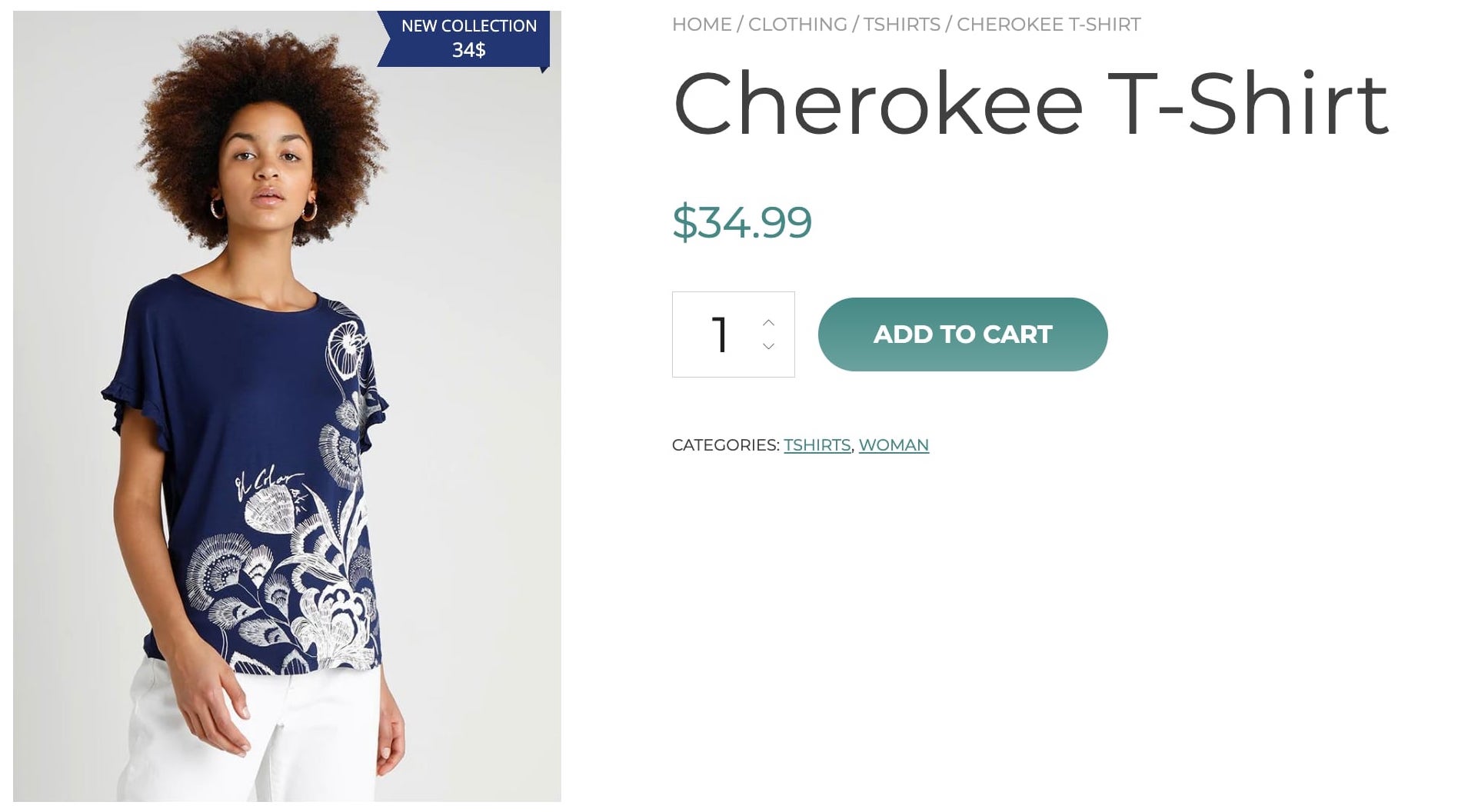
Advanced badges can be used only for on-sale products and the shown discount percentage or amount is automatically retrieved from values entered for regular price and sale price in the edit product page.
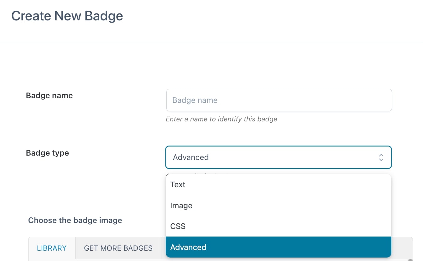
To create your advanced badge, start by entering a name to identify it (N.B.this is a required field) then select Advanced from the dropdown in Badge type.
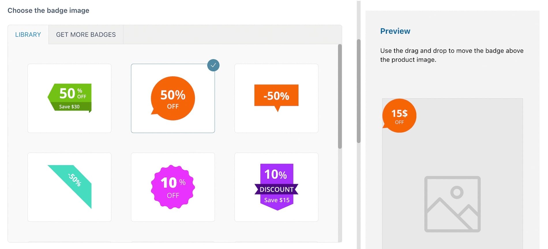
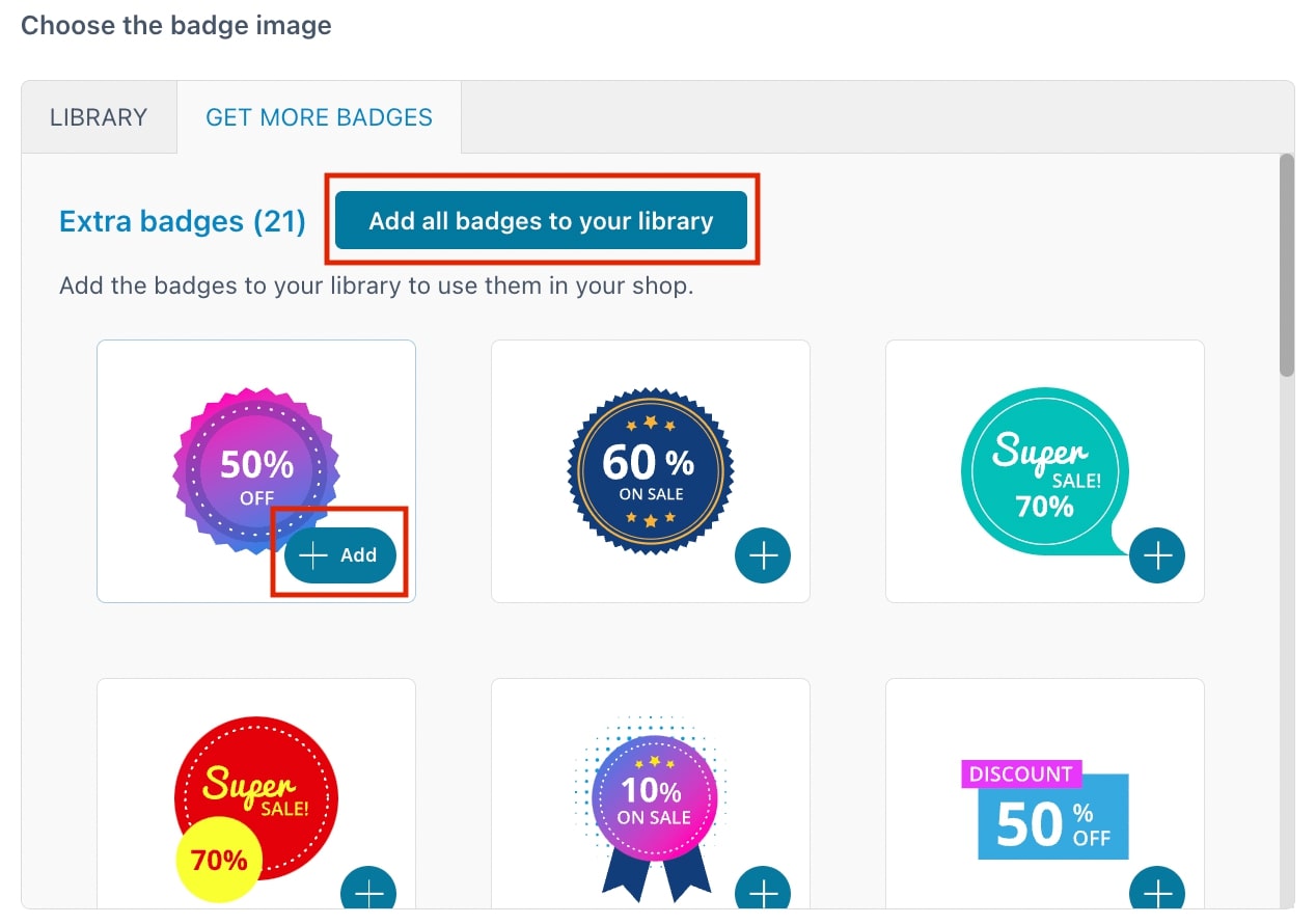
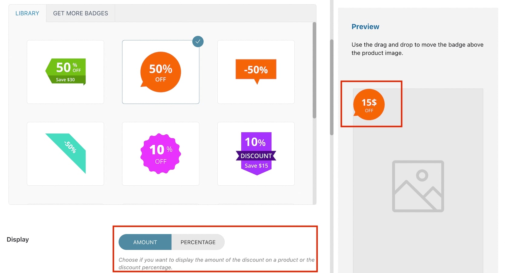
Choose the image for your badge from those available in the library or extra badges.
You can also download extra badges from Get more badges.
Here, you can either download them all or only those you want to use through the related buttons that will add the badges to your library.
NOTE: You can download and use extra badges only if you have activated a valid license key. You can enter the key in YITH License activation.
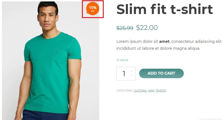
For almost all these badges you can choose whether to show a percent or a fixed price discount:
This option is not available on those badges where you can show both the percentage discount and the saving amount, as you can see in the following example.
Let’s make an example. We’ll set a “regular price” of €10 and a “sale price” of €3 for one of our products. The discount percentage will be 70% and the discounted sum €7. This is what the badge will look like:
Other options are:
Background color: choose the color of the badge background;
Text color: choose the color of the badge text;
Opacity (%): set the percentage of opacity for the badge. Min. 0 = transparent; max 100 = solid color;
Rotation: select the values to rotate the badge;
Flip/Mirror text: enable if you want to apply a mirror effect on the text. If enabled, you can choose how to flip it through the option Flip orientation;
Badge position
Set Position: choose how to set the badge position in the product image from in px or % and fixed. By selecting in px or %, you will have the following options:
Anchor Point: select the anchor point for the badge (top left, top right, bottom, left, bottom right). E.g. in the image above, we have selected top left;
Position: based on the selected anchor point, the position will automatically show two options (in this case top and left) and their values. Adjust them according to your needs in px or %;
Margin: based on the selected anchor point, the margin will automatically show two options (in this case top and left) and their values. Adjust them according to your needs in px or %.
Set position: choose how to set the badge position in the product image from in px or % and fixed. By selecting fixed, you will have the following options:
Position: choose the badge position from top, middle or bottom. E.g. in the image above, we have selected middle;
Alignment: choose the badge alignment from left, center or right. E.g. in the image above, we have selected right;
Margin: based on the previous selections, the margin will automatically show two options (in this case middle and right) and their values. Adjust them according to your needs in px or %.
Scale on mobile: insert the value to scale the badge on mobile devices. Default value: 1.
Preview
Any of the above option settings will reflect in the preview box on the right so you will be able to see in real-time the badge you are creating and apply any necessary adjustments. To move the badge above the product image, you can use drag and drop. When applying this action, the position will be automatically set to in px or % and the values will update based on where you’re moving the badge.
In the Badge rules tab, you will be able to see a list with all the badge rules you have created so far and you can add new ones with the Add Badge Rule button. For each badge rule, you can decide to enable/disable it, edit it, clone it or delete it.
From the same section, you can also search badge rules through the related field and apply bulk actions to enable, disable, and delete them.
We’ll analyze each badge rule type in the following sections:
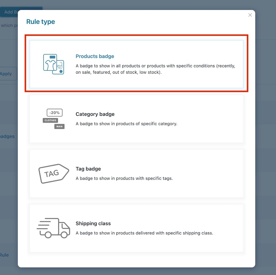
This rule type can be used to assign a badge to all or specific products and manage automatic assignment for recent products, low stock and bestsellers. Let’s analyze its settings:
After clicking on Add badge rule, you will be able to select the rule type. In this case, we will select “Products badge“.
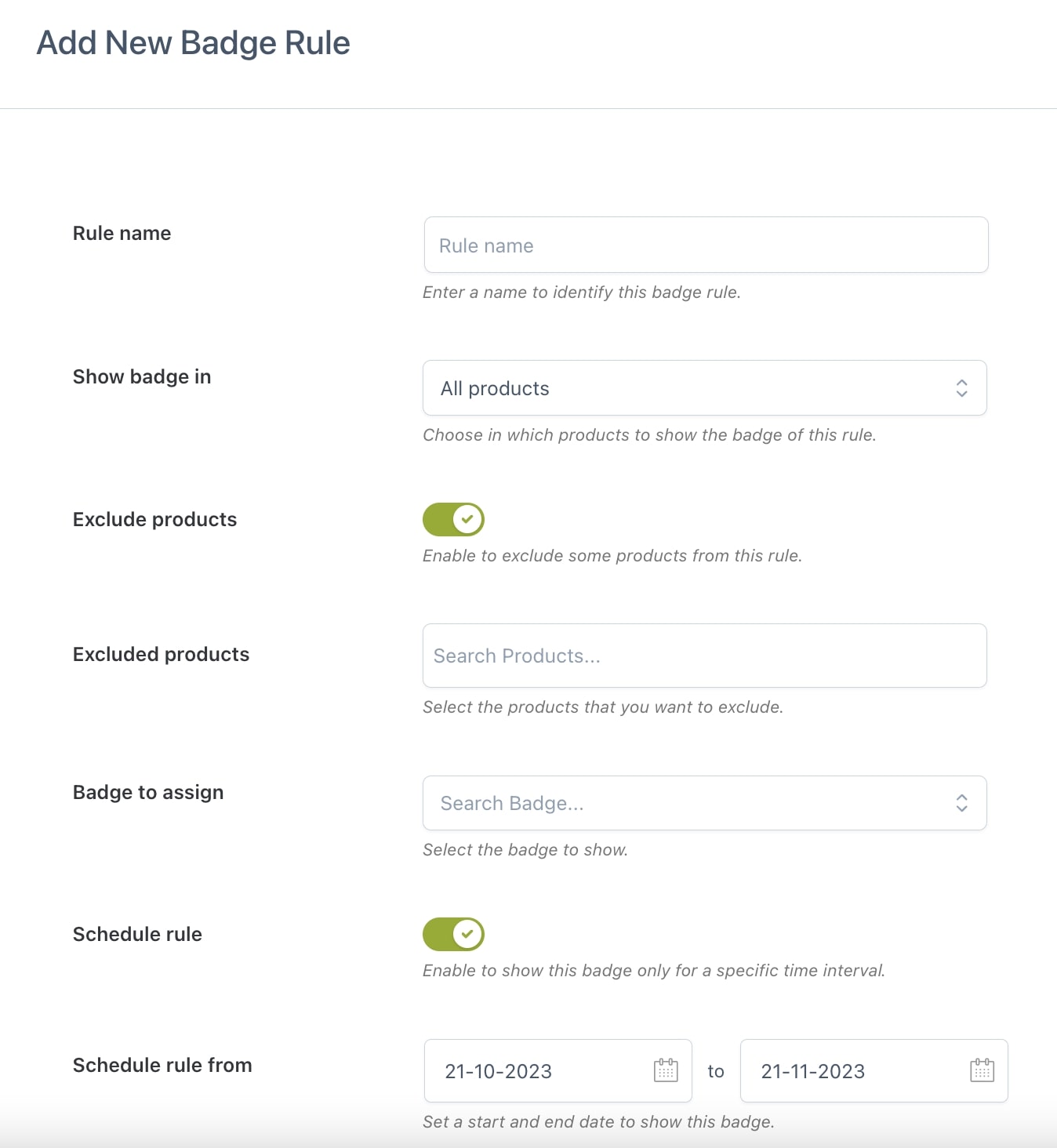
Now you can start configuring the options to create your rule to automatically apply badges to your products.
Rule name: give a name to the rule you are creating to identify it among the others;
Active rule: choose whether the rule will be enabled or disabled. This can be changed in the Badge rules list;
Assign a badge to: select the products to which the rule will apply: all products, only recent products, on-sale, featured, in-stock, out-of-stock or low-stock products, back-order products, bestsellers;
Exclude products: enable if you want to exclude one or more products from this rule;
Excluded products: add the products you want to be excluded from the badge rule;
Badge to assign: select the badge that will be assigned to products of this rule;
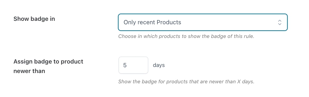
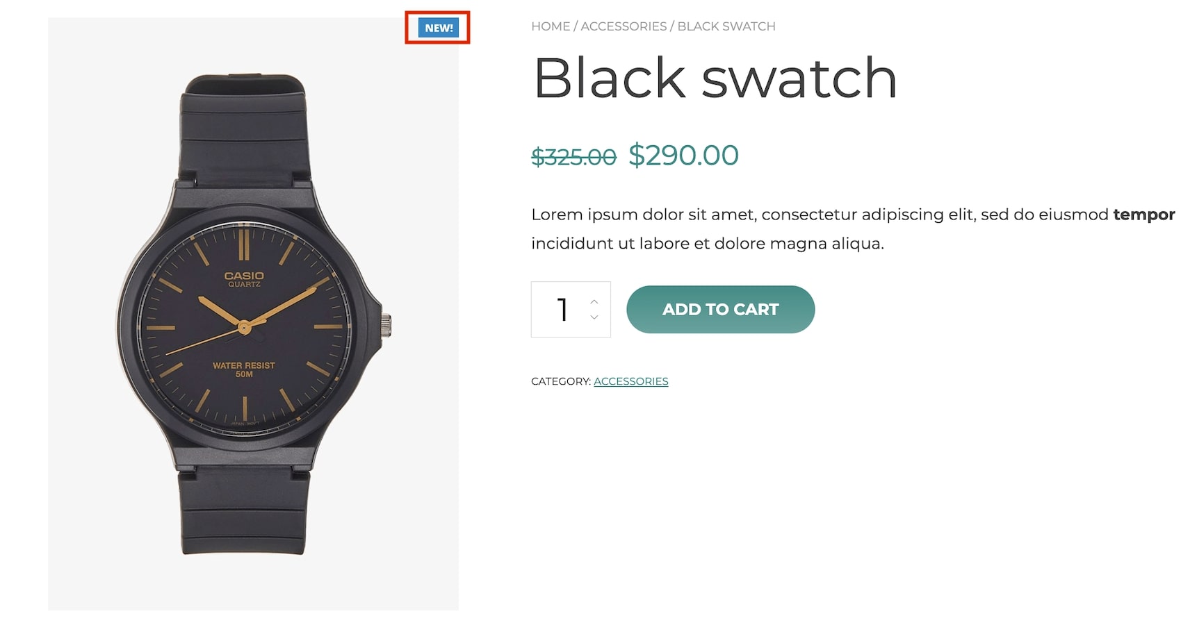
Recent products badge
To show the badges on recent products only, select Only recent products and enter the number of days to be taken into account to apply the badge. E.g. by inserting the value 5 in Assign badge to product newer than the badge will apply only to products published in the last 5 days.
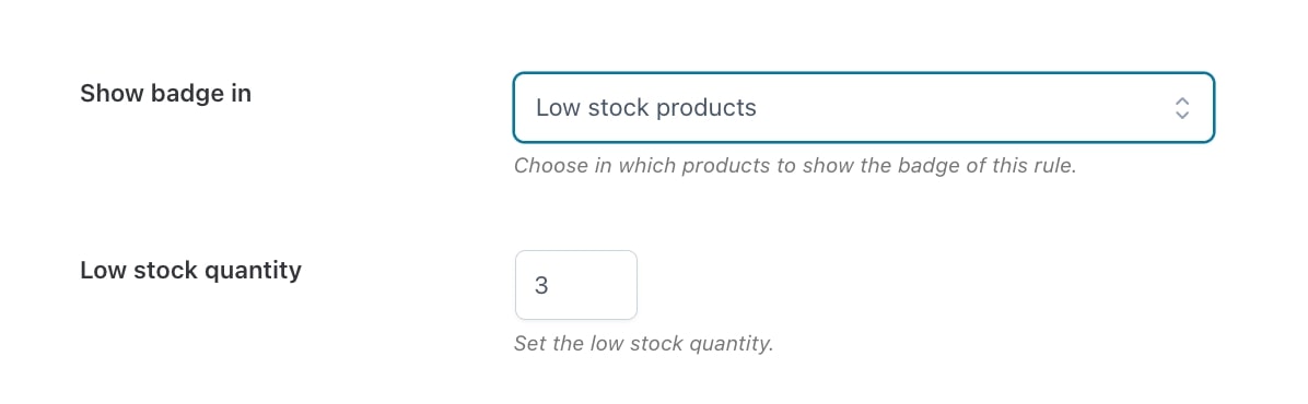
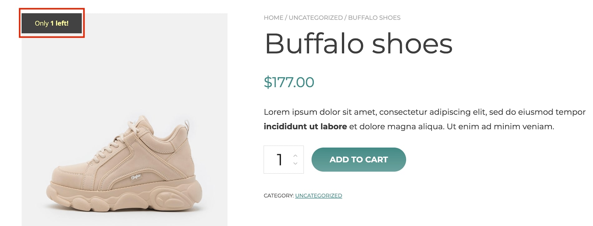
Low-stock products badge
To show the badges only on products with low stock, select Low stock products and enter the quantity to be taken into account to apply the badge. E.g. by inserting the value 3 in Low stock quantity the badge will apply only to products with a stock equal to 3 or lower.
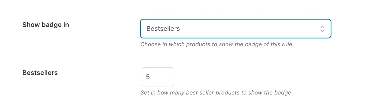
Bestseller products badge
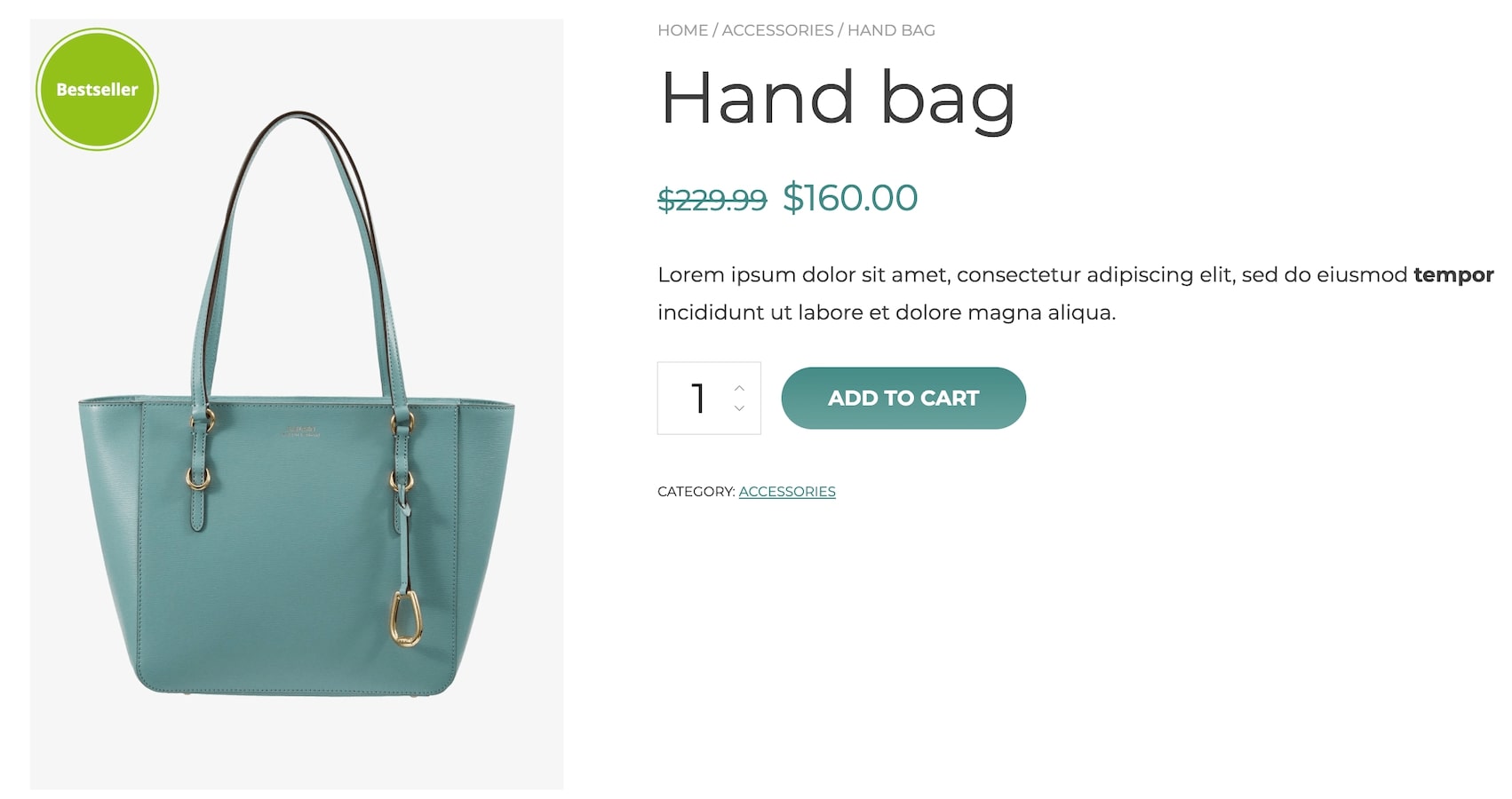
To show the badges only on bestseller products, select Bestsellers and enter the number of products on which show the badge. E.g. by inserting the value 5 in Bestsellers, the badge will apply to the first 5 bestseller products.
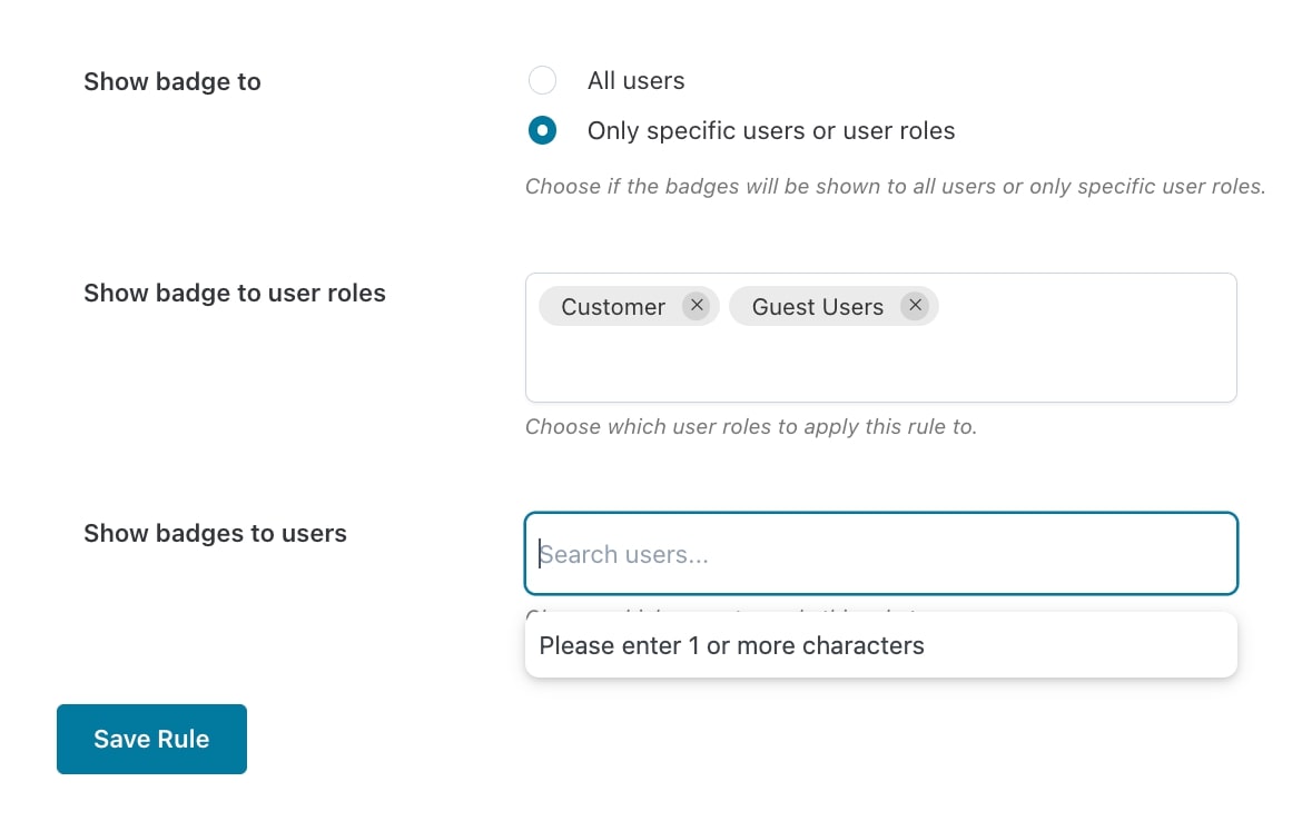
Users
When creating the rule, you will be able to decide the users and/or user roles to whom the badges will be visible. Through the option Show badge to choose whether the badge will be shown to all users or specific users only. Add users and/or user roles in the dedicated fields as shown below.
In case you want to hide the badge on the product detail page, enable the option Hide badges in single product pages that you find in the plugin General settings.
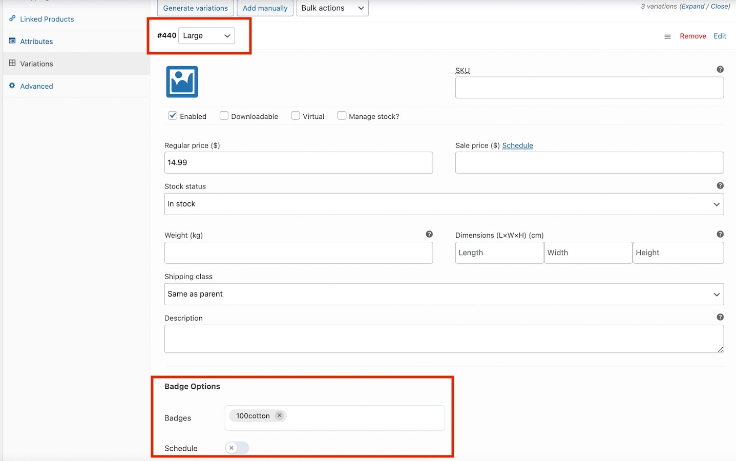
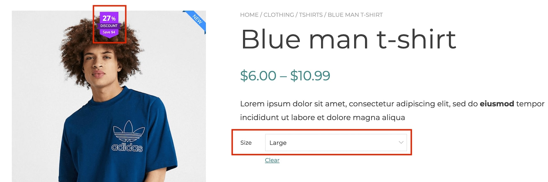
If you want to show and schedule a different badge for each variation, go to the product edit page and set the options available within its variations.
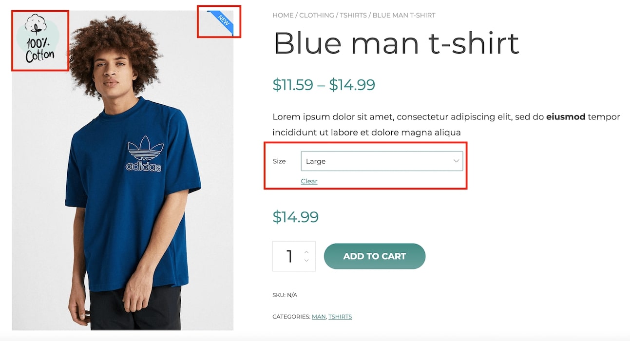
For example, if you have applied the badge new to the variable product but you want to show an additional badge (100cotton) on one of its variations (large), go to the specific variation, select the badge you want to show, and optionally schedule the date range when this badge will show.
When users will select the variation large, this is what they’ll see.
Advance badges
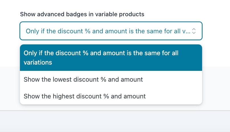
By default, the “advanced badge” will only be shown if all the configured variations have the same discount percentage/amount.
However, this behavior can change based on the settings configured in the tab General settings > Extra >Show advanced badges in variable products.
This option will allow you to decide which advance badge should be shown in a variable product when there is no specific variation displayed.
Besides the default option, you can decide to whether show the minimum or maximum percentage among all the available variations.
NOTE: The badge will not show if you have decided to show the minimum discount percentage and you haven’t set any discount on one of the variations
Below, two examples of how the advanced badge applies based on the selected variation:
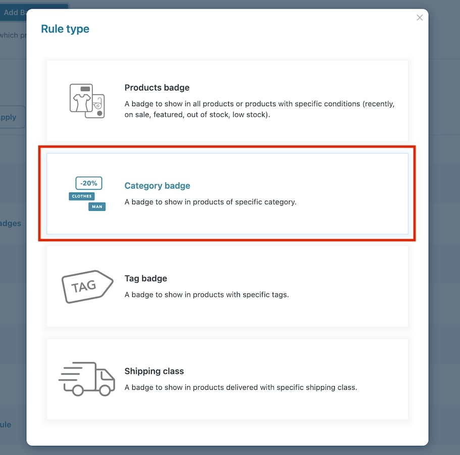
This rule type can be used to assign badges to products with specific categories. Let’s analyze its settings:
Go to the tab Badge rules, click on Add badge rule and select the rule type Category badge.
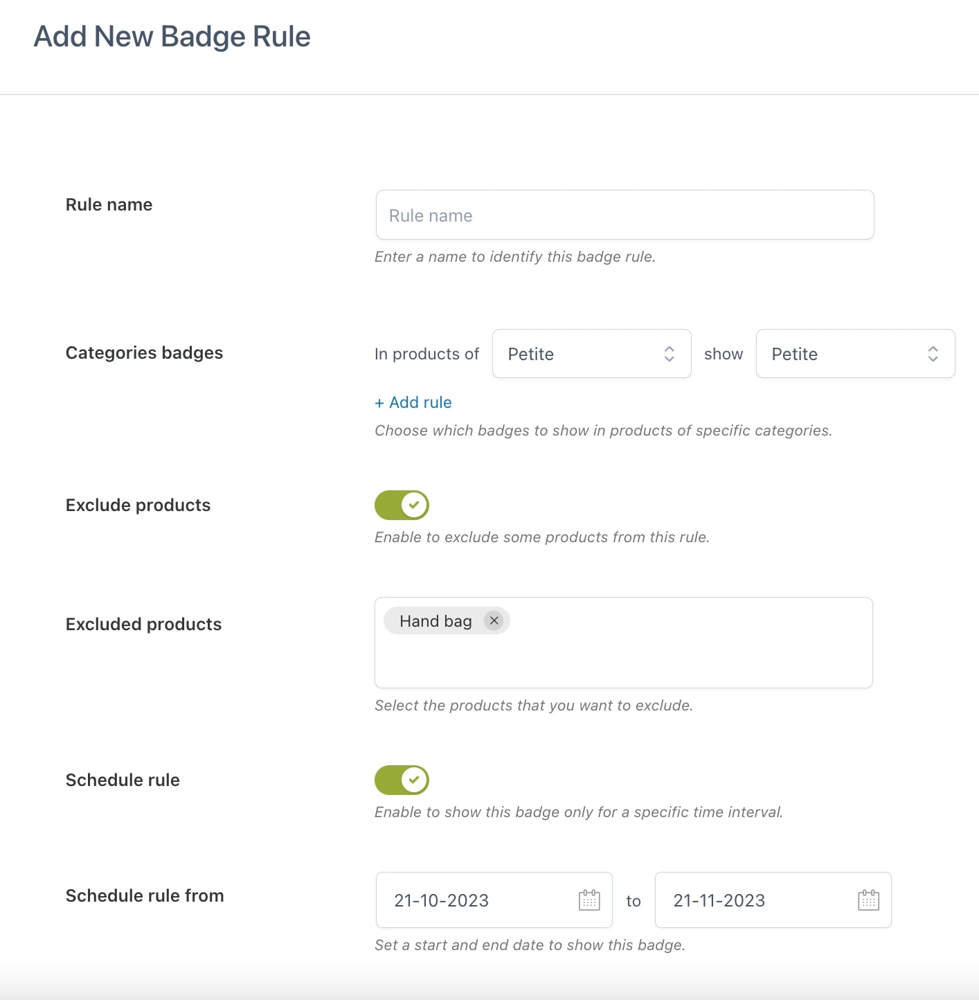
Now you can start configuring the options to create your rule to automatically apply badges to your product categories.
Rule name: give a name to the rule you are creating to identify it among the others;
Active rule: choose whether the rule will be enabled or disabled. This can be changed in the Badge rules list;
Categories badges: through this option, you can create as many category rules as you want by defining the category name in the field In product of and choosing the badge to show on products belonging to that category in the field Show. To add a new rule, just click on the button Add rule.
Exclude products: enable if you want to exclude one or more products from this rule;
Excluded products: add the products you want to be excluded from the badge rule;
Schedule rule from: define the start and end date to show the badge.
Users
When creating the rule, you will be able to decide the users and/or user roles to whom the badges will be visible. Through the option Show badge to choose whether the badge will be shown to all users or specific users only. Add users and/or user roles in the dedicated fields as shown below.
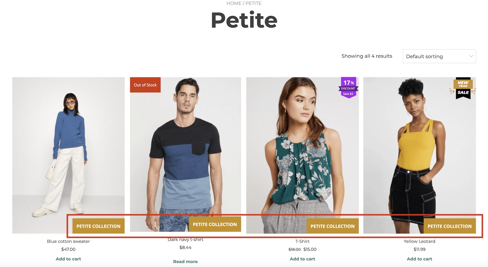
Here is an example of a Category badge for all products under the “Petite collection” category:
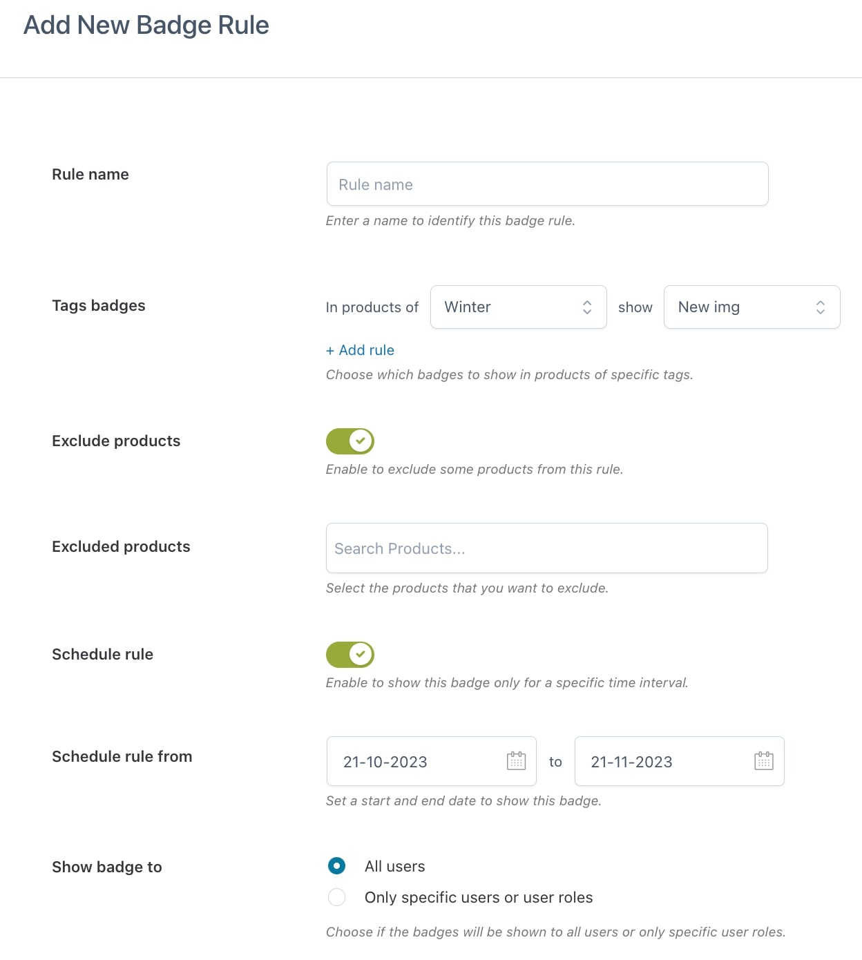
This rule type can be used to assign a badge to products with specific tags. Let’s analyze its settings:
Go to the tab Badge rules, click on Add badge rule and select the rule type Tag badge.
Now you can start configuring the options to create your rule to automatically apply badges to your product tags.
Rule name: give a name to the rule you are creating to identify it among the others;
Active rule: choose whether the rule will be enabled or disabled. This can be changed in the Badge rules list;
Tags badges: through this option, you can create as many tag rules as you want by defining the tag name in the field In product of and choosing the badge to show on products belonging to that tag in the field Show. To add a new rule, just click on the button Add rule.
Exclude products: enable if you want to exclude one or more products from this rule;
Excluded products: add the products you want to be excluded from the badge rule;
Schedule rule from: define the start and end date to show the badge.
Users
When creating the rule, you will be able to decide the users and/or user roles to whom the badges will be visible. Through the option Show badge to choose whether the badge will be shown to all users or specific users only. Add users and/or user roles in the dedicated fields as shown below.