This type of badge is entirely formed of a text label, for which you can customize colors, size, width, height, position, and more.
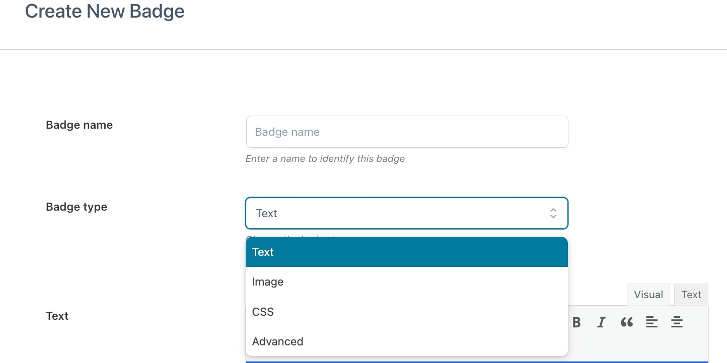
To create your text badge, start by entering a name to identify it (N.B. this is a required field) then select Text from the dropdown in Badge type.
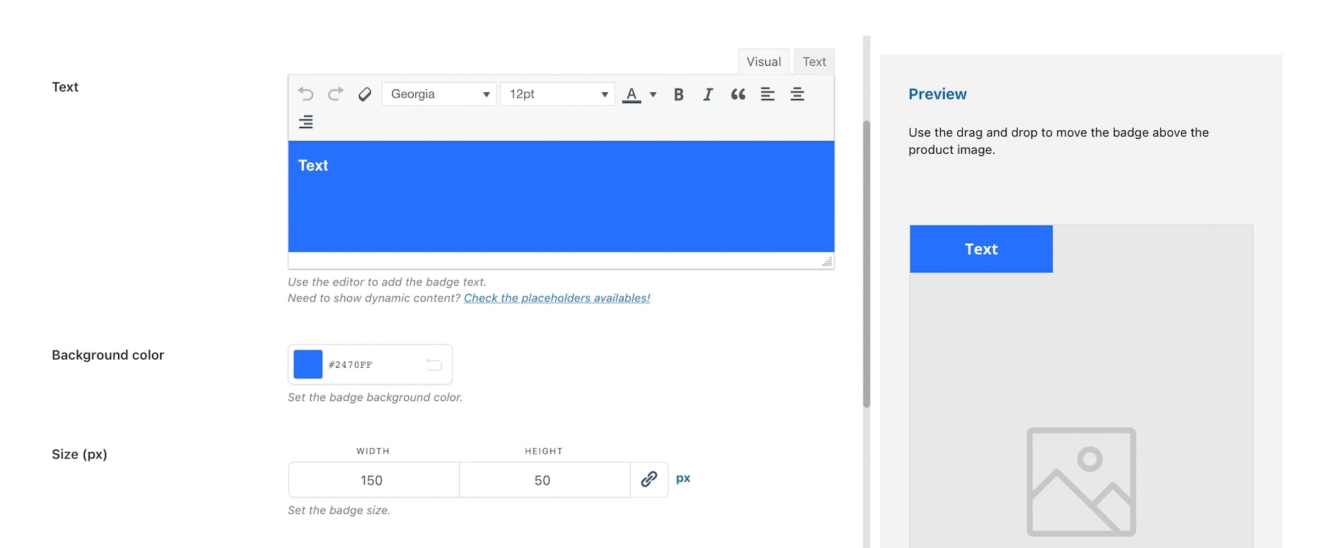
Now you can start setting all the available options through the built-in editor:
- Text: here, you can customize the text style (font, size, color, alignment, etc.);
- Background color: choose the color of the text background;
- Size (px): select height and width of the badge;
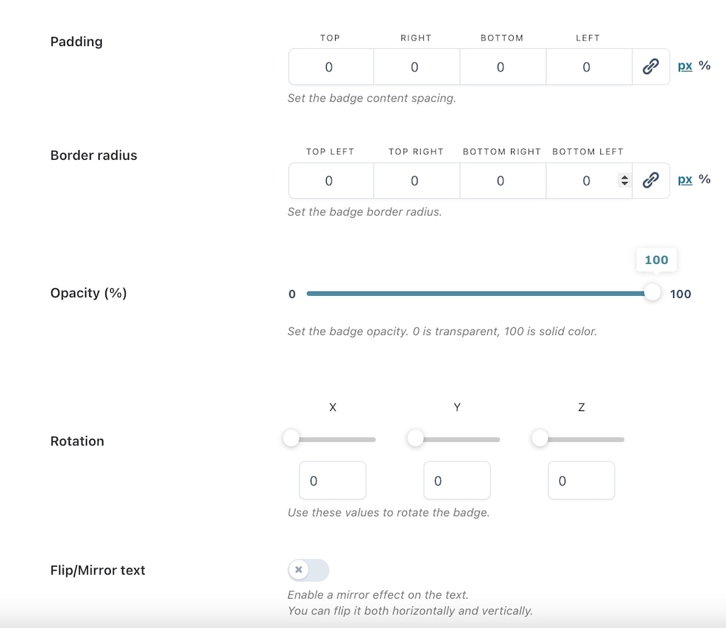
- Padding: set the badge content padding (top, right, bottom, left) in px or %;
- Border radius: set the badge border radius (top-left, top-right, bottom-right, bottom-left) in px or %;
- Opacity (%): set the percentage of opacity for the badge. Min. 0 = transparent; max 100 = solid color;
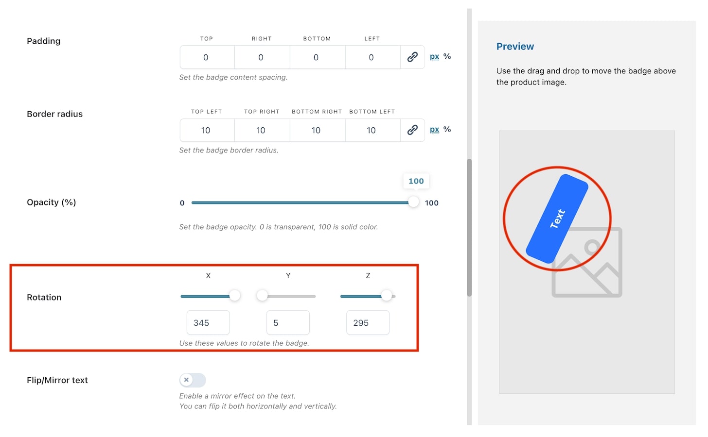
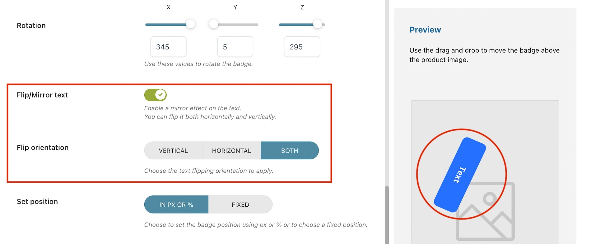
- Rotation: With the rotation option, you can rotate the image like a 3D object. You can rotate it using the three main axes X, Y, and Z. You can either choose to use numbers or the slider as shown in the image below.
- Flip/Mirror text: enable if you want to apply a mirror effect on the text. If enabled, you can choose how to flip it through the option Flip orientation;
Badge position
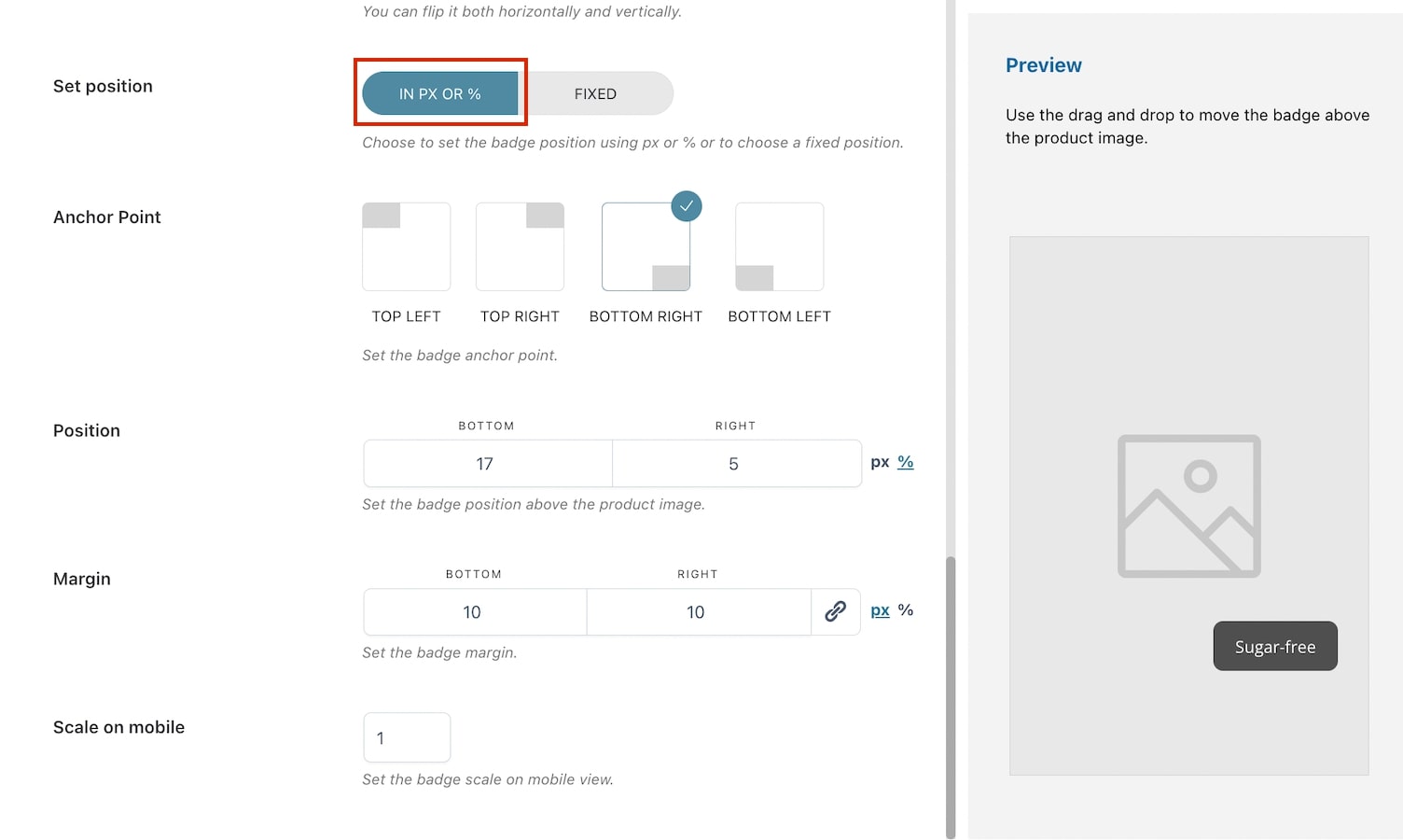
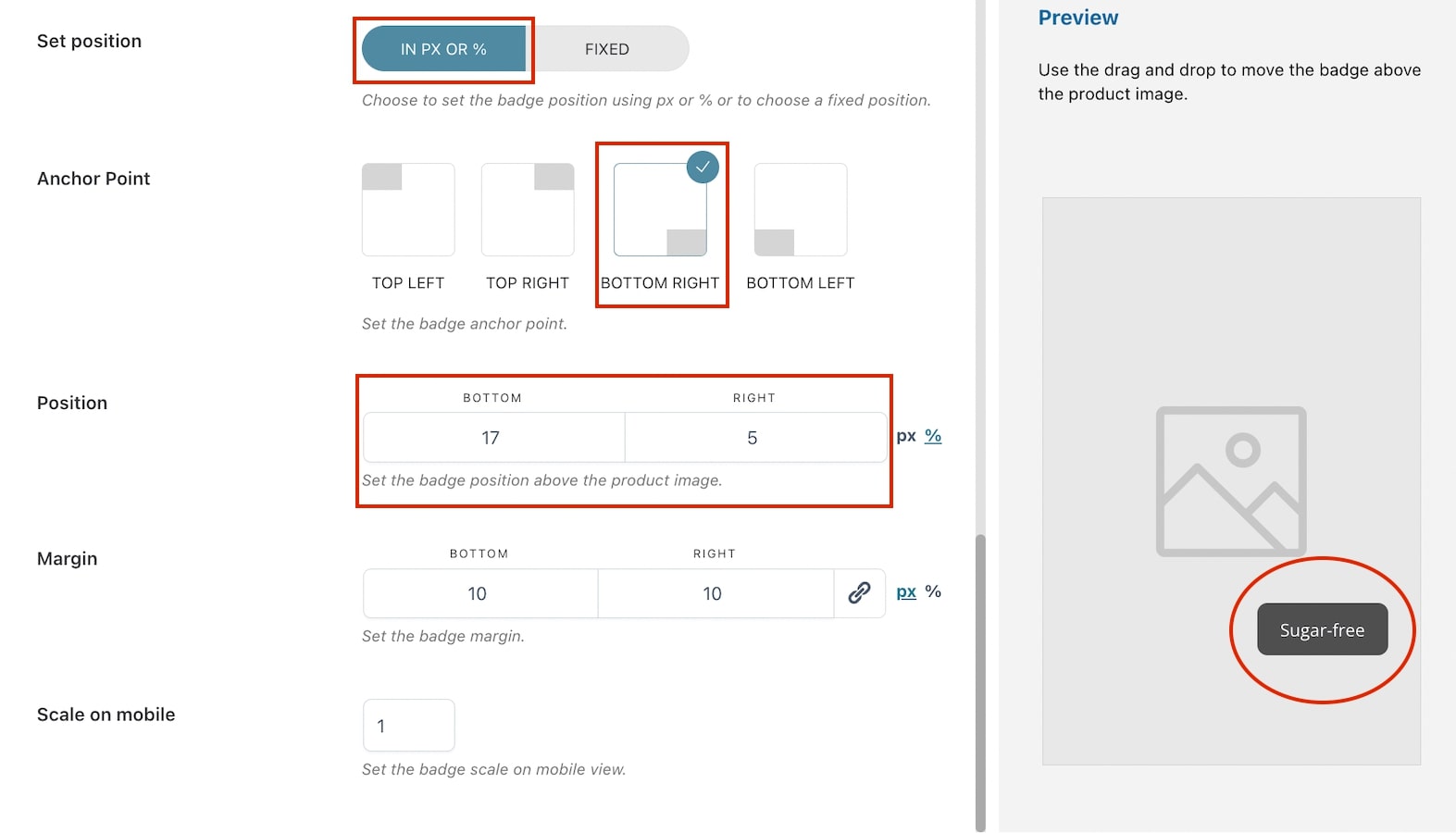
- Set position: choose how to set the badge position in the product image from in px or % and fixed. By selecting in px or %, you will have the following options:
- Anchor Point: select the anchor point for the badge (top left, top right, bottom, left, bottom right). E.g. in the image above, we have selected bottom right;
- Position: based on the selected anchor point, the position will automatically show two options (in this case bottom and right) and their values. Adjust them according to your needs in px or %;
- Margin: based on the selected anchor point, the margin will automatically show two options (in this case bottom and right) and their values. Adjust them according to your needs in px or %.
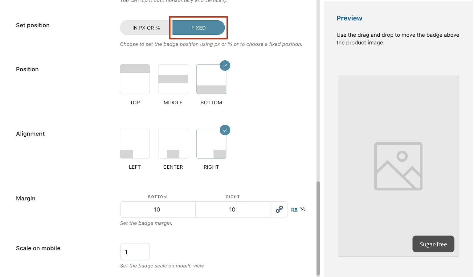
- Set position: choose how to set the badge position in the product image from in px or % and fixed. By selecting fixed, you will have the following options:
- Position: choose the badge position from top, middle or bottom. E.g. in the image above, we have selected bottom;
- Alignment: choose the badge alignment from left, center or right. E.g. in the image above, we have selected right;
- Margin: based on the previous selections, the margin will automatically show two options (in this case bottom and right) and their values. Adjust them according to your needs in px or %.
- Scale on mobile: insert the value to scale the badge on mobile devices. Default value: 1.
Preview
Any of the above option settings will reflect in the preview box on the right so you will be able to see in real-time the badge you are creating and apply any necessary adjustments.
To move the badge above the product image, you can use drag and drop. When applying this action, the position will be automatically set to in px or % and the values will update based on where you’re moving the badge.
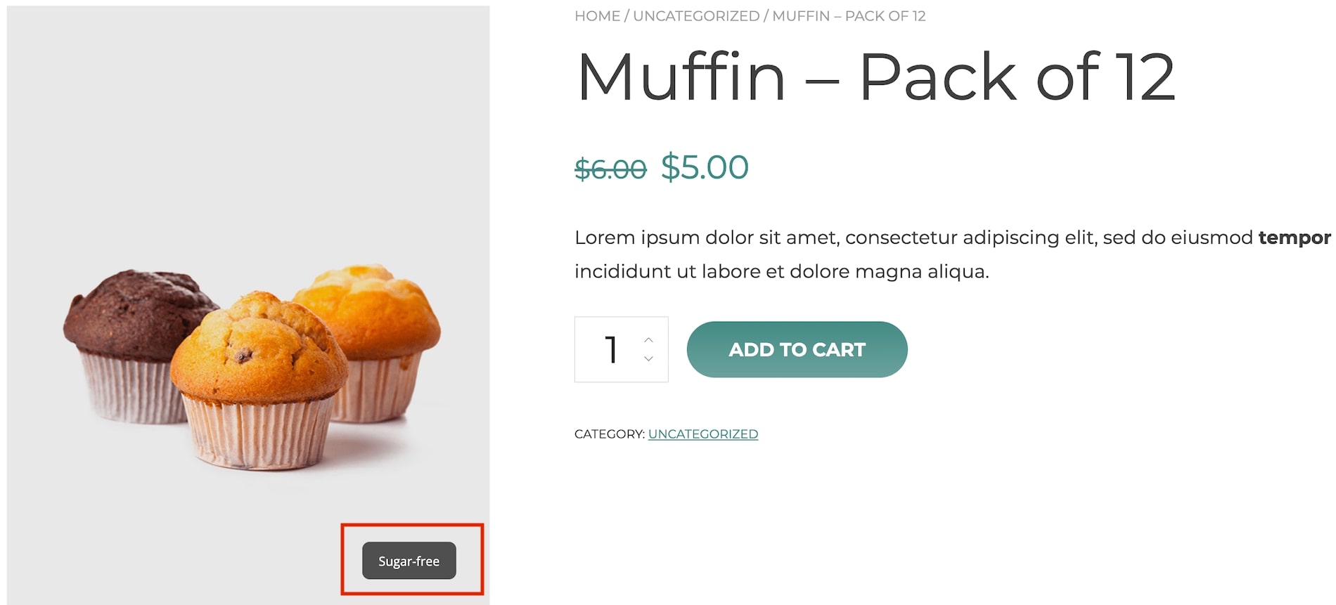
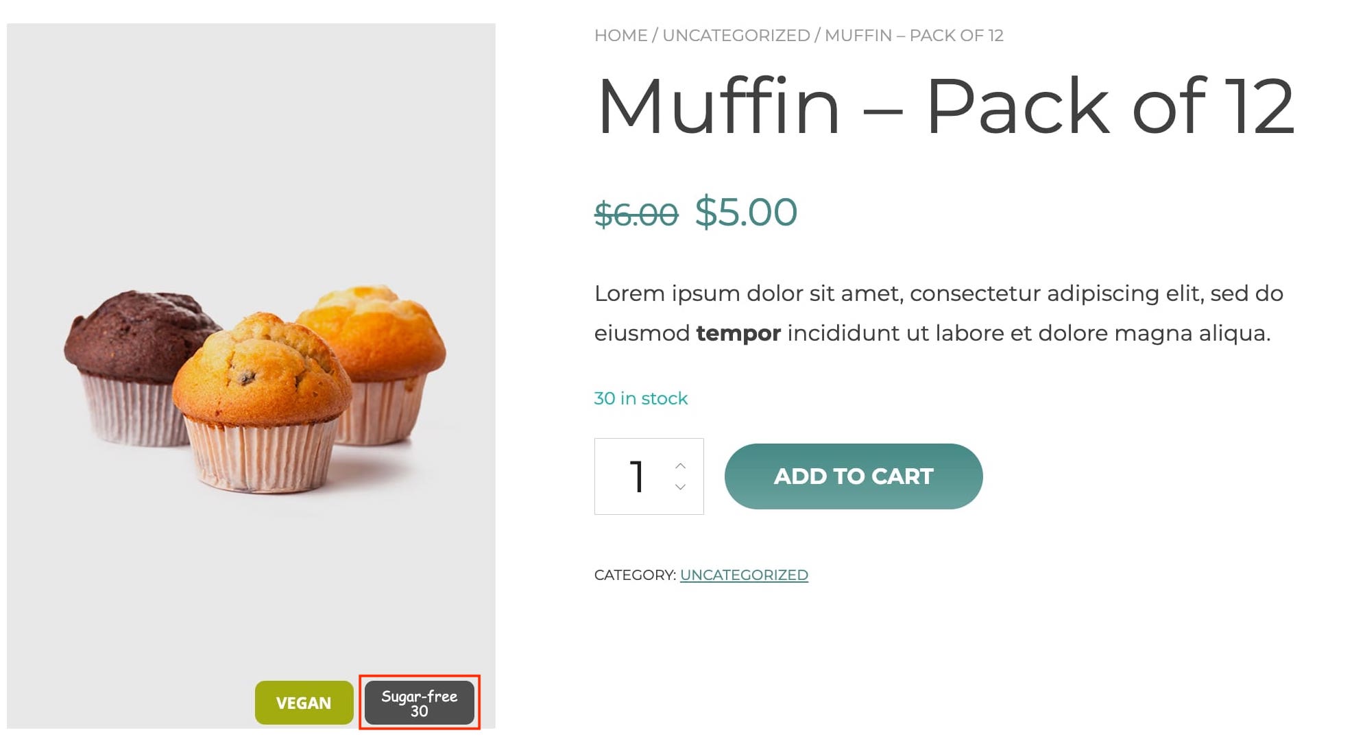
Text badge on frontend
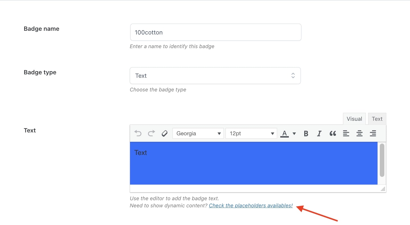
Placeholders
When using the built-in editor, you can add dynamic content to show on the badge through the available placeholders that you can find by clicking on the link under the editor.
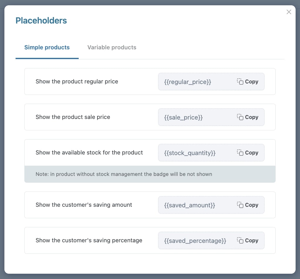
In the modal, you will be able to copy placeholders for simple and variable products.
Simple products
The available placeholders are:
- {{regular_price}} – this shows the product regular price;
- {{sale_price}} – this shows the product on-sale price;
- {{stock_quantity}} – this shows the product stock. For products with stock management disabled, the badge won’t show;
- {{saved_amount}} – this shows the amount saved by customers;
- {{saved_percentage}} – this shows the percentage saved by customers.
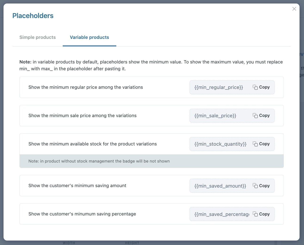
Variable products
The available placeholders are:
- {{min_regular_price}} – this shows the minimum regular price of product variations;
- {{min_sale_price}} – this shows the minimum on-sale price of product variations;
- {{min_stock_quantity}} – this shows the minimum stock quantity of product variations. For products with stock management disabled, the badge won’t show;
- {{min_saved_amount}} – this shows the minimum amount saved by customers;
- {{min_saved_percentage}} – this shows the minimum percentage saved by customers.
Please note: by default, the placeholders show the minimum value. If you want to show the maximum value, just replace min with max. For example, {{max_sale_price}}.