From the tab Product gallery options, you can control what the product gallery will look like.
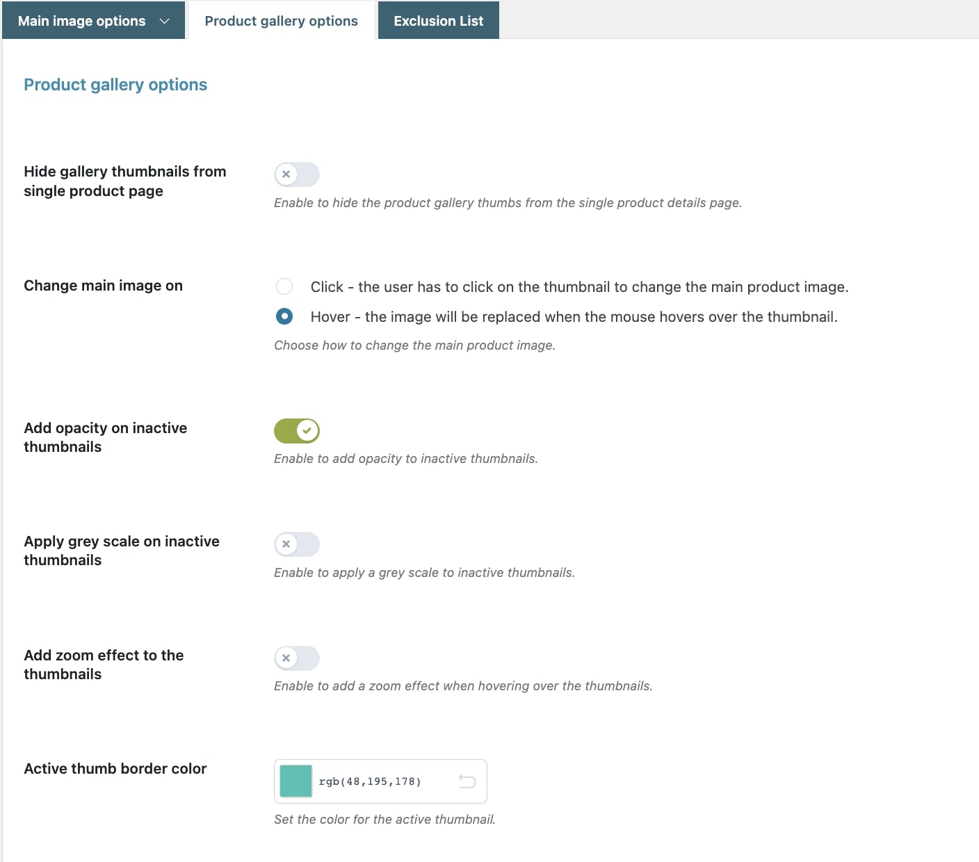
Here, you can configure the following options:
- Hide gallery thumbnails from single product page: enable this option to hide the product gallery thumbnails from the product page. Keep it enabled to configure the gallery and the slider.
- Change main image on:
- Click – the user must click on the thumbnail to change the main product image
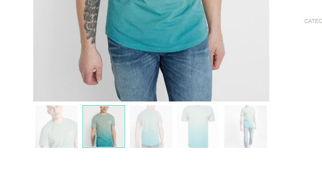
- Hover – the image will be replaced when the mouse hovers over the thumbnail
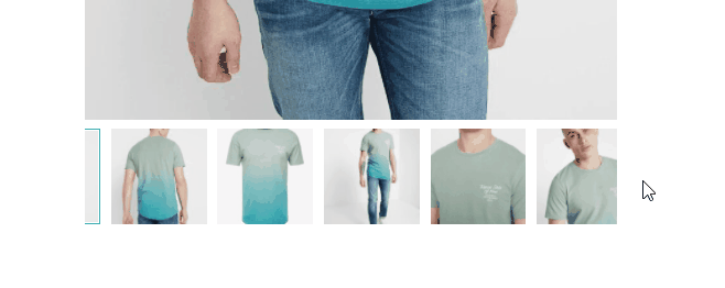
- Add opacity on inactive thumbnails: enable to add opacity on inactive thumbnails and let only the active thumbnail stand out.
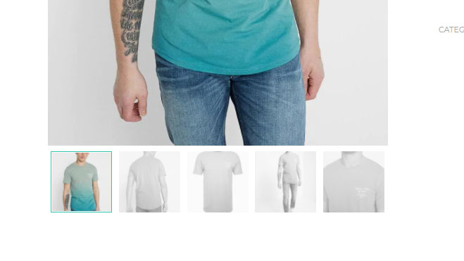
- Apply grey scale on inactive thumbnails: enable to apply greyscale to inactive thumbnails and let only the active thumbnail stand out.
- Add zoom effect to the thumbnails: add a zoom effect when hovering over the thumbnails.
- Active thumb border color: set the color of the active thumbnail border.
Slider options
- Enable slider: enable this option to show the product gallery images in a slider. If enabled, you will be able to configure colors, arrows and autoplay options from the settings below.
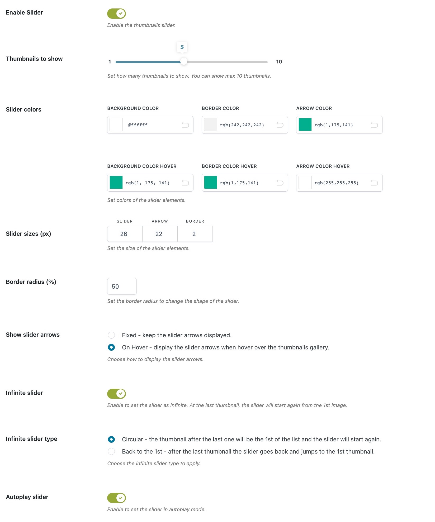
- Thumbnails to show: set the number of thumbnails to show in the slider.
- Slider colors: background – border – arrow (default color and on hover)
- Slider sizes: slider – arrow – border
- Border radius (%): set the border radius to change the shape of the slider. From 0% square corners to 100% round corners.
- Show slider arrows:
- fixed – keep the slider arrows displayed
- on hover – display the arrows when hovering over the thumbnail gallery.
- Infinite slider: enable to let the slider show all the images and start again from the first. This can have a different setting:
- circular – the thumbnail after the last one will be the 1st of the list and the slider will start again.
- back to the 1st – after the last thumbnail the slider go back and jump to the 1st thumbnail.
- Autoplay slider: the slider will automatically play and let the images rotate when the page is loaded.