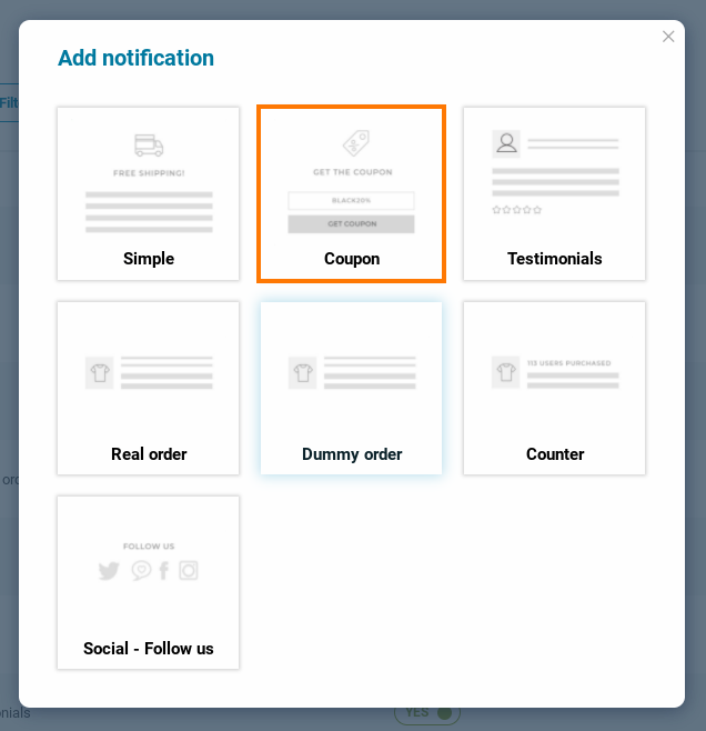
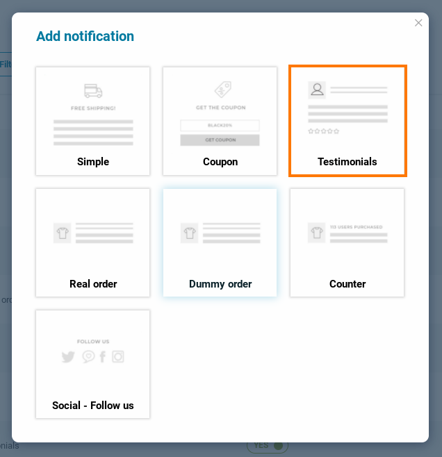
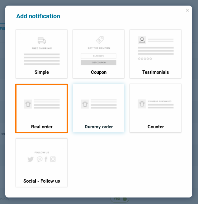
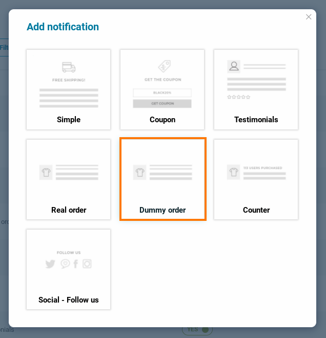
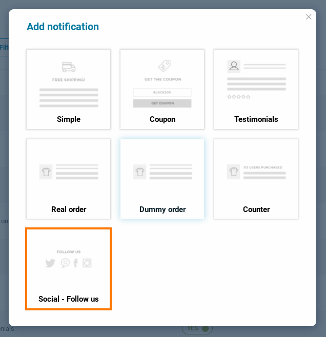
Step 1 – Add a new notification

By clicking on the “+ Add notification” button a popup will open and we will select the notification we want to create. In this case, we want to add a ‘Social – Follow us’ notification to show our Social Media channels and ask people to follow us.
Step 2 – Notification name
The name you give in here is for admin use only. The customer will not see this name, this is simply the title you give to the notification, it is a mandatory field.

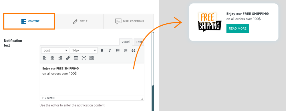
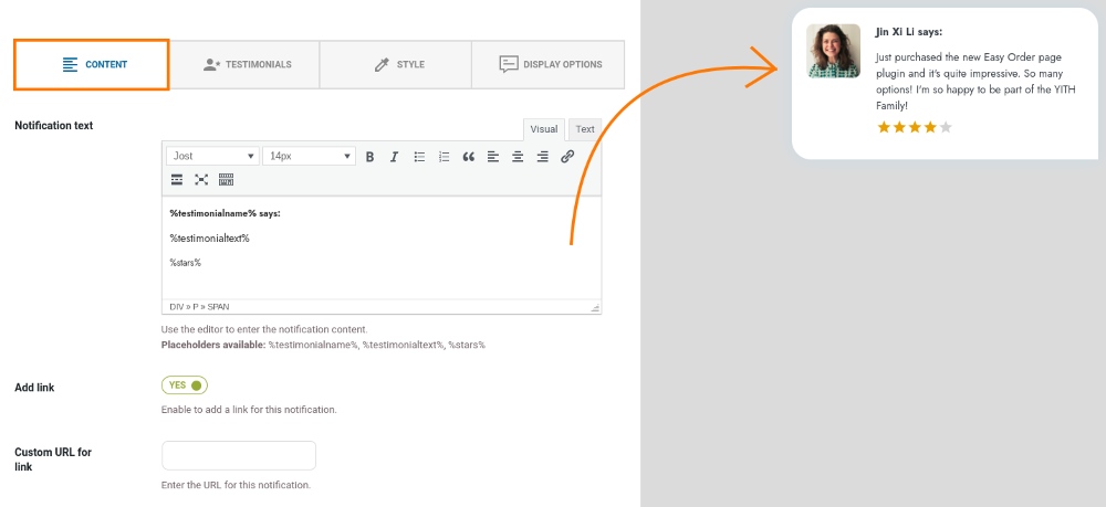
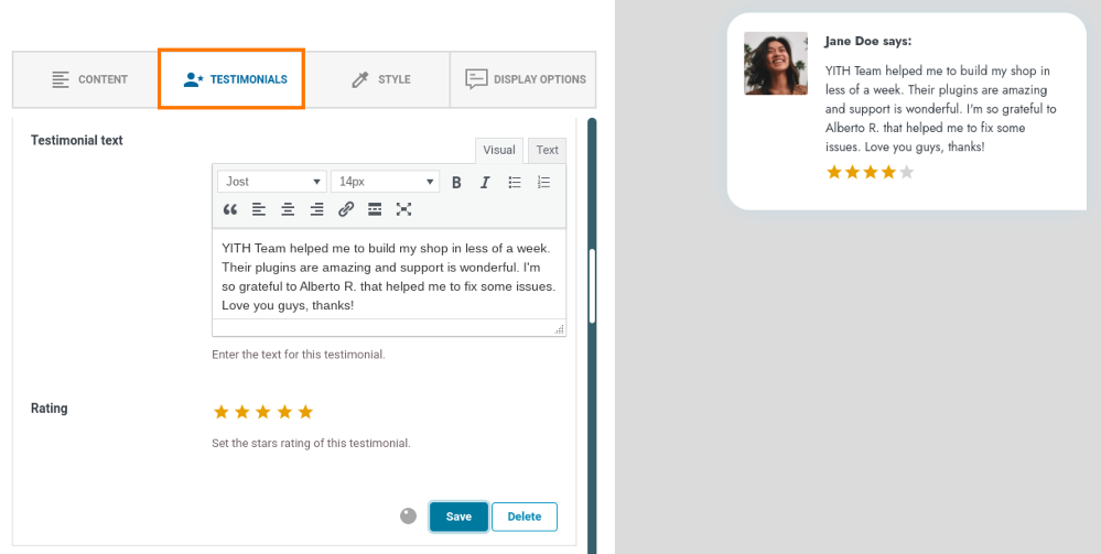
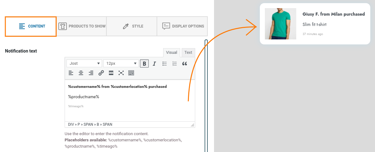
Step 3 – Notification content
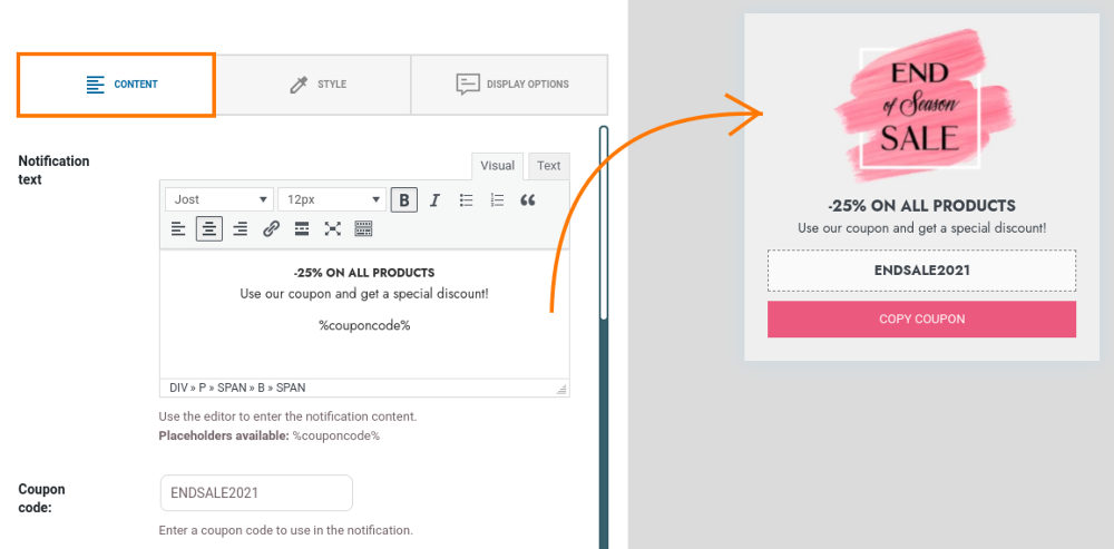
First, we start by adding the text of the notification content. As you can see in the example below, you can edit the font, size, etc.

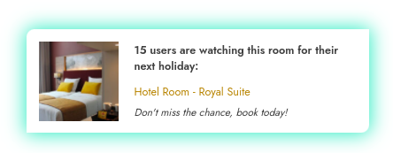
On the right side, you see a preview of the notification you are creating in real time. It changes dynamically as you are editing the notification.
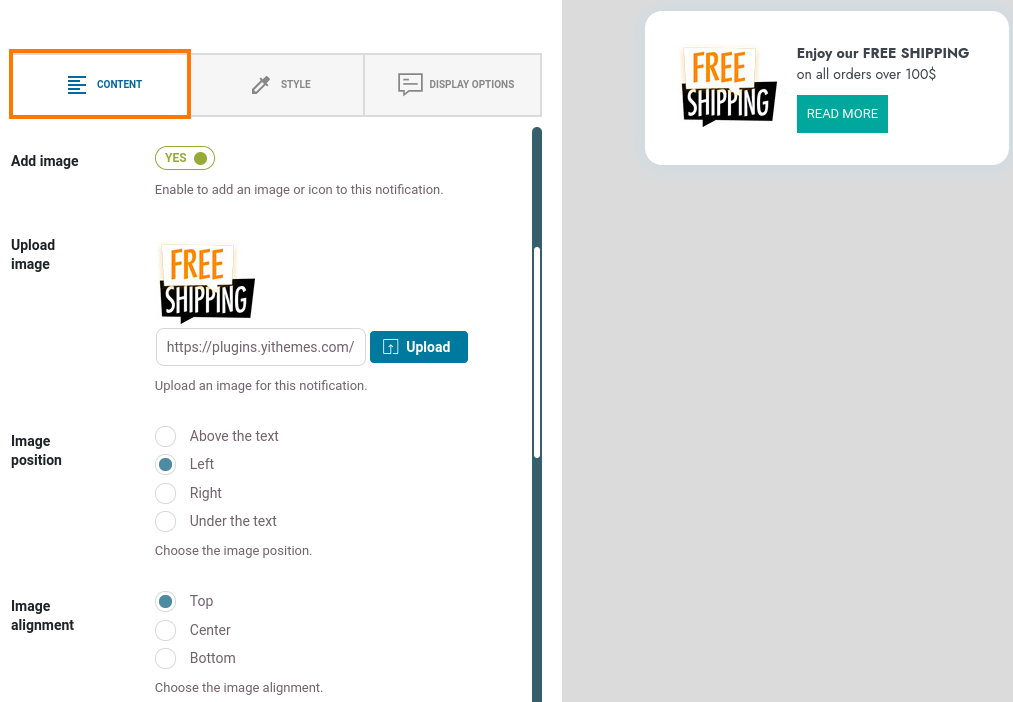
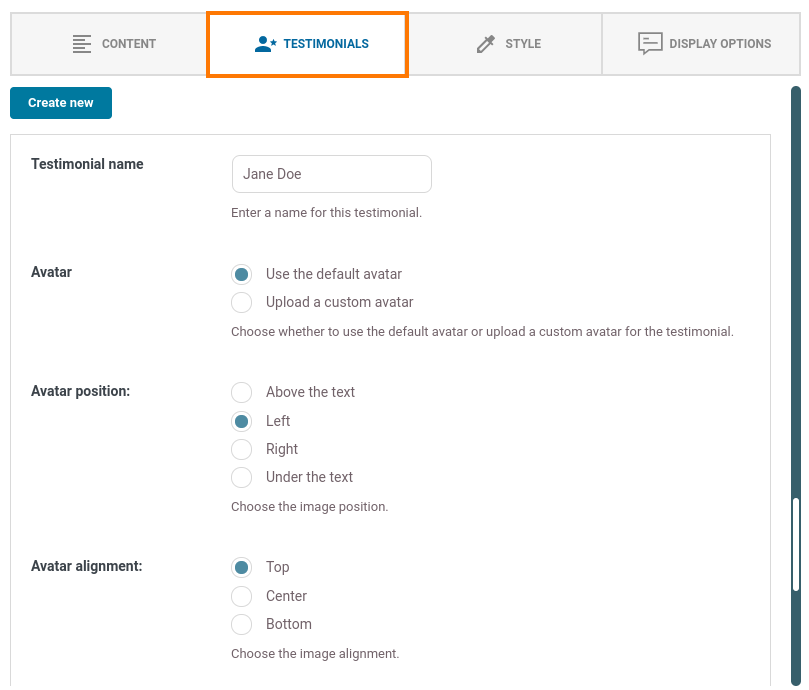
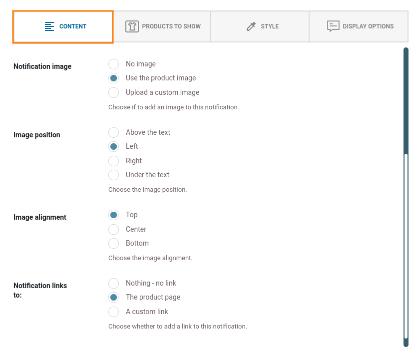
Step 4 – Image options
Now we decide to add a custom image to the notification, by enabling the “Add image” option.
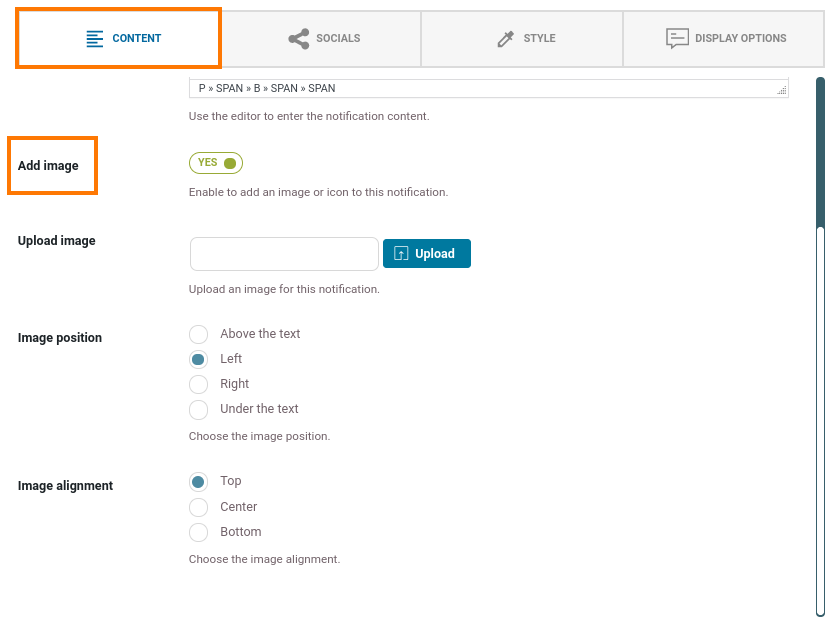
- Upload image: choose a custom image that you want to show.
- Image position: Decide to show it above, left, right or under the text.
- Image alignment: Decide the alignment, top/bottom/left/right or center.
In this example, we choose to not show an image.
For more information on the image position and alignment, check this page here.
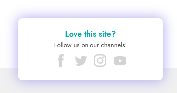
Step 4 – Socials
From the ‘Socials’ tab we can decide to add social media channels to the notification. You can simply decide to show, or not show them by using the toggle.
By default, the plugin includes:
- Facebook
- Twitter
- Instagram
- YouTube
- TikTok
- LinkedIn
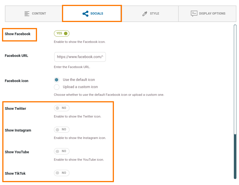
- Specific social media URL: Add the specific URL.
- Specific social media icon: Decide to use the default icon or upload a custom icon.
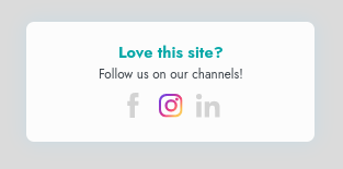
The icons are shown in grey, when hovering over them you’ll see it in color.
You can also add a custom social icon, for example if the social media channel of your choice is not available.

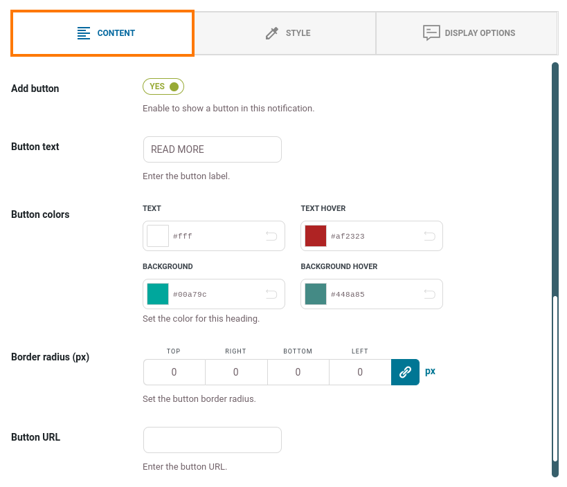
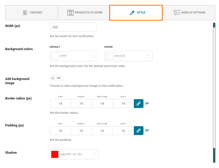
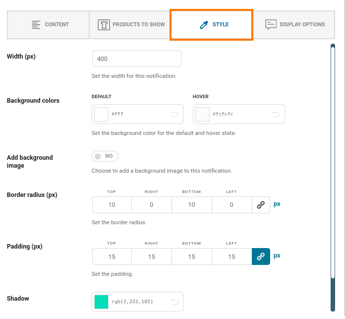
Step 5 – Style
Moving on to the ‘Style’ tab where we can manage the colors, padding, background, etc. of the notification.

- Width (px): Width of the notification.
- Background colors: Default color, and color on hover state.
- Add background image: Decide to show and upload a custom image as a background, instead of a color.
- Border radius (px): Decide to have square or rounded edges (0 for square).
- Padding (px): Decide the amount of space around the content.
- Shadow: Add a shadow color to the notification.
Again, on the right-hand side, you can see the changes you apply directly in the preview.
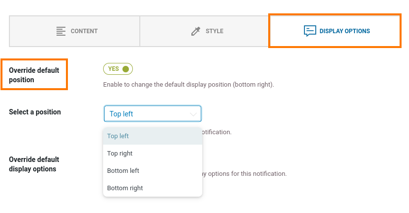
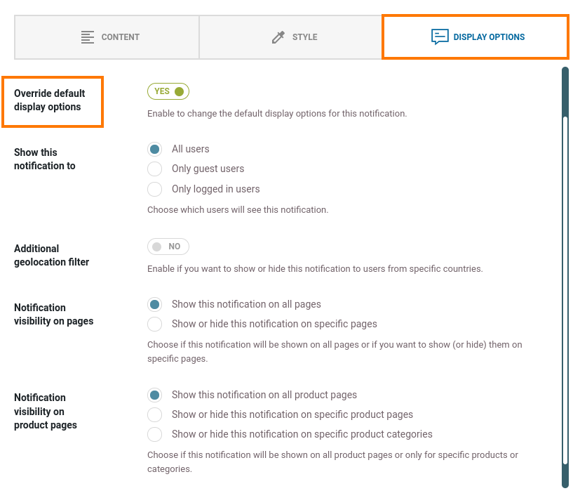
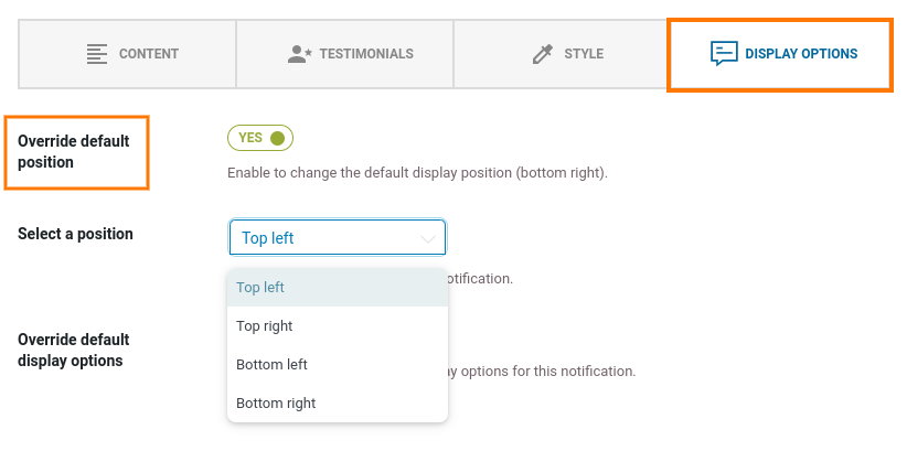
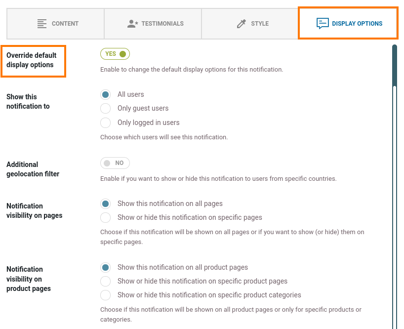
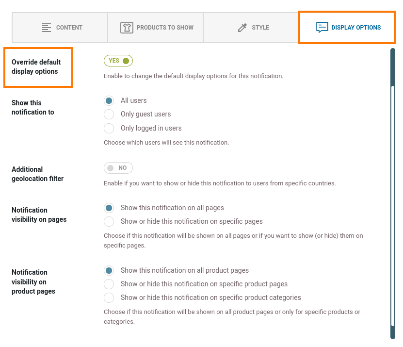
Step 6 – Display options
The ‘Display options’ allow us to override the default options we have set, with regard to displaying the notification.
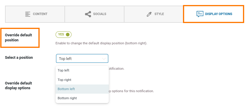
- Override default position: decide to change the default position of the notification.
- Select a position: decide where on the page to show the notification:
- Top left
- Top right
- Bottom left
- Bottom right

- Override default display options: Decide to change the default display options for the notification.
- Show this notification to: Show it to all users, only guest users, or only logged-in users.
- Additional geolocation filter: Decide to hide or show notifications to users from certain countries.

- Notification visibility on pages: Decide to show the notification on all pages or only specific pages.
- Notification visibility on product pages: Either show on all product pages, specific product pages or specific product categories.
- Decide to show or hide the notification on selected products or categories.
For example, we want to show this notification to users from Spain, although by default, these users do not see notifications. Because in the general ‘Display options’ settings, we have excluded that country.
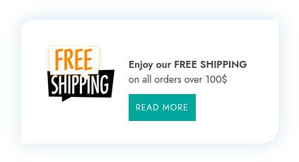
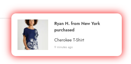
Step 7 – Final result
On the frontend, the notification would look like this: