Step 1 – Add a new notification
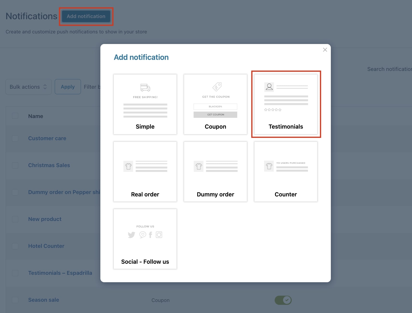
By clicking on the “Add notification“ button, a popup will open allowing us to select the notification we want to create. In this case, we want to add a Testimonials notification when users are visiting the product page for ‘Espadrilla’.
Step 2 – Notification name
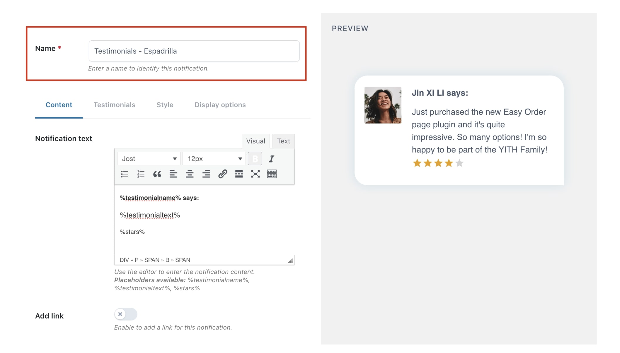
The name you add here is for admin view only. The customer will not see this name, this is simply the title you give to the notification and it is a mandatory field.
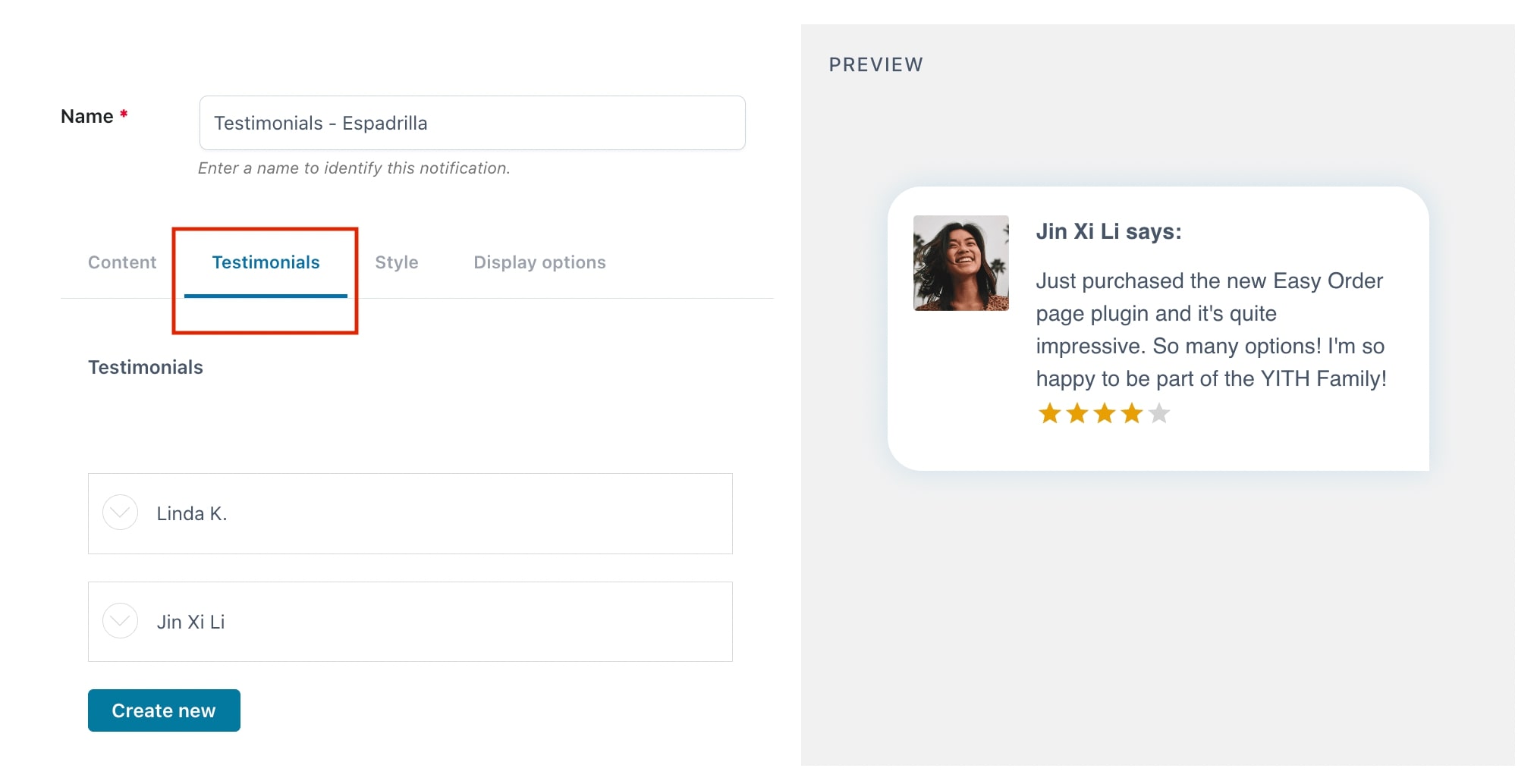
Step 3 – Notification content
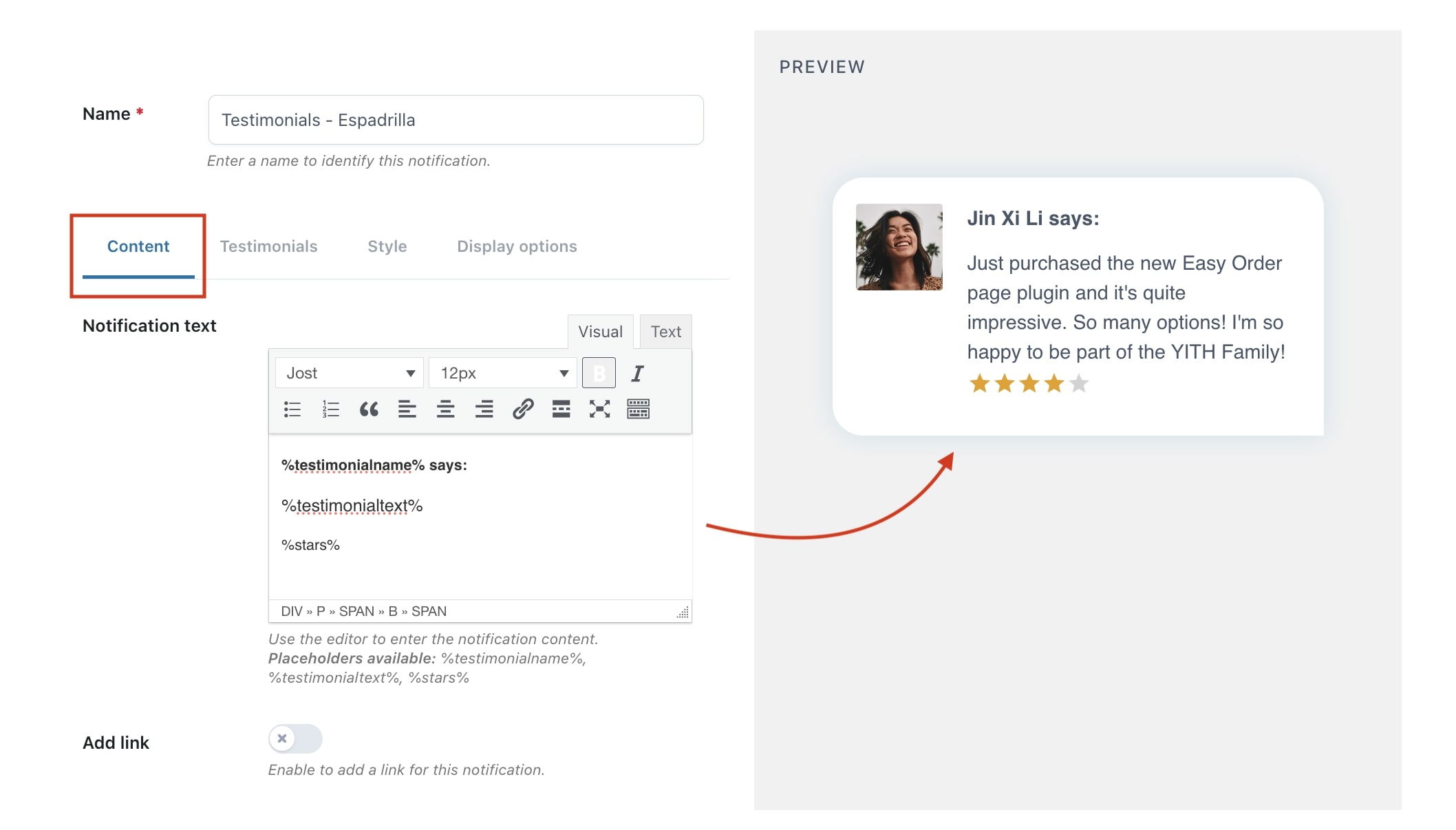
First, we start by adding the text of the notification from the ‘Content’ tab. As you can see in the example below, you can edit the font, the size, etc.
- Notification text: from the available editor you can add the text that will be shown in the notification. You can use the available placeholders: %testimonialname%, %testimonialtext%, %stars%.
Please, note: The actual testimonial text is written in the ‘Testimonials‘ tab (Step 4). In the example from the preview above, the text in the editor is used to show “Jin Xi Li says:”
- Add link: you can add a link to redirect customers that click on the notification. If you add a link the mouse will change to a ‘hand’ icon on hover, so the customer sees that he can click on it.
On the right side, you see a preview of the notification you are creating in real time. It changes dynamically as you are editing the notification.
Step 4 – Testimonial options
Now, we can start to create testimonials.
When you click on the ‘Create new’ button, you will be able to edit the following options:
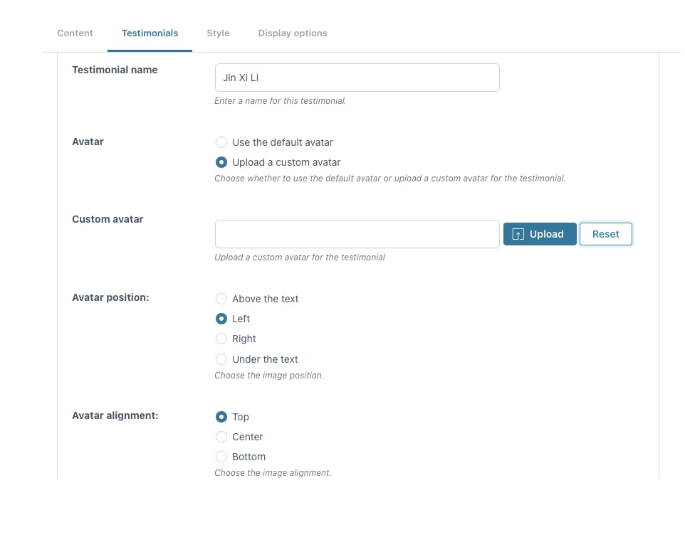
- Testimonial name: name of the dummy customer.
- Avatar: show the default avatar or upload a custom one.
- Avatar position: decide to show it above, left, right or under the text.
- Avatar alignment: depending on the position, decide the horizontal/vertical alignment.
In this example, we choose to show a custom avatar left from text on top.
For more information on the image position and alignment, check this page.
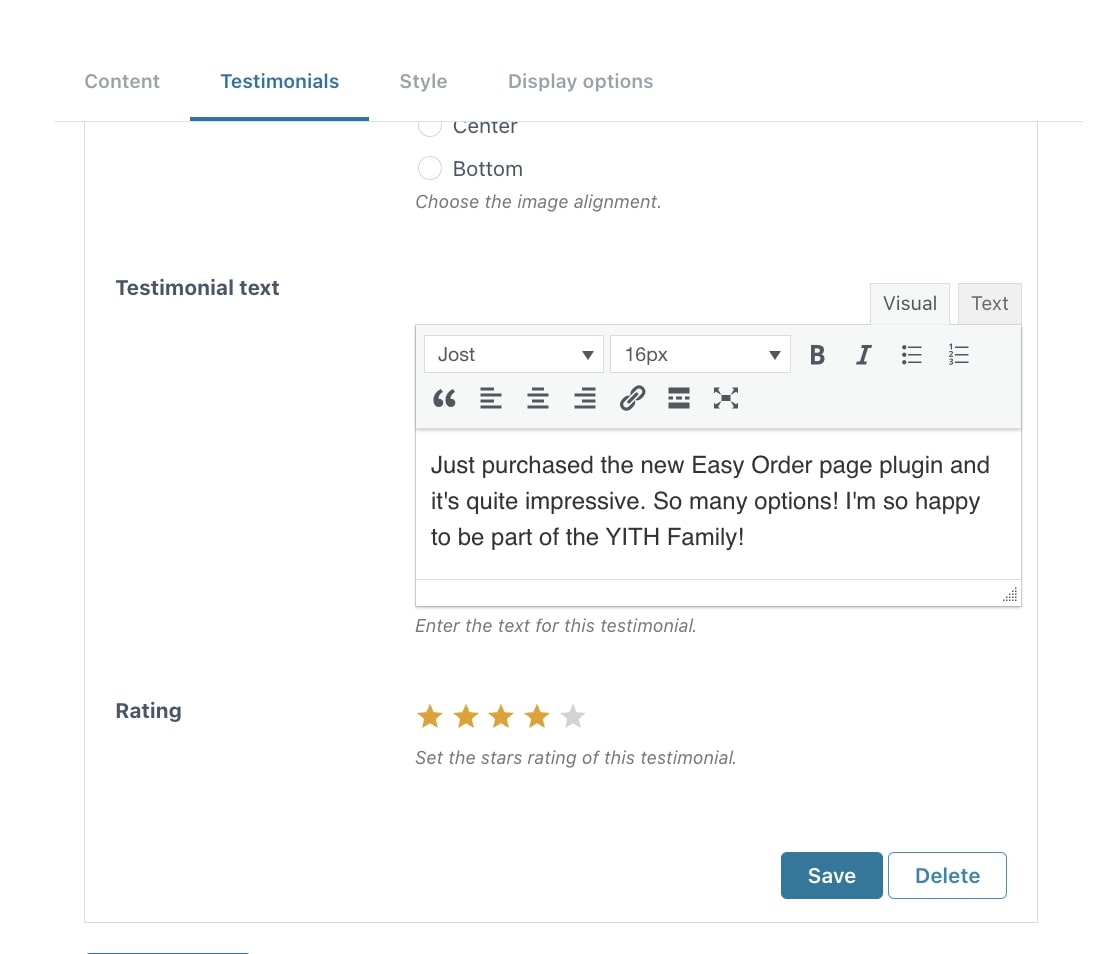
- Testimonial text: add here the testimonial text that will be shown within the notification. You can also decide to copy-paste real testimonials here.
- Rating: add a number of stars as a rating, that is shown within the notification.
- Save / Delete: after editing the options, you can save or delete the testimonial.
The testimonials that you create will be shown randomly, they do not follow any order.
Step 5 – Style
Moving on to the ‘Style’ tab where we can manage the colors, padding, background, etc. of the notification.
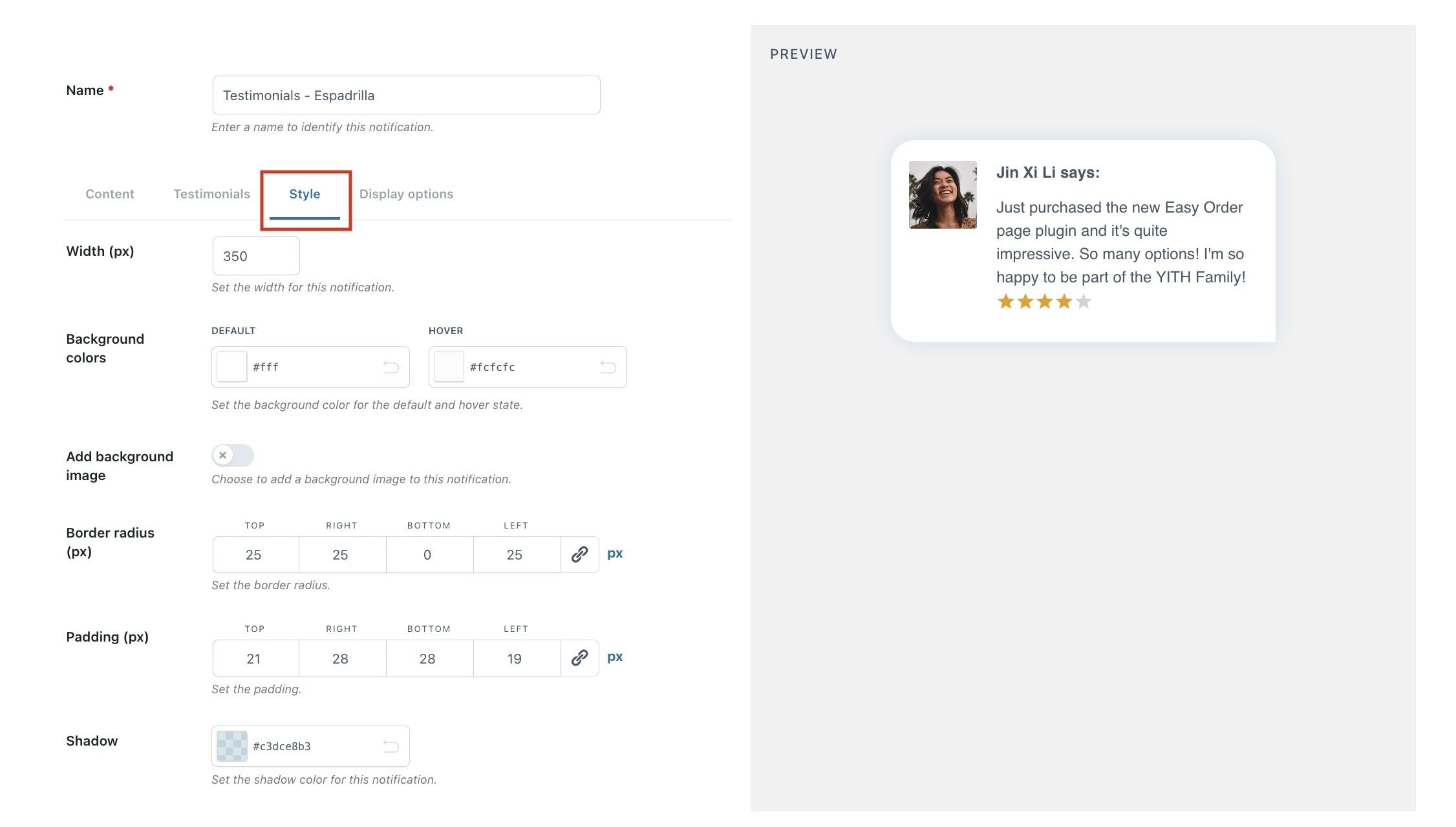
- Width (px): width of the notification.
- Background colors: default color, and color on hover state.
- Add background image: decide to show and upload a custom image as a background, instead of a color.
- Border radius (px): choose to add square or rounded edges (0 for square).
- Padding (px): set the amount of space around the content.
- Shadow: add a shadow color to the notification.
Again, on the right-hand side, you can see the changes you apply directly in the preview.
Step 6 – Display options
The ‘Display options’ allow us to override the default options we have set, with regard to displaying the notification.
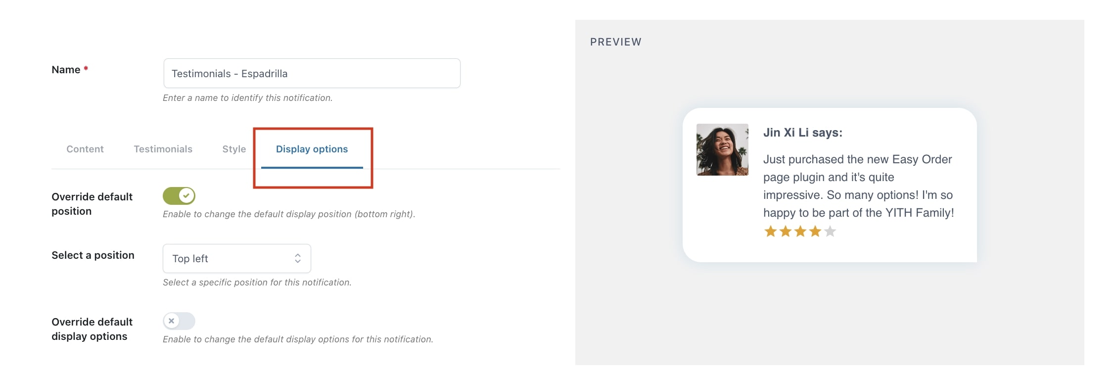
- Override default position: enable this option if you want to override the default position of the notification.
- Select a position: decide in which position on the page the notification pops up:
- Top left
- Top right
- Bottom left
- Bottom right
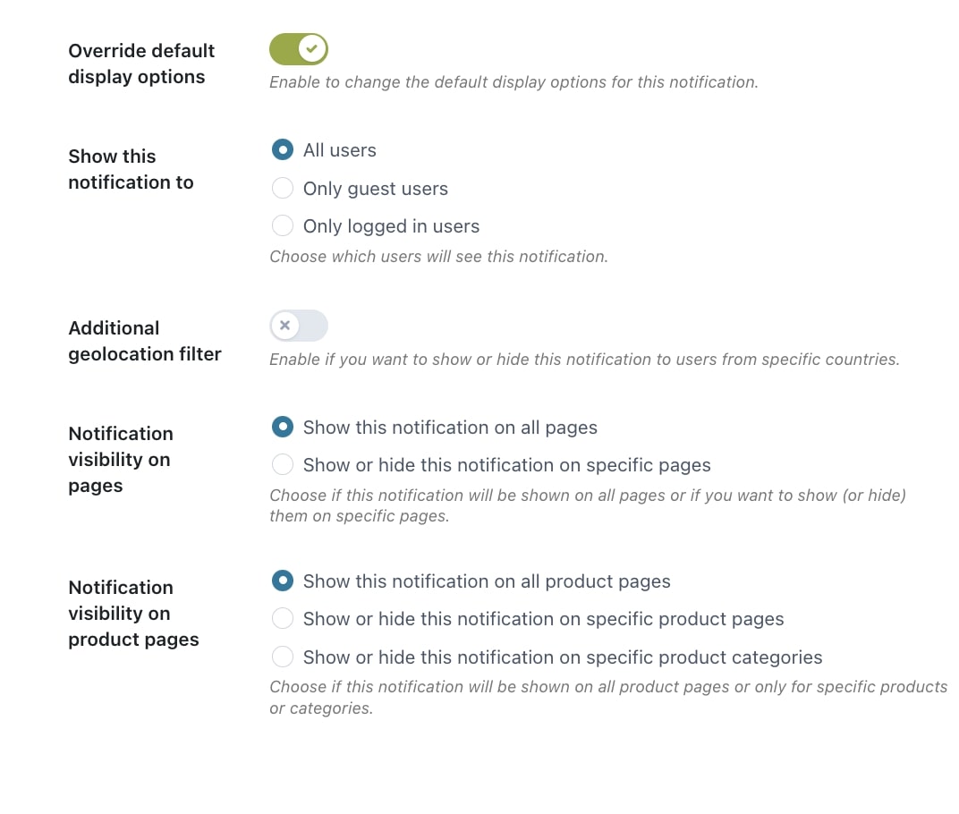
- Override default display options: enable to override the default display options for the notification.
- Show this notification to: you can choose which users can see the notification. You can choose to all users, only guest users, or only logged-in users.
- Additional geolocation filter: decide to hide or show notifications to users from certain countries.

For example, we want to show this notification to users from Spain, even though these users do not see notifications by default because we have excluded that country in the general “Display Options” settings.
- Notification visibility on pages: decide to show the notification on all pages or show/hide it only on specific pages.
- Notification visibility on product pages: either show it on all product pages, or decide to show/hide the notification on selected products or categories.
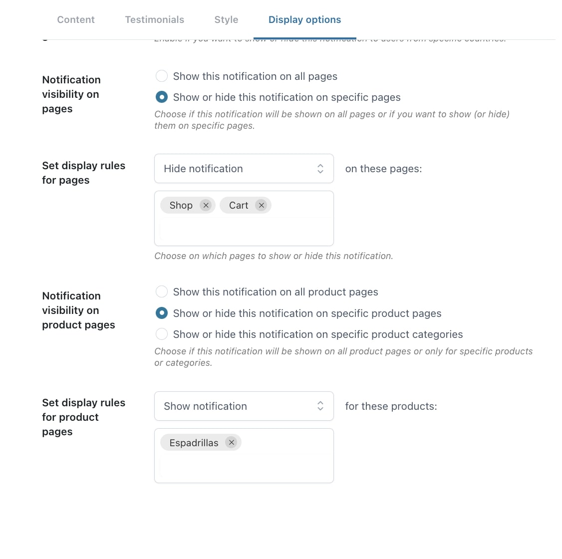
In this case, we want to hide the Testimonials in the Shop and Cart pages, and show it only in the page of our product “Espadrillas”.
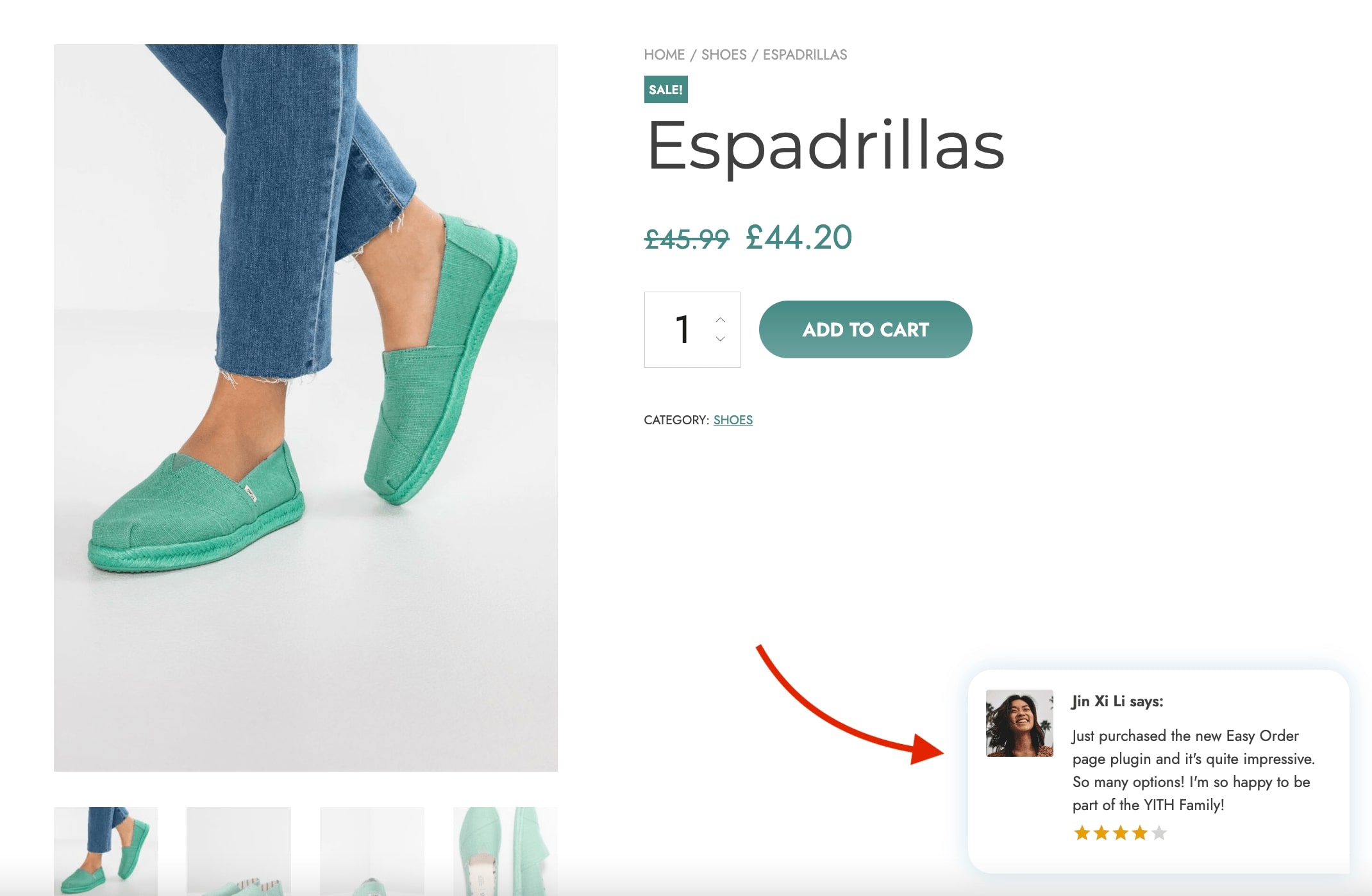
Step 7 – Final result
On the frontend, the notification would look like this: