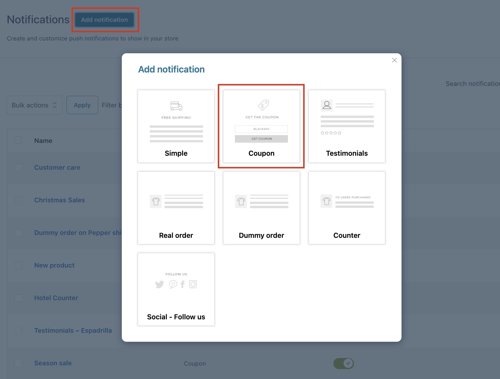
Step 1 – Add a new notification
By clicking on the “Add notification“ button, a popup will open allowing us to select the notification we want to create. In this case, we want to add a Coupon notification for a ‘Season sale’.
Step 2 – Notification name
The name you add here is for admin view only. The customer will not see this name, this is simply the title you give to the notification and it is a mandatory field.
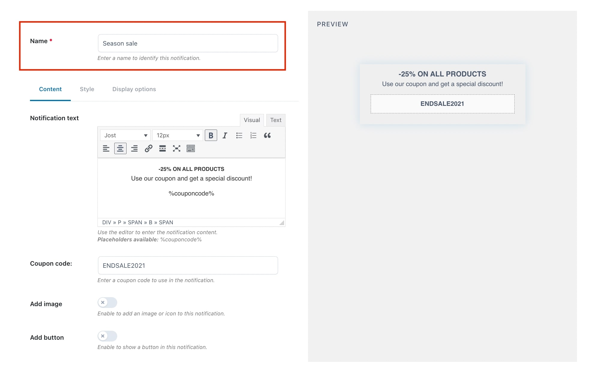
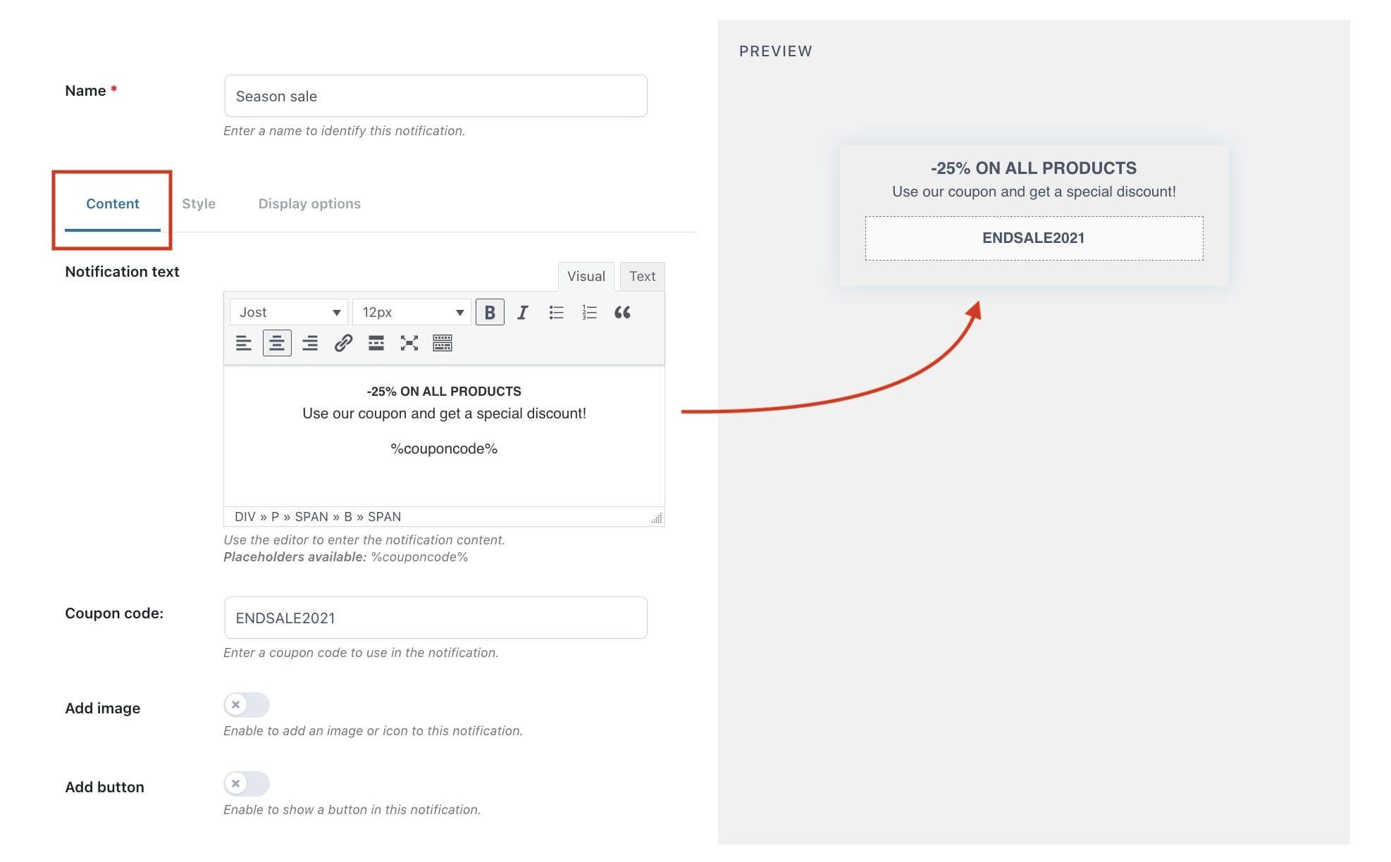
Step 3 – Notification content
First, we start by adding the text of the notification from the ‘Content’ tab. As you can see in the example below, you can edit the font, the size, etc.
- Notification text: from the available editor you can add the text that will be shown in the notification. You can use the placeholder %couponcode%
- Coupon code: from this option you can insert the coupon code that you have previously created from the WooCommerce default settings: Marketing > Coupons.
On the right side, you see a preview of the notification you are creating in real time. It changes dynamically as you are editing the notification.
Step 4 – Image options
Next we decide to add a custom image to the notification, by enabling the “Add image” option.
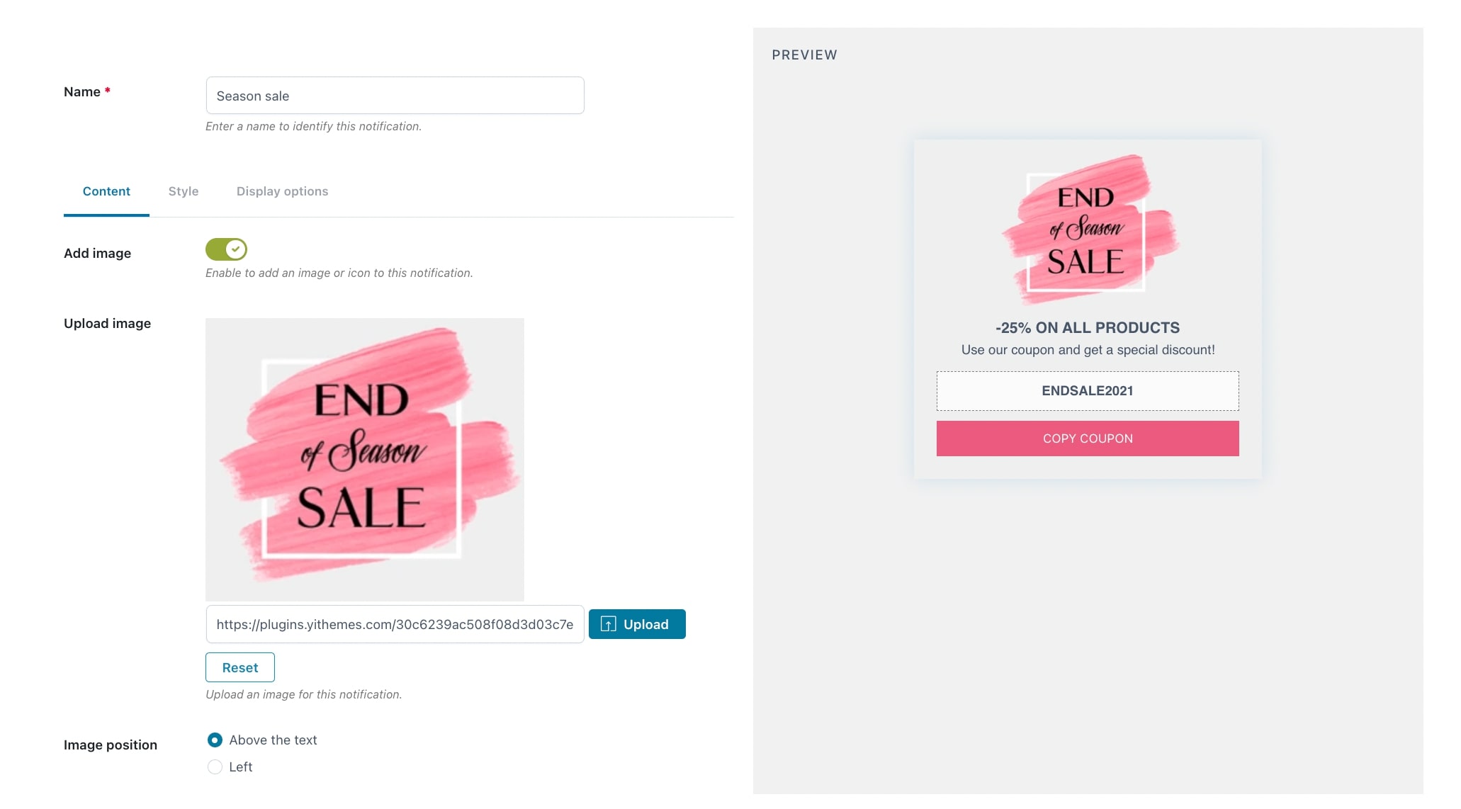
- Upload image: choose an image to upload.
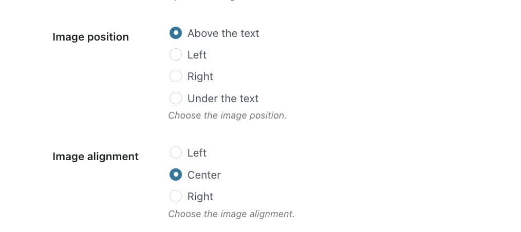
- Image position: select the position of the image based on the text (above it, to the left, to the right or under it).
- Image alignment: based on the image position, you can configure its alignment.
In this example, we choose to show an image above the text in the center.
For more information on the image position and alignment, check this page.
Step 5 – Button options
Now we decide to add a button to allow users to copy the coupon code directly from it. You have to activate the dedicated option.
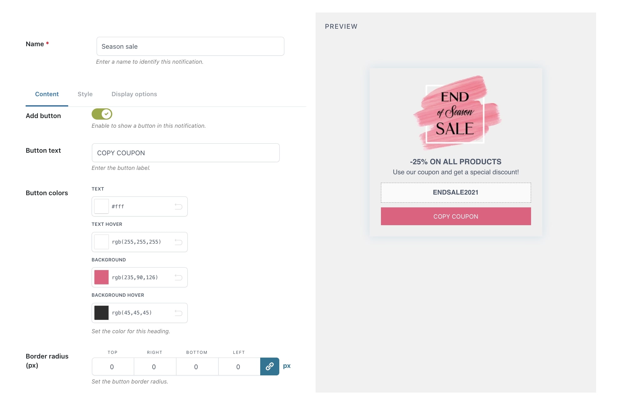
- Button text: add the label you want to show on the button.
- Button colors: set the colors for the button text and background.
- Border radius (px): choose to add square or rounded edges (0 for square).
- Button action: decide what happens when the customer clicks on the button:
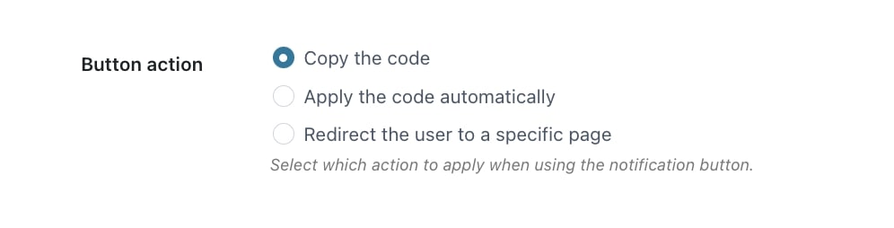
- Copy the code: the code is copied, they only have to paste it in the dedicated ‘coupon code’ field at checkout.
- Apply the code automatically: the code is automatically applied on the cart page.
- Redirect the user to a specific page: add the URL to redirect the customer when clicking on the button. For example, a discount conditions page.
Step 6 – Style
Moving on to the ‘Style’ tab where we can manage the colors, padding, background, etc. of the notification.
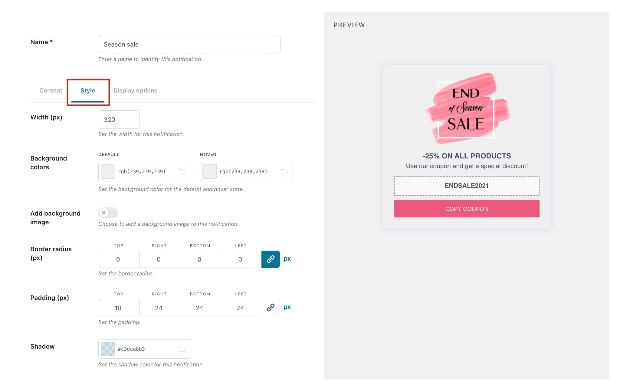
- Width (px): width of the notification.
- Background colors: default color, and color on hover state.
- Add background image: decide to show and upload a custom image as a background, instead of a color.
- Border radius (px): choose to have square or rounded edges (0 for square).
- Padding (px): set the amount of space around the content.
- Shadow: add a shadow color to the notification.
Again, on the right-hand side, you can see the changes you apply directly in the preview.
Step 7 – Display options
The ‘Display options‘ allow us to override the default options we have set in the general Display settings, regarding how the notification is displayed to the user in the frontend page.
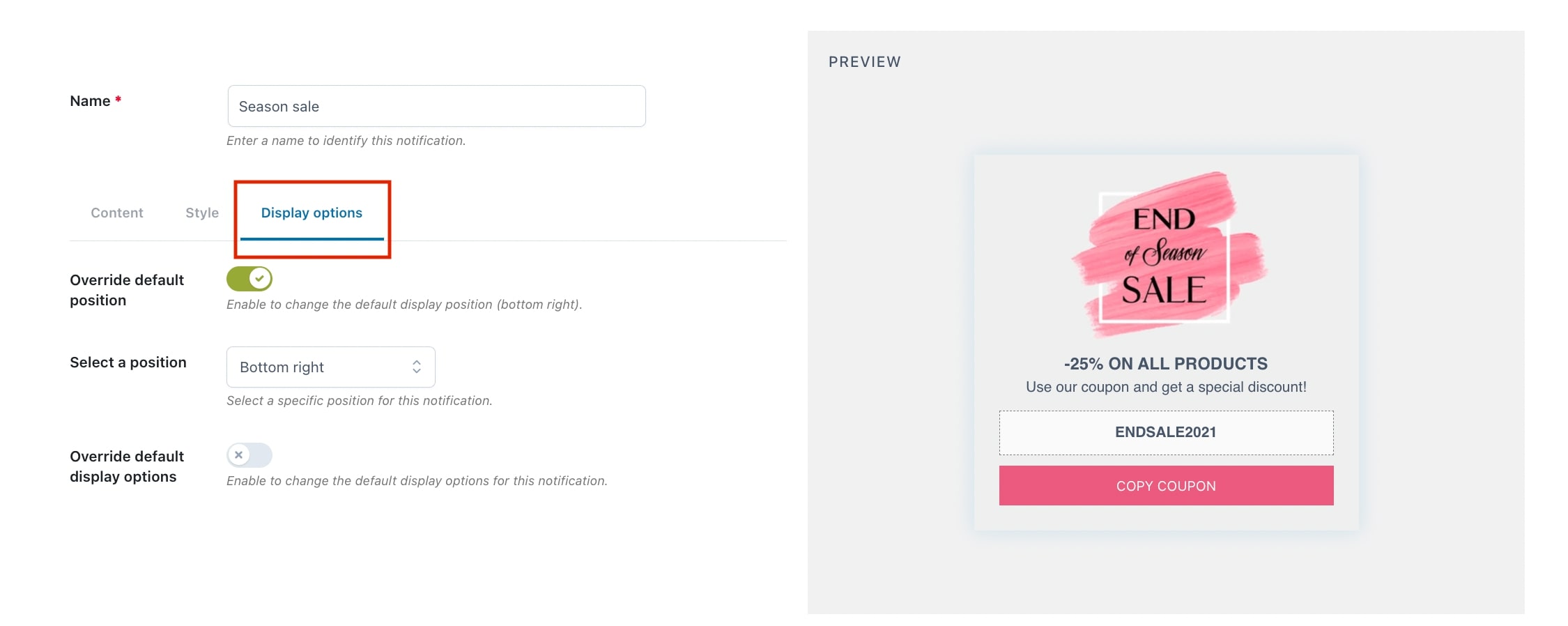
- Override default position: enable this option if you want to override the default position of the notification.
- Select a position: decide in which position on the page the notification pops up:
- Top left
- Top right
- Bottom left
- Bottom right
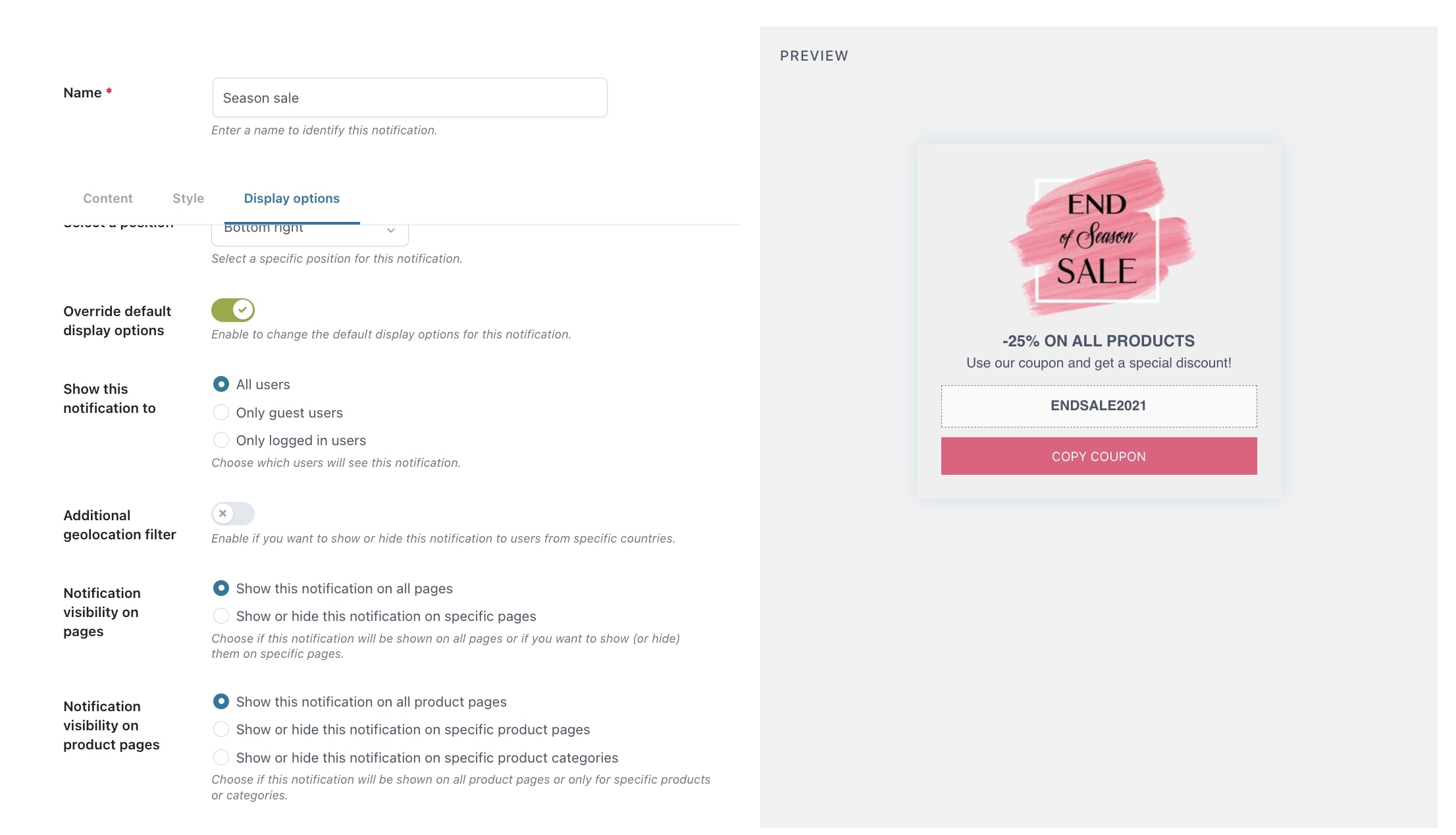
- Override default display options: enable to override the default display options for the notification.
- Show this notification to: you can choose which users can see the notification. You can choose to all users, only guest users, or only logged-in users.
- Additional geolocation filter: decide to hide or show notifications to users from certain countries.

For example, we want to show this notification to users from Spain, even though these users do not see notifications by default because we have excluded that country in the general “Display Options” settings.
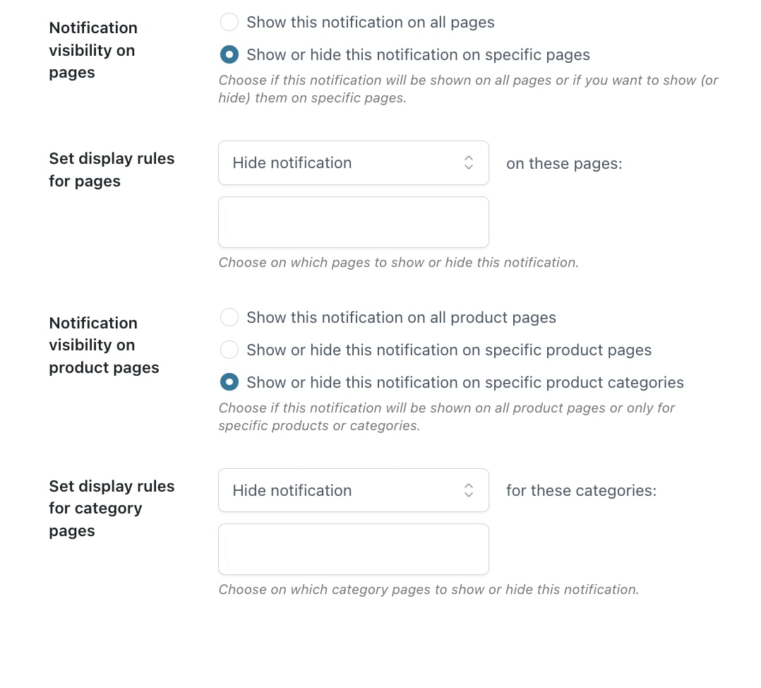
- Notification visibility on pages: decide to show the notification on all pages or show/hide it only on specific pages.
- Notification visibility on product pages: either show it on all product pages, or decide to show/hide the notification on selected products or categories.
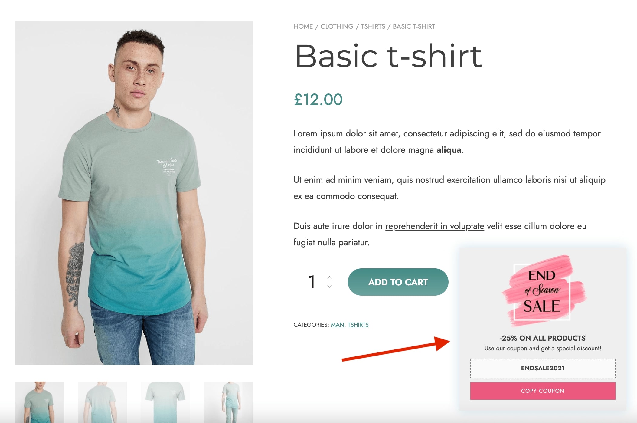
Step 8 – Final result
On the frontend, the notification would look like this: