YITH WooCommerce Ajax Search allows adding a search bar to your website to let users search via Ajax for specific content in your website through posts, pages, and products.
Please note: for the plugin to work properly, it is essential for the REST API not to be blocked. If you do not want to give full REST API access, the ywcas/v1/ endpoint must be accessible.
We recommend following the steps in this guide to configure the plugin based on your needs.
The Search stats section in the plugin panel is where you can find all the statistics related to the Top searches (the most popular searches), Top clicked products (the products with the most clicks from the search results), and Searches with no results (the searched made by users that produced no results).
Tip about Searches with no results: the words listed in this stat can be useful and taken into account when configuring the synonyms words.
If you need to monitor statistics for a specific time interval, you can use the Filter by date option.
To reset the filter, click on the Reset button.
At the bottom of each statistic, you will find a ‘View all‘ link that allows you to access the table showing each query/product and its number of searches/clicks. From this table, you can also filter the statistic by date.
The plugin is ready to use with the block editor. When creating a new post or page, you can find the YITH blocks: Classic search and Overlay search. You can add them to your page with a simple click.
Classic search
When selecting Classic search, you can choose the input size from Small and Large. This block includes 3 other blocks that we will analyze as follows:
By selecting this block, you will be able to configure the following settings:
Placeholder: enter the text for the placeholder of the search field;
Border size: define the size (in px) for the search field border;
Border radius: define the border radius (in px) for the search field;
Color settings: choose the colors for the placeholder, text, background, backgroundfocus, border, and borderfocus;
Submit search style: choose the style from Icon, Text, or Icon + text;
Search icon:(available if Icon is selected) choose where to show the icon from right or left;
Submit color settings: choose the colors for the icon, icon hover, background, background hover, border, and border hover;
Submit button label: (available if Text or Icon + text is selected): enter the text to show as the submit button;
Submit border radius: set the border radius (in px) for the submit button;
Submit color settings: choose the colors for the text(and icon), text(and icon)hover, background, backgroundhover, border, and borderhover.
Icon + text example
Filled state block
This is the block that manages the search results shown when found.
By selecting this block, you will find 3 additional blocks (Related categories block, Product results block, and Related posts block) to configure the following settings:
Related categories block: this is the block that shows the related categories through which you can set:
Label: enter the text to show for the related categories;
Max related categories: set the maximum number of categories to show.
Related categories example
2. Products results block: this is the block that shows the products found as search results through which you can set:
Max results to show: enter the maximum number of products to show;
Layout: choose the layout from List or Grid;
List
Grid
Info to show: enable/disable the product info to show in the results:
Name: the name of products;
Product title color: set the color for the product name;
Price: the price of products;
Price label: enter the text to show for the price;
Image: the image of products;
Image position: (only available with List layout) choose whether to show the product image on the left or on the right;
Image size: set the size (in px) for the product images;
Categories: the categories to which products belong;
Stock: the stock status;
SKU: the products SKU;
Summary: the products summary;
Limit summary length on/off: enable to set a limit for the summary length;
Summary max words: set the maximum number of words to show for the product summary;
Add to cart: the Add to cart button;
No results text: enter the text to show when there are no results for the search;
Show “View all results” link: the link to view all products;
“View all results” text: enter the text to show for the link. To show the number of results, you can use the available placeholder: {total};
Show “On Sale” badge: enable to show the on-sale badge;
Show “Out of stock” badge: enable to show the out-of-stock badge;
Show “Featured” badge: enable to show the featured badge;
Hide “Featured” badge if the product is on sale: enable to hide the featured badge on on-sale products.
Info to show example
3. Related posts block: this is the block that shows the related posts through which you can set the following options:
Label: enter the text to show for the related posts;
Max related posts: set the maximum number of posts to show;
Background color: set the color for the background.
Related posts example
Empty state block
This is the block that manages the search field when still empty.
By selecting this block, you will find 2 additional blocks (Search history and Popular searches block) to configure the following settings:
Search history: this is the block that shows the latest searches made by the user through which you can configure the following settings:
Label: enter the text to show for the search history;
Max latest search items: set the maximum number of results to show for the latest searches.
Please note: the search is registered only if the user visits the product page.
2. Popular searches block: this is the block that shows the most popular searches made by all the users through which you can configure the following settings:
Label: enter the text to show for the popular searches;
Searches to show: set the maximum number of results to show for the popular searches.
Popular searches example
Overlay search
When selecting Overlay search, you will be able to set 2 additional blocks to manage the settings of the search icon and overlay content.
Icon trigger block
This block adds the search icon that will trigger the overlay when clicking on it. You can set the color and colorhover of the icon through the related options.
Icon on the frontend
Overlay content
This block allows managing the overlay when users click on the search icon. It includes 3 other blocks that we will analyze as follows:
Placeholder: enter the text for the placeholder of the search field;
Border size: define the size (in px) for the search field border;
Border radius: define the border radius (in px) for the search field;
Color settings: choose the colors for the placeholder, text, background, backgroundfocus, border, and borderfocus.
Example
Filled state block
This is the block that manages the search results shown when found.
By selecting this block, you will find 3 additional blocks (Related categories block, Related posts block, and Overlay product results) to configure the following settings:
Related categories block: this is the block that shows the related categories through which you can set:
Label: enter the text to show for the related categories;
Max related categories: set the maximum number of categories to show.
Example
2. Related posts block: this is the block that shows the related posts through which you can set the following options:
Label: enter the text to show for the related posts;
Show results related to: select Post and/or Pages;
Max related posts: set the maximum number of posts to show;
Background color: set the color for the background.
Example
3. Overlay products results block: this is the block that shows the products found as search results through which you can set:
Grid layout: here you can set the number of columns and rows to show;
No results text: enter the text to show when there are no results for the search;
Content: enable/disable the info to show in the results:
name
price
image
Add to cart
Example
Empty state block
This is the block that manages the search field when still empty.
By selecting this block, you will find 2 additional blocks (Search history and Popular searches block).
Search history: this is the block that shows the latest searches made by the user through which you can configure the following settings:
Label: enter the text to show for the search history;
Max latest search items: set the maximum number of results to show for the latest searches.
Please note: the search is registered only if the user visits the product page.
2. Popular searches block: this is the block that shows the most popular searches made by all the users through which you can configure the following settings:
Label: enter the text to show for the popular searches;
Searches to show: set the maximum number of results to show for the popular searches.
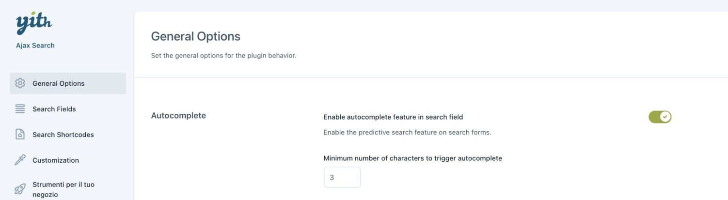
By enabling this option, when users start typing a word in the search field, the plugin will show possible matching results.
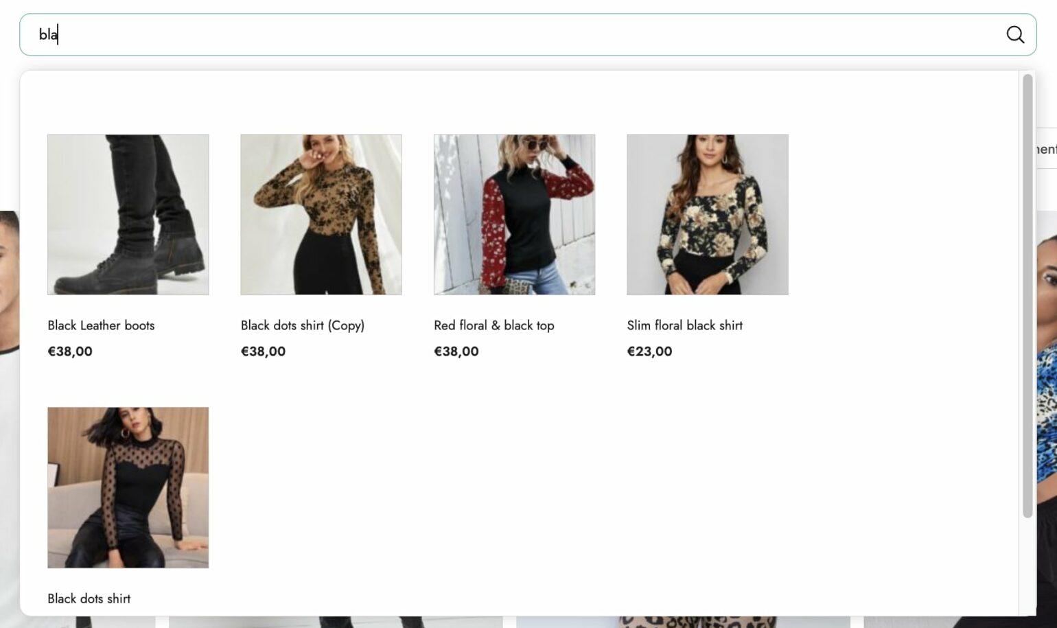
You can define the minimum number of characters that will trigger the autocomplete. In the example below, by typing bla, the results shown have black as a correspondence.
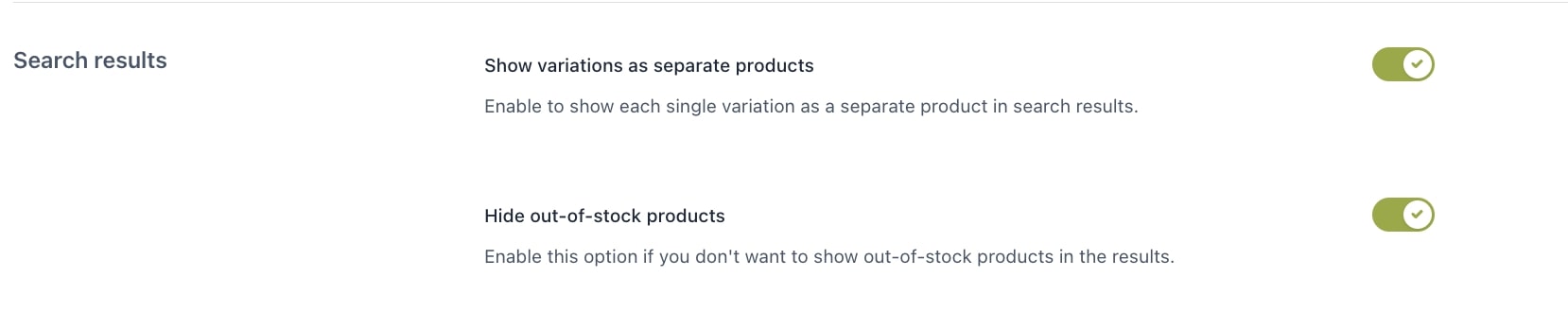
Search results
In this section, you can decide the behavior related to variable products and out-of-stock products.
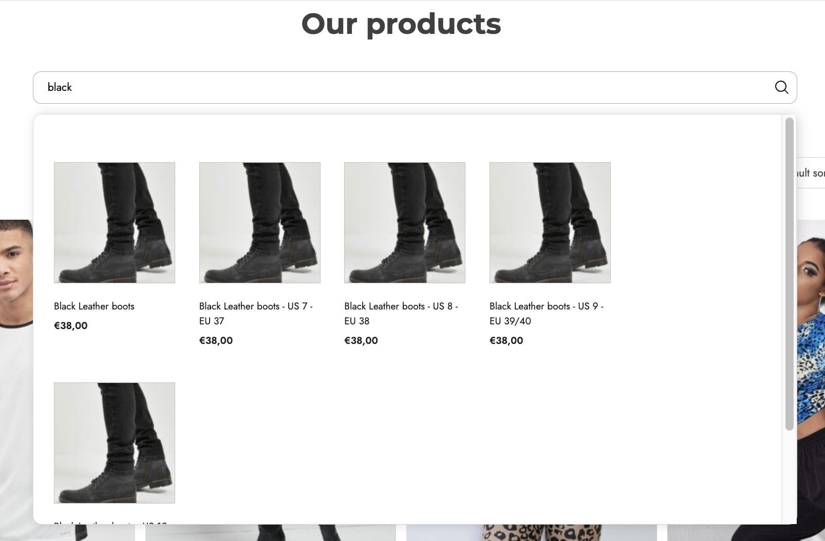
Show variations as separate products: enable to show product variations as single products in the results.
Hide out-of-stock products: by enabling this option, out-of-stock products will be excluded from the search results.
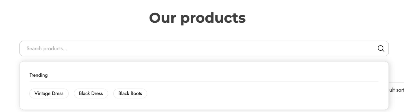
Suggested/Trending searches
In this section, you can enter specific keywords or popular searches to show in the search results. In this way, you can, for example, highlight products you want to push to be purchased or suggest products most commonly searched by other users.
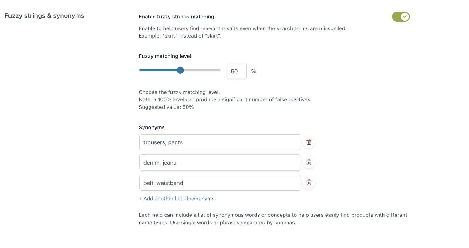
Fuzzy strings & synonyms
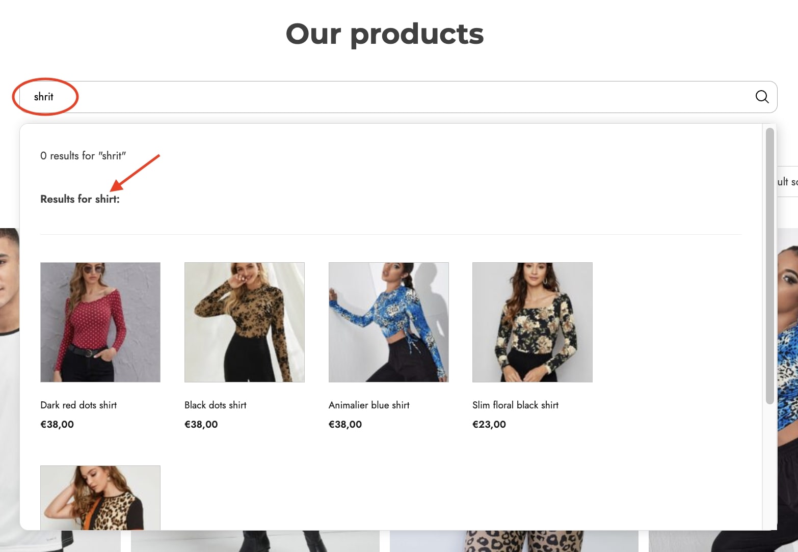
Users might mistype a word when searching for products and this will prevent them from getting results. In this case, to help them get the expected results, you can then enable the option Enable fuzzy strings matching and define the level of matching (we recommend setting the value to 50% to keep the search closer to the relevant word).
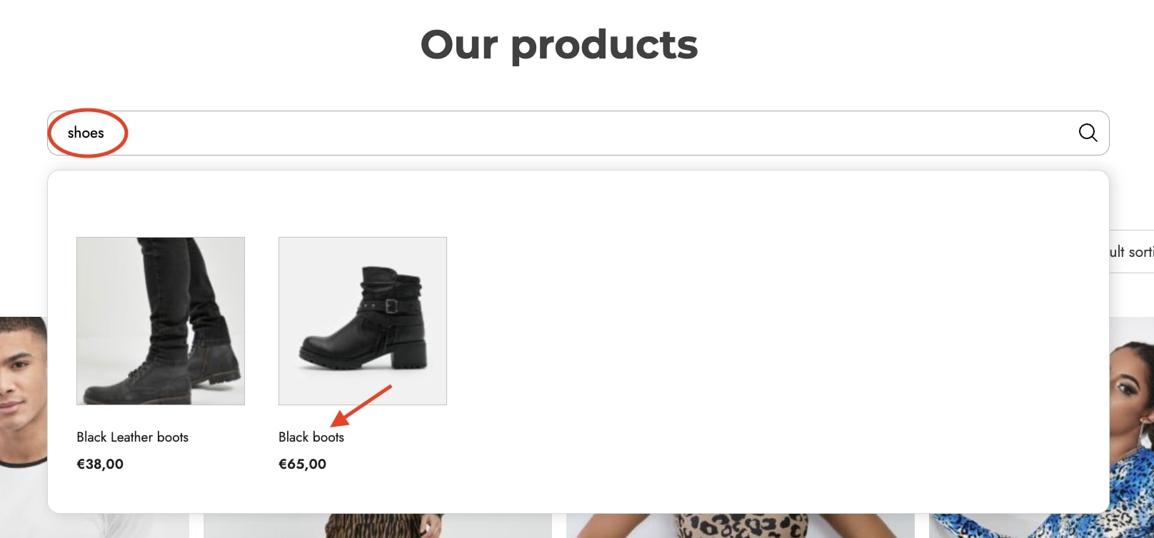
Additionally, through the Synonyms option, you can create one or more lists of synonyms (single words or phrases, comma-separated) so that, when users enter an equivalent word among those specified in your lists, they will get the products they are looking for more easily.
This is the section where you can choose the fields that will be involved during the search. To add a new field, click on the Add field button.
Now, you can select and extend the search to the following fields:
product name
description
short description
SKU
product categories: you can enable all categories or enable/disable specific categories
product tags: you can enable all tags or enable/disable specific tags
product attributes: you can enable all attributes or enable/disable specific attributes
custom fields: you can select one or more custom fields.
Index
In the Search index section, you can set how often and the time for the indexing of fields to be executed.
Schedule indexing: enable to schedule the indexing and choose the interval from:
Daily
Weekly
Schedule time: select the time for the recurring indexing
Index status: this shows the number of indexed items and the date it was executed. You can also manually process it by clicking on the Rebuild index button.
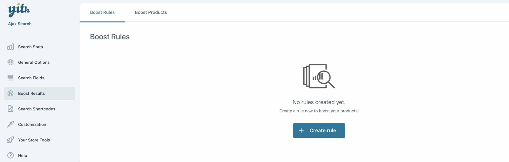
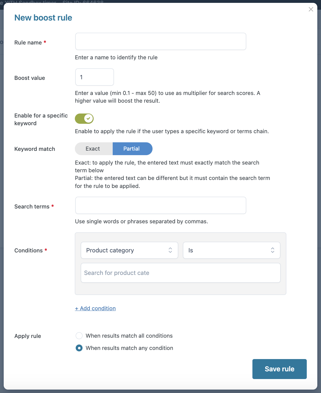
From the section Boost results > Boost rules, you can create rules to increase the visibility of your products in search results. Click on Create Rule to start configuring options and conditions for products to get a higher visibility score and, as a consequence, show more in search results.
Rule options
Rule name: enter the name of the rule;
Boost value: enter a value between 0.1 and 50 to define the visibility multiplier for the products. A higher value will increase the products’ visibility;
Enable for a specific keyword: enable this option to apply the rule only when a keyword or sequence of terms is entered in the search field;
Keyword match: decide whether to apply the rule based on an exact or partial match of the user-entered text with the specified search terms;
Search terms: enter the terms to be considered as a keyword match;
Conditions: create conditions for the rule to be applied by choosing from:
Product category: add the product categories to include (Is) or exclude (Is not) to the related field;
Product tag: add the product tags to include (Is) or exclude (Is not) to the related field;
Stock status: choose whether the stock status must be (Is) In stock or Out of stock or not (Is not);
Product price: choose if the product price must be In range, Not in range, Lower than, or Greater than the values specified in the related fields;
Price range
Price greater than
Apply rule: choose whether the created rule should be applied if the results match all or any of the added conditions.
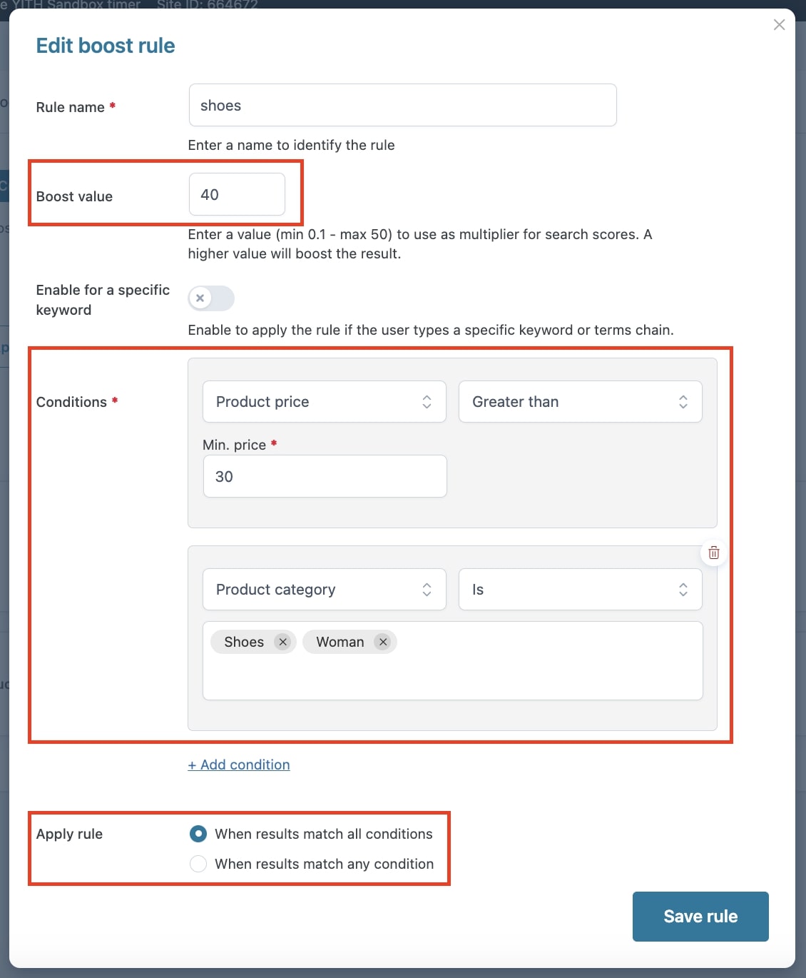
Example
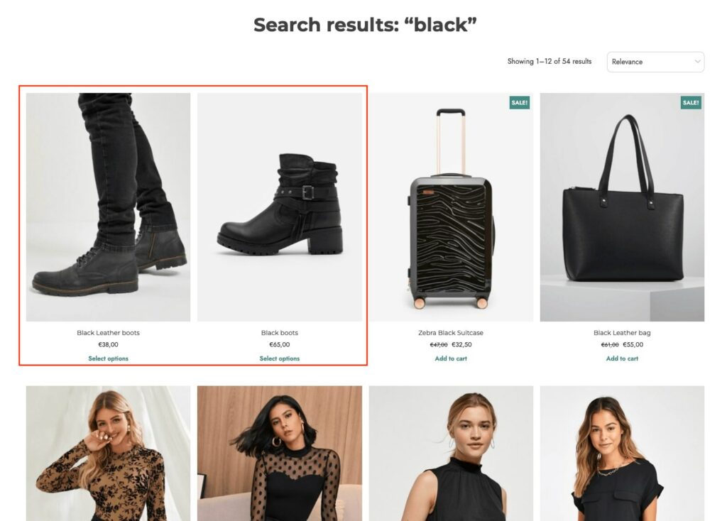
We have created a rule with categories (Shoes and Woman) and price conditions to boost products with prices higher than €30. We want the rule to apply when all the conditions match.
When users execute their search, for example, to search for black products, the results will show as follows.
From the section Boost results > Boost products, you can create rules to increase the visibility of specific products in search results.
Click on Choose product to start configuring a default value for products for which you want to get a higher visibility score and, as a consequence, show more in search results.
From the modal, you can either search for a product in the dedicated field or select them from the products list.
Enter a value between 0.1 and 50 to define the visibility multiplier for the products through the option Boost value. A higher value will increase the products’ visibility.
Example
Suppose we want to promote the gold products first among the search results when users search for a pair of earrings on our site. To achieve this, we will select gold earrings among the products and set their boost value to the maximum (50).
This will ensure that they are shown first in the search results, as shown in the image below.
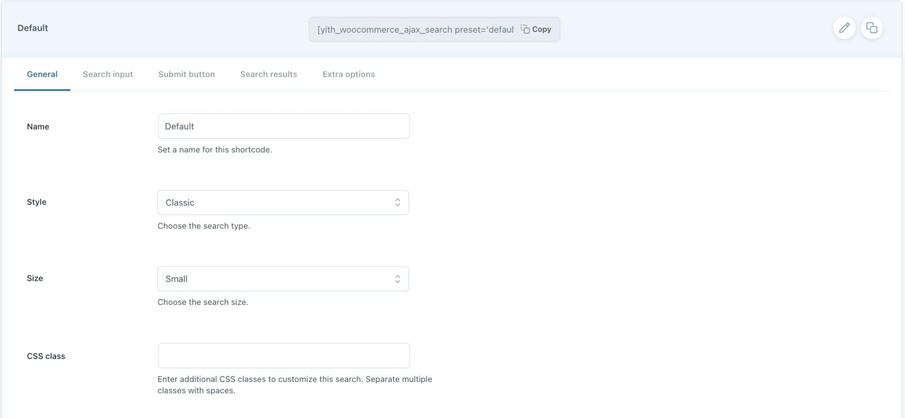
If you don’t use the blocks editor, go to the Search shortcodes section where you can find the default shortcode that you can customize as you want. You can also create other shortcodes by clicking on Add new shortcode and configure the following settings:
Style: choose the layout style from Classic and Fullscreen overlay;
Size: (available if Classic style is selected) choose the search size from Small or Large;
CSS class: enter CSS classes, space separated, to customize the search.
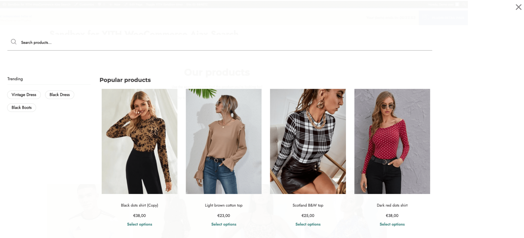
Fullscreen overlay
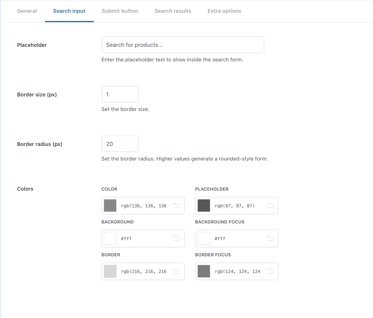
Search input
Placeholder: enter the text that will show within the search bar;
Border size (px): set the size of the border;
Border radius: set the border radius;
Colors: set the colors of the search form, placeholder, border, and background.
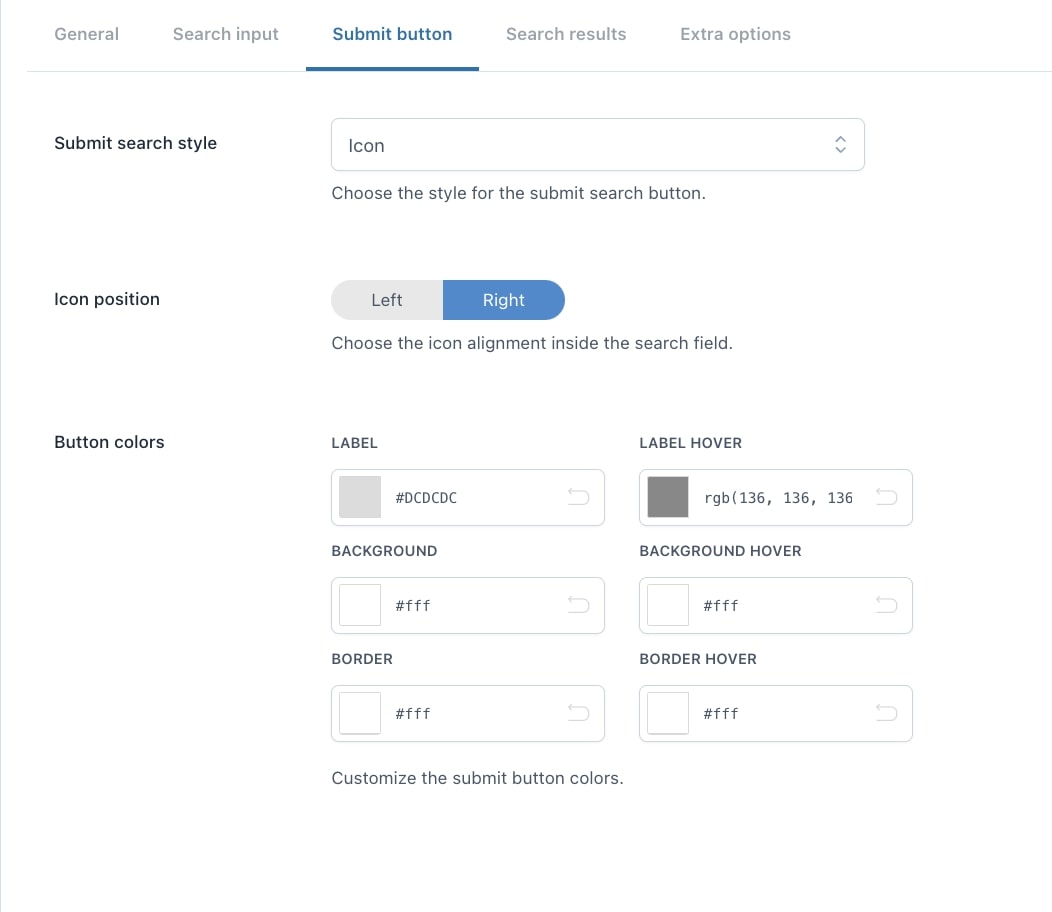
Submit button (available only for Classic style)
Submit search style: select the style to apply to the search button. Available options are:
Icon
Icon position: left or right;
Text
Text: enter the label for the search button;
Icon + Text
Text: enter the label for the search button.
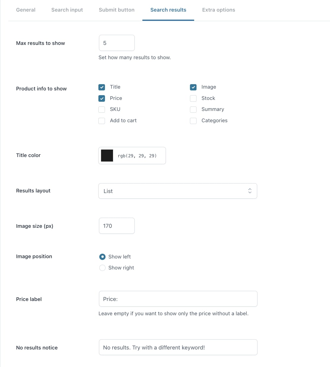
Search results – Classic style
Max results to show: set the number of results to show;
Product info to show: choose the product data to show:
Title
Price
SKU
Add to cart
Image
Stock
Summary
Categories
Title color: set the color of the title;
Results layout: choose whether to show the results as a list or in a grid;
Image size (px): set the size of the product images;
Image position: (available only with List layout) choose whether to show the image on the left or on the right;
Price label: enter the text to show before the price;
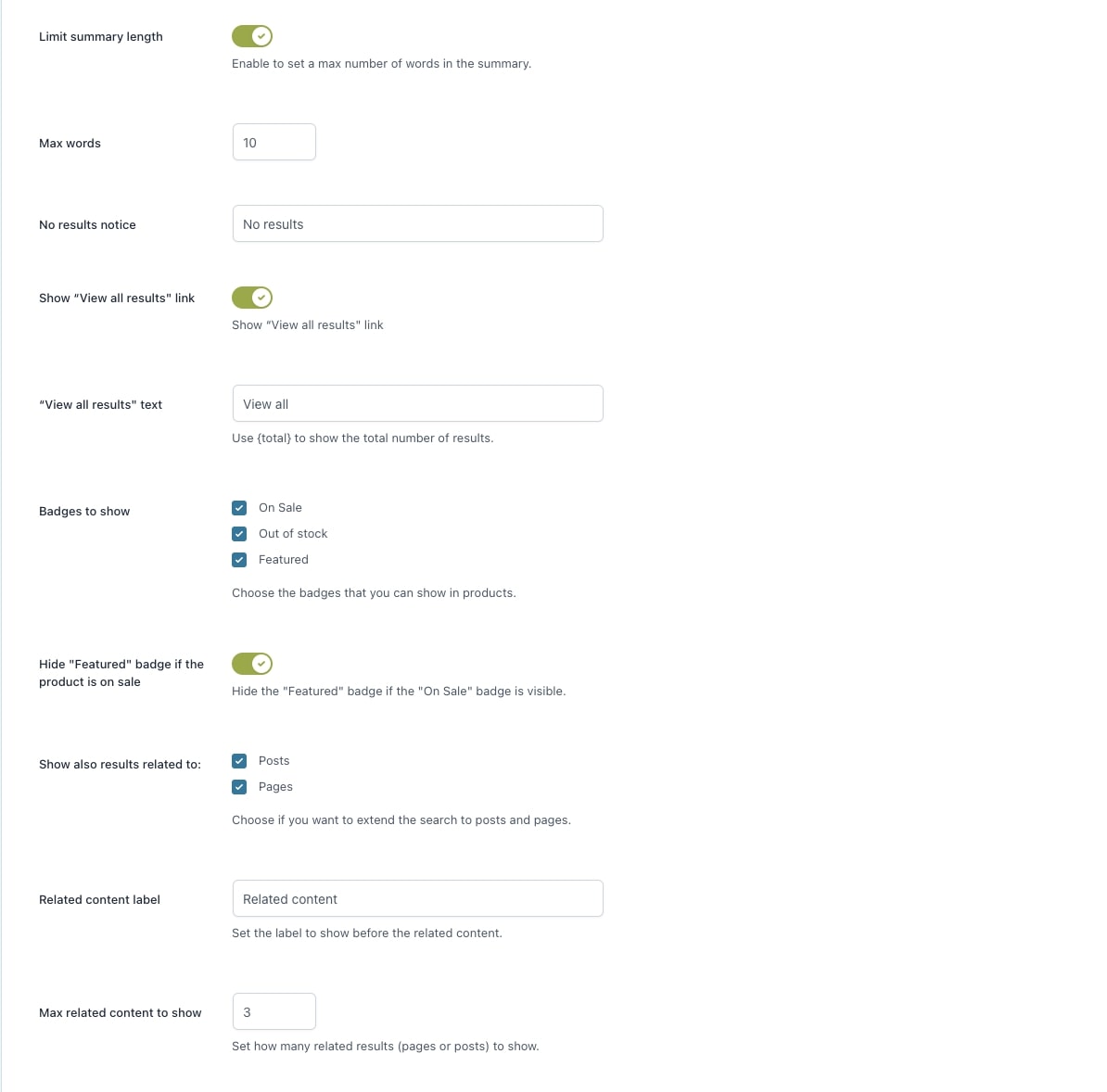
No results notice: enter the text to show when the search produces no results;
Limit summary length: enable this option if you want to define a maximum number of words in the summary;
Max words: enter the value for the maximum number of words;
Show“View all results” link: enable this option to show the View all results in the search results;
“View all results” text: enter the text for the link to view all results. You can show the number of available results by using the placeholder {total};
Badges to show: choose the badges to show:
on sale
out of stock
featured
Hide “Featured” badge if the product is on sale: enable this option to hide the featured badge on discounted products;
Show also results related to: choose whether to extend the search to posts and/or pages;
Related content label: enter the text for the related content;
Max related content to show: set the maximum number of pages or posts to show.
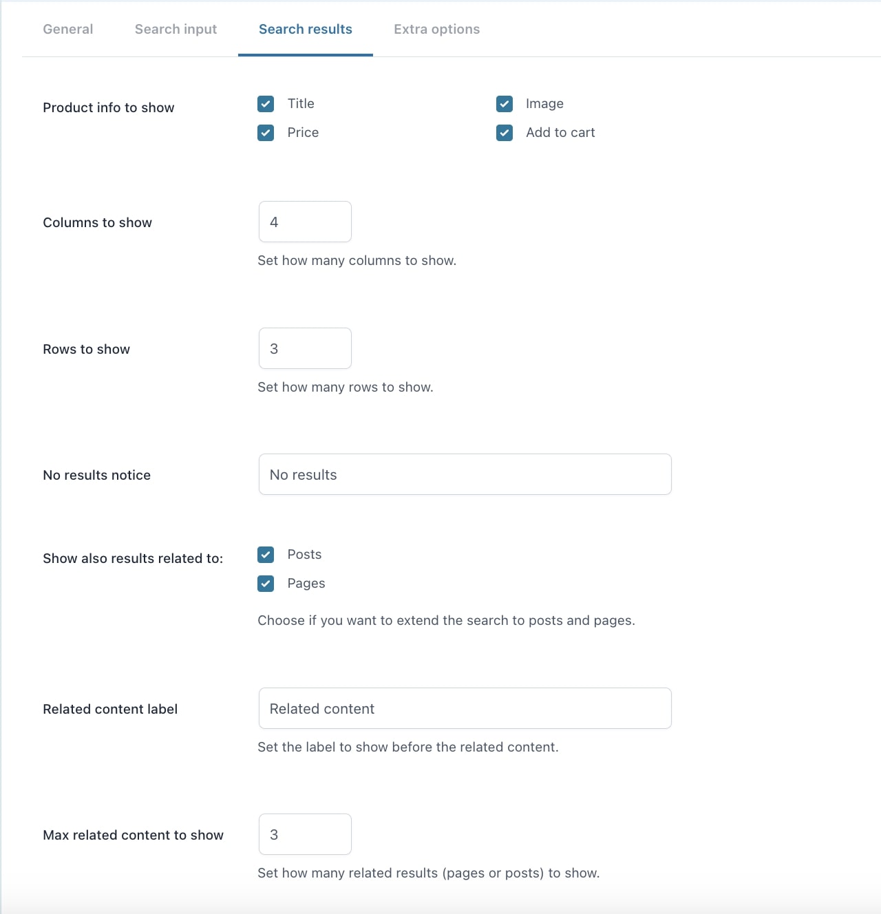
Search results – fullscreen overlay style
Product info to show: choose the product data to show:
Title
Price
Add to cart
Image
Columns to show: set the number of columns to show;
Rows to show: set the number of rows to show;
No results notice: enter the text to show when the search produces no results;
Show also results related to: choose whether to extend the search to posts and/or pages;
Related content label: enter the text for the related content;
Max related content to show: set the maximum number of pages or posts to show.
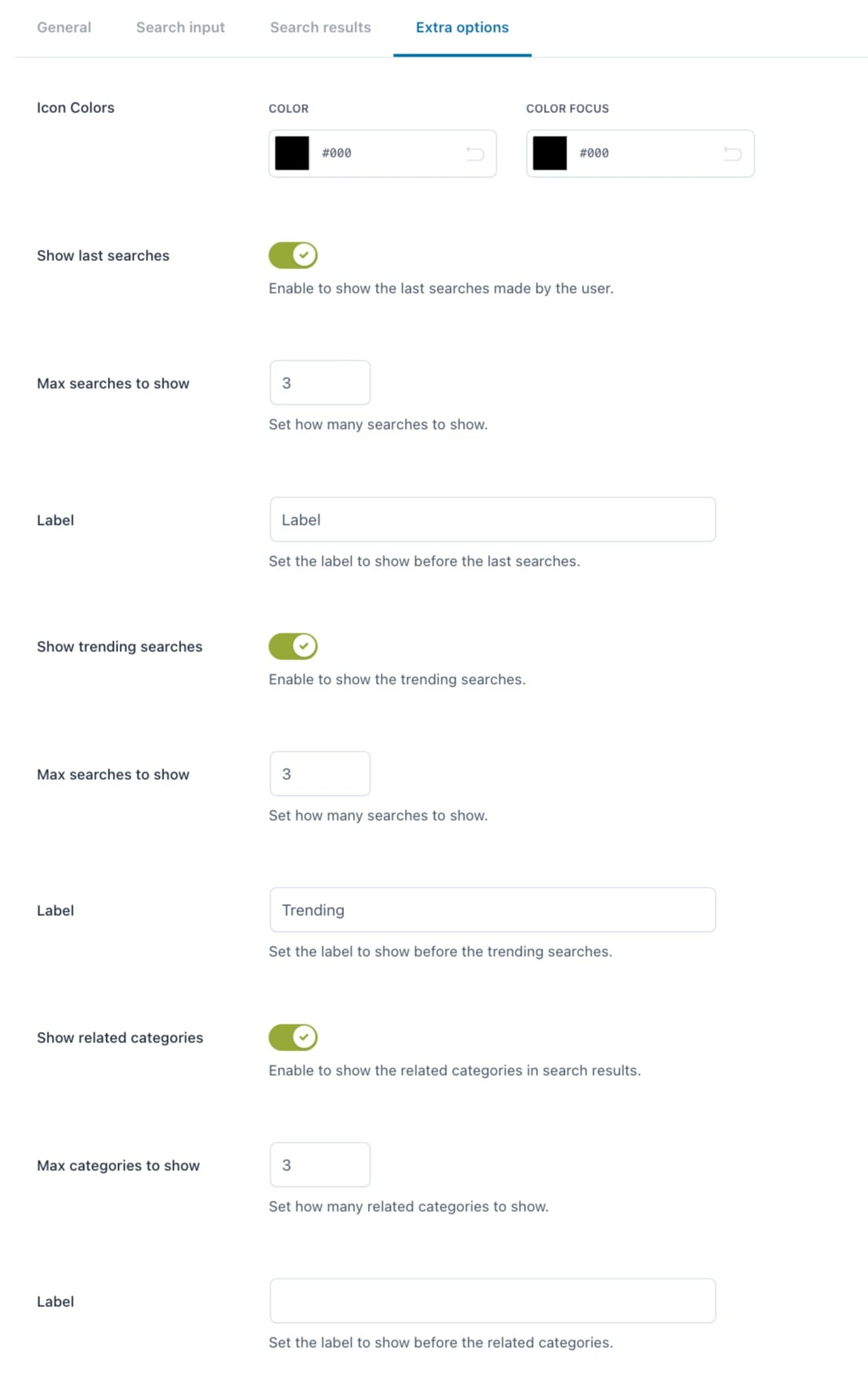
Extra options
Icon colors: (available only with Fullscreen overlay) set the color and color focus of the icon;
Show last searches: enable this option to show the latest searches made by the current user;
Max searches to show: set the maximum number of latest searches to show;
Label: enter the text to show as label for the latest searches;
Show trending searches: enable this option to show the most popular searches made by all users;
Max searches to show: set the maximum number of popular searches to show;
Label: enter the text to show as label for the latest searches;
Show related categories: enable this option to show the categories linked to search results;
Max categories to show: set the maximum number of categories to show;
Label: enter the text to show as label for the categories.
In the Customization section, you can set the text and background colors of on-sale, out-of-stock, and featured badges and the background color of the related content.
To add the search form through the widget, click on “Appearance -> Widgets” and add the Classic Search or Overlay search block. You can read more about the block options on this page.
If you are not using a block editor, instead, and need to use the legacy widget, select the YITH WooCommerce AJAX Search widget to the sidebar as shown in the image below.
The widget allows you to add a title and choose one of the Search shortcodes that you can create from the “Search Shortcodes” section in the plugin settings. For each shortcode, you will be able to customize the way the search form will be displayed.
Please, refer to this page for more details about how to create and customize a preset shortcode.


