In this post, we will go over the available options to customize the quick view options:
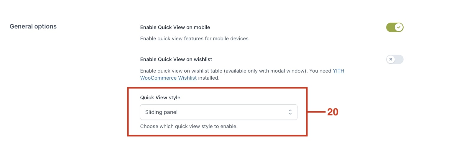
Quick view style
From the General settings you can choose between three layout options for the Quick view style: modal window, sliding panel, cascading. Depending on the layout you choose, you’ll get additional settings:
Modal window
This layout will open the quick view in a classic modal window.
Selecting this option you can also choose the animation when the Modal animation (slide in, fade in or scale up) when you open and close it and the size of the modal window (15).
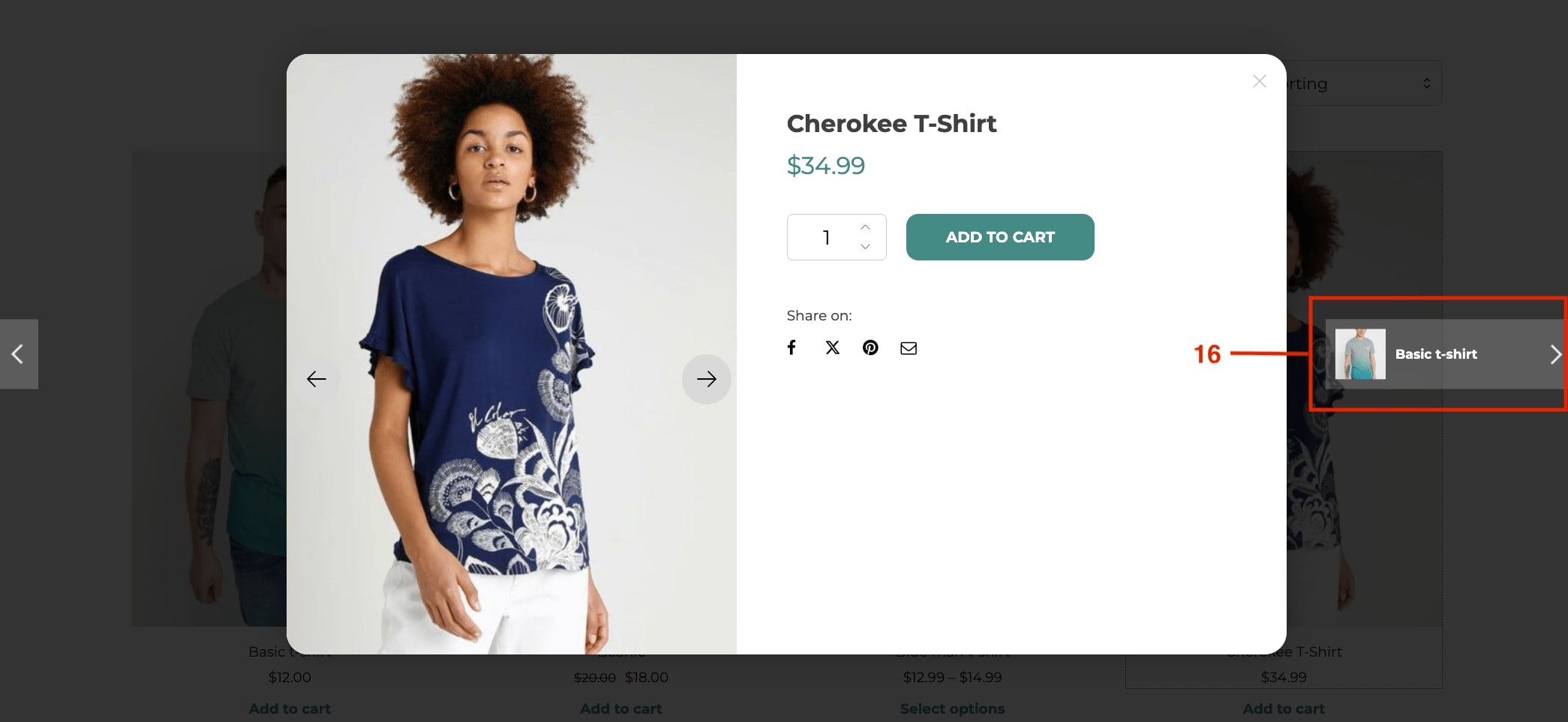
You can also decide if users can navigate through other products from the modal window (16), and enable a text to display when the modal window is loading (17).
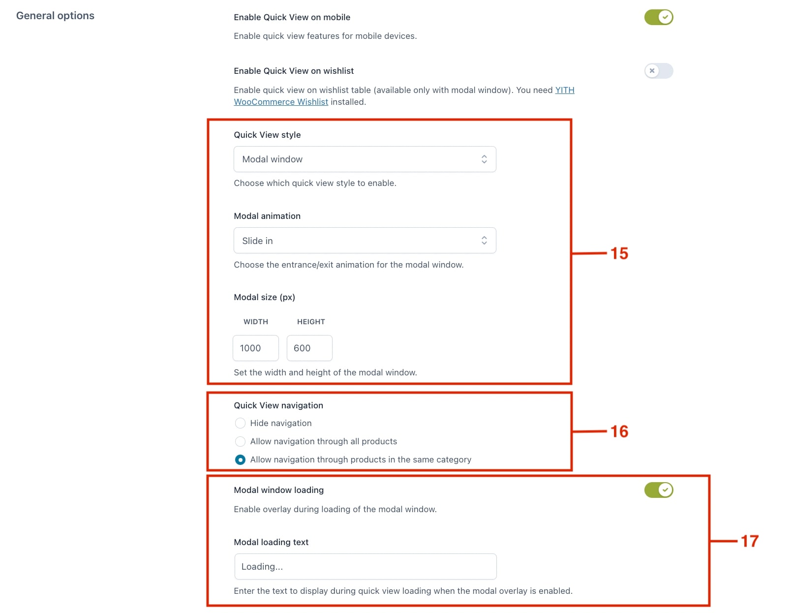
For example, users can easily browse other products’ through the quick view within the same category as the one they are currently viewing.
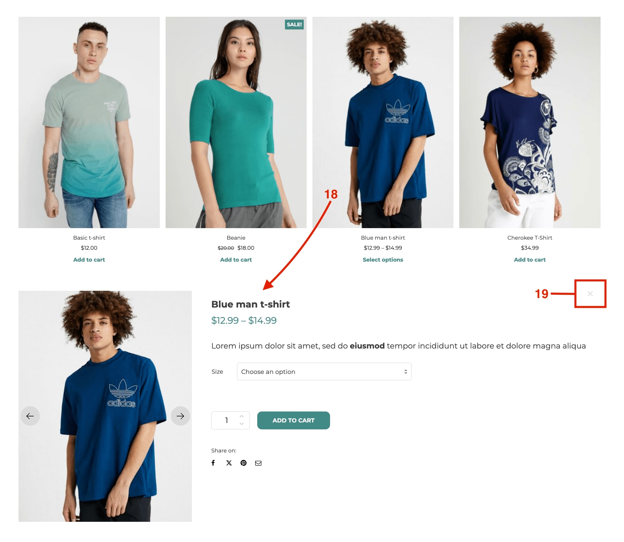
Cascading style
This option displays the product tab directly on the page within a pop-up section (18).
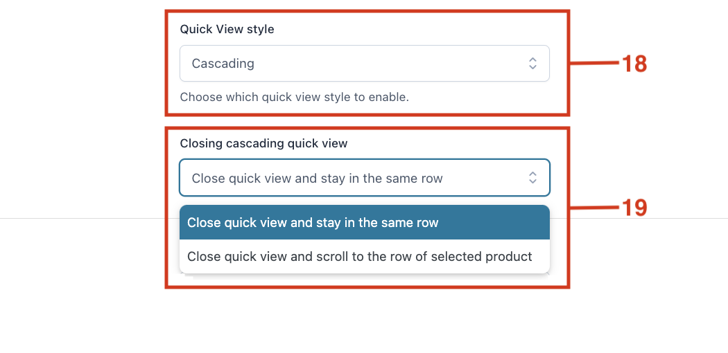
If selected, you can also set the behavior when closing the cascading quick view (19), so that it either stays in the same row below or it scrolls back to the row of the selected product.
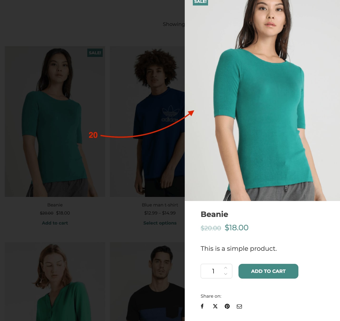
Sliding panel
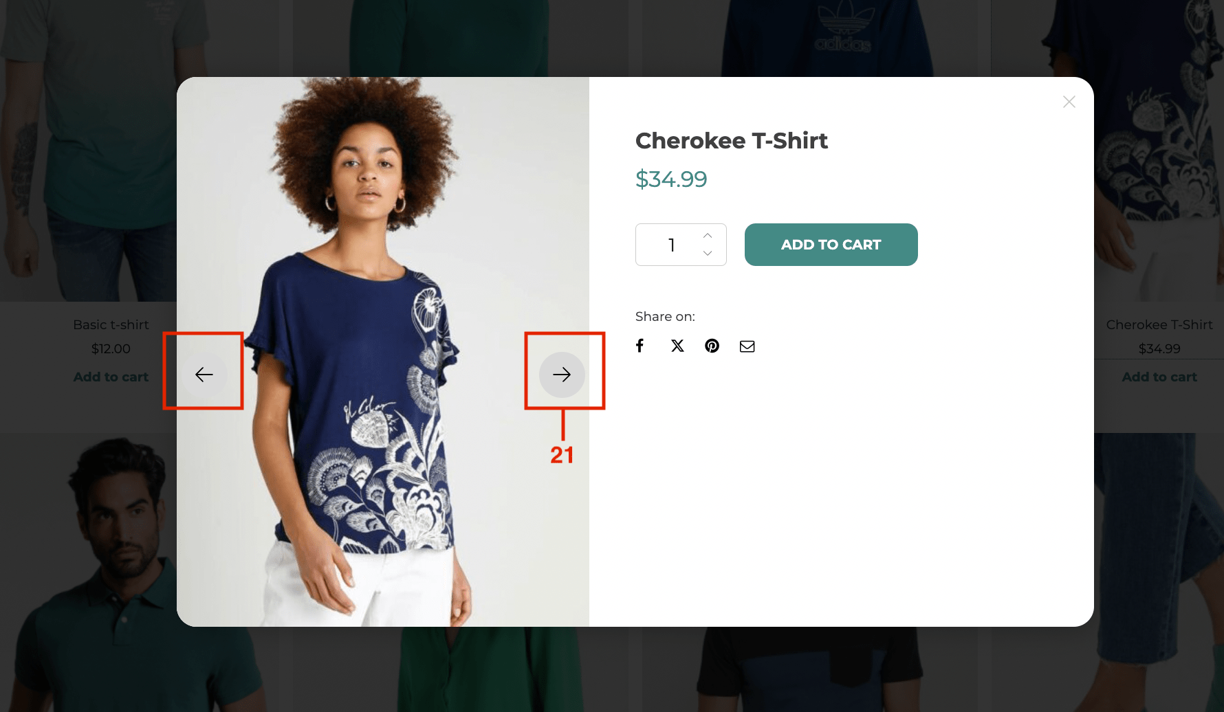
This option displays the quick view in a side panel that slides in from the right side of the browser window (20).
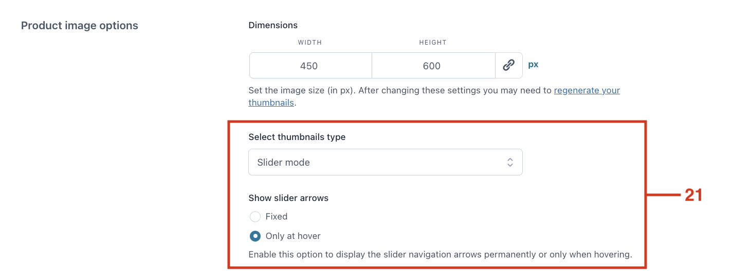
Product image options
From the Content options you can configure how to display the product images. You have three options for the thumbnails type selection: either don’t show, slider mode or classic mode.
If you select Slider mode, you can choose if the arrows display permanently or only when hovering over the image (21).
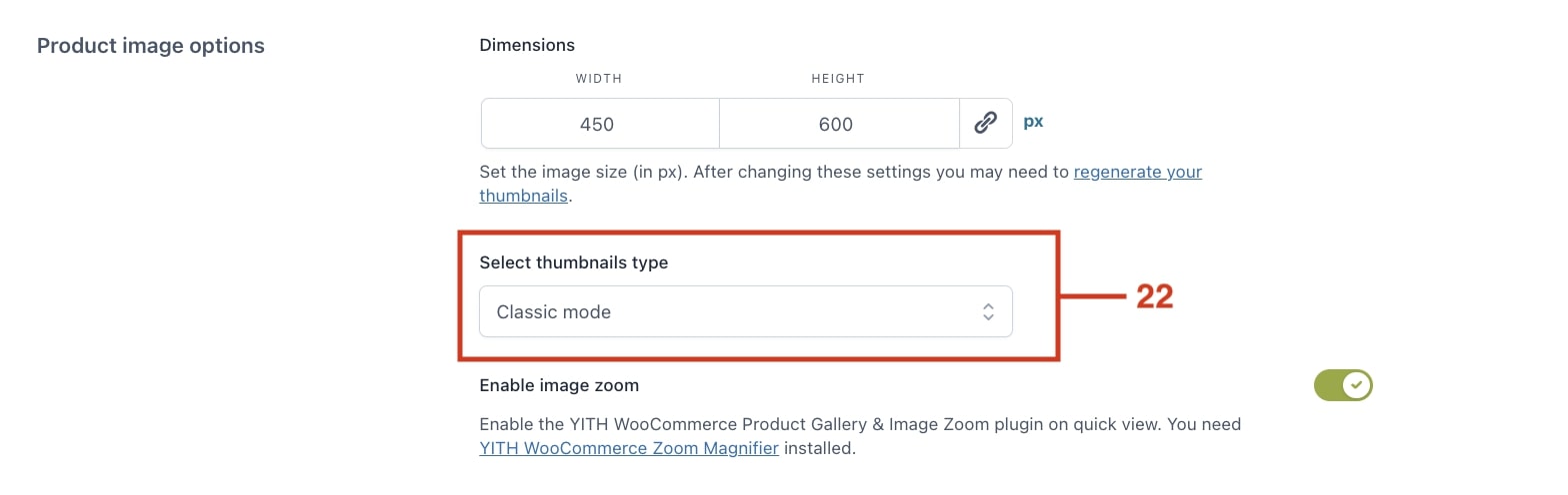
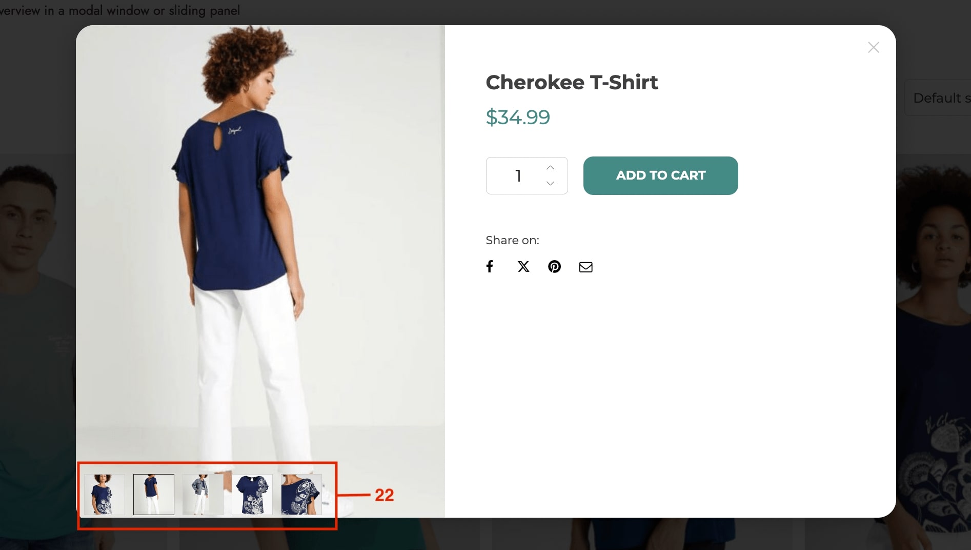
If you select Classic mode (22), you can enable image zoom (only if you have YITH Zoom Magnifier installed, you can click here to read more about the integration).
“Quick view” button options
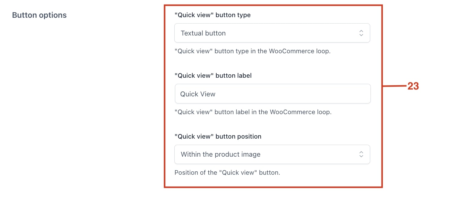
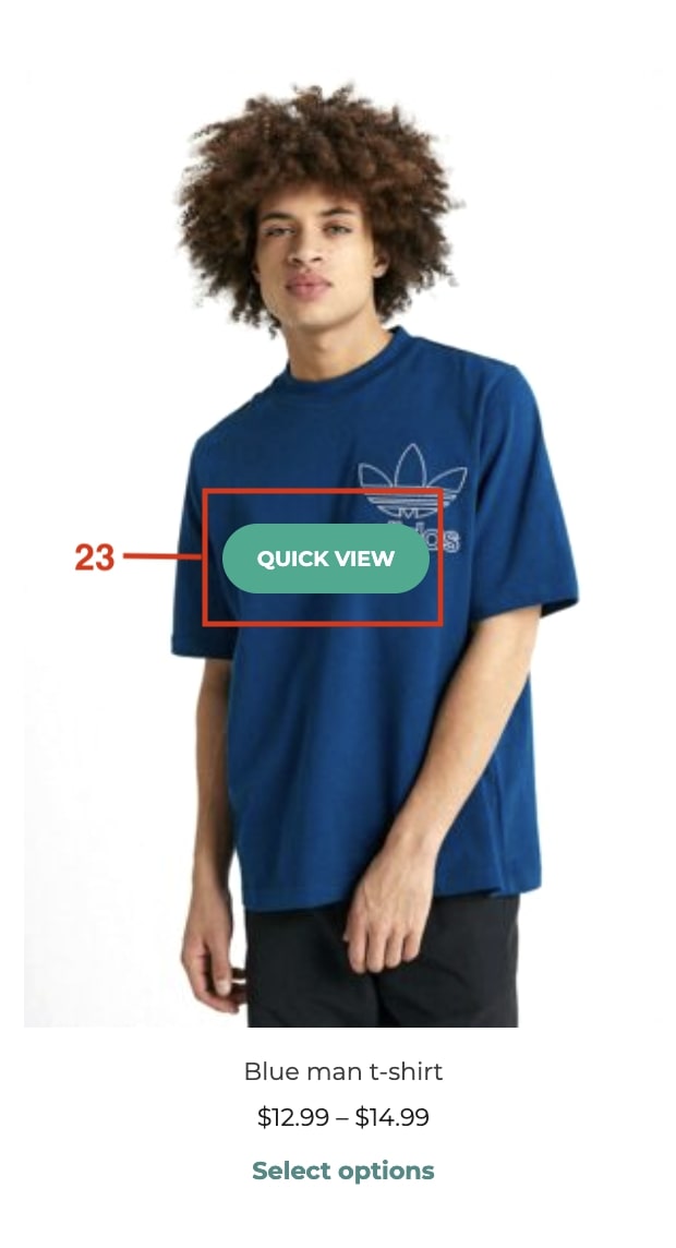
From the General settings, you can configure the Quick view button in the WooCommerce loop, choosing either a textual or an icon button.
When selecting Textual you can set the button text label and the position of the button (below the “add to cart” button, within the product image or use a shortcode/block) (23).
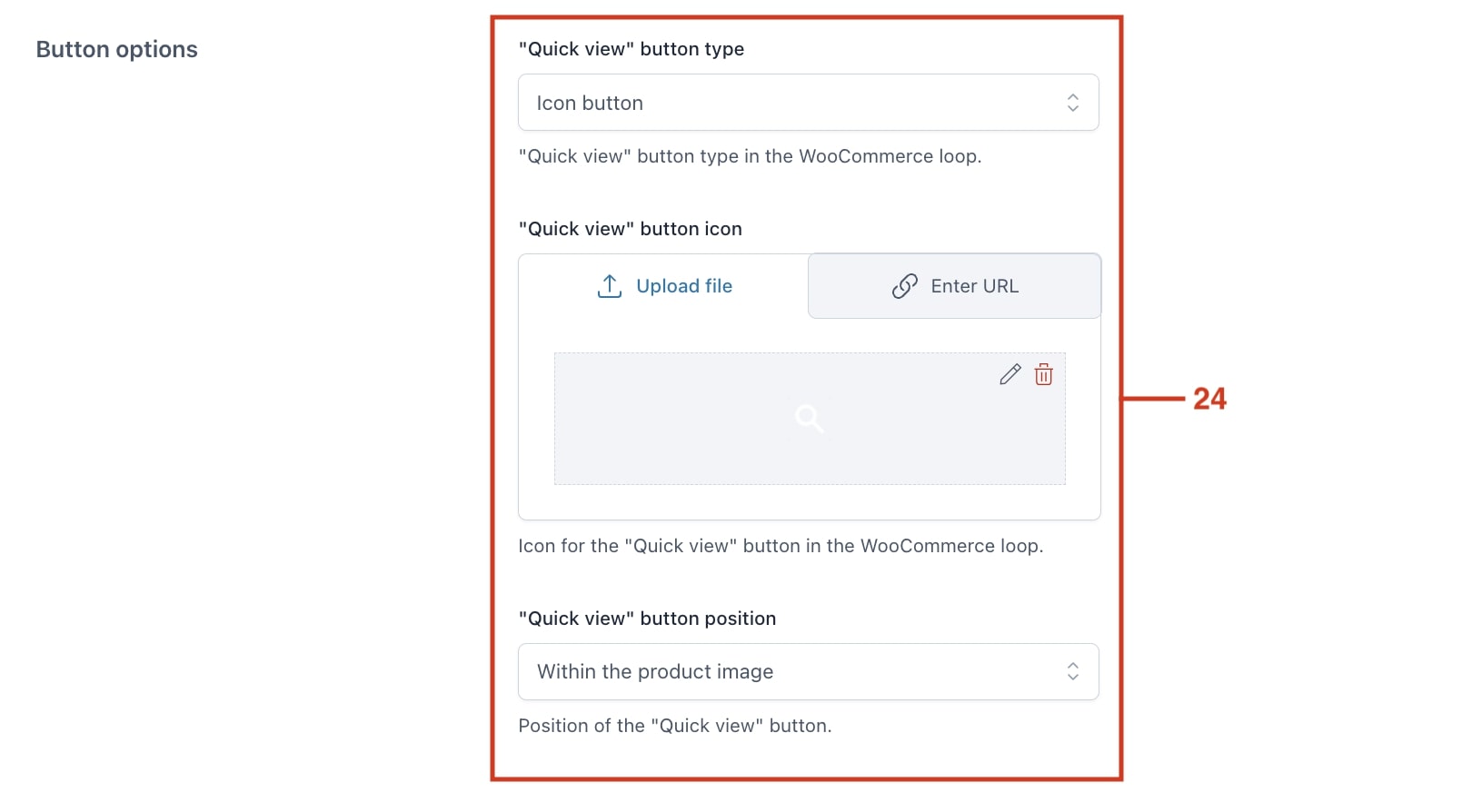
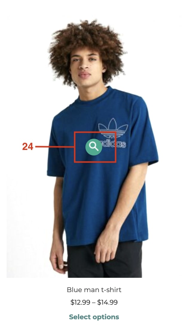
If you choose an Icon instead, you can upload the file for the icon and set the button position as well (24).
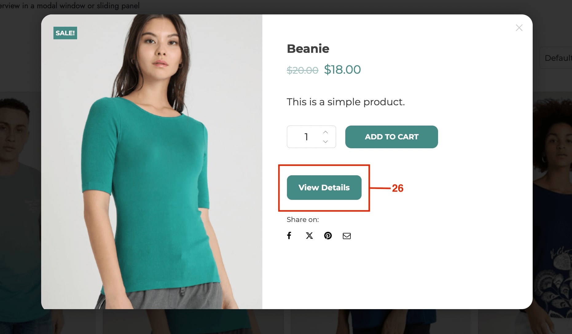
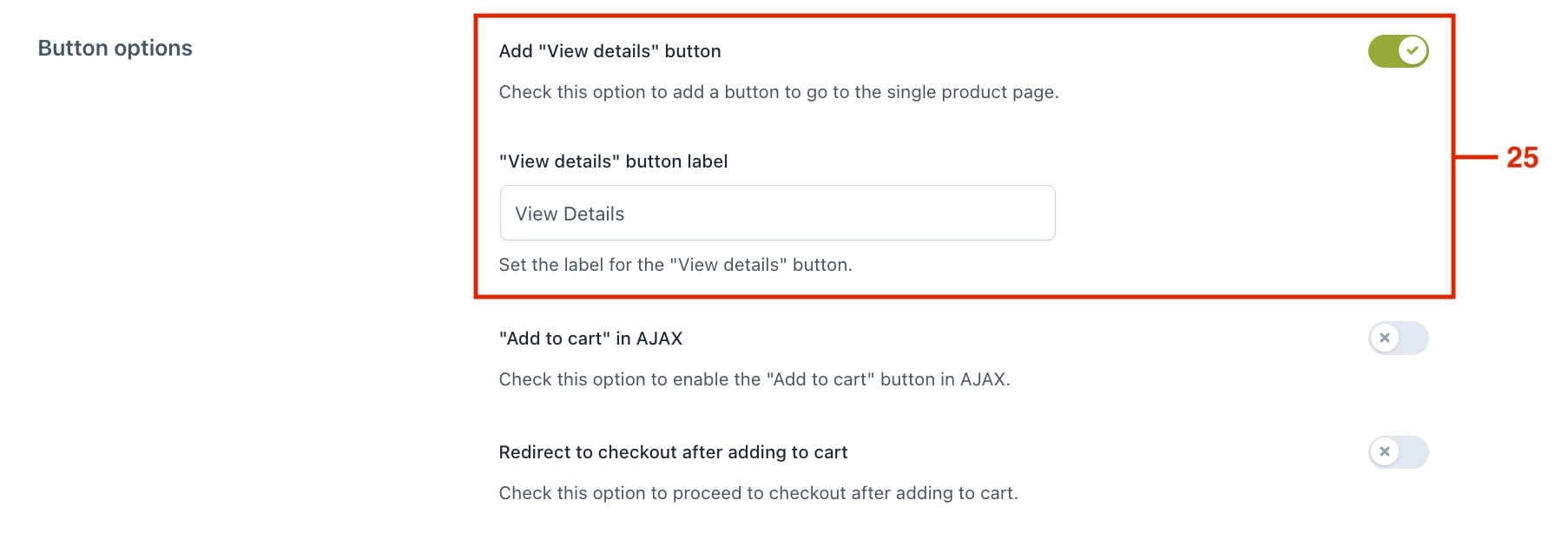
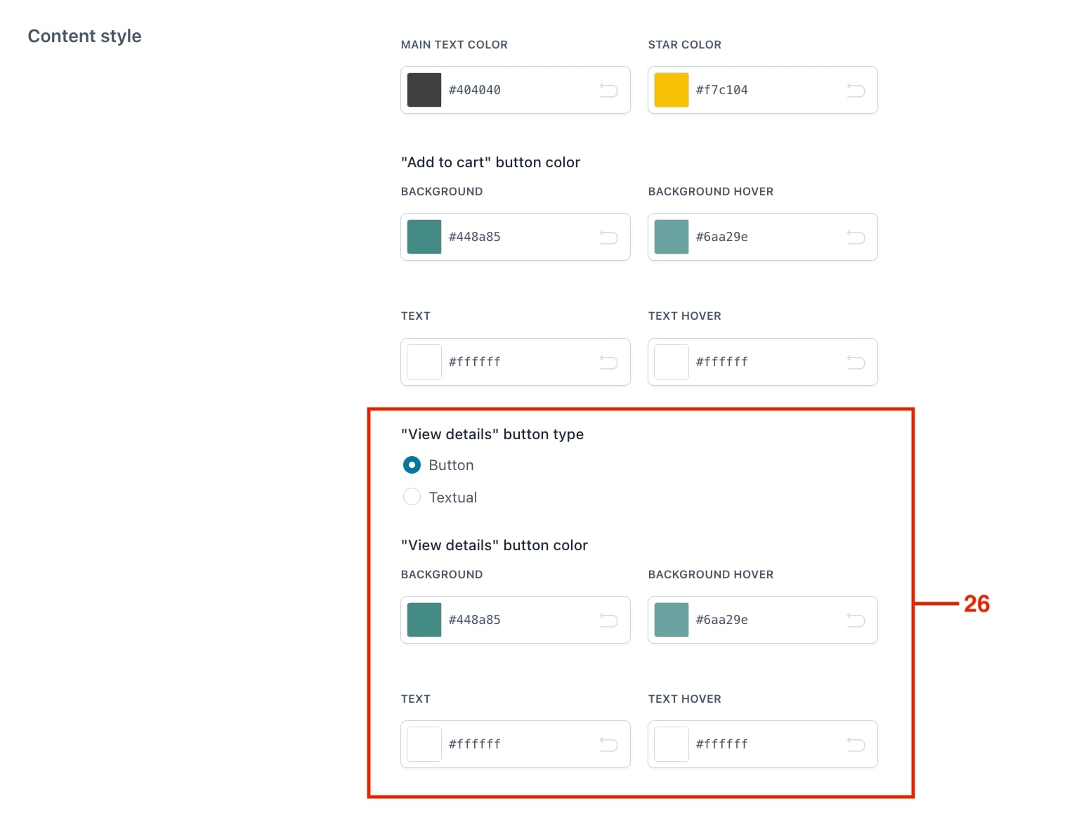
From the Content options, you can enable a “View details” button to allow users to go to the single product page directly from the quick view popup (25).
If enabled, from the Customization tab you can select if the “View details” is a text link or a button. For the button, you can also choose colors (26):
For example, this is how the “View details” button would look like: