From this Customization tab, you can edit all colors and some more style options. Let’s check them all one by one.
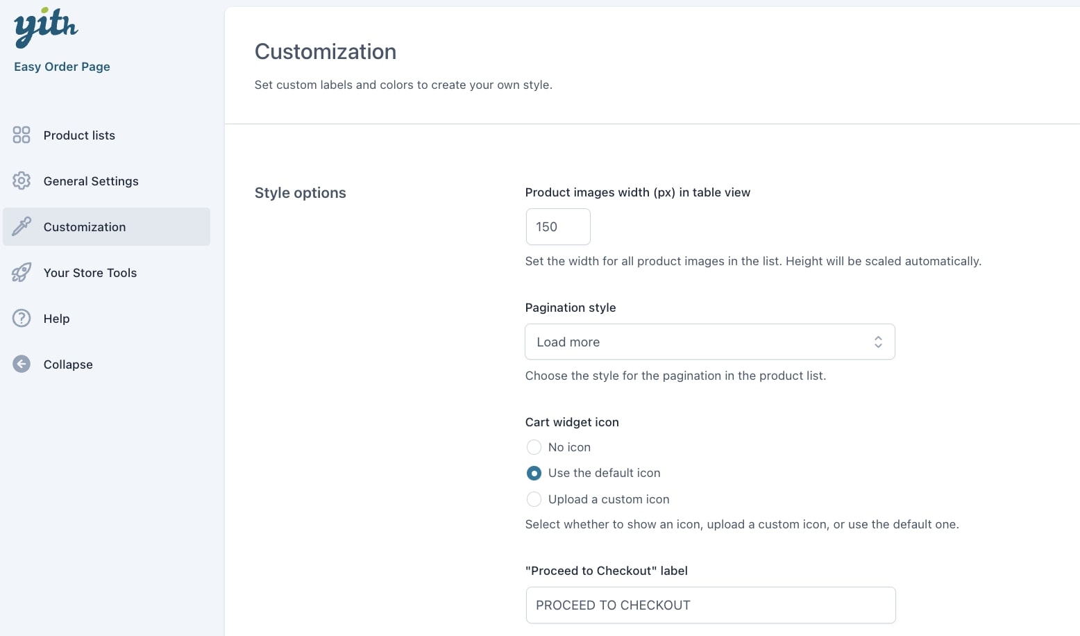
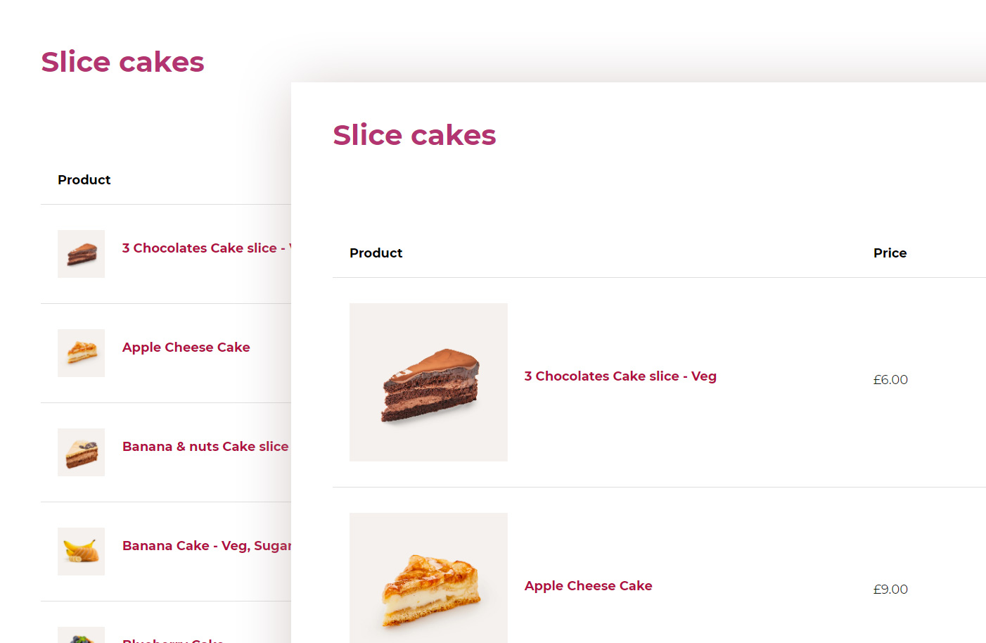
Product images width (px) in table view: set the width for all product images in the list. The image height will be scaled automatically. This option only applies if you’ve selected the Horizontal table view in the Display options.
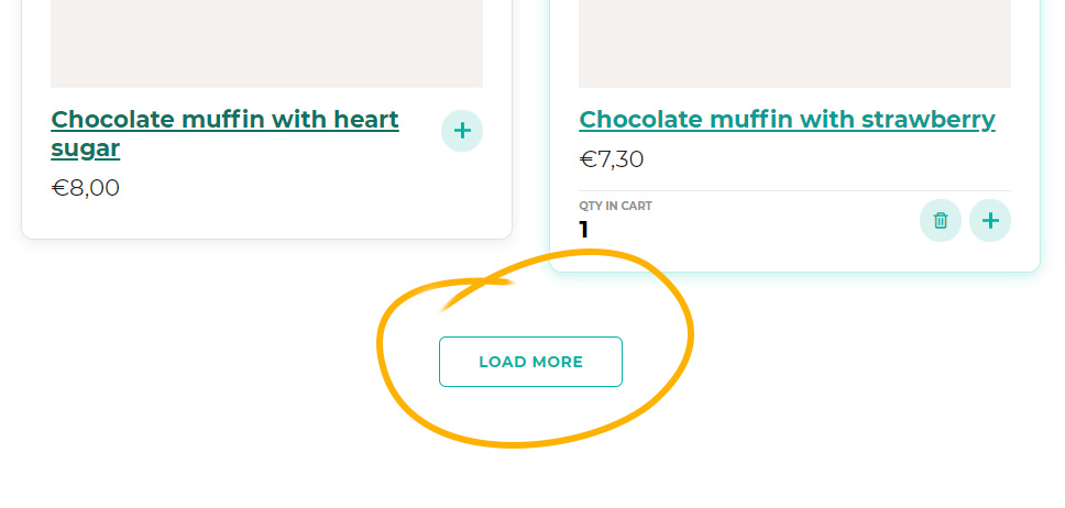
Pagination style: choose whether lists with pagination will have to show a Load more button or will show more products by infinite scroll.
Cart widget icon:
- No icon
- Use the default icon
- Upload a custom icon
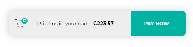
Cart widget colors:
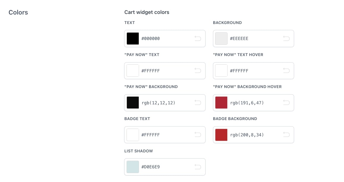
- Text
- “Pay now” text
- “Pay now” background
- Badge (counter for products in cart) text
- List shadow
- Background
- “Pay now” text hover
- “Pay now” background hover
- Badge background
More colors for all the other sections of the list.
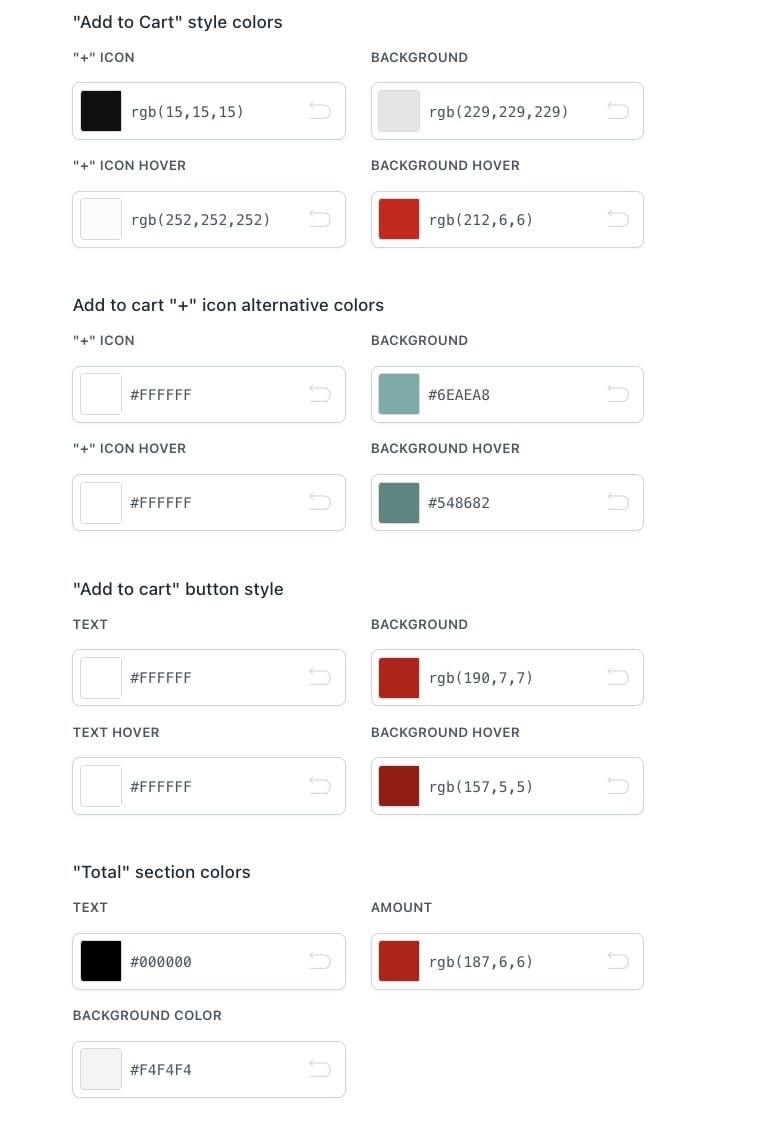

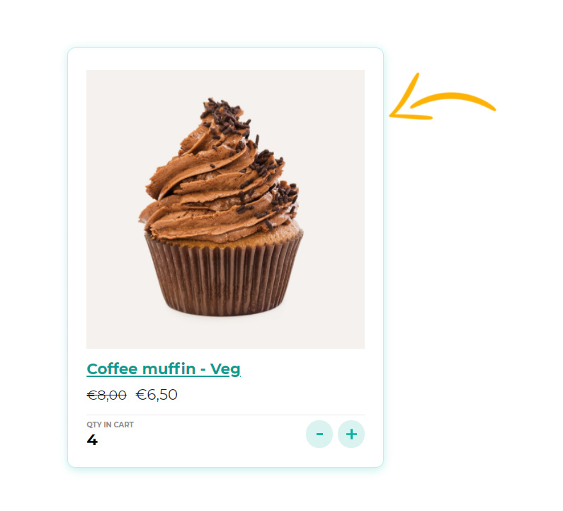
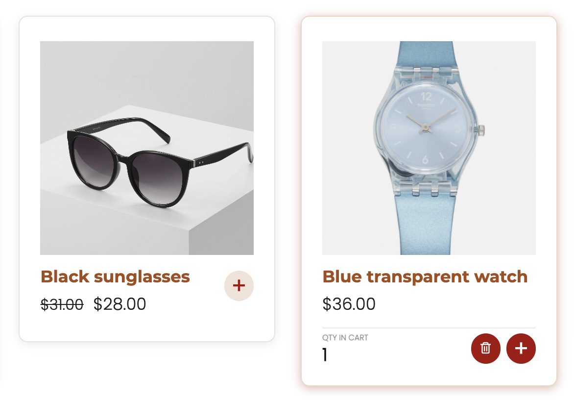
“Add to Cart” style colors: these are the colors of the “+” button when you choose Grid mode (Product on the left in the screenshot below).
Add to cart “+” icon alternative colors: when you select the Grid display mode, you can highlight the cart buttons of those products that have already been added to the cart with different colors, the alternative colors.
In the screenshot below, the product on the right is showing the alternative colors:
“Add to cart” button style: these are the colors of the traditional “Add to cart” button

“Total” section colors: colors of the box where the total price of products added to the cart is displayed.
“Proceed to Checkout” button colors
“Proceed to Checkout” label: enter here a custom text for this button.

“Load more” button:
Product wrapper: you can customize the colors of both the border and the shadow