View Product Page

General options

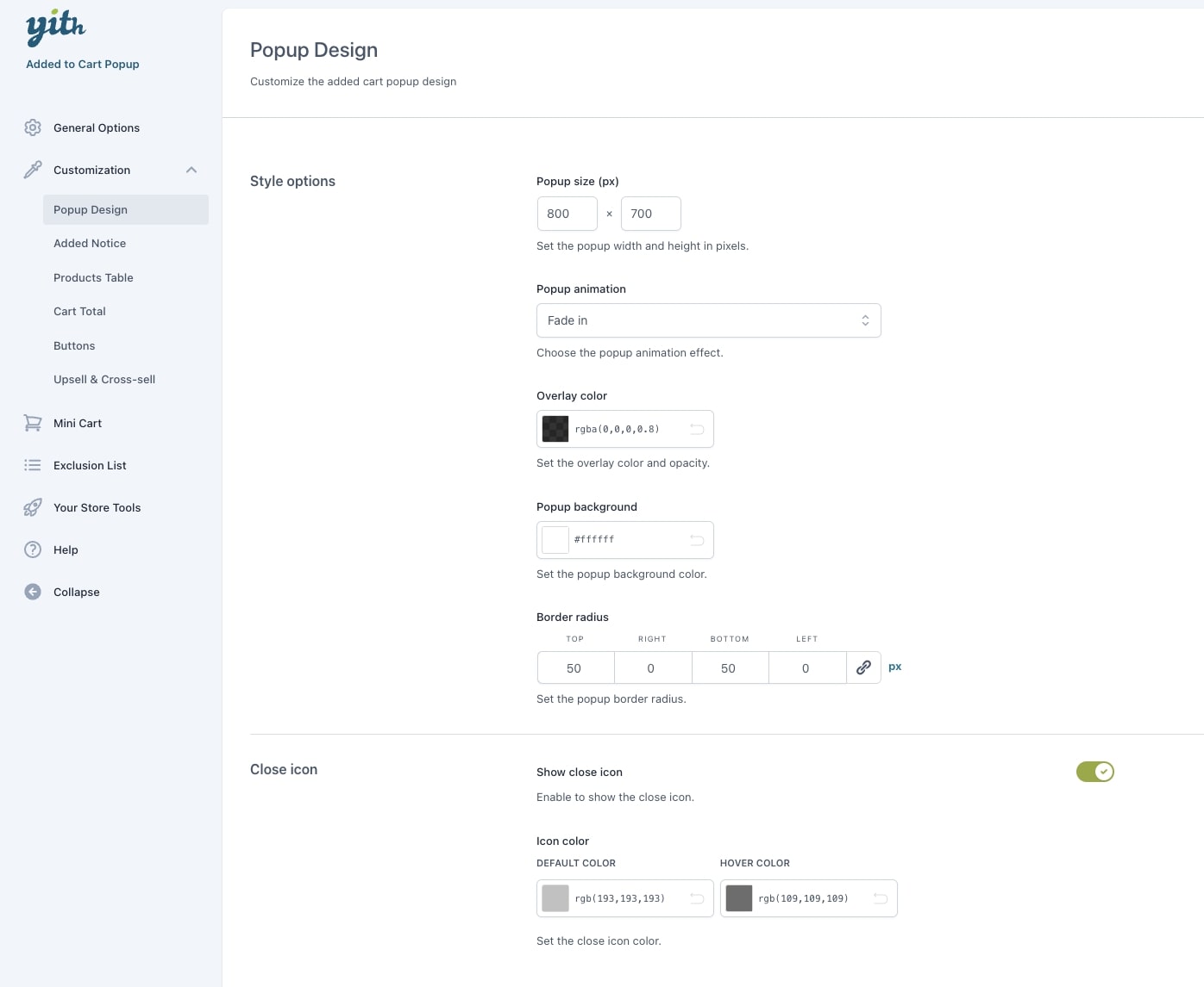
To start configuring the plugin General options go to YITH > Added to Cart Popup > General options.

General options

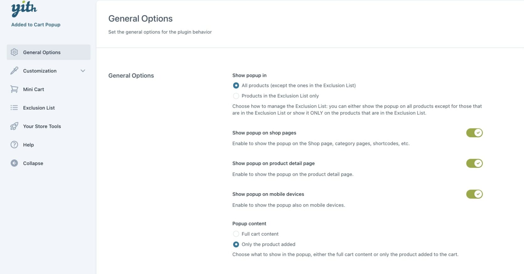
The available options are:

  • Show popup in: choose the products where to show the popup from:
    • All products (except the ones in the Exclusion list)
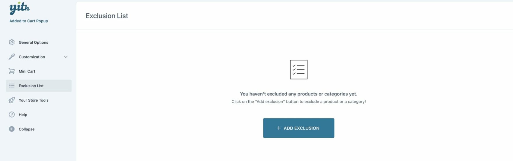
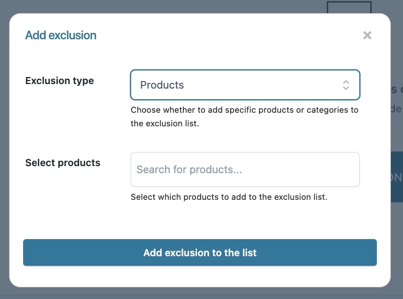
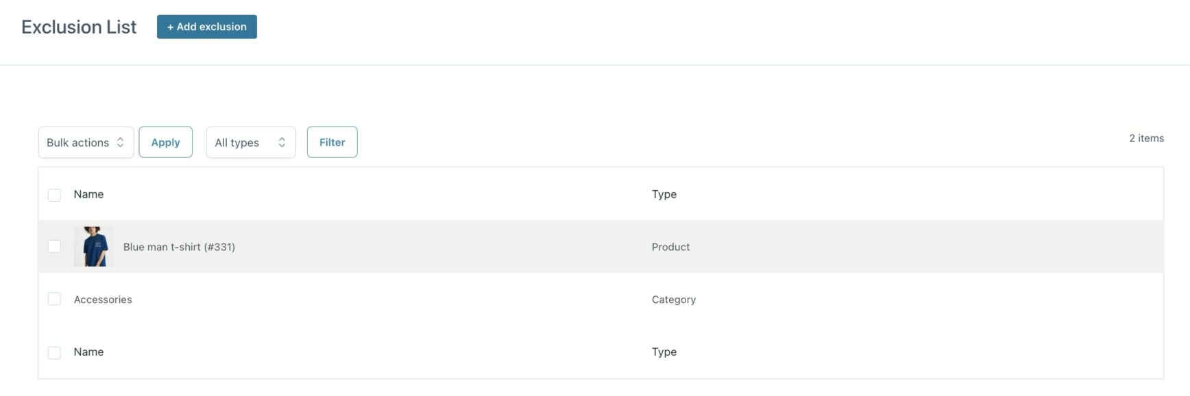
    • Products in the Exclusion list only (to learn how to add single products or categories to the exclusion list, please, refer to this page).
  • Show popup on shop pages: enable to show the popup when the customer adds the product to the cart from the Shop page, category pages, shortcodes, etc.
  • Show popup on product detail page: enable to show the popup when the customer adds the product to the cart from the product page.
  • Show popup on mobile devices: enable to show the popup also on mobile devices.
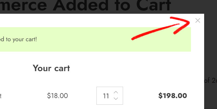
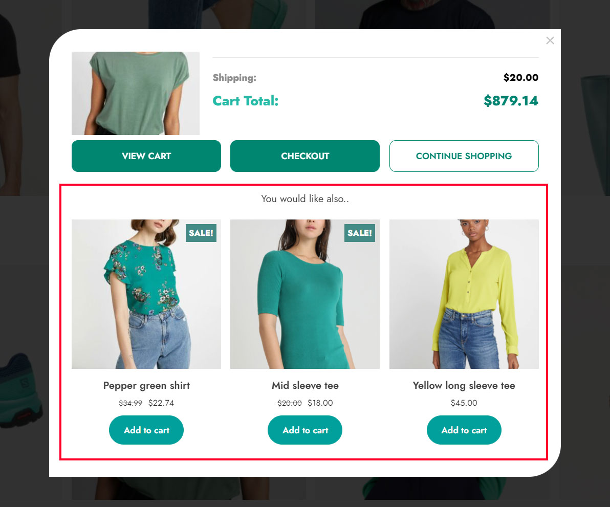
  • Popup content: here you can choose what to display in the popup from:
    • full cart content (you will also be able to edit the quantity or remove items)
    • only the product added
Full cart content
Full cart content
Only product added
Only product added

Popup design

In the Customization > Popup design section, you can customize the popup style and close icon options.

Popup design

Style options

  • Popup size (px): set the popup width and height in pixels. This is the maximum size. If the content does not take the full space, the popup will be automatically shrunk.
  • Popup animation: choose here the popup animation effect among the following:
    • fade in
    • slide in (left)
    • slide in (right)
    • slide in (top)
    • slide in (bottom)
    • 3D flip (vertical)
    • 3D flip (horizontal)
    • scale up
  • Overlay color: set the overlay color and opacity.
  • Border radius: set the popup border radius for each corner.

Close icon

  • Show close icon: enable to show the close icon on the popup.
Close icon
  • Icon color: set the colors of the close icon, default and on hover.

Added notice

In the Added notice section, you can customize all the style options for the notice message shown after adding the product to the cart.

Added notice

Style options

  • Text to show: set the text to show when a product is added to the cart.
  • Text alignment: left or center.
  • Text style: choose among the Heading titles or a simple paragraph style.
  • Border radius: set the border radius for the notice.

Notice options

  • Notice colors: set the default and background color of the notice.
  • Notice icon: choose whether to show the default icon (a checkmark symbol, as shown in the image below), upload a custom one, or no icon.
Default notice icon

Below is an example of the notice with the default icon and a 30px border radius set for the top-left corner.

Notice message with default icon and border radius

Products table

From the Products table section, you can customize the products table shown in the popup through the following settings:

Products table
  • Show product name and price: enable to show the product name and price in the popup.
  • Show variations info: enable this option to show the variations set in the variable products (color, size. etc.).
  • Show product image: enable to show the product image in the popup.
  • Image size (px): set the product image size to show in the popup. After changing these settings, you may need to regenerate the thumbnails.
    Note: when regenerating the thumbnails for this popup, you can select the option yith_wacp_image_size in the thumbnail plugin you’re using.
Product image and variation info

Colors

  • Products color: set the default color and on hover for the product name.
  • Product price: set the color of the product price.
  • Border color: set the color of the separator border.

Cart total

In the Cart total section, you can customize the appearance of the Cart total section shown in the popup. Let’s see the available options.

Cart total
  • Show shipping cost: enable to show the shipping cost in the popup.
  • Show taxes: enable to show the taxes in the popup.
  • Shipping & taxes colors: set the colors for the shipping and taxes info.
  • Show cart total: enable to show the cart total in the popup.
  • Cart total colors: set the colors for the label and amount.
Cart totals

Buttons

In the Buttons section, you can configure the style options for the buttons shown in the popup.

Buttons in the popup

You will find 4 sub-sections with different options that we will analyze below:

View cart

View cart
  • Show “View Cart” button: enable this option to show the View cart button in the popup.
    • “View Cart” label: enter the label of the button.
    • “View Cart” colors: set the colors of the button.

Checkout

Checkout
  • Show “Checkout” button: enable this option to show the Checkout button in the popup.
    • “Checkout” label: enter the label of the button.
    • “Checkout” colors: set the colors of the button.

Continue Shopping

Continue shopping
  • Show “Continue Shopping” button: enable this option to show the Continue shopping button in the popup.
    • “Continue Shopping” label: enter the label of the button.
    • “Continue Shopping” colors: set the colors of the button.

Extra

Border radius
  • Border radius: set the border radius of the buttons.

Upsell & cross-sell

In the Upsell & cross-sell section, you can choose whether to show the upsell and cross-sell products and customize the section as you need.

Upsell and cross-sell section

Let’s see the available options.

Upsell & cross-sell
  • Show suggested products: enable to show a list of suggested products in the popup.
  • Section title: enter the name of the section to show above suggested products.
  • Title color: set the color of the title.
  • Products to suggest: choose among:
    • related products
    • cross-sell products
    • upsell products

Please, refer to this page to learn more about the differences between these products and how to set them up.

  • Columns of suggested products: choose how many columns to show, 1 to 6.
  • Show “Add to cart” button: enable to show the “Add to cart” button for each suggested product.

Mini cart

The plugin includes an icon that allows the popup to open and show the cart content at any time. The mini-cart icon floats on the page and is always available in the same position on the screen, even when scrolling up or down the page or moving from one page to another.

If you are browsing the website or reading more about a product, you will be able to check your cart content at any time with just one click.

To set and customize the floating mini-cart icon, go to YITH > Added to Cart Popup > Mini Cart and configure the following options:

Mini cart options

Mini cart options
  • Show Mini Cart on desktop: enable to show the mini cart on the desktop browser.
  • Show Mini Cart on mobile devices: enable to show the mini cart on mobile devices.
  • Hide if empty: enable to hide the mini cart when the cart is empty.
  • Show counter: enable to show a counter with the number of items in cart.
  • Border radius: set the mini cart border radius.
  • Mini Cart position: set the position of the mini cart icon as it will show on the screen.

Mini cart icon and colors

  • Mini Cart icon: choose if you want to show the default icon or upload a custom one.
  • Mini Cart colors: set the background, shadow and item counter colors.

Mini cart icon
Mini cart colors

Below is an example of how it shows on the front end.

When clicking on the mini cart icon, the cart content and the upsell & cross-sell section (if enabled) will show:

Exclusion list

By default, the popup automatically opens whenever users add a product to the cart.

However, if you want to restrict this to specific products or exclude some products, you can take advantage of the Exclusion list that you find in YITH > Added to Cart Popup > Exclusion list.

Let’s see how it works. This is what you see when it’s empty.

Add exclusion

Let’s click on + Add exclusion to add a product or a category.

Add exclusion

The product/s and/or category/ies will then be added to the exclusion list.

List of exclusions

Now, from the General options, you can decide how the Exclusion list should work through the Show popup in option.

Show popup in

So, considering our list, if we set the option to All products (except the ones in the Exclusion list), the popup will show when we add any product to the cart except for Blue man t-shirt and products belonging to the category Accessories.

On the other hand, if we set the option to Products in the Exclusion list only, the popup will show only when we add the Blue man t-shirt and products belonging to the category Accessories to the cart.

YITH WooCommerce Cart Messages

YITH WooCommerce Cart Messages allows you to create custom messages that will be displayed in one or more pages of the website (Product page, Archive page, Cart, and Checkout page). Messages can be displayed at all times or only for specific products in the cart.

Thanks to this integration, each custom message you have created can be shown in the popup when a product is added to the cart.

After installing and activating both plugins, you can create your custom messages from YITH > Cart Messages > Add new message. All the way on the bottom, you will find the option Show on “Added to Cart” popup, if enabled, you can show the message inside the popup that will open after adding the product to the cart.

Integration with YITH Cart Messages

Example of ‘free shipping’ message

Cart message example

For further details about YITH Cart Messages settings, please refer to the official documentation.