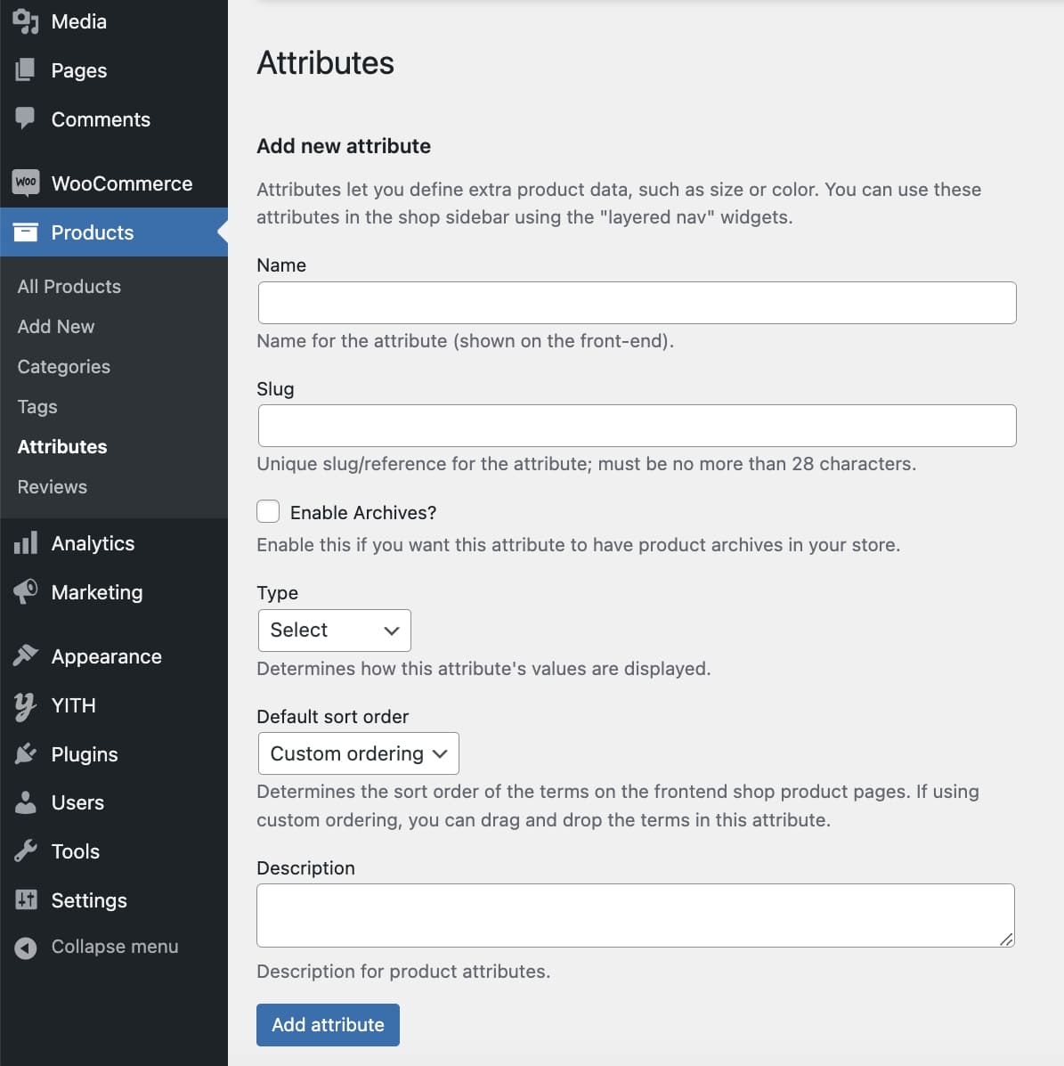
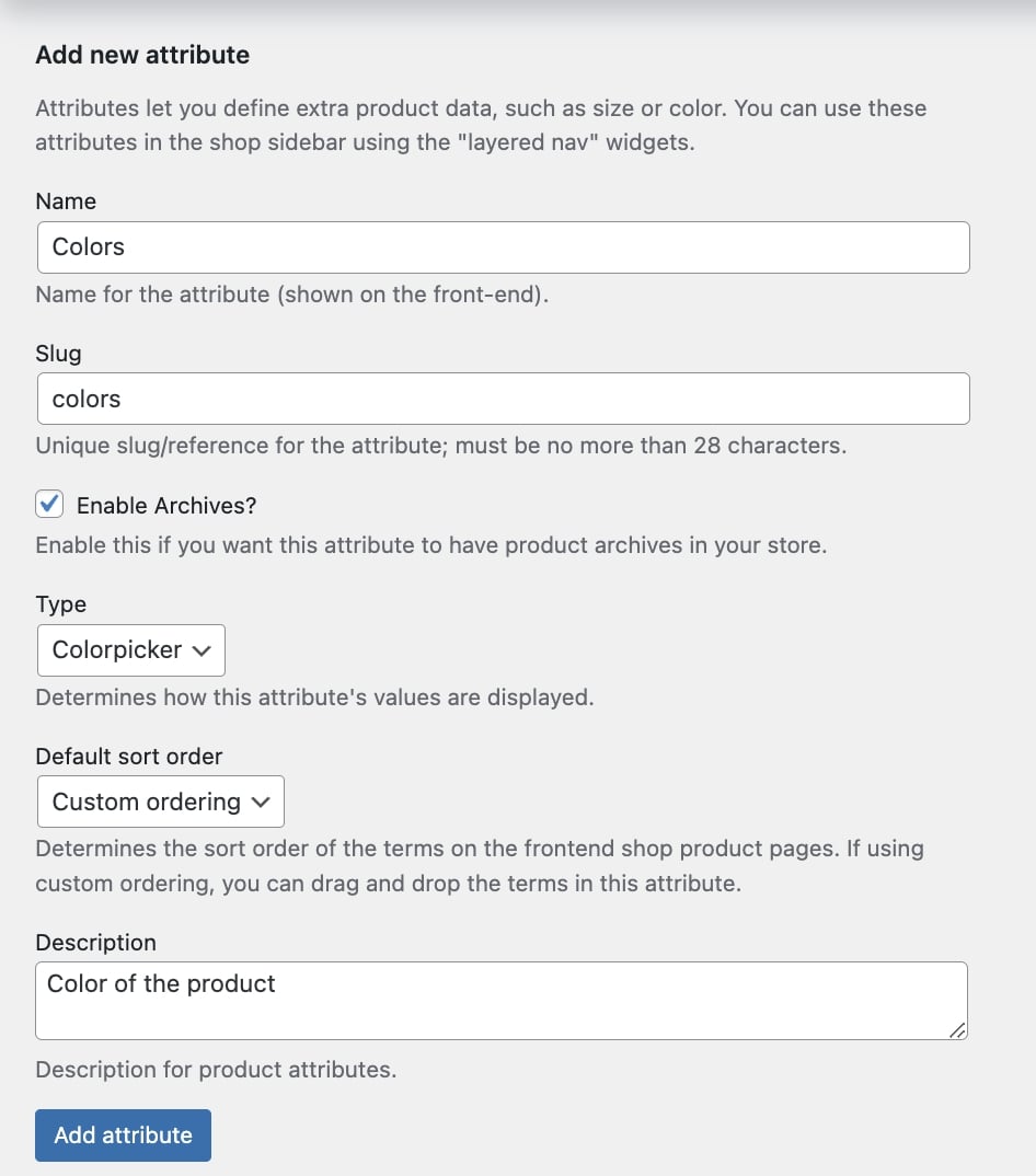
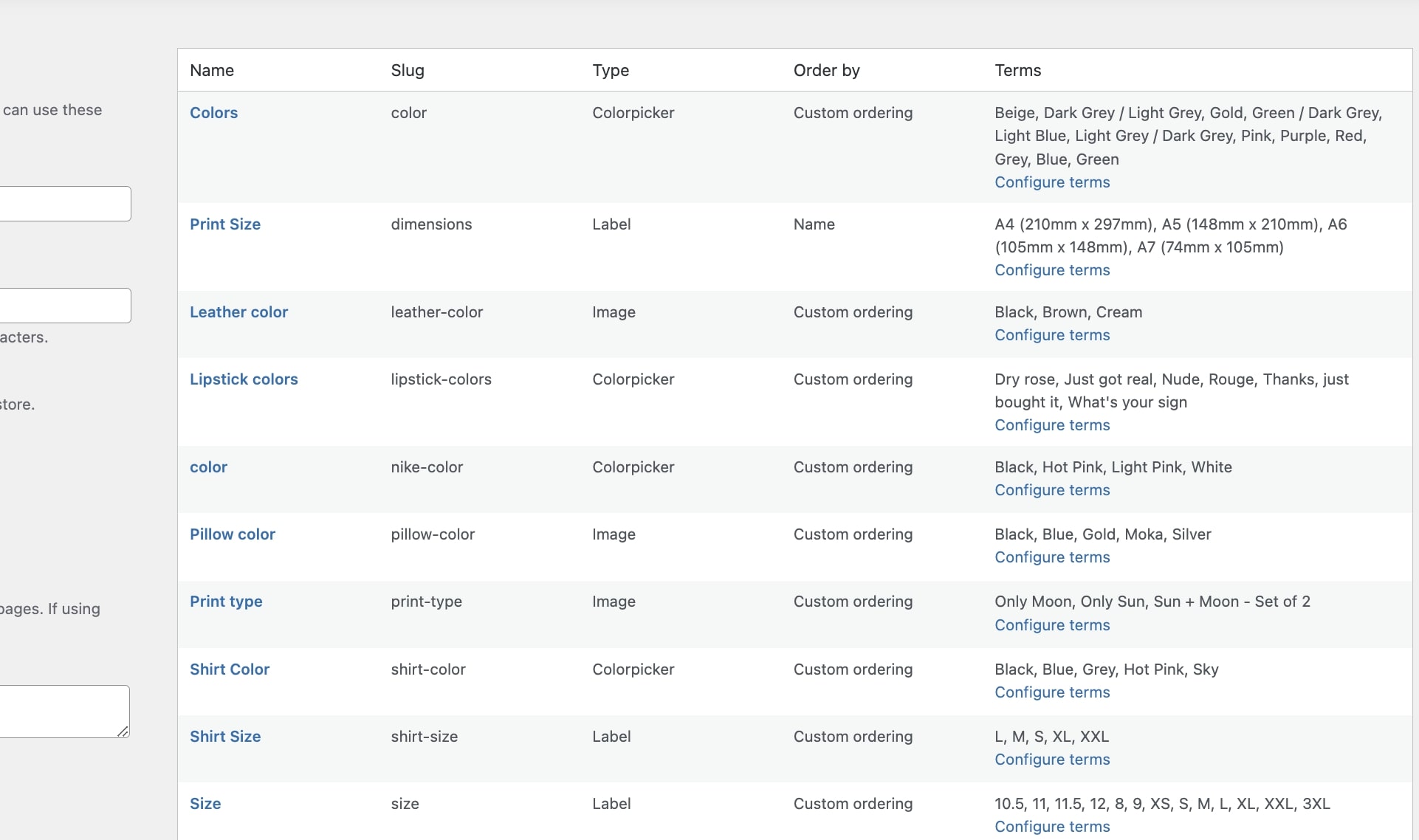
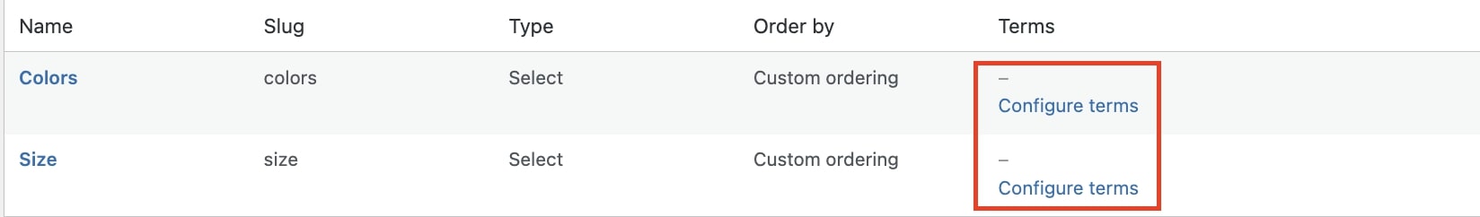
After creating your attributes, you will need to add their terms which can be done by clicking on Configure terms.
Based on the attribute type (Colorpicker, Image, or Label), you will find a different set of options to add the terms for your product variations.
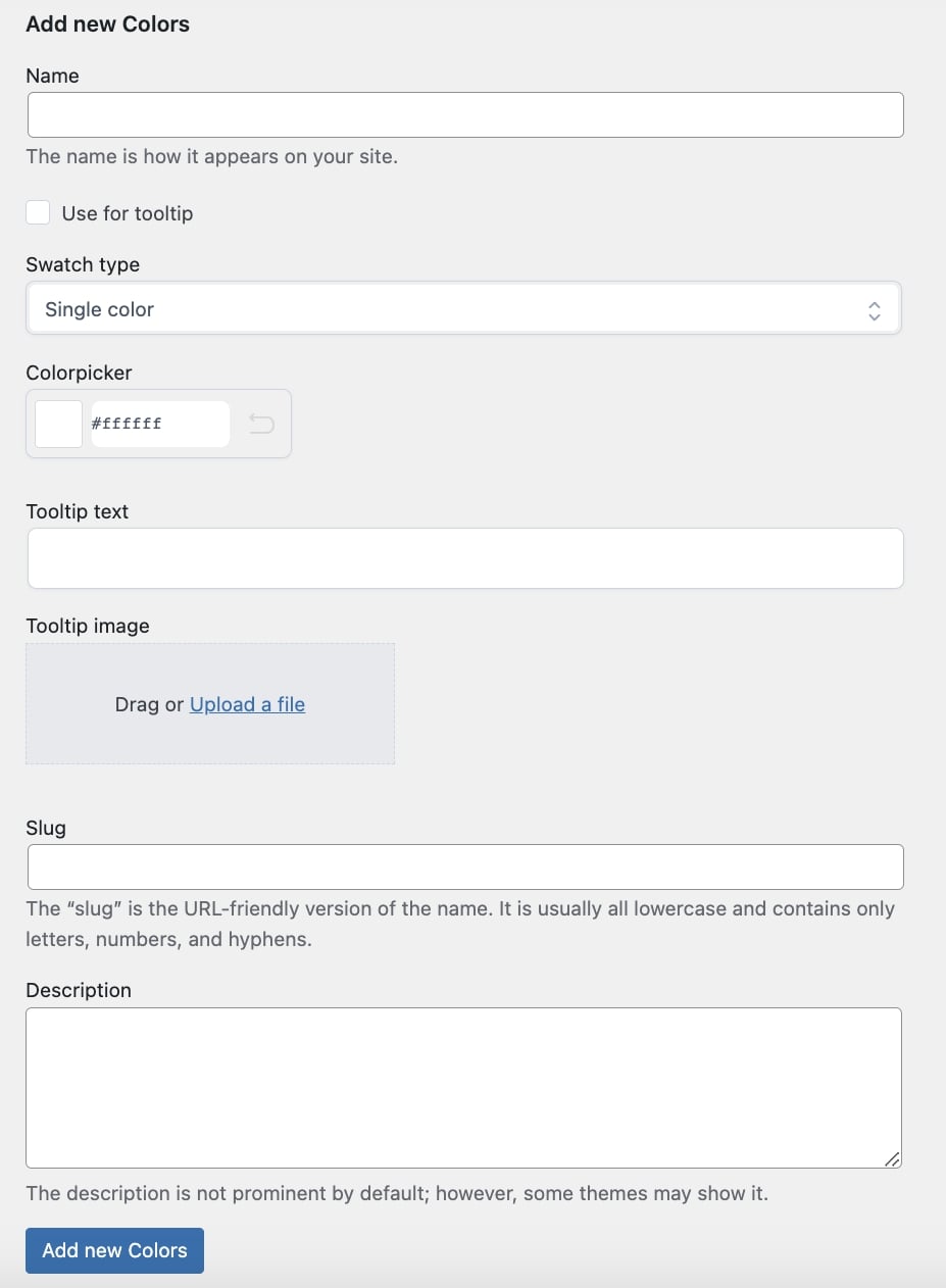
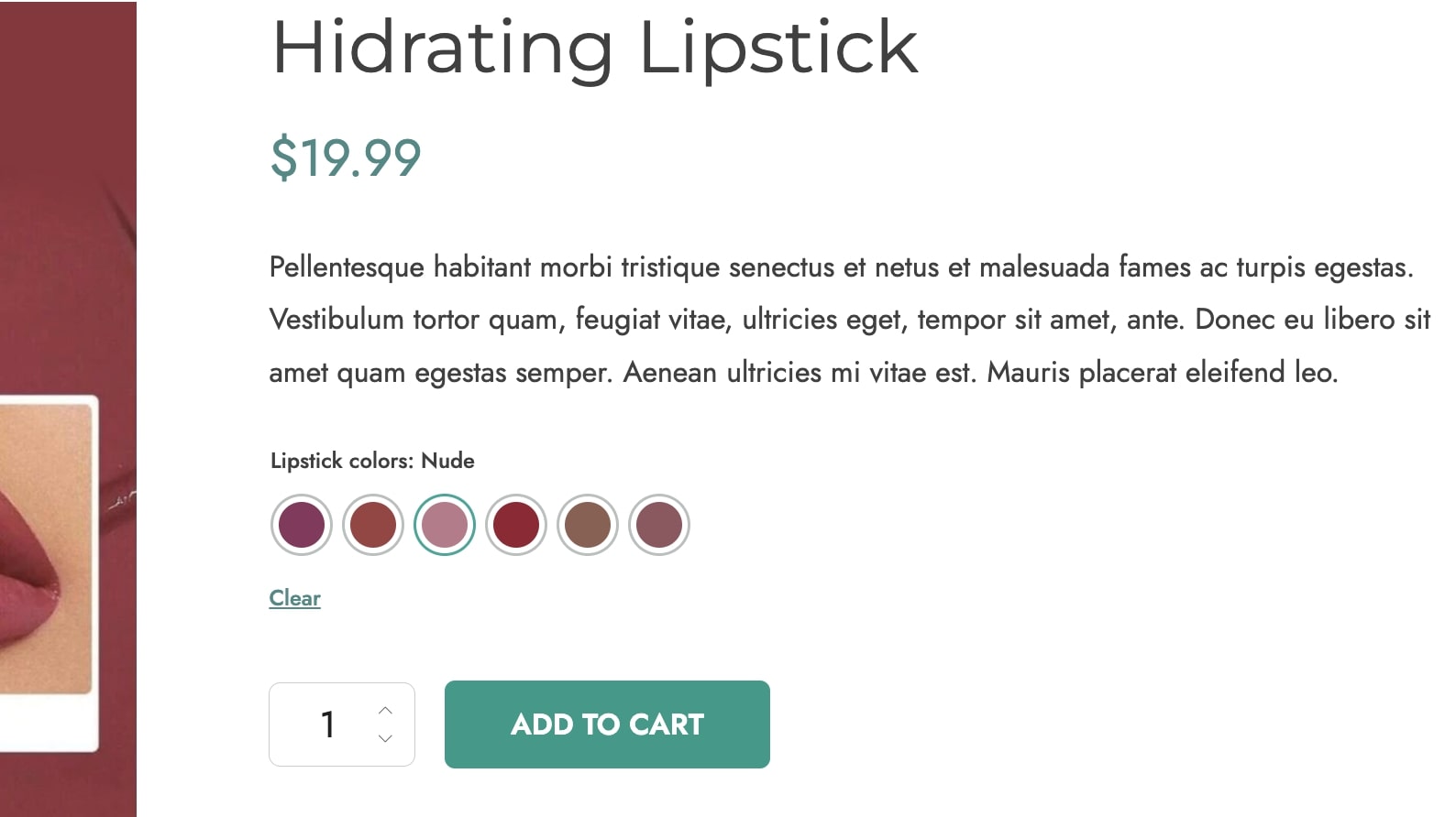
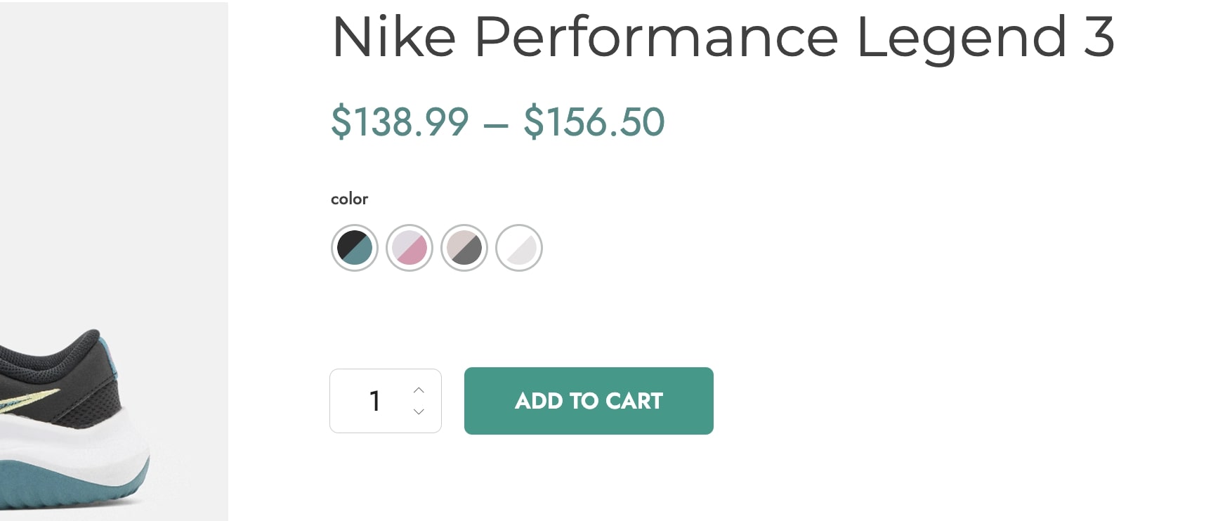
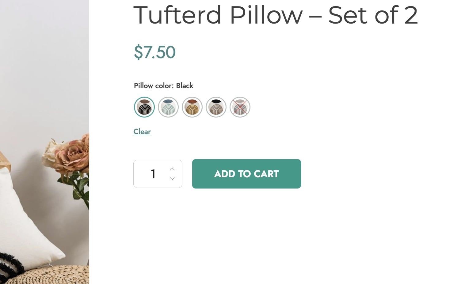
Colorpicker
Name: enter the name that defines the color and will show on the frontend;
Use for tooltip: enable this option to use the term name for the tooltip;
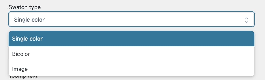
Swatch type: choose the swatch type from
Single color: select if you want to show a single color for the swatch, then choose the color in the Colorpicker option;
Bicolor: select if you want to show a two-tone swatch, then choose the colors in the Colorpicker options;
Image: select if you want to show an image for the color swatch, then drag or upload the file in the related option;
Tooltip text: enter the text for the tooltip that defines the attribute variation and will show on the product page;
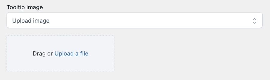
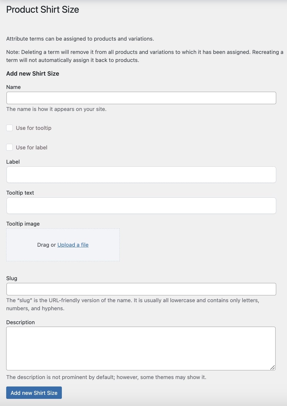
Tooltip image: drag or upload the image for the tooltip that defines the attribute variation and will show on the product page;
Slug: enter the slug for the attribute variation;
Description: enter a description that defines the attribute variation, shown in the front end.
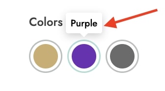
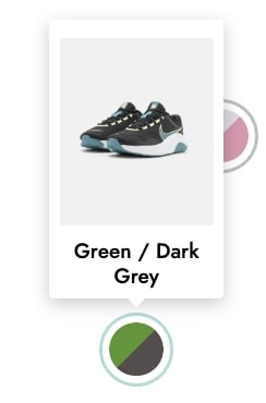
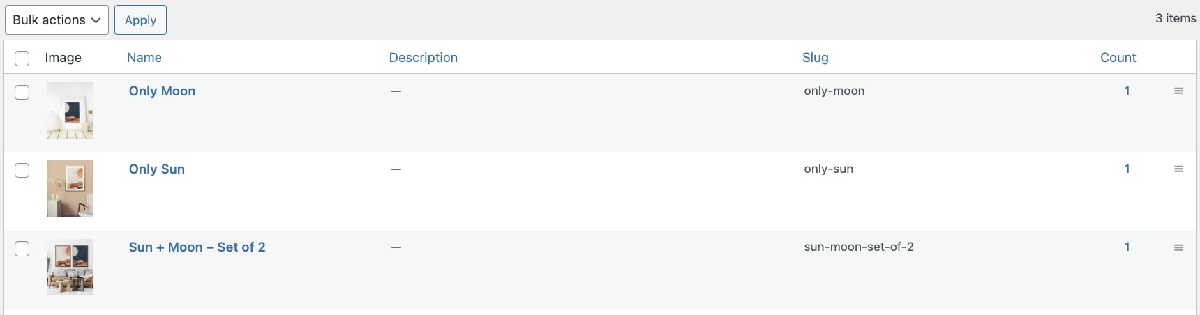
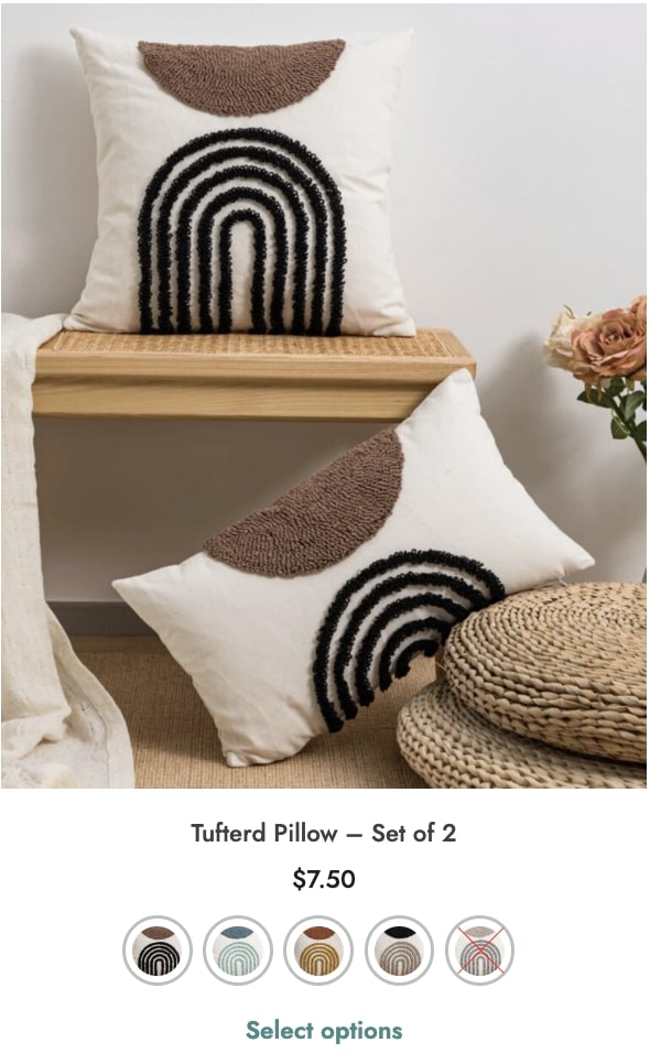
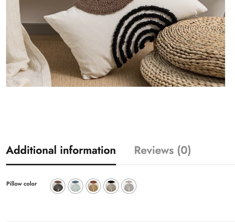
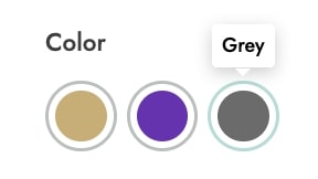
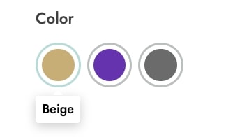
After configuring and adding the terms, you’ll get a view like in the image below.
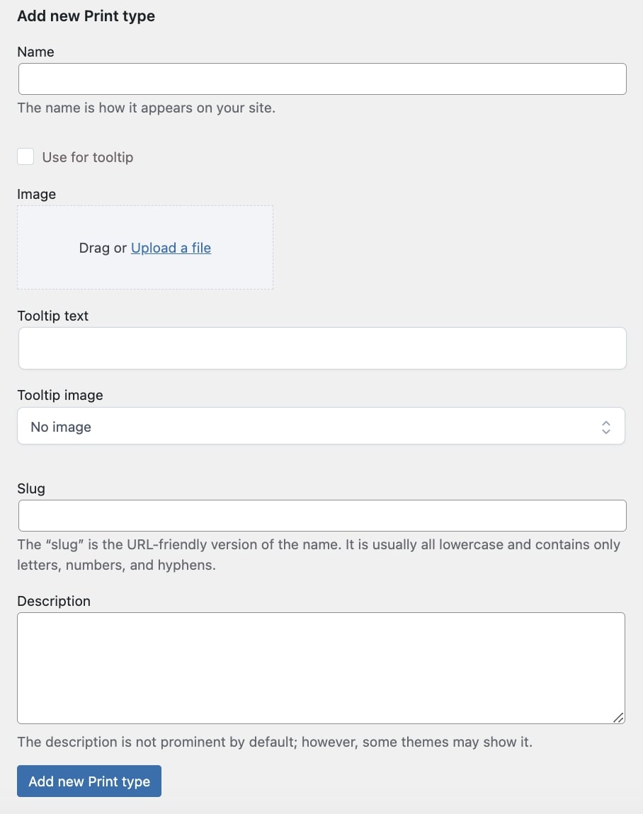
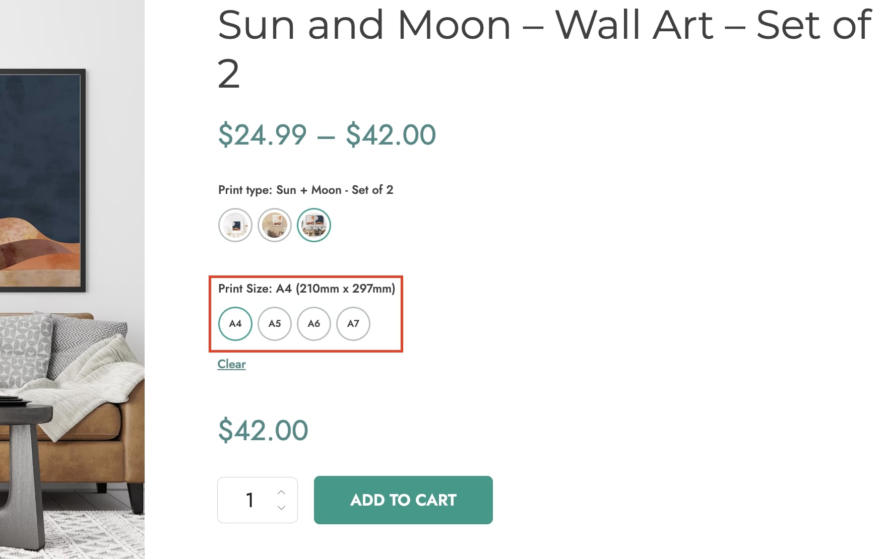
Image
Name: enter the name that defines the image and will show on the frontend;
Use for tooltip: enable this option to use the term name for the tooltip;
Image: drag or upload the image that you want to use for the attribute variation;
Tooltip text: enter the text for the tooltip that defines the attribute variation and will show on the product page;
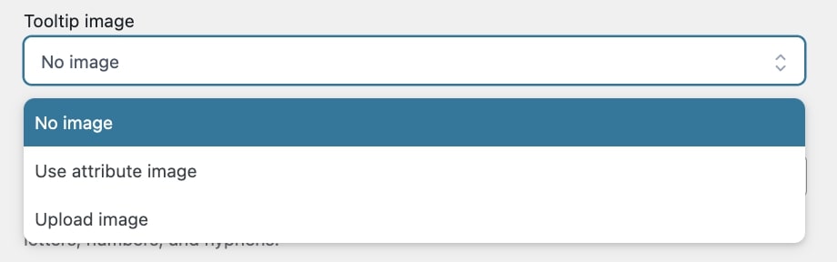
Tooltip image: choose the image for the tooltip by selecting one of the following options:
No image
Use attribute image
Upload image: by selecting this option, you will be able to drag or upload a different image through the dedicated uploader;
Slug: enter the slug for the attribute variation;
Description: enter a description that defines the attribute variation, shown in the front end.
After configuring and adding the terms, you’ll get a view like in the image below.
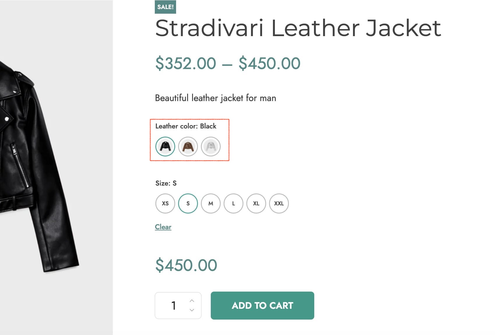
Label
Name: enter the name that defines the label and will show on the frontend;
Use for tooltip: enable this option to use the term name for the tooltip;
Use for label: enable this option to use the term name for the label;
Label: enter the label that defines the attribute variation;
Tooltip text: enter the text for the tooltip that defines the attribute variation and will show on the product page;
Tooltip image: choose the image for the tooltip that defines the attribute variation and will show on the product page;
Slug: enter the slug for the attribute variation;
Description: enter a description that defines the attribute variation, shown in the front end.
After configuring and adding the terms, you’ll get a view like in the image below.
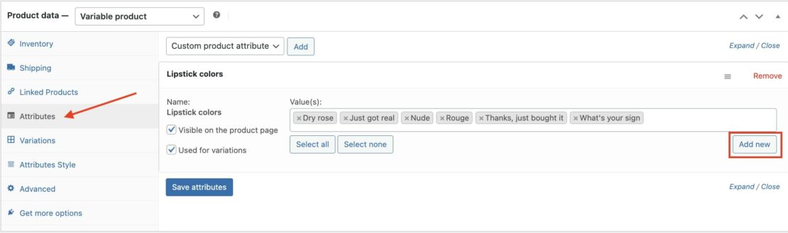
How to add attribute terms from products
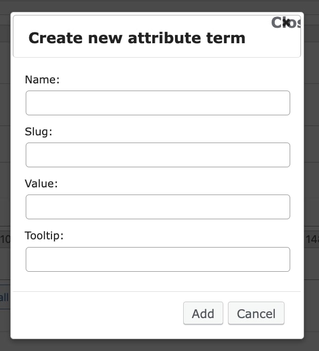
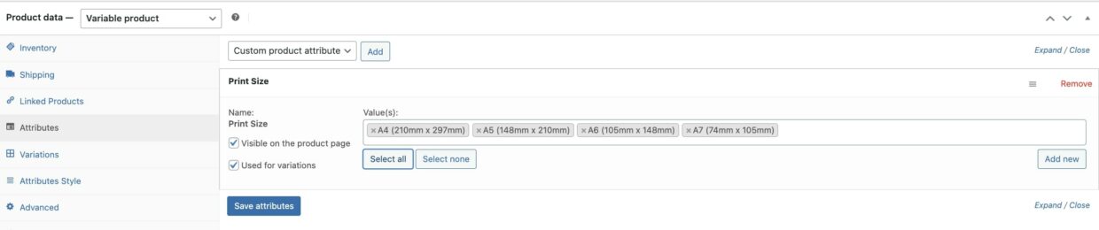
You can create new product variations directly from the Attributes section of the product detail page. After selecting the attribute, click on Add new to add a new term.
The modal window will include the available options that you can use to configure the new attribute term.
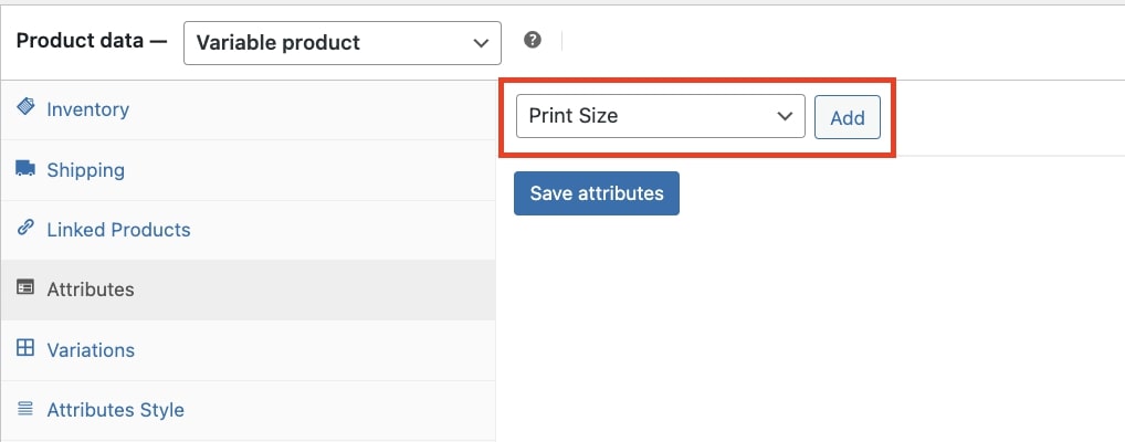
You can add attributes to the product just like for any other attribute belonging to WooCommerce types. Select the attribute and click on Add.
Now select the terms you want to use for the product variations, enable the option Used for variations and click on Save attributes.
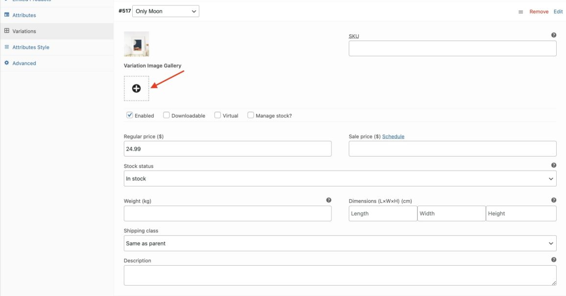
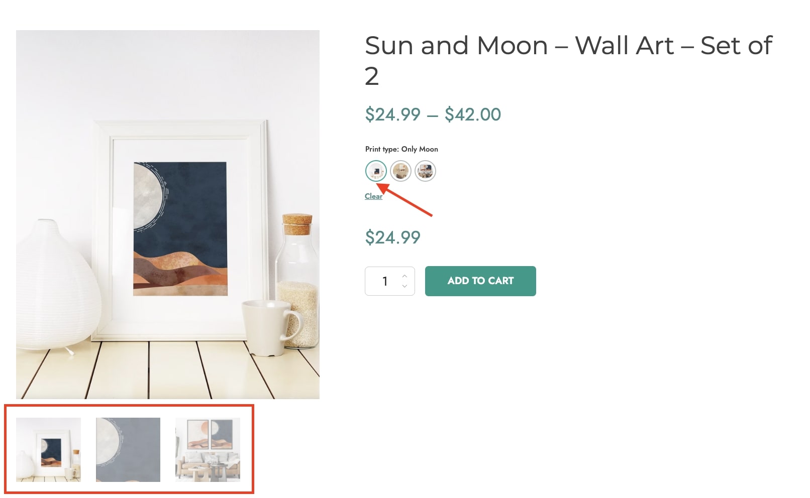
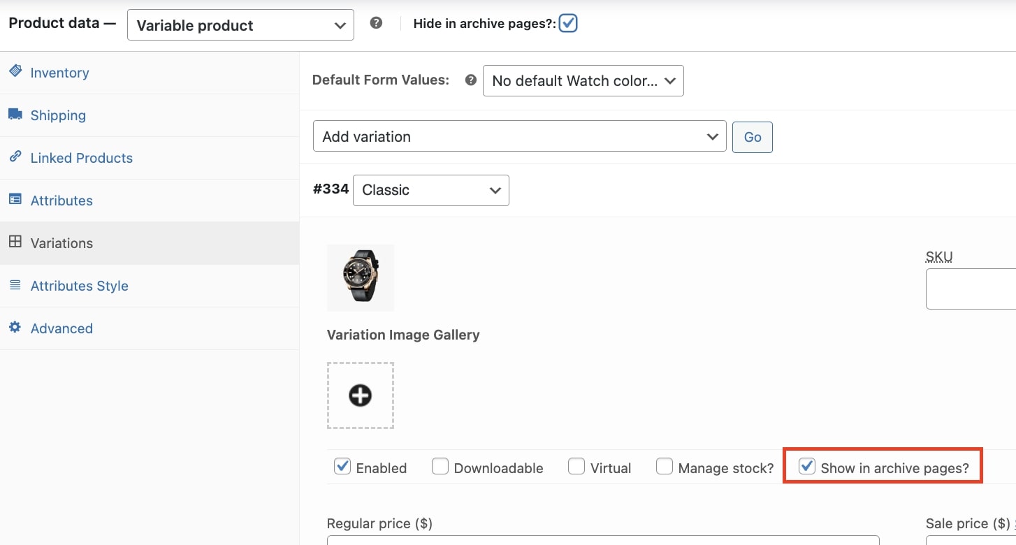
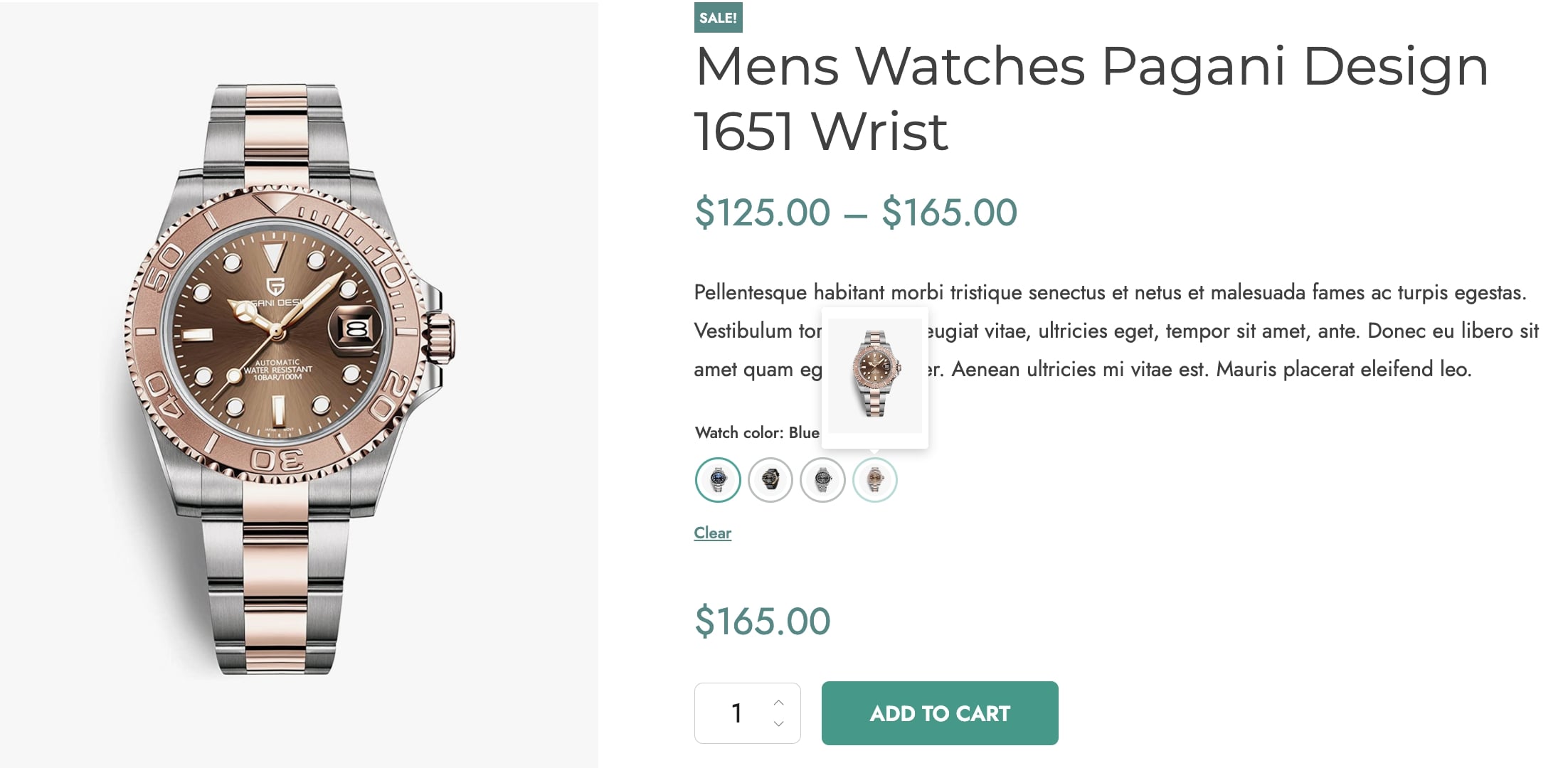
You can now configure the variation settings through the created attribute. Here, you can also find the option to add a different image gallery for each of the product variations.
The customers will see a different image gallery for every variation they select.
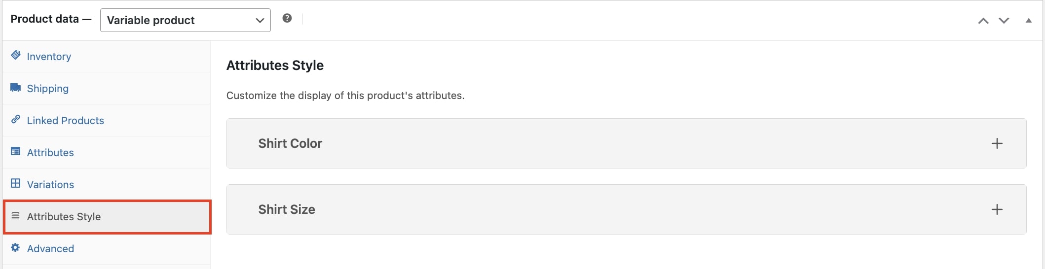
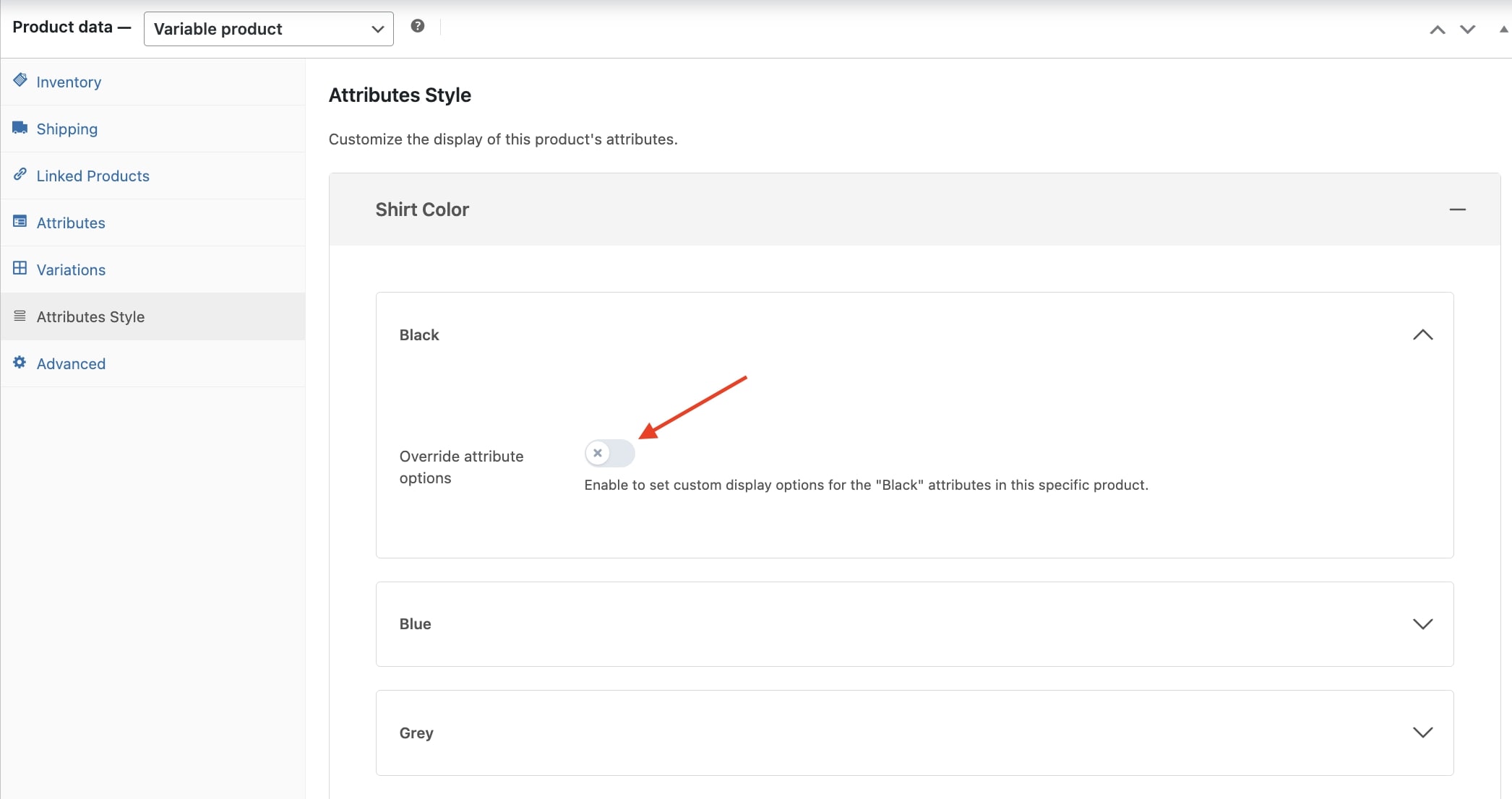
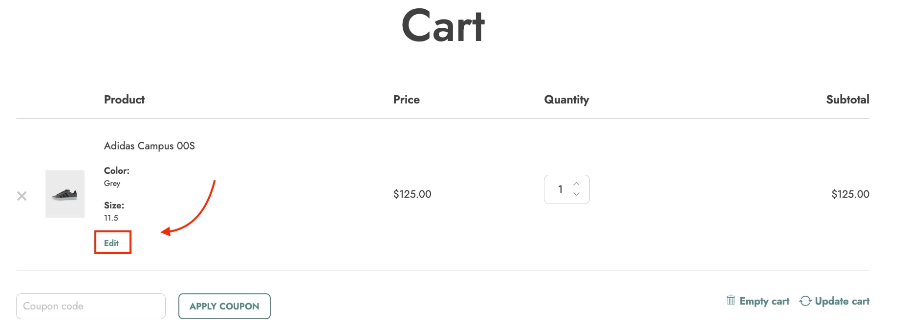
How to customize attribute style at the product level
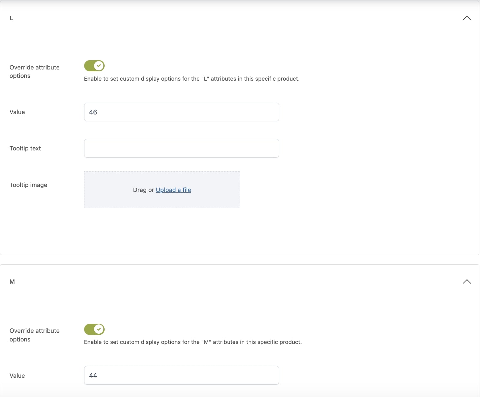
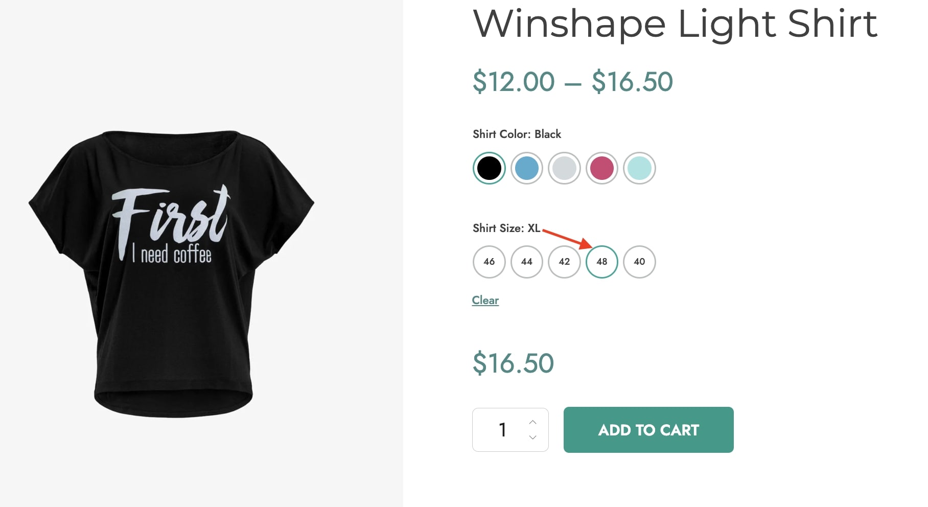
If you need to set a different style for the attributes of a specific product, you can do it through the section Attributes style on the product edit page.
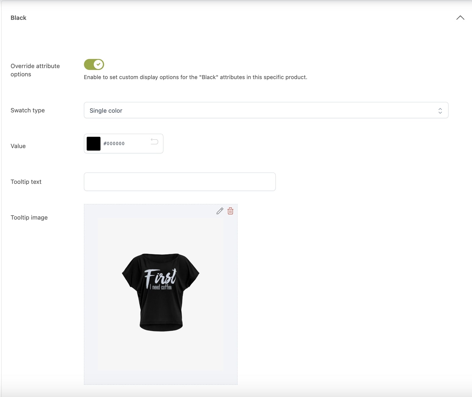
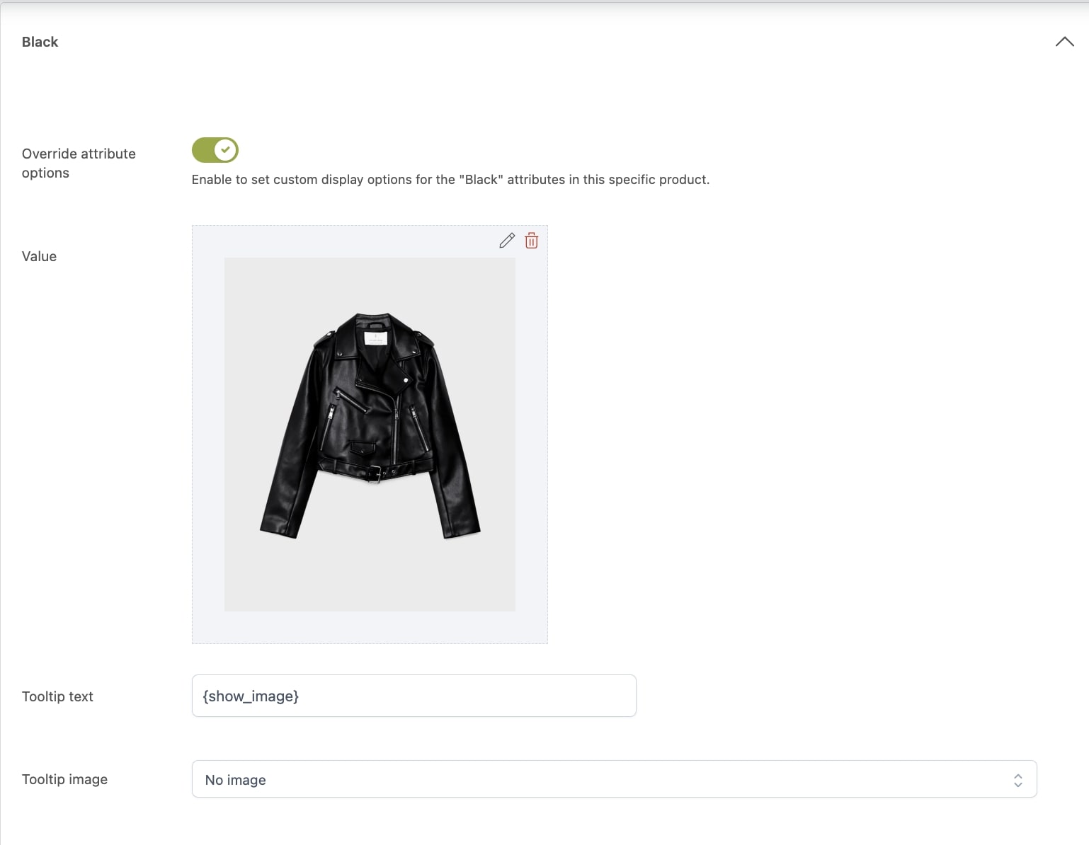
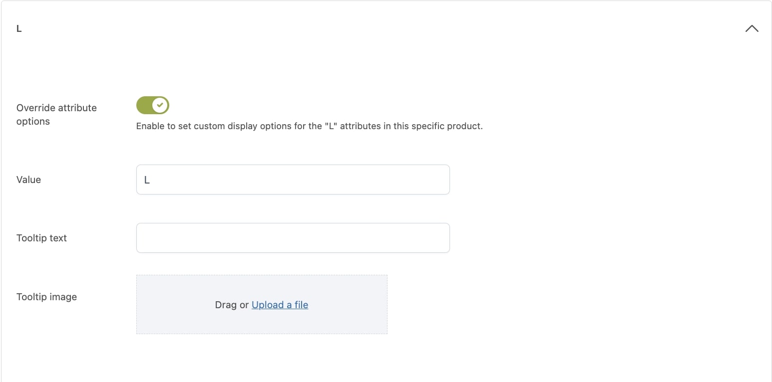
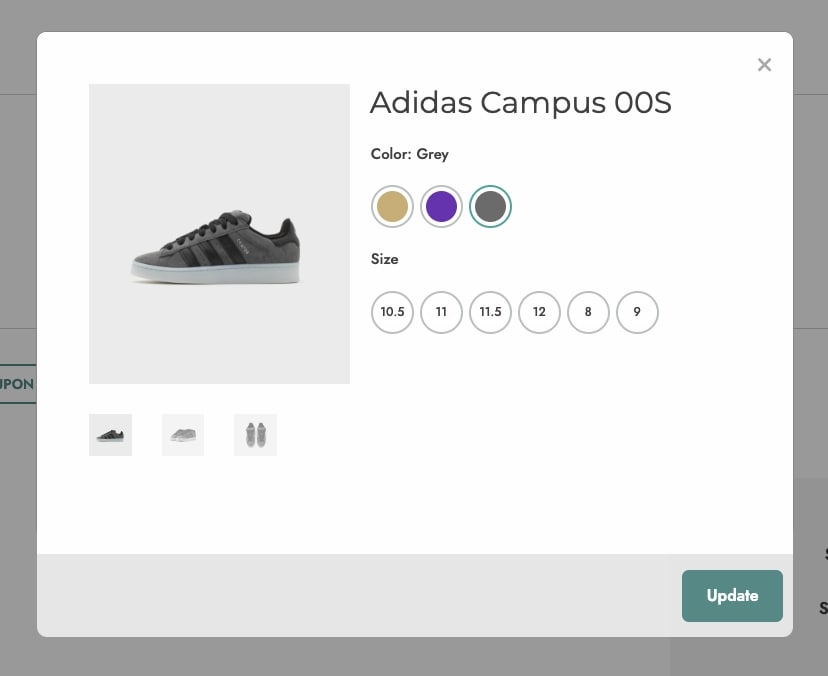
Here, you will find the attributes previously added to the product. By clicking on each of them, the list of terms will show. You can now override their style by enabling the option Override attribute options.
The term options available to be overridden depend on the attribute type.
Colorpicker term options
Swatch type: select the color swatch type (Single color, Bicolor or Image);
Value: select the color/s or set the image;
Tooltip text: enter the text for the tooltip;
Tooltip image: drag or upload the image for the tooltip.
Image term options
Value: drag or upload the image;
Tooltip text: enter the text for the tooltip;
Tooltip image: choose the image to use as tooltip from:
No image: no image will show;
Use attribute image: use the same image assigned to the attribute;
Upload image: upload a different image.
Label term options
Value: enter the label;
Tooltip text: enter the text for the tooltip;
Tooltip image: drag or upload the image for the tooltip.
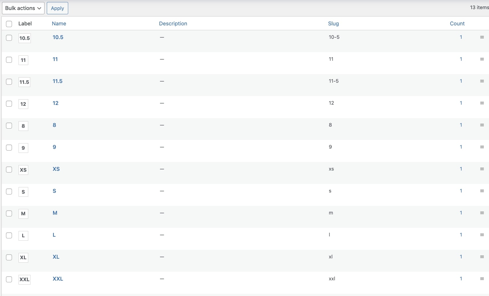
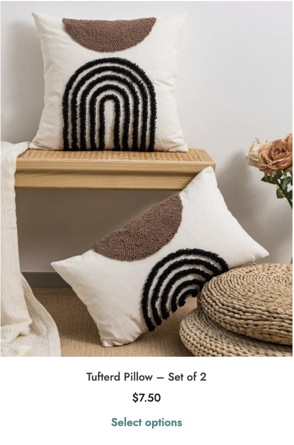
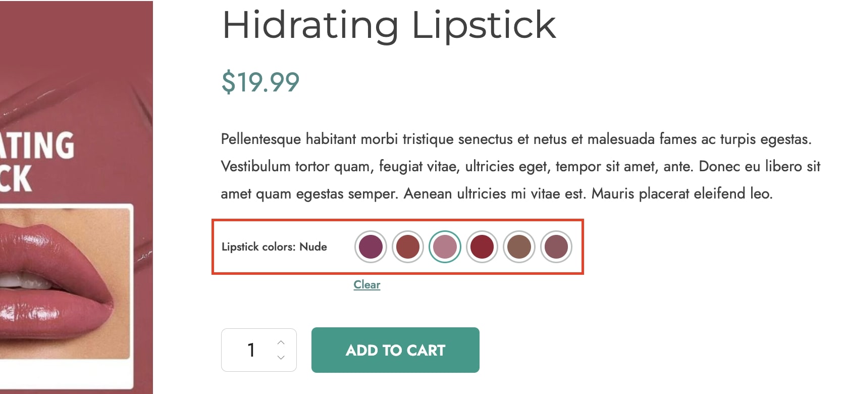
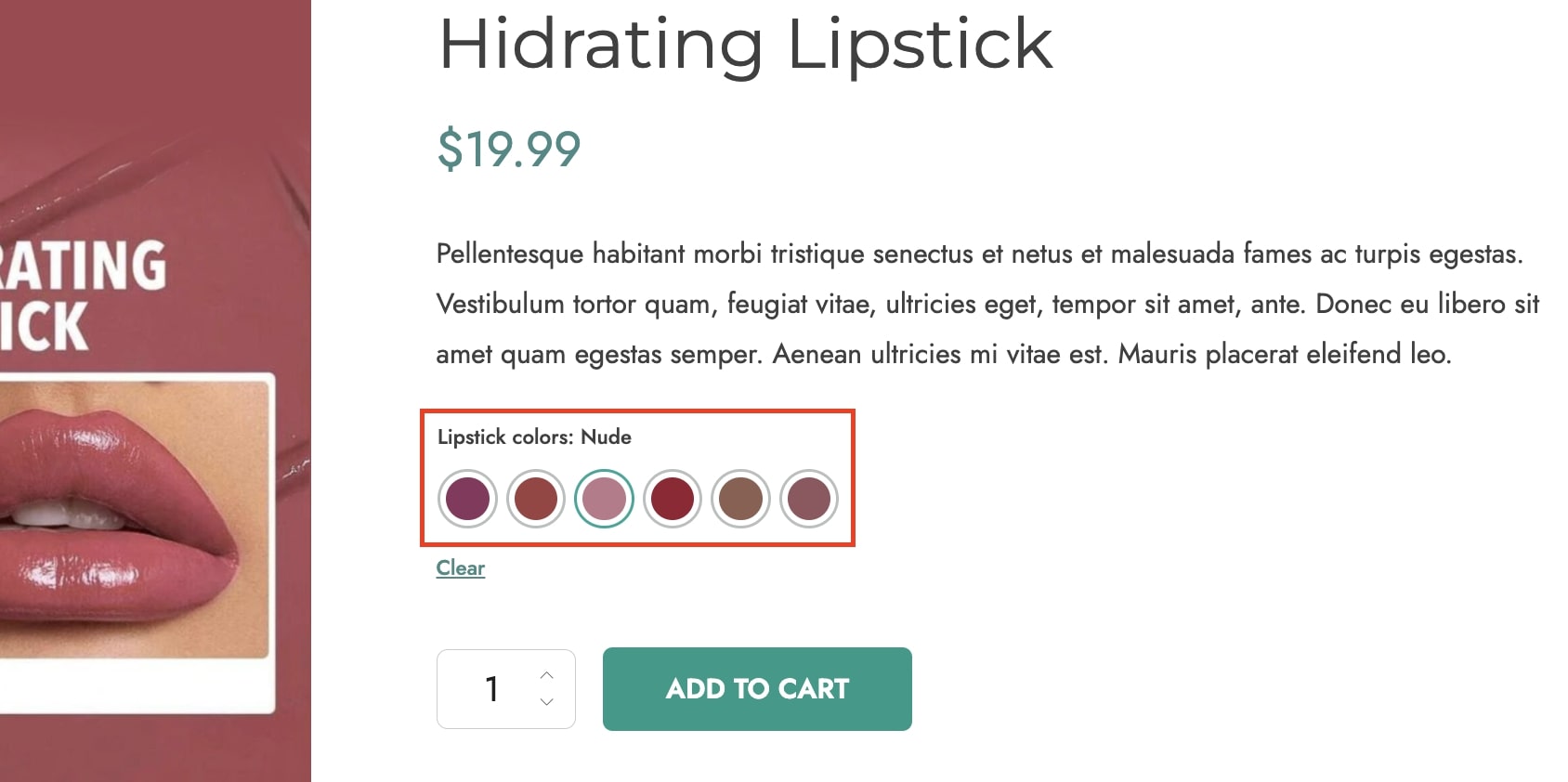
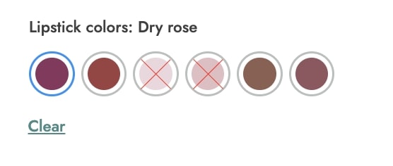
Example
Imagine you are selling clothes in your online store and you want to show the size match for a specific T-shirt model in the following way: S=42, M=44, L=46, etc.
By overriding the label term options in that product, you will get a result as in the image below.
New attribute types that the plugin allows to use, in addition to WooCommerce standard ones, are colorpicker, image and label. Showing these types of attributes on your products will offer users the possibility to have a nice view of the options available and will help them make the right choice for their needs.Let’s see some examples for each type.
Colorpicker
This attribute type allows creating color swatch variations for your products.
You can choose to create variations by
single color
bicolor
or image.
To set up color attribute terms for your product variations, please refer to this page.
Label
The Label attribute allows showing a text label for your product variations.
To set up label attribute terms for your product variations, please refer to this page.
Image
Image attributes allow showing an image to better represent your product variations.
To set up image attribute terms for your product variations, please refer to this page.
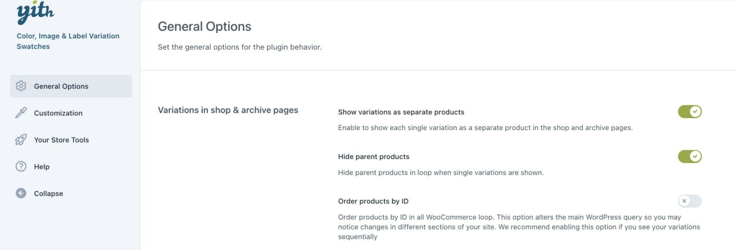
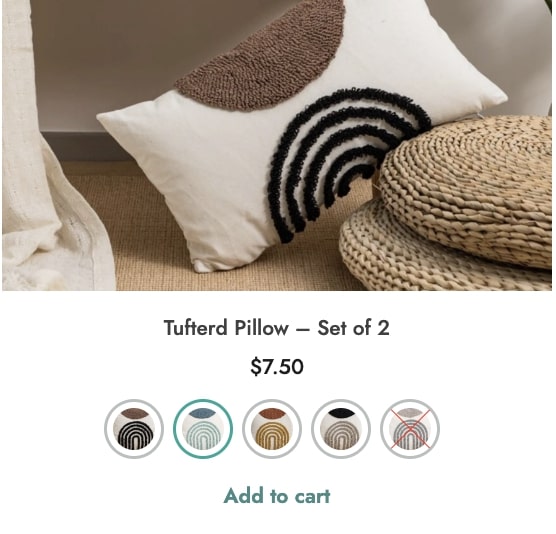
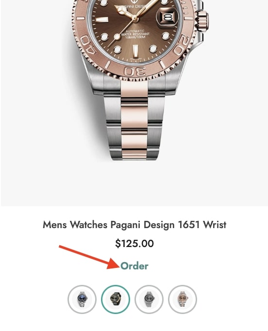
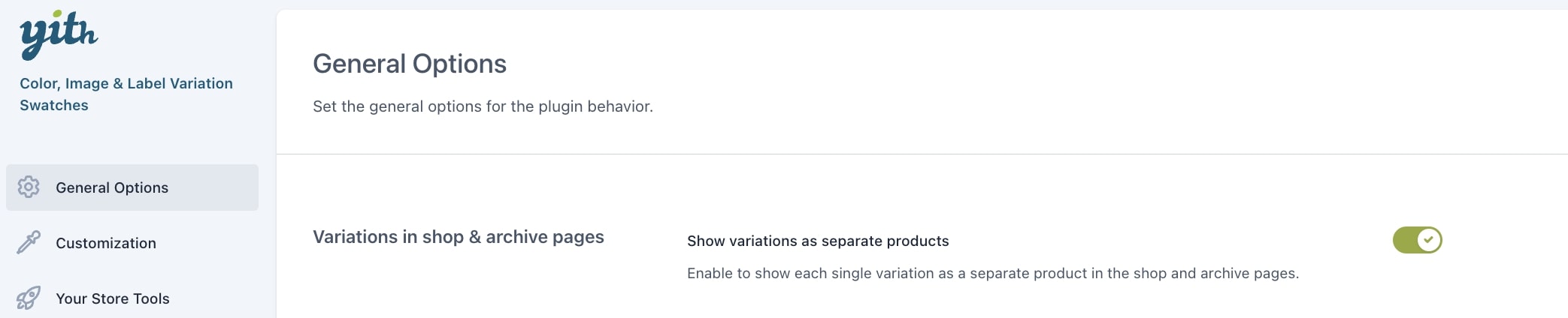
Through the plugin General options, you can choose to show single product variations on default WooCommerce shop and archive pages.
Enable the option Show variations as separate products and decide whether to show or hide the parent product by enabling/disabling the option Hide parent products. If hidden, only the variations of the products will be visible in the loop.
If you want to keep the order and sequentially show the same products, enable the option Order products by ID.
Please note – for the product variations to show as separate products, it is essential to enable the option Show in archive pages? in each variation on the product edit page.
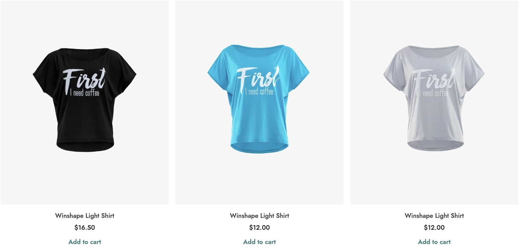
This is an example of separate product variations shown on the Shop page.
In this section, you can also set other options to offer users a better purchase experience.
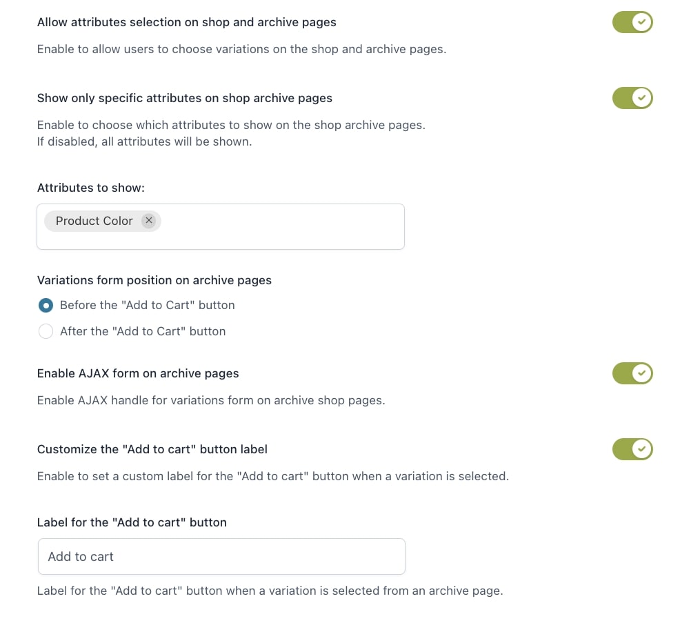
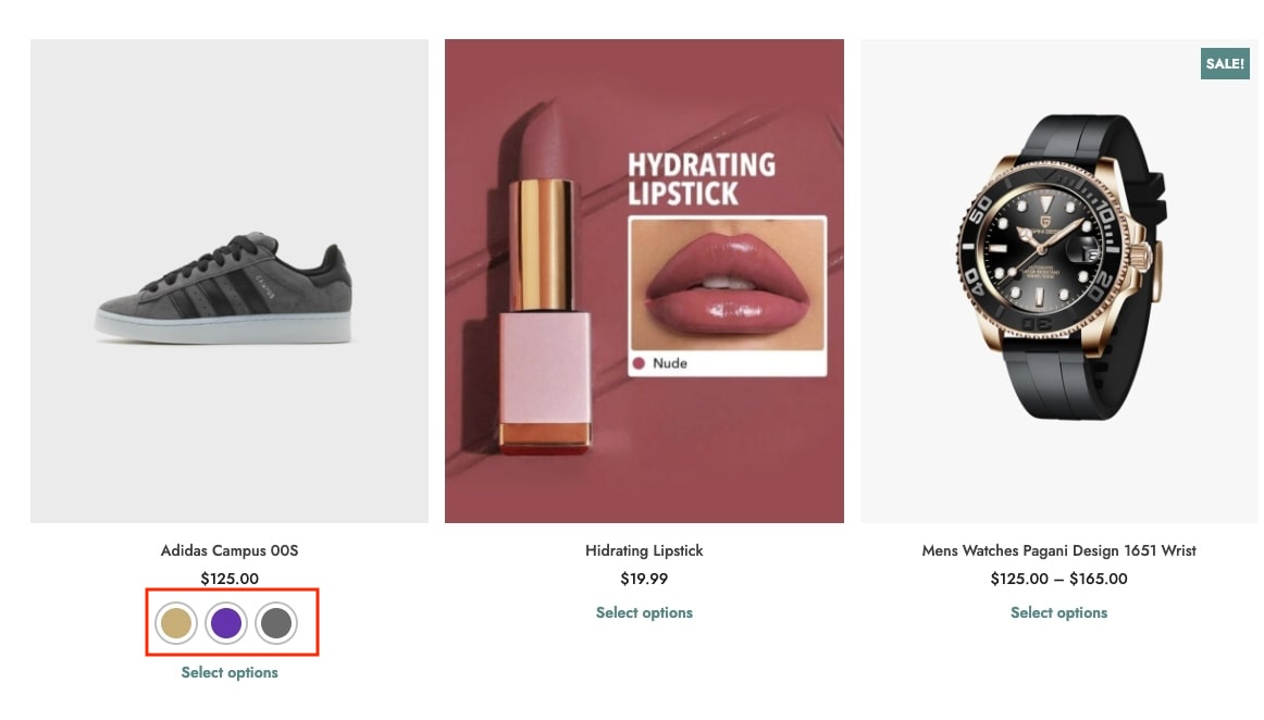
Allow attributes selection in shop and archive pages: by enabling this option, users can select the product variation on shop and archive pages without being redirected to the product page ;
Selection disabled
Selection enabled
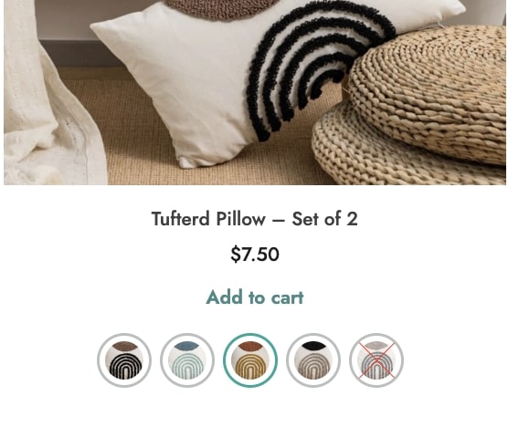
Show only specific attributes on shop archive pages: use this option to show only specific attributes in the shop page.
No attributes selectedSpecific attribute selected
Variations form position in archive pages: choose whether to show the product variations before or after the Add to cart button;
Before Add to cart button
After Add to cart button
Enable AJAX form in archive pages: use this option to enable/disable Ajax on archive pages;
Customize the “Add to cart” button label: enable this option if you want to show a custom text for the Add to cart button;
Label for the “Add to cart” button: enter the custom text to show for the Add to cart button when users select a product variation.
The first option you can find in this General options section is the one to choose the variation layout for the product pages. You can choose from:
Inline
Separate lines
Inline
Separate lines
The other settings are:
Show attribute description: by enabling this option, the attribute description will show on the product page;
Replace product image on hover: by enabling this option, the product image will be replaced with the image of the variation when the user hovers over it.
Show custom attributes on “Additional Information” Tab: enable this option if you want to show the custom attributes style in the “Additional Information” product tab.
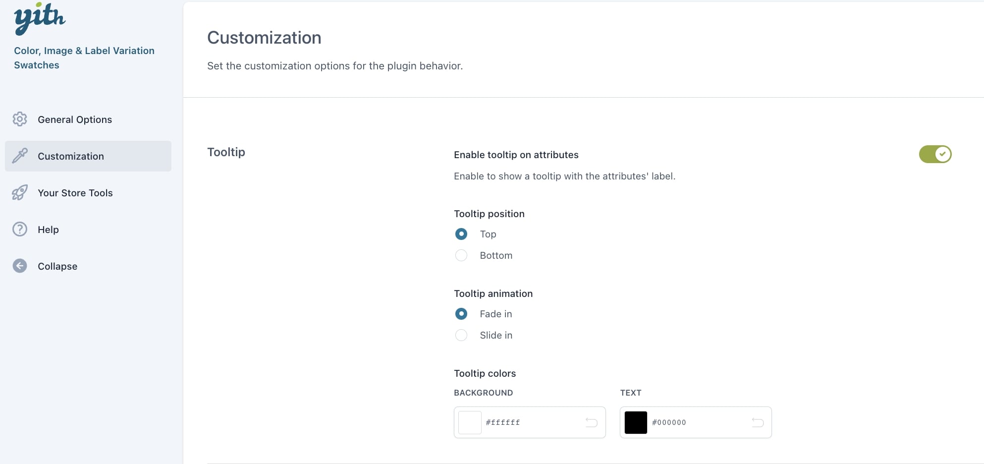
In the section Customization, you can configure the tooltip and style options.
Tooltip options
Enable tooltip on attributes: enabled this option to add a tooltip to each attribute created.
Tooltip position: choose whether to show the tooltip on top or bottom of the attributes;
Top
Bottom
Tooltip animation: choose the animation for the tooltip from Fade in and Slide in;
Tooltip colors: set the colors for the tooltip background and text
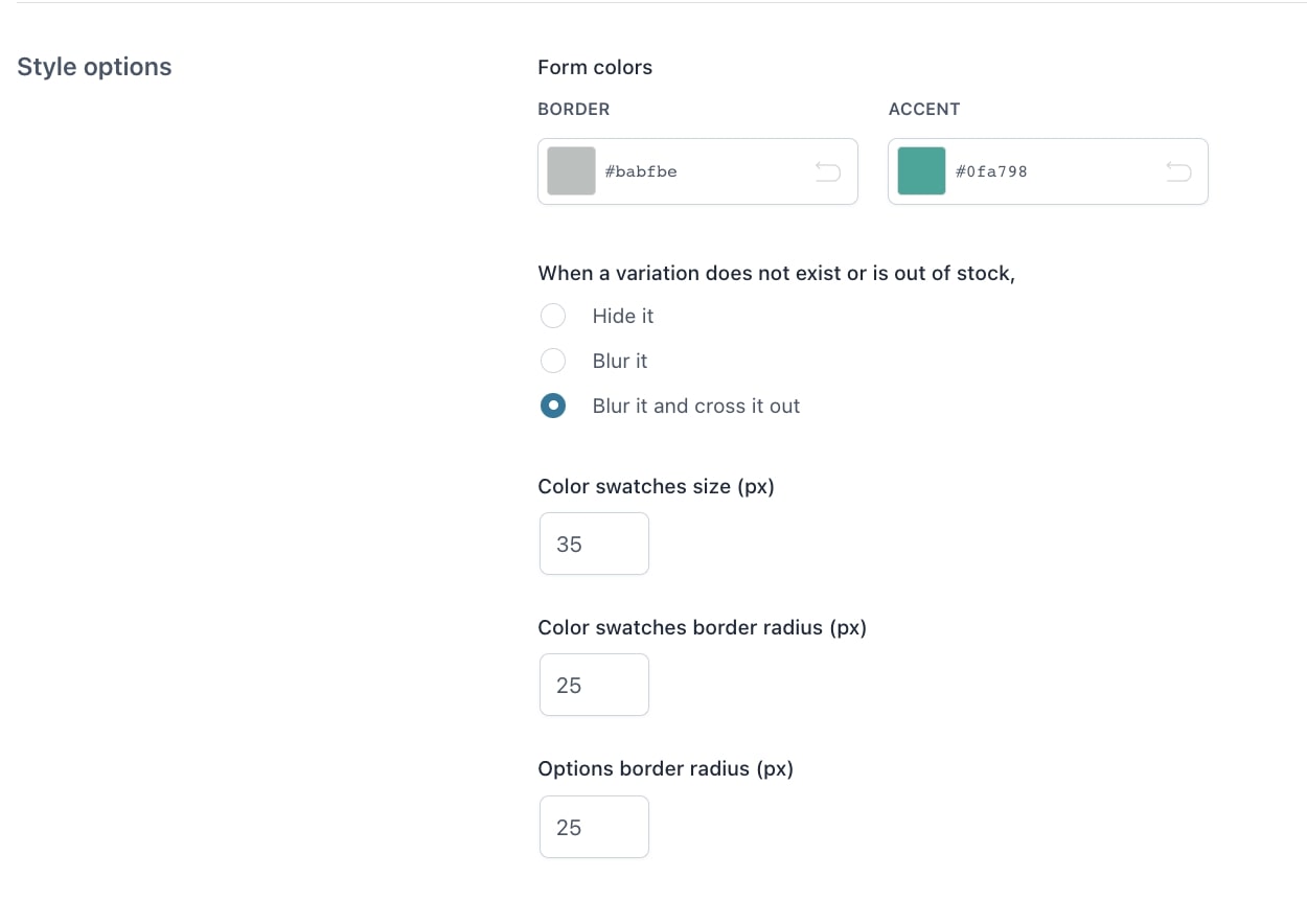
Style options
Form colors: set the border and accent colors;
Example: Border > gray; Accent > blue
When a variation does not exist or is out of stock: choose the behavior to apply when a product variation is not set or is out of stock. Available options are:
Hide it: the variation will be hidden;
Blur it: the variation will show as blurred;
Blur it and cross it out: the variation will show as blurred and crossed out;
Color swatches size (px): enter the value (in px) to define the size of color swatches;
Color swatches border radius (px): enter the value (in px) to define the border radius of color swatches;
Options border radius (px): enter the value (in px) to define the border radius of the options.
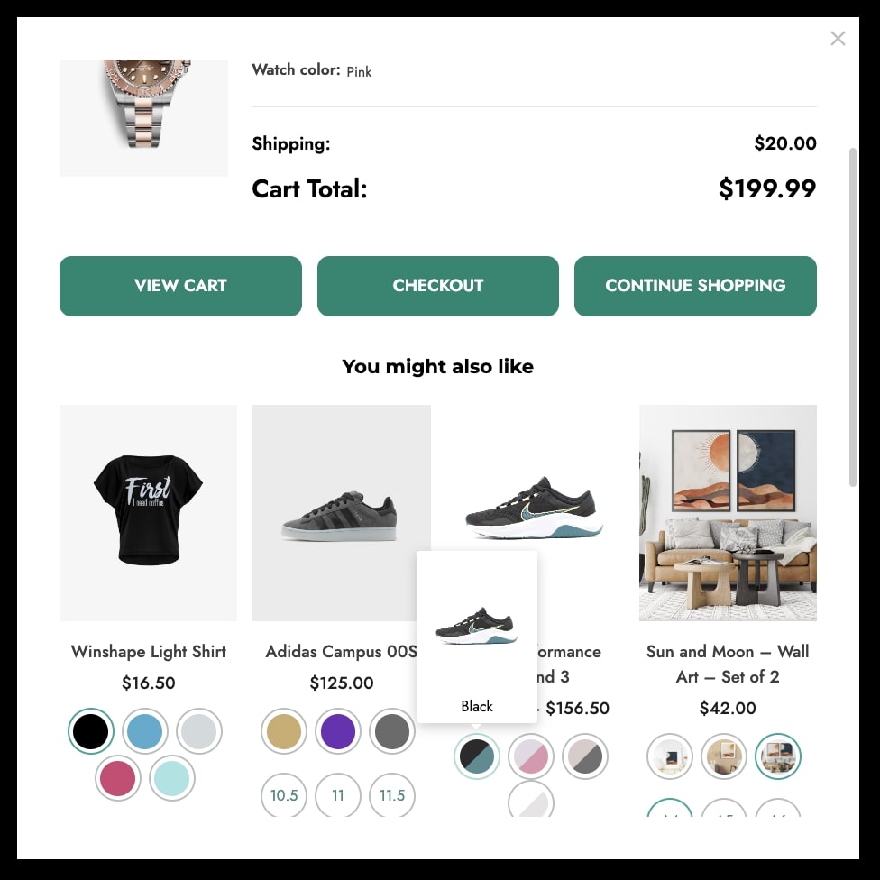
Thanks to YITH WooCommerce Added to Cart Popup you can enable an automatic popup to notify the user about the updated cart content. Every time a product is added to the cart, the popup automatically opens.
The combined use of these two plugins allows users to choose the variation of the products directly from the modal window.
To do it, you need to install and activate the premium version of both plugins on your site.
For further details about YITH WooCommerce Added to Cart Popup settings, please refer to the official documentation.
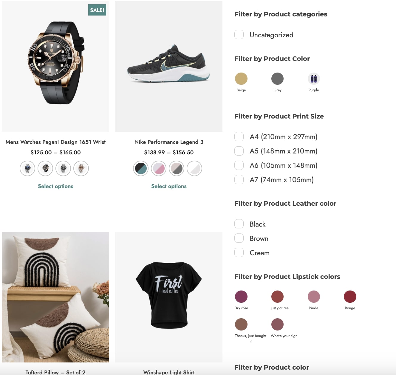
The combined use of these two plugins allows inheriting the colors, labels, and images configured with YITH Color, Image & Label Variation Swatches for WooCommerce as configuration of the filtering terms, so you don’t have to re-create them from scratch in the filter. This applies to Color swatches and Label/Image types.
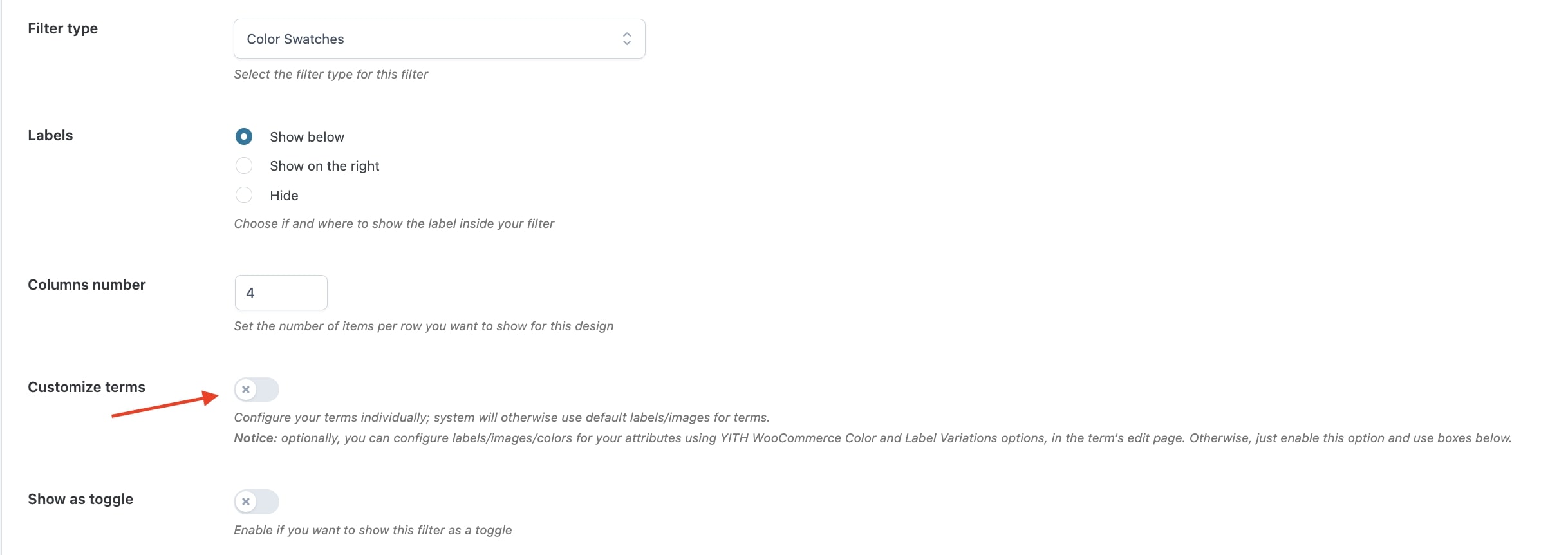
Specifically, by disabling the option Customize terms, the plugin will recover the options configured for the terms with YITH Color, Image & Label Variation Swatches.
When enabling the option “Show variations as separate products” in YITH Color, Image & Label Variation Swatches, each variation will be shown as a separate product.
The filter will also be applied in this case, and will show all products (variations) that match the filter.
For further details about YITH Ajax Product Filter, please, refer to the official documentation.