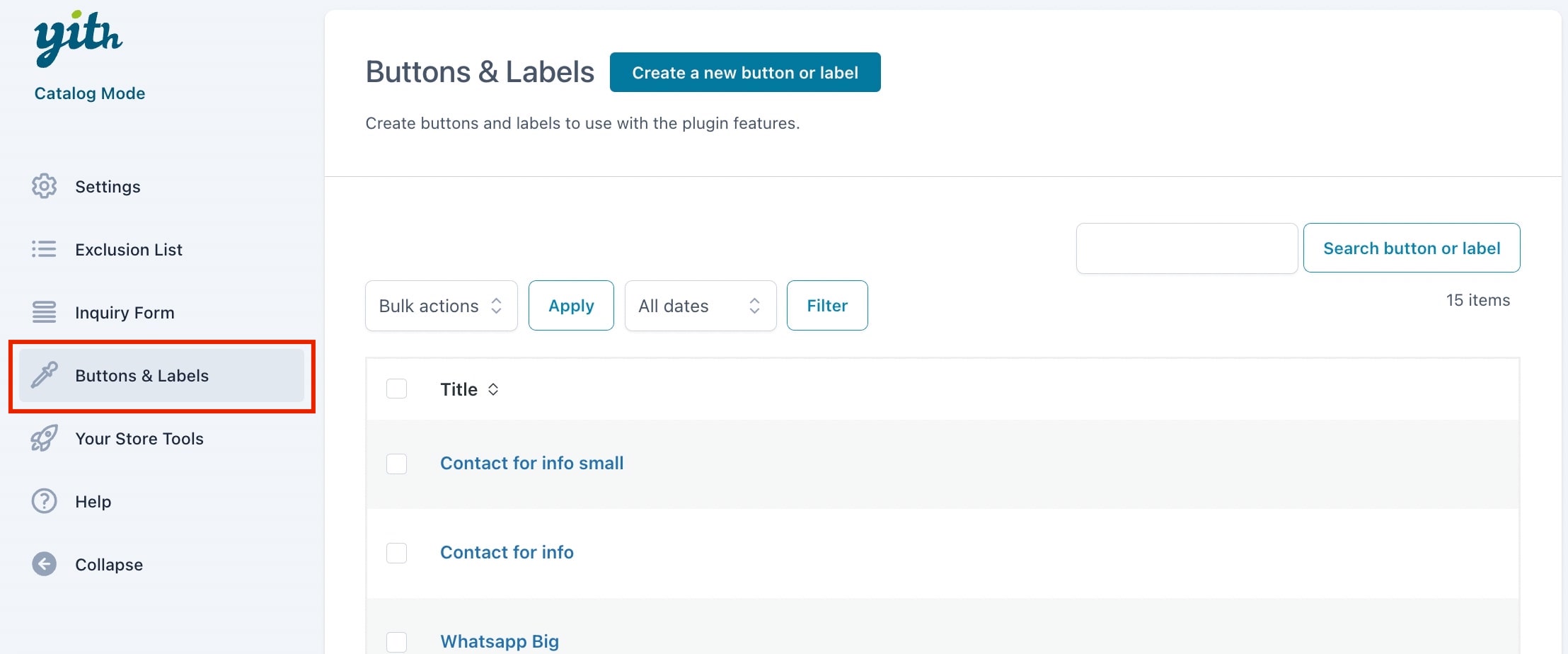
From YITH > Catalog Mode > Buttons & Labels tab you will be able to create many different custom buttons with your own style, so you can use the right one for your products.
You can have one custom button that replaces the following:
- Cart button on the Shop page
- Cart button on product page
- Price on the Shop page
- Price on product page
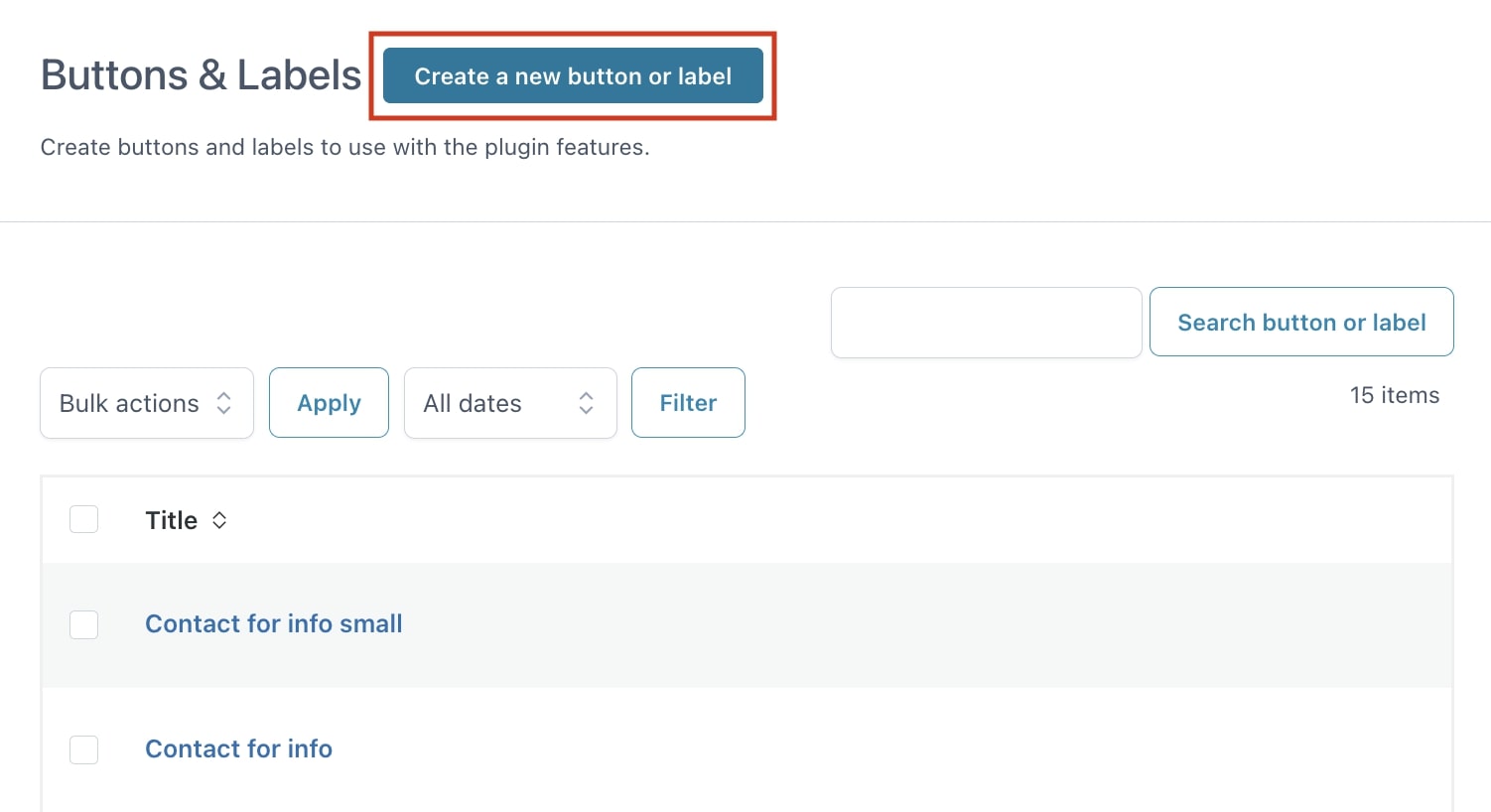
Let’s see how to create custom buttons. First of all, click on the button Create a new button or label.
There are three sections: Content, Style, and Options and a preview box on the right.
Content
In this section you can customize the text and icon for the button/label.
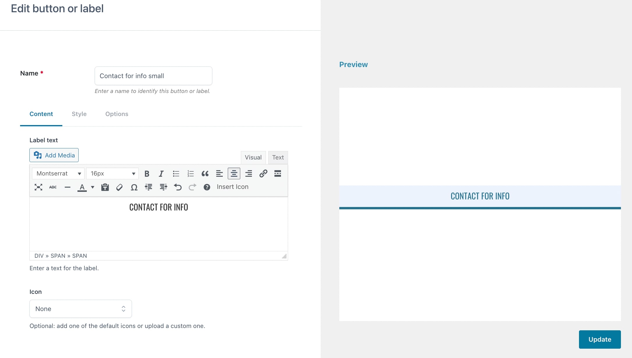
- Label text: here you can find a textual editor to add the custom text of your button, with custom formatting. Please, consider that if you select Theme Default from the font dropdown, the button will inherit the font of the theme, but the preview might not be perfect. If you want to, you can also include a file from your Media gallery.
- Icon: pick a custom icon from the list or upload a custom one. You’ll be able to customize its size in px, alignment, and colors.
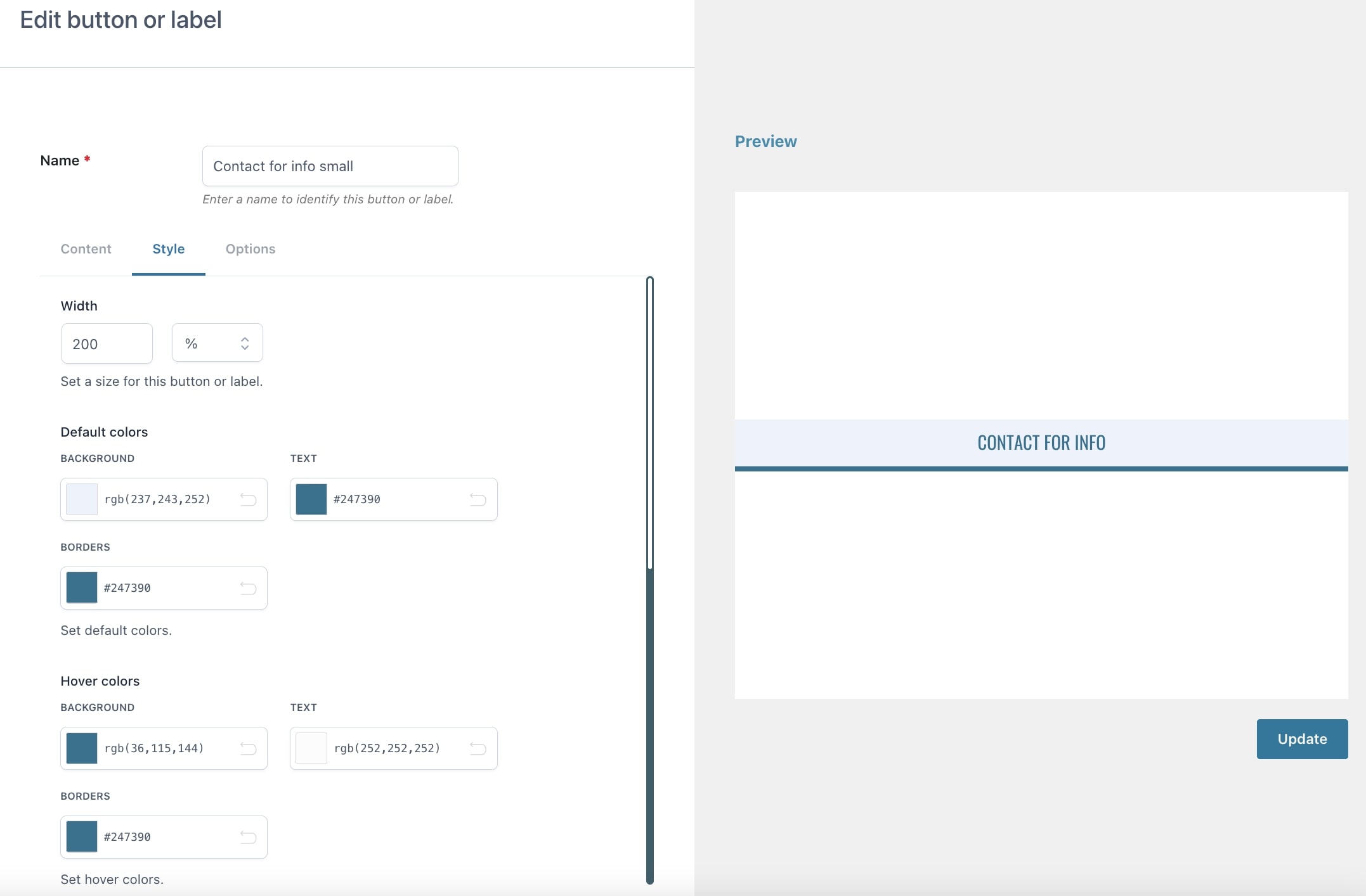
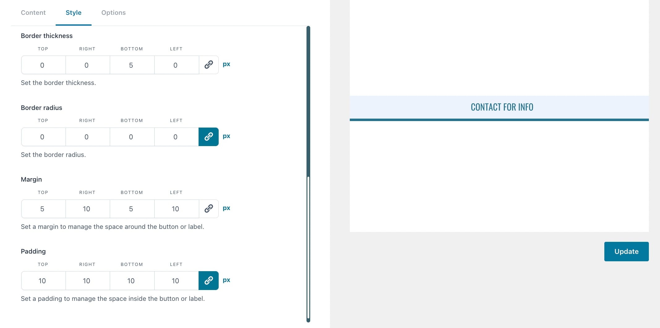
Style
In this section, you will be able to customize the default and hover colors and style of the button (text, borders, width, margin, padding):
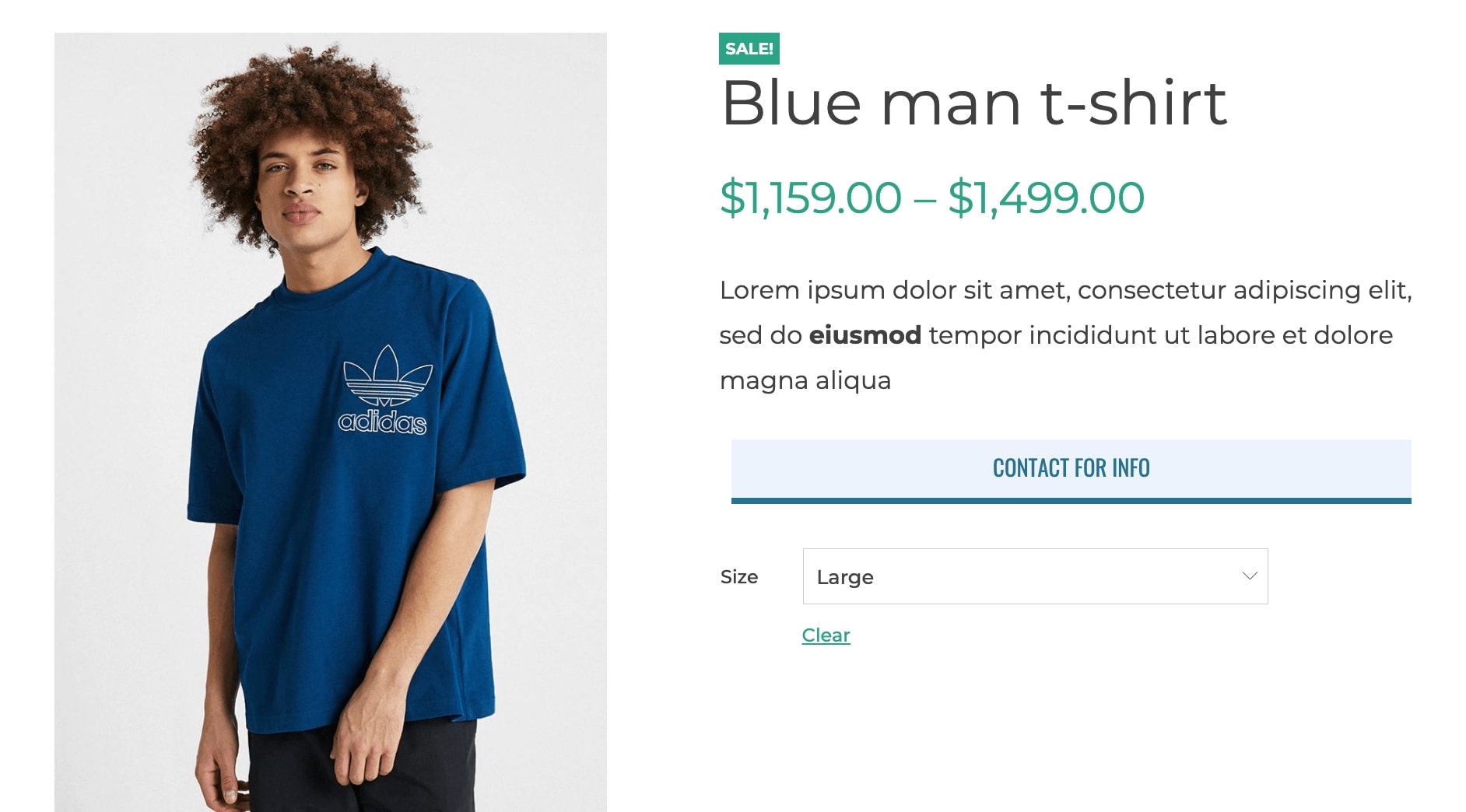
In the product page, the button would look like this:
Options
In this section, you can configure the link and animation of the button/label.
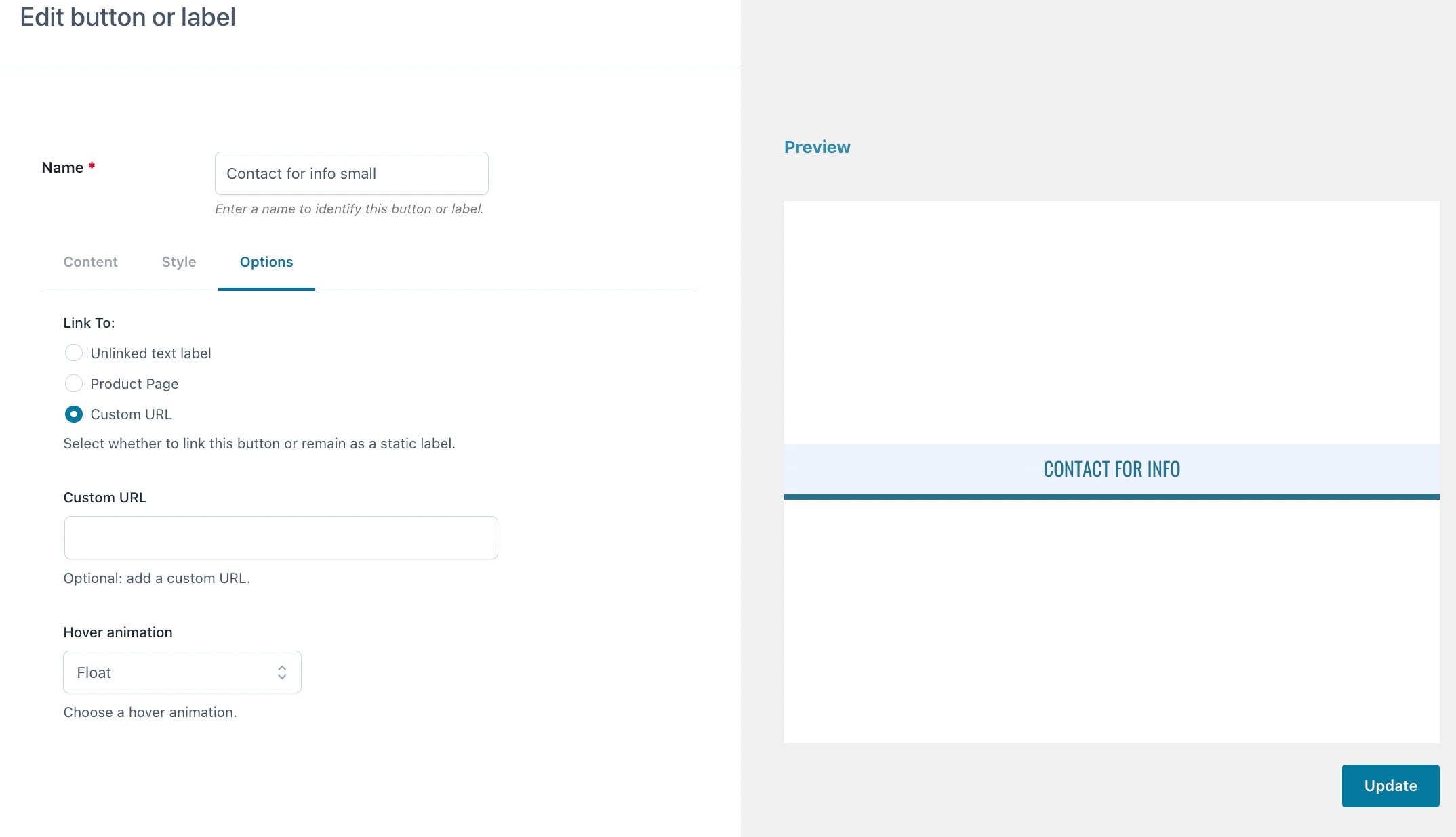
- Link to: choose one of the following:
- Unlinked text label: this lets you simply print a static text without any link.
- Product page: this will make the button dynamically direct your users to the page of the product where the button appears.
- Custom URL: enter here a custom URL of your choice.
- Hover animation: here you can choose the hover animation from Float, Grow, Button, Move Hover Color, Press, Push, Shake, Slide Top, Slide Left.
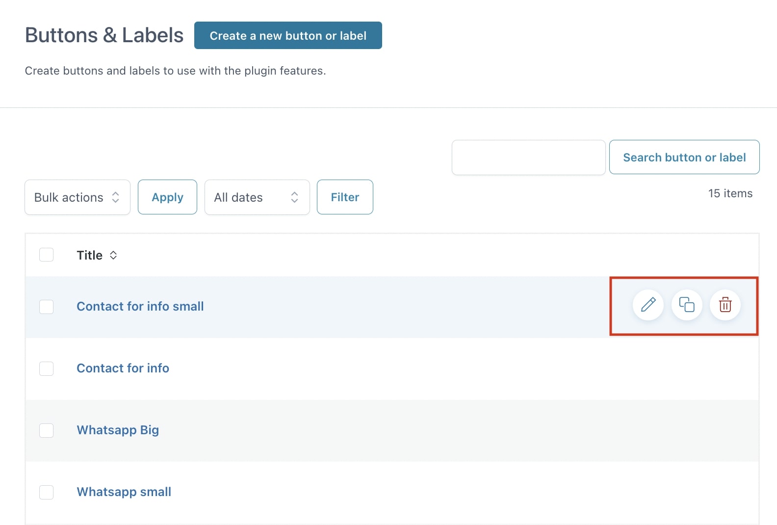
Once you have create a new button or label, you can apply specific actions directly from the Buttons & Labels list:
- Edit
- Duplicate
- Delete