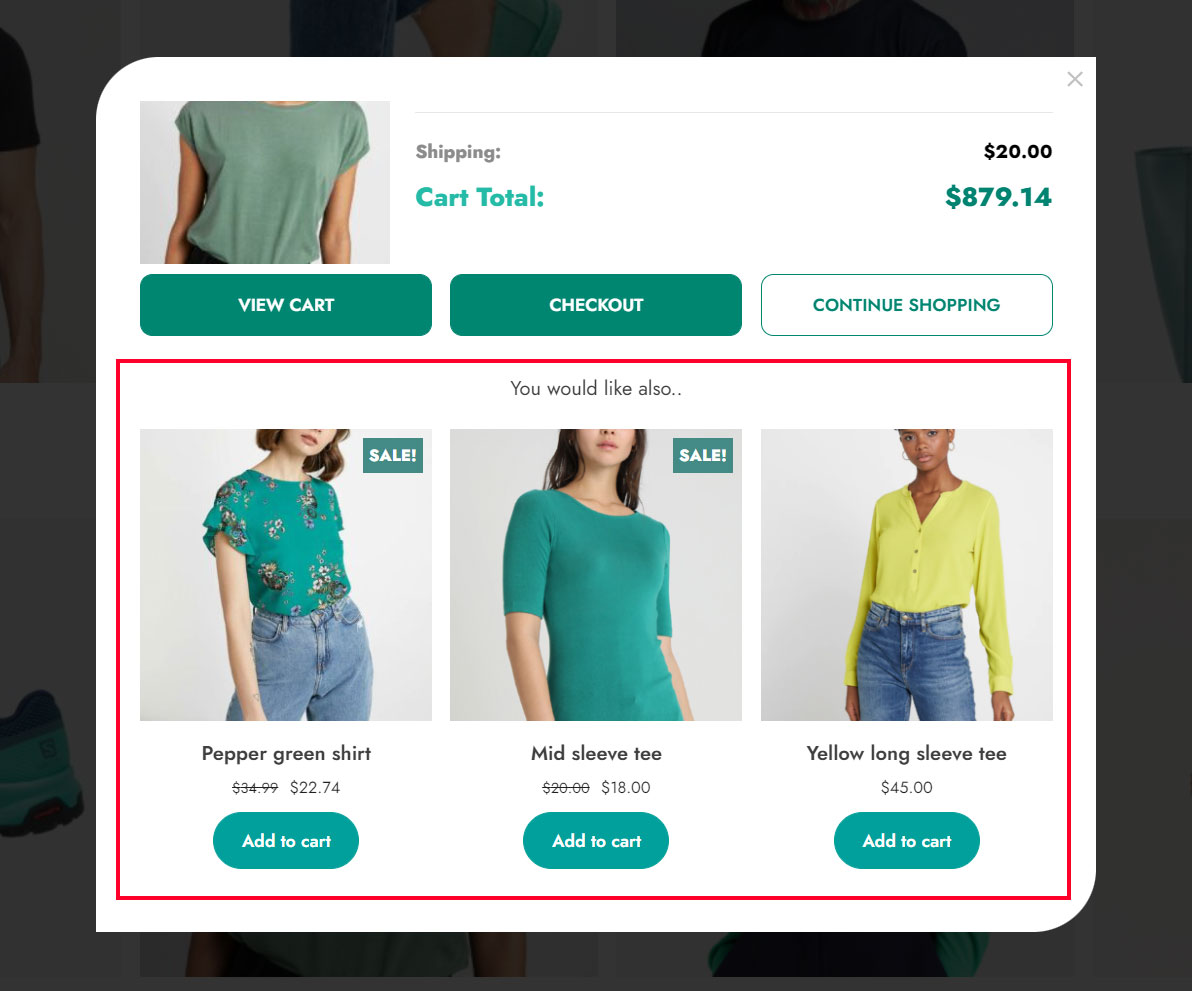
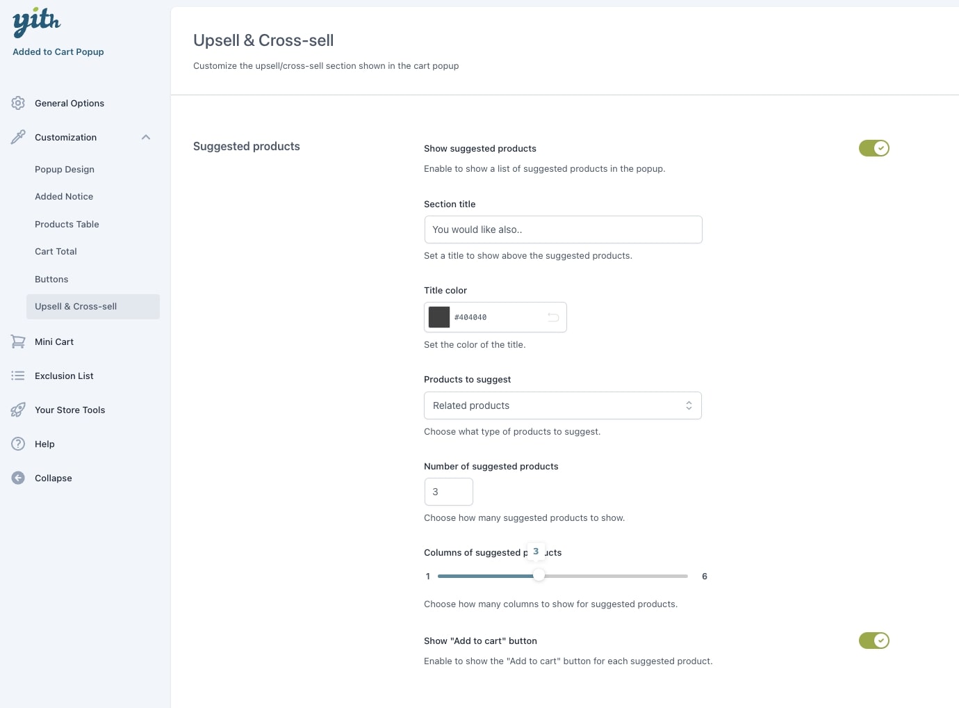
In the Customization > Popup design section, you can customize the popup style and close icon options.
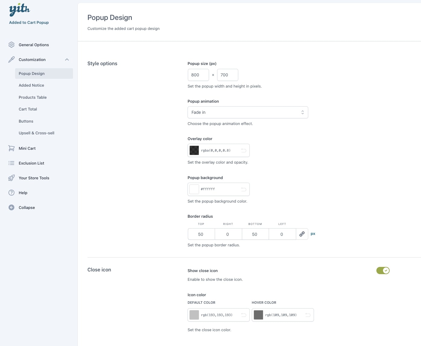
Style options
- Popup size (px): set the popup width and height in pixels. This is the maximum size. If the content does not take the full space, the popup will be automatically shrunk.
- Popup animation: choose here the popup animation effect among the following:
- fade in
- slide in (left)
- slide in (right)
- slide in (top)
- slide in (bottom)
- 3D flip (vertical)
- 3D flip (horizontal)
- scale up
- Overlay color: set the overlay color and opacity.
- Border radius: set the popup border radius for each corner.
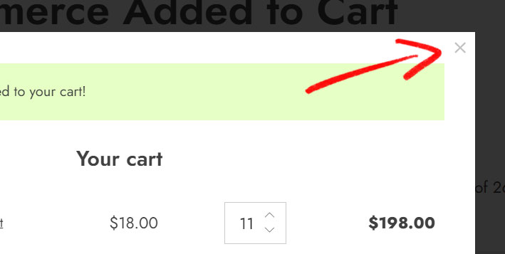
Close icon
- Show close icon: enable to show the close icon on the popup.
- Icon color: set the colors of the close icon, default and on hover.